# everyday ux
> Everyday UX offers practical UX design tips to help you grow as a product designer. Learn user research, wireframing, and design thinking.a
Public Ghost content for AI and LLM tooling. This file includes a bounded export of public pages first, then recent public posts.
Append `.md` to any post or page URL to get the content in Markdown (for example, `/example-post.md`).
## Pages
### Evolve with purpose
URL: https://www.everydayux.net/about/
Last updated: 2025-03-27T23:14:19.000Z
### About everyday ux
I created **everyday ux** as a dedicated space to share content, ideas, and actionable advice with UX product designers. As a product designer, educator, and coach, I’ve shared insights on platforms like Twitter, Medium, and LinkedIn for years. But as these platforms have become less useful and less conducive to real connection, I believe we’re entering a new era where personal blogs, publications, and communities will thrive again. More importantly, designers and creators should have greater ownership and control over their content and the spaces they cultivate. My goal is to build a platform that provides meaningful insights and practical guidance to help you grow and succeed as a designer.
### Mission statement
**everyday ux** exists to empower designers with educational insights, fresh ideas, and practical tips that you can apply immediately. I aim to share simple yet impactful concepts that elevate how you design, think, and collaborate. Whether refining your technical skills or developing interpersonal abilities, the goal is to help you grow as a designer and advance in your career.
Becoming a great designer is a lifelong journey that requires curiosity, continuous learning, and the courage to experiment. **everyday ux** is built on the belief that knowledge should be shared openly, ideas should flow freely, and every piece of content should serve as a stepping stone toward improvement.
But this platform is about more than just honing your craft. It’s about helping you find confidence in your unique design voice, discover your strengths, and navigate the ever-evolving world of UX with creativity and purpose.

### Site map
URL: https://www.everydayux.net/sitemap/
Last updated: 2025-03-29T01:11:33.000Z
_No content available._
### Join 1000+ members
URL: https://www.everydayux.net/membership/
Last updated: 2025-11-05T03:55:43.000Z
Free members gain access to all free content, plus a complimentary 32-page guide on context setting for product teams. Paid members enjoy all premium content and a free digital copy of [*Discover Your Way to Making It*](https://jesseddy.com/discover-your-way-to-making-it?ref=everydayux.net), a book about finding your creative process and forging your own path.
### Free membership content
[Figma annotations: A workaround for teams without full access (free resource included)A flexible workaround for Figma’s limited annotations feature, perfect for teams without full access or dev mode. Includes a free, customizable annotations component you can start using right away.everyday uxJess Eddy](https://www.everydayux.net/free-figma-annotations-component/)
[Three ways designers can be independently strategic at workThe most effective designers shape their work strategically. By generating ideas, building strong partnerships, and owning a problem space, you can amplify your impact—without waiting for permission. Learn how you can use strategy and tactical execution to drive real outcomes.everyday uxJess Eddy](https://www.everydayux.net/three-ways-designers-can-be-independently-strategic-at-work/)
[Why great design still starts in Figma (most of the time)While AI and code-first approaches are on the rise, design tools remain essential for collaboration and iteration. However, not every project requires a design process. Here’s when Figma is worth it—and when jumping straight into code makes sense.everyday uxJess Eddy](https://www.everydayux.net/why-great-design-still-starts-in-figma-most-of-the-time/)
[Don’t let the lack of high-fidelity designs slow your team down: try these ways of collaboratingYou don’t need perfect designs to make progress. This article shares practical ways for designers and engineers to collaborate effectively without waiting for pixel-perfect, high-fidelity designs. Learn to overcome bottlenecks, involve engineers early, and align as a team.everyday uxJess Eddy](https://www.everydayux.net/dont-let-the-lack-of-high-fidelity-designs-slow-your-team-down-try-these-ways-of-collaborating/)
[A practical guide to design documentation with real examples in FigmaThis guide explores how to effectively document design decisions and provide context in Figma, creating transparency and improving collaboration throughout your design process. Discover how to establish a single source of truth, minimize miscommunication, and improve team alignment and efficiency.Welcome to everyday uxJess Eddy](https://www.everydayux.net/a-practical-guide-to-design-documentation-with-real-examples-in-figma/)
[How to scaffold compelling presentations using proven storytelling techniquesDiscover ‘scaffolding’—a powerful technique to build the foundation of any presentation. By structuring your story first, you can create engaging, memorable presentations that capture your audience and clearly convey your message.Welcome to everyday uxJess Eddy](https://www.everydayux.net/how-to-scaffold-compelling-presentations-using-proven-storytelling-techniques/)
[6 top UI design kits and why to use themDiscover how UI kits can streamline your design process by enabling rapid prototyping, fostering team collaboration, and supporting platform-specific projects. Learn how they help you save time, maintain consistency, and experiment with new ideas cost-effectively.everyday uxJess Eddy](https://www.everydayux.net/6-top-ui-design-kits-and-why-to-use-them-in-2024/)
[Embracing flexibility: when linear processes fall short in feature developmentAdopting an experimentation mindset in large organizations is challenging as it clashes with the culture and the desire for rigid plans. This post explores a flexible, iterative approach to product development that focuses on learning and adaptation to better align solutions with customer needs.everyday uxJess Eddy](https://www.everydayux.net/embracing-experimentation-in-large-organizations/)
[Every landing page design starts in a documentA high-converting landing page starts with a compelling story. Strong copy that resonates with your audience, builds trust, and drives action. By focusing on copy first, you define your message, shape the narrative, and create a clear path for engagement.everyday uxJess Eddy](https://www.everydayux.net/every-landing-page-design-starts-in-a-document/)
### Premium content
[30 storytelling techniques you can use in your presentations (with examples)Captivating presentations rely on powerful storytelling. This article presents 30 techniques—from crafting relatable protagonists to building suspense—with examples illustrating each one. Use these strategies to connect with any audience and make your message memorable.Welcome to everyday uxJess Eddy](https://www.everydayux.net/30-storytelling-techniques-you-can-use-in-your-presentations-with-examples/)
### Welcome to your free membership!
URL: https://www.everydayux.net/free-membership/
Last updated: 2025-04-23T02:09:37.000Z
_This page is for subscribers only._
### Welcome to your all access membership!
URL: https://www.everydayux.net/all-access/
Last updated: 2025-05-12T21:42:24.000Z
_This page is for paying subscribers only._
## Posts
### Can you design your resume in Figma? A practical guide to ATS-friendly PDF exports
URL: https://www.everydayux.net/figma-ats-friendly-resume-pdf-export/
Last updated: 2026-09-15T13:17:09.000Z
## What is an ATS?
An applicant tracking system, or ATS, is software employers use to collect applications and manage candidates throughout hiring.
Many of these systems include resume-parsing tools. At its simplest, parsing is a little like copying the text from your resume and pasting it into a database. The parser then tries to identify what each piece of information represents. It adds your name, contact details, job titles, dates, education, and skills to the appropriate fields in your candidate profile.
If the text cannot be extracted cleanly, some of those fields may be incomplete or incorrect. Recruiters may still be able to open and read your original PDF, but your experience could be harder to find through searches, filters, or matching tools.
No single ATS works exactly like every other one. Some platforms offer scoring or automated screening, while others primarily help recruiters store, organize, search, and review applications. So it’s misleading to say every ATS automatically rejects resumes below a particular score.
To find out which export method worked best, I tested three Figma PDF export plugins. One produced broken text, another required a paid account for a watermark-free export, and one produced a clean, readable PDF for free.
## Why ATS compatibility matters for designers
Designers naturally care about typography, hierarchy, spacing, and composition. That can make tools such as Figma more appealing than a traditional word processor. Sometimes, it’s simply easier to lay out a document in Figma than in a traditional word processor. You have more control over the design and can create exactly the layout you want.
However, a resume’s appearance is only half the equation. Its text also needs to remain readable when extracted from the PDF. A beautifully designed resume can still cause problems if names, dates, job titles, or bullet points become garbled, disappear, or appear in the wrong order.
One quick way to spot these problems is to copy all the text from the exported PDF and paste it into a plain-text editor. This is not exactly how every ATS parses a resume, but it gives you a useful approximation: if you cannot extract clean, logically ordered text from the PDF, a resume parser may struggle too.
### Why people recommend Google Docs or Microsoft Word
Google Docs and Microsoft Word are commonly recommended because they are designed for working with text. When used to create a straightforward resume and exported correctly, they generally produce documents with searchable and selectable text.
That doesn’t make every Word or Google Docs resume automatically ATS-friendly. Complicated tables, columns, headers, footers, graphics, and text boxes can still cause parsing problems. But a simple document created in a word processor is usually a dependable starting point.
### Can you use Figma instead?
Yes, but you should test the exported PDF carefully.
Figma gives designers precise control over typography, grids, spacing, and visual hierarchy. The complication is how Figma exports text. According to [Figma’s documentation](https://help.figma.com/hc/en-us/articles/13402894554519-Export-formats-and-settings-for-static-designs?ref=everydayux.net), it exports PDF text as glyphs. Compatible PDF viewers can still select and copy the text, but it isn’t stored the same way as editable text in the original Figma file.
In practice, the key question isn’t simply whether you can highlight the text. It is whether that text remains complete, correctly spaced, and in a sensible reading order when extracted.
**Third-party Figma plugins offer alternative ways to generate PDFs with selectable text. I tested three of them, and the results varied considerably.**
## The three Figma plugins I tested
I tested three plugins that take different approaches to preserving text in PDFs. These results reflect my own tests, supported where relevant by feedback on the plugins’ Figma Community pages.
### Typeport
Typeport offers free, unlimited export for a single-frame PDF, which is enough for a one-page resume. However, removing the Typeport watermark requires a Pro account. Pro is also required for multi-page export, custom fonts, bookmarks, and password protection.
You can test or export a basic one-page resume for free, but you must pay for a finished PDF without the watermark.
### TrueText PDF
TrueText PDF exported selectable text, but the text in my file broke apart and did not extract properly.
Feedback on its Figma Community page is mixed. Some users report that it works well, while others have encountered outlined fonts or PDFs containing both outlined and editable versions of the text. This suggests that the results may depend on the document, fonts, or export setup.
### CrispPDF
CrispPDF was free and produced the cleanest result in my test; the exported PDF contained properly spaced, selectable text that remained readable when copied into a plain-text editor. It also works with custom fonts.
The plugin is still relatively new and has little public feedback, so I cannot confirm that it works reliably for every resume. However, in my test, it produced the best result of the three options.
## Why a single-column resume is the safest choice
Your layout matters as much as the export method.
A resume may appear as neatly separated columns to a reader, but the PDF also contains an underlying content order. When the content order is unclear, the parser can combine text from different columns, extract sections in the wrong sequence, or miss information.
For example, a parser might read a sidebar containing skills or contact details in the middle of your employment history. Although the visual layout appears correct, the extracted text may lose its intended meaning.
Greenhouse, a widely used applicant tracking system, [specifically lists](https://support.greenhouse.io/hc/en-us/articles/200989175-Unsuccessful-resume-parse?ref=everydayux.net) columned layouts, tables, headers, footers, graphics, and text boxes among the formatting choices that can cause incomplete or inaccurate parsing.
> A simple, single-column layout reduces this risk. It also creates a clear reading sequence for recruiters scanning the resume themselves.
## How to test your exported PDF
Before submitting a Figma resume:
1. Open the PDF in a standard PDF viewer.
2. Select all the text.
3. Copy and paste it into a plain-text editor.
4. Check that the content is complete and appears in the correct order.
5. Look closely at names, dates, links, bullet points, and spaces between words.
This is a useful basic check, but it cannot guarantee that every ATS will interpret the file identically. If an employer specifically requests a Word document or another file format, follow those instructions.
## The takeaway
You can design your resume in Figma, but don’t assume that a visually correct PDF is also machine-readable.
In my testing, CrispPDF produced the cleanest result without requiring a paid account. Combined with a straightforward, single-column layout, it let me keep Figma’s design control while producing a PDF with clean, extractable text.
The safest approach is simple: export the resume, inspect the extracted text, and retest whenever you change the design, font, or export method.
### How designers are documenting product thinking for teams and AI
URL: https://www.everydayux.net/how-to-build-a-design-context-system-for-ai/
Last updated: 2026-08-13T13:03:03.000Z
🔒
For Paid Members
In my previous article, [Why writing is becoming the most important skill in design](https://www.everydayux.net/writing-most-important-skill-product-design/), I argued that designers now create much of their value by making product thinking clear. Writing helps teams define the product, align on important decisions, and give AI the context it needs before anyone starts designing.
[Why writing is becoming the most important skill in product designAI can generate polished interfaces in seconds, making visual production easier than ever. A designer’s true value now lies upstream: aligning teams, defining systems, documenting decisions, and transforming complex product thinking into clear, actionable language.everyday uxJess Eddy](https://www.everydayux.net/writing-most-important-skill-product-design/)
> The harder question is how to turn clear product thinking into a context system that people and AI can actually use.
Designers and product leaders are developing lightweight context systems around Claude. They use files such as CLAUDE.md and product.md, along with Skills and project knowledge, to organize product thinking, visual guidance, working conventions, and reusable processes.
> So, what do these systems look like, and what can we learn from them?
---
## How people document context in practice
Each person below has found a unique approach to making knowledge, judgment, and working practices explicit. Some clarify product definition. Others organize reusable processes, explain Claude’s role in the work, or make design principles and collaboration expectations explicit.
**These examples demonstrate how documentation actively shapes the design process.**
---
### Carmen Rincon: Keep product context and design guidance distinct
[Carmen Rincon](https://www.carmen-elena.space/?ref=everydayux.net) serves as senior design partner, co-founder, and product lead at Yummy Labs. She openly shares her Claude workflow for real design projects.
She assigns each type of context a clear location. She recommends keeping [Project Instructions](https://www.linkedin.com/posts/carmenerincon%5Fclaudeai-aifordesigners-uxdesign-activity-7458489148325244928-Ru3q?ref=everydayux.net) to around 200 to 400 words and reserving them for what Claude should always remember. The product.md file describes the problem, users, core flows, principles, current state, and scope.
```
Claude project
├── Project Instructions # Always relevant, around 200–400 words
├── Project Knowledge # Product context, tokens, design guidance
├── Skills # Reusable workflows
└── Current chat # Task-specific direction
```
In her framework, design tokens and broader design system guidance belong in project knowledge, reusable processes belong in Skills, and task-specific instructions belong in the chat. This keeps Project Instructions focused and avoids spending model tokens on information that does not apply to every conversation.
> This clear division ensures the product definition remains accessible before creating screens.
---
### Ron Yang: Assign each context type a clear place
[Ron Yang](https://mysecond.ai/blog/claude-md-for-product-managers?ref=everydayux.net) is a product manager and founded mySecond, a shared system optimized for product teams.
His framework keeps CLAUDE.md brief, serving as an index to five focused files: company.md, product.md, personas.md, competitors.md, and goals.md. The “How to Work With Me” section outlines how Claude should structure recommendations, use customer language, and address assumptions.
```
your-project/
├── CLAUDE.md # The index — read automatically
├── context/
│ ├── company.md # Who you are
│ ├── product.md # What you've built
│ ├── personas.md # Who you serve
│ ├── competitors.md # Who you compete with
│ └── goals.md # What you're focused on now
```
This organization makes product context easy to find, update, and reuse. It also keeps CLAUDE.md manageable and prevents it from becoming an unwieldy document.
---
### Nick Babich: Give every kind of context a home
Nick Babich is a product designer, writer, and editor-in-chief of UX Planet. He regularly shares practical approaches for using Claude Code in product design.
_This post is for paying subscribers only._
### Why writing is becoming the most important skill in product design
URL: https://www.everydayux.net/writing-most-important-skill-product-design/
Last updated: 2026-08-11T13:02:58.000Z
For years, the gold standard in product design was the ability to craft beautiful, high-fidelity mockups. Today, AI can generate polished-looking screens in seconds. Many lack coherence, originality, and product understanding, and they still require a designer’s judgment to become useful.
Even so, this speed has changed expectations. Teams now face growing pressure to move from idea to interface at breakneck speed, often before they have worked through the product itself.
> **This brings a new challenge to the forefront:** when anyone can create high-fidelity designs before doing the real product thinking, what truly matters?
AI usually delivers what is common and expected. When teams have not defined the product clearly, AI fills the gaps with familiar patterns and assumptions. Sometimes the result is noisy, contradictory, or completely off base. Other times it looks coherent but feels generic. In both cases, the interface appears more resolved than the thinking behind it.
The more teams rely on these familiar defaults, the more products begin to resemble one another.
> People notice when everything feels the same, and they are tuning out.
This growing sameness has created a massive “taste premium” in the design industry. As AI handles more of the mechanical, “screen factory” work, companies increasingly prioritize designers with the judgment and experience to take on complex problems. [Figma’s 2026 research](https://www.figma.com/blog/why-demand-for-designers-is-on-the-rise/?ref=everydayux.net) found that 56% of hiring managers saw increasing demand for senior design hires, compared with 25% for junior roles.
> The market is starving for good design, which requires the human ability to recognize, validate, and articulate why a product experience truly works.
This premium extends beyond aesthetics. It includes knowing which problems matter, how a system should behave, what the product should leave out, and whether an interface represents the underlying ideas clearly.
I’ve previously outlined [10 lightweight ways to clarify a product idea before design](https://www.everydayux.net/how-to-clarify-product-ideas-before-design/), including concept statements, entity models, relationship diagrams, content inventories, and page blueprints.
[Prototypes aren’t product briefs: 10 ways to clarify ideas before you designAI can quickly generate wireframes, prototypes, and mockups, but these often skip the foundational thinking designers need. Here are 10 lightweight ways to communicate concepts, relationships, structure, and intent before you dive into design.everyday uxJess Eddy](https://www.everydayux.net/how-to-clarify-product-ideas-before-design/)
[A Claude Skill for product thinking diagramsAI can generate wireframes and prototypes in seconds, but that speed often comes at the expense of clear product thinking. This Claude Skill helps you work through the fundamentals first by choosing the right artifact for the problem you’re trying to solve.everyday uxJess Eddy](https://www.everydayux.net/claude-skill-product-thinking-diagrams/)
> The solution goes beyond writing better prompts for AI.
Somehow, the task everyone spent years avoiding has become the most important part of the design process.
**Clear documentation is first and foremost for your team.** It aligns the team on what you’re building and helps you and AI make good decisions. If you can’t clearly express the product’s purpose, logic, and requirements, neither your team nor your tools can build the right thing.
This is why the most valuable design work now happens before anyone makes a single screen. The work that matters involves thinking clearly, aligning the team, defining the system, and writing things down so decisions become clear, referenceable, and actionable.
---
## The “taste premium” and the challenge of making it explicit
As AI handles more of the hands-on work in design, the value of human judgment and taste comes into sharper focus.
> **But designers now face a new challenge:** translating that vision into something explicit that can guide teammates and direct AI.
#### Why it matters
For decades, entry-level designers sharpened their visual skills, attention to detail, and design judgment through the “foundational tasks” of resizing screens, building wireframes, and managing layouts by hand. AI can now complete many of these lower-level tasks in seconds.
**This raises a big question:** if fewer designers learn through foundational production work, how do we develop tomorrow’s senior designers? As AI takes on more production, real “taste,” the ability to spot, explain, and champion what makes a design truly work, becomes one of the rarest and most valuable skills.
#### Turn instinct into clear guidance
AI cannot infer a specific vision from gut instinct alone. Designers who cannot explain why something works will struggle to guide it beyond generic, average results. Senior designers need to practice turning their visual sense and product judgment into clear, structured guidance.
#### How to navigate this landscape
Show your thinking alongside the visual work. Explain the rules, principles, and reasoning behind the design. This helps stakeholders understand your decisions, turns individual judgment into guidance the team can reuse, and gives AI more relevant and specific context.
[Figma annotations: A workaround for teams without full access (free resource included)A flexible workaround for Figma’s limited annotations feature, perfect for teams without full access or dev mode. Includes a free, customizable annotations component you can start using right away.everyday uxJess Eddy](https://www.everydayux.net/free-figma-annotations-component/)
## Alignment and documentation are becoming core design work
Alignment builds shared understanding around the product’s purpose, users, system behavior, and key decisions. Documentation gives that understanding a durable form the team can reference, question, and build from throughout the design process.
Here’s how to build that clarity before designing:
- **Align before you visualize:** Agree on the big picture and shared language before anyone creates a mockup.
- **Use writing to clarify the thinking:** Start with words and simple models. A clear concept statement, entity model, or list of system rules often reveals gaps that a prototype conceals.
- **Document what the team agrees on:** Make key decisions explicit and referenceable. The format matters less than the clarity.
- **Let the documentation guide design:** A solid foundation grounds the visuals in shared decisions and gives designers clear intent to work from.
Today’s design process needs a more deliberate sequence to support these goals: **Align → Document → Design**
---
## Writing is becoming the backbone of the design process
Writing gives systems thinking a practical form. It helps designers define logic, scope, relationships, and requirements before those decisions become embedded in an interface.
> Putting this thinking into words exposes gaps, contradictions, and assumptions that visual work can easily conceal. It gives the team a clearer understanding of the system they need to design.
Markdown has become a particularly useful format for this work. It is lightweight, easy to update, and readable by teammates and AI tools alike. A Markdown file can capture concept statements, system relationships, product rules, assumptions, requirements, and other decisions that give the work a shared foundation.
The value comes from making product thinking explicit and maintaining it as the work develops. Markdown simply gives that thinking a practical, portable home. This simple form of documentation improves how people collaborate and how machines generate work.
> A strong written foundation becomes your product’s “intelligence layer.”
By mapping the big ideas, data, relationships, and rules in clear language, you give your teammates the context they need to build something that actually works. You also give AI meaningful boundaries, so it can respond to your product rather than fill the gaps with generic assumptions.
Writing reveals uncertainty, exposes disagreements, and gives the team something concrete to discuss before visual details take center stage.
---
## Conclusion
Putting interface logic, ideas, and constraints into words is changing what it means to be a designer. Clear documentation aligns the team, preserves decisions, and gives AI the context it needs to produce work that fits.
The designers who stand out will define the system, articulate their point of view and judgment, and give everyone a solid foundation to build from.
When anyone can make the interface, the ability to explain what should be made and why it matters becomes the real design skill.
### 1,000 people, 1,000 geniuses
URL: https://www.everydayux.net/1000-geniuses-humanistic-capitalism-creativity/
Last updated: 2026-07-28T13:02:57.000Z
> “If you have 1,000 people, you have 1,000 geniuses. They’re just different kinds of genius and a different degree of intensity.”
Imagine leading an organization with the conviction that every employee possesses a unique form of creative brilliance. Traditionally, business environments suggest that in a company of 1,000 people, only two or three are true visionaries. Brunello Cucinelli, however, sees things very differently.
Known as the “king of cashmere,” Cucinelli is an Italian luxury entrepreneur whose company generated €1.4 billion in revenue in 2025\. He achieved this by rejecting conventional corporate playbooks and authoritarian leadership. Running his brand from a restored 14th-century village in Umbria, Italy, he champions a philosophy called Humanistic Capitalism.
At its core, Humanistic Capitalism argues that profit and human dignity are not in conflict; they are fundamentally the same project. Cucinelli’s central premise is that unlocking a company’s collective creativity begins with genuinely believing in people. By replacing rigid hierarchy with deep esteem, a quality he considers the ultimate generator of creativity, Cucinelli has created an environment where universal genius can truly flourish, overturning conventional business wisdom.
## Redefining the “genius”
A common corporate trope, identified by business researcher Jim Collins, is the “genius with 1,000 helpers” model. In such organizations, a single visionary dictates strategy while everyone else merely executes orders.
Collins contends this structure is a liability; truly great companies distribute intelligence rather than centralizing it in one leader.
Cucinelli approaches this exact same idea from a fresh, human-centric angle. He believes that genius is not a rare, ranked quantity held by a select few, but rather that every single person carries a different type of creative intelligence.
This isn’t just an inspiring philosophy; it aligns with contemporary research. After decades of study, Harvard’s Teresa Amabile has shown that creativity depends on a combination of expertise, creative-thinking skills, intrinsic motivation, and a supportive social environment. Her work suggests that many people are capable of making creative contributions when the conditions allow them to draw on their knowledge, curiosity, and judgment. Redefining “genius” as distributed intelligence shifts the focus from searching for a lone visionary to unlocking the collective potential of everyone present.
## The designer’s reality: the org chart tells you nothing
This philosophy of distributed genius maps directly onto design research, stakeholder workshops, and product strategy. In any product ecosystem, the formal corporate org chart tells you almost nothing about where the most critical usability insights actually live. The people who hold the keys to the user experience are rarely the senior executives in boardroom meetings. More often, they are frontline staff: customer support representatives, warehouse teams, and junior developers.
These individuals interact with the product daily and often possess valuable knowledge, but their insights rarely reach the design team because no one in a director role thinks to ask. Academic research on frontline employees’ knowledge hiding reveals a related pattern: poor organizational treatment and restrictive environments cause frontline workers to actively withhold important operational insights from leadership.
Applying Cucinelli’s concept of esteem to design flips this dynamic on its head. Showing frontline workers true esteem means actively seeking out their unique expertise. By designing research workshops that treat every stakeholder as a localized genius, you unlock the suppressed, on-the-ground insights that can completely reshape design decisions.
## How esteem generates creativity
Perhaps the strongest empirical claim in Cucinelli’s philosophy is that “esteem generates creativity.” However, in this context, “esteem” goes beyond praise. It means treating people as thoughtful contributors and giving them access to all relevant information, rather than confining them to a restrictive “need-to-know” model.
To put this into practice, Cucinelli holds an all-staff meeting every two months to ensure everyone participates. This deliberate, company-wide information-sharing means even employees in the most modest roles know where the brand has opened its latest shop.
This level of inclusion is more than a nice gesture; it is a proven driver of innovation. Research shows that organization-based self-esteem is linked to trust and creativity. When employees feel informed, valued, and safe to speak up or take risks, they are far more likely to engage in creative work. Treating every worker as essential turns basic esteem into a powerful multiplier of creativity.
## The counterintuitive secret to credibility
Conventional leadership wisdom suggests that leaders must always project unwavering confidence. Cucinelli, however, believes the opposite: authentic emotional transparency is the true foundation of leadership credibility.
For Cucinelli, leaders must be open not only in good times but also in challenging times. By expressing the full spectrum of emotions, such as sadness, worry, and happiness, they build genuine credibility.
Research on vulnerability and trust supports this counterintuitive claim. Leaders who constantly perform confidence often seem inauthentic, while those who share genuine emotions are perceived as truthful. When leaders only show positivity, employees grow skeptical; authentic leaders make optimism and success more believable.
## The catch: you can’t fake it
While Humanistic Capitalism is inspiring, it only works if an organization builds real, structural support for its ideals.
Cucinelli’s philosophy succeeds because he backs up his words with tangible action. He enforces limited working hours, bans emails after 5:30 pm, encourages long lunches, and shares profits with the community.
If leaders treat “esteem” as a communications strategy rather than a structural commitment, it quickly rings hollow. Success requires genuine belief, followed by consistent behavior, not slick management techniques.
## Why most “human-centered” cultures are just slogans
It is easy to share inspiring quotes about “valuing people” on social media. But the uncomfortable truth is that Cucinelli’s philosophy works only because he built a rigid, concrete operating system to enforce it. Most companies are unwilling to pay that operational cost.
If your organization promotes respect and psychological safety as drivers of innovation while maintaining a culture of endless Slack pings and weekend fire drills, then that belief is hollow. True Humanistic Capitalism requires real, non-negotiable behavioral constraints.
In a 2015 interview, Cucinelli said the company held an all-staff meeting every two months to ensure everyone participated. This deliberate, company-wide information-sharing meant even employees in the most modest roles knew where the brand had opened its latest shop.
- **A hard stop at 5:30 pm.** Cucinelli said employees began work at 8 am and were forbidden from continuing after 5:30 pm.
- **No after-hours email.** Employees could not send emails after the company closed for the evening, and Cucinelli said he never contacted people on Saturdays or Sundays.
- **A ban on mass emails.** Emails could generally be sent to only one or two direct recipients. Cucinelli asked: “Why must a single email be read by 10 different people in order to disperse responsibility?”
- **Rest and respect.** Employees received 90-minute lunch breaks to eat, socialize, rest, or go home to their families. Some took naps afterward in their offices, the library, or the gardens. Mobile phones were not allowed in meetings, encouraging eye contact and presence.
- **Structural pay.** Cucinelli said the company generally paid its staff and suppliers 20% more than the market average.
Cucinelli summarizes the stakes bluntly: *“If I make you overwork, I have stolen your soul.”*
If you want to foster genuine creativity, you cannot rely on abstract cultural promises. You have to build the physical and structural architecture that makes burnout impossible.
## Participatory design is the “1,000 geniuses” model, formalized
What Cucinelli intuited in the fashion industry, the design field has spent decades formalizing under the banner of participatory design (PD). Participatory design is a methodology built entirely around the premise of distributed expertise, the recognition that no single designer, researcher, or executive holds complete knowledge of the problem space.
For years, traditional design methods treated users and stakeholders merely as informants, subjects to be observed and interpreted by an elite class of “genius” designers. Participatory design shifts this paradigm, giving users actual agency and treating them as active co-designers of their own solutions. This is the direct translation of Cucinelli’s “esteem” concept into a tactical framework.
Recent scholarship on distributed participatory design (DPD) even shows how these inclusive benefits can be structured across diverse geographies and hierarchies, mirroring Cucinelli’s all-hands meetings on a global scale. True co-design is built on ongoing consultation and genuine ownership, not token one-off feedback sessions.
---
Building a culture of “1,000 geniuses” is not a naive or soft-hearted corporate experiment. Whether you are leading a billion-euro Italian fashion house or designing complex enterprise software, treating people with systemic esteem is a powerful way to unlock scalable, genuine innovation. If we want to create products, services, and cultures that truly work, we must stop searching for the lone visionary. Instead, we need to design systems, set constraints, and create workshops that respect, trust, and elevate the unique genius of every person in the room.
### The CPPPR framework for better UX case studies
URL: https://www.everydayux.net/how-to-write-a-design-case-study/
Last updated: 2026-07-21T13:00:56.000Z
## Have you ever noticed that writing case studies feels like doing chores?
If you’ve ever sat down to capture your design work and felt like you didn’t know where to start, you’re not alone. In this article, we’ll dig into why writing a compelling case study is so challenging, the common storytelling traps that make it harder, and a practical framework (CPPPR) that can help you turn your real-world projects into stories that actually resonate with hiring managers and clients. By the end, you’ll have a step-by-step approach for making your case studies more human, memorable, and persuasive.
**Think back to an actual project.**
It probably felt exciting and a little chaotic. Lots of challenging problems to solve and quick decisions to make. You debated things out with your team, made some hard calls, and navigated a lot of uncertainty along the way. In the end, you designed something you genuinely felt good about.
But when it’s time to write about that project, it’s hard to tap into that moment. Suddenly, it’s tough to capture what made it so interesting, and you end up describing your work in a way that feels dry or flat.
> First, I did user research. Then I made wireframes. After that, high-fidelity mockups.
**Why does this happen?** How does work that felt so alive in the moment end up feeling impossible to put into words?
First, cut yourself some slack. Writing a great case study is genuinely tough. It takes real effort to communicate your thinking clearly, revise your words, and shape the story in a way others can follow. It’s slow work, and that’s normal. And it’s not because you’re a bad writer, and it’s definitely not because your design work isn’t good. The real issue is the way we’ve all been taught to tell these stories. A lot of the usual frameworks and advice don’t do our work justice; they often trip us up and make case studies harder for people to follow.
Why some case studies miss the mark and how to make sure yours doesn’t
Too often, case studies feel dry or incomplete, missing the story that makes your work memorable. So how do you bring your project to life on the page, showing not just what you did, but how and why it mattered?
### This is where the CPPPR framework stands out
It’s a five-part approach—**context**, **problem**, **process**, **people**, and **result**—designed to bring real clarity and structure to your story. This sequence is intentional, and it follows the way people naturally take in a story: starting with the basics, moving into the main challenge, showing your thought process, introducing the human dynamics, and wrapping up with the outcome.
Unlike other approaches that squish the context into the problem or ignore the human side entirely, CPPPR gives “People” its own spotlight. This makes it a perfect fit for UX, product design, and consulting fields where collaboration, stakeholder alignment, and user empathy aren’t just nice-to-haves; they’re often what make or break a project.
### Why do other methods not work as well?
- **Context and problem get blended together.** Instead of setting the stage and then introducing the conflict, we end up with pages of vague, chronological background that puts readers to sleep.
- **Not enough focus on users.** Many frameworks treat design as a solo, clinical exercise, ignoring the less prominent aspects of the work, such as collaboration, alignment, and the thought processes that shaped it. The human element gets lost.
---
CPPPR addresses these aspects well by using a process meant to demonstrate your strategic judgment and mirror how a reader naturally builds comprehension.
**Here’s how**
### Context (the establishing shot)
**The goal:** Anchor your reader before introducing any tension or conflict.
**How to write it:** Skip the long, chronological background rambling. Instead, use a highly scannable, metadata-style block (3 to 5 sentences or a clean grid layout) that acts as the “establishing shot” of your project. It should instantly outline the client, your specific role, the project timeline, team composition, and overall business goals. It orients the reader immediately without over-explaining.
### Problem (the stakes)
**The goal:** Establish the narrative tension and make the stakes feel consequential.
**How to write it:** Move past copying and pasting a vague design brief. A strong problem statement defines a specific, consequential conflict, what was broken, misaligned, or unknown, and why fixing it actually mattered. Whenever possible, quantify this friction (for example, “a 40% cart abandonment rate”) to show the business impact of the problem, though qualitative framing works just as well as long as the reader understands why solving it was worth the effort.
### Process (the intellectual core)
**The goal:** Demonstrate your active judgment and decision-making, rather than just proving you can follow a textbook design methodology.
**How to write it:** This is the meat of your case study, typically making up 40% to 50% of the content. Do not just list your chronological tools or design steps. Instead, focus on the “messy middle,” the active decisions you made, the directions you explored and intentionally abandoned, and how your thinking evolved under real-world constraints.
### People (the secret ingredient)
**The goal:** Validate that you understand design as a collaborative, “sociotechnical” practice, not a solo visual exercise.
**How to write it:** This is CPPPR’s most distinctive gear. Dedicate a section to the human ecosystem around your work: the users you designed for, the cross-functional team you collaborated with, and the stakeholders whose buy-in you had to earn. Showing you can drive alignment among engineering, product, and executive stakeholders ultimately differentiates a strategic partner from a production designer.
### Result (the proof)
**The goal:** Close the loop and provide the reader with undeniable proof of your impact.
**How to write it:** Connect your outcomes directly back to the initial problem you stated at the beginning. Use quantitative metrics (e.g., improved KPIs, adoption rates, or revenue impact) wherever possible, but back them up with qualitative evidence such as client testimonials or team feedback. To demonstrate a growth mindset and intellectual honesty, wrap up with a brief reflection on what you carried forward or what you would do differently next time.
> By structuring your case study this way, you give readers a narrative that flows naturally, an arc of orientation, tension, journey, cast, and resolution. It makes your work not only easier to read but infinitely more persuasive.
### How to use CPPPR as a storytelling backbone
To get the most out of the CPPPR framework, use it as a behind-the-scenes guide rather than a set of obvious section headings. The best case studies don’t announce their structure; they simply flow, pulling readers along with clear momentum and logic.
CPPPR works because it follows the way people naturally understand stories, moving from orientation and stakes to decisions, teamwork, and outcomes:
- Context: Orientation (setting the scene)
- Problem: Tension (defining the conflict and stakes)
- Process: Journey (navigating decisions and trade-offs)
- People: Cast (introducing collaborators, users, and stakeholders)
- Result: Resolution (showing the impact)
> When you write, use descriptive, active headers that highlight the specifics of your project. These custom headers give readers something meaningful to scan, making your story feel like an engaging article rather than a checklist.
**For example**
- Context: “What it took to serve 5 million shoppers at once.”
- Problem: “Why so many shoppers were ditching their carts.”
- Process: “How we tested three ideas, and learned from what didn’t work.”
- People: “How user feedback (and a few heated debates) changed our direction.”
- Result: “How a simple fix brought back $1.2M in lost sales.”
> Keep in mind, this structure is flexible.
Context, problem, and result should remain clearly separated, but the people element doesn’t always need its own block. Weaving collaboration and user insights directly into your process section makes your story even stronger.
When you treat CPPPR as a mental model rather than a rigid set of steps, you can build case studies that are structured, scannable, and genuinely human.
### Use the framework, not the formula
CPPPR can give your case study a useful shape, but it shouldn’t become another rigid template. Real design work is rarely neat or linear, and forcing every project into five equally weighted sections can flatten the parts that made it distinctive. It can also encourage us to rush through the problem, pad the process with familiar diagrams, or describe collaboration in vague terms that don’t reveal much about how the work actually happened.
It’s also worth remembering that most people won’t read your case study from beginning to end. Recruiters and hiring managers are more likely to scan for the basics: what the project was, what you contributed, what made it difficult, and what changed as a result. Make those points easy to find, and don’t assume the reader will follow the story in order.
The best way to use CPPPR is as a loose spine rather than a checklist. Lead with a clear summary, spend more time on the parts of the story that genuinely matter, and let the structure disappear into the background. The goal isn’t to prove that you completed every section correctly. It’s to help someone quickly understand how you think, how you work with people, and why your contribution mattered.
### Outline first, write second
One of the biggest reasons case studies feel so hard to write is that we try to organize our ideas and craft good sentences at the same time. It’s a recipe for writer’s block. Instead, make things easier on yourself by outlining your story first. Just jot down bullet points for what you want to cover before worrying about the actual wording.
This simple habit gives you a clear, big-picture view of your case study before you dive into the details. You’ll spot gaps (like a thin Process section or a Result that doesn’t really answer your Problem) right away, and you won’t waste time writing paragraphs you’ll later cut. Outlining also helps you avoid getting stuck in the weeds of backstory or unnecessary details, so your case study stays focused and relevant.
**Here’s how to put it into action**
Start by dumping three to five rough points under each CPPPR step. Don’t worry about writing complete sentences; just capture what happened, what you decided, and what changed. Once you have everything on the page, highlight your strongest points and cross out anything extra. Move your bullets around for the best flow; don’t just follow the order in which things happened. Finally, turn each bullet into a clear, punchy sentence or two. With the structure locked in, writing the full draft will feel a lot less daunting.
### What hiring managers really want to see
Hiring managers and clients aren’t focused on the exact order of your deliverables. What matters most is your judgment throughout the project and how well your thinking aligns with their needs.
We tend to write case studies as if they were a museum of our design artifacts. We assume the reader wants to see a neat, chronological archive of our deliverables: the user journey map, the low-fidelity wireframes, and the final UI. We treat the case study as proof that we obediently followed a textbook design process.
But the real goal of a case study isn’t to prove you followed a rigid process or simply show off a polished output. It’s to show how you think when there is no clear answer, how you make intentional trade-offs, how you diverge and converge, and how you adapt your thinking. You will write much more impactful case studies by communicating your strategic value.
---
Bringing your case study to life doesn’t require reinventing your process. It’s simply about choosing the right structure and making your story easy for others to connect with.
The CPPPR framework helps you highlight what matters most: your judgment, your collaboration, and the impact you made. Lead with the result so readers see your value right away. When presenting live, use the framework as your script to keep your story clear and engaging.
In the end, the most memorable case studies are about more than design artifacts or deliverables. They reveal how you think, how you solve problems with others, and how your work creates real change. When you tell that story, you give people a reason to remember you and a reason to want to work with you.
### The product designer’s guide to becoming an intrapreneur
URL: https://www.everydayux.net/how-to-become-an-intrapreneur-as-a-product-designer/
Last updated: 2026-07-07T19:58:06.000Z
Have you ever spotted opportunities for innovation within your company and felt compelled to bring those ideas to life? If you’re driven to explore new possibilities and champion change from within, you might be suited for the role of an intrapreneur.
An intrapreneur is an employee who embraces an entrepreneurial mindset within an established organization, pursuing new ideas, taking ownership, and driving transformative change without the existential risk of starting a company from scratch. In tech, intrapreneurs have been the catalysts behind some of today’s most ubiquitous products.
**These innovators enjoy the best of both worlds:** leveraging the scale, infrastructure, budget, and networks of a large corporation, while exercising entrepreneurial creativity. However, their primary objective differs fundamentally from that of most employees.
As an intrapreneur, your mission isn’t just to maintain the current business. It’s about seeking out and creating new opportunities for the future.
This requires learning to navigate organizational hierarchies designed for execution and predictability, rather than speed or disruption.
### Designers are natural intrapreneurs
If you are a product or UX designer, you already hold a “wildcard” that makes you uniquely suited for this journey. Your craft and problem-solving skills align naturally with corporate innovation. Designers are natural change-makers. They’re trained to step into users’ shoes, spot unmet needs, make sense of complex problems, and imagine better ways of doing things.
In fact, design’s core human-centered methodologies: discovery, ideation, prototyping, and testing closely mirror modern lean startup practices. When you facilitate a design workshop, advocate for user research, or map user journeys, you are already embodying the role of an intrapreneur within your organization.
Your greatest advantage is your ability to make ideas tangible.
> A prototype can accomplish what a thousand meetings cannot.
While other teams debate abstract requirements in endless documents, a designer can quickly visualize a solution, making it harder for leadership to say “no” and much easier for stakeholders to rally around the solution.
---
### Moving from execution into strategy
Despite these advantages, many designers remain stuck in “execution mode,” serving as providers who style features only after strategic decisions are made.
> When designers step into strategic leadership roles, research consistently shows that design-led companies outperform their competitors on key business metrics.
Evolving from an individual contributor to a strategic partner accelerates your career and materially changes business outcomes.
The real barrier to unlocking value isn’t your ability to innovate; it’s the structure of the organization itself. Corporations are built to protect and optimize what already works, not to nurture new ideas. That’s why succeeding as an intrapreneur takes more than creativity; it also requires strategic thinking, relationship-building, and organizational influence. To bridge this gap, you’ll need to go beyond design skills and master the art of influencing your organization.
---
### Avoiding the trap of “innovation theater”
In a corporate environment, the comfort of a steady paycheck can make it easy for designers to focus on work that feels innovative but doesn’t actually move the business forward. Sometimes, leaders and managers may even encourage this. “Innovation theater” is when teams prioritize appearances, like running workshops, polishing slide decks, or endlessly redesigning dashboards, without ever delivering meaningful value to users.
The real benchmark of intrapreneurship is whether your work results in products that reach customers and deliver measurable business value. The number of design sprints you run is far less important than the impact you create. To avoid the theater trap, regularly ask yourself: *“What measurable outcome am I creating, changing, or improving?”*
### Execution mode vs. intrapreneur mode
To drive strategic value, you must deliberately move beyond the traditional “feature factory” mindset. As Marty Cagan warns, designers without business literacy risk being permanently confined to delivery-only roles, optimizing screens and producing flows for features already decided by others.
Breaking out of this execution loop requires shifting how you operate day-to-day.
**Waits for requirements vs.**
→ Proactively identifying strategic problems and opportunities.
**Focusing entirely on craft and delivery vs.**
→ Contributing directly to the roadmap and strategy from day one.
**Considering the work finished at handoff vs.**
→ Staying highly engaged post-launch and owning the results.
**Owns the design. vs.**
→ Co-owning outcomes and the ultimate business success.
**Presenting a prototype as the deliverable vs.**
→ Using it to communicate how the solution reduces churn and drives growth.
---
### Mastering business fluency
To earn a strategic seat at the table, you need to speak the language of business. Executives care about outcomes, not just usability or aesthetics. To build influence, show how your design decisions address user needs and directly impact metrics that matter to leadership, turning your work into clear business value.
Speaking the language of business means reframing design in terms of business outcomes. As a designer-intrapreneur, your goal is to connect design decisions to their financial or operational impact, whether that's driving revenue, reducing costs, improving retention, accelerating time-to-market, or mitigating risk.
### Own your hypothesis (skin in the game)
Strategic intrapreneurs don’t wait for a brief. They spot problems, form hypotheses, and proactively pitch solutions. To move from task execution to business experimentation, use this disciplined, business-driven formula:
> “We believe \[change\] will result in \[metric improvement\] for \[user group\] by \[amount\] in \[time\]”.
By adopting this structure, you signal to leadership that you understand the business context and value measurement, and that you are ready to co-own the ultimate outcomes while moving beyond delivering only design assets.
---
### Navigating politics and influencing without authority
Product and UX designers usually don’t have direct authority over engineering teams, product managers, or business executives. To make an impact, you need to build influence rather than depend on formal power. Influence is at the core of every intrapreneur’s success and is what enables you to drive real change.
Without influence, your ideas are unlikely to get the attention or traction they deserve. To unlock their potential, focus on shaping how work gets done, not just doing the work yourself. Start by consistently delivering on small promises; this builds trust and establishes credibility, laying the groundwork for taking on bigger initiatives over time.
---
### Understand your stakeholder ecosystem
To navigate a corporation, start by understanding who holds influence and what motivates them. Instead of viewing “management” as a single entity, map your key players into three categories and tailor your communication style for each group:
- **Champions:** These leaders already believe in the value of design. Rather than selling them on UX maturity, offer them an ambitious, strategic vision they can champion at higher levels.
- **Skeptics:** These stakeholders may have been burned by unsuccessful design projects in the past and are unlikely to respond to creative enthusiasm. They require concrete evidence, competitor benchmarks, and proof-of-concept validation.
- **Gatekeepers:** These individuals control execution. Since their main concern is risk mitigation, offer them low-risk entry points, small pilots, and clear compliance safeguards.
Before pitching an initiative, ask: *What does this stakeholder care about? What are their goals, pressures, and fears? For every stakeholder,* answer the “what’s in it for me?” question in their own language. Product managers, engineers, and financial analysts all operate under different constraints; adapt your message to fit their unique realities.
---
## Avoid common missteps and course-correct quickly
Even with great design skills and the best intentions, intrapreneurial efforts often stumble over the same familiar hurdles. Spotting these common traps and knowing how to steer clear of them can make all the difference in getting your ideas off the ground and making a lasting impact.
_This post is for subscribers only._
### A Claude Skill for product thinking diagrams
URL: https://www.everydayux.net/claude-skill-product-thinking-diagrams/
Last updated: 2026-07-01T20:58:48.000Z
AI can produce impressive wireframes, prototypes, and even working interfaces in seconds. But I’ve found that this often encourages teams to skip over the thinking that should come first. We start discussing screens before we’ve agreed on the core concepts, relationships, information architecture, or even what problem we’re trying to solve.
🔒
For Paid Members
***That’s what inspired a recent post***
[Prototypes aren’t product briefs: 10 ways to clarify ideas before you designAI can quickly generate wireframes, prototypes, and mockups, but these often skip the foundational thinking designers need. Here are 10 lightweight ways to communicate concepts, relationships, structure, and intent before you dive into design.everyday uxJess Eddy](https://www.everydayux.net/how-to-clarify-product-ideas-before-design/)
The article introduces 10 lightweight artifacts that help teams clarify product thinking before moving into design.
> To make those techniques easier to use, I turned them into a Claude Skill.
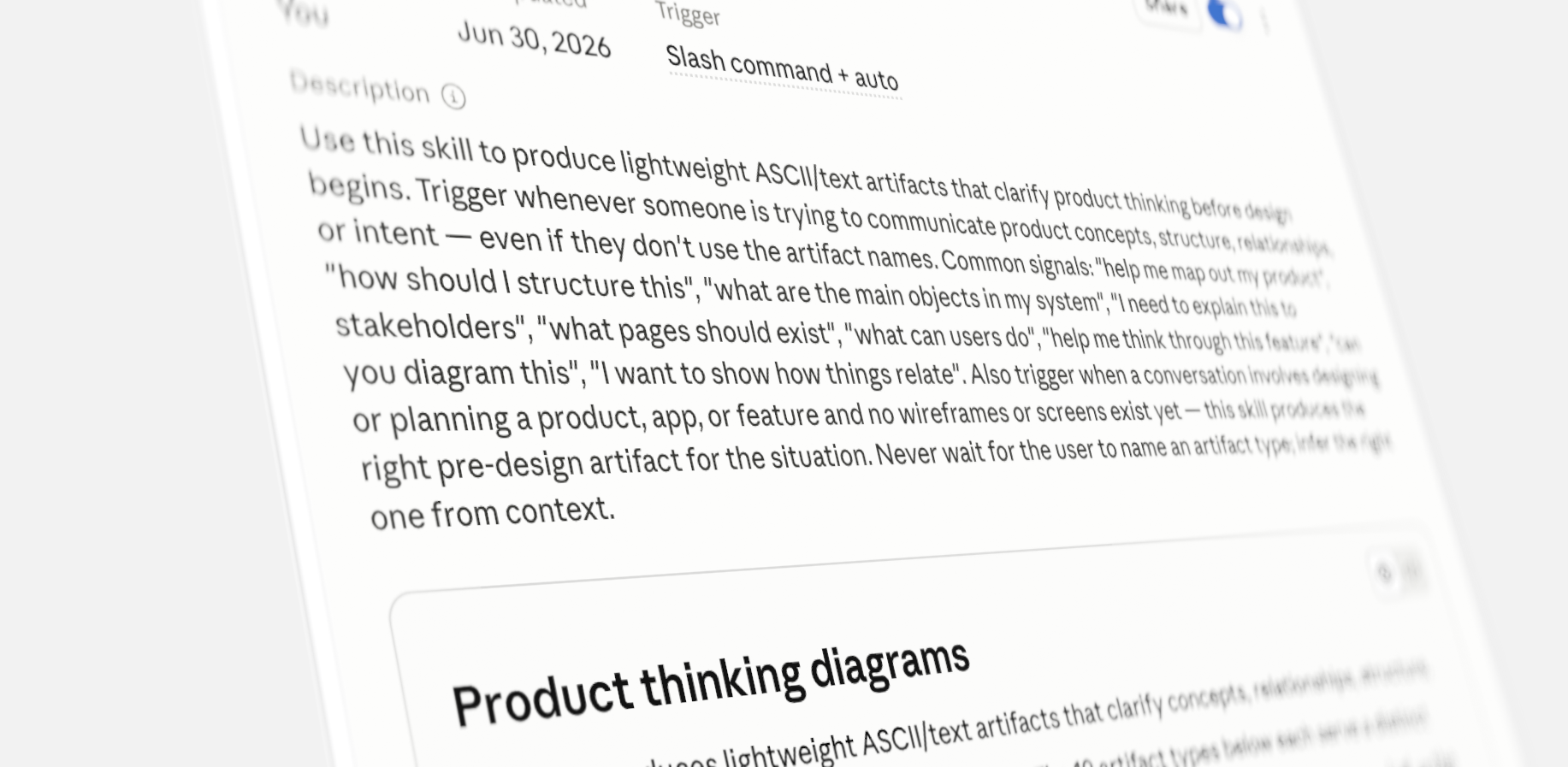
With the skill, all you have to do is describe your situation, and it automatically chooses the right artifact for you. There’s no need to recall tool names, prompts, or which approach fits best.
Instead of asking Claude to generate a UI, describe your product or feature. The skill determines which artifact will best clarify your thinking, then generates it automatically.
It’s especially useful when you’re asking questions like:
- We have an idea, but what exactly are we building?
- What are the main objects in this system?
- How do these things relate to one another?
- What pages do we actually need?
- What information belongs on this screen?
- What are users actually trying to accomplish?
- Before we prototype this, can we make sure we’ve thought it through?
I originally created these artifacts because I saw how easy it was to skip the fundamentals and move too quickly into prototypes. More recently, I’ve been using them with engineers to align on concepts, relationships, structure, and intent before anyone starts designing or building.
The output is deliberately lightweight, simple text and ASCII diagrams rather than polished visuals. A concept statement or relationship diagram often does more than another prototype.
### Paid members can download the Claude Skill below.
_This post is for paying subscribers only._
### Early takeaways from Figma Config 2026: AI, endurance, and the future of design
URL: https://www.everydayux.net/figma-config-2026-ai-future-design/
Last updated: 2026-06-30T15:00:14.000Z
Figma Config 2026 landed at a turning point for design. We’re living in an age of rapid acceleration, with generative AI compressing the time it takes to craft, generate components, and write code.
****Note:** Not all Config talks are live yet, these takeaways reflect the handful currently available, which already reveal where the industry is heading.
Watch these sessions back-to-back, and a striking counter-narrative emerges: as technical barriers fall, the value of human judgment, endurance, vulnerability, and vision skyrockets. As Figma CEO Dylan Field put it, the question is no longer whether it can be made, but what you would make if you could make anything.
> As you read the following summaries, keep three recurring themes in mind:
### 1\. From execution to orchestration
We are no longer just pixel-pushers; we are system orchestrators. Chelsea Larsson emphasized that language is now a primary design medium, prompting designers to move upstream to shape AI’s behavior and mental models. Holly Herndon introduced “protocol art,” arguing that the future of design lies in building the rules, incentives, and networks that draw better thinking from people, not just cranking out outputs.
### 2\. The crisis of confidence and the need for defensibility
AI lets one designer do the work of a hundred, but speed doesn’t guarantee quality. Bobby Meixner found a 6:1 gap between how fast designers are moving and how confident they feel. As machines take over generation, human judgment is a scarce resource. Leaders stressed that defending the vision, validating with users, and designing against harmful patterns remain human burdens—we can’t offload them to algorithms.
### 3\. Creative endurance and the real world
Perhaps the most powerful theme: you can’t prompt the human spirit. Socrates Heres argued that AI can speed up a first draft, but it can’t compress the sweat and discipline it takes to build a lasting career. Vicki Tan echoed this, sharing how we must follow our restless energy to create work that’s unmistakably ours. Jésabel DC challenged us to build tools that “activate reality,” returning users to real life rather than trapping them in digital worlds.
> The existential dread of the AI era is real, but these talks prove the designer’s role isn’t dying, it’s evolving. Here are the biggest takeaways from Config 2026’s first live sessions.


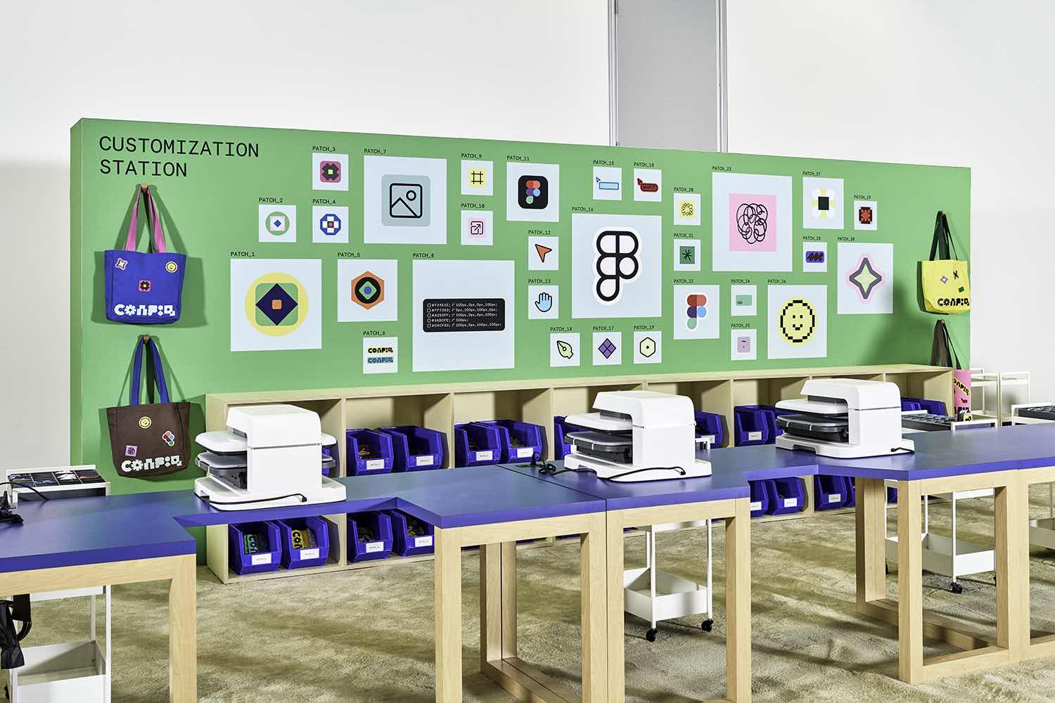
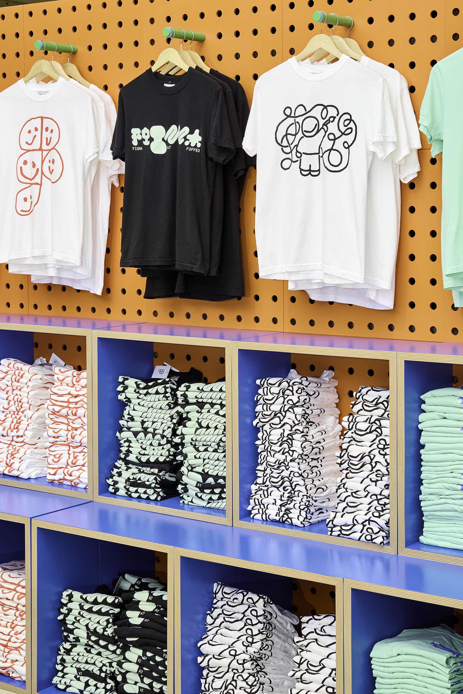


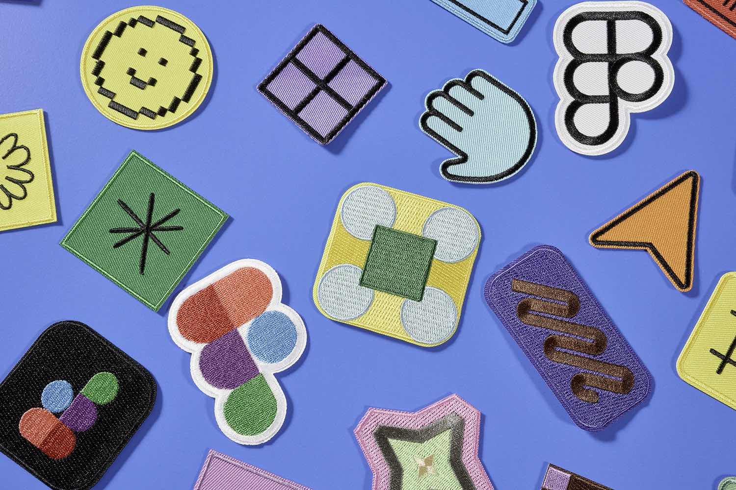

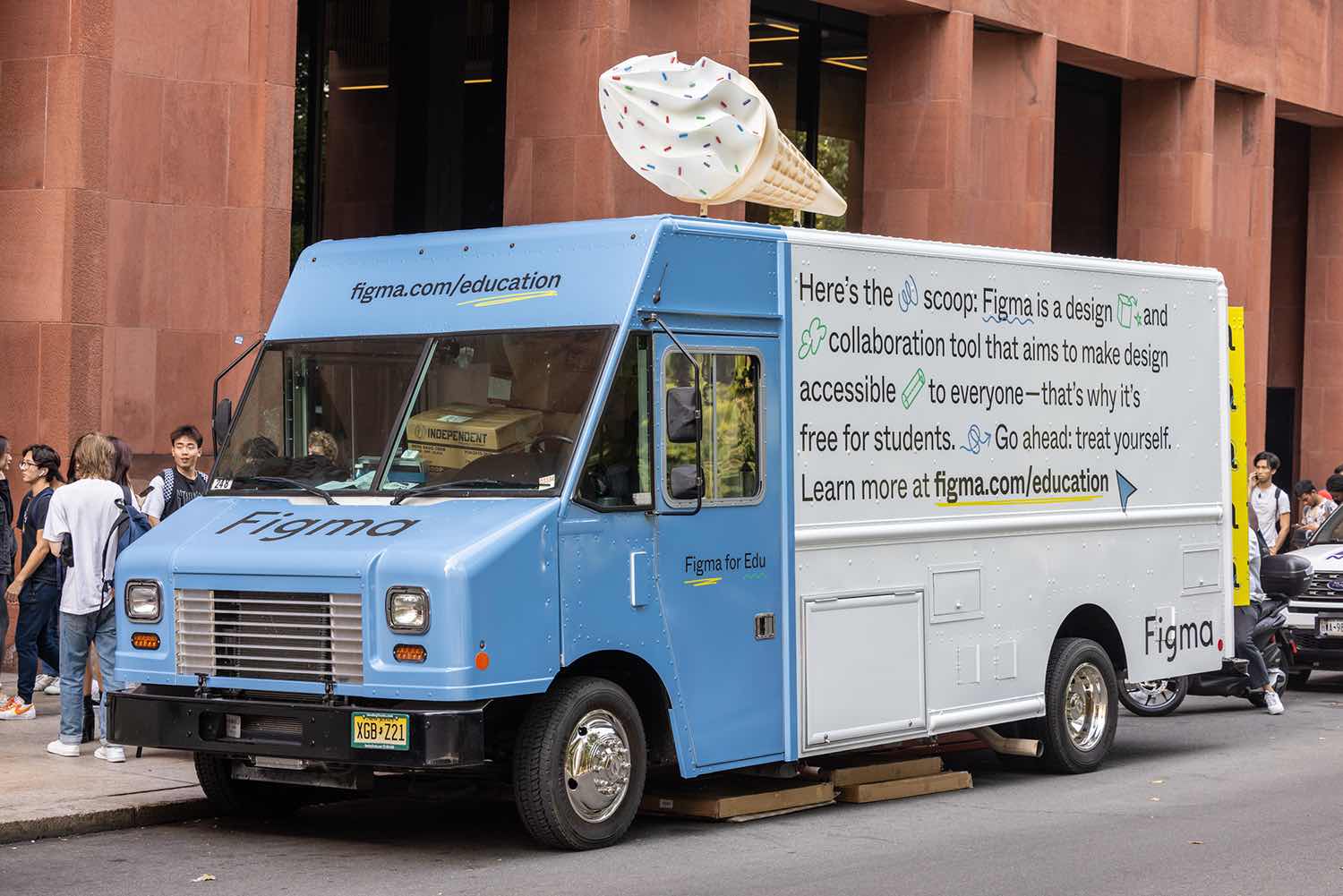
Images courtesy of Figma
---
## Config 2026 Keynote
[Dylan Field (CEO & Co-founder, Figma)](https://config.figma.com/san-francisco/session/829e6ced-3257-4f5c-b675-aa72f4d1f98f/?ref=everydayux.net)
For years, many believed that only those who could code would shape the future, and that knowing how something should look and feel was not enough. This belief sparked a persistent “design versus code” debate. But as Figma CEO Dylan Field argues, this is a false choice. With AI making technical work more accessible, the real question is:
> How do we empower people to reach new creative heights?
Today, AI’s rise has made collaboration between designers and developers more fragmented. Many now work in isolation, each using separate AI tools and trading prototype recordings for inspiration. At Figma’s 2026 Keynote, the company addressed this challenge by announcing major updates that unify code, motion, and visual effects on a single shared canvas.
### Bridging the gap: Code is now a design material
To bridge this gap, Figma introduced [Code Layers](https://help.figma.com/hc/en-us/articles/39582753756695-What-s-new-from-Config-2026?ref=everydayux.net#h%5F01KVG8HJ70PKQ2SCTN1T1YSYJV), bringing code directly onto the design canvas. Designers and developers no longer need separate preview windows. Teams can import GitHub repositories or upload local folders to the canvas and view multiple coded prototypes side by side.
Code Layers work seamlessly with familiar design actions. Designers can branch a coded prototype by holding Option and dragging the layer. The new “Extract Design” feature lets you record a user flow and instantly convert it to a top-down view of static states. You can then experiment with empty states or UI updates, and Figma will automatically detect changes and update the code layer with minimal effort.
### Democratizing complex visuals: Native motion and shaders
Figma is expanding its capabilities so teams are no longer limited by their tools. Advanced skills like motion design and shader creation are now built directly into the browser.
[Figma Motion](https://help.figma.com/hc/en-us/articles/39582753756695-What-s-new-from-Config-2026?ref=everydayux.net#h%5F01KTN7QBXW6KS1ACWCXEQT506N) makes the timeline a core design element, including keyframes, easing controls, and 3D transforms on the X, Y, and Z axes. Because it’s integrated into Figma’s main platform, multiple designers can collaborate on the same timeline, and animations update automatically as designs evolve.
Alongside Motion, Figma introduces [Shaders](https://help.figma.com/hc/en-us/articles/39582753756695-What-s-new-from-Config-2026?ref=everydayux.net#h%5F01KTN83YAEP8XT0X6EMAVY9HYJ) for fills and effects. Previously, these effects required complex math, but now designers can use the Figma agent to create progressive blurs, glass effects, caustics, and mesh gradients simply by uploading a reference image. Shaders feature on-canvas handles, support layering for complex effects, and are fully animatable, reacting in real time to anything moving in Figma Motion.
### Scaling systems: Node-based workflows and generative plugins
For design leaders seeking to scale systems and maintain consistency, separate AI text prompts aren’t enough. After acquiring Weave, Figma added [node-based creative workflows to the tools panel](https://help.figma.com/hc/en-us/articles/39582753756695-What-s-new-from-Config-2026?ref=everydayux.net#h%5F01KTN7Y1CTH37GZJD245X1QH1J). These tools let teams run repeatable tasks, like creating smooth 360-degree product videos or batch-applying style changes to large photo libraries, ensuring consistency across assets.
Figma also empowers teams to quickly build custom tools. With [Generative Plugins](https://help.figma.com/hc/en-us/articles/39582753756695-What-s-new-from-Config-2026?ref=everydayux.net#h%5F01KTN83F3RX24C86S3PTK4V3TC) powered by Agent Express, designers can ask the Figma agent to create plugins instantly, no coding or extra apps required. Whether your team needs a bento grid randomizer or a tool that imports real F1 race data, plugins appear directly in the properties panel and are easy to share. To speed up repetitive tasks, the agent now supports “Skills,” allowing teams to save common prompts as slash commands for tasks such as automated compliance checks. By unifying code, motion, custom tools, and shaders into a single connected canvas, teams can finally break out of silos and create at the speed of thought.
[See all new features](https://help.figma.com/hc/en-us/articles/39582753756695-What-s-new-from-Config-2026?ref=everydayux.net)
---
## The marathon designer: creative endurance beyond prompts and pixels
[Socrates Charisis, Founder & Designer, Quintessential](https://config.figma.com/san-francisco/session/7856aab8-4ce1-430a-8066-efae860ffa60/?ref=everydayux.net)
While the industry debates whether AI will replace developers and designers, Socrates Heres, co-founder of Athens-based studio [Quintessential](https://www.quintessential.gr/?ref=everydayux.net), offered a much-needed, deeply human perspective at Config. He reminded us that while generative tools can accelerate first drafts and automate routine work, they cannot compress the sweat, discipline, and study needed for a lasting creative career. As Heres put it: “You can’t really prompt creativity. And you can’t really prompt endurance.”
> For design leaders, this talk was a masterclass in cultivating resilience and protecting the maker mentality in a constantly shifting landscape.
### Hiring for the unlookable maker
Heres challenged the standard hiring playbook. After reviewing dozens of near-identical portfolios for an open role, he realized he wasn’t seeing anyone’s true potential. A standard portfolio, he noted, is just a snapshot of the past, not a forecast of the future.
Instead of hiring for pedigree, Quintessential hires for side quests. Heres shared the story of hiring a motion graphics video editor for a design engineer role, not because their portfolio was polished, but because it showed the candidate spent free time building custom variable fonts, making iOS games, and wrestling with inverted corners in CSS. The lesson for Principals and Leads: bet on the unlookable hire, people who build out of relentless curiosity, not just to fill a brief.
### Protecting IP: Combating the order taker trap
A core leadership challenge is preventing burnout as high-performing teams face a relentless pace of execution. Stacking heavy projects drains the joy from your best builders, turning passionate makers into order takers and fueling quiet quitting.
To counter this, Quintessential launched Maker Months. Every other month, Friday mornings are reserved for three uninterrupted hours of pure creative time. No client briefs, no expectations, no approvals, just space to learn a tool, brainstorm, or build internal prototypes. Heres urges leaders to treat internal ideas as IP worth protecting, even if it means pushing back client meetings to safeguard that time.
### Surviving the 30-kilometer wall
Drawing on his marathon experience, Heres compared mid-project burnout, like tackling a massive rebrand while juggling daily work, to the 30-kilometer mark in a race. At this point, your overarching why is no longer enough to justify the pain, and even encouragement from the sidelines can feel like a burden.
For senior designers navigating complex, multi-month shifts, the way through isn’t to fixate on the finish line. Instead, you rely on discipline and focus on the immediate next step. Each small detail, each conversation, and each tiny interaction compounds, and it’s this mastery of fundamentals that eventually brings inspiration and creativity back to the door.
---
## Ready for the world
[Vicki Tan, Designer and Author](https://config.figma.com/san-francisco/session/e220cef8-e2a0-4384-b9a7-bf6a0b23274a/?ref=everydayux.net)
Many experienced designers eventually hit a wall that is neither anxiety nor boredom. It’s a restlessness, a sense that something inside you wants to go somewhere, even if you can’t say exactly where. Drawing from Jungian psychology, Vicki Tan identifies this as a “floating charge of energy not attached to its right object,” or what Traditional Chinese Medicine calls “stagnant chi.”
Tan’s talk chronicled her journey to channel this stagnant chi, which led her to design and write an adult choose-your-own-adventure book about decision-making, entirely in Figma. Her process revealed three crucial insights for design leaders seeking to channel their own creative energy.
### Theory doesn’t change behavior; design does
With a background in behavioral science, Tan was fascinated by cognitive biases and why we get stuck. But she realized that simply naming a mechanism, like loss aversion or status quo bias, rarely changes behavior. When helping a friend find the courage to quit her job, explaining the science didn’t help. It was only when Tan framed the decision through a relatable story about Mapo Tofu and living on a self-sustaining budget that her friend became unblocked.
For design leaders, this is a reminder of our core function: not to explain how complex systems work, but to change behavior by showing what’s possible. The job is to translate intimidating concepts, like a career change, into small, recognizable choices users can see themselves in.
### The trap of the “too polished” design
When venturing into new territory, like designing a book, it’s tempting to over-index on professional polish. Tan leaned on her UX background to design the proposal as a UI flowchart. For the visuals, she hired professional illustrators and a cover designer.
Publishers rejected the professional designs; they were too polished and felt disconnected from her voice. Ultimately, Tan used her own unrefined illustrations and cover concepts. The lesson for senior creators: authenticity often trumps pristine execution. Sometimes the work must be unmistakably yours, using the actual skills and quirky perspectives you possess.
### The hidden architecture of “re-membering”
The hardest part of a deeply personal project isn’t technical craft, it’s what the work asks of you internally. As Tan built her book’s non-linear structure, she realized she was burying the toughest topics: emotions, relationships, and her father’s sudden passing.
To finish the work, she had to practice what a meditation teacher called “re-membering,” not just recalling the past, but actively reconnecting with lost parts of herself to become whole again. Tan reminds us that creativity requires letting complex emotions into the work rather than treating them as interruptions. When your stagnant energy finds its direction, the questions stop following you, and you start following them.
---
## Writing for humans in an AI world: The new design medium
[Chelsea Larsson, Content Design, Anthropic](https://config.figma.com/san-francisco/session/47d280de-e85a-4e10-b6e6-b97734490e9f/?ref=everydayux.net)
When AI burst onto the scene, anyone who made a living shaping strings, error messages, or UI copy suddenly found themselves asking a terrifying question: “Are we cooked?” Chelsea Larsson, lead content designer at Anthropic, felt this firsthand. Tasks like updating error message strings, which used to take weeks of cross-functional wrangling, were suddenly being executed by Claude in 20 minutes.
But Larsson quickly realized that her job wasn’t eradicated; it simply moved upstream. For senior and principal designers, this is the core shift of the AI era: the painstaking execution is being automated, so our expertise must focus on shaping the systems and behaviors of AI itself.
### Language is now a primary design medium
For decades, words were layered atop design to explain it. Today, language is the medium that shapes product experience. Larsson shared an example: trying to help users export data from a competing AI to Claude. A prompt with demanding language (“it is my right”) triggered safeguards against jailbreaking, resulting in a poor user experience. Simply reframing the prompt to reflect a legitimate “data portability” use case drastically improved the output.
The lesson for design leaders: get under the hood of your AI tools. User experience is now dictated less by UI layouts and more by system prompts. For example, Claude is deliberately trained to be diplomatically honest rather than dishonestly diplomatic. That’s why Claude will actively, but politely, push back on bad ideas rather than act as a sycophant. Shaping this foundational language layer is the new design work.
### Closing the capability gap and defining mental models
Technology is advancing so quickly that a massive gap is opening between what AI can do and what users think it can do. When users struggle to adopt a new feature, it often isn’t a failure of visual design, but a failure to design the right conditions and mental models to bridge that gap.
Larsson illustrated this with the “Tale of Agent Mode.” Anthropic was building autonomous coding tools for knowledge workers, and, because the industry is obsessed with “agents,” the internal team called it “Agent Mode.” However, research has shown that users don’t want to act as middle managers for a bunch of idle task loops. They want tools that expand their own capabilities and help them feel more skilled.
By intentionally shifting the mental model and naming the feature “Co-work,” they transformed how users perceived the tool. For principal designers, this highlights a critical responsibility: you are not just designing interfaces, you are shaping the language and mental models that will define how people interact with technology for years to come.
### Encoding values for human thriving
The pace of AI development brings a heavy sense of responsibility. Larsson compared this moment to the advent of cars, which led to cities designed for vehicles rather than people, or the rise of social media, where engagement algorithms destroyed our attention spans.
Those past designers didn’t set out to harm people, but the patterns they created became the default, because design encodes values. As we build the AI future, it’s easy to prioritize product-market fit and powerful systems over human connection. Larsson challenges design leaders to design against addictive patterns and sycophantic models. The ultimate goal must be human thriving. When designing an AI experience, leaders should always ask: “Did I leave room for the person?”
---
## The rules are the art: creating with AI
[Holly Herndon, Artist, Herndon Dryhurst Studio](https://config.figma.com/san-francisco/session/94c665ce-4b37-4127-b49a-425ac25319a2/?ref=everydayux.net)
If AI models can generate decent media and code, what is the creator’s role? For artist and protocol builder Holly Herndon, the answer isn’t to retreat from technology, but to shift the focus of creative intervention. The art is no longer just the final image or output; it’s the system itself.
Herndon introduced the concept of protocol art, a mental model for design leaders shaping the next generation of tools. It urges us to stop obsessing over individual outputs and start designing the rules and environments that orchestrate collaboration.
### The centaur vs. the minotaur
To illustrate the divergence of AI design, Herndon uses two mythological metaphors: the Centaur and the Minotaur.
- The Minotaur, a human body with a beast’s head, represents users trapped in systems beyond their control. Minotaur systems do all the thinking for the user, puppeteering them to create what the system wants rather than what the person wants. Designing for Minotaurs leads to “slop,” the default output of an attention economy that asks little of us.
- The Centaur, a human head driving an inhuman body, represents systems built around human interests. A Centaur system is designed to draw out more thought from people.
For senior designers building AI features, this is the test: Are you designing a Minotaur that automates away user agency, or a Centaur that expands human capacity?
### Positive-sum intellectual property
Herndon demonstrated the Centaur approach through her project, Holly Plus. During the pandemic, she trained an AI model on her own voice and released it to the public, letting anyone sing through her digital twin.
Instead of seeing AI as a threat to her intellectual property, she built a protocol with a royalty-split model that incentivized collaboration. This approach led to unexpected art, like her friend recording a Dolly Parton cover using her voice while wearing a motion-capture suit. The takeaway: when you design the right protocols and incentives, you move from zero-sum protectionism to positive-sum collaboration, enabling users to build things you couldn’t have predicted.
### Leaning into the discomfort
Ultimately, shifting from creating things to creating systems is unsettling. Herndon notes that in scripture, angels often appear as terrifying, fiery creatures that must say “do not be afraid,” while the devil appears as something comfortable and familiar.
Frictionless, automated Minotaur systems may feel comfortable in the short term, but they strip away our agency. Fiery, complex Centaur systems challenge us to answer a tough question: Now that anyone can generate anything, what do we actually want to make, and why? Herndon argues we only find the answer by leaning into discomfort and building tools that force us to collaborate and figure it out together.
---
## Designing with confidence in an AI-powered world
Bobby Meixner, VP, Solution Marketing, UserTesting
In 1967, a man walked up to a wall outside a London bank, inserted a mildly radioactive piece of paper, and withdrew 10 pounds. That first ATM was a revolutionary moment, but before it could exist, someone had to convince a room of conservative bankers that people would trust a machine to dispense their money. Similar battles played out for the iPhone, Uber, and dating apps.
Bobby Meixner uses this story to remind design leaders of a foundational truth: the core craft of design predates any tool. It’s about understanding people well enough to imagine what they don’t yet know they need, and having the conviction to defend that vision until it exists. AI cannot do that; that job remains fundamentally human.
### The 6:1 confidence gap and the reversibility factor
Today, AI allows a single designer to do the work of a hundred. But with this speed, we’ve lost the friction that kept us safe. A hundred people naturally pressure-test each other, challenging assumptions and asking if a feature is necessary.
In a recent survey of 183 design leaders, 91% said their work is moving faster with AI, but only 15% feel more confident in their output. This creates a 6:1 gap between speed and confidence. Meixner introduces the “reversibility factor”: designers feel confident in early ideation, when AI is a brainstorming partner and decisions are easy to undo. But as products become irreversible, confidence collapses. Sixty-five percent of designers can’t say their outcomes are better because of AI, and nearly one in five say they are sometimes worse.
### The validation divide
If speed isn’t delivering better outcomes, how do leaders manage risk? The data reveals a split: designers are evenly divided on whether AI has made their work more or less risky (38% each).
The key difference between the two groups is validation. Those who feel the risk has increased rely only on peer critique or skip validation altogether. Those who feel the risk has decreased actively validate more by cross-checking with research, running usability tests, and talking to customers. Defensibility is what matters.
### Embedding insights at the speed of AI
To close the confidence gap, leaders must protect human judgment by grounding it in customer insights. The problem: traditional research cycles can’t keep up with AI-assisted design sprints. Meixner highlighted how new tools like the UserTesting plugin for Figma solve this by embedding validation into the canvas. Designers can now use AI to analyze feedback, generate recommendations, automatically implement UI changes, and launch usability tests to millions—all without leaving their workspace.
By bringing validation upstream to match the speed of creation, designers regain the ability to confidently defend their work. Meixner closed by revealing that every photo in his presentation was AI-generated, complete with subtle, nonsensical imperfections. The machine can generate the image instantly, but only human judgment notices what’s wrong. Your judgment is still a scarce resource.
---
## The future is low-tech: lessons from the early 2000s
[Jésabel DC, Tech Anthropologist & EdTech Founder, The Lifestyle Lab](https://config.figma.com/san-francisco/session/79c76468-0c48-41ae-8775-7a46d4409bb3/?ref=everydayux.net)
As technology has grown more powerful, a paradox has emerged: user experience is actually getting worse. Jésabel DC, a tech anthropologist and low-tech futurist, argues that this isn’t because designers are less thoughtful than they were in the early 2000s. Instead, the business model shifted to an extraction mindset, optimizing for time spent on the platform and treating user attention as a resource. As a result, we stopped designing experiences for users and started designing engagement mechanics that exploit their nervous systems.
For design leaders who shape systemic product decisions, Jésabel offers a new paradigm: low-tech. This doesn’t mean going back to flip phones; it means building technology that fosters a healthy relationship with users and lets them step back into their real lives. Looking to the early 2000s, she highlighted four lessons for building tech with a secure attachment style.
### Embed clarity: The Lego principle
Modern tech relies on massive help centers, tooltips, and complex onboarding. Jésabel points to Lego instructions, using zero words and only visual sequencing, to highlight a core truth:
> if an interface needs explanation, it needs a redesign. Strong products teach through experience. When you ask users to read onboarding, you’re making them do the design’s work.
### Prioritize orientation: The loading bar effect
In the early 2000s, cues like loading bars, hover animations, and camera sounds kept users grounded. These cues answered the question, “Where am I?” What’s happening? Can I interact? Did my action work? Today, features like infinite scroll and algorithmic feeds disorient users, creating dependency. Jésabel urges designers to regulate users’ nervous systems by prioritizing orientation, because disorientation breeds dependency and orientation builds trust.
### Activate reality: The Pokémon bridge
Too many products today replace real behaviors with digital versions—we consume community instead of participating, and signal identity instead of developing it. The original Pokémon ecosystem, which extended from Game Boy to trading cards and tournaments, shows that technology should activate reality, not replace it. Modern examples like Strava or Tinder’s pivot to in-person events show that successful products act as bridges, helping users engage more deeply with the physical world.
### Serve the user: Designing for anticipation over retention
The original Animal Crossing mirrored the real-world clock: if it was night, stores closed in the game. These natural stopping points let players leave. Nintendo could design this way because they weren’t monetizing engagement; they were designing for anticipation.
Jésabel warns that most apps today are built with an anxious attachment style—afraid the user will leave. Healthy technology requires a secure attachment style: confidence that users will return for real value. For senior leaders, the challenge is aligning the business model with user success, like Pinterest’s campaign encouraging users to go offline and cook recipes or build projects they pinned. When a company’s survival depends on making users more capable in the real world, serving the user becomes the ultimate advantage.
---
In the end, Config 2026’s new tools may give us unprecedented speed, but the next decade of design will be defined by the endurance, judgment, and ethical vision championed by these speakers. The “human centaur” is not just a metaphor, but a mandate to combine the best of what machines can do with the irreplaceable qualities only people bring. Now that we can generate almost anything in an instant, our ultimate challenge isn’t just building better digital experiences; it is building tools that help our users thrive in the real world. What will you choose to build?
### How gaps in AI fluency can fracture design teams—and how to fix them
URL: https://www.everydayux.net/ai-fluency-gap-design-teams/
Last updated: 2026-06-17T15:00:15.000Z
## AI literacy is uneven
There’s a striking paradox unfolding in companies today: while 75% of companies are racing to implement AI technologies, only 35% of employees have received AI training in the past year. Organizations are deploying powerful new tools at breakneck speed, but leaving the majority of their workforce behind, without the guidance or support needed to use AI effectively.
The gap between AI-fluent and AI-unfamiliar employees has quickly become one of the defining tensions of the mid-2020s workplace. This divide is more than just an educational shortfall; it’s a deeply rooted cultural, psychological, and collaborative challenge that has real, lasting consequences. The most troubling aspect? The gap isn’t distributed evenly. Age and gender disparities are glaring: only 20% of Baby Boomers have been offered AI training, compared to nearly half of Gen Z workers. Globally, 71% of AI professionals are men, leaving women significantly underrepresented.
Confronted with these numbers, most organizations default to running a basic workshop. But one-off training sessions rarely stick. To truly bridge the AI divide, companies must acknowledge that traditional training doesn’t cut it. AI integration isn’t just about knowing which buttons to press; it’s a fundamental cultural and behavioral shift.
### How the AI gap fractures teams
Beyond the adoption statistics lies a more troubling reality: the AI skill gap quietly fractures team dynamics.
> When AI is introduced without careful integration, team coordination can actually decline.
A Columbia Business School study found that adding AI to workflows made human team members less able to anticipate each other’s actions. Low and medium-skilled teams are hit hardest, while highly skilled groups are protected by their established routines.
For individual employees, this operational divide comes with a steep psychological cost. Underprepared workers report rising cognitive fatigue, eroding trust, and a growing sense of isolation, even in our hyper-connected digital era. When some colleagues supercharge their workflows with AI while others struggle to keep up, power imbalances emerge, making day-to-day collaboration more difficult.
Ultimately, the AI skills gap is a problem of connection, not resistance. Most people aren’t refusing to adopt AI; they just haven’t been shown how it fits into their daily work in a way that feels relevant to them.
A design industry example: When Microsoft’s design team began integrating AI, veteran designers, accustomed to pixel-perfect control, found AI’s unpredictability frustrating rather than freeing. Ironically, newer team members adapted more quickly because they weren’t anchored to legacy methods. To move forward, leaders must stop battling perceived “resistance” and instead help employees see how AI can enhance their unique workflows.
### The pitfalls of conventional training
Faced with the AI skill gap, many organizations instinctively run a workshop. But a single session rarely creates lasting change. McKinsey’s research shows that basic AI mechanics aren’t the bottleneck; most people can learn simple prompting in just a few hours.
> The real breakdown comes when companies confuse knowing how to use a tool with true integration. The hardest part of AI adoption isn’t technical; it’s changing how leaders and teams think, make decisions, and collaborate. This requires deep, ongoing behavior change, not just information transfer.
Conventional corporate training misses the mark. Employees may learn the basics, but they’re left without a practical framework for real-world use. According to Corndel, 54% of workers say they lack clear guidelines on AI usage, fueling inconsistent adoption. And 65% want ethical AI training—not just how-to guides. Traditional training fails because it treats AI as a routine software upgrade, overlooking the deeper cultural and behavioral changes it requires.
### What actually works: practical solutions for the AI skills gap
Rather than relying on isolated workshops, the most successful organizations embed learning into daily routines. Here are three practical, proven strategies companies use to close the AI skill gap:
- **Mentorship loops:** Peer-driven learning is the most durable way to upskill teams on AI. Organizations are creating “mentorship loops” in which junior employees teach senior staff about AI (reverse mentoring), and AI-fluent employees pair up with those less comfortable with AI. This approach enables learning in real-world contexts and at each employee’s own pace, creating a supportive, low-pressure environment.
- **Sandbox time:** Nearly half of employees feel AI is outpacing their company’s training. Providing dedicated “sandbox time” gives people a safe space to explore AI tools without pressure. Role-specific peer groups, “lunch and learns,” and live workshops built around real work examples consistently outperform generic online modules.
- **AI hackathons:** AI-focused hackathons aren’t just for engineers; they’re powerful tools for closing the skill gap. Research shows that structured experimentation through hackathons reduces anxiety and boosts a sense of belonging. At Weathernews, a companywide Generative AI Hackathon drew in 80% of employees, generating over 180 business improvement ideas and proving that everyone can participate when given a safe, structured environment.
### Building AI literacy for everyone
To truly move forward, leading organizations are moving beyond one-size-fits-all training and investing in “tiered” AI literacy programs. The foundation is a universal baseline: every employee should understand what AI is, what it’s not, and key concepts such as hallucination, data privacy, and ethical use. Once this shared understanding is in place, organizations can offer advanced, role-specific tracks, whether that’s practitioner pathways for designers or strategic judgment for leaders.
**The big takeaway:** AI upskilling isn’t just an IT rollout; it’s a change management journey. For adoption to stick, skill-building must go hand in hand with workflow redesign, incentive realignment, and visible shifts in leadership behavior. If daily routines and frontline habits don’t evolve, neither will the organization’s AI maturity.
We’re at a turning point: AI literacy is becoming what digital literacy was in 2010, a universal baseline, not a niche skill. The winners in the years ahead won’t just be those with the flashiest tools. Instead, the real advantage will belong to organizations that create the conditions for knowledge to flow seamlessly between their most and least AI-fluent people.
## 🔒 Members-only exclusive
### A designer’s guide to AI upskilling—for designers, leaders and managers.
_This post is for subscribers only._
### Prototypes aren’t product briefs: 10 ways to clarify ideas before you design
URL: https://www.everydayux.net/how-to-clarify-product-ideas-before-design/
Last updated: 2026-06-02T15:00:53.000Z
It’s now remarkably easy to produce deliverables, as AI can generate wireframes, diagrams, HTML prototypes, and polished mockups in minutes. This rapid creation is reminiscent of when product managers and founders would use any available tool, like PowerPoint, to visualize an idea. Increasingly, I receive high-fidelity prototypes before seeing a simple brief with core product thinking or requirements.
I’m not here to sound like an old-school designer; AI can absolutely help in the early stages of design. Most of the time, you can tell if it’s really adding value or just creating noise. If it’s not helping, this post offers a few ideas that may be useful.
### Using the right tool at the right time
---
> With AI, just because you can doesn’t always mean you should.
The challenge is that AI-generated deliverables often introduce detailed UI before the underlying concepts, relationships, and mental model are established. Teams end up debating screens before aligning on what the system is, how it works, or the right user experience. This makes it harder to extract the core intent, as AI produces more noise than clarity.
While prototypes have their place, it’s usually easier to start with organized text and lightweight models than with fully formed artifacts.
It’s natural to want to visualize ideas, as screens, diagrams, and prototypes help us communicate and explore. But these can sometimes create the illusion of clarity before we’ve truly defined the essentials.
> To make ideas easier to discuss and collaborate on, I’ve developed simple methods you can use, alone, with stakeholders, or with AI, to clarify product thinking before design.
### Use AI and your own thinking to nail the fundamentals first
---
The early design process is about working through foundational questions together. Before designing interfaces and along the way, we need to clarify the core concepts, relationships, information architecture, and user goals that shape the product.
Focusing on concepts and relationships first makes collaboration easier for everyone, shifting the emphasis from screens and layouts to the ideas that matter most.
Visualizing ideas is still valuable, and the goal isn’t to avoid visual artifacts but to use lighter-weight representations to communicate ideas without jumping ahead to finished design.
With that in mind, I’ve put together techniques to communicate concepts, relationships, structure, and intent before moving into wireframes or visual design. Each serves a different purpose, with example AI prompts included.

## 10 lightweight artifacts for clarifying product thinking before design
---
To demonstrate each technique, I’ll use a fictional team wiki product. The aim isn’t to design the product itself, but to show how different artifacts can clarify concepts, relationships, structure, and intent before moving into design.
### 1 - Concept statement
- **What is it:** A brief summary that defines what the product, feature, or concept is and its purpose.
- **Question it answers:** What is this thing?
*Example*
```
A team wiki helps teams create, organize, and find shared knowledge in one place.
```
*Prompt*
> Define the core concepts in this system. For each concept, provide a concise definition in one or two sentences. Focus on what the thing is, not how it is implemented.
---
### 2 - Entity model (object model)
- **What is it:** A list of the main objects in the system, typically the key nouns users interact with or manage.
- **Question it answers:** What are the elements in the system?
*Example*
```
Workspace
Collection
Page
Author
Comment
```
*Prompt*
> Identify the primary entities in this system. Focus on the core nouns users need to understand and manage. Avoid UI concepts, pages, and implementation details.
---
### 3 - Relationship diagram
- **What is it:** A visual diagram showing how system entities are connected.
- **Question it answers:** How are the entities related?
*Example*
```
Workspace
└─ Collection
└─ Page
├─ Author
└─ Comment
```
*Prompt*
> Create a simple relationship diagram showing how the primary entities relate to one another. Use only boxes, indentation, and arrows. Do not design the UI.
---
### 4 - Cardinality model
- **What is it:** Describes how many of one entity relate to another (e.g., one-to-one, one-to-many).
- **Question it answers:** How many of each thing can exist?
*Example*
```
A Workspace can have many Collections
A Collection can have many Pages
A Page belongs to one Collection
A Page has one Author
A Page can have many Comments
```
*Prompt*
> Define the cardinality relationships between the core entities. Describe ownership and one-to-many relationships using plain language.
---
### 5 - Information architecture (IA)
- **What is it:** A high-level overview of how information, pages, and concepts are structured in a product.
- **Question it answers:** How is the product organized?
*Example*
```
Workspace
├─ Collections
├─ Pages
├─ Search
└─ Settings
```
*Prompt*
> Create a high-level information architecture showing navigation, page hierarchy, and user flow. Focus on structure, not interface design.
---
### 6 - Sitemap
- **What is it:** A hierarchical outline of pages showing product structure and user navigation paths.
- **Question it answers:** What pages exist?
*Example*
```
Home
Collections
└─ Collection detail
└─ Page detail
Pages
└─ Page detail
Search
Settings
```
*Prompt*
> Create a sitemap that shows all pages and subpages. Use a simple hierarchical structure. Do not include UI components or layouts.
---
### 7 - Content inventory
- **What is it:** A complete list of all content, data, and actions found on a page.
- **Question it answers:** What information appears on each page?
*Example*
```
Page detail
├─ Page title
├─ Page content
├─ Author
├─ Last updated
├─ Collection
├─ Comments
├─ Related pages
└─ Edit history
```
*Prompt*
> Create a content inventory for each page. List all information, data, and actions that should appear on the page. Do not describe layout or visual design.
---
### 8 - Page blueprint
- **What is it:** A basic wireframe showing a page’s main sections and content groups.
- **Question it answers:** What sections are on the page?
*Example*
```
┌──────────────────────────────┐
│ Page detail │
├──────────────────────────────┤
│ Page title │
│ Metadata │
│ │
│ Page content │
│ │
│ Related pages │
│ Comments │
│ Edit history │
└──────────────────────────────┘
```
*Prompt*
> Create a low-fidelity page blueprint. Organize content into logical sections and containers. Do not design components, styling, or visual treatments.
---
### 9 - Feature inventory
- **What is it:** A list of all actions, capabilities, and features available in the product.
- **Question it answers:** What can users do?
*Example*
```
Workspace
• Create collection
• Create page
• Edit page
• Comment on page
• Search pages
• Move page between collections
• View edit history
```
*Prompt*
> List the actions and capabilities available for each entity. Focus on user actions rather than interface controls.
---
### 10 - User tasks/jobs
- **What is it:** Describes the tasks or goals users want to achieve with the product.
- **Question it answers:** Why does this product exist?
*Example*
```
• Create shared documentation
• Find information quickly
• Organize knowledge by topic
• Keep content up to date
• Discuss or clarify information
• Understand what changed over time
```
*Prompt*
> For each page or entity, identify the primary user jobs and goals. Focus on what users are trying to accomplish, not the features used to accomplish them.
---
These techniques are not new.
Designers have used versions of them for decades.
What’s changed is how easy it is to jump straight to deliverables. AI can now generate wireframes, prototypes, diagrams, and polished mockups in minutes, making it tempting to skip the thinking that usually comes first.
The goal isn’t to replace prototypes or design artifacts, but to use the right tool at the right time. Sometimes a one-sentence concept statement is more valuable than a prototype; sometimes a simple relationship diagram unlocks more understanding than a wireframe.
If these techniques help you have clearer conversations, write better briefs, or align teams faster, please let me know or leave a comment!
### The creative tightrope: why true innovation calls for a paradoxical mindset
URL: https://www.everydayux.net/creative-tightrope-true-innovation-paradoxical-mindset/
Last updated: 2026-05-20T15:00:47.000Z
## Why creativity thrives on tension
What if the very conditions that ignite creative breakthroughs are also the ones that hold them back? This puzzling dilemma reveals a fundamental truth about innovation: creativity is full of contradictions. We often praise creativity, but research shows we tend to reject truly innovative ideas when they appear. Organizations aim to encourage innovation, yet they unknowingly set up barriers that squash originality and risk-taking. Even in classrooms, teachers who say they want creative students may accidentally discourage creative behaviors.
When we face conflicting demands, it’s natural to seek a comfortable compromise. But real creativity doesn’t come from settling for the middle ground. Instead, it thrives when we hold onto the tension between ideas that seem impossible to combine. Trying to smooth out this tension by picking one side or searching for balance can actually kill the creative spark.
To truly innovate, we need to let go of either-or thinking and build what researchers call a “paradoxical mindset.” People with this mindset don’t see contradictions as problems; they see them as fuel. The tension isn’t a flaw to fix; it’s the source of every creative leap.
---
### Why compromise kills creativity
When we’re caught between opposing forces, we usually try to find a safe compromise. We want things to fit together neatly. But real creativity doesn’t work like that.
A real paradox means holding onto the tension between ideas that seem impossible to combine. You can’t just split the difference or pick one side. If you do, you miss the true essence of creativity.
> For example, if a challenge requires a solution that’s both wildly original and extremely practical, settling for something only a little original and a little practical results in average outcomes.
The magic happens when you manage to meet both demands fully, at the same time. It’s this very tension that creates the space for breakthrough ideas.
---
## Embracing contradiction: the paradox mindset
To innovate, we have to move beyond either-or thinking.
> The best creators and leaders build what researchers call a **“paradox mindset,”** and they don’t see opposing demands as threats or problems.
Instead of trying to erase the tension, people with a paradox mindset lean into it. They treat contradictions as the energy that powers new ideas. For them, a paradox isn’t something to solve; it’s the foundation of creativity itself.
---
## Paradox 1: the trap of novelty and usefulness
At its core, creativity means coming up with ideas that are both totally new and genuinely useful. These two requirements, novelty and usefulness, can’t exist without each other, but they’re always pulling in opposite directions. That’s what makes creativity so tricky and so powerful.
> The trap lies in the fact that maximizing one of these dimensions actively undermines the other.
If you push for maximum novelty, you often generate ideas that are far too radical, eccentric, or detached from reality to ever be successfully implemented. Conversely, if you rely entirely on usefulness, your thinking becomes anchored in safe, established norms and conventional frameworks, severely constraining your originality. Because creativity requires both elements to be present simultaneously, a perfectly novel but useless idea contributes nothing, and a highly useful but completely conventional solution fails to qualify as creative.
### Why both novelty and usefulness matter equally
**Here’s why this tension is so hard to escape:** creativity isn’t just about adding novelty and usefulness together, it’s about multiplying them. If either one is missing, there’s no creative breakthrough.
That means a brilliant but useless idea isn’t creative. And a practical but boring idea isn’t creative, either. Both sides matter equally; if one is zero, it doesn’t work.
So, if you try to focus on just one side and ignore the other, you’ll miss out on true innovation. The real challenge is to keep both in play, even though it’s hard.
### What’s happening in the brain?
This tug-of-war between originality and practicality also happens in your brain. Neuroscientists have found that creativity uses two distinct, and often competing, brain systems: one for generating wild, spontaneous ideas, and another for evaluating and controlling them.
Usually, when your brain is in idea-generation mode, the control and evaluation systems shut down, and vice versa. These two can’t run at full power simultaneously.
But creative breakthroughs only come when both systems work together, even though it’s uncomfortable. That’s when new ideas become both original and workable.
---
## Paradox 2: flexibility versus persistence
### Walking two paths at once
Coming up with great ideas is only half the creative battle. Making them real means walking two paths at once. You need flexibility to try out wild possibilities and see things from new angles, but you also need persistence to dig in, refine, and keep going when things get tough.
If you rely only on flexibility, your work can become chaotic and lose direction. If you rely only on persistence, you risk getting stuck in routines and missing out on new possibilities. The key is to endure challenges without becoming rigid, and to adapt without losing your way.
So how do you actually keep that balance? It turns out your goals matter. If you’re focused on learning and growth, you’re better at mixing flexibility and persistence. But if you’re only out to look good or prove yourself, you’ll shy away from risk and stick to what you already know.
---
## Paradox 3: team diversity and creative harmony
### When teams collide
If you work in a team, you face another creative paradox: you need a mix of different minds to spark great ideas, but too much difference can lead to chaos. Just putting lots of perspectives together doesn’t guarantee innovation; if the group can’t find common ground, the result is more likely to be confusion than creativity.
That’s where “resonance” comes in: a sense of shared purpose, trust, and psychological safety. Diversity brings new ideas, but resonance turns those ideas into something real and unified. The magic isn’t just in having different perspectives, but in bringing them together skillfully.
Here’s the wild part: when teams really click, neuroscience shows their brains start to sync up. This real-time alignment helps people share focus, intentions, and problem-solving energy. The most creative teams actually get on the same wavelength, literally.
---
## Thriving in creative tension
### Learning to love the paradox
You can’t eliminate creative tension, nor should you try. Creativity lives in the push and pull between opposite forces. Lean too hard into usefulness, persistence, or harmony, and you’ll smother the spark that drives originality. Go all-in on novelty, flexibility, or unchecked divergence, and you risk losing focus and coherence. Paradox isn’t a bug in the system; it’s the fertile ground where the best ideas take root. To truly innovate, you have to get comfortable with contradiction and master the art of working with both sides at once.
### The power of productive disequilibrium
The secret to powerful creativity? Stay in “productive disequilibrium,” that sweet spot where things feel a little unstable, but possibility is everywhere. Whether you’re teaching, leading, or working solo, create environments that welcome creative tension. Use constraints as fuel, not roadblocks. Let failure be a sign you’re pushing boundaries, not a reason to retreat. Don’t chase comfort; walk the creative tightrope and trust that the friction between opposing forces is exactly what leads to brilliance.
### Genius vs. Talent: Why playing it safe holds you back
URL: https://www.everydayux.net/genius-vs-talent-creative-risk/
Last updated: 2026-05-05T15:00:10.000Z
### The Danger of Art
As designers—especially product designers—we may not consider ourselves artists. Our work is often grounded in systems, logic, and solving practical problems. But we are creative problem solvers, and there’s a phrase we should all embrace, no matter how technical our craft may be.
The acclaimed artist, poet, and writing teacher Jack Grapes suggests you write down a simple mission statement and hang it in your room to look at every single day:
> “Art is fraught with danger!”
It’s a stark reminder that playing it safe and relying on what you already know is the enemy of truly great work.
This inherent danger of creation speaks to a profound philosophical difference between talent and genius—a subject that has fascinated thinkers for centuries. Philosopher Arthur Schopenhauer captured this core distinction when he wrote:
> “Talent is like the marksman who hits a target which others cannot reach; genius is like the marksman who hits a target which others cannot even see.”
This isn’t simply a matter of having more or less ability; it’s about two fundamentally different ways of thinking and approaching problems.
Talent operates safely within established paradigms. It relies on mastering existing domains, perfecting known methods, and refining ideas that are already understood. A talented creator can hit a difficult target, but they’re still aiming at a target that’s known and visible.
Genius, on the other hand, achieves what others can’t even imagine. It doesn’t just improve on what exists; it transforms or creates it. True genius means venturing into unexplored territory with wild imagination, creating revolutionary work that rewrites the rules and reshapes our understanding of reality.
To reach that kind of greatness, you can’t cling to the safe harbor of your talent; you have to step into dangerous, unknown places where the targets are invisible.
---
### The trap of your own talent
According to Grapes, the relationship between a creator and their talent is often like a mutually beneficial, but ultimately limiting, business transaction. We make an unspoken deal with our abilities:
> “Make me look good, and I’ll keep you on the payroll,”
And our talent agrees to the terms. Because talent is reliable and will consistently produce “good” work, it’s incredibly tempting to lean on it.
But that’s exactly why your own talent can become the biggest obstacle to achieving true greatness.
This counterintuitive idea is strongly supported by recent psychological research, which reveals a fascinating paradox: the very skills that fuel your success can eventually become a safe harbor that constrains you from making a real creative breakthrough. A 2026 study on creativity found that while individuals and organizations love to champion innovation, they often suppress the risky behaviors required to achieve it, instead relying on proven methods.
By constantly depending on your talent to keep you safe and make you look good, you actually prevent your true genius, which is needed for “great” work, from ever coming through.
To escape this trap, you have to master the art of “unlearning.” Innovation increasingly demands that you consciously abandon the outdated knowledge and mental frameworks that once gave you an edge, but now block fresh thinking. Your accumulated expertise can actually distort your judgment if you’re unable to let it go.
If you want to move beyond merely “good” work, you must be willing to break the comfortable deal you made with your talent, let go of the skills that make you feel safe, and operate without a net.
---
### Chasing the “Accidents of Genius”
If you can’t rely on your talent to achieve greatness, how do you actually reach it?
According to Grapes, you can’t force greatness with a formula; you can only chase what he calls the “accidents of genius.” These moments only happen when you step fully into the unknown and abandon the safety of your skills. Grapes compares this terrifying process to “falling off a cliff.”
When you intentionally put yourself in danger, out of your depth, and reach a point where your talent can’t save you, your genius finally wakes up and comes to your rescue.
You’ve probably experienced an accident of genius before. It’s that profound moment when you step back from a piece of writing, a painting, or a design, realize it’s utterly amazing, and immediately ask yourself:
> “Where did that come from?”
Because you didn’t rely on your predictable talent, you genuinely have no idea how you created it. Inevitably, your next question is:
> “How can I do that again?”
The frustrating reality is that you can’t simply command it to happen; you can only make yourself receptive by repeatedly venturing into the unknown and letting go of your talent.
The necessity of struggling in the unknown is echoed by author Robert Greene’s research on mastery. Greene noticed that great creators begin projects with excitement and deep focus, but inevitably hit a wall of frustration when they spot flaws in their original vision.
While lesser artists might give up or settle for a mediocre, half-realized project, true masters push forward.
They understand, sometimes unconsciously, that this period of frustration and inadequacy is a necessary catalyst for a creative breakthrough.
Grapes encapsulates this dynamic with a piece of wisdom he once found in a fortune cookie:
> “Talent does what it can, genius does what it must.”
Your talent is inherently limited and will only ever do what it can do comfortably. But when you’ve exhausted your abilities, put yourself in trouble, and are free-falling off a creative cliff, your genius does what it must to catch you.
---
### Conclusion: The paradox of mastery
While it’s essential to let go of your talent to achieve true greatness, there’s a crucial paradox at the heart of this philosophy: you can’t simply reject mastery from day one.
Breakthrough innovation doesn’t come from lacking skills; instead, it requires you to first relentlessly copy, master, and internalize existing frameworks. Research across art, science, and patents shows that a consistent 5–10 year “mastery window” is needed before true breakthroughs occur. Achieving this initial mastery frees up the mental bandwidth necessary to make genuine creative leaps.
Simply put, you have to fully develop your talent before you can transcend it.
Once you’ve spent years developing your talent, risked failure, and finally captured an “accident of genius,” the real work begins. Grapes compares a finished piece of art or writing to a “machine” you might buy at a hardware store. Even if you’ve captured a moment of genius, you might “plug it in” and find it doesn’t quite work for your audience.
That’s when you put on your editor’s hat and tinker with the parts. If a concept or image isn’t clear, there’s no emotional payoff for the reader, so you have to figure out what to add, cut, or move to make the “machine” work.
Ultimately, Grapes reminds us of the old adage:
> “Writing is rewriting.”
Even the greatest artists don’t create perfect first drafts. To reach your highest creative potential, you need the courage to step into the unknown and free-fall until your genius catches you. But once you land, you still need the patience and discipline to tinker with the resulting “machine” until it astounds your audience.
### The Portfolio Renaissance: Creativity Returns to the Web
URL: https://www.everydayux.net/portfolio-renaissance-creativity-returns-to-the-web/
Last updated: 2026-04-15T00:54:55.000Z
**Thanks to today’s powerful creative tools, the internet is experiencing a true renaissance.**
Side projects, playful experiments, design, and coding all feel alive again. Designers are tapping into a renewed sense of creative energy. The tools have lowered the friction, but they’ve also shifted people’s mindset back toward fun, curiosity, and the creative process itself.
> You can see it in how people are approaching their websites and portfolios.
There’s more personality. More risk-taking. Less polish for the sake of it, and more expression. And given the current state of the job market, there’s never been a better time to show who you are through your work, not just what you’ve done, but how you think and what you care about.
This week, I want to share a few portfolio sites that caught my attention. Hopefully, they spark a few ideas for what you might explore in your own work.
Enjoy!
### Marijana Pavlinić, Brand Designer at Vercel
Marijana Pavlinić’s portfolio exemplifies thoughtful design: structured and playful, yet purposefully understated. While it employs a Bento layout, the result is elevated and refined. Professional work appears alongside personal snapshots, side ventures, and projects in progress, creating a camera roll effect that invites exploration. The layout feels more like a well-organized workspace than a traditional portfolio. Her creative process comes through, combined with some project context and fragments of daily life. This minimalist approach gives every element room to breathe, making the portfolio feel fresh, authentic, and easy to navigate. Even without bold visuals or animation, the careful structure and purposeful curation leave a memorable, lasting impression.
[Visit Marijana’s Website](https://marijanapav.com/?ref=everydayux.net)
---
### Mackenzie Child, Product Designer at Laracasts
Mackenzie Child’s portfolio is shaped by a clear sense of ownership and intentional, product-inspired structure, reflecting his design engineering roots. The site is anchored by a concise career timeline that tells his story at a glance, while side projects, experiments, and teaching add depth and variety. Everything is presented clearly: visitors quickly grasp what he does and how he works, aided by the inclusion of tools and personal projects that add texture without clutter. Instead of relying on flash, Mackenzie’s portfolio communicates substance and evolution, inviting exploration of a thoughtfully curated, ever-growing body of work.
[Visit Mackenzie’s Website](https://www.mackenziechild.me/?ref=everydayux.net)
### Andrea Da Silva, Product Intern @ Metalab
Andrea Da Silva’s portfolio instantly draws you in with its lively spirit and inventive design. From the outset, you’re greeted by a collage-like mix of typography, icons, and motion that sets a playful but polished tone. The site’s open layout gives every section room to breathe, making each project, case study, and testimonial feel intentional and easy to navigate. Modular card designs allow different facets of her work to shine, while subtle hovers and micro-interactions guide attention and make the experience feel tactile and responsive. This careful attention to detail creates a portfolio that balances personality with usability, proving how small, thoughtful touches can add depth.
[Visit Andrea’s Website](https://adasilv2.framer.website/?ref=everydayux.net)
### Jordan Rosenberg, Designer and Illustrator
Jordan Rosenberg’s portfolio breaks away from tradition, inviting pure discovery rather than guiding visitors down a set path. The site feels more like an open canvas or a studio pinboard. Everything is presented at once, encouraging curiosity and active exploration. Clicking on any piece lets you dive deeper, reinforcing an atmosphere of creative freedom and openness. At first, the sheer density can seem overwhelming, but this mirrors the true nature of creative work: experimental, multifaceted, and always in progress.
Instead of highlighting only a handful of polished case studies, the portfolio showcases an impressive range and volume, giving a sense of taste, consistency, and style across many projects. Borrowing cues from physical creative spaces, you’re invited to scan, scroll, and focus on what draws your eye, making the experience participatory rather than passive. The approach is intentionally opinionated and may not suit everyone, but that’s what makes it memorable. By prioritizing exploration over hierarchy, the portfolio feels alive, authentic, and uniquely reflective of Rosenberg’s creative voice.
[Visit Jordan’s Website](https://jordanrosenberg.com/?ref=everydayux.net)
---
### Tips for designers embracing today’s creative renaissance
_This post is for subscribers only._
### Why designers struggle to build influence at work
URL: https://www.everydayux.net/why-designers-struggle-to-build-influence-at-work/
Last updated: 2026-04-01T14:00:30.000Z
Do you often feel relegated to the role of an order taker in your design work?
> This dynamic is something that designers commonly experience.
Stakeholders often bring designers into projects late in the game, after they have already framed problems and made key decisions. This timing limits designers’ opportunities to contribute meaningfully.
Over time, this dynamic makes the designer’s role reactive rather than proactive.
Many designers assume improving their craft will change this. In most cases, it doesn’t lead to the kind of impact they’re looking for.
**Influence plays the most important role.**
[In a recent presentation](https://www.everydayux.net/how-designers-build-strategic-influence), I broke down what actually changes this and how designers can start to shift their role in a practical way.
[How designers build strategic influence at work — full presentation (watch now)Discover how designers build real strategic influence at work in this full presentation. Gain a practical framework grounded in trust, voice, and strategic judgment, complete with actionable examples and methods you can use immediately.everyday uxJess Eddy](https://www.everydayux.net/how-designers-build-strategic-influence/)
The concept of agency drives this shift.
When you embrace agency, you adopt an ownership mindset, develop a clear perspective, ask insightful questions, challenge assumptions, and take responsibility for outcomes rather than just outputs.
When designers operate in this manner, they evolve their roles. Teams involve them earlier in projects and give their perspectives greater consideration.
However, mindset alone does not suffice.
### Three factors consistently determine how much influence a designer holds in the workplace:
- **Trust**, which includes how you present yourself professionally and the strength of your relationships
- **Voice**, how clearly you frame problems and communicate your thinking
- **Strategic judgment**, which relates to the quality of decisions underlying the work
Most designers focus on producing tangible outputs such as screens, flows, and prototypes.
What really matters is the strategic judgment behind the work, your reasoning, the trade-offs you make, the alternatives you explore, and the clarity you bring to defining the problem.
If you do not make your underlying thinking visible, others find it difficult to trust your judgment. In my presentation, I show how to make this thinking explicit. I include strategies such as:
**Things like:**
- Simple methods for establishing trust with new teams at the outset
- Techniques for structuring presentations to ensure ideas are effectively communicated
- A storytelling framework that helps reduce resistance to your work
- Approaches for making your reasoning visible within design files so others can understand your rationale without direct explanation
I also address a frequent challenge: building confidence, especially when you speak up or present. You can build this gradually instead of throwing yourself into high-pressure situations right away.
Small, incremental changes here can add up to significant effects over time.
If you feel stuck in execution, pay attention to this. You can find a comprehensive overview [in the full presentation](https://www.everydayux.net/how-designers-build-strategic-influence), available to paid subscribers.
### How designers build strategic influence at work — full presentation (watch now)
URL: https://www.everydayux.net/how-designers-build-strategic-influence/
Last updated: 2026-03-31T14:01:01.000Z
💡
I recently ran a session on building strategic influence at work and wanted to share the full presentation here. I’ve shared the full version here for paid subscribers.
### I recently gave a presentation to 80+ designers on how to build strategic influence at work.
I focused on one core principle every designer should adopt, a practical framework for building influence, and actionable tips you can start using right away. It’s a culmination of many of my own learnings.
The designers who become truly influential are those with high agency.
High agency is a mindset. These designers are proactive and believe they can shape outcomes. They spot opportunities, make intentional choices, and move things forward without waiting to be asked.
One key idea: trust is everything.
> “If people do not trust you, they will not hear your ideas, rendering your efforts dead in the water.”
Warmth comes before competence. No matter how talented we are, it’s our kindness that opens doors. Lead with trust, empathy, and clarity before showcasing skill.
I also introduced Nancy Duarte’s “Sparkline” framework, a simple way to structure presentations by showing what’s not working, what’s possible, and how your solution bridges the gap.
For introverts or anyone nervous about public speaking, I shared practical ways to get started and build confidence over time.
**Watch the full presentation for the full framework and practical tips you can apply straight away.**
### A quick look at a few slides from the presentation
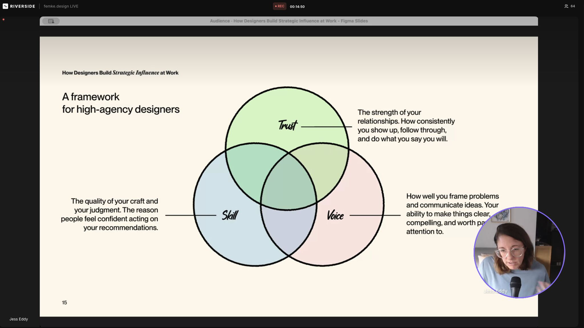
### How designers build strategic influence at work — full presentation (watch now) 👇🏼
_This post is for paying subscribers only._
### How designers can stay grounded amid AI overwhelm
URL: https://www.everydayux.net/designers-stay-grounded-ai-world/
Last updated: 2026-03-17T14:00:01.000Z
There is a common feeling amongst designers right now.
It’s a distinct kind of overwhelm. Less like ordinary stress and more like being caught between confusion and paralysis.
Every week, there is a new model, tool, or workflow part of the discussion. One person says designers need to become AI orchestrators. Another argues the future belongs to deep craft. Someone else insists learning to code is essential, while another claims coding will soon be irrelevant.
Each perspective sounds plausible. None feels completely certain.
A question lingers in the back of many designers’ minds: What should I actually be learning right now?
It’s tempting to treat this as a straightforward question of skills, but often something deeper is at play.
### The hidden worry
When designers ask what they should learn next, the question often assumes that somewhere there is a correct path. A particular stack, specialization, or sequence of skills that leads safely into the future.
Looking closer, the real concern is more emotional. Many designers are worried about becoming irrelevant, about not knowing how they’ll fit into a future they can’t yet see, about choosing the wrong direction, or being left behind as the profession evolves around them.
> The uncomfortable truth is that no one really knows what the future holds. (Not even the “experts.”) The industry itself is still figuring out where things are heading.
One thing is for sure: choosing to do nothing, or settling into a comfortable job that doesn’t push you to grow, makes it harder to keep pace as the field evolves.
Because the future is uncertain, the search for the “right” skill path often becomes a search for certainty itself. It’s easy to fall into a cycle of comparing career roadmaps, bingeing tutorials, and scanning for patterns in others’ choices, all in the hope that the next step will suddenly reveal itself.
It makes sense to feel uneasy. Design is evolving at such a rapid pace that new tools and ideas can make the ground feel unsteady beneath your feet.
But treating uncertainty solely as a planning problem often leads to paralysis. Often, instead of taking small risks or trying things out, people find themselves stuck in research mode, waiting for a moment of perfect clarity that rarely arrives.
In most cases, clarity begins to emerge once you start taking action.
So instead of searching for the perfect plan, it may be more useful to focus on a set of strategies that help designers stay adaptable as the profession evolves.
The truth is, the tools are already here. With today’s range of AI options, it’s possible to assemble prototypes, concepts, or even full products in countless ways. The real challenge is no longer about how to build, but deciding what’s actually worth building. Increasingly, the spotlight is on the tools themselves, sometimes at the expense of the outcomes they’re meant to enable.
Here are twelve strategies that help designers navigate uncertainty and change.
## 12 strategies for navigating uncertainty in the age of AI as a designer
---
### 1\. Cultivate taste
Taste never goes out of style, and it’s currently something AI tools aren’t good at. AI tools excel at creating cookie-cutter designs. As tools make execution faster and cheaper, judgment becomes more valuable. Designers who immerse themselves in great work, thoughtfully critique and evaluate interfaces, and dig into what makes products feel cohesive, develop a level of judgment that’s tough for AI to imitate. Make time for moodboarding, explore design inspiration, and create just for the joy of it.
### 2\. Develop a point of view
Skills matter, but perspective is what truly sets a designer apart. Designers who develop strong, thoughtful opinions about how products should work, or how teams can solve problems, tend to attract the most interesting opportunities. A well-defined point of view reveals how you weigh trade-offs, set priorities, and imagine outcomes. Perspective isn’t just an add-on: it transforms design from a service into a kind of leadership. Seek out areas in your current work that lack a clear point of view, or find ways to take ownership of overlooked aspects of the product.
### 3\. Stay close to real users
Direct exposure to how people behave keeps design instincts sharp. Tools and frameworks evolve quickly, but understanding human behavior remains one of the most durable sources of insight. Watching how people actually use a product often reveals gaps between what teams assume and what users experience. These observations often inform design choices more powerfully than frameworks alone. Sometimes, teams get so caught up in adopting AI that they lose track of whether those changes genuinely benefit the user.
### 4\. Write about what you are learning
Writing clarifies thinking. Sharing ideas, documenting experiments, or reflecting on projects forces vague insights into concrete form. It also creates opportunities for conversations with others exploring similar questions. Over time, this process builds a record of how your thinking evolves. It can gradually position you as an expert in that topic area. Writing inside your workplace can be just as valuable, whether it’s documenting insights, explaining decisions, or sharing lessons with the team.
### 5\. Stretch beyond your job title
Side projects, consulting, and building small products often expose designers to different types of decisions. These experiences broaden perspective and reveal how design interacts with product strategy and business outcomes. Instead of focusing only on the interface, you begin to think about priorities, trade-offs, and how a product actually succeeds in the real world. That broader context often changes how you approach design work inside a team. Even within your current role, it can help to look for small “side quests” or offer to contribute in areas slightly outside your comfort zone.
### 6\. Experiment more than you plan
Careers increasingly resemble portfolios of small experiments rather than carefully planned ladders. Trying new approaches, tools, or domains often leads to discoveries that could not have been predicted in advance. Experimentation can take many forms. It might mean designing a strange app around an unusual idea, building a tiny product just to see if it works, or exploring a concept that feels a little unconventional. These small experiments often teach more than carefully planned exercises.
### 7\. Go deep in a domain
Design skill combined with domain knowledge is powerful. A designer who deeply understands a particular industry brings context that generic design knowledge alone cannot provide. They begin to recognize the constraints, workflows, and incentives that shape how products are actually used. Over time, they also develop a feel for the nuance of the problem space, the edge cases, trade-offs, and subtle patterns that outsiders often miss. That depth of understanding makes it easier to identify opportunities others might overlook and to propose solutions that feel both original and practical within that environment.
### 8\. Understand how products make money
Designers who understand revenue, retention, and business constraints operate differently within teams. They can frame design decisions in terms that resonate with leadership and product strategy. Instead of focusing only on interface improvements, they connect design choices to outcomes such as growth, customer satisfaction, or long-term retention. That perspective allows them to participate more meaningfully in strategic discussions and helps others see how design contributes to the business’s success.
### 9\. Strengthen communication and influence
Running meetings, explaining ideas clearly, and aligning teams are skills that become more valuable over time. As tools automate execution, the ability to persuade, suggest good ideas, and guide decisions becomes increasingly important. Much of this influence grows from the relationships you build with the people around you. When colleagues trust you because of how you think and communicate, they are more open to your ideas and more willing to involve you in important conversations. Over time, that trust makes it easier to bring people together and move complex decisions forward.
### 10\. Expand opportunity within your current environment
Sometimes the most meaningful growth comes from expanding the scope where you already work. Taking on new problems, collaborating across teams, or shaping strategy can develop capabilities that no course can provide. Many parts of a company operate without a dedicated designer, and those gaps can become opportunities if you are curious and willing to help. Through your relationships and network inside the organization, you may find chances to contribute where design is needed but not yet present. Over time, this kind of involvement helps you see the product and the business more holistically, while also broadening the kinds of problems you can work on.
### 11\. Spend time around curious people
Curiosity is contagious. Being around people who are experimenting with new ideas, tools, or approaches often changes how you think about your own work. Their questions, experiments, and perspectives can introduce possibilities you might not have considered on your own. If you cannot easily find people like this in your workplace, many online communities bring together designers and builders who share what they are exploring. Spending time in those spaces can expose you to new ideas and keep your own curiosity active.
### 12\. Choose environments that challenge you
A comfortable role with little change might feel secure, but it can quietly stall your growth. Environments that introduce new challenges and a bit of uncertainty often result in faster learning. When problems are ambiguous, and the next steps aren’t clear, designers are nudged to think more creatively and develop fresh approaches. Over time, these experiences build a kind of confidence and adaptability that’s hard to develop in roles where the work is always the same.
---
### The risk we actually understand
It’s important to start by finding work you genuinely enjoy. You might be able to create a sense of certainty by focusing on a valuable task or a stable role, but if the work itself does not interest you, that stability can eventually make even meaningful work feel draining or unfulfilling.
The future of design will continue to shift. Some roles will evolve, new tools will appear, and parts of the work will inevitably become automated.
What is much easier to predict is the direction of one particular risk: stagnation.
A role that asks little of you and rarely stretches your thinking can feel safe, but over time, it often leads to a slow disconnect from where the craft and the industry are heading.
Interestingly, it is often in uncertain environments that designers stay sharp. Situations that introduce complexity or ambiguity tend to push people to keep learning, adapt quickly, and explore new ways of working.
Over time, that process of continual adaptation matters far more than predicting exactly where the profession will go next.
### What a UX design portfolio looks like in 2026
URL: https://www.everydayux.net/ux-portfolios-2026/
Last updated: 2026-03-03T14:00:07.000Z
This post was partially inspired by the episode “The design process is dead. Here’s what’s replacing it” from Lenny’s Podcast, featuring Jenny Wen (head of design at Claude), as well as other research, and has been refractored for clarity and practical insight here.
### Rethinking the traditional design process
For years, the UX industry followed the traditional design process as if it were the only way forward. We conducted discovery and research, diverged and converged, and treated each phase as an article of faith. But looking around in 2026, it’s clear that the old process no longer reflects how we actually work.
What’s really driving this shift isn’t just a change in philosophy, but the remarkable speed of product development everywhere. Engineers, now armed with autonomous AI agents, can build and ship features in almost no time. Designers also have new coding tools and AI assistants, such as Figma Make, Claude Code, and v0\. We can quickly create, test, and iterate on working prototypes ourselves, without waiting for a developer to translate static files. This means designers no longer need (or want) to rely on lengthy, polished mockups. The reality now is that our job is to help the team move forward, not hold up progress in the name of perfection.
> There’s no question that this pace can put real pressure on craft, and it’s not always clear that this is the ideal direction. But it’s the reality we’re all navigating right now.
As the designer’s role becomes more strategic, more AI-driven, and more cross-functional, the way we demonstrate value has to keep up. A 2026 UX portfolio isn’t about polished case studies; it’s proof of how you tackle ambiguity, use AI as a true creative partner, and move quickly from insight to execution to deliver results that matter to the business. All of this counts even more when everything around you is moving fast, and the ground keeps shifting.

### Why portfolios must show your thinking
The designer’s day-to-day has changed. Not long ago, most of our time went into mockups and prototypes. Now, that’s maybe a third of the job. Portfolios need to adjust as well: hiring managers don’t just want to see finished designs, they want to see how you frame complex problems, how you use AI as a creative partner without losing your judgment, how you tie design decisions to business outcomes, and how you help teams move forward when things are changing fast.
Highlight near-term impact, not distant visions. The artifacts you showcase should match the real pace of today’s product development. In the past, a signature piece might have been polished screens for a five-year product vision. But with technology evolving so quickly, those long-term forecasts rarely hold up or matter. Now, it makes more sense to focus on three to six-month horizons. Instead of highlighting theoretical, multi-year plans, your portfolio should feature scrappy, functional prototypes that show you can help move projects forward, now.
#### The legibility framework
If you’re looking for fresh case studies, consider using the **“legibility framework.”** Originally borrowed from venture capital, this approach is about spotting and refining “illegible” ideas. Those early, confusing, high-energy concepts that live at the frontier of your team’s work. Legible ideas are obvious and easy to understand, but rarely novel. On the other hand, illegible ideas might start as dense internal prototypes or ambitious experiments, generating real buzz within engineering or research groups even if their value isn’t immediately clear.
To use this framework well, look for where the energy is in your organization. Pay attention to what engineers and researchers are focusing on and what’s getting people excited, even if you don’t fully understand the idea at first. When you spot an illegible idea with momentum, dive deeper to figure out what’s behind the excitement. Then, use your UX, prototyping, and storytelling skills to translate that raw concept into something clear and usable. That’s where designers add real value, and your portfolio should make that process visible.
### How portfolio formats are evolving
As our work changes, so does the way we show it. Static websites with long case studies are giving way to more interactive, AI-native formats—like RAG chatbots or custom sites that reflect your approach. These new formats let you actively demonstrate your technical fluency and strategic thinking, rather than just presenting past work.
Especially for early-career designers, portfolios should look more like a collection of “science projects.” Instead of just theory, show what you’ve actually built—even if it’s rough. Hiring managers want to see that you can use today’s tools to make real products, not just talk about them.
As you adopt new technologies, make sure you’re integrating AI in a way that actually adds value. Show how it improves your workflow or thinking—not just as a trendy add-on.
#### Demonstrating modern skills
To thrive in 2026, your portfolio needs to go well beyond static design files. Show that you’re comfortable with the full, modern tool stack, not just design software. But prototyping tools like Figma Make, Claude Code, Magic Patterns, or Lovable. Today’s designer is expected to work with a range of tooling, and hiring managers want to see that range in action.
#### Living in code for the “last mile”
Another big shift: some designers now spend much more time working directly in code. We’re expected to polish features, tweak front-end details, and help get the product across the finish line. If this is you, your portfolio should make it clear that you’re comfortable with IDEs like VS Code and can quickly prototype and refine in code, not just hand off designs for others to build.
#### The evolving role of Figma
Traditional design tools still have a place. Figma remains important, but its role is different now. It’s the best environment for fast, broad exploration—testing out multiple directions before anything is built. Figma is where you can play with visual details and interaction styles, before committing to a design direction.
#### Showcasing your AI stack
A modern portfolio should clearly outline your AI stack and how it speeds up your work. Show practical experience, using tools like Claude, Claude Code, or Co-work to manage tasks or support front-end engineering. If you’ve collaborated with AI (say, using an agent in Slack to fix a UI bug and merge the change), make that visible. It shows you’re adaptable and ready for how teams really work today.
#### Your portfolio, from a hiring manager’s perspective
As the designer’s role continues to evolve, hiring managers want people who demonstrate resilience and a willingness to adapt. They’re scanning for folks who don’t get stuck in old habits and are ready to pick up new tools on the fly.

### Beyond mindset, three types of designers are emerging
#### The “block-shaped” strong generalist
We’ve moved beyond the classic T-shaped designer. The block-shaped generalist brings solid skills across several areas and can flex into PM or engineering when needed. Teams move fast, so designers who can pivot and make an impact in different roles are highly valued.
#### The deep specialist
There’s still a strong need for deep specialists—designers with real technical or visual expertise. Maybe you’re as comfortable writing code as you are designing, or your visual skills set your work apart. That kind of depth matters, especially as AI handles more routine tasks.
#### The “craft new grad”
Early-career designers have a real edge if they’re humble, fast learners, and not weighed down by tradition. If you’re using today’s tech to actually build things (rather than sticking to theory), you’ll stand out as adaptable and valuable to teams building what’s next. ***Example:***
[Talking with product designer and engineer Rachel ChenA conversation with designer Rachel Chen about building range early in her career, the habits shaping her craft, and what she’s learning through the Silicon Valley School of Design. She shares the choices, challenges, and lessons guiding her as a designer who also engineers.everyday uxJess Eddy](https://www.everydayux.net/talking-with-product-designer-and-engineer-rachel-chen/)
### Resilience and adaptability matter most
Looking forward, the main message for UX designers is clear: your portfolio should show adaptability. Rigid processes are fading, and the pace of change is only accelerating. To succeed, hiring managers want to see that you can roll with whatever the industry throws at you.
[Designers who do excellent work are “fast on their feet”Designers who do excellent work are fast on their feet, embracing flexibility and adaptability as core traits. These skills help us navigate shifting priorities, collaborate effectively, and grow in our careers. Learn how to cultivate them and stay nimble as a designer.everyday uxJess Eddy](https://www.everydayux.net/designers-who-do-excellent-work-are-fast-on-their-feet/)
With AI models, there’s no way to predict every outcome or rely on static mocks. A strong portfolio proves you’re willing to launch scrappy prototypes, test them in the real world, and iterate based on what actually happens.
Designers who will thrive aren’t the ones clinging to old rituals. The ones who stand out will embrace new tools, integrate AI thoughtfully, and jump into code to help the team move faster. Your 2026 portfolio should show you’re ready to use modern technology and aren’t held back by the way things used to be.
### Designing with behavior in mind: A conversation with Jerome Ribot of Coglode
URL: https://www.everydayux.net/behavioral-design-coglode-jerome-ribot-interview/
Last updated: 2026-02-10T14:00:36.000Z
Behavioral science plays a big role in shaping how products and services are designed. Many teams mention ideas such as scarcity, defaults, or loss aversion, but few know how to use them well or responsibly in real-world situations.
[Coglode](http://coglode.com/?ref=everydayux.net) has spent the past ten years working to close this gap between theory and practice. CEO, founder, and designer Jerome Ribot founded Coglode in 2014 to make behavioral science easier for product and experience creators to use. It started as an internal tool but has grown into a popular set of resources and training programs that help teams turn academic research into practical choices.

Jerome Ribot, Coglode
Their best-known product, [Nuggets](https://www.coglode.com/nuggets?ref=everydayux.net), breaks down behavioral insights into short prompts that spark discussion, challenge assumptions, and encourage more thoughtful design. Coglode also offers training, develops tools such as the Cookbook platform, and works with organizations including Spotify, Google, Apple, Barclays, BCG, and the World Bank.
> At its core, Coglode’s philosophy is about distillation and application: making research understandable, usable, and connected to everyday decisions.
Rather than treating behavioral science as a set of tactics to drive short-term metrics, Jerome has consistently advocated for a more thoughtful approach, one that prioritizes long-term trust, emotional outcomes, and ethical design.
As Coglode marks its tenth year, the team is also setting an ambitious goal for the decade ahead: to demonstrate £100 million in measurable behavioral impact through its work.
In this interview, I talked with Jerome about common behavioral mistakes in today’s design industry, how teams can create a shared language around behavior, and why curiosity—not control—will shape how designers work in an AI-driven future.
## Q&A with Jerome from Coglode
##### When you look at the design industry today, what behavioral mistakes do you see most often, and why do they persist?
One of the most common mistakes is the heavy-handed use of behavioral science to pursue short-term gains at the expense of long-term brand trust.
In a rush to prove ROI, teams often overuse principles like scarcity, loss aversion, or friction in ways that feel coercive. This triggers *reactance* — our instinctive urge to reclaim autonomy when we feel pushed too hard. You might retain someone for a little longer, but you’ll leave them frustrated, resentful, and far less likely to return.
**The long-term alternative is confidence:** make it easy to leave when it makes sense, ask thoughtful questions, and part on good terms. People may forget what you did, but they won’t forget how you made them feel — and that applies just as much to brands as it does to people.
##### How can designers balance using behavioral insights for inspiration with making sure they’re applying evidence appropriately and in the right context?
> Behavioral insights are powerful, but they’re highly context-dependent.
**Take scarcity.** A coffee brand shouting “limited stock” and flashing urgency cues creates anxiety and avoidance. Another shop quietly presenting a “very rare” £10 coffee reframes scarcity as an invitation to appreciate quality. Same principle, but completely different emotional outcome.
So the question isn’t *“Does this principle work?”* but *“How should our brand use it?”* How should it leave people feeling? Is that on-brand? Small, low-risk experiments can help teams develop a feel for what’s both effective *and* appropriate.
##### If a team wanted to start using behavioral science tomorrow, what would be the smallest, most effective first step?
Start by building a shared behavioral language.
In our training, we ask each team member to pick one behavioral “Nugget” that resonates with them and explain why. This takes as little as ten minutes, requires no prior knowledge, and immediately sparks discussion and application ideas.
Done regularly, it becomes a lightweight habit that helps teams think more clearly - and more humanly - about their work.

##### Which behavioral insights or patterns feel most relevant for 2026, given the rise of AI, the increased cognitive load from information proliferation, and shifting attention habits?
As we hand over more tasks to AI tools, we’re seeing both an increase in Analysis Paralysis and a reduction in Autonomy.
On Analysis Paralysis, or our tendency to shut down when presented with too much information, there’s been a significant uptick in the cognitive resources required to process and internalise what AI provides. If we think the Internet Age changed our brains, then we’re in for a shock when it comes to AI.
Now, with AI data being highly personalised, with added memory and increasing processing speed, we’re at even greater risk of being overwhelmed by the very tools that aim to make our lives easier.
> We’ll see a shift towards more thoughtful, concise, and visual information formats that honour our cognitive limitations.
The other behavioural pattern concerns autonomy. As we increasingly hand over tasks to AI, there’s a natural existential dilemma regarding our own role in the process. Many creative people still feel this fear and remain reluctant to engage with AI tools, fearing they will lose control and, in turn, a sense of their unique value.
However, the fear around our value can be overcome by recognizing that, as creative people, AI tools enable us to extend what we already do so well into brand-new areas. So, the visual artist can now explore motion for the first time. The writer can now compose songs. We can express our creativity in new ways that build on our talents, rather than feeling replaced.
The behavioural antidote to a fear of diminishing creative control isn’t resistance - it’s curiosity. We need to lean in, let go of the rigid way we see ourselves, and let new AI tools have us playfully explore uncharted paths like never before.
##### What design decisions tend to have disproportionate behavioral impact but are often overlooked?
Defaults: We tend to stick with the preselected option.
They quietly shape behavior everywhere, from AI tools that switch you to new models to apps that pre-select expensive options or sort by popularity rather than price.
Because defaults lower cognitive effort, their influence is only growing. Teams should regularly audit them: What’s the default? What’s the alternative? Is it intentional, clear, and fair? Defaults that feel sneaky can erode trust faster than almost anything else.
##### What have you learned about teaching behavioral science to mixed teams?
I recall a story after training a mixed team at Google DeepMind a few years back.
One team member had a PhD in Behavioural Science. Towards the end of the training, they asked if they “could have a word.”
Surely I had disappointed them and somehow dumbed down our discipline, and they wanted to tell me so, albeit in confidence?
When I told her my fears, she laughed.
> “No, Jerome, you don’t understand. Honestly? I’ve often felt that my expertise has held me back; I’ve felt alone because no one speaks my language. Introducing a common behavioural language with my team has been a game-changer for us. But selfishly? It makes my job that much easier, too! So thank you.”
My biggest takeaway from teaching mixed teams is the power of understanding, communicating, and solving problems through a shared behavioural language. Since then, we always recommended training mixed teams. When everyone can reason together about human behavior, better decisions follow naturally.
##### Where do you recommend people start when exploring your tools and resources?
- Start with our free [Figma Behavioral Design Library](https://www.coglode.com/figma?ref=everydayux.net) to help annotate and justify design decisions.
- Next, [Nuggets Box One](https://www.coglode.com/nuggets?ref=everydayux.net) is a simple way for teams to build shared behavioral understanding through discussion and practice.
- For faster progress, our one-day [training sessions](https://www.coglode.com/training?ref=everydayux.net) work well.
Later this year, we’ll launch [Coglode Intelligence](https://www.coglode.com/intelligence-waitlist?ref=everydayux.net) — an AI platform designed to help teams answer questions through a behavioral lens. Sign up for the waitlist.
0:00
/0:56
1×
Coglode Intelligence
### A simple framework to help you decide whether a job is worth staying in
URL: https://www.everydayux.net/how-to-know-when-to-quit-a-job/
Last updated: 2026-02-10T01:50:56.000Z
Most career advice focuses on pushing through tough times. We’re told to be resilient, work harder, and hang on even when it gets rough.
But what about the moments when staying put is holding you back? Or worse, impairing your mental health. The real challenge isn’t just enduring difficulty; it's recognizing when sticking it out isn’t good for you or helping you grow.
We’re used to hearing that quitting means you’ve failed, that you’re not tough enough, or that you’re just acting out of frustration. But the truth is, quitting thoughtfully requires real clarity, courage, and reflection. It’s not an in-the-moment rash decision. Rather, it’s about noticing patterns, weighing your options, and making purposeful choices once you see things clearly.
This matters because staying is not neutral. Time invested in the wrong environment has a cost. It drains your energy and erodes confidence. It can even be hard to focus on your work. And yet, many people stay not because things are working, but because leaving feels wrong or scary. Financial pressure, visas, caregiving responsibilities, and timing all shape what is possible in the short term.
> This article doesn’t ignore those realities or pretend they’re easy to solve.
Instead, it’s here to help you find clarity, even when you can’t make a move right away. You’ll learn how to manage the second-guessing, plan your exit thoughtfully, or decide to recommit with intention.
This approach also acknowledges the emotional side of leaving. Letting go of something that once felt like the right fit is rarely simple. There’s often a real sense of loss for what your role used to be, or what you hoped it would become, and making space for those feelings is an important part of moving forward.
That’s where the ***quit quotient*** comes in. It’s a straightforward framework designed to help you navigate these decisions with intention, not to encourage quitting on a whim or staying out of fear, but to help you honestly decide where your time and energy have the best chance to grow.
****A quick note:** Much of what you’ll find here is inspired by theMITmonk’s video, “Watch This for 13 Minutes and You’ll Outperform 99% of People.” The quit quotient framework and its core insights come straight from that talk, but have been reworked here for deeper reflection and everyday use.
## Quitting is a skill, not a failure
### Reframing quitting
Most of us grew up hearing that quitting is a sign of weakness. If something feels hard, uncomfortable, or downright exhausting, we’re told to give it time, push through it, try harder, dig deeper, and be even more resilient.
> But what if there’s another way to look at quitting?
Quitting can be a smart, strategic move. In fact, figuring out when to walk away might just be one of the most valuable skills you ever develop. It’s not about running from discomfort. It is about protecting your energy, creativity, and capacity to grow.
Sticking it out in the wrong job isn’t a harmless choice. Over time, it can erode your motivation, confidence, and even your sense of self-worth. What once felt exciting and challenging can become a burden. So quitting, in this sense, isn’t about giving up at all. It’s about choosing where your effort can really multiply and make a difference.
### Why people struggle to quit
If quitting were easy, more of us would do it sooner.
A major reason we stay too long is loyalty to the past or hopes for the future. Maybe a role was wonderful once, or a manager really believed in you at the start. When things change, it’s only natural to want to hang on and hope things go back to how they were or might be again.
Another reason is uncertainty. Even when a situation is clearly draining, it is familiar. Leaving means stepping into the unknown. That can feel more frightening than staying somewhere that no longer fits.
And then there’s the impact on your confidence when the environment itself turns sour. If you’re constantly questioned, undermined, or overlooked, it’s only natural to start doubting yourself. Over time, that steady erosion of self-trust makes it much harder to take bold steps or make clear decisions.
> So we wait. We put up with things. We keep telling ourselves that things will get better soon. But quietly, the cost of staying keeps adding up.
Progress isn’t about toughing it out in the wrong situation for as long as possible. It’s about having the courage to recognize when something isn’t working anymore and taking action.
The sooner you stop pouring your energy into what drains you, the sooner you can channel it into something that truly helps you grow.
**Time is powerful.** Where you choose to invest it shapes everything. Quitting isn’t a sign of giving up or a lack of commitment. Sometimes, it’s the very spark that gets real momentum going.

## Why quitting faster creates compounding returns
### Time is the real investment
When most of us think about quitting, we tend to zero in on the risks. But what barely gets talked about is the cost, the price you quietly pay for staying too long.
When you spend time in the wrong environment, your progress doesn’t just stall; it starts compounding in the wrong direction. Your energy drains away, your confidence shrinks, and even your curiosity fades. You’re still working hard, but you’re getting less and less back for all that effort.
> However, the opposite is true, too.
When you invest your time in the right place, everything compounds in your favor. Growth and momentum accelerate, and learning builds on itself. Suddenly, the same amount of effort creates way better results.
The impact you make isn’t determined only by your effort, but also by the environment where you’re putting in that effort. The right setting can multiply what you’re able to achieve.
### The hidden cost of waiting
Waiting without a clear plan can quietly become one of the most expensive choices you make.
Sometimes people wait, hoping for leadership changes that may never happen. Or they keep waiting for recognition they’ve already earned, or for the culture to shift and things to finally settle down.
At the time, all this waiting doesn’t feel too bad. In fact, it usually feels reasonable, maybe even responsible.
**But here’s the catch:** waiting always comes with a cost. Weeks turn into months. And that is time you could have spent elsewhere that would have helped you grow much faster.
### What this really comes down to
The real rewards of compounding show up when your energy and efforts align with the right opportunities, not just when you work hard for its own sake.
> Putting in effort is important, but channeling that effort into places where it can truly multiply makes all the difference. When you stay too long in a place that doesn’t fit, it changes you over time.
## The Quit Quotient framework overview
If quitting really is a skill, the next big question is: how do you actually practice it, without just acting on impulse or letting your emotions call all the shots?
When you’re stuck in a draining situation, it’s hard to think clearly. You’re tired, you’re second-guessing yourself, maybe even blaming yourself for how you feel. That’s exactly when those nagging, vague feelings like “this isn’t working” really need some structure.
That’s where the quit quotient comes in.
### About the framework
The quit quotient is a straightforward framework to help clarify decisions that often feel emotionally charged. Rather than relying only on your gut instinct, it invites you to pause, step back, and take a more thoughtful look at what’s really going on. The quit quotient helps you view your situation through three lenses (drive, fit, and growth). Each one reveals signals that are easy to miss when you’re tired, frustrated, or doubting yourself.
And it’s not just for work. The same approach can help with relationships, side projects, or any long-term commitment that’s lost its spark. Wherever you’re putting your time and energy, this framework helps you determine whether that investment is paying off or quietly wearing you down.
> At its heart, the quit quotient takes that fuzzy sense of dissatisfaction and turns it into a clear, actionable signal.
### How it works
You’ll score your current situation across three simple dimensions. Each one highlights a different side of how well things are working for you, and how much momentum you’ve got.
Rate each dimension on a scale of 1 to 10, then sum the scores to get your total.
That total gives you a quick sense of whether it’s time to double down, pause and reassess, or start planning to move on. It won’t decide for you, but it does help make your options and trade-offs much clearer.
Next, we’ll walk through each of the three dimensions together and see how to use them in practice.
### The framework and how to use it
Before you dive in, here’s one quick note.
As you read the next three sections, rate each dimension on a scale of 1 to 10, with 10 indicating a perfect fit. Try to be honest with yourself and score based on how things really are today, not how they used to be, or how you wish they could be.
> Just remember: you’re not aiming for perfection here, just being honest with yourself.
### Dimension 1: Drive
##### Does this work give you energy or take it?
Drive is the most personal part of this whole framework. It’s all about your own energy and how you truly feel about the work, at your core.
At its core, drive boils down to one big question: Does this role excite you, or does it drain you? How does the work feel to you, day after day?
**When assessing drive, reflect on questions like**
- Does this work energize me, or does it leave me drained?
- Do I feel genuinely curious and engaged, or am I feeling guarded and worn out?
- Am I excited to jump in and contribute, or am I counting down the days and trying to get through the week?
- Do I feel proud of what I’m doing, or am I relieved when it’s done?
**Common warning signs include**
- You’re dreading work almost every day.
- You’ve lost interest in the problems or challenges that once excited you.
- You’re stuck in a cycle of self-doubt and second-guessing yourself.
- You catch yourself emotionally checking out or just feeling numb at work.
### Dimension 2: Fit
##### Are you in an environment that helps you grow?
If drive is all about how the work feels to you, then fit is about the environment you’re working in. The people, the culture, and the everyday atmosphere.
Fit is about the folks around you and the system you’re a part of. It’s asking: Are you in a position to grow, and do you enjoy the culture?
**As you think about fit, ask yourself**
- Are the people around me pushing me to grow and bringing out the best in me?
- Do the leaders here genuinely care about my growth, or do they go through the motions?
- Can I share my ideas openly without worrying they’ll be shut down or dismissed?
- Does it feel like my relationships are getting stronger?
**Poor fit often manifests as patterns rather than single events. These patterns might look like**
- You’re called out or second-guessed in front of others.
- Some of your responsibilities have been removed, and no one has explained why.
- You’re left out of important decisions or miss out on opportunities to grow.
- The culture is becoming increasingly political and even somewhat toxic over time.
When fit is not working, even capable people begin to shrink as we lean into self-protection.
### Dimension 3: Growth
##### What does staying here make possible later?
The last piece of the puzzle is all about looking ahead.
Growth is about what staying in this role could make possible, not just right now, but down the road. It’s about what you’re learning, where your path is heading, and what new doors might open if you keep investing your time here.
**To assess growth, consider**
- What skills am I developing here that will continue to pay off in the future?
- Are there new doors this role could open up for me, now or in the future?
- If I stick around for another year, will I feel more capable, or just more stuck?
- Is this role helping me grow and broaden my path, or is it slowly narrowing my options?
**You may experience less growth than before. Here are a few signs to watch for:**
- You feel like you’re not learning anything new anymore.
- The work no longer challenges or stretches you as it used to.
- It seems like new opportunities are either out of reach or only come around if you play the politics game.
- You’re mostly just maintaining your skills. Not really growing or expanding what you can do.
When your growth slows, each month or year you stay becomes much more costly.
It’s helpful to view growth through the lens of how it positions you for the future. If you’ve been somewhere for a while and haven’t had any new opportunities, a lot of time can start to pass.

## Scoring and interpretation
Once you have your three scores, it’s time to interpret what they mean. Individually, they offer a snapshot. Together, they help you see the bigger picture and identify patterns you might have missed.
> Now, the framework moves from reflection to practical steps you can actually take.
### How to score honestly
Before you tally up your results, take a moment to reset your mindset.
As you score each dimension from 1 to 10, focus on how things are for you right now, not in the past, and not in some ideal future.
**A few tips to keep your scoring grounded**
- Be truthful with yourself, even if the truth is uncomfortable.
- Try not to let memory or wishful thinking influence your rating.
- Look at what’s actually happening today.
Both nostalgia and hope can cloud your judgment, so the clearer you are about the present, the more helpful your final score will be.
> Once you’ve given each area a rating, add up your three scores to see where you stand.
### Reading the result
Once you add up your scores, you’ll end up in one of three zones. Think of these not as judgments, but as helpful signposts to guide your next steps.
##### Green zone: 24 to 30
Here’s where everything clicks: your drive, your environment, and your growth opportunities all point in the same direction.
You feel energized by your work, supported by your surroundings, and excited about where things are heading. This is what people mean when they talk about a “10x fit.”
If this is where you land, go all in. This is your chance to put down roots and let your effort multiply.
##### Yellow zone: 16 to 23
This is where most people end up, and it can feel pretty uncomfortable.
Some aspects of your situation are working well, while others are not. You may receive mixed signals, making it difficult to determine next steps.
Here, the best move isn’t to rush into a decision. Instead, try setting up a time-bound experiment for yourself.
**For example**
- Give yourself another three to six months.
- During that time, actively try to change what isn’t working.
- Keep track of what genuinely improves, and what stays the same.
- At the end of your experiment, revisit your scores.
The key is to be intentional. There’s a big difference between waiting passively and deliberately reassessing after you’ve tested whether real change is possible.
##### Red zone: 15 or below
If you find yourself here, things are truly out of sync.
Maybe one—or even all—of the key areas are not working, and you’re feeling the drain on your energy, confidence, or momentum. Hanging on in this spot will not solve the underlying problems.
If your score lands you here, it’s time to make a responsible plan to move on, sooner rather than later.
However, you can take your time, develop a plan, lay the groundwork for your exit, and put your time where it’s most likely to help you grow.
---
Making a big career decision is never easy, but having a clear framework can make all the difference. Whether you choose to stay, leave, or reassess, remember: your time and energy are valuable. Choose the path that helps you grow—and trust yourself along the way.
### Why creative blocks aren’t about creativity
URL: https://www.everydayux.net/creative-blocks-arent-about-creativity/
Last updated: 2026-01-28T14:00:11.000Z
Many of us chalk up creative blocks to a lack of inspiration or skills. But in reality, it’s not usually about creativity at all. It’s about something much harder to identify, but easier to control. Creative blocks are often a symptom of insufficient groundwork, a lack of understanding. As designers, constraints are part of our work. Time is almost always one of those constraints. And we are likely to experience what *feels like a creative block* when we rush to solutions before fully grasping the problem because we’re short on time or think we know the answer.
**This approach can have dire, but avoidable consequences.**
We can get stuck in cycles of guesswork and endless tweaking. This can lead to growing frustration that ***feels like a creative block***. The solution isn’t to push through, but to build a strong foundation of understanding. When you do this, solutions will naturally emerge.
> Creative blocks are usually the result of upstream failures.
We are all familiar with the feeling.
Not knowing or having enough information can leave us feeling like we’re poking around in the dark. Like, we can’t quite figure out how to move forward. When this happens, one of the best things to do is go back to the basics.
### The action bias: why we jump to solution mode
We often dive into design work too quickly, thanks to a psychological tendency known as action bias. Especially in high-pressure settings. We feel compelled to “do something” immediately, rather than taking the time to pause and think things through.
- **The illusion of progress:** Putting a layout on the screen feels like real work, while time spent researching or thinking doesn’t, especially to our stakeholders.
- **Easing anxiety:** Uncertainty is uncomfortable. Jumping straight to solutions makes us feel better. It gives us a false sense of control and temporary relief from the discomfort of not having all the answers.
- **The “expert” trap:** Even seasoned designers can fall into “pattern matching.” Assuming they’ve seen this problem before and reaching for familiar solutions. This can lead to going on autopilot, applying old answers to new challenges without checking if they truly fit.
Albert Einstein once said that if he had an hour to solve a problem, he would spend 55 minutes understanding it. Then he would take five minutes to come up with solutions. In the modern workplace, we often do the opposite. This creates the “tinkering trap.” It happens when people make endless small adjustments, but experience no real progress or breakthroughs.
### Creativity follows understanding
Research highlights that **deep understanding is a critical factor for creativity**. Creative blocks often happen when we lack information, research, empathy or haven’t spent enough time listening. It’s almost impossible to find a solution without fully understanding the problem. Skipping discovery often leaves designers “working blind.”
### The high cost of the “order taker” persona
We establish ourselves as experts by asking the right questions early in the process. And by guiding the team and process. Without that curiosity and initiative, we risk losing our role as strategic partners and instead becoming “order takers,” simply following instructions rather than guiding and facilitating. This shift can lead to a specific kind of creative block, fueled by friction with stakeholders. Endless iterations aren’t usually a design issue, but a briefing issue. When our briefs are incomplete, nonexistent, or lack clarity, it can result in late-stage discovery work and repeated rounds of feedback.
### Internal and external hurdles
Creative blocks don’t come from one source. They can emerge from a combination of internal strain and external pressure.
Internally, we can struggle with things like cognitive overload, imposter syndrome, and value misalignment. When a project feels meaningless, misaligned with personal values, or mentally overwhelming, creativity is elusive because of emotional and cognitive friction.
Externally, the environment matters just as much. Tight deadlines, high-stress cultures, isolation, and rigid organisational constraints all restrict creative movement. In regulated industries like finance, strict rules can distance designers from a real understanding of users, making creative work feel abstract, disconnected, and mechanically executed rather than meaningful.
> In both cases, the block isn’t artistic. It’s structural.
### The discovery phase: a necessary step
When pressure mounts, teams default to “just start designing.” Discovery is seen as a luxury rather than a necessity. But this is where many problems begin, and creative blocks are born.
Skipping discovery doesn’t save time; it simply delays clarity. It replaces finding the right path with guesswork, leading to frustration, endless revisions, and a sense of being stuck. In professional settings, creative block often shows up as dissatisfaction with the work, not because the designer lacks ideas, but because the work lacks meaning, grounding, and context.
> The solution is not more effort. It’s a step back.
Stepping back into research, reframing the problem, and reconnecting with the work’s real context restores creative momentum. Discovery doesn’t slow progress. It’s quite the opposite. Discovery prevents misdirection and future time spent spinning our wheels. Rooting ourselves in understanding creates clarity and freedom.
### The role of mindfulness in creativity
If discovery provides the external map, mindfulness provides the internal clarity to navigate it. Many people associate mindfullness with meditation, but mindfulness is a tool that helps us in all areas of life.
Mindfulness allows us awareness. It pulls designers out of autopilot and back into the present. It allows us to stay open, attentive, and mentally flexible instead of reactive and habitual.
This is where creativity reactivates, not through inspiration, but through a clear mind, attention, and perception. Here are a few ways mindfulness helps:
1. **Decluttering the mind and managing stress:** A primary trigger for creative blocks is cognitive overload. A designer cannot think creatively when they feel unfocused or overwhelmed. Mindfulness helps regulate attention. It shifts focus away from spiralling thoughts like “I can’t do this,” and back to the actual details of the problem. This mental clarity creates space for creativity to re-emerge.
2. **Shifting from ego to purpose:** Creative blocks often arise when designers fixate on personal taste or the pressure to create a “portfolio piece.” This ego-driven focus creates friction and unrealistic expectations. Mindfulness helps redirect attention away from self-judgment and back to the purpose of solving real user problems.
3. **Strengthening empathy and listening:** Empathy requires presence. You cannot understand users while mentally rushing, judging, or multitasking. Mindful listening helps designers hear what isn’t explicitly said in briefs and interviews. This prevents the “working blind” feeling that leads to blocks later in the project.
4. **Increasing task enjoyment through perspective:** We often feel blocked because we are bored, and we are bored because we have stopped being curious. Mindfulness reframes routine work by encouraging close attention and curiosity. Designers begin noticing “novel distinctions” in familiar problems, which restores interest, flexibility, and engagement, even in unglamorous industries or repetitive layouts.
5. **Facilitating flexible thinking:** At its core, mindfulness is the ability to shift perspective. A mindless state operates on autopilot, trapped in rigid categories and the assumption that we already know the answer. A mindful state stays open to the specific context of the moment. This ability to see a problem with fresh eyes is what allows designers to solve complex, high-stakes problems without getting stuck in old patterns.
---
### Creative blocks are not a personal failure
Creative blocks don’t mean you’ve lost your spark. They’re just a sign that something important is missing. Maybe it’s a lack of understanding, a need for more structure, or simply not enough space to think. It’s not about a lack of talent or inspiration. More often, creative blocks show up when we rush through the thinking, don’t have enough context, or try to solve problems that haven’t been clearly defined. The real magic happens when we stop blaming ourselves and start seeing it as a system issue. Instead of forcing ourselves to push through, we can step back and focus on regaining clarity. We don’t need to force creativity; it will emerge in the right conditions.
### Feedback loops are the new unfair advantage
URL: https://www.everydayux.net/feedback-loops-unfair-competitive-advantage/
Last updated: 2026-01-20T14:00:51.000Z
If you’re a builder or someone with the urge to build, the factors that lead to success have changed. AI has rewritten the rules. Teams can now create products incredibly fast, which means far fewer things genuinely set you up for success as a founder.
> AI has collapsed the cost of execution. Almost anything can be copied, often instantly.
💡
I recently [watched a talk by Sandeep](https://www.youtube.com/watch?v=Nqx0QjHQ9ww&ref=everydayux.net), also known as the MIT Monk, that clearly illustrates this point and offers specific advice on adapting your processes to increase your idea’s chances of success in the market.
Anyone can copy your product, feature set, Website, and even business model in an afternoon. What used to require large teams, significant time, and substantial capital can now be replicated with a handful of prompts and a few modern tools.
> Building is no longer the hard part. Shipping something that looks and works well is table stakes, not a competitive advantage.
This breaks many of the old ideas about defensibility. Being first, being clever, or having a polished product is no longer enough to win in the market.
Tight, fast, intentional feedback loops that let you fold user feedback into your product in hours or days are what make the difference now.
### Feedback loops have always mattered
Feedback loops have always been a critical success factor. Teams that learn fast and incorporate those learnings back into the product have always had a better chance at success.
> What’s changed is that how little else is defensible now emphasizes building products users love more than similar ones on the market.
Before AI, when execution was slower and more expensive, things like product polish, scale, and being first to market bought you time. Copying was harder, and teams could afford slower product cycles and longer gaps between learning and implementation.
Now copying is easy. Products, features, and even entire businesses can be recreated quickly.
So feedback loops shift from being a best practice to being the thing that sets you apart. When almost everything can be copied, the speed at which you learn, adapt, and respond to reality becomes your unfair advantage.
### Learning is the new unfair advantage
What actually creates an unfair advantage now is not the idea itself, but how quickly you learn once it’s out in the world.
> Fast, intentional feedback loops are difficult to copy.
Feedback loops are a habit built into how a team works. This looks like building in public, learning in real time, and fixing things quickly. It means shipping continuously rather than waiting for large, infrequent releases, paying close attention to what users are actually doing, and adjusting without defending ideas that are not working.
In short, it requires letting go of what you think should exist, following the path shaped by real feedback, and doing it fast.
### Feedback loops in practice
Cursor is one of many companies operating in a crowded market, a red ocean full of teams trying to solve similar problems. Yet it has emerged as one of the leading AI coding tools. They achieved this by relying on tight feedback loops. Cursor went from zero to one hundred million in revenue in its first eighteen months, then from one hundred to five hundred million the year after that. Impressive.
They didn’t get this far by having a secret, a novel idea, or an untouchable feature set. They built and improved features quickly using customer feedback. Cursor ships new features constantly, sometimes every day. Instead of guessing what users want months in advance, they release, observe what happens, and adjust immediately.
And, they dogfood their own product.
> The team uses Cursor to build Cursor!
This breaks down the walls between building and learning.
Insight into what needs improving shows up instantly, not weeks or months later. Instead of relying on reports or opinions, improvements are driven by what the team is actually experiencing as they use the product themselves.
In this respect, product market fit becomes an ongoing practice rather than a one-off milestone. Feedback loops allow your team to adapt quickly as user needs change or when you see they are not being met. You can adjust much closer to real time. Even if competitors copy individual features, they can’t match the speed at which you’re learning and adapting. What’s difficult to replicate is the cadence of feedback and the discipline of responding quickly.
This has been a key driver of Cursor’s success so far. Not because it can’t be copied, but because it learns faster than the rest.
---
You don’t need to be the smartest, the fastest to launch, or the most original to win in the market. You win by embracing one of the oldest fundamentals of building good products: listening to users. By listening, adapting, and shipping quickly through tight feedback loops, you can bring your idea to life and shape a product that evolves alongside your users as you learn.
### How designers adapt as interfaces become generative and disposable
URL: https://www.everydayux.net/designers-adapting-to-generative-disposable-ui/
Last updated: 2026-01-13T19:23:03.000Z
#### Table of contents
****Durable, persistent interfaces are all we’ve ever known**
- The world that shaped long-lived interfaces
****How software is decoupling**
- Why interfaces start to behave more like responses
- Where durable UI still matters
****What this change means for designers, teams, and product strategy**
- How design, product, and engineering roles evolve
- What actually becomes valuable
****Advice for designers** **(members only)*
- Designing for unclear intent
- When not to show UI
- Shared understanding, not just personalization
- Intent vocabulary
- Rules over screens
- When generated interfaces work, and when they don’t
- How design systems make generated UI usable
- Design for reversibility
- Make system behavior legible
For most of our careers, designing software has meant designing interfaces. Screens, flows, navigation, states. When something didn’t work, the answer was usually to redesign the UI.
> That mental model is starting to change.
As AI agents and generative systems become more capable, the interface is no longer the only, or even the primary, way people interact with software. Interfaces are becoming cheaper to create, easier to tailor to a specific moment, and less necessary to keep around forever.
This raises an uncomfortable question for designers and product teams: if interfaces no longer need to be durable by default, what are we actually designing now?
This article explores that question, what’s changing underneath it, and what it means for how we design, build, and run products in the future.
This piece was inspired by the video **“Agents will kill your UI by 2026, unless you build this instead”* by Nate B Jones on AI News and Strategy Daily. This article builds on ideas from that talk and translates them into a more practical lens for designers and product teams.
---
### Durable, persistent interfaces are all we’ve ever known
For as long as we’ve been designing, the interface has been the product.
When you bought software, you were buying a bundle of screens and flows for performing tasks.
> The advent of AI agents is challenging this approach.
Generative AI and agentic systems are changing the economics of pixels. They’re no longer scarce or expensive to produce. Even if the quality isn’t perfect yet, once pixels become cheap and contextual, the interface no longer needs to be durable (permanent, or non-changing) by default.
**What does this mean for UIs?**
- Instead of designing a single interface to serve everyone, which is expensive to overhaul and update, the product can anchor itself in a durable core: the data models, business rules, permissions, workflows, audit logs, and domain logic that define how the system works.
- On top of that, it can generate contextual, in-the-moment interfaces on demand, only when they’re actually needed.
In this way, the interface isn’t something you learn once and expect to stay the same. Parts of it are created on demand, shaped by intent, and exist only to support a specific decision before fading away.
##### The world that shaped long-lived interfaces
To understand why this feels so disruptive, it helps to remember why coherent, long-lived interfaces became the default in the first place.
For decades, interfaces were expensive to produce.
Designing and building UIs takes time, careful planning, extensive iteration, and many rounds of design and development. Add to that QA, localization, documentation, training, and often extensive cross-team coordination. Once an interface is shipped, you want to amortize that cost for as long as possible.
Because of that, one interface has to work for everyone. It doesn’t matter much if it fits your exact needs or preferences. The interface had to be shared by thousands or millions of users across many different workflows, and it had to stay stable so people could learn it once and use it again and again.
Organizations naturally optimize around this reality. They invest in opinionated interaction design, rigid navigation structures, and strong mental models. They build training programs, certifications, and change management processes to help people adapt to the software, rather than the other way around.
> Stability isn’t just a design choice; it’s an economic necessity.
That model makes sense when every pixel has to be carefully designed and agreed on up front. The challenge, and the opportunity, is that the way we design and experience interfaces may soon look very different.
### How software is decoupling
This change in how we design interfaces didn’t come from a single breakthrough, but from several self-reinforcing developments maturing at the same time.
- **First**, generative UI enables the creation of full-screen experiences and interfaces from text or context, challenging the idea that every screen needs to be carefully designed in advance.
- **Second**, the way we think about UI is changing. Instead of permanent pages, we’re seeing more ephemeral, throwaway, hyper-contextual panels. Interfaces can appear for a specific task, work on top of the same durable core, and then disappear once that task is done. We’re already seeing early versions of this in tools like chat-based assistants, natural-language analytics, and AI-powered IDEs, where interfaces appear as temporary panels or artifacts in response to a specific task, then fade away once that task is complete.
- **Third**, software is increasingly acting on our behalf. Instead of a person clicking through menus and dashboards, an agent can take an instruction, call the right APIs, and generate exactly the UI needed in that moment, like a chart, table, or summary panel. People are already doing this today, asking a system for a specific view of their data and getting it back instantly, without ever opening a traditional dashboard.
Taken together, the interface stops being a fixed place you navigate and starts behaving more like a response to what you’re trying to do, shaped by intent and context rather than something you have to search through.
This doesn’t mean all interfaces are constantly changing. There is still an important role for durable UI in products, especially for navigation, onboarding, and shared understanding.
What changes is what sits underneath the surface. Instead of maintaining hundreds of rarely used pages, many of those experiences can be generated on demand. This is especially true for low-traffic views and one-off decision panels that are expensive to design and maintain but rarely revisited.
The result is a product with a stable surface people recognize and rely on, and flexible, task-specific interfaces that appear only when needed.
##### Imagine a customer service software scenario
An agent opens a ticket where the customer says, **“X keeps happening.”* That might refer to repeated delivery delays, billing errors, or a recurring product issue**.*
The agent asks the system to check whether this is a pattern. In response, a temporary visual summary appears alongside the ticket: a small chart showing recent tickets by issue type, a short timeline highlighting repeat problems, and a comparison with similar customers.
**The view exists to answer one question in that moment:* Is this an isolated incident, or something that needs escalation?
Once the agent responds to or escalates the issue, the visualization disappears. The ticket stays the same, and the underlying data remains part of the system.
### What this change means for designers, teams, and product strategy
This changes what it means to design, build, and run products in the first place.
For designers, the center of gravity moves away from designing specific screens and flows. The work becomes more about defining how systems generate the right interface at the right time.
That includes defining patterns and constraints, and setting the rules that govern how UI appears across different contexts. In practice, designers focus less on individual screens and more on shaping how user intent turns into an interface, without surprising or overwhelming people.
For PMs, the questions change too. Instead of asking, “What page do we build next?”, the focus moves to intent and outcomes. What kinds of tasks should the product support? Which state changes need to be safe and auditable? Where is human judgment required, and where can things be automated? Product thinking moves upstream, closer to decisions and consequences, rather than pages and features.
For engineers, especially those working on the front end, the job becomes less about pushing pixels and more about building reliable foundations for generation. That means stable agent interfaces, strong validation logic, clear boundaries, and systems that support composability without breaking trust. The UI becomes thinner, but the underlying structure has to be more robust.
### Where durable UI still wins
There are still areas where a durable UI matters. Complex, high-stakes work relies on cognitive mapping and spatial memory. People performing tasks in fields like finance, healthcare, or incident response depend on familiar layouts and predictable behavior. Constantly changing interfaces add risk in those environments.
Regulated contexts also demand durability. Audit trails, training, and compliance require reproducible flows. You need to be able to show exactly what someone saw and approved, which is hard to reconcile with fully ephemeral interfaces.
Team collaboration is another place where durable UI remains important. Shared work needs shared views. People need common reference points, and teams need ways to pin, share, and standardize what they’re looking at.
### What actually becomes valuable
As this transition plays out, what makes products successful starts to change.
Winning products are easy for agents to work with. They have clean schemas, predictable behavior, strong safeguards, and clear boundaries. They are composable and reliable, which makes them useful building blocks in larger systems.
Products that struggle tend to rely too heavily on the interface itself as the value. If the main differentiator is a beautiful UI or a carefully controlled monolith that users must live inside, that advantage erodes quickly once people can generate their own views on top.
The biggest impact is that the UI is no longer the moat. What matters more is the underlying system, how well it supports intent, and how safely it enables the on-demand generation of interfaces.
## Advice for designers
As AI-generated interfaces become easier to create, the role of design changes. When UI is no longer something you carefully handcraft once and ship to everyone, design moves upstream. The work shifts away from perfecting individual screens and toward shaping how systems behave, make decisions, and respond over time. In this world, designers gain a different kind of responsibility.
Below, I share practical guidance for designers, covering when generated interfaces work, when they don’t, and how design systems, reversibility, and clear boundaries help them feel usable and trustworthy.
_This post is for subscribers only._
### Why designers who shape ideas lead the way
URL: https://www.everydayux.net/why-knowing-what-to-build-matters-for-designers/
Last updated: 2026-01-06T14:00:21.000Z
**2026 is here. Welcome to the first article of the year. 🎉**
The start of a new year is more than just about beginning anew. It is a chance to reconsider what you want to do. You can choose where to focus your time, your energy, and your skills. You don’t need to completely reinvent yourself (unless you want to). For designers, that question feels especially important right now.
Making things has never been easier or faster. We can prototype, iterate, and ship at a pace that would have felt impossible not long ago. But as execution gets cheaper, the real challenge has shifted. The work that matters most now happens before we open a design file.
This article is about that change. Choosing what to build is now more crucial than how fast or well you build it. This ability is becoming one of the most valuable skills for designers.
The design industry is at a real inflection point. For a long time, our value was closely tied to execution. How fast can we design or wireframe? How polished is the UI we designed? How fluent are we in our tools?
> That still matters, but it is no longer the constraint.
Today, we can spin up prototypes, flows, and even working software in a fraction of the time it used to take. Making things is easier than ever. The harder and more valuable skill now is knowing what’s actually worth making in the first place.
As building gets cheaper and faster, the conversation inside product teams has shifted. We’re no longer stuck on “can we build this?” The real questions are tougher.
- Should we build this?
- Why this instead of everything else we could be working on?
Teams are sharpening their focus on purpose, impact, and smart trade-offs over feasibility. Many teams have limited time and energy. So, they need to make thoughtful decisions.
### Designers are synthesizers
Designers sit in a unique position in this new reality. We’re close to user behavior, business goals, and technical constraints all at once. A product manager might notice a metric slipping. An engineer might notice a system limitation. Designers tend to notice the human friction that connects those signals.
> Good ideas hardly ever come from a single breakthrough insight.
They arrive through synthesis. We see patterns form across behavior, research, conversations, and constraints. Three users encounter the same problem at the same step. They describe it in different ways. The business’s needs conflict with user expectations. Pattern recognition is a key way designers help teams figure out what matters most.
### The power of the thinking artifact
Noticing the problem is only half the work. The other half is helping the team see it too. This is where making becomes a form of thinking.
Prototypes aren’t only for making an idea as real as possible. They’re a way to explore what a decision feels like. A simple three-screen flow can spot issues faster than a long strategy document. It can reveal confusion, tension, or unnecessary complexity in a brief moment.
> When we build to think, not to ship, we bring better questions into the room earlier.
- Does this actually solve the friction we noticed last sprint?
- Are we creating real value, or adding more surface area?
- Is this trade-off worth the impact on users?
### Be a designer in action
Picture a team creating a detailed, data-rich dashboard. Users want better visibility. A designer could spend weeks refining tables and layouts. Or they could spin up a paper-thin prototype in an afternoon and show it to a handful of users.
They might discover that users care only about one specific number. By getting the team to ***think***, the designer saves weeks of work. This shifts their focus to the factors that have a significant impact.
### Leading with judgement
This is why this skill matters so much right now. Designers who connect the dots and spot opportunities have more influence. They use making as a way to think. This approach helps shape what gets built. Knowing what is worth building and what isn’t is where the biggest impact lies.
### If you want to start exercising this muscle tomorrow, try a few small shifts
**Build to interrogate.** When you’re handed a feature request, don’t start with a high-fidelity mockup. Make a rough prototype that focuses on the messiest part of your idea. Use it to determine whether it resolves the problem well.
**Voice the patterns.** When you notice the same friction recurring across many user sessions, don’t log it and move on. Link it to the roadmap.
> Solving friction can better advance business goals than launching a new feature.
**Here’s how**
- **Focus on efficiency**: fixing friction points improves current processes. This leads to faster results.
- **Customer satisfaction**: smoother experiences keep customers happy. Happy customers are more likely to return.
- **Cost-effective**: Solving issues often costs less than developing new features. This saves time and resources.
- **Immediate impact**: Addressing friction can show quick wins. New features take longer to see benefits.
Removing obstacles can speed up progress more than adding new features.
Default to “should.” In your next planning chat, focus less on how long design will take. Instead, think about what you won’t build if you choose this.
As the cost of building continues to fall, your value isn’t in how well you use a tool. It’s in how well you use your judgment.
### How to create positive change with kindness, creativity, and authenticity
URL: https://www.everydayux.net/kindness-creativity-authenticity-for-positive-change/
Last updated: 2025-12-09T14:00:31.000Z
Many designers want to make a positive impact through their work. That can feel like a tall order, and not something most of us get to do unless we land on exactly the right project. But there are more immediate, subtle ways to improve the world, ways available to anyone, at any time.
Ordinary people can influence the world around them by choosing to show up with care, imagination, and honesty. These three acts: kindness, creativity, and authenticity, are how we make daily life better for ourselves and others. They’re also the qualities we need most in a time defined by complexity, uncertainty, and increasing disconnection.

Acts of kindness create a ripple effect reaching people you’ll never meet.
### Acts of kindness
Acts of kindness, even small ones, have a big impact. They create a ripple effect that reaches people you may never meet. A smile, a helping hand, or a quiet gesture of support can brighten someone’s day and remind them they’re not alone.
Kindness works because it spreads. Research shows that when someone experiences generosity, they’re about 25 percent more likely to help others. That effect can extend several steps through a social network, moving from you to a colleague to someone in their circle, and so on. A single act can influence far more people than you might imagine.
The opposite is also true. Unkindness and small moments of hostility move through groups the same way, eroding trust and lowering what a team or community can achieve. Choosing generosity isn’t just about feeling good; it’s a way to prevent the social fallout from negativity.
There’s also a personal payoff. Acts of kindness release serotonin, dopamine, and oxytocin, the chemicals that lift mood, reduce stress, and strengthen connection. Scientists call this the ‘helper’s high.’ Over time, kindness also improves physical health. People who practice it regularly report lower anxiety and blood pressure, along with signs of slower aging. Generosity fuels connection, connection fuels generosity, and everyone benefits.

Creativity is one of the most practical forces for good.
### Creativity
Creativity is often framed as something rare or artistic, but in everyday life, it’s one of the most practical forces for improvement. It begins with noticing what could be better, imagining an alternative, and taking even a small step toward it. Those steps can shift how people feel, collaborate, and solve problems.
Creativity works because it opens up new possibilities. When someone brings imagination and flexible thinking to a situation, they notice options others might miss. That shift in perspective can influence how a group works together and how ideas develop. Often, the impact stretches further than expected.
Research shows that creative thinking increases open-mindedness, curiosity, and hope. When people see a creative approach, it encourages them to explore, experiment, and contribute. This energy spreads through teams, creating conditions in which improvement becomes the norm rather than the exception.
Creativity also strengthens personal well-being. Even small creative activities can lower stress, improve mood, and increase engagement with your environment. They activate parts of the brain linked to pleasure, motivation, and problem-solving. They also build confidence by reminding you that you have some influence over your world.
Ultimately, creativity is an act of contribution. Imagining something better and taking steps to realise it creates value for others. You make things clearer, kinder, or more workable. You help people feel understood. You introduce optimism where things feel stuck. When creative thinking becomes a habit, its benefits carry far beyond the original idea.

Authenticity is the foundation of trust and community.
### Authenticity
Authenticity is about living in line with your values rather than performing for approval. When your actions match what you believe, you reclaim energy that would otherwise go into maintaining a facade. That energy strengthens your relationships and your sense of self.
Authenticity builds trust, which is the foundation of community. When people show up as they are, vulnerabilities included, they create the psychological safety needed for honesty, risk-taking, and resilience. This is why authentic teams tend to collaborate better and navigate conflict more effectively.
It also shapes how we live day to day. When your identity is grounded in your values and your relationships, you feel less pressure to prove yourself through status or possessions. This weakens the pull of 'compensatory consumption' and supports more sustainable ways of living. Authenticity reinforces a sense of self built through connection rather than comparison.
Why does this work? Because authenticity meets three core human needs:
- **Autonomy** – directing your own life.
- **Competence** – feeling effective and valued.
- **Relatedness** – feeling cared for and connected.
When these needs are met, people report higher vitality, life satisfaction, and overall well-being. Authenticity also lightens the burden of impression management. When you’re no longer spending energy trying to look a certain way, stress and anxiety decrease, and that freed energy flows back into your relationships.
---
Everyday choices add up. Choosing kindness over indifference, creativity over passivity, or authenticity over performance doesn’t just improve your own life. It fosters a culture that uplifts everyone. These choices meet our deepest human needs for connection, meaning, and belonging.
A better world doesn’t require dramatic shifts. It grows through simple, human acts repeated over time.
### Talking with product designer and engineer Rachel Chen
URL: https://www.everydayux.net/talking-with-product-designer-and-engineer-rachel-chen/
Last updated: 2025-11-25T14:00:22.000Z
This week, we hear from [Rachel Chen](https://www.rachelchen.tech/?ref=everydayux.net), a product designer who also engineers. She’s one of those rare designers who shares her work with a mix of honesty, curiosity, and real generosity and excels at showing, while storytelling. I started paying attention because [her posts](https://x.com/racheljychen?ref=everydayux.net) stand out on a timeline that’s deep in its “did I cook?” era, where a lot of work feels simplistic and interchangeable. Rachel’s work doesn’t. It’s thoughtful, skilled, and clearly driven by passion rather than performance. It is a breath of fresh air.
Rachel’s path has also been unusually broad for someone early in their career. She’s moved through design and engineering internships across industries and is now at the [Silicon Valley School of Design](https://www.svsd.school/?ref=everydayux.net), picking up a mix of skills that give her a wide-angle view of how products are actually made. That range shows up in how she thinks and talks about her work. In this interview, she opens up about how she built her craft, what surprised her most about formal design training, and how she’s navigating the early stages of a career that blends creativity, technical depth, and intentional growth.
##### How did you first get into both design and engineering? Did one come first, or did they evolve together?
I started coding in [Scratch](https://scratch.mit.edu/?ref=everydayux.net) in elementary school, and then began freelancing in graphic design in high school. From there, I discovered product design, which was the right path for me—I loved deeply understanding people, business, and technology, and wrapping it all together in a tangible artifact.
From there, I did both design and engineering internships to build a really diverse skill set–becoming a technical designer with a strong business sense. Now, I consider myself a product designer with engineering skills that enable me to understand how products are built, what is possible with today’s technology, and what will be possible in the future.
0:00
/0:07
1×
Some work as an intern at 1Password.
##### You have four internships listed on your resume. Was that intentional, and did you have a strategy behind stacking that much early experience?
I can’t say it was completely intentional! Coming into university, I didn’t think much about internships, but had my eyes set on one startup that I’d heard about through a classmate: Onova. That was the only company I applied to at the time, and I was fortunate to land the role!
In my second year, I hoped to land an internship at a bigger company and succeeded–at the Royal Bank of Canada.
In my third year, I received offers for a Winter product design internship at 1Password and a software engineering internship at Bloomberg. It wasn’t my intention to do two internships back-to-back, but I felt like both of these were really exciting opportunities that I didn’t want to turn away!
Although I didn’t have a planned strategy for building so much early experience, my mindset has always been to seek growth and be actively opportunistic.
[Hack Western hackathon](https://www.hackwestern.com/?ref=everydayux.net) \- 2025
##### How did you develop your product design skills and craft over time?
It took many years of getting reps in and working on as many projects as I could—personal passion projects, design-a-thons, and internships. It’s really easy to get caught up in a phase of “what should I do next” and “I want to get better, but I don’t know how”, but what has worked for me was just getting started—it doesn’t have to be the “perfect” project—and learning along the way.
At first, I focused more on leaning into my strengths of product sense, understanding people, and being technical. However, in the last several months, I’ve learned the importance of visual craft and prototyping. I’ve invested a lot more time into curating Pinterest and [are.na](https://www.are.na/?ref=everydayux.net) boards, studying visual design in others’ work online, and learning motion design and prototyping. I realized that you could have the greatest UX sense and design thinking, but without strong visuals, you’ll never even get the chance to show those skills off.
[Why every designer needs a design inspiration libraryA design inspiration library is a lifelong practice; one that helps you anchor new projects, spark original ideas, and refine the taste and discernment that define great designers.everyday uxJess Eddy](https://www.everydayux.net/design-inspiration-library/)
Lastly, one of the greatest skills for a designer is knowing how to seek feedback. I’m the type of person who can get quite attached to my work. Still, I’ve forced myself to embrace feedback as a gift, and now even go as far as asking for harsh and brutally honest feedback (even if it means choking down some tears) and learning how to present work and facilitate feedback sessions, whether with colleagues, mentors, peers, and even non-designer friends, has been instrumental to my growth as a designer.

##### You’re currently in the Silicon Valley School of Design. What led you to choose SVSD?
As a self-taught designer, I was well into my university career but still felt a lack of clarity in the design space and wanted greater rigour in my skill development. When I heard of SVSD, it felt like what I was looking for—a place to really learn what design is and get challenged.
Six months into [SVSD](https://www.svsd.school/?ref=everydayux.net) now, I feel like it has been the best investment I’ve made in myself.
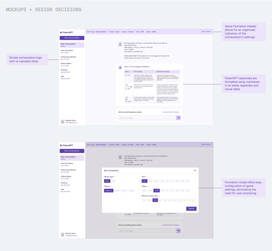
##### You already seemed like a strong designer before joining SVSD. What have you learned or experienced there that’s been surprising or indispensable?
I already had some experience coming into SVSD, but I was looking to become exceptional. And in that journey, I’ve learned and grown in ways I certainly didn’t expect to.
1. **Networking** \- a big challenge for me has always been building relationships and connections within the industry. I’m naturally introverted and an overthinking person, which makes it difficult to initiate conversations–especially with people I look up to. By challenging myself to put myself out there (with encouragement from SVSD) through cold outreach and posting my work online, I’ve had incredible conversations with some of my design heroes and received an unimaginable number of opportunities.
2. **Storytelling** \- I had never really understood the importance of storytelling in design until SVSD. Doing the work is one thing, but being able to talk about it with clarity and impact is a whole different skill. I can feel the difference it’s made in our internal SVSD crits, in my interviews, and in the way I approach conversations as a whole.
Naheel, who runs SVSD, has been such a wonderful mentor and has given me so much more than design skills to walk away with.
[Rachel’s Website](https://www.rachelchen.tech/?ref=everydayux.net).
##### What’s your favourite thing you’ve designed or built so far?
This may be a little corny, but [my portfolio](https://www.rachelchen.tech/?ref=everydayux.net). Out of all my projects, it’s the one that has gotten the most iterations, the most dedication, and is the one I am the most proud of—and is certainly the most “me.” I spent late nights tinkering with motion curves for the thumbnail animations, pushing deployment after deployment to resolve bugs, and exploring fun Easter eggs (currently RacheLLM, my AI sidebar).
My portfolio is still far from perfect, though, and I always welcome feedback!
##### What tools are in your design and tech stack right now?
I’ve always been a Figma fan and use Cursor daily! Recently, I’ve been exploring Midjourney for image generation and art direction, and Lottielab and Protopie for motion and prototyping.
##### Looking ahead, what are you dreaming about? Are there any products you’d love to design or build in the future?
I’m really excited about consumer AI and experimental AI products. I’m currently working with Amazon to explore new possibilities for Alexa+ and AI experiences, and hope to continue working on cool projects like this.
In the future, I’ll certainly be building my own startup—not sure what it’ll be yet!
👤
If you like articles like this, consider subscribing!
### The updates that defined this week in tools for designers
URL: https://www.everydayux.net/design-tool-updates-notebooklm-mobbin/
Last updated: 2025-11-18T19:48:01.000Z
Hey everyone. I’m trying something new this week and pulling together a quick roundup of notable updates across design and product tools. If it’s helpful, I’d love to hear from you or see a thumbs up.
There were a couple of big and exciting updates this week. The two standout launches came from [NotebookLM](https://notebooklm.google.com/?ref=everydayux.net) and [Mobbin](https://mobbin.com/?via=jess&ref=everydayux.net). NotebookLM’s deep research update is significant, turning Notebook into a true end-to-end research partner that can explore the web and synthesise findings, which you can easily query. Mobbin introduced animations, opening a new way to gather inspiration for an important, often overlooked part of the design process.
> Alongside these headline releases, several other platforms shipped thoughtful improvements. Here’s what stood out.

## NotebookLM deep research
NotebookLM has quickly become one of my favourite tools. For researching, analysing, and querying information, it’s hard to beat. It’s still AI, and it works best when paired with clear human direction, but the experience is genuinely impressive. Their latest update is a great addition to the core features.
Google [announced](https://x.com/NotebookLM/status/1989078069454270649?ref=everydayux.net) deep research for NotebookLM this week, a major step that turns the tool into an active research assistant. The feature can now search the web on your behalf, review many sources, and produce a structured, citation-backed report that drops directly into your notebook. From there, you can work with the material using the tools already in NotebookLM, including audio overviews, video overviews, study guides, and follow-up questions.
0:00
/0:34
1×
Google Notebook LM - Deep Research
This update brings research and analysis into one place. You no longer need to gather material elsewhere and then move it into NotebookLM; the entire process can now happen within a single workflow. Google also expanded file support in the same release, adding Google Sheets, Drive PDFs, Word documents, Drive URLs, and images, which makes it easier to build a complete research set. NotebookLM has been evolving into a more comprehensive research tool for a while, and this release takes it further.
Designers can use tools like Notebook LM to quickly gather domain knowledge and information, either by querying existing internal documents or by performing open-ended web searches, reducing the initial research time by up to half.
[Ways to bring your team closer to UX researchPractical ways to help your team connect with research, from quick synthesis activities to immersive techniques like gallery walks and research walls. Make insights something people can see, feel, and build on together.everyday uxJess Eddy](https://www.everydayux.net/ways-to-bring-your-team-closer-to-research/)

## Mobbin animations
Mobbin is another one of my favourite tools. It’s useful in so many parts of the design process. If you care about design inspiration, it’s the place to go. You can explore full user flows of beautiful mobile apps and Websites, and their latest update makes it an even stronger all-around resource for designers.
[Mobbin](https://mobbin.com/?via=jess&ref=everydayux.net) also [announced](https://mobbin.com/changelog/2025-11-12-introducing-animations/?via=jess&ref=everydayux.net) an important update this week: animations! 🥳 You can now see animations from popular apps so that you can have a peek into animations and micro-interactions. The release includes a few other updates; you can now set your auto-play preference for videos, and teams and enterprise customers can invite teammates with links or request access to their company workspace when their email domain matches.
0:00
/0:25
1×
Mobbin Animations
Mobbin is the most useful tool I’ve found for design inspiration, and it’s become a core part of many designers’ design process.
[Why every designer needs a design inspiration libraryA design inspiration library is a lifelong practice; one that helps you anchor new projects, spark original ideas, and refine the taste and discernment that define great designers.everyday uxJess Eddy](https://www.everydayux.net/design-inspiration-library/)
## Other product announcements
Several other tools also shipped thoughtful improvements that deepen their ecosystems and streamline common designer workflows. Here are the highlights across Builder.io, Penpot, Sketch, Spline, and Miro.
_This post is for subscribers only._
### Design, AI, and the question of originality: the Quartr visuals debate
URL: https://www.everydayux.net/quartr-posters-ai-design-originality/
Last updated: 2026-02-24T01:34:02.000Z
There’s been a bit of a kerfuffle around the new visuals Quartr dropped last week, and it’s a useful case study in how design, branding, generative AI, intent, and community reaction can align and clash.
[Quartr](https://quartr.com/?ref=everydayux.net), a financial research platform that shares earnings calls and investor materials, recently released a new set of visually striking visuals for major company earnings reports. The design community’s response has been largely positive, with many praising the fresh, attention-grabbing style, though some questioned whether the visuals feel original and fully aligned with the brand.
### Some people are applauding
The visuals were created by designer Haris ([@haris\_chc](https://x.com/haris%5Fchc/?ref=everydayux.net)) and brand strategist Oliver ೫ ([@Prof\_Kalkyl](https://x.com/Prof%5FKalkyl?ref=everydayux.net)). Their goal seems clear: turn dry earnings reports into something that garners attention and feels cinematic. Each visual takes a minimalist, high-end approach that makes company updates look more like gallery pieces or album covers than financial announcements.
> A lofty and interesting design challenge.
The series includes visuals for companies like Robinhood, Uber, Starbucks, McDonald’s, and Airbnb, each given the same refined, high-end treatment. The result is a series of visuals that blur the line between finance and culture, bold, sophisticated, and instantly shareable.
Designer Josh Puckett [described the visuals](https://x.com/joshpuckett/status/1986838139638587749?ref=everydayux.net) as proof of what he calls *uncommon taste and effort*. The two things that separate good work from great work. Each visual, he noted, takes a simple idea and turns it into something distinct: a clever concept, composed with care, that feels both familiar and new. Rather than relying on a single template, the creators explored each one individually, creating a collection that feels intentional and cohesive.
Not everyone saw it that way.
### Some people are criticising
The work wasn’t without criticism. [Many noticed a distinct “Midjourney vibe,”](https://x.com/ciguleva/status/1986535285103227122?ref=everydayux.net) and some were quick to point out that the visuals appeared to be made using the help of AI, a detail that, for a few, was a dealbreaker, though most didn’t seem to mind.
While no one from Quartr has explicitly said the visuals were made with AI, [a post from co-founder Oliver Hamrin](https://www.linkedin.com/posts/oliver-hamrin-6341a2202%5Ftesla-tuesday-on-quartr-poster-a-combination-activity-7320462333032464384-6b21/?ref=everydayux.net) about six months ago suggests they likely were. In it, he shared a Tesla-themed graphic and noted that it was created *“using a combination of ChatGPT 4o, Midjourney v7, and Figma.”*

One of the [sharpest critiques](https://x.com/michaelmiraflor/status/1986576660691628391?ref=everydayux.net) captured a broader sentiment in the design world:
> “Founders already doing Temu versions of the hot design thing.”
It’s a biting way to describe how brands can rush to mimic the latest visual trends without the depth, thinking, or originality behind them.
**For some, that’s what the Quartr visuals represent:** design that looks premium and polished, but borrows an aesthetic that feels disconnected from the brand’s voice and purpose.
The fact that designers questioned their authenticity without any proof says something, too. It suggests the visuals fall into the uncanny valley: hard to tell whether they were made by humans, AI, or a mix of both; a place where aesthetic trends and generative tools overlap just enough to make us question.
Many took issue with the visuals not aligning with the product’s brand or aesthetic. And while that’s a fair critique, there’s also another side to it: If a campaign grabs attention and sparks conversation, isn’t that part of what good marketing is meant to do?

Creative strategist, Michael J. Miraflor, offered a [more nuanced take](https://x.com/michaelmiraflor/status/1986803548848574519?ref=everydayux.net). The problem, they argued, isn’t that the visuals might have been made with AI.
> *“Slop isn’t defined as being AI. All AI isn’t slop. Slop is a lack of consideration, culture, context, taste, or point of view. You can tell when something’s just the easy way out.”*
Their point is that the issue runs deeper than tools. It’s about intention, distinction, and having a clear point of view. There’s always been derivative design, long before AI. The tools don’t make something good or bad; the thinking behind them does. When a design feels polished but hollow, or like it’s copying a vibe rather than creating one, it becomes what they call “premium mediocre:” visually impressive, but empty at its core.
They also cautioned against imitation. “The worst thing you can do is just copy this creative direction,” they wrote. *“Develop your own point of view, that’s the point.”* It’s a fair reminder that the Quartr debate isn’t just about AI or aesthetics. It’s about originality, discernment, and how easily visual trends can slip into creative shortcuts.
The design community’s enthusiasm even inspired others to experiment with the style. Creative [Tatiana Tsiguleva](https://x.com/ciguleva?ref=everydayux.net), and creative ambassador at Perplexity, [recreated a similar visual aesthetic](https://ciguleva.substack.com/p/it-could-be-visual-for-quartr-but) by blending SREF codes in Midjourney, writing, “I love the colors and compositions in their recent posts, so I decided to recreate the style in Midjourney. Let’s see what I got.”
I created a few visuals inspired by the debate, using Tatiana’s SREF codes, Quartr on Quartr, you could say, and, well, they turned out pretty good.



Visuals I created using SREF codes in Midjourney
Also, [brand designer Charlota noted](https://x.com/0xCharlota/status/1987139203420070125?ref=everydayux.net) that a startup recently commissioned her to create an entire AI-generated image library for their brand for $10k, the kind of brief that barely existed a year ago. Startups with limited budgets can now produce brand assets that once required large teams and timelines.

Personally, I think Michael’s perspective about having a point of view is right on. It’s something I’ve written about before with some [incredibly talented brand strategists](https://www.wearefamilystyle.com/?ref=everydayux.net): a strong point of view is what sets a company apart. It’s the difference between a company that has no point of view and one that stands for something.
[If everything can be copied, what makes a product unforgettable?A strong point of view goes beyond branding. It’s a perspective that shapes how a product communicates, the feelings it evokes, the language it uses, and the patterns it employs. We explore Discord, Oura, Todoist, and Figma to see how POV makes products unforgettable.everyday uxJess Eddy](https://www.everydayux.net/point-of-view-in-product-design/)
That said, I also think Quartr’s visuals did exactly what they were meant to do. They grabbed attention. They got people talking. And in that sense, the campaign succeeded; it raised awareness of Quartr through visuals that sparked curiosity, debate, and even controversy.
Maybe part of what’s fueling the debate isn’t how the visuals were made, but how good they are. We’ve seen plenty of AI-inspired work before, often easy to spot and dismiss because, frankly, it’s not that good. But these are different. They’re compelling. They show what’s possible when you combine generative tools with strong creative direction. And maybe that’s what really unsettles us. It’s not the tools themselves, but what they reveal: our fear of being left behind, replaced, or not good enough, and what that means for our sense of identity.
**Looking at them together, it’s easy to see why opinions were split.**
Some of the visuals have that unmistakable “Midjourney feel.” The hyperreal lighting, the textures, the slightly uncanny polish. But others show real creative thinking, turning a simple idea into something tactile, witty, and human.
As a group, they actually hold up well. There’s a clear consistency in tone, style, and curiosity, with a high-end polish that ties them together and makes them feel like a family; a thoughtful, cohesive series that compellingly reframes corporate companies. The blend of AI-inflected surrealism and more grounded visual ideas gives the collection both range and personality. The real question now is where they go from here. Will they keep leaning into borrowed aesthetics, or will they evolve toward a visual identity that feels distinctly their own?
Whether you loved or disliked the visuals, the conversation they sparked reveals something important: we’re still collectively figuring out what originality means in an era where tools make it easier than ever to create. The real opportunity for designers is using these tools with intention while keeping originality top of mind.
## What do you think?
### Paper: A vision for the future of digital design built around creative freedom
URL: https://www.everydayux.net/paper-code-native-design-tool/
Last updated: 2025-11-04T14:00:11.000Z
[Paper](https://paper.design/?ref=everydayux.net) is a new design tool built on a fluid, code-native canvas that aims to give designers a true creative playground. A place to experiment, explore, and create without the usual constraints of rigid systems. Its vision is to bring advanced creative tools into a single space, combining the expressive depth and functionality of apps like Photoshop and Illustrator with the immediacy of a web-based canvas. That means pixel editing, filters, support for modern color spaces like P3 gamut, and even animated shaders, all designed to help designers create cohesive, distinctive visual worlds.
💡
****Background**
Paper was founded by Stephen Haney in 2024, following his experience with [Modulz](https://modulz.app/?ref=everydayux.net), the company behind [Radix UI](https://www.radix-ui.com/?ref=everydayux.net). Drawing on lessons from that work, he set out to build a tool that brings creativity back to the center of digital design. Vlad Moroz joined a few months later as the founding designer, and the team has since been gradually onboarding designers, with more than 40,000 signed up for early access as the product continues to evolve toward its broader vision.

Paper Founder, Stephen Haney
Earlier this year, Paper [raised a $4.2M seed round led by Accel](https://paper.design/blog/seed?ref=everydayux.net) and opened its [public alpha](https://paper.design/?ref=everydayux.net), inviting designers to try it and help shape its evolution. While the product today is still lean, the core foundation is already visible, and the team is iterating quickly based on community feedback.
**So what can you actually do with Paper right now?** In addition to fundamental layout and design tools like text, color, shapes, and frames, Paper’s standout feature is its code-native foundation. Everything you design runs on real React and Tailwind code, which means designers can copy elements—from layouts to animated shaders—as production-ready components. The app also includes support for animated shaders, AI image generation, background removal, and one-click color palette extraction, making it surprisingly capable in some areas for a product still in its early stages.
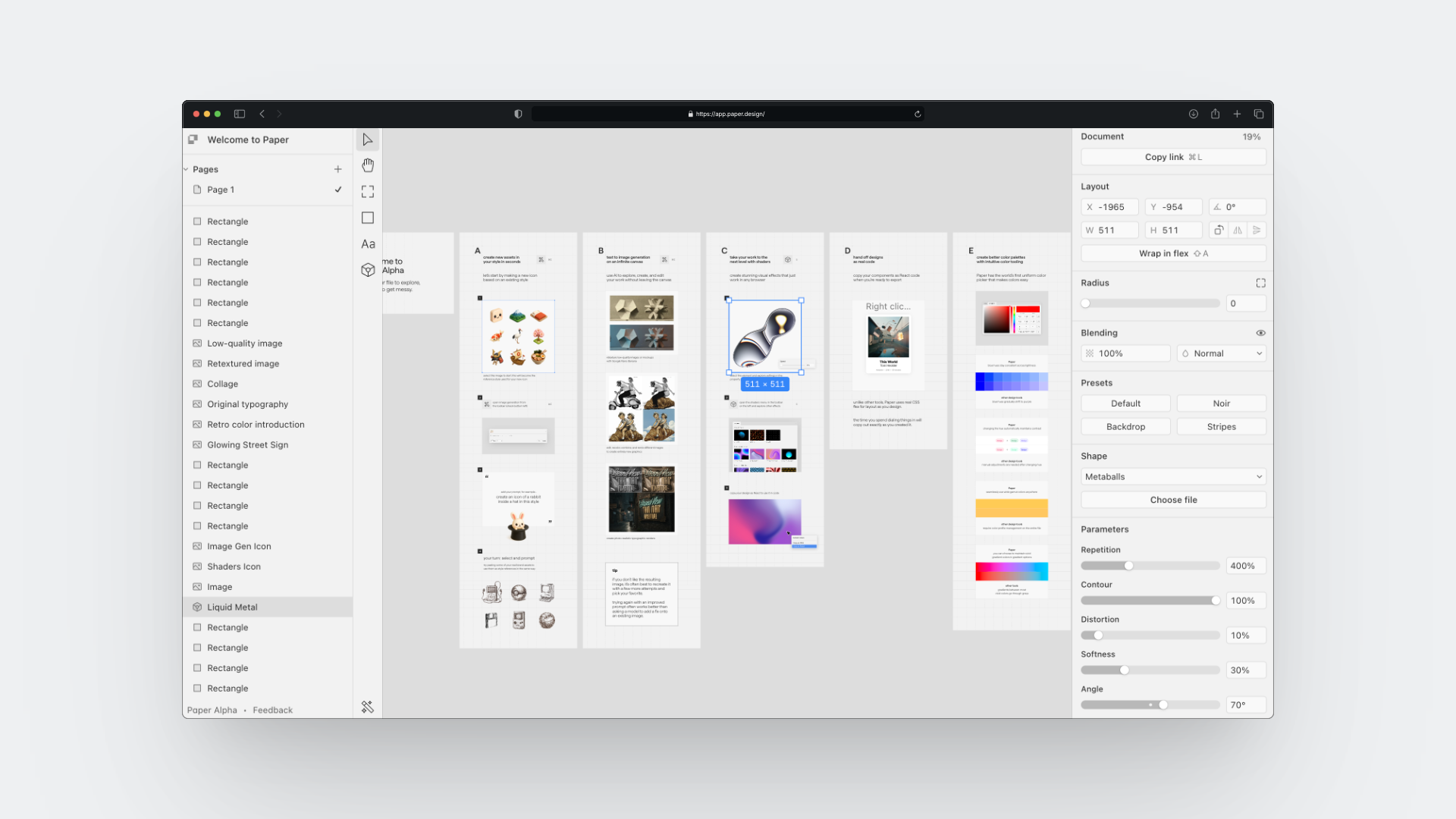
Paper app
##### Jess: From what I’ve seen, Paper focuses on the ideation layer of the design process. Why do you think this phase is undervalued in current tools?
**Stephen:** Right now, I see design entering a phase of creative expansion. We’ve been through the “flat” era, where there was consolidation into the same systems and the same look. A lot of today’s tools were built with this in mind.
And now I’m hearing from the design community and companies a desire to stand out. The world’s appetite for great software is only increasing, and AI is helping companies ship faster. But is the quality there? Design is the differentiator that helps companies stand out. Great taste is forever durable. And we need tools that help creatives maintain a high-quality bar across multiple forms (vector graphics, code, animation) to keep up with AI-powered engineering teams.

@fuma\_nama on [X](https://x.com/fuma%5Fnama/status/1965788219636908228?ref=everydayux.net)
##### Jess: In the long term, what kind of designers do you see using Paper most, brand, product, or any creative who wants to explore ideas more freely?
**Stephen:** We are making a Swiss Army knife of useful tools for anyone designing or building software. We are seeing product designers ship quickly, like million.dev’s new [Ami](https://www.ami.dev/?ref=everydayux.net) project, which was made in Paper and used “Copy as React” to ship fast. And we’re also seeing brand designers like [Blesson](https://x.com/BlessCreatics/status/1980174424851513625?ref=everydayux.net) use shaders to create unique worlds and visual language.
@Blesson on [X](https://x.com/BlessCreatics/status/1980174424851513625?ref=everydayux.net)
##### Jess: How do you see the balance between creative freedom and systemization evolving over the next few years?
**Stephen:** It’s so important to be able to design with creative freedom and without the constraints of code or browsers. You need to try three things and quickly explore the problem space. In that sense, a better design tool is faster and more expressive. And that need isn’t going away.
On the flip side, everyone feels that our existing tools aren’t “bridging the gap” very well, hand-off is still pretty broken, and people spend a lot of time making things perfect in their design tool with effort that never makes it to their users.
So that’s a tough problem to solve, both of those things at once. But it’s one of our core goals to build an expressive, free design tool that “speaks designer” and also translates 1:1 to code as often as possible. And that should make hand-off easier and preserve more details from the design phase.
@paper on [X](https://x.com/paper/status/1973497363093397819?ref=everydayux.net)
##### Jess: Paper brings together advanced creative tools like shaders and pixel editing. How did you decide which capabilities to include from day one?
**Stephen:** I try to speak with a designer every day. I think of myself as a “problem collector.” I want to hear where today’s workflows break down so we can fix them.
I was on a call when a designer showed me a still frame from an animated AI loading orb they made in Figma. They were planning to give this picture to their front-end developer and hoped that they knew how to make it real. It was clearly a broken process. So that moment created the idea for Paper Shaders, and the goal to give designers the power to perfectly dial in animated effects that can copy out and ship exactly as they designed.
Paper shaders by [@uuuuuulala](https://x.com/uuuuuulala?ref=everydayux.net)
##### Jess: How do you imagine designers using Paper alongside Figma in their workflow?
**Stephen:** Design tools famously take a long time to build. I hear numbers like 5 years for Figma, 10 years for Framer. We’re about a year in, and our approach is to build where the existing tools will need to catch up. And at the same time, balancing the table stakes features.
So, already there are incredible shaders, high-quality AI image editing, better color controls, and many things in Paper that you can only do in Paper. Another example is ***“Copy as React”*** and the Tailwind integration. And over time, we’ll build the table stakes too, like a world-class pen tool. For instance, this week we’re shipping “selection colors” to easily edit colors within a selection, and “ignore flex layout” to absolutely position items within “auto layout.”
So over time, you’ll see designers complete more of their daily workflows end-to-end in Paper and gain the unique powers it offers.
##### Jess: What kinds of tasks do you see AI being genuinely helpful with, and where do you think it risks stepping into the creative role of the designer?
**Stephen:** I am a huge believer that humans will remain the primary decision-makers for the foreseeable future. Design is about way more than the pixels; it’s stakeholder management, collaboration, aligning the team, and setting a quality bar. AI isn’t a fit for these jobs.
I do think AI will let individual designers do more work at once. I hear from designers that engineering speed has increased, and it’s harder to support a big team of engineers. Engineering used to be the bottleneck, and that’s not always true anymore.
So we’re focusing on using AI to speed up boilerplate work rather than AI as the designer. For instance, if you need to localize a design into three regions, that’s a perfect job for an LLM. And we can make a canvas-aware chat agent that can see your design file, create new artboards, copy the content over, and translate it. Or maybe you want to refactor your design tokens using a prompt rather than manually going through them one by one. So we will be focusing on these time-saving AI helpers first. It’s a helper that the human is steering.
@agusegui on [X](https://x.com/agusegui/status/1981401851611291938?ref=everydayux.net)
##### Jess: You’ve been onboarding users one by one. What have you learned from those early conversations that most surprised you?
**Stephen:** There’s so much hunger for new tools, new creative possibilities. I think designers are using way more tools than they were 5 years ago. I see a lot of jumping between tools, stitching together workflows, and trying to figure out how to use AI tools together with traditional tooling like Figma. It’s exciting to give designers new options to do their best work, and we have been grateful for all the interest and support so far.
@paper on [Twitter](https://x.com/paper/status/1973496823743705433?ref=everydayux.net)
##### Jess: You’ve talked about design and engineering as “separate but equally valid” roles. How do you see that relationship evolving as AI continues to advance?
**Stephen:** Today, a lot of information is lost in the “hand-off.” One of my hopes for AI is that it can help take information from the design phase and make it more directly usable for engineers.
For instance, Paper's "Copy as React" feature exports the exact 1:1 code that the designer was looking at when they made the design. And AI can easily translate that designed code into the specific context for your production codebase while preserving tiny visual details. That’s a pretty big jump forward from yesterday’s workflows, which involved manually translating design files into code. Not only is it faster and easier, but more of the designer’s intent reaches the end user.
### Why the smartest designers move between high and low fidelity
URL: https://www.everydayux.net/blending-high-and-low-fidelity-in-design/
Last updated: 2025-10-29T00:42:00.000Z
Designers sometimes find themselves in a surprisingly useful niche, where they need to ***defidelity*** a design, taking a high-fidelity screen and converting it into a low-fidelity, or skeleton, state. What might seem like a step backward is often a way to see the work more clearly and guide the conversation.
Moving between or mixing high and low fidelity is about communication. Adjusting fidelity helps you focus attention, clarify intent, and shape the kind of feedback you get. Sometimes you simplify to spotlight what matters most, and other times you add detail to draw focus to a particular change or idea.
And while rebuilding screens from scratch used to be tedious, several Figma plugins, which I cover in this article, now make it easy to convert high-fidelity designs into low-fidelity versions automatically. What was once a niche workflow has become a practical tool for the design process.
### Refocusing attention on what matters
Low-fidelity visuals help communicate high-level concepts, overall ideas, and UX principles without the risk of people getting lost in UI details, keeping conversations focused on strategy and experience rather than aesthetics.
> *The feedback you get correlates with the fidelity you present to the audience.*
The most compelling reason to lower fidelity is to refocus on function and user experience. When you present high-fidelity designs, people naturally react to details, color, typography, spacing, and iconography. Those details matter, but early in the process they can overshadow conversations about structure, flow, and purpose. Getting too pixel-perfect too soon can make it harder to see opportunities to strengthen the underlying UX approach.
Converting high-fidelity designs to low-fidelity—with clear intent and purpose—removes visual distractions and refocuses the conversation, making feedback more specific and actionable. Stakeholders are more likely to engage with how the design works: whether the flow feels natural, the hierarchy makes sense, and the overall structure supports the goal. A simpler presentation keeps discussion centered on usability and clarity rather than visual detail.
**This approach also connects to a broader, more strategic use case.**
> A colleague recently described using defidelity not just for critique, but to communicate high-level ideas and UX principles within an existing product. By turning detailed Figma mocks into simplified “illustrations,” they could demonstrate feature opportunities, show where users encounter certain interactions, and focus the conversation on principles rather than pixels. It’s a smart way to turn existing design work into teaching material that helps teams see the bigger picture.
This idea gets to the heart of the topic and reveals an important nuance: when used intentionally, moving from high to low fidelity turns fidelity itself into a communication tool.
Designers can use a **blended approach**, combining high and low fidelity to focus attention on different aspects of the UI, communicate more clearly, and shape the kind of conversation and feedback they want to invite.
## Blending fidelity
Presenting a hybrid design, where some parts are low-fidelity and others are high-fidelity, can be a powerful way to communicate in UX and product design. It helps you guide attention intentionally, keeping the discussion grounded in concept and structure while providing enough detail for validation and clarity.
Mixed-fidelity designs help you control where feedback lands. By intentionally keeping some areas low-fidelity, using simplified wireframes or grey boxes, you signal that those parts are still being explored and open to structural feedback. The higher-fidelity sections, on the other hand, make it clear which components are more resolved and ready for detailed or visual critique.
### Example: high-fidelity inside low-fidelity
Adding selective high-fidelity details to a low-fidelity design helps you steer focus and make discussions more intentional. To illustrate, let’s say you’re working on a coffee map app and integrating photos from Google Maps for the first time. You want to show the team where those images might appear and how they affect the browsing experience.
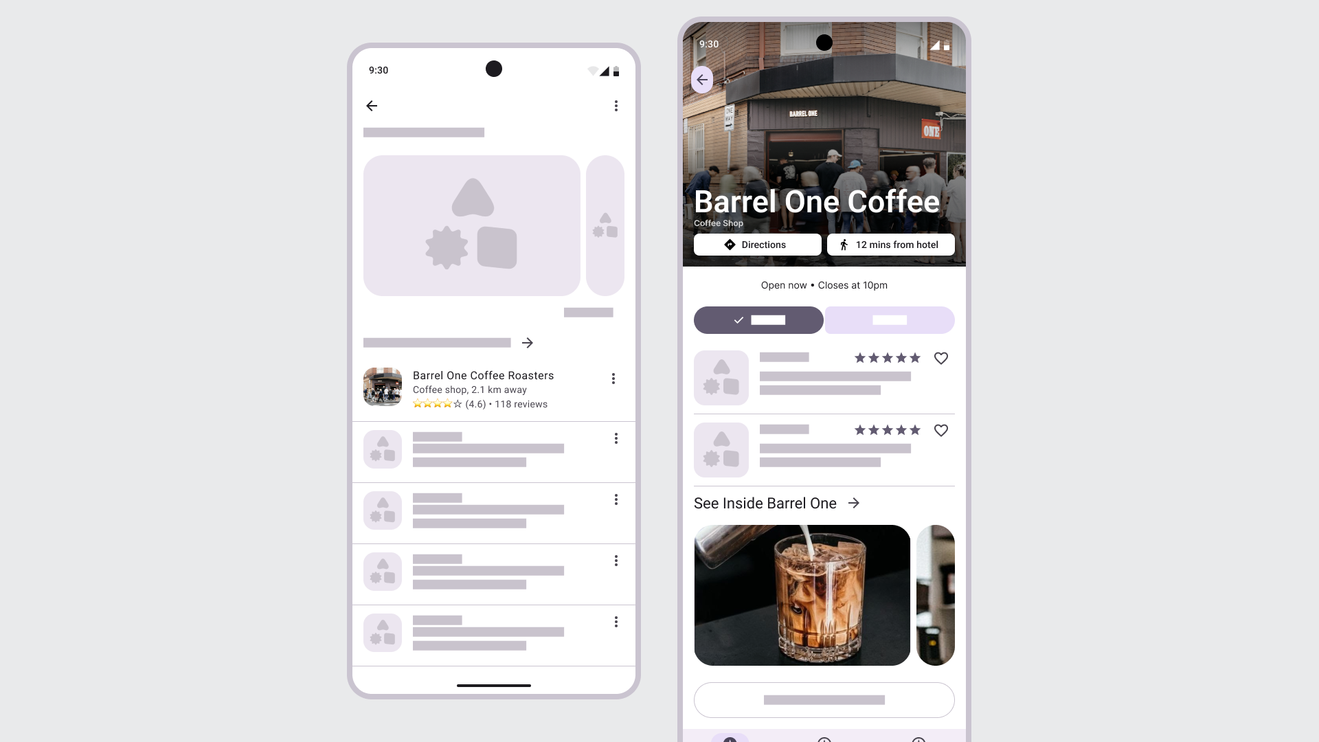
By keeping most of the layout low-fidelity, you draw attention to the role of imagery itself—how it conveys the brand and shapes how people move through an experience. This use of blending fidelities helps you steer attention so the team can focus on integrating visual content thoughtfully and, in turn, shaping a more meaningful conversation and feedback loop around its impact.
***Use high-fidelity inside low-fidelity when you want to:***
- Highlight and focus on a new element or change while cutting out distractions.
- Show how imagery, motion, or data affects the experience.
- Clarify hierarchy, focus, or visual weight in context.
---
### Example: low-fidelity inside high-fidelity
Sometimes you want to combine low-fidelity elements, into an existing UI or design. This approach is useful when you want to show an early idea inside an existing, mature interface without suggesting it’s final.
In this example, most of the settings page remains in high-fidelity, while the new banner and announcement area are shown in low-fidelity. This contrast makes it clear where the new elements would appear and what they’re meant to convey. It signals that the idea is still being explored and focuses attention on the addition itself rather than the surrounding UI. It’s a quick, effective way to discuss placement, tone, and intent without suggesting the design is final.
A high-fidelity design with low-fidelity elements to communicate how we might integrate new design elements.
This approach is especially useful when producing multiple examples quickly for team, strategic or leadership discussions. By showing only the parts that might change, you can move faster, communicate intent clearly, and focus the conversation on the decision that matters, the *why* behind the addition, without spending time polishing every screen.
***Use low-fidelity inside high-fidelity when you want to:***
- Keep unfinished areas abstract to show they’re still in progress.
- Gather feedback on structure and flow without visual distractions.
- Test ideas or interactions before investing in polish.
- Signal that the design is still open to change.
---
## The purpose of low-fidelity designs in the design process
Low-fidelity designs help designers work faster in the early stages of the design process, and they help teams think clearly and collaborate. They strip away polish so everyone can focus on what matters: the idea, structure, flow, and intent behind an experience.
> High-fidelity designs can create a false sense of completion.
When a design looks polished, people assume it’s close to done. That perception can make it harder to have open, broader conversations. Converting a high-fidelity screen to a low-fidelity one reopens the space for reflection. It signals that the work is still flexible and that feedback is welcome on the fundamentals, not just the finish.
###### Guide the conversation
Lw-fidelity helps guide the conversation to where you want the focus to be. The fidelity you present shapes the kind of feedback you’ll get. Rougher visuals tend to surface bigger, structural questions (“Does this flow make sense?”), while more detailed mockups invite tactical or aesthetic critique (“Does this color feel right?”).
###### Reduce cognitive load
Keeping things intentionally low-fidelity can also reduce cognitive load for stakeholders. Without the distraction of color, type, or brand detail, it’s easier for people to follow the logic of a user flow or grasp what’s being tested.
###### Move fast!
Finally, low-fidelity helps teams move faster. When visuals are quick to change or discard, it’s faster and safer to explore. People are more open to trying new directions or challenging assumptions when the design is not final. This flexibility is especially valuable early in the process or when revisiting existing features, times when stepping back can reveal what the team may have overlooked.
> Used this way, low-fidelity isn’t a step backward. It’s a deliberate pause that helps clarify structure, spark honest discussion, and keep the design process adaptive and grounded.
👤
If you like articles like this, consider subscribing!
## Figma plugins for converting high-fidelity designs to low-fidelity wireframes
After exploring when and why it helps to move between high-and low-fidelity, I wanted to see how well current plugins actually support that shift in practice. I tested a handful of Figma plugins that promise to convert high-fidelity screens into simplified, low-fidelity wireframes in seconds. Here’s how they performed, what worked well, and where they needed a little extra fine-tuning.
### Skeleton Craft
Skeleton Craft quickly converts your Figma designs into simplified skeleton screens. It supports text, images, strokes, and inputs, letting you strip back detail while keeping layout and rhythm intact. It’s great for simulating loading states, creating minimal graphics for marketing or documentation, or showing structure without visual noise.
This was the first plugin I tried, and it worked pretty well. I had to make a few adjustments, but it was quick, and that’s to be expected. Once you reduce the design to two or three colors, it’s easy to adjust the entire UI. Skeleton Craft also offers a seven-day free trial.
[View Figma plugin](https://www.figma.com/community/plugin/1468695523811733262/skeleton-craft-effortless-skeleton-screens-for-loading-and-simplified-ui?ref=everydayux.net)
Image: a side-by-side view showing a high-fidelity dashboard (left) and its low-fidelity skeleton version (right) created with Skeleton Craft.
### Higherframer
Higherframer lets you turn polished designs into clean wireframes with a single click. It’s designed for moments when you want to show structure, not style—whether you’re presenting a concept at a high level or reworking an existing feature from a fresh perspective. The plugin offers useful controls for preserving text, colors, or images, giving you flexibility over the level of fidelity to retain.
This conversion was a little smoother, and I didn’t have to adjust as much, but even when I do, it doesn’t take long. The result is a quick, tidy wireframe that looks intentional rather than stripped down, making it an efficient tool for reframing or simplifying high-fidelity designs for review. This plugin appears to be free.
[View Figma plugin](https://www.figma.com/community/plugin/1251657512550963365/higherframer?ref=everydayux.net)
Left: original high-fidelity dashboard design. Right: wireframe version created with Higherframer, preserving text and color while simplifying structure.
### Lo-Fier
Lo-Fier transforms polished Figma designs into clean, low-fidelity wireframes with a single click. It’s built for fast iteration and early-stage feedback, converting text into simple rectangles and replacing images with neutral backgrounds or your choice of colors. You can tweak corner radii, adjust color palettes, and decide how much structure or abstraction you want to show.
Lo-Fier also worked well and might be my favorite. The out-of-the-box greyscale conversions are excellent, producing a balanced, minimal look right away. It also offers flexible options for color matching and image preservation, making the outputs more interesting and adaptable. This plugin has a two-conversions-per-day trial limit.
[View Figma plugin](https://www.figma.com/community/plugin/1415655392005856315/lo-fier-convert-to-wireframe?ref=everydayux.net)
Left, Lo-Fier greyscale conversion with simplified tones. Right, Lo-Fier output preserving color and images, demonstrating flexibility in maintaining visual context.
### Wirebox
Wirebox stands out for its playful, boxy outline aesthetic. It gives your designs a distinct wireframe look with just one click. The default conversion color is an intense hot pink (which definitely gets attention), but I switched mine to blue for readability. I’m showing two versions here: one using only strokes, and another with partial fills for better contrast.
This was one of the more interesting plugins I tried, fun to use, and surprisingly fast once you tweak the colors. I did have to make some small adjustments to improve legibility, but the results were worth it. While the style may not be the most communicative for every use case, it’s a great option when you want to lighten the tone of a presentation or visually separate UX exploration from polished design work.
[View Figma plugin](https://www.figma.com/community/plugin/764471577604277919/wire-box?ref=everydayux.net)
Left, Wirebox with stroke-only output. Right, Wirebox with selective fills for improved readability.
### Building your own wireframes from scratch
If you’d rather create low-fidelity wireframes manually, there are some great resources you can find in the [Figma Community](https://www.everydayux.net/find-the-winning-idea-with-any-constraints/). Google’s [**Material 3 Kit**](https://m3.material.io/?ref=everydayux.net) ([Figma kit](https://www.figma.com/community/file/1035203688168086460?ref=everydayux.net)) is surprisingly effective. It’s structured, accessible, and flexible enough to adapt for quick concepting.
Typography can also help set the right tone for low-fidelity work. These fonts are designed to blend in with a wireframe-style vibe.
- [**Sriracha**](https://fonts.google.com/specimen/Sriracha?ref=everydayux.net): a Thai + Latin handwriting typeface with an informal, loopless feel and sans-serif balance. It adds warmth and personality while staying clear and readable. Designed by *Cadson Demak*, Thailand’s pioneering communication design studio.
- [**Redacted**](https://fonts.google.com/specimen/Redacted?ref=everydayux.net): intentionally unreadable fonts for wireframing and prototyping. They replace dummy text with blurred or scribbled shapes, keeping the audience focused on structure rather than content. Designed by *Christian Naths*.
- [**Protest Riot**](https://fonts.google.com/specimen/Protest+Riot?ref=everydayux.net): a creative type family by *Octavio Pardo*, inspired by the energy and imperfection of protest signs. The styles, Strike, Guerrilla, and Riot, share identical spacing, allowing you to vary tone and intensity without breaking layout.
Whether you start from a design system or assemble your own kit of visual building blocks, using consistent styles and wireframe-friendly fonts keeps your explorations fast, expressive, and focused on what really matters: the experience.
👤
If you like articles like this, consider subscribing!
In the end, fidelity isn’t just about aesthetics or polish; it’s a tool for shaping conversations whether you’re stripping things back to explore structure or layering in detail to highlight intent, the level of fidelity you choose signals what kind of dialogue you want to have.
As tools make it easier to move between high- and low-fidelity, the real opportunity is learning when to do so and why. A well-timed reduction can clarify thinking, accelerate collaboration, and remind everyone that design is as much about exploration as it is about refinement.
### How to look for the winning idea in any set of constraints
URL: https://www.everydayux.net/find-the-winning-idea-with-any-constraints/
Last updated: 2025-10-21T14:00:42.000Z
### As designers, we’re always working within constraints.
Sometimes they’re practical, time, scope, or feasibility. Other times, they’re strategic or political; a top-down directive, an executive preference, or an inherited idea that doesn’t feel quite right.
When that happens, the question isn’t whether the idea is perfect. It’s how to make something *workable* within the situation you’re in. The goal is to identify the version of the idea that can succeed, given the constraints, rather than waiting for ideal conditions that never come or building an idea you know won’t work.
**This skill is one of the most underrated design skills:** the ability to stay creative *inside* the box. It requires holding two truths at once: seeing what’s wrong with an idea while still believing there’s a way to make it work. This tension is where great ideas can emerge from intentional design thinking.
Psychologically, this kind of thinking connects to a few well-studied approaches:
**Reframing**
- *Changing the way a problem is defined so new paths emerge.*
**Constraint-driven creativity**
- *Using limits as triggers for innovation instead of obstacles.*
**Lateral thinking**
- *Finding sideways moves when the direct route is blocked.*
Instead of rejecting constraints, we can *engage* with them and look for the openings they create. The paths that don’t yet exist but may work. Sometimes we can reshape the original idea, while other times it leads to something entirely different but more grounded and real.
We can find the winning idea within a set of constraints by ***calibrating*** and homing in on what **resonates**; sensing *what’s possible*, and *what’s necessary*. It’s how great designers turn imperfect conditions into something surprisingly good.
---
### The bricolage mindset
The ability to find a winning idea, especially when faced with constraints or a flawed existing solution, is at the heart of an entrepreneurial strategy known as **bricolage.** In innovation research, bricolage describes how people create progress in resource-scarce or highly constrained environments.
Instead of waiting for perfect tools or timing, you start with what’s already here. You gather what exists, half-formed ideas, old prototypes, even things that didn’t work, and use them as raw material for new ideas. Design becomes less about invention and more about transformation.
#### Embracing the bricolage mindset
**At its core, bricolage requires an adaptive, resourceful mindset.**
**Refuse to be constrained**
- *Bricoleurs* resist being limited by their environment. They push past obstacles by reframing them as prompts rather than barriers.
**Shift from need to availability**
- Instead of asking, *“What do I need?”* we ask, *“What do I already have?”* This shift, from seeking new inputs to re-seeing existing ones, is what makes progress possible even in constrained conditions.
**Retrospective assessment**
- The process often starts by looking back at what’s already on hand: past explorations, unused assets, existing patterns, or even half-finished concepts. By revisiting and re-examining these, we start to see new possibilities emerge.
#### Using bricolage processes to find a winning idea
**The practical side of bricolage lies in how those available resources are recombined, tested, and shared.**
**Recombination of resources**
- The bricoleur makes do by combining existing resources for new purposes. What’s ordinary in one context becomes novel in another.
**Improvisation and experimentation**
- Design and execution often happen simultaneously, an iterative, improvisational process where ideas evolve through doing.
**Leveraging networks**
- While early studies focused on individuals, more recent research highlights network bricolage, where alliances and existing relationships become extensions of one’s resource pool.
#### Working with a flawed or inherited idea
**Bricolage is especially powerful when the initial idea is weak or externally imposed. Instead of discarding it, the bricoleur treats its components as raw materials for recombination.**
**Ideational bricolage**
- This involves reusing and reshaping old ideas into new ones, turning a “bad” idea into the basis for a better one.
**Organizational bricolage**
- In larger systems, this might mean rearranging existing structures, workflows, or roles to create something new, building on what already exists rather than starting over.
**Innovation as outcome**
- Whether applied to products, services, or business models, bricolage consistently turns imperfect inputs into surprisingly effective results.
To put bricolage in perspective, it helps to compare it with two other ways people create under uncertainty: causation, which starts from a fixed goal and plans backwards, and effectuation, which begins from available means and evolves forward. Together, they reveal different ways of finding progress when conditions are unclear.
| Feature | Bricolage | Causation | Effectuation |
| ------------------- | ------------------------------------------------------------- | ----------------------------------------------- | ---------------------------------------------------------- |
| **Starting point** | Existing resources (often constrained) | A defined outcome or goal | Available means and resources |
| **Strategy** | Recombine what’s at hand to reach a goal | Choose means to achieve a fixed outcome | Choose among possible outcomes achievable with given means |
| **Decision-making** | Refuses to be constrained; thrives in limited environments | Exploits opportunities in stable, known markets | Explores opportunities in uncertain or emerging markets |
| **Opportunity** | Creates and transforms markets through resource recombination | Assumes opportunities already exist | Creates new markets through flexible adaptation |
### Bricolage and entrepreneurial thinking
At its core, entrepreneurial thinking is about creating value under uncertainty, finding ways forward when resources are limited, conditions are unclear, or traditional paths don’t apply.
> **Bricolage** is one expression of that mindset.
It’s the mechanics of entrepreneurial thinking in action: instead of waiting for ideal conditions, the bricoleur acts, experiments, and recombines what already exists to create something new.
In entrepreneurship research (notably by Baker and Nelson, 2005), bricolage is recognized as a strategy for innovation in resource-constrained environments. Success often comes from reframing constraints as opportunities, making do with what’s at hand, combining existing resources in new ways, and iterating through action.
In this sense, bricolage is **entrepreneurial creativity under constraint**, a way of thinking that thrives in ambiguity, helps you adapt quickly, and generates momentum in scenarios of scarcity rather than focusing on limitations.
If you zoom out, entrepreneurial thinking is the broader philosophy; bricolage is the practical, creative method it often takes.
### Practicing constraint-driven creativity
**Bricolage is a mindset you can practice.** When you’re navigating constraints, a murky direction, or inherited ideas, the challenge isn’t just finding a way forward; it’s keeping your thinking open enough to see one.
**Here are two tools you can use to get started:** a *set of beliefs* and a *set of reframing prompts*. These are mental anchors and questions you can use when you feel stuck on a project or when it feels overdetermined. Use them to shift your focus from what’s missing to what’s possible, and to uncover the opportunities that constraints quietly create.
🔒
****For members only, please login or subscribe.**
_This post is for subscribers only._
### The three non-negotiable tenets of great design work
URL: https://www.everydayux.net/three-tenets-of-the-creative-process/
Last updated: 2025-10-14T14:00:23.000Z
Whether we realize it or not, we all have creative processes that help shape our ideas. They show up in small, often unnoticed moments, like taking the time to write a thoughtful Slack message, and in more intentional acts, like planning and running a workshop. Everyone does this, regardless of whether they see themselves as “creative.” Yet we tend to reserve that label for designers, artists, and musicians, even though creativity runs through all of us.
Creative processes are for everyone, from the financial analyst designing a budgeting and forecasting model, to the HR specialist creating a more engaging onboarding experience, to the research scientist developing a new way to test a hypothesis.
> Creativity isn’t about who we are, but about the outcome we’re trying to achieve and the process we use to get there.
We run into problems when we see creativity as a solo pursuit or fail to recognize our work as a creative act. Creativity is deeply personal, but it isn’t meant to be solitary. When we make it solely about ourselves, we lose the perspective and energy that come from others, the very things that make our ideas stronger. When we don’t see our work as creative, we often skip the very steps that make creativity possible.
> *No matter who we are or what we do, we can all ask ourselves, *“What’s the best outcome I can create?”**
**Each of us defines our own creative process, but three non-negotiable principles apply to everyone:** exploring ideas, getting feedback, and iterating. These steps fuel creativity by first giving us space to explore possibilities, then inviting others into the process, and finally refining our ideas as many times as needed to reach the best outcome.

## The three most important tenets
### 1 / Diverge on ideas
One of the most important principles is diverging on ideas. Divergent thinking creates space for exploration without the pressure to land on the perfect solution right away. Taking time to consider a wide range of possibilities helps ensure we don’t overlook the idea worth building on.
Diverging on ideas means exploring different solutions and developing them enough for both ourselves and others to understand. It’s a creative process in itself, and ideally, an enjoyable one. Approaching it with a sense of play allows imagination to run free and invites unexpected possibilities. Feasibility and practicality can come later. When we confine ourselves to obvious answers or narrow constraints too soon, we lose the opportunity to think expansively and uncover truly original ideas.
In the workplace, our colleagues often judge us by the quality of our work. That can make us overly focused on how our ideas are perceived, spending too much time polishing an early concept when a simple outline would do. But if we can let go of the need for perfection and focus on generating multiple ideas, we open up far more possibilities and spend our energy where it matters most.
> At this stage, what counts isn’t how polished the idea looks, but how wide we allow our thinking to go.
**At first, it’s easy to get attached to one idea and overlook other possibilities.**
But it’s important to pause and think broadly, exploring different directions before settling on a path. Considering multiple options helps us make better decisions about which ideas to develop further. Investing in the wrong one can be costly, so it’s worth taking the time to find the right approach to build on rather than rushing to a quick answer. In the end, what we’re really looking for is a strong foundation to grow from.
💡
****Actionable tips**
Start by reflecting on your own creative process. Do you make space for divergent thinking? If not, try widening your perspective. When exploring ideas, keep asking yourself, “What if?” This simple question helps you imagine alternative scenarios and consider options you might otherwise overlook. Break down complex problems into smaller, more manageable parts, and tackle each one separately. Try using a timer to set clear boundaries for your idea sessions. A bit of time pressure can be a surprisingly effective creative constraint.
### 2 / Seek feedback
Seeking feedback is essential to developing our ideas. No matter how self-aware we try to be, our biases and emotions can cloud our judgment. Feedback brings in perspectives we might not have seen on our own. The more ideas we share, the more feedback we invite, leading to richer discussions and more interesting directions. This process helps us uncover blind spots, spot potential issues, and generate stronger ideas. Staying open to constructive criticism, and allowing ourselves to be a little vulnerable, is key.
> The aim isn’t a perfect, final answer but continuous improvement.
Asking for feedback can be difficult because it means being open to criticism and allowing ourselves to be vulnerable. With practice, though, we can build confidence and start to see feedback as a tool that helps us reach better outcomes. To truly embrace it, we need a safe space to share ideas without fear of judgment. Creating that space is a shared responsibility between individuals, teams, and the broader organization.
As you evaluate feedback, you’ll begin to notice patterns and find insights that strengthen your creative process. Feedback naturally leads into the next principle, iteration. As you gather feedback, you’ll spot opportunities to improve, generate new ideas, and refine or rule out others.
💡
****Actionable tips**
Begin by asking people you trust for their input, then gradually widen the circle of people you seek feedback from. Ask open-ended questions and use “why” to encourage deeper thinking and uncover underlying issues. Stay open to constructive criticism, as it often reveals insights you might not see yourself. Think of feedback as a gift that helps you grow and improve.

### 3 / Relentlessly iterate on ideas
As we move to the third principle, we can see how all three work together. We start by gathering feedback from a wide range of sources, then refine and build on our ideas using what we’ve learned. During this stage, it’s important to thoughtfully evaluate all feedback and decide how best to apply it.
Iterating on our ideas gives us the chance to refine and strengthen them. Through this process, we can improve our work, uncover better directions, and raise the overall quality of what we create.
This process isn’t strictly linear, and it’s up to us to decide how many rounds of iteration and feedback are needed. It’s more of a continuous loop that continues until the work feels like it’s there, or has gone as far as it can go.
Iteration is an inherently human process. It’s normal to feel overwhelmed by feedback, even when it’s helping. Breaking it down and visualizing each step can make it easier to manage and stay focused on progress.
Taking clear notes and grouping similar pieces of feedback can make the process easier to manage. Remember that feedback is input for your consideration, it’s up to you to decide what to take on and how to use it.
Knowing when to stop iterating takes practice. With time, you’ll develop a sense of when an idea has matured and has reached its peak. Until then, one helpful concept to keep in mind is the law of diminishing returns. Notice the scale of improvement with each round. If the changes start to feel small or incremental, the idea has likely reached its potential, and further tweaks may not add much value.
💡
****Actionable tips**
When refining your ideas, save different versions so you can compare and discuss them with others. Bring your ideas to life by creating mockups or working prototypes. The more tangible your concept, the more useful the feedback will be. Keep every iteration, if you’re a designer, hold onto all your design rounds; if you’re a financial analyst, do the same for your models and spreadsheets.
> Creativity is not exclusive to those who identify as “creative.”
Anyone can tap into their creative potential, regardless of profession or background. We can embrace three core tenets to unlock this potential: diverging on ideas, seeking feedback, and iterating. By adopting these principles, we can create a culture of creativity and innovation in our personal lives, workplaces, and communities. So, apply these tenets and unleash your creativity!
**Creativity is a journey, not a destination; continuous improvement is the goal.**
### Why every designer needs a design inspiration library
URL: https://www.everydayux.net/design-inspiration-library/
Last updated: 2025-10-08T14:00:43.000Z
****TL;DR**
Design inspiration serves many purposes. It’s useful in getting anchored in new projects, developing ideas, and taste. A strong visual library trains your eye, fuels originality through connection, and helps you see what makes design effective. Whether you save inspiration in Figma, MyMind, or a folder on your desktop, what matters most is using it intentionally, as a creative habit that sharpens both your craft and your design thinking.
**Design inspiration is one of the quiet activities behind great product design.** A library of inspiration is simply a collection of images and examples that resonate with you, interfaces and designs you admire, an interaction that feels clever, or visuals that impress. They can come from anywhere: a product you’re using, a website you love, something you spot on Twitter, or one of the many professional resource sites designers rely on.
A library of inspiration builds awareness of how products solve problems, shape experiences, and express ideas. Over time, this practice becomes a *creative habit* that helps us start faster, think more broadly, and refine our sense of what “good” really looks like.
> Here’s how I use design inspiration in my own process.
### Getting anchored
Looking at design inspiration is one of the first things I do when starting a new project. Why? Initially, a new project is wide open and somewhat ungrounded. There’s excitement, but also some uncertainty about where to start. Finding inspiration helps anchor the work. It’s how I begin to understand the space, the possibilities, and the kind of energy the project might need.
Once I start looking at different designs, things begin to fall into place. My brain starts connecting ideas, and they begin to take shape; most importantly, I feel a sense of momentum.
### Explore and diverge
The beginning of any design process is exploratory and divergent, and that’s intentional. Casting a wide net helps me explore new directions and uncover interesting ideas and possibilities. It’s how I start to figure out what works and what doesn’t, and begin narrowing.
> Having a cache of design inspiration ready to go helps speed up this process by widening the range of ideas I can explore and refine.
### Sharing inspiration
Sometimes, I’ll share design inspiration for a project so that my teammates and stakeholders can be part of the process. Pictures and examples often tell a clearer story than words alone. This becomes especially valuable when working with cross-functional teams. Visual references make it easier to point to proven patterns and help non-designers understand design decisions. In that way, design inspiration strengthens collaboration.
> That said, inspiration is personal. It’s part of how each of us works and thinks. While sharing some of your design references can be helpful, you should never feel pressured to open up your entire library.
### Always learning
We’re all a work in progress, and so are our design skills. I never consider myself done learning or improving. Design trends evolve, conventions change and emerge, and there’s always something new to explore.
Design inspiration helps me see different ways of solving problems and exposes me to exceptional work from other designers. That perspective pushes my skills forward and reminds me that growth is part of the process.
I’m realistic about where I stand; there’s always room to grow. And design inspiration, especially when it’s rooted in big visions and bold ideas, helps me think more deeply and expand my approach to design.
As designers, our inspiration libraries aren’t just tools for getting started. They shape how we see, think, and create. Over time, the practice of collecting and studying design work evolves into something more profound: a training ground for discerning taste and originality in ideas.
Beyond helping you start and get inspired, design libraries also play a deeper role: they shape your **taste** and fuel **originality**. How you collect and connect what inspires you determines the kind of designer you become.
---
### Developing taste
Building a visual inspiration library helps you train your eye. Over time, it becomes a quiet but powerful practice that shapes your aesthetic judgment and strengthens your sense of style.
Taste is one of a designer’s most important skills. In a world where AI can produce limitless variations, what defines you isn’t output, but taste, and the skill to translate that taste into thoughtful design.
Developing taste comes from active curation and ***creation***, not passive consumption. Each time you add something to your library, you’re choosing something that resonates with you. That act of selection brings you closer to finding your own style, builds discernment, and teaches you to recognize quality.
The more you expose yourself to great design, the more fluent you become. Over time, you begin to notice relationships between composition, expression, and form that others might overlook. You begin to understand *why* certain designs feel balanced, inviting, or powerful.
Your visual library becomes a reflection of your evolving sensibility. What draws your attention, what feels timeless, and what feels distinctly “you.” And as your taste sharpens, so does your ability to create work that feels clear, intentional, and unmistakably your own.
### Connecting ideas to spark originality
The process of gathering and combining ideas from diverse sources mirrors how creativity truly works. We rarely create something from nothing. Instead, original ideas emerge when we connect what already exists in new and unexpected ways.
Creativity is inherently combinatorial. Albert Einstein called it “[combinatory play](https://www.themarginalian.org/2013/08/14/how-einstein-thought-combinatorial-creativity/?ref=everydayux.net),” describing how memory, experience, and imagination come together to form something unique. Great ideas often begin with noticing how two unrelated things might fit—or clash—in interesting ways. Design inspiration fuels this process by exposing us to patterns, forms, and ideas that can later collide and spark something new.
**Research backs this up:** most innovation doesn’t come from brand-new ideas but from reshaping old ones in fresh contexts.
The key is exposure. To connect diverse ideas, we need to feed our minds with diverse inputs, different disciplines, styles, and ways of thinking. That’s why building an inspiration library is so valuable. It gives your ideas a place to mix, evolve, and grow. When you curate references thoughtfully, you begin to spot connections that others might overlook.
> In the end, gathering and combining inspiration is more than a creative exercise; it’s a skill. It reflects how designers think, learn, and push boundaries. Every idea we create carries echoes of what came before, transformed by our own perspective.
### Where to find design inspiration
There’s no shortage of places to find design inspiration, but some sources are more useful than others. What matters most is the quality of what you collect and whether it reflects real, working design, not just polished concepts.
For mobile, product, and interface designers, [Mobbin](https://mobbin.com/?via=jess&ref=everydayux.net) is one of the most valuable resources out there. It’s a huge, searchable library of screenshots and flows from real apps and websites, making it ideal for studying how successful products actually handle design problems. You can browse full user journeys, compare patterns across platforms, and see how teams solve common UX challenges in the wild. It’s practical inspiration rooted in real-world use.
Mobbin, real-world design inspiration.
If you’re looking for a more curated and wide-ranging collection, [UI Goodies](https://uigoodies.com/?ref=everydayux.net), a design resource I created, offers an [*Inspiration*](https://uigoodies.com/inspiration?ref=everydayux.net) page dedicated to high-quality tools, galleries, and references. It’s a thoughtfully organized space that makes it easy to discover new sources without the overwhelm, whether you’re exploring visual trends or building your own reference library.
For web design specifically, [A1.gallery](https://www.a1.gallery/?ref=everydayux.net) has become one of the best curated sources of inspiration. It’s clean, considered, and refreshingly free of clutter. Beyond that, there are numerous other platforms, such as [Dribbble](https://dribbble.com/?ref=everydayux.net), [Behance](https://www.behance.net/?ref=everydayux.net), and [Awwwards](https://www.awwwards.com/?ref=everydayux.net), and the key is to use these resources intentionally. Each reflects a different slice of the design world.
### Make inspiration hunting a daily habit
If design inspiration excites you and you want to do more of it, make it a habit. Treat it like part of your design practice, not a side activity you only do when you have time. Even ten minutes a day is enough to discover something new that inspires you.
You might spend a few minutes each morning browsing your favorite inspiration sites. Some designers set aside a short block of time after lunch or before wrapping up the day to explore, reflect, and add to their library. It doesn’t need to take long, but consistency matters. A few minutes of intentional exposure each day can compound your ideas and creative energy.
By establishing a daily rhythm of finding and examining good design, you begin to notice what works and what aligns with your personal taste. Over time, this type of training will sharpen your skills and intuition, helping you design with greater confidence, clarity, and creative depth.
### The best ways to save your design inspiration
Once you start collecting design inspiration, the next question is where—and how—to keep it. Every tool shapes the kind of relationship you have with your library. Some are about permanence, others about discovery. The best choice depends on how you work and what you value most.
> Read on for some of the best ways designers can save and organize their inspiration, and what makes each approach useful in different contexts.
_This post is for subscribers only._
### Dark patterns at scale: what Amazon Prime teaches us about deception in design
URL: https://www.everydayux.net/amazon-dark-patterns/
Last updated: 2025-10-25T23:12:37.000Z
Amazon will pay $2.5 billion after the FTC said it tricked people into signing up for Prime and made cancellation difficult. The case highlights dark patterns: design choices that benefit the business but work against users on a massive scale.
_This post is for paying subscribers only._
### Why we can’t plan greatness, and what to do instead
URL: https://www.everydayux.net/why-we-cannot-plan-greatness/
Last updated: 2025-09-22T15:00:48.000Z
Kenneth O. Stanley’s **“Why Greatness Cannot Be Planned*” argues that rigid goals often hinder us from achieving true breakthroughs. He demonstrates how objectives can create tunnel vision and even perverse incentives, whereas real innovation typically arises from curiosity, exploration, and unexpected stepping stones. Through ideas like the treasure hunter mindset and novelty search, Stanley makes a case for loosening our grip on plans and embracing the unknown. It’s a reminder that greatness is discovered, not mapped.
### So, why can’t we plan greatness?
Kenneth O. Stanley’s [*Why Greatness Cannot Be Planned*](https://www.amazon.com/Why-Greatness-Cannot-Planned-Objective/dp/3319155237?ref=everydayux.net) makes a bold claim: setting rigid objectives often limits us, rather than helping us achieve extraordinary things. When we try to map out greatness, we narrow our vision and unintentionally block the creativity and curiosity that lead to real breakthroughs.
The book invites us to think differently, embracing exploration, serendipity, and what Stanley calls ***stepping stones***—unexpected discoveries that open new possibilities, even if they don’t resemble the final goal. Stanley argues that objectives can act as a “false compass,” creating tunnel vision, rewarding surface-level progress, and steering us away from surprising opportunities. History backs him up: airplanes, computers, and other revolutionary inventions didn’t come from following a clear plan; they came from curiosity-driven exploration.
His approach is less about control and more about staying open, playful, and curious, trusting that each stepping stone you find can become part of a path no one could have predicted.
---
### Why this book is worth your time
> Stanley’s book resonates because it challenges a deeply ingrained belief that clear goals are the only way to succeed.
**He offers a compelling alternative:** exploration as a guiding principle. His stories and metaphors, drawn from AI research and real-world examples, show how rigid objectives can backfire while curiosity unlocks innovation.
Rather than fixating on a single destination, Stanley champions a treasure hunter mindset. This means collecting ideas, following what sparks interest, and trusting that remarkable things often come from unexpected connections. His writing is accessible and engaging, making it valuable for entrepreneurs, educators, creatives, and anyone working in complex environments.
---
### Why objectives can mislead
Objectives often feel like reliable markers of progress, but in practice, they can be deceptive. They tend to reward surface-level results at the expense of creativity, making us overly confident in a single path forward, even when navigating uncharted territory.
One of Stanley’s most vivid examples of this is the British snake bounty story. During colonial rule in India, the British government offered a reward for every dead cobra, hoping to reduce their numbers. At first, the program appeared successful, but locals soon began breeding cobras to collect more bounties. When the program ended, the breeders released their now-worthless snakes, leaving the country with an even larger cobra problem.
**This story highlights the danger of perverse incentives:** when metrics become the primary focus, people optimize for numbers rather than genuine outcomes. Instead of solving the problem, the system amplified it. Stanley calls this a “false compass”—objectives that give the illusion of progress while leading us further from meaningful solutions. He likens it to a Chinese finger trap: pulling harder only makes it tighter, and the solution is counterintuitive. In creative work, the most valuable stepping stones rarely resemble the final goal, and clinging too tightly to objectives can cause us to miss them entirely.
---
### The treasure hunter mindset
Instead of following a strict plan or chasing a single endpoint, Stanley encourages us to explore widely, collecting anything that feels interesting or valuable along the way. Every discovery becomes a stepping stone, no matter how small or seemingly unrelated, and each one has the potential to lead somewhere surprising. This mindset embraces uncertainty and serendipity, creating room for divergent thinking and richer innovation. Just as evolution builds extraordinary complexity by testing countless variations rather than following a blueprint, we too can thrive by staying open to unexpected paths.
This treasure hunter mindset is more than just a way of thinking; it’s the foundation for a practical method Stanley developed called novelty search. Where the treasure hunter roams, guided by curiosity, novelty search gives that curiosity structure, turning exploration itself into a measurable and repeatable strategy.
---
### Novelty search: curiosity in action
Novelty search is the engine behind Stanley’s philosophy—a strategy designed to reward exploration itself rather than chasing a predefined goal. Instead of asking, “How close am I to the finish line?” novelty search asks, “What’s different? What haven’t we tried yet?” It measures progress not by proximity to an objective, but by how novel each step is compared to those that have come before.
The Picbreeder experiment brings this concept to life. Picbreeder was an online platform where people “bred” images by choosing the ones they found most interesting, generation after generation. Participants weren’t aiming for a specific picture; they were following their curiosity. Yet this open-ended process produced astonishing, intricate images, results that no one could have mapped out in advance. The lesson was striking: some of the most impressive outcomes came from users with no clear objective at all. By freeing themselves from fixed goals, they uncovered stepping stones that led to surprising breakthroughs.
##### This approach inverts traditional goal-setting.
In AI experiments, Stanley demonstrated that algorithms driven by novelty, rather than fixed objectives, could solve mazes and navigate complex environments more effectively than those trained to “win.” Free from the pressure to optimize toward a single endpoint, these systems explored unexpected paths, and those explorations often revealed better solutions.
Novelty search works because it embraces uncertainty, variation, and even failure. Attempts that seem fruitless often lay the groundwork for future discoveries. This mirrors evolution itself: nature doesn’t follow a blueprint, but through exploration and diversity, it generates extraordinary complexity. Stanley’s work demonstrates that when we stop obsessing over outcomes and instead focus on what’s genuinely interesting, we create a fertile environment for ideas and innovations no plan could have predicted.
---
### A bigger picture of innovation
> Stanley’s work paints a broader picture of how progress actually happens.
He demonstrates that serendipity isn’t just luck, it’s something we can cultivate by remaining curious and open to unexpected connections. Diversity also plays a crucial role: real breakthroughs rarely come from converging too quickly on one idea, but from exploring many directions and perspectives. And constraints, rather than being barriers, can sharpen focus and spark creative problem-solving. Evolution itself is proof of this, thriving on simple boundaries like “survive and reproduce” while generating extraordinary complexity. These lessons challenge our default approaches in education, research, and business, which often prize predictability over exploration. Stanley argues that the environments most likely to foster innovation are those that reward curiosity, experimentation, and an openness to surprise.
---
### How UX product designers can use this approach
For UX product designers, Stanley’s work is a call to trade rigid certainty for curiosity—exploring broadly, questioning assumptions, and staying open to paths that can’t be fully mapped in advance. Holding objectives lightly helps avoid what he calls a “false compass,” where strict goals narrow vision and discourage exploration.
This mindset views every research insight, prototype, or discarded idea as a stepping stone; an unexpected discovery that might lead to the next breakthrough. Novelty search reinforces this by encouraging teams to prioritize what’s unusual or intriguing over what’s easily measurable.
Rather than focusing only on metrics like click-through rates or time on task, designers can evaluate success by a design’s ability to spark new ideas and uncover surprising opportunities. Progress in design is rarely linear, and Stanley’s work champions embracing that unpredictability as a source of creativity.
---
### The exploratory discovery approach
*(A framework inspired by Why Greatness Cannot Be Planned) 👇🏼*
_This post is for subscribers only._
### Biggest takeaways for UX designers from Figma’s 2025 AI report
URL: https://www.everydayux.net/figma-2025-ai-report-insights-for-ux-designers/
Last updated: 2025-09-15T15:00:01.000Z
****TL;DR**
Figma’s 2025 AI report shows that AI is no longer a novelty in design; it’s reshaping how we work, raising expectations, and making design skills more valuable than ever. Designers are using AI mainly for research and speed, but quality still depends on their judgment and creativity. Building for AI introduces new complexity, from prototyping challenges to designing agentic systems, and success comes from close collaboration and adaptability. Now’s the time for designers to experiment and shape how AI fits into their work.
### Why this report matters
[Figma’s 2025 AI report](https://www.figma.com/blog/figma-2025-ai-report-perspectives/?ref=everydayux.net) takes a clear look at how AI is reshaping product development, not just for the teams building AI-powered products, but also for the designers and developers using AI in their day-to-day work.
Over the past few years, I’ve been doing exactly that, weaving AI into my own design practice to work with content, imagery, and prototypes. Have a look at some of my practices: [www.jesseddy.com/ai-practices](https://jesseddy.com/ai-practices?ref=everydayux.net)
By surveying 2,500 designers and developers across industries and team sizes, the report captures how AI is influencing everything from early discovery and design to final delivery. It highlights both the promise of automation and efficiency, as well as the uncertainty and growing pains that come with rapid adoption.
###### Inside the research
The report is based on a survey of 2,500 designers and developers across seven countries, conducted in January 2025\. Participants represented a diverse range of industries and company sizes, offering a year-over-year perspective on how AI is transforming workflows, products, and collaboration.
*\*“Vibe coding” is not mentioned in this report.*
[Get the full report](https://www.figma.com/reports/ai-2025/?ref=everydayux.net)
---
The conversation about AI in design has moved past hype. It’s no longer a question of *whether* AI will shape our work but *how—and how fast.* This year’s report offers a grounded view of what’s happening across design teams, workflows, and products. For UX designers, the message is clear: AI isn’t just another tool; it’s reshaping expectations and raising the bar for thoughtful design.
Let’s review some takeaways.
###### 1\. AI skills are becoming essential for every designer
conducting more user testing, determining how much of the AI to reveal, and exploring ways to make the AI’s decision-making process The good news? Design isn’t going anywhere; it’s becoming even more valuable. More than half of AI builders consider design to be more important for AI-powered products than for traditional ones, and nearly all agree that it’s at least as critical.
###### 2\. Core design principles still work, but adaptability is key
AI’s unpredictability has shifted how designers work, but the fundamentals still hold. Best practices, such as rapid iteration, user research, and close collaboration with engineers, remain crucial. What’s changed is the level of flexibility expected. Eighty-one percent of successful teams say building AI products feels significantly different from building non-AI products.
> As one designer put it, working on AI products means being “more tech-led” than usual. Generative AI’s unpredictability calls for experimentation, even as we rely on timeless design principles.
###### 3\. Designing for AI introduces new complexity
Designing for AI introduces challenges that aren’t part of traditional product design. Teams are conducting more user testing, determining how much of the AI to reveal, and exploring ways to make the AI’s decision-making process clearer. Designers are constantly asking: How much should users see? How do we explain what’s happening behind the scenes? How do we keep a human in control?
Prototyping comes with challenges. Because AI’s behavior is probabilistic, realistic prototypes are tough to create. This means more iteration and deeper collaboration, but also opens the door to new ways of testing and validating ideas.
###### 4\. Close collaboration is non-negotiable
Seventy-five percent of successful teams report close collaboration between design and development, extending even to those building the AI models. Designers are influencing user experience earlier than ever, shaping how models interact with people from the start.
The report also highlights agentic AI as the fastest-growing product category. These tools act independently, making multi-step decisions, and they demand thoughtful, nuanced UX work. Designers who develop their skills here now will be well ahead of the curve as demand increases.
###### 5\. AI is speeding up design but not improving quality yet
AI is making designers faster; 78% of respondents say it improves efficiency. But quality is a different story. Only 58% of respondents feel AI improves their work quality, and among designers, that number drops to just 40%, compared to 68% of developers.
The takeaway? AI can help us move quickly, but it doesn’t replace sharp thinking, high standards, and strong creative direction.
###### 6\. Designers are using AI more for research than creativity
AI is already becoming a trusted partner for many designers. In the discovery phase, 38% use AI for desk research, and 40% use it to analyze user data. In the design phase, it’s used to generate assets (33%), draft interfaces (22%), and explore layouts or themes (21%).
The picture is clear: AI is helping teams move faster and explore more options, but designers remain the decision-makers and quality keepers.
**To make this report even easier to put into action, here’s a quick FAQ based on its key insights, perfect for bookmarking or sharing with your team.**
## Frequently asked questions
###### How important is it to learn AI skills?
Very. Eighty-five percent of respondents, including designers, say learning to work with AI will be crucial for their future success. Ninety-five percent of AI builders see design as at least as important for AI-powered products as traditional ones, with 52% saying it’s even more critical.
###### Does AI reduce the role of design?
No, it elevates it. More than half of AI builders believe that design is more important in AI products than in traditional ones, and enhancing customer experience is a leading goal of AI initiatives, making UX a crucial component.
###### Do design best practices still work?
Yes, but they need more flexibility. Teams are still relying on research, iteration, and close collaboration, but 81% of successful teams say AI projects feel very different to build, so designers are learning to adapt quickly.
###### What’s hardest about designing for AI?
Designing and building AI projects presents new challenges, including determining how much to reveal to users, explaining how AI works, and striking a balance between automation and human control. Even prototyping is tougher because AI is unpredictable, so teams often need extra iteration.
###### How does AI’s unpredictability change prototyping?
Prototyping is challenging because AI doesn’t always behave the same way twice. Unlike traditional products with predictable outputs, generative AI requires more iteration and technical understanding to create prototypes that feel realistic.
###### Who should designers collaborate with most closely?
Close collaboration is essential. Seventy-five percent of successful teams highlight strong design–development partnerships, and designers need to work closely with the people building AI models to shape user experience decisions early.
###### Is AI making design work better, or just faster?
For now, it’s mostly about speed. Seventy-eight percent of respondents say AI improves efficiency, but only 40% of designers feel it improves quality, compared to 68% of developers. AI can help you move faster, but design quality still relies on thoughtful oversight.
###### How are designers using AI today?
Most designers lean on AI for research rather than creative work. In the discovery phase, 38% use AI for desk research and 40% for analyzing data. In design, AI helps generate assets (33%), draft interfaces (22%), and explore layouts or themes (21%).
###### What AI trends should designers keep an eye on?
Agentic AI is growing fast. These systems can complete multi-step processes on their own and require thoughtful UX design to determine when to check in with users, how to share information, and which interfaces make sense.
###### How should I start using AI in my own workflow?
Start experimenting. Even if your team hasn’t fully embraced AI, testing tools for research, prototyping, and asset creation now will help you speed up your process and understand their strengths and limitations.
---
AI is no longer a side note in design; it’s shaping how products are built and how teams collaborate. This year’s report makes it clear: designers who experiment now will have the advantage later.
The tools are here, the expectations are rising, and the space is moving quickly. Start small, test widely, and focus on building the skills that will help you guide AI’s role in your work. The future of design will be shaped by people who stay curious, adapt fast, and keep users at the heart of every decision.
💡
If you’re curious about how AI can fit into your own practice, I’ve shared [how I’m using AI in my design practice](https://jesseddy.com/ai-practices?ref=everydayux.net), from working with content to imagery and prototyping.
### If everything can be copied, what makes a product unforgettable?
URL: https://www.everydayux.net/point-of-view-in-product-design/
Last updated: 2026-02-24T01:36:17.000Z
In my last article with [Family Style](https://www.wearefamilystyle.com/?ref=everydayux.net), I spoke with Hannah and Jess about branding as a competitive moat. They reminded me that the strongest brands don’t just look distinct, they think distinct, and that a sharp, ownable point of view (POV) is one of the hardest things for competitors to copy.
[Inside Family Style: A conversation with Jess Walker and Hannah Swann on branding, product design, and differentiationBranding isn’t just a visual layer—it’s a competitive moat. In this conversation with Family Style, we explore how product designers can embed a sharp, ownable point of view into digital products, create distinction in startups with little branding, and build long-term competitive advantage.everyday uxJess Eddy](https://www.everydayux.net/spotlight-interview-with-jess-walker-and-hannah-swann-of-wearefamilystyle-com/)
That conversation stuck with me. It made me curious about how POV shows up not just in brand design, but in product design itself. What does it look like when a product has a strong brand POV baked into its design? How does it feel different from one that doesn’t have a strong POV?
To explore this, I asked [Family Style](https://www.wearefamilystyle.com/?ref=everydayux.net) to share examples of companies with a strong POV. They not only provided a list but also explained the fundamentals of what a POV really is. This article builds on that foundation, diving deeper into how products like Discord, Oura, Todoist, and Figma bring their philosophy to life, and why POV is more important than ever in crowded markets.
---
### There’s no shortage of good design out there.
There are endless places to get [design inspiration](https://uigoodies.com/inspiration?ref=everydayux.net).
Design is more commoditized than ever; patterns, aesthetics, and even whole feature sets are easy to replicate. It’s easier than ever to focus on craft and produce good design, but harder than ever to stand out. A compelling point of view (POV) is the one thing competitors can’t copy.
A strong POV isn’t just a mission statement, bold selection of colors, or layer of brand polish. It’s a belief about how a problem should be solved, a philosophy that shows up in every design decision, not just the brand language.
> **It says:** *Here’s how we think this should work. Here’s what you should value, feel, or do.*
Some brands wear this loudly, while others do so more quietly. But the ones that stick with us always share a throughline: **they are not just well-designed, they have conviction**. A philosophy, mission, or way of looking at the world. Their POV shapes how the product communicates, looks, feels, and works, in ways that are consistent and unmistakable.
That’s why POV matters. Don’t mistake POV for decoration. A compelling POV is one of the most defensible design choices you can make.
### POV ≠ brand veneer
When people talk about a product’s POV, it’s easy to confuse it with branding. A striking color palette, a clever logo, or a polished campaign can all make a company *look* bold, but none of that guarantees the product itself has a point of view.
A POV goes deeper than surface aesthetics. It is evident in the fabric of the product, in how it communicates, the feelings it evokes, the language it uses, the visual style it adopts, and the interaction patterns it employs. Each of these facets expresses the brand’s POV, and together they’re what make a product distinct and memorable in a sea of lookalikes and forgettable experiences.
A POV isn’t the same as visual expression. A product can look bold without having a strong POV, and it can also carry a strong POV without looking bold. Visual style and philosophical conviction aren’t the same thing.
> The most memorable products don’t just look distinct, they think distinct.
## Examples in practice
Once you start looking for it, POV is everywhere. It’s in the way products make you feel, the rules they bend, and the choices they consistently reinforce. Let’s explore a few that stand out!
---
### Discord
> **POV:** Where the world talks.
Discord doesn’t feel like a polished social network; it feels like hanging out with friends. That conviction runs through every choice. Pseudonyms and avatars let you shape your own identity. Custom emojis, bots, and niche channels foster a sense of shared humor and camaraderie. Even the dense, layered UI feels less like a pristine app and more like a lived-in space where conversations overlap and energy spills over.
The visual identity reinforces this mood. “Blurple” hues, playful geometry, and the Clyde mascot signal an approachable aesthetic. Illustrations slip between 2D and 3D, often dropping into real-world contexts, which makes the product feel less like software and more like a cultural backdrop. Copywriting leans casual and enthusiastic, never corporate, making the smallest interactions feel personal.
**The effect is intentional:** Discord positions itself as the anti-social network, offering no ads, no algorithmic noise, and no pressure to perform. Instead, you get flexible tools to build the community you want, on your own terms. That choice, to design for belonging over broadcasting, is the throughline that makes Discord so distinct. In their branding and as a through line in the product, Discord creates an inclusive world where no one feels like an outsider.

---
### Oura
> **POV:** Health is holistic, and you should be in charge of it.
Where most wearables shout “performance” with neon accents and dashboard-style charts, Oura takes the opposite approach. The ring itself is understated. A minimal object designed to blend into your life rather than stand out. The app adheres to the same philosophy: Nordic-inspired tones, quiet typography, and spacious layouts that evoke a restorative rather than clinical feel.

[Images courtesy of Daniel Fuhrer](https://www.danielfuhrer.com/design/oura?ref=everydayux.net)
This restraint is intentional. Oura isn’t trying to overwhelm you with raw biometrics. Instead, it translates complex physiological data into simple, human stories: a readiness score, a recovery trend, a gentle nudge to rest. The language is calm and supportive, avoiding the hyper-competitive tone that defines so many fitness products. You don’t feel judged, but guided.
0:00
/0:07
1×
[Video courtesy of REJOICE](https://www.rejouice.com/work/oura-ring?ref=everydayux.net)
Even in their campaigns, Oura reinforces this perspective. From packaging to taglines, the focus is on clarity, empowerment, and balance, not hype or speed. Everything about the brand, from the soothing vowel sounds of its name to the ring’s circular form, aligns with the idea of wholeness.
The result is a product that feels less like a gadget and more like a wellness companion. By combining scientific rigor with elegant design, Oura positions itself as something rare in the category: technology that feels human.
---
### Todoist
> **POV:** Clarity creates momentum.
Todoist succeeds not by piling on features but by stripping them away. The app is deliberately minimal: a calm red-and-white interface, rounded typography, and a clean hierarchy that always brings the next task into focus. Where other productivity tools lean into dashboards, widgets, and complex tagging systems, Todoist rewards consistency and simplicity. Add a task, complete it, and watch your progress build.
That philosophy carries through in the details. Karma points and streaks encourage steady accomplishment without the heaviness of “gamification.” The language is clear and supportive, helping users feel in control rather than overwhelmed. Even the choice of red, often avoided in productivity apps, is reframed here as energizing, a visual cue that action is the goal.
Doist, the company behind Todoist, is known for running its business like it runs its product: focused on long-term focus rather than short-term hype. Remote-first, asynchronous, and globally inclusive, their culture echoes the same values of autonomy and calm progress.
The result is a product that quietly supports you without getting in the way. Todoist doesn’t demand your attention; it frees it up, helping you maintain a sense of calm and steady progress.
---
### Figma
> ***POV:*** Nothing great is made alone.
Figma’s conviction is simple but powerful: nothing great is made alone. From the beginning, the product has been built around a multiplayer design, with live cursors moving together on the same canvas, comments that live right inside the file, and sharing links that invite anyone in with a single click. Every feature is designed to encourage a collective approach to design rather than a private one.
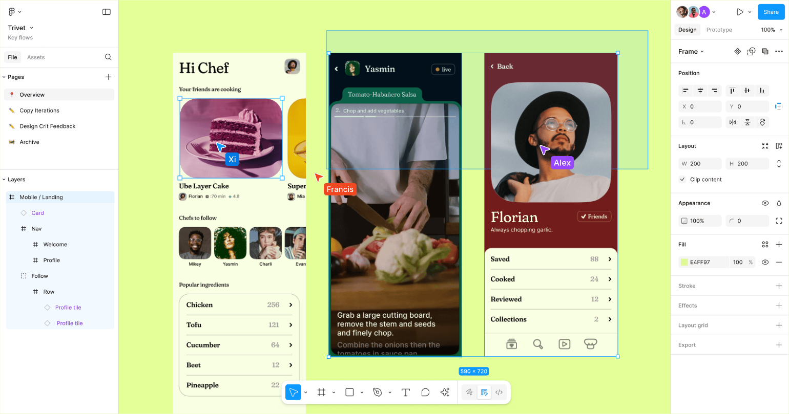
That belief extends beyond the tool itself. The visual identity is bold and expressive, featuring geometric shapes, vibrant palettes, and motion-driven elements that come alive when people work together. The playful touches inside the product, from avatars floating on the screen to stickers and confetti in FigJam, aren’t decoration; they reinforce the idea that collaboration can be fun, not just functional.
Figma also frames its community as part of the experience. Templates, plugins, and resources flow from users back into the product, creating a sense that the tool is co-built by the people who rely on it. In that way, the product isn’t just about designing *in* Figma, but designing *with* Figma.
> The result is a platform that feels less like software and more like a shared creative space. Figma makes collaboration not just possible, but natural, which is what sets it apart.
---
## Why POV is a moat
The truth is that most products don’t remain unique for long. Companies copy features, good design patterns spread fast, and even visual styles come and go. What can’t be copied as easily is the conviction behind your product, the belief that shapes every decision.
> That’s where a strong POV becomes your moat.
A POV gives your product something more than just its looks or features. It’s the thread that runs through how you prioritize, how you communicate, and how you want people to feel when they use it. Others might mimic the interface, but they can’t fake the philosophy behind it.
That’s why products like Discord, Oura, Todoist, and Figma stand apart. Their POV isn’t an add-on; it’s what holds the whole experience together. And it’s what makes them memorable, even in markets full of near-identical alternatives.
In a space where feature parity is the norm, a clear point of view is one of the few things that truly lasts.
---
## How to define and apply POV
Defining a POV can feel abstract, but it doesn’t have to be. Think of it as uncovering the belief that already guides your best decisions, then ensuring it shows up everywhere. Here’s a simple way to put it into practice:
_This post is for subscribers only._
### 3 signs it’s time to trust your gut and break the rules in your creative career
URL: https://www.everydayux.net/3-signs-its-time-to-trust-your-gut-and-break-the-rules-in-your-creative-career/
Last updated: 2026-02-24T01:40:40.000Z
There’s a stage in every creative career where the rules that once felt like a safety net start to feel more like a box. Early on, we rely on best practices, frameworks, and tried-and-true methods because they provide structure and give us confidence. However, over time, the very rules that helped you get started can hinder you from doing your most original work.
This is when your creative instincts kick in. It doesn’t mean throwing out everything you’ve learned, but rather trusting the judgment you’ve built through years of experience, pattern recognition, and countless wins and failures.
How do you know you’ve reached that point? It shows up in three key ways:
1. You start questioning why things *“have to”* be done a certain way
2. Traditional methods feel more limiting than helpful
3. You get more excited by experiments than by following proven formulas.
*Let’s dive in.*

### 1\. You question why things “have to” be this way
One of the clearest signs to lead with your instincts is when you catch yourself asking, ***“But why does it have to be this way?”*** Instead of taking conventions at face value, you start pulling at the seams and imagining what could exist beyond the standard playbook. That curiosity is often the spark that leads to breakthrough ideas.
Take [David Carson](https://www.davidcarsondesign.com/?ref=everydayux.net), a self-taught graphic designer who transformed the field of design, for example. In the ’80s and ’90s, while most designers relied on strict grids and legibility, he threw those rules aside. His fragmented, overlapping typography, often bordering on illegible, defined the grunge movement and reshaped editorial design, inspiring a generation to see disorder as its own kind of expression. His attitude—one he sees as partly underdog, partly “why not?”—carries through not only his most famous projects like art directing Ray Gun magazine or his work for Transworld Skateboarding, but also branding projects, surfboard designs, packaging design for potato chips, and more, making him as relevant today as ever.







[Designs courtesy of David Carson.](https://www.davidcarsondesign.com/t/tag/raygun/?ref=everydayux.net)
Even in healthcare, questioning “the way things are done” has had a real impact. At GE Healthcare, designer Doug Dietz noticed how frightening MRI machines were for children. Instead of pursuing costly technical upgrades, he and his team focused on redesigning the patient experience. The result transformed how kids felt about scans and significantly reduced the need for sedation.
This same questioning also extends to digital products. Like Carson and the GE team, UX designers have challenged long-held assumptions about how people navigate, connect, and interact online. Some of these experiments became industry standards, while others sparked debate and controversy. All of them began with the simple instinct: “Does it really have to be this way?”
[Medium moved beyond the binary “like” by introducing a clapping system](https://uxdesign.cc/fifty-shades-of-claps-a-case-study-for-clapping-on-medium-22c6e7b71140?ref=everydayux.net), where readers can clap up to 50 times for an article. The change broke from the conventions of most social platforms, offering a more nuanced way to show appreciation. It sparked widespread discussion, praised by some as bold and expressive, critiqued by others as confusing or inflationary.
> It’s not that we should reject the rules altogether, but we should learn them so well that we can bend or break them with purpose.
It’s the habit of questioning itself that signals your creative instincts are sharpening. When “the way it’s always been done” is no longer cutting it, you can step into a more innovative space.

### 2\. Traditional methods feel limiting, not helpful
Frameworks and processes are designed to help us, especially in the early stages of of our career. They act as guardrails, providing structure and helping us build confidence. But as your expertise deepens, those same methods can begin to feel less like a guide and more like rigid rules that inhibit your creativity.
This shift is known in psychology as the **expertise reversal effect**: instructional methods and structures that support novices can actually hinder experts once skills and understanding are deeply internalized. Novices rely on frameworks to navigate complexity, while experts develop pattern recognition and tacit knowledge, the intuitive grasp that renders rigid, step-by-step processes unnecessary or even constraining.
If you’ve ever been frustrated by a system that can’t flex for a new idea, or trusted your instincts over what the data suggests, it’s a sign that your judgment is maturing. You’ve developed the experience to see beyond conventional wisdom and make a deeper impact.
This tension also plays out in product design. When methods or data points start to feel more like obstacles than enablers, designers often rely on instinct to move forward. Some of the most impactful product decisions have come from moments where teams trusted their vision over rigid frameworks, bending or even abandoning the rules to create something new.
For example, designers often find that rigid [design systems limit creativity and slow innovation](https://uxpamagazine.org/reimagining-design-systems-as-evolving-products/?ref=everydayux.net). The system may work well for standard flows and screens, but when new patterns or ideas emerge, it can feel like they’re not a match. Designers describe being forced to either abandon their original ideas or wait for new component approvals, both of which slow progress. This tension highlights why design systems must be treated as evolving products that adapt alongside designers’ vision and the industry itself.

### 3\. You’re excited by experiments, not formulas
You know your instincts are kicking in when trying new things feels more exciting than sticking to what’s safe and proven. Instead of pursuing certainty, you’re curious enough to test, tweak, and see what happens.
> Failure doesn’t feel like a setback anymore, it feels like a clue that’s helping you get closer to something better.
This shift often shows up in three ways:
- **Prototype-first thinking**: You’d rather build something rough and test it quickly than spend weeks perfecting a plan.
- **Comfort with ambiguity**: You don’t need all the answers before starting; you see uncertainty as fertile ground for discovery.
- **Learning-oriented failure**: When an idea doesn’t work, you treat it as insight gained rather than wasted effort.
Some of the most celebrated creative breakthroughs have come from this mindset. IDEO, for instance, is famous for continually evolving its own design methods. They never treat their process as fixed; instead, they experiment, adapt, and invent new ways of working as new challenges emerge.
When you find yourself more excited by the chance to try something new than by the safety of following a formula, it’s a strong signal that your instincts are taking the lead.
---
> Creative growth isn’t about rejecting everything you’ve learned; it’s about knowing your craft so well that you can trust your instincts. When curiosity, intuition, and experience work together, you can bend rules, explore bold ideas, and create work that truly stands out.
### Ways to bring your team closer to UX research
URL: https://www.everydayux.net/ways-to-bring-your-team-closer-to-research/
Last updated: 2025-08-26T15:00:48.000Z
#### Table of contents
****Notebook LM**
- Opening research up with AI
****Gallery walks**
- What’s a gallery walk?
- Setting one up
****Research immersion walls**
- What’s a research immersion wall?
- Why it works
- Setting one up
- War rooms
****Graffiti walls**
- What’s a graffiti wall
- Setting one up
- Making it useful
****Collaborative synthesis activities**
- Immediate post-session synthesis
- Structured note-taking
- Synthesis buddies
- Affinity mapping
- Template-driven analysis
- Empathy mapping
- Multi-session synthesis
****TL;DR**
Research is valuable, but teams often struggle to engage with it after a readout or deck. To make insights stick, we need ways to immerse people in them. Digital tools like Notebook LM create interactive notebooks that enable teams to query research directly and efficiently. Gallery walks allow people to engage with insights in an active way, while immersion walls and war rooms transform findings into a living, shared space that remains visible over time. Graffiti walls gather candid, anonymous input, and collaborative synthesis activities ensure that teams make sense of raw data together through techniques such as post-session recaps, affinity mapping, and empathy mapping. Together, these approaches make research an experience that teams can share.
Research is only as valuable as the impact it has on your team. Yet too often, findings get buried in a slide deck or report. If we want to gain insights that inform decisions and spark new ideas, we need more engaging ways to share them. That can mean opening research up in a digital space, where teams can query and explore it with AI tools like Notebook LM. Alternatively, it can mean bringing research into the physical environment through gallery walks, immersion walls, or even full-scale war rooms, allowing people to interact with it directly. What follows are practical approaches to help teams get closer to research.
> Think of these as building blocks rather than strict recipes. You can adapt, mix, or recombine them to suit your team and project.
---
### Notebook LM
#### Opening research up with AI
Before exploring physical methods like gallery walks or research immersion walls, it’s worth considering a digital-first option: [**Notebook LM**](https://notebooklm.google.com/?ref=everydayux.net), Google’s AI-powered research assistant.
At its core, Notebook LM lets you create a “notebook” powered by Google’s Gemini 1.5 Pro model. Think of each notebook as its own mini language model, trained only on the sources you’ve uploaded. That might include your own research notes and transcripts, or external materials such as articles, PDFs, YouTube videos, or even audio files.
0:00
/0:21
1×
Google Notebook LM
Once your sources are in, Notebook LM can summarize them, generate timelines, create FAQs, or produce audio overviews. Even more powerful, your team can ask direct questions of the notebook, and every answer comes with citations linking back to the exact part of the original material. In practice, this makes large and complex bodies of research easier to navigate, especially for teammates who don’t have the time (or appetite) to comb through raw data themselves.
Notebook LM lowers the barrier to engagement and turns research into something people can interact with anytime, anywhere. Instead of a static deck or buried documents, you have a living, searchable research companion, one that helps your team surface insights, make connections, and carry findings into their day-to-day decisions.
From here, let’s look at physical ways to bring research into the room and make it something your team can walk through, see, and interact with together.
---
## Gallery walks
#### Let your team walk through insights
When you’ve spent weeks deep in interviews, focus groups, and surveys, it can be hard to bring your team into the richness of your findings. A report or slide deck can only go so far, and people might not engage with it. What makes research stick is when people feel and experience it; when they step into the world of your users themselves.
*That’s where gallery walks come in.*
##### What’s a gallery walk?
Gallery walks originated in education as an active learning technique that encourages students to move through stations and engage with artifacts together. Designed to spark collaboration and critical thinking, these qualities make them valuable in research, balancing depth, efficiency, and inclusivity so that every voice is heard and patterns emerge collectively.

Image via [Envato](https://1.envato.market/uigoodies?ref=everydayux.net)
In research, the same principle applies. Rather than telling people what you found, you invite them to experience it. Insights are displayed as posters or artifacts arranged around the room, much like a gallery. Teams rotate through each station, adding notes, discussing what they see, and building on one another’s thoughts.
You usually set up six *(or a number that suits you)* stations, each dedicated to a specific theme or topic. Posters can include quotes, images, or guiding prompts. Groups spend 15–20 minutes at a station, writing notes on sticky notes, sketching connections, or discussing it out loud. Conversations are often recorded, and the sticky notes capture individual reflections alongside group debates.
> Unlike a simple readout, it’s an active, collective synthesis where personal perspectives and shared meaning merge.
##### Setting one up
You don’t need much to run a gallery walk, but a little planning goes a long way.
- Pick four to six themes, each framed as an open-ended question.
- Create stations with posters, whiteboards, or printed artifacts that include images and prompts.
- Gather materials such as sticky notes, markers, and audio recorders if you plan to capture discussions.
- Arrange the stations around the room so small groups of three to five people can gather without crowding.
- Give teams 15–20 minutes per station, then rotate and encourage them to read and build on earlier annotations.
> As a facilitator, your role is to keep things moving, answer questions, and encourage participation, rather than leading the content itself. The power comes from participants engaging directly with the material.
Finally, have each group return to their starting station to see how their ideas have evolved. Then bring everyone together for a whole-room debrief. This is where the magic often happens: themes connect, patterns emerge, and the group begins to see the bigger story.
---
## Research immersion walls
#### Turning research into living, shared memory
One of the hardest parts of conducting research isn’t just collecting valuable insights; it’s ensuring they remain part of the team’s day-to-day thinking. Some projects go on for weeks or months. Decks and reports that communicate findings are great, but people sometimes overlook them, and they can be challenging to interact with. A **research immersion wall** allows for a permanent or semi-permanent living space for research.
##### What’s a research immersion wall?
A research immersion wall is akin to a gallery walk that never ends. A space like this enables you to display quotes, photos, findings, and questions in one large area. Over time, the wall becomes a shared map of what you’ve learned, something the whole team can walk up to, navigate, and add to.
Spaces like this work because our brains remember locations and spatial layouts far better than we remember lists or slides. When we correlate information to a physical spot, we can recall it more easily and see new connections between ideas. In cognitive science, this is referred to as a “spatial memory extension.” It’s the same principle behind memory palaces, where people remember information by placing it in imagined rooms. Here, the wall *is* the room.
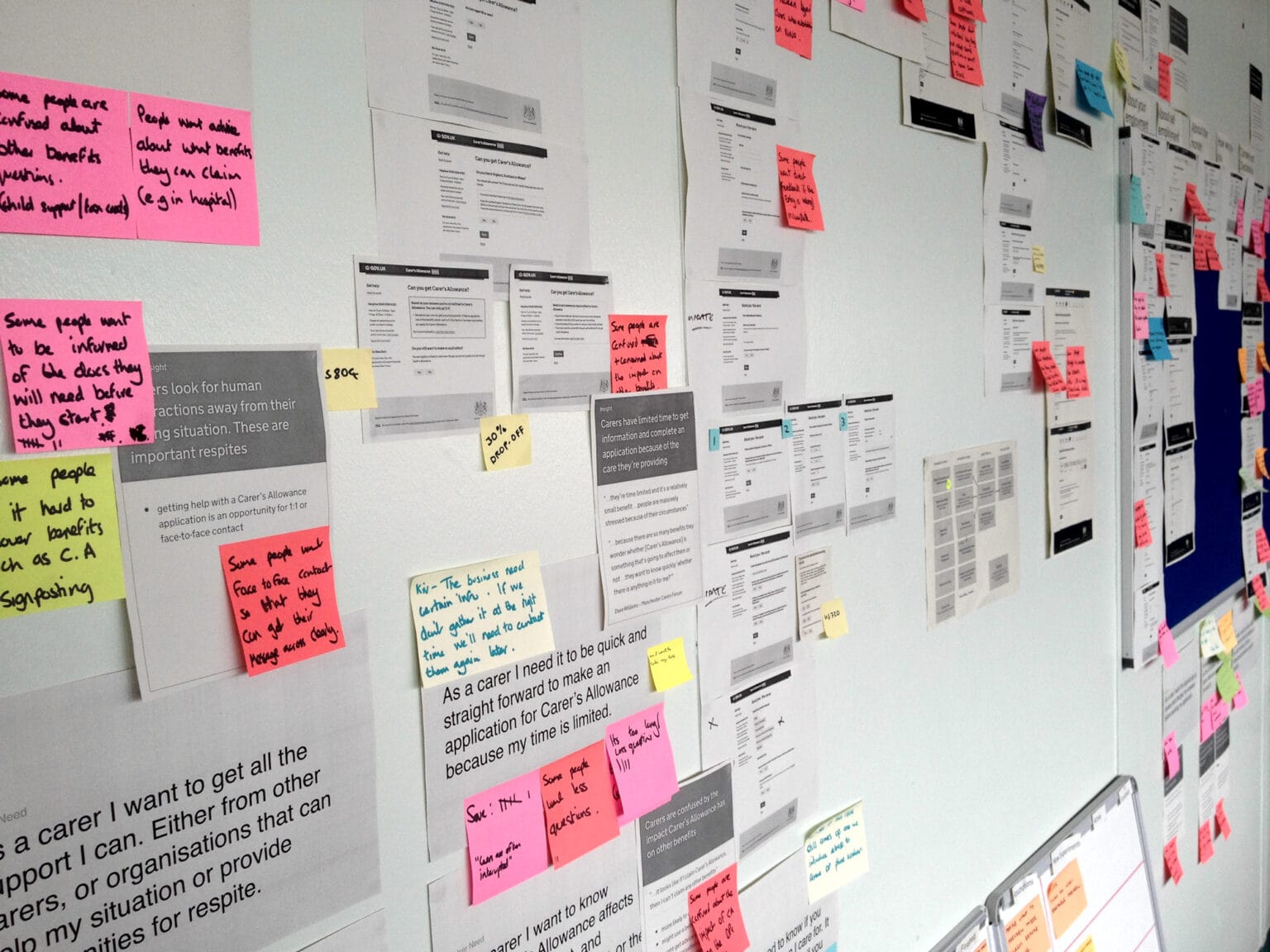
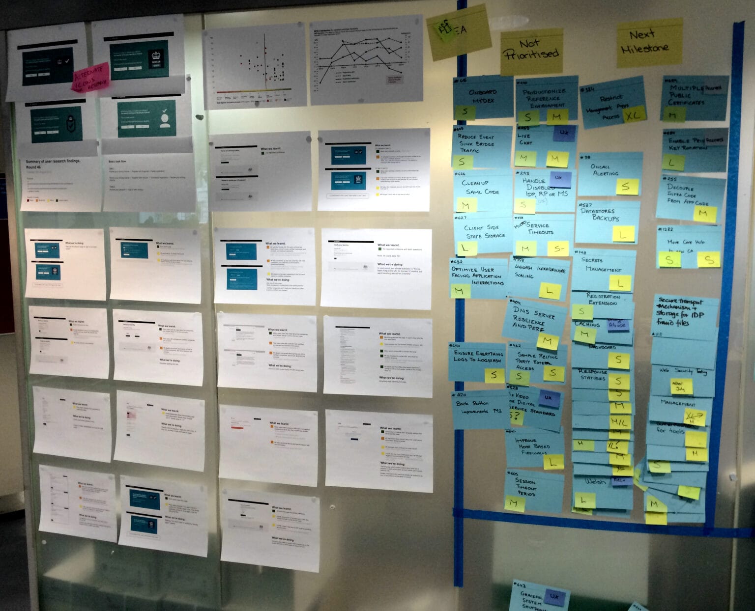
Images courtesy of gds.blog.gov.uk
##### Why it works
Our short-term memory is limited. We can juggle maybe seven things at once. But our spatial memory can handle much more. A research wall offloads that burden: instead of keeping every detail in your head, you place it in the room where everyone can see it.
This has two big effects. First, it reduces cognitive load, freeing the team’s mental energy for higher-level thinking. Second, it makes patterns easier to spot when related insights sit near each other on a wall; connections almost jump out at you.
##### Setting one up
You don’t need a perfect setup to start.
A blank wall, a few foam boards, or even portable whiteboards can do the trick. What matters most is creating enough surface area to hold a wide range of insights and making it easy to update over time.
*Some quick tips:*
- Keep core insights at eye level, with supporting evidence nearby and raw data lower down
- Use colors, clusters, and arrows to show relationships
- Mix formats: quotes, stats, photos, journey maps, for variety and clarity
- Refresh regularly with new findings and reorganize as patterns shift
A wall can act as a hub for synthesis sessions, like an extended gallery walk. You can run small-group discussions around different sections, encourage annotations with sticky notes, or dot-vote to highlight what feels most important. Some teams even rotate “wall stewards,” so responsibility for keeping it fresh doesn’t fall on just one person.
> And if you need a digital bridge, QR codes or photos of the wall can link back to more comprehensive datasets or help track its evolution over time.
## War rooms
Some teams extend immersion walls into full war rooms, transforming an entire space into a project hub. Every wall provides insights and context, so the moment you step inside, you’re surrounded by the research and drawn into the work.
Image courtesy of launchagency.com
## Graffiti walls
#### Gathering candid input creatively
Unlike gallery walks or immersion walls, which help teams engage with research they already have, graffiti walls are a **research collection method**. They’re designed to gather fresh input directly from participants in an open, anonymous, and creative way.
##### What’s a graffiti wall?
A graffiti wall is a temporary public canvas where people can stop, reflect, and respond to a prompt. Instead of formal interviews or surveys, you invite participants to write, sketch, or draw their thoughts directly on a shared surface. Because contributions are anonymous and playful, you often get feedback that feels more honest and unfiltered than in structured sessions.
> The power of graffiti walls lies in their accessibility.
They reduce social pressure, making it easy for anyone to share an opinion quickly. Anonymity lowers barriers, which means you’re more likely to capture candid thoughts, frustrations, moments of delight, or new ideas that might otherwise stay hidden. They’re not designed to replace more in-depth methods, such as interviews or observations, but they work well as a **supplementary technique** to stretch research budgets and engage broader audiences.
##### Setting one up
Start with one clear, open-ended prompt such as *“When using our product, I hate it when…”* or *“What’s one thing you’d most like to see improved?”* Place your canvas in a high-traffic area where your target audience feels comfortable stopping. Attach pens, markers, or sticky notes directly to the wall, and include simple instructions that encourage both writing and drawing. Bright materials and sample responses help people overcome the blank wall effect.
##### Making it useful
Graffiti walls need light facilitation. A friendly nudge to participate or a starter question can spark momentum. Over time, the wall fills with varied responses, creating a visual record of many voices. To preserve the input, photograph the wall regularly, both close-ups and full views, before it’s taken down. Later, cluster similar responses to identify patterns and themes. Because the data is anonymous, analysis focuses on **content rather than demographics**, surfacing needs and pain points that can guide deeper follow-up.
---
## Collaborative synthesis activities
Before a team can be immersed in research, the findings themselves need to be clear. Raw notes, transcripts, and recordings on their own are overwhelming and fragmented. Collaborative synthesis activities are how we turn that raw material into shared understanding. By working together to spot themes, cluster insights, and challenge interpretations, teams create patterns they can trust and build a stronger foundation for the immersive methods that follow.
##### Immediate post-session synthesis
- Right after a research session, spend 15 minutes as a group capturing insights. Begin by recalling key takeaways from memory for a few minutes, then review notes for details and quotes. This ensures impressions are fresh and nothing critical gets lost.
##### Structured note-taking
- Assign clear roles during research: one person conducts the interview, while another takes detailed notes in a shared document. This prevents information silos and allows the team to spot patterns as they emerge.
##### Synthesis buddies
- Pair people from different disciplines, for example, a designer with a PM. Buddies review findings together, identify themes, and challenge each other’s interpretations. This surfaces perspectives one discipline alone might miss.
##### Affinity mapping
- Have everyone jot down one observation per sticky note (physical or digital), then group them collaboratively into clusters. Discuss and refine clusters until they form clear, actionable themes. Use this when you need to make sense of large sets of observations.
##### Template-driven analysis
- Use predefined categories or codes based on your research goals (like “decision-making” or “pain points”). Apply these to your data, then adjust as new themes appear. This provides structure while staying flexible.
##### Template-driven analysis
- Use a four-quadrant framework, what users say, do, think, and feel, to organize insights. Run short, silent brainstorming rounds to avoid groupthink, then cluster and discuss the ideas. Empathy maps are most effective when you want to establish a shared understanding of user motivations and context.
##### Multi-session synthesis
- Instead of analyzing after every single session, gather insights after every three to six sessions. This helps teams see bigger patterns and prevents fatigue. Stop when the same findings keep surfacing, which signals research saturation.
Working collaboratively on this project ensures that the group considers multiple perspectives and gives the entire team a stronger connection to the findings. Collaborative synthesis activities offer lightweight, structured approaches to transform scattered observations into a shared understanding, ranging from brief post-session recaps to more in-depth mapping workshops.
---
Immersing teams in research isn’t about replacing reports or decks, but rather making research more immersive, interesting, and interactive. Whether through gallery walks, immersion walls, war rooms, graffiti walls, or collaborative synthesis, these practices transform findings into an experience that teams share. When research becomes part of the environment, it stays alive in people’s minds, guiding decisions long after the initial readout is over.
### Protecting design quality in an AI-accelerated environment
URL: https://www.everydayux.net/protect-design-quality-ai-acceleration/
Last updated: 2025-08-19T15:00:01.000Z
****TL;DR**
AI-assisted coding enables the rapid deployment of features, but design still requires time to explore, iterate, and incorporate human judgment. When engineering advances faster than design can keep pace, quality suffers, or designers become burned out. The good news is that teams can adapt by involving design earlier, utilizing AI to automate low-value tasks, evolving design systems into workflows, and refining processes to maintain strong design influence. For individual designers, it’s about working smarter: building decision banks, setting up rapid prototyping, utilizing AI for routine tasks, and maintaining focus on the decisions that matter most. The goal is balance—where speed and quality move in sync.
If you’ve been working in product for a while, you’ve probably noticed some changes. Not long ago, even in fast-moving teams, design had a bit of breathing room. You could stay a step or two ahead of engineering, make thoughtful decisions, and still ship something you felt confident about.
Now, in some companies, AI-assisted coding has significantly accelerated that pace. Engineers can quickly develop and deploy working features. PMs can tinker on the weekend and come back Monday with a functioning prototype. What used to take weeks now happens in just a few days.
The traditional method, where design sets the direction before building, is being challenged. This *design, then the build* process, doesn’t work as well with the increasing pace at which we can build things. This means the window for design impact and influence is shrinking, and with it, the space for the kind of quality that comes from exploration, iteration, and careful thought.
### The core problem: a process mismatch
Designers are still integral to the process, but in some cases, they are often looped in once a build is already underway, leaving less space for thoughtful, in-depth work, such as ensuring we’re solving the right problem, exploring alternatives, and refining the details that make a product feel thoughtful and considered.
> Those steps can’t be compressed to match AI-speed development without losing quality.
**When this mismatch persists, two things tend to happen:** features ship without enough design input, creating uneven or frustrating experiences, or designers push themselves to keep pace and burn out, slowly losing their influence over the product. Either way, the work—and the people doing it—suffer.
###### Communication and developing a shared plan is key
These breakdowns aren’t only about speed, but also communication. Too often, different functions push ahead in isolation, making progress without aligning their efforts. When team members fail to pause and clarify *how* they’ll work together, whether to explore, converge, or move in parallel, misalignment and surprise creep in, leading to inefficiencies and confusion.
---
### Why good design can’t simply “speed up”
Good design takes time, and the more we’re rushed to produce, the less space there is for real design thinking. To create effective work, we must understand the problem, explore various directions, make informed trade-offs, and refine our ideas until they are practical and applicable to real people in real contexts.
Not every project requires deep exploration; much of the craft lies in knowing what level of rigor the work demands and tailoring your approach accordingly.
> Work that requires deeper exploration necessitates human judgment, taste, and empathy, qualities that can’t be rushed without compromising depth.
**However, AI can accelerate certain aspects of the process.**
Designers can utilize AI to brainstorm, help explore ideas, make sense of customer feedback, or prototype concepts more efficiently. But it can’t replace the thinking and decision-making that make design work truly effective.
> The real question isn’t whether designers can match the new pace of development. It’s how we restructure our processes so that design retains its influence and impact in a world where building is so fast.
Designers should absolutely **lean into AI for designing, coding, and prototyping**, and pair closely with engineers when shipping new features. But AI isn’t the only lever; some teams are already adapting their processes to protect design quality under tighter timelines.
---
### Building a sustainable model
A sustainable approach to a design process in the age of AI isn’t about adhering to a single, fixed process. It’s about paying attention to what’s happening around you and choosing the right activity and collaboration model for the moment, which is something designers already do. The same process won’t fit every situation, and part of the craft is knowing when to adjust your approach.
- There are times when design needs space—to think deeply, frame the problem, and explore divergent directions. This kind of work can’t be rushed.
- There are also moments when it’s better to sit alongside a PM or developer and shape something in real time. Both modes are essential, and the craft lies in knowing when to lean into each.
- And sometimes, the smartest move is to refine the design after it’s already been coded or prototyped.
Teams don’t need to compromise on quality when moving fast, but communicating on process is non-negotiable. If you spot something that requires more design attention, call it out and ask for time to refine it. Raising the flag early usually makes it easier to find that space.
And finally, don’t be afraid to expand your toolkit. Sometimes the best way to push an idea forward is to prototype it yourself in code. Other times, it’s about knowing which shortcuts AI can handle so you can focus on the decisions that matter.
The point is that sustainable design isn’t a rigid process; it’s the ability to stay alert, adapt, and apply the right level of design at the right time.
---
### Practical steps teams can take today
These are quick, practical adjustments teams can make right now. Beyond these, some organizations are also rethinking their structures and long-term ways of working to stay ahead of the AI-speed curve.
###### Embed design throughout the lifecycle
- Bring designers in while ideas are still being formed, not after requirements are finalized. Their early input helps shape smarter solutions. But don’t stop there. Treat design as an [ongoing practice](https://blog.daisie.com/continuous-product-design-best-practices-for-successful-implementation/?ref=everydayux.net), not a one-time act at the beginning. Continue iterating alongside real-world feedback to ensure design influence remains strong from start to finish.
###### Push designer AI adoption and fluency
- Give designers access to generative tools like Vercel and Figma Make, and support them with hands-on training in areas like prompt writing, quick variant generation, and AI-assisted testing. With the right tools and skills, designers can keep pace with faster cycles without compromising on quality.
###### Parallelize concepting and prototyping
- Ditch the strict *‘design first, then build’* sequence where appropriate. Bring designers, engineers, and PMs together in parallel to evolve ideas and prototypes in real time. That “building an app in your garage” energy, everyone huddled in the same room, sparks exciting ideas, co-design, and co-development while cutting handoffs and speeding up feedback.
###### Expand design systems into flows
- Don’t stop at component libraries. Define clear patterns for common flows and interactions so AI-assisted builds have a strong foundation to draw from, and developers have a reliable resource instead of stitching together a hodgepodge of UI components.
###### Strengthen DesignOps
- Establish DesignOps as the operational backbone for AI-accelerated workflows. These teams handle [*everything except actual design*](https://www.infragistics.com/blogs/designops/?ref=everydayux.net)—the processes, tools, and infrastructure that keep designers moving at the same pace as engineering. With automated quality checks and streamlined workflows in place, speed doesn’t have to come at the expense of user experience.
###### Automated design-to-code
- Use [AI tools that turn designs into production-ready code](https://research.aimultiple.com/design-to-code/?ref=everydayux.net). This consolidates various aspects of the work, reduces handoff friction, and helps maintain design integrity when engineering moves quickly.
The point of these ideas is not to push designers to match engineering’s pace at all costs. It’s to adjust how work happens so both disciplines can contribute at their best. When the process incorporates design thinking while leveraging AI speed, the result can be fast without compromising quality.
---
### Maintaining design quality when timelines compress
When the product development process speeds up, it can feel like the only way to keep up is to work faster. However, the designers who excel in this environment adapt and adjust their process to meet the needs of the moment.
Here are some practical ways to do that:
###### Build your own “decision bank”
- Create a personal reference library of insights, principles, and proven solutions. This can include user research highlights, common design heuristics, and examples of successful flows. Having these ready means you won’t have to reinvent the wheel when under pressure.
###### Use time-compressed design thinking techniques
- Swap long research and discovery phases for quicker, lighter-weight practices. For example, conduct short empathy interviews, use clear problem statements, or run rapid ideation sketches. You still gain meaningful insights, just in a fraction of the time.
###### Apply rapid decision-making frameworks
- Adopt lightweight models, such as RAPID or DACI, to clarify who decides, who advises, and who needs to be informed. These frameworks help you make fast, confident calls and prevent the slow creep of “decision by committee.”
###### Set up AI workflows for routine tasks
- Automate the low-value, yet time-consuming, parts of your process. AI can help cluster feedback into themes, generate quick design variations, or draft baseline research materials. Offloading this work gives you more space for refinement, judgment, and creative problem-solving.
###### Build a personal rapid prototyping pipeline
- Develop a repeatable workflow that enables you to transition from an idea to something testable quickly. Whether that’s sketch → Figma → code prototype or another pipeline, the goal is to validate ideas fast, gather feedback, and keep momentum.
###### Experiment with micro-sprints
- Instead of waiting for a full sprint cycle, carve out one-or two-hour bursts to frame a problem and produce a testable artifact. It’s a way to explore more directions with less overhead and keep creativity flowing under tight timelines.
###### Communicate clearly under time constraints
- Practice giving succinct explanations of your design decisions, why you chose an approach, and what trade-offs were made. Use a quick “quality gate” checklist (e.g., accessibility, brand alignment) to ensure standards aren’t sacrificed in the rush.
###### Design your workflow
- Organize your work to reduce cognitive load. Batch similar tasks, keep templates for repeatable decisions, and treat constraints as prompts for creativity rather than blockers. The way you structure your workflow matters as much as the tools you use.
###### Invest in AI fluency
- The more comfortable you are with AI, the better you’ll know when to delegate and when to trust your instincts. Experiment with prompts, tools, and workflows until AI becomes a natural extension of your process, not a novelty.
###### Build partnerships with allies in product and engineering
- Cultivate relationships with PMs and developers who respect design. These allies can help protect your time, advocate for design quality, and create an environment where design has influence even when timelines are compressed.
With AI compressing timelines and reshaping how we build products, it’s critical to focus your energy where it matters most, on judgment, creativity, and decisions that maintain design quality, even when your window of influence feels smaller.
---
Design doesn’t need to match engineering click for click. What it needs is awareness, adaptability, and the confidence to apply the right process at the right time. Sometimes that means slowing down to frame a problem; other times, it means jumping in alongside a PM or developer to build in real-time. AI can take some of the load, but it can’t replace the judgment, creativity, and empathy that make design valuable.
The teams and designers who thrive won’t be the ones who work faster. They’ll be the ones who stay alert, protect the space for good design, and learn how to move in sync with the pace of change, without losing the quality or humanity in their work.
### Glassmorphism in 2025: How Apple’s Liquid Glass is reshaping interface design
URL: https://www.everydayux.net/glassmorphism-apple-liquid-glass-interface-design/
Last updated: 2026-02-24T01:30:45.000Z
****TL;DR**
Glassmorphism is everywhere in 2025, and Apple’s new Liquid Glass has taken it to the next level with real-time depth, motion, and adaptive contrast across all platforms. The style brings warmth and polish after years of flat design, but it’s not without drawbacks; accessibility, performance, and usability all need careful attention. Done with intention, it can add depth, hierarchy, and a premium feel; done carelessly, it risks becoming style over substance.
### Glassmorphism has arrived in full force
It feels like glassmorphism is everywhere in 2025\. You’ve probably seen it without even realizing it, those frosted, semi-transparent panels layered over vibrant backgrounds in everything from fintech dashboards to creative tools. [Apple’s introduction of its Liquid Glass](https://www.youtube.com/watch?v=jGztGfRujSE&ref=everydayux.net) design system has supercharged this trend, demonstrating what’s possible when translucent depth, refraction, and motion are all handled in real-time. Available on every major Apple platform, Liquid Glass adapts to context, content, and device motion, bringing a level of polish, accessibility, and consistency that the industry hadn’t seen before. The result is a style that feels both fresh and familiar, bringing back depth and warmth after years of flat interfaces.
Hey 👋, I’ve compiled over 25 practical resources, tutorials, articles, icons, plugins, inspiration, and CSS generators at the bottom of this post to help you get familiar with this evolving design language.
### What is Glassmorphism?
Glassmorphism is a visual style that combines transparency, background blur, and soft layering to create the look of frosted glass.
It often employs vibrant colors behind a glass effect, subtle borders to define edges, and light and shadow to make elements appear as if they’re floating. The term was coined by designer Michał Malewicz in 2020 and gained momentum when Apple introduced similar effects in macOS Big Sur. Unlike neumorphism, which relies heavily on soft shadows and minimal contrast, glassmorphism offers greater versatility, improved accessibility, and a brighter, more dynamic feel.
### How Apple’s Liquid Glass moves beyond traditional glassmorphism
Apple’s Liquid Glass takes the familiar frosted, semi-transparent look of glassmorphism and elevates it into something far more advanced. Instead of static blur and simple transparency, it uses physically accurate lensing and refraction that respond to light, motion, and the user’s environment in real time. As you tilt a device or interact with the UI, highlights shift, shadows adapt, and glass surfaces subtly flex, creating a sense of physical depth that feels alive.
Where traditional glassmorphism often looks the same regardless of context, Liquid Glass actively adapts tint, opacity, and contrast based on what’s behind it, ensuring legibility and separation even in complex scenes. Apple has also unified this system across all platforms in its ecosystem, providing designers and developers with consistent tools, APIs, and motion behaviors by default.
Importantly, performance and accessibility have been designed in from the start. GPU acceleration keeps effects smooth, while dynamic contrast adjustments address the readability challenges that have long plagued glassmorphism. The result is more than just a prettier version of a trend; it’s a responsive, cohesive material system that blends realism, adaptability, and usability at scale.

macOS Tahoe 26 lets users customise the desktop and Dock with new looks for app icons and widgets crafted from multiple layers of Liquid Glass. [Image source](https://www.apple.com/au/newsroom/2025/06/apple-introduces-a-delightful-and-elegant-new-software-design/?ref=everydayux.net).
### Why glassmorphism is hitting hard in 2025
##### Tech finally caught up
For years, glassmorphism was more of a design fantasy than a practical choice. Blur effects and layered transparency were heavy on performance, so they stayed tucked away in concept work. Now, modern devices have the processing power to render them effortlessly, and CSS properties like `backdrop-filter` enjoy broad browser support. That means these effects look smooth, even on lower-powered devices, and can be implemented directly in production without slowing things down.
##### Platform validation
When Apple introduced glass-style panels into macOS Big Sur in 2020 and continued refining them in products like iOS and macOS, it lent the look credibility. [Microsoft’s Fluent Design “Acrylic”](https://learn.microsoft.com/en-us/windows/apps/design/style/acrylic?ref=everydayux.net) materials did the same. Seeing the biggest platforms commit to glass effects reassures designers that the style isn’t just a fleeting experiment, but a well-supported visual language they can confidently use.
##### Flat design ran its course
After years of ultra-minimalist, flat design dominating digital products, many users are feeling “design fatigue.” Glassmorphism provides a softer, more layered alternative that keeps interfaces clean while adding warmth and depth. The frosted look feels less mechanical and more approachable, making it easier on the eyes while still maintaining a modern feel.
##### It signals quality
The complexity and finish of glass effects naturally give off a premium, high-tech vibe. That’s why you’ll see them in fintech dashboards, luxury brand websites, and cutting-edge apps; they convey a sense of sophistication and attention to detail. In an era where many products share the same design systems, glassmorphism enables brands to stand out without compromising usability.
[Glassmorphism Dashboard - Widgets by Leon Abramovic](https://dribbble.com/shots/25346465-Glassmorphism-Dashboard-Widgets?ref=everydayux.net)
### It’s a stylistic upgrade
Glassmorphism is a functional style upgrade of sorts. Its layered transparency makes it easy to create a clear visual hierarchy without relying only on color or typography. Foreground panels stand out, but the blurred background still provides just enough context to help people understand their surroundings. Unlike opaque modals that block everything behind them, glass effects keep users connected to their environment, making the experience feel more natural and less disruptive.
This is especially powerful in complex products, such as dashboards, analytics tools, or multi-layered interfaces, where organizing information is half the battle. And it fits neatly into a broader shift away from strict minimalism toward what some call “minimalist maximalism,” interfaces that stay clean and functional while also bringing personality, depth, and visual richness. In the right hands, glassmorphism manages to be both beautiful and purposeful.
---
### The critical perspective: where glassmorphism falls short
For all its visual appeal, glassmorphism has its fair share of critics, and their concerns are worth noting before you decide to use it.
###### Accessibility remains the biggest hurdle
Semi-transparent layers and blurred backgrounds can create serious contrast issues, especially over complex imagery. That makes text harder to read and can exclude users with visual or cognitive impairments. The style can also introduce motion or blur effects that cause discomfort for people with vestibular conditions.
###### It can be heavy on performance
Glass effects, especially real-time blur, are computationally expensive. On lower-powered devices or mobiles, this can lead to lag, battery drain, or the need for scaled-back effects. Not all browsers fully support the required CSS properties, which means developers must add fallback styles to ensure consistent results.
###### Usability suffers without discipline
When applied without care, glassmorphism can blur the lines—literally—between interface layers, making it harder for users to distinguish controls or navigate. Icon shapes can lose clarity, and readability can vary wildly depending on what’s behind an element.
###### Some see it as style over substance
Seasoned designers note that glassmorphism often thrives on platforms like Dribbble or Behance, but appears far less frequently in functional, production-level products. The criticism: it’s a cyclical design trend, more about novelty than solving real user problems, and risks looking dated in just a few years.
The takeaway: Glassmorphism can work beautifully, but only if you approach it with intention. That means designing for accessibility from the start, testing across various devices and contexts, and ensuring the style supports usability rather than distracting from it.
---
### The mixed reception to Liquid Glass
Reactions to Apple’s Liquid Glass have been mixed and “passionate.” Some designers and beta testers view it as a bold evolution of glassmorphism, characterized by a polished, dynamic, and visually striking experience when experienced firsthand. Others are far less convinced, raising concerns about accessibility, usability, and overall design consistency.
##### Common themes
- **Contrast and readability** are the most frequent complaints, with some pointing out that even Apple’s keynote examples show text that’s difficult to read against dynamic or complex backgrounds.
- **Form over function** often arises, with comparisons to past design eras, such as Windows Vista’s Aero, which was beautiful in screenshots but harder to use in everyday contexts. As one person on Reddit put it:
> “Looks like Apple had a Microsoft moment lol.”
- **Icon color removal** sparked pushback, as it reduces quick recognition and wayfinding for users who rely on distinct visual cues.
- **Accessibility settings**, such as “Reduce Transparency” and “Increase Contrast,” are seen as essential workarounds, although some worry thatthey aren’t obvious or enabled by default.
- **Performance and environment concerns** include potential battery drain, heavier GPU load on mobile devices, and difficulty reading elements in bright light.
- **Inconsistent execution** was another talking point, with some noting that Liquid Glass feels less cohesive than Apple’s VisionOS design language.
> A smaller but vocal group believes this is a bold step forward and expects Apple to refine the design, just as it has with other controversial UI shifts in the past.
The overall sentiment is that Liquid Glass makes a strong visual statement. Still, its long-term success will depend on how well Apple can balance the aesthetic with usability, inclusivity, and performance in real-world use.
---
### Best practices for using glassmorphism
Glassmorphism can add depth and polish, but without care, it can also make an interface harder to use.
Nielsen Norman Group [highlights](https://www.nngroup.com/articles/glassmorphism/?ref=everydayux.net) a few ways to get it right:
###### 1\. Meet contrast requirements
- Translucent elements can make text hard to read, especially over complex or multicolored backgrounds. Always check contrast ratios; tools like the [Contrast plugin in Figma](https://www.figma.com/community/plugin/748533339900865323/contrast?ref=everydayux.net) can help, so your text remains legible in every context.
###### 2\. Use more blur for busy backgrounds
- The busier the background, the stronger your blur should be. Trying to keep background details too visible can distract users and hurt readability. If you control the background, keep it simple; if you don’t, increase blur to maintain focus on the content.
###### 3\. Let users adjust transparency
- Whenever possible, give people control over contrast or transparency settings. Apple’s accessibility options, for example, allow users to reduce transparency or boost contrast, making glass effects appear solid for improved visibility.
The takeaway: Glassmorphism is most effective when it’s subtle, intentional, and accessible. Use it sparingly to create depth and visual hierarchy, and test it in real-world contexts to ensure it helps rather than hinders.
---
### Looking ahead
Glassmorphism isn’t just for today’s screens; it’s well-positioned for the next generation of interfaces. In AR, VR, and spatial computing, layered, semi-transparent panels help maintain depth and context without overwhelming the environment behind them. Apple’s Vision Pro, for example, utilizes frosted overlays to seamlessly blend interface elements into 3D spaces, allowing users to interact with information while still being able to see their surroundings.
As adaptive UI design evolves, glassmorphism could become even more dynamic. Imagine materials that adjust blur, opacity, and color automatically based on lighting, motion, or the complexity of what’s behind them. In this future, the style isn’t just decorative, it’s responsive, context-aware, and integral to how users navigate richer, more immersive digital environments.
---
### How to get started with glassmorphism
The good news is you don’t need to build everything from scratch to try glassmorphism in your work. Figma plugins make it easy to preview and fine-tune glass effects right on the canvas, while CSS generators can give you ready-to-use code for the web. Many tools even let you adjust the blur strength, transparency, and borders in real-time, so you can quickly find a look that works.
Start small; design a card or a simple component before rolling out and practicing on an entire interface. That way, you can see how it plays with your brand colors, typography, and overall layout without overwhelming the design.
If you want to immerse yourself, I’ve curated a list of tutorials, articles, icons, plugins, inspiration, and CSS generators, so you can explore the style and start experimenting right away.
Dive in!
Glassmorphism is used in the Apple Vision Pro interface. [Image source](https://developer.apple.com/design/human-interface-guidelines/windows?ref=everydayux.net).
## Over 25 curated resources, including tutorials, articles, icons, plugins, inspiration, and CSS generators.
Login or signup as a free member to access these resources.
_This post is for subscribers only._
### What productivity really means, and how to make it work for you
URL: https://www.everydayux.net/what-productivity-really-means/
Last updated: 2025-08-11T22:25:21.000Z
****TL;DR**
True productivity isn’t about doing more; it’s about doing the right things in a way that supports your energy, focus, and well-being. Modern workplaces often undermine this with constant noise, meetings, and “productivity theater,” but sustainable systems prioritize clarity, trust, and protecting time for deep work. The right rhythm blends focused effort, recovery, and meaningful priorities, turning productivity into a practice that fuels both better job and a better life.
### 1\. What is productivity?
Most people think productivity means getting more done. But that’s only part of the picture, and often the least useful part. True productivity isn’t about ticking boxes or packing your day with tasks. It’s about how effectively you turn your time, energy, and attention into meaningful progress.
At its core, productivity is a ratio: **output divided by input**. It’s how much value—real value—you create with the resources you have. That could be finishing a design sprint, writing a strategy doc, or solving a customer problem; the output matters. But so does how you got there.
There are a few layers to this:
- **Personal productivity** is about how well you manage your time and focus to complete high-value work, the kind that moves the needle, not just fills the hours.
- **Workplace productivity** zooms out: it examines how individuals and teams contribute to shared goals efficiently and with minimal waste or duplication.
- **Economic productivity** scales up even further, prompting the question: How effectively does a company, industry, or entire country convert labor and capital into goods and services?
In real life, productivity is rarely about doing *more; it’s* *about doing the right things*. It’s about doing *what matters,* and doing it sustainably. That means stripping out unnecessary effort, reducing friction, and designing your day around focus and clarity, not constant motion. Being productive doesn’t mean being maxed out. It means having enough space to think, make, and follow through.
### 2\. Why is it hard to be productive at work?
If you’ve ever reached the end of the day feeling like you were busy but got nothing done, you’re not alone. Productivity in modern office and tech environments isn’t just hard, it’s structurally discouraged. We’ve built systems that reward responsiveness, visibility, and motion over focus, clarity, and deep work. Here’s why that happens.
###### First, there’s the constant digital noise.
Notifications, Slack pings, emails, Jira updates, and calendar reminders all fragment your attention. What feels like multitasking is actually rapid context-switching, which drains cognitive energy and makes it harder to do thoughtful or creative work. In reality, every “quick check-in” or browser tab left open taxes your working memory and erodes your ability to concentrate.
###### Then come the meetings.
In many tech teams, recurring check-ins and agile rituals are baked into the culture. Some are useful. Many are not. The bigger issue is that they splinter your time into unusable fragments, leaving no uninterrupted stretches for deep work. And if a meeting doesn’t have a clear goal or ends with no decision? That’s the time you don’t get back, and the momentum you won’t regain easily.
###### On top of this is information overload.
Company wikis, shared drives, spreadsheets, emails, and Asana boards - you’re expected to know where everything lives, what’s current, and what requires your input. Cognitive fatigue sets in not because you’re lazy, but because your brain was never meant to sift through this much unstructured input. It’s not a focus problem; it’s an architecture problem.
###### There’s also a cultural tension between monitoring and trust.
Many companies try to boost productivity by tracking time, clicks, or keystrokes. But surveillance doesn’t improve focus; it creates pressure and second-guessing.
Another major drain is what Cal Newport calls **“meta work.”**
Meta work refers to the tasks that surround the primary work, including updating tickets, responding to status threads, and writing weekly summaries. Necessary? Sometimes. However, in many environments, meta work expands to fill the day, crowding out the actual value-driving tasks for which you were hired.
###### Physical (and virtual) spaces don’t help much either.
**Open-plan offices** are notoriously distracting, and even in remote setups, you’re often bouncing between Zoom fatigue and the loneliness of working in a vacuum. Neither state is ideal for producing your best thinking.
###### Add to that vague goals and shifting priorities, and it’s no wonder people lose motivation.
If the outcomes are unclear—or constantly changing—it’s hard to know where to invest your energy. Tech teams are particularly vulnerable to this: new initiatives emerge weekly, priorities shift with the market, and hype cycles (such as AI, crypto, or whatever’s next) can divert focus for months.
###### Last but not least: burnout and blurred boundaries.
When work seeps into evenings and weekends, your brain never fully powers down. Recovery is a productivity tool, not a luxury, but it’s often neglected in “always on” cultures.
In short, most office environments are engineered for availability, not output. Productivity suffers not because people don’t care or aren’t trying, but because the conditions for doing good work aren’t protected. The path forward isn’t about forcing more effort. It’s about removing the obstacles that make focus rare and clarity difficult.
In short, most office environments are engineered for availability, not output. Productivity suffers not because people don’t care or aren’t trying, but because the conditions for doing good work aren’t protected. The path forward isn’t about forcing more effort, but about removing the obstacles that make focus rare and clarity difficult.
###### Tool overuse and productivity theater.
In many workplaces, especially in tech, productivity has become something you *perform*. Hours are lost polishing Notion pages, grooming Jira tickets, or writing lengthy updates no one reads.
This is productivity theater: when the appearance of activity takes priority over the substance of meaningful work. Metrics get optimized. Dashboards fill up. But the actual thinking, the real value, is quiet, slow, and often invisible.
True productivity doesn’t always show up in a status update. It looks like an empty calendar, a document in progress, or someone staring out the window, connecting ideas. If your tools are making you feel more productive than you are, it might be time to simplify.
#### What it looks like when companies get it right
That said, some companies have shown what’s possible when you get this right.
**Toyota** built its global reputation on *Kaizen*, a philosophy of continuous improvement. On the factory floor, [tools like the Andon Cord](https://future-code.dev/en/blog/high%E2%80%91performance-culture-in-action-6-companies-that-turned-culture-into-results/?ref=everydayux.net) enable any employee to pause production and address a problem, signaling that quality and ownership take precedence over speed.
**Netflix** takes a different approach: high trust, radical candor, and clear accountability. With its [“freedom and responsibility”](https://www.performyard.com/articles/best-company-culture-examples?ref=everydayux.net) model, employees are trusted to make big decisions and held to high standards, with minimal micromanagement.
**Google**, long admired for its workplace culture, invests in autonomy, well-being, and psychological safety. By creating space for experimentation and rewarding creativity, not just efficiency, it helps teams stay motivated and focused as they tackle complex problems. [Employees are not confined to desks](https://www.performyard.com/articles/best-company-culture-examples?ref=everydayux.net). Instead, they are encouraged to work in spaces that best suit their creativity.
These cultures may appear different on the surface, but they share one commonality: they’re intentional about creating the *conditions* for productive work. Clarity, trust, autonomy, and respect for people’s cognitive energy are foundational.
### 3\. The link between productivity and stress
Stress and productivity have a complicated relationship. A little stress can sharpen your mind. Too much can wipe it out completely. The key is balance and understanding where that tipping point lies.
Psychologists describe this relationship using the [**Yerkes-Dodson law**](https://www.healthline.com/health/yerkes-dodson-law?ref=everydayux.net), which shows that performance improves with arousal (or stress) up to a certain point. After that, it falls off a cliff. In practice, that means a bit of pressure before a deadline might help you focus, but chronic tension, overload, or anxiety will sabotage your ability to do good work.
This type of helpful stress, known as **eustress**, creates a sense of urgency without inducing feelings of overwhelm. It can boost cognitive performance and motivation in the short term; consider the way athletes perform under pressure, or how a meaningful project deadline can sharpen your focus. The right amount of stress narrows your focus and increases engagement.
But most workplace stress doesn’t fall into that category. **Excessive or prolonged stress**, often caused by unclear goals, an overwhelming workload, or ineffective leadership, triggers a physiological stress response that undermines productivity. Cortisol remains elevated, sleep quality declines, and your ability to concentrate, regulate emotions, and make decisions all suffer. You might still show up to work, but you’re not operating anywhere near your potential.
Data confirms this. One study using the Perceived Stress Scale (PSS) and the Health and Work Questionnaire (HWQ) found that as stress levels increased, productivity and job satisfaction dropped significantly. The most common symptoms are fatigue, low morale, presenteeism (working while unwell), and eventually burnout.
It’s also worth noting that **stress doesn’t hit everyone the same way**. Your ability to manage it can depend on factors such as support from coworkers or managers, job security, autonomy, and even your gender. Two people might have identical workloads, but if one feels heard, supported, and clear on their goals, they’re more likely to stay productive and emotionally resilient.
In short, **a certain amount of stress can be beneficial, but excessive stress can overwhelm the system**. And once you’re in chronic stress mode, no productivity method or to-do app will save you. The real fix lies in designing work environments, both personal and organizational, that respect the need for rest and meaningful focus.
### 4\. How to structure your day for focus and flow
Most people only do **2 to 4 hours of high-impact work**. Focus is a limited resource, not something you can stretch indefinitely. So the goal isn’t to squeeze more out of yourself, but to **structure your day around your natural rhythm**, protecting your best hours and supporting them with recovery and intention.
Here’s a sustainable blueprint for getting meaningful work done without burning out.
#### 1\. Start with your peak focus window
Everyone has a window, often in the morning, when their mind is sharpest. For many, it’s between 9 a.m. and noon. **Block this time for deep work**: anything that requires focus, creativity, or complex thinking. No meetings. No inbox. No Slack. Just uninterrupted time to move the needle.
This is your prime cognitive real estate. Treat it like it matters.
#### 2\. Midday: shift gears, don’t push through
As your mental energy dips (usually early afternoon), **switch to tasks that are easier to execute**:
- Emails and messages
- Status updates
- Admin work
- Low-stakes meetings
Use time-blocking or Pomodoro-style intervals to maintain structure, but don’t expect your brain to fire on all cylinders. It’s not supposed to.
#### 3\. Late afternoon: reset and prepare
The late-day lull isn’t dead time; it’s maintenance time. Use it for:
- Planning tomorrow
- Reviewing what got done (and what didn’t)
- Tidying up your workspace or digital clutter
- Taking a short walk to let ideas settle
These low-effort habits keep you organized and lower the activation energy for tomorrow’s work.
#### 4\. Make room for recovery
Productivity doesn’t just happen at your desk. It’s shaped by how well you rest, reflect, and reconnect with your body and environment.
- Take a walk, get outside, lift something heavy
- Let your mind wander (boredom is fuel for creativity)
- Read, talk to a friend, cook something slow
- Do something unstructured on purpose
This isn’t wasted time, it’s how you refill the tank.
#### 5\. Evening: wind down with care
How you end the day affects how well you show up tomorrow. Ditch the screens early. Journal or reflect. Get to bed at a time that actually lets you recover.
> If you want sharper thinking, faster output, and more resilience, start by protecting your sleep.
---
###### The rhythm that works
- \~3 hours of deep, focused work
- \~3 hours of execution and admin
- \~3 hours of recovery and maintenance
This beats the constant grind every time. Productivity isn’t about doing more; it’s about doing what matters, at the right time, and letting the rest go.
### 5\. The health benefits of sustainable productivity
We often think of productivity as something you *do*, a way to complete tasks, hit deadlines, or stay ahead. But done right, it also becomes something that *benefits you*. A healthy relationship with productivity doesn’t just help you work better. It enables you to feel better, think more clearly, and stay well over the long term.
###### Mental well-being starts with meaningful effort.
When you focus your energy on purposeful work and give yourself the time and space to do it well, it boosts your mood and self-esteem. You’re not just busy; you’re effective. That sense of progress is deeply protective: it reduces anxiety, tempers depressive symptoms, and builds a stronger sense of motivation. Even small wins can shift your mental state when they come from focused, intentional effort.
###### Structure calms the mind.
Chaos breeds stress. But when your time, tools, and tasks are organized in a way that makes sense, your nervous system gets a break. You can think more clearly, make decisions more quickly, and handle setbacks with greater resilience. Being productive isn’t about rigid control, but rather about creating enough structure that your mind doesn’t have to carry everything at once.
###### Physical health also receives a boost.
Many productivity practices naturally encourage movement, whether that’s walking between focus blocks, exercising in the afternoon, or simply standing up regularly. These habits improve sleep, lift your mood, support immune function, and lower the risk of chronic conditions. It’s not about intensity, it’s about consistency and rhythm.
###### Fewer sick days, more engaged days
When you’re mentally and physically well, you show up, not just in body, but in presence. That reduces both absenteeism (not being at work) and presenteeism (being there but mentally checked out). A sustainable productivity routine keeps energy and attention available for the work that matters.
###### Better work, better relationships.
Productivity also influences how you show up. When your workload is balanced and your mental state is steady, you’re more confident, collaborative, and emotionally available. That improves team dynamics, social connection, and your sense of belonging at work and home.
---
In the end, productivity isn’t just a performance metric; it’s a wellness strategy. When your work habits align with your capacity, support your recovery, and give you space to move and breathe, they create a feedback loop of health, motivation, and focus. This isn’t about pushing harder. It’s about working in a way that sustains you.
###### The role of identity and self-worth
It’s easy to conflate productivity with self-worth, especially in environments where busyness is treated as a badge of honor.
**“I am what I achieve” thinking** leads to endless striving and a fear of rest. Even leisure or creativity can start to feel like wasted time if they don’t produce a tangible output.
When your identity is tied to output, every delay or low-focus day can feel like a personal failure rather than a normal part of working life.
But productivity isn’t a measure of your worth. It’s just one dimension of how you move through the world.
Sustainable productivity comes from detaching your value from your performance. That means recognizing that rest is productive, that setbacks are data, not judgments, and that your worth doesn’t shrink on the days you do less.
### 6\. Designing a productivity system that works for you
There’s no one-size-fits-all formula for being productive. What works for your colleague, your manager, or the latest productivity YouTuber might burn you out in a week. The most effective systems are **personal**, flexible, and built through small, intentional experiments.
The goal isn’t to optimize every second. It’s to create a rhythm that respects your energy, aligns with your values, and helps you do meaningful work consistently.
Here’s how to design a system that fits *you*.
###### 1\. Map your peak hours
- Spend a week tracking your energy and focus. When do you feel sharpest? When are you sluggish?
- Use that data to reserve your peak window (often 2–3 hours) for high-impact work. Protect it like it matters, because it does.
###### 2\. Diagnose your biggest distractions
- List what derails your focus most often, notifications, messages, meetings, mindless scrolling.
- Then decide what to eliminate, what to batch, and what to allow only during low-energy times.
###### 3\. Get clear on goals and values
- If you don’t know what matters, you’ll default to what’s urgent.
- Write down your top 3–5 goals (for the week, month, or quarter) and a few values that guide your choices.
- Use them as a filter for what you say yes to, and what you don’t.
###### 4\. Test simple structures
- Try time-blocking your day into distinct chunks (deep work, admin tasks, breaks, and planning).
- Use a lightweight to-do method, such as the Ivy Lee 5, Eisenhower Matrix, or a kanban column on your desk.
- Start your day by setting a focus. End it by reflecting on what worked and what didn’t.
###### 5\. Design for recovery and adjustment
- Breaks aren’t a bonus; they are fuel. Schedule them.
- Once a week, take 15 minutes to review what’s working, what’s not, and what you’ll adjust.
- This is where your system becomes sustainable.
---
#### A sample framework to get you started
Use these five prompts to build and refine your own system, one day at a time:
###### 1\. Identify your peak hours
**“When do I feel most focused or creative?”**
> Block that time for your most important work. Don’t let meetings creep in.
###### 2\. Audit your distractions
**“What pulled my attention away today?”**
> Batch notifications, mute low-priority channels, and save shallow tasks for your off-peak hours.
###### 3\. Set your top priorities
**“What 1–3 things, if done today, would make it a successful day?”**
> Keep this visible. Use it to guide your choices when the day gets noisy.
###### 4\. Create a loose structure
**“What will my day *actually* look like?”**
> Plan blocks for deep work, admin tasks, breaks, and wrap-up. No need to be rigid, just intentional.
###### 5\. Review and adjust
**“What worked today? What drained me? What will I change tomorrow?”**
> A five-minute daily review helps you spot patterns and course-correct quickly.
---
#### Permission to do less
There’s power in subtraction. Productivity isn’t only about finding the right system; it’s about having the courage to stop doing things that don’t matter.
Some of your best work won’t come from doing more. It will come from doing *less* with more intention. Fewer tools. Fewer inputs. Fewer expectations. Space creates possibility.
You don’t need to fill every hour. You don’t need to optimize everything. Sometimes, the most productive decision is to let go of the noise and trust that your energy is better spent elsewhere.
---
### Final thoughts: productivity as a practice, not a finish line
Productivity isn’t about squeezing more hours into the day or holding yourself to unrealistic standards. It’s about making space for what matters, and doing it in a way that supports your energy, your health, and your growth over time.
Yes, the modern workplace can make this hard. Distractions, stress, and vague priorities are real challenges. But you’re not powerless. When you start to work *with* your natural rhythm, protect your focus, recover deliberately, and align your daily actions with your values, you begin to shift the entire experience of work.
Designing your own productivity system is an act of self-leadership. It’s about moving from a reactive to an intentional approach. From scattered to steady. From burned out to sustainable.
You don’t need to be perfect. You need to be curious enough to notice what helps you work well, and honest enough to adjust when it doesn’t.
Productivity isn’t a tool or a trend. It’s a rhythm. A practice. A way of making your time count in a world that constantly pulls you in every direction. When you approach it with care, it becomes something much more powerful than getting things done.
It becomes a way of living a better life.
### A curated collection of GPT image prompts and styles
URL: https://www.everydayux.net/gpt-image-creation/
Last updated: 2025-08-08T00:57:03.000Z
If you’re reading this in your inbox, this week’s newsletter is arriving a bit later than usual, as I’ve been taking some much-needed time off while transitioning into a new role. Thanks for your patience. 😄
##### This week, I’m sharing a side project with you!
I haven’t shared the app publicly yet, so if you find it useful, I’d appreciate it if you spread the word. Feel free to share it on social media.
## Image creation with GPT
If you’re experimenting with GPT’s new image generation feature and want inspiration or ready-to-use styles, this one is for you.
When OpenAI released GPT-4o in March 2025, image creation became a built-in feature of ChatGPT. That changed how I worked. I’d been using Midjourney for the past couple of years, and while its output is hard to beat, GPT’s accessibility and speed made it easy to explore and iterate casually.
Around the same time, I began noticing a wave of 3D-style renders appearing on Twitter. Many had a distinct look, clean, tactile, almost toy-like, or architectural. They felt different from the usual AI art. Some were photorealistic, some abstract, some clever takes on 3D UI elements. I started bookmarking everything.







Images created using chatGPT
> What caught my attention was how creators were achieving consistency and style, not just with text prompts, but with JSON configurations for finer control.
Unlike plain text prompts, JSON gives you more precision and control when creating images with GPT. You can define specific aspects of the image, like the scene, subject, style, color palette, lighting, and mood, in clearly labeled fields. This reduces ambiguity and helps the model interpret your intent more reliably. It also makes it easier to tweak just one element, say, the lighting or background, without rewriting the entire prompt. If you want consistent results across multiple generations, structured JSON is especially helpful.
**For example, a JSON image prompt might look like:**
```
{
"scene": "a magical forest clearing",
"subjects": [
{
"type": "fox",
"description": "wearing a wizard hat, sitting on a tree stump",
"position": "center"
}
],
"style": "storybook illustration",
"color_palette": ["forest green", "gold", "midnight blue"],
"lighting": "soft dappled sunlight",
"mood": "whimsical and cozy",
"background": "glowing mushrooms and tall trees",
"composition": "eye-level view, centered subject"
}
```
**Seeing all the great 3D images inspired me to pull together what I’d found and turn it into something more usable.**
Additionally, I’ve recently been experimenting with AI tools like [Vercel](https://v0.dev/?ref=everydayux.net) and [Figma Make](https://www.figma.com/make/?ref=everydayux.net) to build UI concepts and small apps.
- **Vercel** is an AI-powered platform that generates full-stack web interfaces and production-ready React code from natural language prompts, Figma files, or image references.
- **Figma Make** is a built-in prompt-to-app tool that enables you to quickly explore, iterate, and convert Figma designs into interactive prototypes using natural language.
---
Equipped with my recent Vercel experience, I took my collection of bookmarked 3D images and built a simple web app that anyone can use to explore them.
The app is open and lightweight. Just click on an image to view the prompt or JSON config that created it. You can use them to kick off your own ideas, whether you’re prototyping, exploring a visual style, or just playing around.
[](https://img-prompts.vercel.app/?ref=everydayux.net)
[Custom 3D Image Prompts from Top CreatorsExplore a gallery of 3D image prompts and styles crafted by talented creators. Each includes detailed JSON instructions and examples for generating stunning AI renders.3D Image Prompts Gallery](https://img-prompts.vercel.app/?ref=everydayux.net)
You might use it to prototype, play, or create something unexpected. Either way, I hope it helps you explore what’s possible.
Let me know if you try it, I’d love to see what you make!
### Performance at all costs: Is tech’s high-performance culture worth it?
URL: https://www.everydayux.net/performance-at-all-costs-tech-high-performance-culture/
Last updated: 2025-08-08T00:57:20.000Z
### High-performance cultures in tech
High-performance cultures have become a hallmark of the tech industry. Companies like Meta, Atlassian, and Amazon have built their reputations on speed, scale, and relentless ambition. These environments reward output, celebrate rapid iteration, and maintain a consistent pace of delivery that has become the industry norm.
It’s easy to see the appeal. High-performance cultures are often credited with driving innovation, pushing teams toward big goals, and outperforming competitors. But in recent years, a more complicated picture has emerged. While these environments can deliver results, they also take a toll on individuals, teams, and long-term sustainability.
Burnout, stress, and attrition are no longer fringe concerns; they are increasingly recognized as significant issues. Creative roles, such as design, are especially impacted, often squeezed between tight timelines and pressure to prove value.
> As more people speak up about the hidden costs of working this way, a quiet shift is underway.
This article examines what high-performance culture truly entails, its impact on the individuals performing the work, and what alternatives might provide a healthier, more sustainable path forward.
### What is a high-performance culture?
In theory, a high-performance culture is one where individuals and teams consistently strive to reach ambitious goals and are held accountable for delivering results. In practice, it’s a system built around measurable outcomes, fast execution, and continuous optimization. Many of the world’s most influential tech companies have embraced this model as a key to innovation and growth.
These cultures tend to share a few common traits:
- Clear goals and performance metrics
- Frequent reviews and structured feedback cycles
- Strong emphasis on productivity, speed, and scale
- High levels of internal competition and visibility
- Recognition is tied closely to output and impact
Within this system, there’s often a strong sense of urgency—sometimes framed as a feature, not a bug. Rapid iteration becomes the norm. Shipping quickly is seen as a proxy for progress. Individuals are expected to keep pace, regardless of the conditions.
For some, this kind of environment can be energizing. It creates momentum and offers clear incentives. However, it also assumes that sustained intensity is always possible—and always worthwhile. That assumption doesn’t hold true for everyone, and it’s one reason why the cracks are becoming increasingly difficult to ignore.
### Why high performance isn’t always high impact
##### The upside
At their best, high-performance cultures can drive results that most companies only hope to reach. Clear goals, strong accountability, and a shared sense of urgency can energize teams and unlock rapid innovation. When supported by trust and direction, people often push past what they thought was possible.
There’s data to back this up. Companies with strong performance cultures report higher revenue growth, stronger engagement, and greater adaptability. For ambitious teams working on fast-moving products, the structure and momentum of these cultures can be energizing and motivating.
But that energy comes at a cost.
##### The dark side
Sustained intensity is rarely sustainable.
In cultures where speed and output are always the priority, burnout isn’t a risk; it’s the norm. People may look productive on the surface, but beneath that, resentment builds. Many quietly disengage, feeling overwhelmed, exhausted, and stuck in performative cycles that reward motion over meaning.
For many, especially in creative or human-centered roles, the deeper issue is values misalignment. When quality takes a backseat to speed, or when decisions are made based on intuition rather than evidence, it becomes harder to stay motivated. Over time, the emotional cost adds up.
Toxic patterns emerge, long hours to stay competitive, jockeying for high-visibility projects, and constant signaling of value. Reviews are framed as fair but often feel relative, turning teammates into quiet competitors. A few may thrive, but most burn out or disengage.
##### Designers often feel the squeeze most
Designers in high-performance environments often face a particular kind of squeeze.
With ratios like [five product managers to every one designer](https://www.petermerholz.com/newsletter/tma-on-designer-and-researcher-burnout-share-your-experience/?ref=everydayux.net), there’s pressure to move fast, stay visible, and deliver impactful work week after week, all while protecting craft, advocating for users, and keeping up with new tools like generative AI.
> This dynamic forces designers into a constant tradeoff: say “no” to most requests to protect quality, or say “yes” to everything and risk delivering mediocre work. It’s a rock-and-a-hard-place situation with no good outcomes.
The problem isn’t just workload; it’s that the system often leaves no room for design to do what it does best. Exploration, reflection, iteration—these are the first things to go when timelines get tight. And without space for creative thinking, design becomes reactive rather than strategic.
Many designers also feel pressure to constantly prove their value.
When business goals consistently override user research or evidence-based decisions, it becomes harder to stay motivated. That kind of dissonance can be exhausting and lead to the erosion of energy, motivation, and the kind of culture that supports real design work.
### The cost of constant high-performance
At Meta, [some employees described](https://www.businessinsider.com/facebook-papers-inside-meta-years-of-scandals-leaked-documents-2021-11?ref=everydayux.net) being “burnt out,” feeling “increasingly gaslit,” and facing “Sisyphean headwinds.” Internal documents portray a culture shaped by constant urgency and repeated ‘surge’ periods, leaving employees emotionally taxed and disconnected from their work.
The sentiment isn’t isolated to Meta.
Atlassian, once praised for its collaborative and flexible culture, has undergone a sharp transformation following the rollout of its APEX review system and stack ranking.
**One employee** [**described the change**](https://www.glassdoor.co.in/Reviews/Employee-Review-Atlassian-E115699-RVW96668679.htm?ref=everydayux.net) **as:**
> *“A move from encouraging growth and creativity, flexible working, and a work-life balance, to one that is competitive, cut-throat, and unsustainable.”*
Teams report working nights and weekends just to avoid performance improvement plans (PIP) or to get ahead.
The comparisons to Amazon and Meta are hard to ignore.
**As one Atlassian employee posted on Blind:**
> *“*The performance review cycle keeps everyone stressed all year. It creates a race between peers, where everyone is trying to outshine each other just to stay afloat. Managers are under pressure too, some lash out at their teams without realizing they’re part of the problem. The whole system feels like it’s adopting the worst of Amazon and Meta’s culture. APEX doesn’t feel like a tool for growth, it feels like it was built to make firing easier.*”*
**Another wrote:**
> *“We used to help each other succeed. Now it’s about surviving the review cycle.”*
**And while companies avoid using the term “stack ranking,” many say it’s exactly what’s happening.** [**One Reddit user commented**](https://www.reddit.com/r/cscareerquestionsOCE/comments/1jp4v5d/do%5Fnot%5Fjoin%5Fatlassian%5Fnow/?ref=everydayux.net)**:**
> *“*Stack ranking has to be one of the most toxic decisions, making people compete against each other is going to completely undermine getting anything done as a team, training and upskilling because employees are now motivated to backstab each other.*”*
**Internally, Atlassian refers to its version of stack ranking as “calibration.” As one employee explained:**
> “Managers go into calibration sessions, which is where you’re ‘calibrated.’ The whole thing is absolutely ranking and comparing and pushing people across the bell curve.”
The review process remains deeply comparative and stressful.
At Atlassian, there’s a strong current of resentment surrounding the need to “play the game,” securing high-visibility projects, promoting your work, and continually signaling value. On the surface, it’s just a performance framework. In reality, it’s a system that breeds stress, rivalry, and burnout.

### Healthier ways to build great teams
If high-performance culture pushes people to deliver more, faster, alternative models ask a different question: How do we create the right conditions for great work to happen, and keep happening?
Many of the most resilient and creative teams in tech don’t build on pillars of pressure. Instead, they build around collaboration and purpose.
##### When performance comes from working well together
In collaborative cultures, performance isn’t about who works the hardest; it’s about how well people work together. Teams align around shared goals, give and receive feedback openly, and collectively solve problems.
Psychological safety is essential. When people feel safe to speak up, ask for help, and challenge ideas without fear of judgment, trust builds, and it is this trust that makes real innovation possible.
Slack’s culture is rooted in empathy, not just as a product principle, but as a way of working. Founder Stewart Butterfield put it simply: “It’s very difficult to design something for someone if you have no empathy.” This mindset shapes how Slack builds tools and how its teams operate. The company’s values—courtesy, craftsmanship, playfulness, solidarity, and helping people thrive—reflect a desire to make work more pleasant and productive. Diversity and inclusion are also core to Slack’s culture, grounded in the belief that a range of perspectives drives better outcomes.
This culture isn’t just about good vibes (though they matter). Slack’s emphasis on empathy, inclusion, and thoughtful design creates an environment that values how people work, not just what they produce. The result is a workplace that aims to be both productive and humane.
##### When meaning and well-being drive the work
Where collaborative cultures focus on how teams work together, sustainable cultures focus on why the work matters and whether the way it’s done is healthy and humane.
These environments prioritize well-being *and* meaningful work. Leaders model transparency and set realistic expectations. Employees are trusted to manage their energy, not just their output.
Companies like Buffer and Patagonia are recognized for this approach, and others, such as Slack, have introduced flexible work models, well-being tools, and cultural norms that support balance and autonomy. Flexibility, growth, and alignment with personal values aren’t treated as perks; they’re built into the work structure.
These companies still prioritize outcomes, but they focus on creating work that is sustainable and long-lasting. They just recognize that sustained excellence looks different from a short sprint, and that purpose is often a stronger long-term driver than pressure.
### How to do great work without losing yourself
In high-performance cultures, it’s easy to confuse effort with impact. Striving becomes a default—more hours, greater visibility, and increased urgency. However, that kind of momentum often leads to burnout, rather than better outcomes.
Working authentically is about aligning your values with your output. It’s not about disengaging, but being selective, intentional, and real.
Here are a few ways to show up fully without getting caught in the performative loop:
##### Set boundaries that protect your energy
Use calendar blocks, Do Not Disturb settings, and clear communication to create guardrails around your time. Let your team know when you’re off, and stick to it. Boundaries help you spend your time in a way that is sustainable.
> When demands pile up, don’t default to yes. Ask what matters most. Offer tradeoffs. Prioritization is a collaborative act.
##### Focus on impact over optics
Not all work is visible. That doesn’t make it less valuable.
Track your contributions, reflect on outcomes, and let the work speak for itself. When you share your work, whether it’s a prototype, a write-up, or a quick summary, you’re not promoting yourself; you’re making things clearer for others. Transparency isn’t about visibility for its own sake; it’s about sharing knowledge that helps the team move forward.
Look for small ways to support your teammates as well, flagging issues early, unblocking someone, or offering context before it’s requested. These quiet contributions often have more lasting impact than constantly trying to stand out.
Say no when needed. Fewer high-impact results are worth more than constant motion.
##### Build real relationships
Find the people who value substance over show. Mentors, allies, teammates who care about the work and the humans doing it. Share honest feedback. Celebrate each other’s wins. A trusted circle makes the workplace feel less like a performance and more like a team.
##### Be transparent about your limits
You don’t have to be superhuman to build trust. Let people know what you can take on, and when you need to recalibrate. Authenticity fosters trust, which in turn creates more effective working conditions for all parties involved.
##### Practice wu wei: effortless action
Wu wei is the idea that the best results often come from *not* forcing things. Instead of grinding through resistance, you align with what’s ready, what feels natural, and what matters.
Focus your attention fully on the task at hand. Let go of the need to control every outcome. Create space for ideas to emerge, not just be executed. You can still aim high, just without burning out on the way there.
### Why pushing harder eventually stops working
High-performance cultures often assume that more effort equals more output. Stay later, work harder, push further, and the business results will follow.
But effort doesn’t scale indefinitely.
At a certain point, more output starts to deliver less in return.
This is the law of diminishing returns, and it plays out in both individual productivity and team performance. The tenth hour of work is rarely as effective as the first and is often detrimental to productivity. Eventually, pushing harder stops helping and starts hurting.
In innovation-heavy environments like technology, this manifests as *innovation exhaustion*: constant activity with little meaningful progress. People get worn out and less creative. And despite all the extra effort, the work slows down.
Real high performance doesn’t come from pressure; it comes from people feeling engaged, supported, and connected to a purpose.
- When people are engaged, they’re more consistent, more focused, and more resilient.
- When work feels meaningful, motivation becomes intrinsic.
- When people feel safe to speak up, experiment, and fail, teams move faster—not because they’re rushing, but because they’re learning.
Pushing harder can work in the short term. However, over time, it’s the teams that work cohesively and collaboratively within supportive, human-centered systems that remain effective.
### What the best cultures do differently
The best high-performance cultures don’t push harder; they work smarter. They give people what they need to do great work and stay well.
##### What sets them apart
Companies like Google, Apple, and Toyota have become known not just for innovation but for how they build systems that support sustained excellence. These cultures aren’t perfect, but they offer valuable insights into what works.
- **Google** focuses on psychological safety and open communication. Their most effective teams are those where people feel safe to speak up, take risks, and learn from one another.
- **Apple** gives experts room to lead. It’s a high bar, but the culture prioritizes craft and autonomy over hierarchy, letting designers and engineers push their domains forward with minimal interference.
- **Netflix** sets clear expectations and hires for high trust. With radical candor and high context-sharing, employees are expected to act in the company’s best interest and are given the freedom to do so.
- **Toyota** is built around continuous improvement. From factory floors to executive teams, every employee is encouraged to make things better, one small step at a time.
##### What works about these cultures
While their strategies differ, these companies share key traits:
- **Clarity of mission and standards**: People know what’s expected and why it matters.
- **Psychological safety**: Teams feel safe to speak honestly, ask questions, and learn from their mistakes.
- **Autonomy and trust**: People are trusted to use their judgment and given space to do great work.
- **Commitment to learning**: There’s always room to grow, reflect, and refine.
- **Strong feedback loops**: Feedback is timely, specific, and integral to the culture, not a one-time event.
##### What we can learn from these companies
You don’t need to copy Google or Netflix to build a better culture. But the lesson is clear: high standards don’t have to come at the expense of people. In fact, the most enduring high-performance environments are built *for* people, ones that see them not just as workers, but as whole humans with ideas, energy, and limits.
These companies perform well because their systems support both excellence and sustainability. That’s the difference between *driving output* and *enabling it*.
### A better way to aim high
High-performance cultures don’t need to disappear. But they do need to evolve.
Performance alone isn’t enough, especially when it comes at the expense of people’s energy, motivation, and health. The future of sustainable excellence lies in building cultures that support both ambition and well-being. Not either/or.
That shift doesn’t require a full reinvention. It starts with a few deliberate choices:
##### Balance performance with well-being
Support the whole person, not just their output. That means offering flexibility, respecting time off, and integrating well-being into day-to-day operations. Breaks, boundaries, and recovery aren’t luxuries. They’re part of doing great work.
##### Foster collaboration and trust
Psychological safety is a prerequisite for real innovation. People need to feel safe asking questions, admitting mistakes, and sharing ideas. Mentorship, peer coaching, and cross-functional work help build the trust that keeps teams resilient and adaptable.
##### Support whole-person growth
Development plans shouldn’t be a box-ticking exercise; they should reflect where someone is now and where they want to go. Offer learning that goes beyond technical skills: leadership, communication, and emotional intelligence. When people grow, so does the business.
##### Align values with practice
Culture isn’t what’s written on the wall. It’s the incentive structures and everyday norms, the things that actually guide decisions, behaviors, and priorities. Recognize behaviors that reflect your values. Communicate clearly about expectations and growth paths. And connect individual contributions back to a shared purpose.
> Sustainable high performance creates the right conditions for people to thrive, enabling them to do their best work, again and again.
##### Your team, project and manager have a huge impact
Even in companies that champion performance and well-being, your direct experience depends heavily on the team and manager you work with. In high-performance environments, these variables matter more than most people realize.
Supportive managers create space for autonomy, clarity, and psychological safety. They coach instead of micromanaging, align the team around a purpose, and recognize the invisible work that keeps everything running smoothly. With the right team and manager, the pressure can feel manageable. The wrong team and manager can make it feel unbearable.
The truth is, your success in a high-performance system often has less to do with company values and more to do with day-to-day leadership and team dynamics. Your experience depends less on the company’s values and more on your team’s day-to-day reality.
---
### Redefining high performance for the long haul
It’s easy to conflate intensity with excellence. But real, lasting success in tech doesn’t come from constant pressure—it comes from clarity, trust, and environments that support people as whole humans.
High-performance culture gave us speed, scale, and ambition. However, we now need something more balanced. Something that leaves space for depth, not just velocity. That values rest as much as output. That makes room for creative thinking, not just nonstop doing.
The best work doesn’t come from constant pressure and delivery, but from teams who feel safe, connected, and motivated by purpose, not fear.
So the question isn’t whether performance matters. It’s what kind of culture makes high performance possible, for the long haul.
### Prototypes and product requirements work better together
URL: https://www.everydayux.net/prototypes-vs-prds-why-you-need-both/
Last updated: 2025-08-18T04:46:00.000Z
**Teams often fall into two categories:** those eager to see a design or prototype quickly, and those who insist on having a comprehensive Product Requirement Document (PRD) before proceeding.
Of course, it’s not always so clean-cut. In high-ambiguity situations, the design process itself can help create the definition needed to even begin writing a useful PRD. A rough PRD draft may come first, even if key parts are still fuzzy.
That’s why it’s more helpful to view prototypes and PRDs as complementary tools, not competing ones. This shows the tension between wanting to move fast and needing a clear understanding of what we’re building and why. However, viewing it as an either/or scenario misses the essence. Prototypes and PRDs fulfill distinct roles, and their true value emerges when they are used together, deliberately. When treated as complementary tools, not locked into a fixed order, they help teams think through ideas more clearly and make faster progress
### Why a single artifact can’t convey the entire narrative
Prototypes are excellent for transforming ideas into something tangible. They illustrate a real-life experience and facilitate effective discussions among teams. However, they don’t fully explain why a feature is needed, the constraints that influenced its design, or how its success will be assessed.
This is where PRDs prove essential. A well-crafted PRD outlines the reasoning behind the project, detailing goals, tradeoffs, technical aspects, and business context. Yet, even the most comprehensive document can’t replicate the actual product experience.
> Finding the right amount of detail can be challenging.
PRDs that are too detailed can be difficult to interpret, whereas those that are too vague can be non-starters and lead to confusion. Prototypes serve to ease this tension by showing, rather than telling.
Individually, each tool has limitations, but combined, they create a fuller picture of the what, why, and how. Prototypes show the experience. PRDs structure the thinking behind them, encompassing goals, constraints, edge cases, and trade-offs. On their own, each paints an incomplete picture. Together, they give teams a clearer idea of what they’re building and why it matters.
### The case for working in sync, not in silos
When teams develop prototypes and PRDs simultaneously, the give-and-take sharpens both the vision and the details, each offering a different lens for understanding the work. Together, they form a mutual reference point, something everyone can comprehend, engage with, and rely on.
This method also reduces **“work-about-work.”** The meetings, back-and-forth clarifications, and redundant tasks that accumulate when teams lack a common frame of reference. Using both tools allows everyone to work more efficiently and spend less time translating ideas or resolving misunderstandings.
When design and documentation evolve together, teams are better informed and aligned. Instead of scrambling to catch up or fix confusion after the fact, teams can stay in sync and work things out as they go.
### The true meaning of “living” and its importance
For a prototype or PRD to be effective, it must mirror the team’s current mindset. The advantage of considering these tools as living artifacts is that they evolve in tandem as the project progresses. However, “living” requires active maintenance. This involves revisiting the PRD after a significant design alteration or updating the prototype when priorities change. Without ongoing attention, these tools lose their utility. To remain beneficial, living artifacts require ongoing maintenance, which involves clear ownership, shared access, and regular reviews to ensure they continue to represent the current situation accurately.
_This post is for subscribers only._
### The real traits that make people want to work with you, and set you up for long-term success
URL: https://www.everydayux.net/being-great-to-work-with/
Last updated: 2025-08-08T00:57:42.000Z
If you’re reading this in your inbox, sorry it’s arriving a bit later than usual this week. It’s been a busy one!
After working on different teams across product and design, one thing has become clear. The people who thrive aren’t always the most talented. They’re the ones who keep projects moving, communicate well, and make work easier for everyone.
They follow through, stay grounded under pressure, bring steady, positive energy, and make progress feel more seamless. Not everyone notices these traits, but they make teams work, especially when things get messy.
In collaborative work like UX and product design, how you show up matters just as much as what you know. This post looks at the traits that make someone great to work with, and why they tend to outlast raw skill.
### Being great to work with has more impact on your success over time than talent alone
Talent helps you stand out, but it’s not the only trait imperative to building trust.
In collaborative roles, your success depends on how well others can count on you. That means showing up consistently, following through, and helping the team move forward without adding bottlenecks.
The people who get invited into early conversations, trusted with important projects, or seen as leaders usually aren’t the loudest or the most brilliant. They’re the ones who make the process smoother, not by doing everything perfectly, but by creating a solid foundation and keeping everyone in sync.
### What being great to work with looks like
Being great to work with shows up in consistent, observable behavior and how you operate day to day. These are the habits that build trust, keep projects on track, and make collaboration smoother for everyone involved.
##### Good attitude
Approach work with optimism and openness. Stay calm under pressure. People with a good attitude make collaboration easier, boost morale, and help people around them stay grounded when things get tough. They look for solutions instead of assigning blame, and their presence makes others more comfortable speaking up or asking for help.
**Example:** When a project hits a wall, they refocus the team on what’s possible instead of what went wrong.
##### Follow-through
Do what you said you’d do, consistently and without reminders. Reliability builds trust faster than any one-off win. It keeps projects moving and reduces the need for oversight. When things slip, you flag it early and take responsibility for the next step.
**Example:** If you commit to a deadline, it happens. And if it doesn’t, others hear about it well before it becomes a problem.
##### Clear communication
Keep people informed, aligned, and unblocked. In practice, this means surfacing blockers early, offering updates before they’re asked for, and asking good questions when something is unclear. It also means being good at giving and receiving feedback in a way that promotes momentum.
**Example:** When priorities shift, you proactively update stakeholders, explain what’s changing, and help realign expectations so no one’s left guessing.
##### Make work easier for others
Making work easier for others often means communicating more than feels necessary, which can look like creating easy-to-review designs, sharing videos or prototypes, documenting key decisions, or adding clear annotations. It includes writing agendas, setting goals, and making sure everyone is aligned on what’s happening and what’s coming next. It’s not just about your part of the work, but how it fits into the whole. The best collaborators think upstream and downstream, share input, and close loops before they become blockers.
**Example:** Instead of posting a Slack update, you pull key collaborators into a quick meeting to walk through the work and align on next steps.
These aren’t innate traits. They’re habits you can practice. And over time, they help you build a good reputation and become the reason people trust you and want to work with you again.
### The backstage advantage: cheerful, accountable, adaptable
These traits rarely top the list in hiring rubrics, but they shape the day-to-day reality of working with you. They influence how people experience meetings, challenges, and change. Over time, they create more impact than most realize.
##### Cheerfulness
Bring steady, optimistic energy, not performative positivity, but a calm, encouraging presence. This creates psychological safety, a good vibe, and helps everyone work together well.
- Boost morale in stressful moments
- Reduce tension and help others stay focused
- Make collaboration smoother and more human
- Create emotional stability during change or uncertainty
*→ Be someone who makes the room feel lighter, not heavier.*
##### Accountability
Take full ownership of your work. Follow through. Speak up early. Being accountable builds trust faster than almost anything else.
- Follow through without being chased
- Reduce the need for oversight or clarification
- Keep projects moving, especially when priorities change
- Set a standard that encourages shared ownership across the team
*→ Be someone others don’t need to double-check.*
##### Adaptability
Adaptability means adjusting to new circumstances, learning quickly, and focusing on solutions when plans fall through. It keeps work moving when things don’t go as expected.
- Adjust to change without slowing down
- Stay open to feedback and new ways of working
- Solve problems with flexibility, not rigidity
- Help the team stay resilient during transitions
*→ Be someone who helps others navigate change, not resist it.*
These traits are often the reason people want to keep working with you. They quietly build your reputation through the way you communicate, follow through, and respond under pressure, especially when things don’t go as planned.
### What managers are really looking for
What most managers want goes beyond intelligence or technical skill.
They want someone they can count on, someone who communicates clearly, flags issues early, and helps them move faster by reducing friction. This is what managing up looks like in action: anticipating needs, aligning with their priorities, and operating in a way that makes their job easier.
One of the first things managers pay attention to is reliability. It’s not just about completing tasks, but about doing so without hand-holding. When you show that you follow through consistently and take responsibility, you earn trust, and with that trust comes more meaningful, visible work.
Clear, respectful communication is just as important as the work itself. It means sharing important information early, keeping people informed along the way, and approaching feedback thoughtfully. These habits reduce misunderstandings, build alignment, and create a stronger sense of shared progress.
Then there’s net-positive impact, the kind that comes from how someone works, not just what they know. These are the people who make the team better by anticipating needs, stepping in to help without being asked, and staying steady under pressure. They don’t add noise or confusion; they create clarity and calm.
This is where traits like cheerfulness, accountability, and adaptability really matter. They’re not just nice-to-haves—they’re what makes someone trustworthy and easy to rely on. When a manager is choosing who to count on, these qualities often make the difference.
##### Managing up is part of being great to work with
A big part of being great to work with is knowing how to work with your manager—being able to “manage up.”
That means understanding their goals, preferences, and pressure points, then adjusting how you communicate and work to keep things running smoothly.
- Keeping them in the loop without needing to be asked
- Anticipating what they’ll need for a meeting or project
- Framing updates or issues in a way that supports fast, informed decisions
- Clarifying expectations early instead of making assumptions
Managing up isn’t about performing or trying to please. It’s about building trust, reducing friction, and helping your manager stay focused on what matters, just like you would for any teammate.
---
### The traits that compound
Technical skills will always matter, but they’re not what makes people want to work with you most. The qualities that truly shape your reputation and open new doors often look different.
They show up in how you work, day in and day out.
In the way you follow through, stay calm under pressure, support others, and bring clarity to situations that need it. Do that consistently, and you become someone people trust. Someone they turn to when it counts.
That’s what sets you apart over time. Because the people who are great to work with don’t just get things done, they make work better for everyone around them.
That’s what teams remember. And that’s what moves careers forward.
### What if our purpose is not about what we do, but how we do it?
URL: https://www.everydayux.net/purpose-is-how-you-show-up/
Last updated: 2025-08-08T00:57:53.000Z
### The traditional view: purpose as role or achievement
From a young age, we’re taught to think of purpose as something tied to **what** we do. It appears in questions like, *“What do you want to be when you grow up?”* or in the quiet pressure to discover your one true calling. In creative work, this often sounds like: *“I’m a designer,”* *“I want to lead a team,”* or *“I’m working toward launching my own product.”*
> These are all valid goals, but they’re also external markers.
And they tend to shift. Roles change. Projects end. New tools emerge. If we anchor our sense of purpose to a title or achievement, the ground can feel shaky when things change (and they always do).
### A more resilient approach: purpose as a way of being
What if purpose isn’t a fixed destination but a way of moving through the world? Instead of basing it on a job title or a major milestone, we can define purpose by **how** we do things; our presence, our values, and the energy we bring to our work and relationships.
This approach is more durable. Even if your role evolves or teams come and go, how you choose to show up remains entirely in your hands. Whether things are falling into place or you’re feeling stuck, the energy and presence you bring still matter.
When purpose is grounded in how you show up, it gives you something to ground yourself in, even when everything around you shifts.
It’s not about abandoning ambition but expanding your sense of purpose to include not just the outcomes you’re after but the person you’re becoming along the way.
### Why this matters for UX (and creative work in general)
In UX, things are always changing, and teams are constantly reorganizing. Projects move around, and priorities shift. The work rarely stays the same for long. However, the way you approach your craft; how you listen, explore, make decisions, and collaborate, can remain the same.
> That consistency is powerful, and it becomes an integral part of your personal blueprint.
Great UX doesn’t come from outcomes alone, it’s shaped by the process you follow and the mindset you bring. The experience you create for others often reflects how you worked: with care or speed, thoughtfulness or haste, openness or rigidity.
You can be intentional not just with the work itself, but with how you show up for the people you’re doing it with. Craft matters, but so does presence, care, and how you carry yourself in the process.
### Living the mindset: purpose in practice
We don’t need to reserve this way of working for big moments. It shows up in the small, everyday choices: how you give feedback, how you handle ambiguity, how you treat your teammates on a tough day.
Purpose isn’t waiting on the next opportunity, it starts with how you approach the one in front of you. You just need clarity on what matters to you and a willingness to bring that into your work. Some prompts to ground you:
- What qualities do I want to embody?
- How can I bring more care or curiosity into this task?
- What would this look like if I approached it with more presence?
Purpose becomes something you practice, not something you chase.
[The transformative power of personal values: align your life with what matters mostYour personal values are the foundation of a purposeful life. They shape your decisions, provide motivation, and are core to your identity. Discover how to identify, embrace, and live by your values to create a life and career that reflects who you truly are. Let your values guide the way.everyday uxJess Eddy](https://www.everydayux.net/the-transformative-power-of-personal-values-align-your-life-with-what-matters-most/)
### A simple reminder
The work will change. The roles will change. But how you move through it all is yours to define.
We don’t have to pin purpose to a title or achievement. It can stem from how you show up, your approach, your presence, and the way you make others feel along the way.
Sometimes, that’s what leaves the biggest impact.
### Create like a child, edit like a scientist
URL: https://www.everydayux.net/create-like-a-child-edit-like-a-scientis/
Last updated: 2025-08-08T00:58:02.000Z
Creativity thrives in two modes: uninhibited play and disciplined refinement. “Create like a child, edit like a scientist” succinctly captures this idea. It’s more than clever advice; it’s a practical lens for making better work and navigating the creative process.
This piece unpacks the mindset and shows how to apply it across disciplines.
### 1 / The mindset behind our best creative work
**Why curiosity and play lead us to our best ideas.**
> “Create like a child, edit like a scientist.”
It’s one of those phrases that instantly clicks; easy to remember, surprisingly deep. Though no single person can lay claim to it, this popular maxim has become a guiding principle for writers, designers, musicians, and artists who understand that the best work often begins with **permission to play**, followed by the **process of refinement**.
The phrase has been quietly circulating through creative circles for years, gaining traction on blogs, in writing workshops, and across social media. However, it recently gained new life when Tyler, the Creator, used it to describe his creative process in an interview, sparking a wave of renewed attention. For many, it instantly articulated something they’d always felt but never had words for.
At its core, the maxim taps into a powerful idea: **the creative process works best when we refrain from editing too early.** Many creatives might feel the need to rush into refinement before an idea’s had a chance to breathe.
They try to make something ***imaginative*** and ***perfect*** in one go.
But creativity doesn’t work that way. Ideas need room to emerge. When you give them time to take shape, you get to something real, something that wouldn’t surface under pressure.
*Similar sentiments have been echoed across generations.*
- Ernest Hemingway famously advised, *“Write drunk, edit sober.”*
- Stephen King put it this way: *“Write with the door closed, rewrite with the door open.”*
These quotes all point to the same truth: **good work depends on giving yourself full permission to explore and experiment, then returning with fresh eyes for critical analysis, deeper thought, and careful refinement.**
Let’s explore why this mindset resonates so deeply and how adopting it can unlock better outcomes in UX design, creative work, and life itself.
[Why every designer needs a bit of kindergarten thinkingCreativity thrives in curiosity, not conformity. Inspired by kindergarten thinking, this article explores how play, passion, and shared exploration can help designers unlock better ideas and enjoy the process more along the way.everyday uxJess Eddy](https://www.everydayux.net/kindergarten-thinking-for-designers/)
### 2 / Why the phrase resonates
**The wisdom we’re born with, but tend to forget.**
At first glance, *“Create like a child, edit like a scientist”* sounds like simple advice.
But it contains a profound truth about how we work best when we treat creativity and critique as separate modes, each with its own mindset, tempo, and tools.
To **create like a child** is to explore without fear and judgment.
It’s playful, imaginative, and free of the pressure to get it “right.”
Children don’t hesitate to draw dragons with seven legs or invent stories that make no sense to anyone else. They’re not worried about perfection. They follow curiosity wherever it leads, and that’s often where the most original ideas begin.
To **edit like a scientist** is to switch gears entirely. This mode is methodical, curious in a different way. It asks: *What’s working? What’s not? What can be improved, clarified, or tested?* A scientist doesn’t take their first idea personally; they refine it through experiments and feedback. This stage is all about iteration, structure, and smart constraints.
We’re all born with access to both modes. But somewhere along the way, usually through school, social pressure, or the expectation to “perform,” we start collapsing them together. We judge ideas the moment they form. We hesitate to start unless we know where something is going. And as a result, we either block ourselves entirely or produce work that’s safe, expected, and unmemorable.
Psychologists have long described this tension through the lens of **divergent and convergent thinking**. Divergent thinking opens up possibilities by asking “what if?” and exploring multiple options. Convergent thinking narrows things, applying logic and other realistic factors to arrive at the best solution. Both are essential to creativity, but trying to do both at once short-circuits the process. It’s nearly impossible, nor is it wise, to invent and evaluate at the same time.
This becomes even trickier in the digital age, as tools like Figma, UI kits, Vercel, and Canva collapse creation and editing into a single interface. We can move from idea to pixel-perfect layout in minutes, but that speed can trick us into expecting polish too early. Without intention, we often end up blending modes and rushing the process, instead of switching between them and taking our time.
That’s why the phrase resonates. It doesn’t just sound nice, it gives us a language to name something we’ve always known, but often forget: **our best creative work happens when we honor the difference between play and precision.**
---
### 3 / A creative philosophy in the wild
**How artists, musicians, and makers are using it.**
The phrase *“Create like a child, edit like a scientist”* may not have a single origin, but its meaning has clearly struck a chord across the creative world.
It’s been picked up and shared by writers, musicians, designers, and creators of all kinds, not just as advice, but as a creative philosophy that guides how they work.
While the underlying concept has circulated in creative circles for some time, **Tyler, the Creator’s** recent public endorsement and articulation of the phrase have helped bring it to wider attention, making it more prominent in recent discussions about creativity.
In a widely shared interview from [Instagram’s *Ask It Anyway* series](https://www.youtube.com/watch?v=ATSBD1jPTVU&ref=everydayux.net), he explained how his creative process thrives on two distinct energies: **an uninhibited, childlike flow when making something new**, and a **structured, critical mindset when refining it later**.
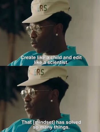
##### Creatives embrace this philosophy
- Writers have long embraced this idea. Writing freely, then refining. From H.G. Wells’ sandcastle metaphor to Hemingway’s “Write drunk, edit sober,” the message is the same: let ideas form before you start shaping them.
- Musicians and producers describe a similar rhythm: explore and record in the early stages, layer sounds, experiment with texture, then move into edit mode to cut, balance, and refine.
- Artists often start with a messy, impulsive phase, then shift into a slower, more deliberate process where meaning and composition take shape.
- Educators and edtech creators often begin with playful, exploratory methods to spark creativity, then use structured feedback and evaluation to guide progress.
**Rick Rubin’s creative process mirrors this mindset.**
While he doesn’t use the phrase directly, his approach aligns. In [*The Creative Act*](https://www.amazon.com/Creative-Act-Way-Being/dp/0593652886/?ref=everydayux.net) and interviews, Rubin describes the early phase of making as collecting “seeds.” Ideas gathered without judgment, guided by curiosity and openness. He emphasizes experimentation, play, and allowing ideas to unfold without interference. Later comes the discipline: ruthless editing, clear decisions, and a focus on what best serves the work. His four-phase model—Seed, Experimentation, Crafting, and Completion—tracks closely with the principle that great creative work starts with exploration and takes shape through refinement.
**The message is clear:** Make first, edit later. Creators use it to remind themselves—and each other—that the most important thing is to begin creating.
As creative tools continue to put more power in our hands, making it easier than ever to design, write, or build, the need to separate these two energies becomes even more important.
[What Flow reveals about the creative process and self-directed learningFlow is a stunning animated film and a testament to creative independence. Made by a self-taught filmmaker without storyboards or a traditional pipeline, it proves that great work comes from curiosity, experimentation, and trusting the process. Here’s what Flow reveals about the creative journey.everyday uxJess Eddy](https://www.everydayux.net/what-flow-reveals-about-the-creative-process/)
### 4 / Applying it to UX design
**Lead with curiosity; sharpen later.**
This mindset is also incredibly useful in design. UX work demands both imagination and pragmatism. But too frequently, we try to hold those two ways of thinking at the same time. That’s when we might miss the best ideas or opportunities. *“Create like a child, edit like a scientist”* helps by giving each mindset its own space in the process.
##### Create like a child
**Embrace playful ideation**
In the early phases of the design, loosen the grip on polish and precision. Sketch loosely, prototype quickly, and let strange ideas surface without filtering them too soon. The goal is to surface possibilities you might not have considered. Treat the process like an open question.
**Encourage experimentation**
Lean into rapid prototyping, design sprints, and low-fidelity wireframes. These methods are designed to be quick and imperfect. You’re not polishing, you’re exploring. Try things out without worrying if they’ll work. The goal isn’t to be right, it’s to see what’s possible.
**Foster curiosity**
Look at problems with fresh eyes. Ask “what if?” and “why not?” instead of jumping straight to best practices. When you bring a sense of wonder into the process, you’re more likely to spot unexpected opportunities and design something that stands out.
##### Edit like a scientist
**Test and validate rigorously**
Once you have a few directions, it’s time to shift modes. Now you’re asking different questions: What’s working? Where are users getting stuck? What needs to change? Start testing and gathering feedback. Get curious about how people use what you’ve made.
**Iterate methodically**
This is where structured processes matter—A/B testing, analytics, and heuristic evaluation. Let the data help shape your next steps. Be willing to discard or revise even your favorite ideas if the data doesn’t support them.
**Document and reflect**
Keep detailed records of what you test and why, so you can learn from failures and successes, just as a scientist would.
### In life and work
This mindset also applies to life. It reminds you to give yourself time to explore, and also time to make sense of what you’ve found.
**Balance creativity and critique**
Start by generating freely; no judgment, no second-guessing. Later, return with a critical lens to refine what’s worth keeping. Keeping those phases distinct helps you move faster, make clearer decisions, and produce sharper work.
**Collaborate effectively**
In team settings, this mindset can be a game-changer. Allow for open, playful idea sharing, then shift together into a more structured, evaluative mode. Both phases are important, and each requires a different kind of thinking.
> The best UX designers I know aren’t just great at tools or trends. They know when to explore possibilities and when to focus on what works. They explore freely, then shape and refine with intention.
---
### 5 / Living the mindset
**Use it in your life.**
*“Create like a child, edit like a scientist”* isn’t just a work mantra. It’s a way to approach your life with more openness, intention, and self-awareness. At its core, it’s about being playful and curious when you try something new, and reflective and honest when it’s time to grow.
Here’s how it can show up in everyday life.
##### Create like a child
**New experiences don’t always need a plan.** Follow curiosity, even if the outcome is unclear. Try things, notice what draws your attention, and don’t overthink whether it “makes sense.” That openness, more exploratory than strategic, is often where the most meaningful shifts begin.
**Let yourself try new hobbies, take small risks, and make mistakes without pressure.** Be playful. Take a cooking class just because it sounds fun. Say yes to a strange idea. Try something and see what happens. You don’t need a plan to get started.
**And keep asking questions.** Especially about things you think you already understand. “Why am I doing it this way?” “What if I tried something different?” That childlike curiosity keeps you from getting stuck in default patterns.
##### Edit like a scientist
Shift gears. Reflect on what worked and what didn’t. Look at your day, your habits, your relationships. What’s adding energy? What’s draining it? What patterns are emerging? This isn’t about being hard on yourself, but rather being honest and thoughtful, like a scientist reviewing an experiment.
**Make small changes based on what you notice.** Adjust how you spend your time. Try a new way of responding in a tough conversation. You don’t need to overhaul your life; learn from the data of your own experience.
**It helps to write things down, too.** You don’t have to be a daily journaler, but keeping notes on what you’re trying and what you’re learning helps you stay aware of your own growth. Scientists keep lab notebooks. You can do the same, in your own way.
---
*“Create like a child, edit like a scientist”* protects what matters most in creative work: momentum, clarity, and depth. When you separate exploration from evaluation, ideas have room to develop before being shaped. That distinction isn’t just helpful, it’s essential.
In life, the same applies. Releasing control gives you space to learn, adapt, and stay curious. You stop expecting precision on the first try and start trusting that clarity will come through the process. Over time, that builds creative resilience, sharper thinking, and a way of working that’s both grounded and alive.
### Collaborative design: how teams solve problems together
URL: https://www.everydayux.net/collaborative-design-methods-examples/
Last updated: 2025-08-08T00:58:12.000Z
Design isn’t a solo act. In fast-moving, hybrid teams, our best work occurs when cross-functional partners collaborate on real-world problems, shaping ideas, stress-testing solutions, and building momentum as a team.
Collaborative design is not about holding endless or ineffective workshops or bringing everyone together for a brainstorming session. Done right, it’s structured, intentional, and highly effective.
> So what does good collaboration actually look like? How do teams share ownership without sacrificing focus or quality?
In this article, you’ll see four real examples of collaborative design in action. You’ll see how teams with different goals, roles, and constraints align quickly, move with clarity, and ship with confidence.
---
### Example 1: Emerging methods, working in code
There’s a shift in how teams, especially designers and engineers, are working together. Instead of waiting for polished Figma files, many teams now start directly in code. Engineers scaffold a functional UI early, and designers jump in later to refine the experience directly in the codebase, often using tools like Cursor.
> It’s fast. A little messy, yet very exciting and reflects a true builder mentality. And it’s changing how teams think about the role of design.
In this model, design is more tightly integrated into the build loop. The Figma file isn’t always the source of truth anymore. It’s where early thinking and exploration happen, where teams align just enough to clarify and move forward.
Designers are also becoming more self-sufficient. With tools like [Vercel](https://v0.dev/?ref=everydayux.net), Claude, and GPT, they can spin up functional prototypes independently. The goal isn’t production-ready code, but faster feedback, real context, and earlier validation.
This approach gives designers more autonomy and tightens the feedback loop with engineering. Prototypes evolve from static deliverables into live, testable artifacts and conversation starters. Collaboration feels lighter, faster, and more mutual.
Of course, not every project starts in code. When teams are still defining the problem or aligning on strategy, traditional methods often prove more effective. Sometimes the first step isn’t building, but finding a shared language, surfacing diverse perspectives, and framing the challenge.
### Example 2: Co-creation workshop for early concepts
When teams are just starting to explore a problem space, co-creation workshops can be a powerful way to build shared understanding and set direction. These sessions typically bring together product managers, designers, researchers, and other key stakeholders, each offering a different lens on the problem.
The goal isn’t polished or finished designs. It’s to surface the right problems, align on priorities, and lay a strong foundation for what comes next. Effective facilitation is critical: time-boxed activities, sketching exercises, and focused discussions ensure everyone has a voice while keeping momentum.
A good co-creation session doesn’t need to produce final outputs, but it should leave the team and you, the designer, with enough clarity to move into mid-fidelity exploration. It also creates early alignment on user needs and builds a sense of shared ownership for the work ahead.
Here are a few formats that work well in these early workshops:
- **Lightning decision jam**: Helps teams quickly identify challenges, prioritize, and generate actionable ideas in a structured flow.
- **Design studio**: Encourages parallel ideation through individual sketching and group critique to converge on strong directions.
- **Crazy 8s**: A rapid-fire method for sketching eight ideas in eight minutes. Great for breaking through the obvious.
- **How might we (HMW)**: Frame challenges as opportunities by converting user problems into “How might we...” questions.
- **Jobs-to-be-done mapping**: Aligns the team around the functional, emotional, and social needs that drive user behavior.
Each can be adapted based on your team’s needs, but all aim to bring structure, speed, and shared insight to the process.
### Example 3: Async collaboration using Figma and Loom
In distributed teams working across time zones, asynchronous collaboration becomes essential. When time zones don’t overlap and real-time meetings are limited, tools like Figma and Loom enable designers and stakeholders to stay in sync without needing to be online simultaneously.
Instead of traditional critique or sharing sessions, asynchronous workflows might involve recording Loom videos to walk through a prototype and the rationale behind it, and leaving comments directly in Figma, using an organized Figma file to guide reviewers through a structured flow.
This approach supports speed. No one has to wait for the next available time or come online outside of working hours to give or receive feedback. It’s also more inclusive, giving quieter voices time to reflect before responding and allowing stakeholders to participate at their convenience.
### Example 4: Rapid iteration with stakeholder involvement
Collaboration doesn’t always happen up front. Sometimes it unfolds during the process and amid the work. When timelines are tight and expectations are high, rapid iteration can be the most effective form of collaboration.
The key is maintaining frequent and structured feedback loops. Instead of long approval cycles, teams rely on short, focused cycles of building and reviewing. Designers share quick prototypes or annotated designs, keeping track of decisions and open questions, and stakeholders weigh in through lightweight check-ins.
This format maintains momentum while preserving clarity. Everyone knows what’s being worked on, what’s been agreed to, and what still needs input. It reduces ambiguity and builds trust, not only in the work itself, but also in the process and the people involved.
Visually, this kind of collaboration might look like a simplified loop: prototype → feedback → refine → repeat. It’s not flashy, but it’s fast, grounded, and designed for delivery.
### Key takeaways
Across all three examples, certain patterns emerge. Collaborative design works best when teams create shared visibility, foster environments where everyone feels safe to contribute, and use structured ways to gather and act on input.
What to avoid? Design-by-committee decisions that blur accountability, unclear ownership that stalls progress, and overlong meetings that drain energy.
**The best collaboration is deliberate.**
### Collaborative design supports innovation
When teams collaborate across roles, they find better and more creative ways to solve problems; here are more benefits of collaboration.
- **Taps into diverse perspectives:** Different roles and backgrounds surface better ideas and challenge assumptions.
- **Improves real-time problem-solving:** Early cross-functional input reveals risks and ensures solutions are viable.
- **Keeps work grounded in user needs:** Multiple viewpoints help stress-test ideas before they reach users.
- **Builds buy-in from day one:** Involving others early increases ownership and reduces resistance.
- **Speeds up iteration cycles:** Fast, integrated feedback loops move ideas forward with fewer bottlenecks.
- **Breaks down silos:** Collaboration connects insights across teams, leading to stronger, more aligned solutions.
---
### Common traps to avoid
Even with the best intentions, collaboration can go sideways. Here are some pitfalls to watch out for:
- **Design by committee**: Design by committee slows decisions and creates products that try to please everyone but serve no one.
- **No shared goals = fragmented work**: Align on objectives, metrics, and priorities early, or so collaboration sticks.
- **Unclear roles and responsibilities**: Without defined ownership, tasks might get overlooked. Assign responsibilities upfront.
- **More features ≠ more value.** Prioritize solving real user problems, not just creating output.
- **Skipping user input misguides design:** Internal feedback alone can misalign the product; bring in real users early and often.
- **Unstructured communication hinders alignment:** More collaborators mean more chances for confusion. Keep comms clear and documented.
- **Polish without purpose fails:** Don’t prioritize aesthetics over usability. Validate core flows first.
Being aware of these pitfalls will help design better workshops and make running workshops worthwhile.
---
##### Good collaboration is not frictionless, but it’s designed to work through it.
If you’re looking to make your own design process more collaborative, you don’t need to overhaul everything. Start small. Choose one of the methods above, maybe a short async feedback loop or a half-hour co-creation session, and try it on a low-stakes project this week.
Utilize familiar tools such as Figma, Miro, Google Docs, or Loom. Focus on creating shared visibility and giving everyone a clear way to contribute. Be intentional about structure and facilitation.
The goal isn’t to get everyone involved in every decision. It’s to create just enough structure for better thinking, better teamwork, and better outcomes.
> Before your next project kickoff, ask: Where could a bit more visibility or tighter collaboration help us move faster, or make better decisions?
---
The goal of collaborative design isn’t unanimous agreement, but rather engaging in a process that produces better work than one person could do alone. When teams work together and bring clarity, structure, and trust to the table, they don’t just move faster, they make sharper decisions, avoid costly missteps, and deliver work that holds up under pressure.
### Why every designer needs a bit of kindergarten thinking
URL: https://www.everydayux.net/kindergarten-thinking-for-designers/
Last updated: 2025-08-08T00:58:22.000Z
#### How curiosity, creativity, and play can reshape your design process.
Most design advice tells you to optimize: work smarter, manage your time, refine your process. But what if the real unlock isn’t about optimizing, but about thinking more like a kindergartener?
In a world where creativity is more valuable than ever, many designers feel boxed in. Rigid processes, tight timelines, and pressure to get it right the first time can squeeze the life out of ideas. We forget that great work often starts with wandering, not planning. With trying, not knowing. With play, not performance.
This guide explores a different mindset, one inspired by kindergarten classrooms, where imagination, building, sharing, and reflection are the means by which learning occurs. Drawing from the work of MIT’s Mitchel Resnick, we’ll explore how his “Kindergarten Thinking” framework can help you approach design in a more open-minded way.
---
### Part 1 / Rediscovering creativity: What kindergartners get right
Modern work is optimized for efficiency and rewards conformity and productivity, not imagination. But creativity needs something different: space to explore, permission to play, and room for curiosity to lead the way.
Mitchel Resnick, a researcher at the MIT Media Lab and creator of [Scratch](https://www.edsurge.com/news/2019-01-03-mitch-resnick-the-next-generation-of-scratch-teaches-more-than-coding?ref=everydayux.net), believes the rest of life, not just school, should be more like kindergarten, not less. His philosophy, “Kindergarten Thinking,” advocates a learning approach centered on imagination, experimentation, and collaboration. Not a linear checklist, but a looping process of imagining, making, sharing, and reflecting.
This is known as the spiral of creative learning. It starts with an idea, then takes shape through building or making. From there, playful tinkering opens up new possibilities. Sharing that work with others brings fresh feedback and perspectives. And reflection, asking what worked, what didn’t, and why, creates the momentum for another loop through the spiral.
Many creative people already work this way, looping through ideas and iterating as they go. But under pressure, it’s easy to stop trusting that instinct.
In contrast, most adult work culture prizes predictability over play. Deadlines, deliverables, and expectations can crowd out the space needed to explore. We skip the messy middle. We rush to results. But creativity lives in the chaos in between.
And that’s exactly when we need kindergarten thinking most.
The open, exploratory spirit of a good kindergarten classroom offers a powerful reminder: curiosity leads to discovery. Play reveals new paths. Collaboration makes ideas better. Reflection brings clarity.
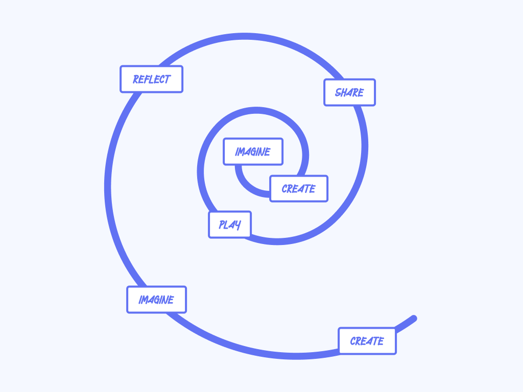
The spiral of creative learning
Take a moment to reflect: When was the last time you felt truly curious while working on something? What was different about that experience? Did you have more space, more ownership, or fewer expectations? Did it feel a bit like play?
Chances are, your best ideas didn’t come from following a rigid brief. They emerged when you let yourself wander, tinker, and explore.
The best part? This mindset isn’t a one-off; it’s a habit you can build into everyday work. In Part 2, we’ll explore how.
### Part 2 / How kindergarten thinking helps you design better
At the heart of kindergarten thinking are four core ingredients: projects, passion, peers, and play. Mitchel Resnick calls them the four Ps. They apply just as much to professional design teams as they do to five-year-olds with building blocks.
Projects, passion, peers, and play aren’t just for kids. They’re the building blocks of creative work at any level.
Let’s reframe each through the lens of creative work:
##### Projects
Kindergarten kids don’t learn by memorizing; they build things that matter to them. That’s where their focus, energy, and growth come from.
Designers are no different. Creative confidence grows when you’re working on something real. If the problem feels too abstract, disconnected from users or outcomes, it’s hard to care, and harder to push through uncertainty.
Real projects provide creative energy with a purpose. A user's need, a team's goal, and a side project; these are the containers that focus our effort.
##### Passion
Young kids chase what excites them. Designers should do the same, but with intent.
This isn’t only about following what feels fun, but fun can be a signal. It’s often the doorway into deeper curiosity and meaningful work. What keeps showing up in your thinking? What idea won’t leave you alone? Follow that thread.
That kind of engagement unlocks more creativity and often leads to better, more innovative ideas.
##### Peers
In kindergarten, kids create side-by-side. They borrow ideas, give feedback, and build in public. It’s a shared process. Not just collaboration, but co-creation.
That’s the essence of co-design: designing with others. It means involving peers early, valuing their input throughout, and shaping the outcome together.
Designers benefit from the same posture. Share before things are polished. Invite real input, not just a sign-off. Let teammates and stakeholders help shape the direction, rather than just responding to it.
When you open up your process like this, you don’t just get feedback, you get better ideas, faster. You create shared ownership. And you tap into the collective creativity of the group.
##### Play
Play is the engine. It’s how kids test limits, invent possibilities, and keep momentum going.
Importantly, they don’t dwell when something fails. If a block tower falls or a drawing doesn’t work out, they move on. They try something else. For them, it’s not failure, it’s just part of the process.
For designers, play means experimenting without pressure. It looks like quick sketches, working with an idea that doesn't immediately make sense, or throwing out the first five ideas to get to the sixth.
When we treat our work as something to explore, not prove, we create space for new directions to emerge. This process requires spending time on discovery.
##### A quick example
Let’s say, as the designer on a project, you received a brief with a clear problem and an implied solution. The expectation was to implement a refined version of what had already been scoped.
But instead of defaulting to what was assumed, you took a step back and asked, “What if?” That question opened up the space to explore. You imagined different possibilities and cast a wide net, brainstorming new ways to approach the problem.
By suspending the need to land on an answer immediately, you can uncover stronger, more creative, and user-focused directions that hadn’t been considered. It wasn’t about resisting the brief, but looking beyond it.
> That shift, from accepting a solution to rethinking the question, can change the outcome entirely.
Kindergarten thinking isn’t a framework or method. **It’s a posture.** When you design in the spiral of creative learning, it is less about performance and more about exploration.
### Part 3 / Design like a kindergartener: a mindset shift for modern makers
**Imagine, create, play, share, reflect—then do it again.**
Kindergarten thinking isn’t just a feel-good idea. It’s a practical mindset for creative work, especially in environments that prize output over exploration.
Mitchel Resnick’s spiral of creative learning gives us a model: imagine → create → play → share → reflect. Then repeat. It’s not linear. It’s cyclical. It welcomes being open to a path unknown, embracing failure, and rewards curiosity, treating each step as fuel for momentum, not a checkpoint to clear.
Designers already work in a loop: research, sketch, prototype, test, and revise. But too often, those loops feel like pressure to deliver, not permission to explore.
So what if you made space for imagination, experimentation, and reflection—not just when things go wrong, but by default?
Here are a few questions to consider:
- What’s something you’re curious about but haven’t explored, because it didn’t feel "productive"?
- What would happen if you treated your next idea like a toy or a sketch, not a deliverable?
- What if your next prototype were for your peers, not your stakeholders?
**Try this:** pick an idea you’ve been sitting on, something small, interesting, and maybe a little weird, and run it through a mini spiral.
- **Imagine**: Let yourself wonder. No prompt, no pressure. Just curiosity.
- **Create**: Make a quick version. A sketch, a messy draft, a working file.
- **Play**: Push it further. Break it, remix it, try something unexpected.
- **Share**: Show someone. Ask what they notice, not what they’d fix.
- **Reflect**: What surprised you? What did you learn? What might come next?
Then loop again.
At its core, this is what design has always been—and what it’s meant to be.
Kindergarten thinking doesn’t ask you to take your work less seriously. It asks you to make your process more open. Because when you bring imagination, curiosity, and play into your practice, you don’t just make better things, you become more creative, resilient, and alive in the work.
Creativity isn’t something you master once. It’s an ever-evolving work in progress.
And like the best kindergartens, your creative practice works best when it’s rooted in curiosity, guided by passion, shared with others, and open to play.
Kindergarten thinking means being open. Willing to try. Willing to wonder. Willing to learn by doing.
So the next time you feel stuck, stale, or boxed in, remember the spiral:
Imagine, create, play, share, reflect. Then do it again.
It’s not just a better way to design. It’s a better way to stay connected to why you started designing in the first place.
### 31 case study writing tips for designers (in a free Figma file)
URL: https://www.everydayux.net/case-study-writing-tips-figma/
Last updated: 2025-08-08T00:58:33.000Z
A while back, I shared an article called [*How to write and present UX case studies that get you noticed*](https://www.everydayux.net/ux-case-study-guide/). It was packed with ideas, but I kept thinking: what are some practical tips that designers can use while designing their case study?
I created a free (for members) Figma file with 31 case study tips, organized into cards that you can keep open as you write. Each one focuses on a specific principle, such as clarifying your role, framing constraints as opportunities, or structuring a story arc that feels relatable and engaging.
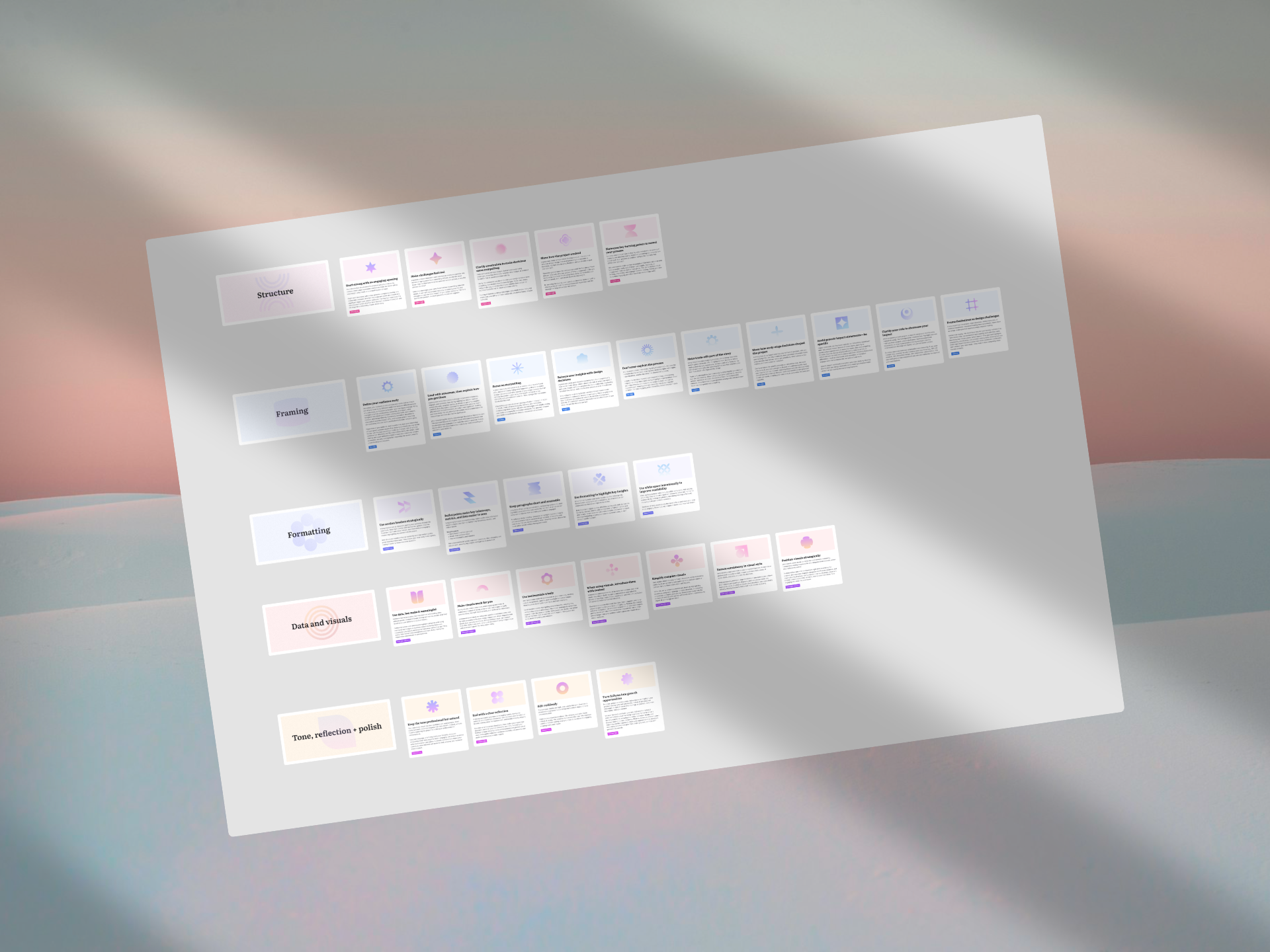
The goal: to create tips that you can use in Figma that help you write a case study that’s not just informative, but clear, strategic, and memorable. Explore how to apply the mindset of a designer to writing and developing a case study. Each section below includes a list of the most relevant cards from the Figma file, so you can go deeper or use them as a reference when you need them.
⬇️
Download the Figma file at the bottom of this post.
### 1 / Treat writing like a design challenge
Developing a case study *is* an exercise in writing, but if you’re a designer, you already have most of the tools you need. The same principles you use to create clear, intuitive interfaces also apply to communicating your work. Think of your case study as a user experience in itself. One where your reader needs to quickly understand what you did, why it mattered, and how you think.
Start by identifying the audience. Are you writing for a hiring manager scanning for signals of leadership and impact? A fellow designer curious about your process? An exec looking for business value? Just like designing for different personas, your writing should adjust based on who’s reading.
Then apply the basics of information architecture: lead with the most important insight, break content into logical sections, and use a clear hierarchy to guide attention. Treat each paragraph like a UI element. Does it serve a purpose? Is it in the right place? Is it helping or adding noise?
Finally, reduce friction. Don’t over-explain every step of the process. Instead, focus on the moments that mattered, trade-offs, turning points, and decisions that shaped the outcome. Include only the research insights that drove change, and keep your content high-level but meaningful. Utilize formatting and white space to enhance scannability and maintain your audience's engagement. A well-written case study tells a story and makes the significance of your work obvious and easy to grasp.
##### Relevant tips
- Define your audience early
- Use section headers strategically
- Bullet points make key takeaways, metrics, and lists easier to scan
- Use formatting to highlight key insights
- Don’t over-explain the process
- Use white space intentionally
### 2 / Structure creates meaning
Structure shapes how your work is perceived. A well-structured case study guides your reader through a clear and meaningful journey, helping them understand not just *what* you did but *why* it mattered.
A strong narrative structure mirrors good storytelling. Start with the problem, introduce the insight that shifted your thinking, walk through the actions you took, and end with measurable results. This “*problem → insight → action → result*” arc gives your case study emotional clarity and logical flow.
But structure isn’t only about order—it’s about emphasis. Highlight turning points that changed your direction or sharpened your focus. Surface the trade-offs you navigated along the way. These decision points give your reader insight into how you think and work under pressure.
It also helps to lead with outcomes. Don’t wait until the end to show impact. Share a key result early to capture attention and set expectations. From there, your process becomes the proof behind the result.
And finally, think of your formatting choices as part of the structure. Section headers, bullets, bolded lines, and spacing act like visual signposts. They make it easier to scan and absorb key takeaways, just like good interface design.
##### Relevant tips
- Make challenges feel real
- Lead with outcomes, then explain how you got there
- Make trade-offs part of the story
- Show how the project evolved
- Focus on storytelling
### 3 / Help your audience feel what mattered
Facts inform, but feelings make an impression. A great case study doesn’t just report what you did but makes the impact feel real and human. That means grounding your decisions in authentic moments, surfacing user struggles, and showing the thought process behind the work, while also acknowledging the tension inherent in your constraints.
The most compelling design decisions are the ones tied to real user pain points. Don’t just describe what changed; rather, show the friction users faced and explain how your solution addressed that specific issue. Grounding your decisions in context helps the reader feel the weight of the problem and the value of the resolution.
Visuals can reinforce this emotional connection, but only if they’re used with purpose. Add screenshots, diagrams, or comparisons only when they clarify a point, illustrate improvement, or bring a moment to life. Avoid decoration. Every visual should carry meaning and support your narrative.
When talking about constraints, don’t shy away from them. Whether you had limited time, resources, or data, frame those limitations as design challenges. Share how you adapted or prioritized under pressure; this not only adds credibility, but it reveals your problem-solving mindset.
Finally, let people see how the work evolved. Show the loops of feedback, the shifts in direction, and the choices that emerged through iteration. This builds trust with your reader—they’re not just seeing the polished version, they’re seeing how you got there.
##### Relevant tips
- Balance user insights with design decisions
- Make visuals work for you
- When using visuals, introduce them with context
- Frame limitations as design challenges
- Show how early-stage decisions shaped the project
---
Writing a case study isn’t just about showing what you did, but rather it’s about shaping how others understand it. When you apply design thinking to how you write, structure, and tell your story, your work becomes easier to grasp and memorable. If you found this helpful, please share it with a friend or teammate!
### Download the case study tips Figma file
##### Free for everyday ux members
_This post is for paying subscribers only._
### Things worth seeing this month
URL: https://www.everydayux.net/may-2025-design-trends-tools-updates/
Last updated: 2025-08-08T00:58:47.000Z
This week, instead of a deep-dive article, I’m sharing a mix of things I’ve been exploring, ideas, tools, and trends that caught my attention recently. From platforms for visual inspiration to emerging design formats and new creative tools, here’s a roundup worth checking out.
### Cosmos
[Cosmos](https://www.cosmos.so/?ref=everydayux.net) is a digital sanctuary for visual thinkers. Designed with intention, it provides a calm, immersive space to collect and organize inspiration, free from the noise of likes, comments, and followers. The dark, minimalist interface like a curated gallery, inviting designers, artists, and creative minds to explore and express without distraction. Every interaction feels thoughtfully crafted, from smooth transitions to art-directed typography, making Cosmos as inspiring to use as the content it holds.
Cosmos
### Visual Electric
[Visual Electric](https://visualelectric.com/?ref=everydayux.net) is an AI-powered image generation platform designed for creative exploration, with a strong emphasis on photography-inspired aesthetics. It showcases a wide range of styles—editorial, fashion, product, cinematic, and minimalist—highlighting its ability to produce highly detailed, stylized, and imaginative visuals. Users can input rich prompts describing mood, lighting, subjects, and style to generate photorealistic or artistic images.
The platform caters to creative professionals, designers, photographers, and artists seeking distinctive visuals for editorial, conceptual, or commercial work. Its diverse outputs, from avant-garde fashion to surreal compositions, reflect a focus on both technical quality and artistic direction.

Visual electric
---
## Design news
### Airbnb’s new generation of 3D icons
Airbnb recently launched a redesigned app featuring a new media format for icons called “Lava,” a proprietary, high-performance format designed for animated, 3D UI elements. Unlike static icons or formats like Lottie, Lava delivers richly rendered, tactile icons with smooth, high-frame-rate playback and full alpha transparency, bringing a playful and immersive feel to the interface.
> Designers, in short, are losing their minds over this new style. It’s fun, visually rich, and feels like a modern throwback to the hyper-realistic 3D Apple icons of the early 2000s, only reimagined with today’s tech and taste.
Lava functions as a lightweight “micro-video” with a transparent background, enabling responsive, real-time animations that can pause, play, or sync with user interactions. The icons are prerendered in 3D with detailed lighting and shadows, giving them a handcrafted, clay-like appearance. A custom rendering engine ensures seamless performance across Airbnb’s web, iOS, and Android apps, with no need for platform-specific adjustments.
### 3D icon tools and explorations
[Charlie Clark](https://x.com/clarkcharlie03?ref=everydayux.net) is quietly working on [Thiings](https://www.thiings.co/?ref=everydayux.net), a beautiful library of 3D icons with user profiles so people can show off their creations.
0:00
/0:18
1×
Thiings by Charlie Clark
Richard Rolfs created a GPT prompt that remarkably closely replicates the new Airbnb icon style. [Check it out and try making your own](https://www.richardrolfs.com/resources/airbnb-2025-lava-icons?ref=everydayux.net).
> Here’s a Pixar-style lamp I generated using Richard’s prompt. This is one attempt, with no edits.
A Pixar-style lamp using Richard Rolfs prompt
[@soumyadesign](https://x.com/soumyadesign?ref=everydayux.net) uses a structured, iterative approach to generate 3D icons. She builds prompts with consistent syntax, angle, texture, details, and reuses outputs to reinforce style. For accuracy, she references images (such as IKEA shots) and provides specific feedback when results require refinement. For Airbnb-style icons, she referenced their set; for others, she relied on careful prompt tuning without external references.
> Here’s a set of lamps I created using her technique. [See the thread and her method](https://x.com/jesseddy/status/1926056302494544135?ref=everydayux.net).
Set of lamps using @soumyadesign's method.
Lastly, take a look at how [@MattJedrzejewsk animated this 3D icon](https://x.com/MattJedrzejewsk/status/1906835418588590318?ref=everydayux.net) with a full 360-degree view—perfect for use in any app or website.
0:00
/0:49
1×
3D animation by [@MattJedrzejewsk](https://x.com/MattJedrzejewsk/status/1906835418588590318?ref=everydayux.net)
---
## Tools and apps
### How to convert
[How to convert](https://howtoconvert.co/?via=jess&ref=everydayux.net) is one of my favourite new finds.
0:00
/0:46
1×
How to convert
**How to convert** is a privacy-focused file conversion tool that runs entirely in your browser or offline via a downloadable app, meaning your files never leave your device. Unlike typical converters that upload files to external servers, it processes everything locally, eliminating privacy risks. It supports batch conversions, offers advanced settings for various formats, including images, audio, and documents, and accommodates over 2,000 file types, including niche and professional formats. The platform is available on the web and as a cross-platform app, with a simple interface, transparent one-time pricing, and active, open development based on user feedback.
---
## Other news
### Config ’25
Figma Config wrapped for the year—if you missed the Figma updates and product launches, [@nlevin has a great summary thread](https://x.com/nlevin/status/1920199213268545588?ref=everydayux.net) that covers it all concisely. [See and watch the talks](https://www.youtube.com/@Figma/videos?ref=everydayux.net).
### Y Combinator
YC [encourages more designers](https://www.ycombinator.com/rfs?ref=everydayux.net) to become founders, arguing that their strengths, user empathy, problem-solving, and taste are critical to building great companies. As AI and no-code tools lower technical barriers, design-led startups are uniquely positioned to thrive, and YC wants to fund them from the start.
### James Dyson
James Dyson just launched the world’s thinnest vacuum cleaner, showing how obsessive attention to every design detail and use case can lead to products that are both transformative and highly profitable. [Read more and chime in](https://www.linkedin.com/feed/update/urn:li:activity:7332914493531799552/?ref=everydayux.net).
### Why UX design still feels sidelined in many organizations
URL: https://www.everydayux.net/why-ux-design-still-gets-sidelined/
Last updated: 2025-08-08T00:58:57.000Z
### Why does UX design often feel like an afterthought in some organizations, even when everyone agrees it’s valuable?
Designers are naturally positioned to substantially impact the products they work on and, by extension, the business, shaping what gets built, how it’s built, and why. However, many of the most important decisions happen upstream, with design often treated as an afterthought or not considered relevant at this stage. This scenario isn’t necessarily intentional.
> It’s about power structures.
Not in a cynical or conspiratorial sense, but in how all systems behave: they settle. Over time, roles, rituals, and reporting lines harden. They become self-reinforcing, often without anyone noticing. Once those structures are in place, it becomes very difficult to shift influence, even when the intent is there.
**As a result, these self-reinforcing structures create the same recurring challenges for designers, keeping them stuck in tactical roles rather than strategic ones.**
Many organizations still see designers as people who create screens and are good at using a tool (Figma), rather than valuable problem-solvers who shape *what* to build and *how* to build it. Even though screens are an **output of the problem-solving process, not the main feature**, much like a photo is the outcome of a photographer’s creative judgment and perspective, not just their camera skills.
### The high cost of sidelining design
This isn’t just frustrating for designers: it’s a **huge value loss for businesses**, which pay for top talent but only tap into a fraction of their potential.
In the worst cases, this lack of utilization leads organizations to question the value of design altogether, reinforcing the misconception that designers aren’t effective or strategic, without ever giving the design practice a real chance.
Designers are often the last to be included in problem definition, if they’re included at all. Despite being some of the most knowledgeable people in the room about the user, the business, and the product, they’re frequently brought in only after the strategy is set and the roadmap is locked. This leads to a range of familiar frustrations.
Frustrations include being treated as decorators or screen creators, asked to *“make it look good”* after the core decisions have already been made, and reducing design to a final layer of polish. They’re brought in too late to share early insights about user behavior and pain points, missing the chance to shape the problem before solutions are locked in.
> Critical decisions about priorities, trade-offs, and product direction are often made without their input, leading to missed opportunities and a poorer product experience.
Other common frustrations include being handed fully formed ideas with little room for creative exploration, leading to rushed, reactive work. When design is measured primarily by visual appeal or speed, it misses the chance to impact user outcomes and business goals.

**This isn’t just frustrating for designers.** It’s a structural problem that prevents organizations from reaping the full benefits of design.
As a relatively new discipline in the corporate world, design is often grafted onto systems that were never built to include it at the center. So, despite all the talk about “user-centricity,” designers usually find themselves downstream from real decisions.
It’s not necessarily personal. It’s structural. And that’s exactly why it’s so persistent. For organizations to be truly successful, they need to address this issue at its root.
It’s not just about individual roles or communication styles. It’s about the deeper, often invisible dynamics that shape decisions—how power structures form, settle, and reinforce themselves over time. Once in place, these structures quietly but powerfully dictate who has influence, who gets heard, and who is left out.
It’s also worth mentioning that not all of these challenges are purely structural or unintentional. Sometimes, people deliberately use these structures to protect their influence or control over certain areas of the business. They might gatekeep, land grab, or intentionally exclude others, like designers, to maintain control over their projects or portfolios. This behavior can further limit design’s influence and make breaking through established power dynamics even harder.
### Here are six of the most persistent structural challenges that keep design on the sidelines:
#### 1 / Power structures settle and self-reinforce
Organizations don’t just wake up one day and decide where power will reside. Structures emerge slowly, shaped by leadership, urgency, habit, and early decisions made under pressure. Over time, these structures settle. And once they do, they tend to stay put.
Systems don’t just behave this way; they *settle* into this.
What begins as a practical shortcut, like shipping fast without design input, becomes the norm. PMs and engineers are hired early, build the foundations, and define how decisions are made. Many key dynamics, team shape, road mapping cadence, and success metrics are locked in when design shows up.
That’s why having design leadership at the top from the start matters. When there’s no senior design voice at the table early on, the function lacks the visibility and leverage to shape the organization's growth. Design becomes a layer added onto a structure that was never built to include it as a core driver. And once that structure is in place, design is often asked to adapt to it, not vice versa.
So even when a company says it wants to elevate design, the system it’s built on doesn’t naturally allow for it. And when that system treats design as a service layer instead of a strategic partner, change is slow and uneven.
But it’s not just about where power lands, it’s also about how those early decisions create a path that’s hard to deviate from, even when better options emerge later. This is what systems thinkers call path dependence.
#### 2 / Path dependence: the system is already set
In systems theory and economics, there’s a concept called *path dependence*. It explains how early decisions, often made quickly, out of necessity, can shape a system’s long-term direction. Once a path is taken, it becomes increasingly difficult to reverse, even if better options appear later.
In tech and product teams, that path is often set early: hire engineers, then PMs, then maybe a designer, if there’s budget left. Who’s in the room during those formative moments becomes the default core team. Their tools, rituals, priorities, and ways of working solidify over time.
When added later, design tends to be positioned as a support function, brought in to help execute, refine, or polish. By that point, the system is already shaped. The roadmap is owned elsewhere. Decisions are made without design input. The idea of looping in UX “earlier” sounds good, but rarely sticks.
Once that structure is in place, it’s incredibly difficult to shift without deliberate rethinking at the organizational level. This is not because people are resistant, but because the system is simply doing what it was built to do.
**This is the quiet challenge of design maturity:** not proving that design matters, but trying to influence a system that wasn’t built with design in mind.
#### 3 / Institutional inertia: Organizations resist change
Change doesn’t come easily, even when people agree that design should be more involved. That’s because organizations, like all systems, tend to preserve what already exists.
Over time, rituals take hold, how roadmaps are made, who signs off on what, which meetings matter, and which don’t. Policies form, reporting lines solidify, and unspoken norms emerge. All of this subtly reinforces the original power dynamic.
So when someone says, *“We want to lead with design,”* they may genuinely mean it. However, the structure often makes that promise hard to fulfill. Designers might be invited to a meeting here or there, but they’re not included where the actual decisions happen, upstream, before options are locked in.
> This isn’t necessarily about bad actors. It’s about inertia.
The organization keeps moving in the direction it already knows, even if that path quietly sidelines UX. Without a structural shift, design remains peripheral, not by choice, but by the inertia of the system.
#### 4 / Statements vs. reality: the user-centric paradox
You’ve probably heard it before:
> *“We’re user-centric.”*
It sounds great. It’s often printed in onboarding decks, company values, and product briefs. But then the roadmap gets locked before research begins. Major decisions are made in rooms where no designers are present. The user shows up in the slide deck, but not in the strategy.
**This is the paradox:** design is praised in principle, but sidelined in practice.
And again, it’s not because people are hostile to UX. It’s structural. A company can say all the right things about design, but if the system still routes power through product and engineering, nothing really changes.
That’s the tension many designers feel daily: valued but not empowered, trusted but not consulted, and design having a seat but not a voice. Over time, that gap between language and action becomes a source of quiet disillusionment.
Being “user-centric” isn’t about intention. It’s about structure. And unless that structure shifts, the language is just branding.
#### 5 / Legitimacy and who defines value
Power influences what gets done and determines what *counts*.
In most organizations, the groups that hold power also define success metrics. If the dominant lens is product or engineering, success is often framed in terms of velocity, throughput, and revenue. Those are legitimate forms of value that get reported, celebrated, and resourced.
Design might influence all those things, but rarely in a straight line. Its impact is often indirect: improved comprehension, lower support tickets, stronger trust, smoother adoption. All of these are valuable, but they don’t always fit neatly into the success language shaped by others.
So even when design delivers results, those results are filtered through someone else’s framework. A simplified onboarding flow might reduce churn, but unless the system recognizes *that* as meaningful, the design team stays invisible.
**Legitimacy is power.** And until design helps redefine what value means inside the system, its contributions will always feel a little out of sync with the conversation.
#### 6 / The uphill push designers feel
Designers often feel like they’re constantly advocating, explaining, and justifying, trying to prove their value in rooms that weren’t built for them. Even when they succeed, the recognition can feel partial or misaligned. The work is framed as “nice to have,” even when critical to the outcome.
> *If you feel like you’re pushing uphill, it’s because you are.*
That’s because the system wasn’t designed with design in mind. The levers of influence, timelines, metrics, and authority are still calibrated for other disciplines. **So design operates with a kind of structural friction: always valuable, but never quite fully aligned with how the organization moves.**
This scenario is frustrating and disempowering, especially if you don’t realize what you’re up against. The push makes more sense once you understand you’re working *within* a settled system. And more importantly, it becomes easier to see where change might begin.

### What can be done
If the challenge is structural, the solution has to be structural too.
It’s not just about advocating for design as a function *but also* embedding it as a strategic driver that shapes how organizations make decisions.
Start by framing design work in strategic terms. Understand what the business values. Connect design outcomes to metrics that matter, like retention, adoption, conversion, and operational efficiency. Show not just what you made, but the impact it had. Only then can design become a truly integrated part of the organization’s structure.
Build alliances with those in power, partner with product leaders, engineers, and marketers, and help them win with design, not just by helping with visuals and prototypes but also by framing problems, testing ideas, and shaping solutions that drive real outcomes.
Most importantly, help redefine what your organization sees as valuable. That might mean pushing for new success metrics, creating visibility for work that improves quality, not just speed, and making the case for a design leader with real decision-making authority.
### Reframe the mission
The goal isn’t just to raise awareness of design, it’s to evolve the system so that design becomes part of making better decisions by default.
When design is structurally embedded, it changes how organizations think, decide, and serve their users. It shifts the focus from outputs to outcomes.
That kind of change doesn’t happen overnight. It requires patience, persistence, and a clear-eyed view of the system you’re working within. It means recognizing that the path forward isn’t just about individual influence, but evolving the environment.

### Design at the core: what it takes
A truly design-led organization integrates design as a strategic function. This means embedding design into the very fabric of decision-making, rather than treating it as an add-on. Here’s what that looks like in practice:
##### Design is structurally embedded
- Design has a voice at the highest levels, shaping strategy and decisions.
- Design is a core function, with dedicated resources, budget, and authority.
- User insights guide both strategy and execution, not just surface tweaks.
##### Collaboration is built into the process
- Designers, PMs, and engineers initially align on goals and priorities.
- Prototyping, testing, and iteration are core practices, not final steps.
- Design is included in problem definition and decision-making.
##### Design is part of the culture
- Design’s value is reinforced through hiring, promotions, and internal storytelling.
- Design outcomes are framed in business terms, creating shared understanding.
- Design is a competitive advantage, directly linked to customer loyalty and long-term success.
By aiming for this model, organizations make design more influential and create a more robust, human-centered decision-making process that ultimately leads to better business outcomes and higher user satisfaction.

### The benefits of building a design-inclusive organization
Some of the world’s most successful companies have fully integrated design into their strategy and operations. [Apple’s](http://apple.com/?ref=everydayux.net) high design standards and focus on intuitive, beautiful products have set industry standards and created a devoted customer base. [Airbnb](http://airbnb.com/?ref=everydayux.net) credits design as a core driver of its success, embedding design thinking into everything from digital interfaces to host tools. [Stripe](http://stripe.com/?ref=everydayux.net) has built its brand around beautifully designed developer tools, making complex financial processes more accessible. Even [Netflix](https://www.netflix.com/?ref=everydayux.net), known for its data-driven approach, relies heavily on design to create personalized, engaging user experiences.
> These companies don’t use design as just for aesthetic value; they leverage it as a strategic advantage, creating great product experiences that set them apart and improve the bottom line.
When used properly, design is a strategic advantage that drives better outcomes across the entire business. By integrating design into every stage of decision-making, companies see benefits that extend far beyond the product itself.
### Here’s why a design-inclusive approach pays off
##### Better products and experiences
- Align products more closely with real user needs, reducing costly pivots.
- Identify root causes faster and innovate more effectively.
- Create more intuitive, enjoyable, and trusted products.
- Deliver solutions that solve real problems and resonate with real users.
##### Stronger teams and collaboration
- Reduce friction and drive shared goals through cross-functional alignment.
- Increase designer satisfaction, reducing burnout and turnover.
- Build resilient teams that adapt quickly to change and uncertainty.
- Foster collaboration, curiosity, and empathy throughout the organization.
##### Better business outcomes
- Outperform competitors on revenue, market share, and CLV.
- Build brand equity and loyalty by treating design as a competitive advantage.
- Focus on meaningful problems, not just tactical execution.
- Improve efficiency, reduce costs, and strengthen brand value.
##### Greater innovation and agility
- Continuous innovation through rapid prototyping and iterative improvement.
- Respond to changing markets and uncover new opportunities faster.
- Reduce risk and time-to-market via early testing and user feedback.

### Inclusive collaboration models
Ultimately, creating a design-led organization depends on how teams collaborate and who’s included in the conversation at the beginning. Here are some ways of working that can make design a core part of decision-making.
##### Early involvement
- Align PMs, design, and tech leads on problems and outcomes from the start.
- Co-create roadmaps that balance potential solutions with technical constraints and strategic priorities.
- Share research responsibilities early to define critical questions and guide discovery.
##### Co-creation and participatory design
- Involve stakeholders directly in the design process.
- Run cross-functional workshops to gather insights and generate ideas collaboratively.
- Leverage collective intelligence to ground solutions in real needs.
##### Continuous collaboration
- Frame problems around user needs to uncover deeper insights.
- Include design in prioritization, decision-making, and ongoing alignment.
- Use cross-functional critiques to keep teams aligned and informed.

### Bring design to the center
If the problem is structural, the solution has to be, too. It’s not just about inviting design to more meetings, but rethinking how decisions are made, where influence sits, and what success looks like.
This means moving beyond outputs to focus on outcomes, embedding design as a core function, not just a support role, and building cultures where design isn’t just consulted but integrated into the organization’s foundation.
> This kind of change is slow, often uncomfortable, and sometimes invisible. But it’s the kind of work that makes everything else better.
### 15 GPT prompts to tailor your resume and land more interviews
URL: https://www.everydayux.net/15-gpt-prompts-to-tailor-your-resume-to-any-job/
Last updated: 2025-08-08T00:59:06.000Z
This guide explains why tailoring your resume matters, and how to do it more efficiently with GPT. Paid members also get 15 practical, time-saving prompts to help you align your resume with any job—quickly, confidently, and with greater agility.
### The truth about resumes in design hiring
Tailoring your resume can feel tedious when juggling applications, updating your portfolio, or preparing for interviews. But it pays off to avoid skipping this step.
> Here’s why tailoring your resume pays off—and why it’s essential if you want to stand out.
**Read more about writing an ATS-friendly resume.**
[How to design an ATS-friendly resume that gets noticed by recruitersWhen applying for jobs, many designers create two resumes: one for application tracking systems (ATS) and one that is designed. The extra effort is not necessary. This guide explains how to create a single resume that is both visually appealing and passes ATS standards.everyday uxJess Eddy](https://www.everydayux.net/ats-friendly-resume-tips/)
#### 1\. Applicant tracking systems (ATS) filter out generic resumes
Before a human sees your resume, it’s likely scanned by an Applicant Tracking System (ATS). These systems look for keywords and phrases pulled from the job description. Your resume gets ranked lower or filtered out completely if they don't find a match.
That means your resume needs to reflect:
- **Tools** (e.g., Figma, Framer, Webflow)
- **Processes and methods** (e.g., wireframing, prototyping, user research)
- **Titles or roles** (e.g., UX designer, product designer, UI/UX specialist)
You’re already a strong designer—now make sure your resume speaks the same language as the job post, so your strengths come through clearly!
#### 2\. Recruiters don’t read, they scan
If you do pass the ATS, the next hurdle is speed. Most recruiters spend less than 10 seconds on an initial scan.
They’re looking for signs of relevance at a glance:
- Do you mention the exact tools or methods the role asks for?
- Are your key UX skills and results easy to spot?
- Do your projects show measurable impact?
#### 3\. Tailoring signals effort—and fit
When you tailor your resume, you increase your odds of being seen. You also show that you understand the role and are a thoughtful, relevant match.
A tailored resume answers the implicit question:
> Why you, for this role, right now?
It uses the company’s own language, mirrors its priorities, and makes it easy for a hiring team to imagine you on their product team.
---
### Why tailoring feels hard (especially for designers)
Tailoring your resume is one of the smartest things you can do, and with everything else on your plate, it’s completely understandable if it hasn’t been your focus yet.
Because it takes time, time you often don’t have.
- You have to analyze each job description
- Identify the tools and skills they care about
- Adjust your resume to reflect those priorities
- And repeat the process for every single application
When you’re deep in job applications or focused on finding the right role, tailoring your resume can feel like another task. But it makes all the difference, because your portfolio can only make an impact if your resume gets you through the door.
### Where GPT makes resume tailoring easier
GPT helps you showcase your experience more clearly and efficiently, so your strengths come through faster and more effectively.
It helps you identify the right terms from each job post, highlight the aspects of your experience that match the role’s focus, and quickly build tailored versions of your resume without starting from scratch.
Need a strong starting point? [Resume Now](https://trkta.com/?a=407&c=9&s1=&ref=everydayux.net) offers simple, professional templates that make it easy to create a clean, well-structured resume. This allows you to focus your energy on tailoring the content with GPT.
You stay in control. GPT helps you move faster and align more closely with what hiring teams are scanning for.
Here’s what GPT helps you do:
- Speeds up tailoring by surfacing the keywords and priorities in each job
- Refines your language to highlight real skills and outcomes
- Makes your resume easier to scan—both for ATS and recruiters
**Key principle:** Use GPT for *clarity*, not fiction. It’s about precision, not exaggeration.

### How to use GPT to tailor your resume
#### 1\. Be specific
Generic input = generic output. GPT works best when you give it real details.
- **Less effective:** “Worked on a mobile app.”
- **More effective:** “Designed and prototyped a mobile app using Figma, improving task completion time by 20%.”
#### 2\. Focus on outcomes
Don’t just list tasks—show the difference your work made.
- **Instead of:** “Conducted user research.”
- **Try:** “Led user research that uncovered usability issues, informing the product redesign.”
#### 3\. Keep it honest
GPT can help you refine how you present your experience, but the substance should always stay true. The goal is to highlight your work clearly and authentically in a way that aligns with the role’s requirements.
### What GPT does best
- **Match your resume to each role:** Align your skills and tools with what the job description emphasizes.
- **Improve structure and clarity:** Make your projects and results easier to scan and understand.
- **Speed up the process:** Create tailored versions of your resume faster, without rewriting every line.
****Key principle:** Use GPT for clarity, not fiction. It’s about precision and matching, not exaggeration.
---
## 15 prompts to tailor your resume faster
These 15 GPT prompts are organized to help you fast at every stage of tailoring your resume. You’ll learn how to extract key terms from job posts, refine your content for clarity and impact, adapt your resume for different roles or industries, and optimize it for readability. Whether you’re applying to UX, product design, or any other role, these prompts will help you create a sharper, more relevant resume without starting from scratch each time.
_This post is for paying subscribers only._
### How to design an ATS-friendly resume that gets noticed by recruiters
URL: https://www.everydayux.net/ats-friendly-resume-tips/
Last updated: 2025-08-08T00:59:14.000Z
**Did you know that up to 75% of resumes don’t get seen because they’re unreadable by ATS software?** A beautifully designed resume won’t help if it can’t be parsed. That’s the gap many applicants fall into: a design that looks good but doesn’t get read.
SPONSORED
[](https://trkta.com/?a=407&c=9&s1=&ref=everydayux.net)
****Get hired faster with one of the top AI-powered resume builders.**
Choose from recruiter-approved templates and instantly add pre-written phrases that highlight your skills and work experience. Trusted by millions—and free to use.
[Create your resume ](https://trkta.com/?a=407&c=9&s1=&ref=everydayux.net)
### What is an ATS, and why should you care?
An ATS (applicant tracking system) is software companies use to scan, sort, and rank resumes *before* a human ever sees them. Popular systems include **Workday**, **Taleo**, **Greenhouse**, and **iCIMS**. These systems look for:
- Structure (headings like “Experience,” “Education”)
- Keywords that match the job description
- Job titles and dates to assess relevance and career progression
- Readable formatting and file types
## The resume design dilemma
Many designers create two versions of their resume: one that’s “ATS-friendly” and one that’s more visually polished. On paper, it seems like a smart strategy—optimize for the system and still have something that feels like you.
But in practice, it’s clunky, time-consuming, and often unnecessary. Managing multiple versions creates friction. And more importantly, it misses the point.
**The truth is, you don’t need two resumes. You need one that does its job well:**
- Is readable by ATS systems
- Communicates your experience clearly
- Reflects good design through **structure and hierarchy**, not decoration
This article breaks down how to create a single, effective resume that works for both humans and machines, without compromising your design standards.
💡
Because a good resume doesn’t just look clean, it **reads* clean. And that’s what gets you seen.
---
### The myth of the ATS filter
There’s a persistent belief that if your resume isn’t perfectly formatted for ATS software, it gets auto-rejected before a human ever sees it. This idea has fueled a wave of fear-driven advice: avoid columns, don’t use color, and always submit a .docx file.
But the reality is less dramatic—and more nuanced.
ATS (applicant tracking system) software doesn’t evaluate your qualifications. It doesn’t pass or fail your design. Its job is simpler: extract your information—job titles, dates, skills—and map it into fields that recruiters can search and filter.
If the software can’t parse your resume cleanly, it doesn’t mean you’re rejected. It means your details might appear in the wrong place or be missed entirely when someone searches for relevant keywords.
That’s the risk. Not invisibility, but inaccuracy.
And while ATS parsing is imperfect, it’s not the biggest barrier. The primary reason many resumes are overlooked is that they’re difficult to scan. They bury relevant experience under vague language or over-styled layouts. They don’t connect the candidate to the job.
Hiring managers still review resumes. However, if yours isn’t structured clearly or doesn’t reflect the language used in the job description, it may never appear in a recruiter’s search. The system won’t reject you, but you’ll still be invisible.
💡
****The takeaway:** It’s not the system rejecting you. It’s the resume that’s not doing its job.

### The Figma resume trap
Figma is a powerful design tool, but it’s not built for structured document exports. When you use it to create your resume, you’re working against the grain.
**The problems typically appear after export:** bloated file sizes, text layers that break apart, and elements that aren’t selectable or readable. What looks sharp on your screen might show up as a fragmented mess to an applicant tracking system—or worse, to the person reviewing it.
This doesn’t mean you *can’t* use Figma. But it does mean you need to understand its limitations and design within them.
If you’re prioritizing performance and compatibility, tools like **Google Docs**, **Word**, or **Pages** are safer choices. They produce cleaner, more predictable outputs. If you’re comfortable with **InDesign**, you can make it work—*if* you know how to tag and structure the content properly for screen readers and parsing.
If you still want to use Figma, take these steps to reduce the risk:
- Stick to a **single-column layout**
- Use **standard system fonts** (e.g., Arial, Roboto, Calibri)
- Export as **PDF (Standard)**—not Print
- **Test your file** by pasting it into a plain text editor or running it through an ATS checker, such as [Resume Now](https://trkta.com/?a=407&c=9&s1=&ref=everydayux.net).
- **Figma exports** tend to be large; ensure your PDF is less than 3MB
From a Reddit user:
> “I had a pretty two-column resume. Then I switched to a one-column layout and got way more traction. It was still visually clean, just way easier to read.”
This isn’t about playing it safe; rather, it’s about *getting seen*.
---
### When “pretty” becomes a problem
It’s easy to assume your resume should look as “designed” as the rest of your work. However, many visual flourishes—such as two-column layouts, bar charts, icons, and a heavy use of color—often end up doing more harm than good.
The issue isn’t aesthetics. It’s legibility. When formatting choices compete with content, clarity suffers. And clarity is the whole point.
Many designers equate “visually engaging” with “effective,” but those aren’t the same thing.
> Your resume isn’t a canvas for creative expression; it’s a tool for communicating value, fast.
Hiring managers aren’t grading your layout. They’re scanning for key signals: titles, skills, progression, and results. If they have to dig for that, you’ve already lost their attention.
From a Reddit user:
> “I received 2,000 resumes in the first two weeks for my last job posting. Ain't nobody got time for pretty in wave one recruiting. So, whatever you do, make sure to include the keywords from my job post so the ATS can pick them up. As a hiring manager, I don't care about a pretty resume - you got the assignment wrong. Pretty is in your portfolio. I want an insanely good information hierarchy and readability in your resume. Keep it simple; the simpler, the better. I'll scan your resume for approximately 15 seconds if the first line and your employers' names catch my interest.”
💡
****The key principle:** Good design isn’t about decoration—it’s about communication. If your formatting gets in the way of understanding, it’s not good design.
### Keyword relevance > visual flair
A good resume should *sound* like a match.
Both ATS tools and recruiters use keyword searches to filter resumes. If your resume doesn’t include the right terms, it’s unlikely to show up, regardless of how well it’s designed.
Your resume must align its language with the role.
Here’s how to do it well:
- **Analyze multiple job descriptions** for the roles you’re targeting
- **Look for patterns**—specific tools, skills, job titles, and outcomes
- **Use exact phrases**, not variations (e.g., “project management” instead of “managing projects”)
- **Include a “Skills” section** with the most relevant and role-specific terms
- **Weave keywords into your experience bullets** in a natural, outcome-focused way
From a Reddit user:
> “Keyword stuffing looks suspicious. But if you don’t match the job description language, you might never show up in searches.”
💡
Don’t overload your resume with keywords just to get noticed. Use the correct terms, but ensure that everything still reads naturally. Your goal is to demonstrate that you're a strong match for the role, not to deceive the system.
---
### What a good resume design actually looks like
Design still matters—just not in the way most people assume it does. A well-designed resume doesn’t need to impress visually. It needs to read effortlessly.
This is where your design eye comes in—not to decorate, but to guide. The same principles you apply to interface design apply here: hierarchy, clarity, consistency.
Strong resumes don’t rely on visuals to stand out. They stand out because they’re easy to scan, easy to understand, and structured in a way that respects the reader’s time.
Here’s what that looks like in practice:
- A **clear type hierarchy** that separates sections, roles, and results
- **Consistent spacing** that gives the page breathing room
- A **logical flow**—typically Experience → Skills → Education
- **Conventional section labels** like “Experience,” “Education,” or “Skills” (not “My Story” or “Where I’ve Been”)
- **Use plain formatting** that feels considered, not like a default template.
From a Reddit user:
> I’m a hiring manager, and I must say that the worst thing I experience with résumés is not having an actual hyperlink to your portfolio from your résumé. And if you have a password, please include it in very close proximity to your portfolio site’s hyperlink, ideally where I can find it easily. The way hiring software and platforms work disincentivizes me from considering you as a serious candidate if you don’t do these two things, especially if I have hundreds, if not thousands, of resumes and applications to review.
💡
****Good resume design isn’t loud.** It’s confident in its quietness.
## 🔍 The resume that works checklist
Use this to sanity-check your resume before hitting send:
- ✅ **Single-column layout**
- ✅ **Standard system fonts** (Arial, Roboto, Calibri)
- ✅ **.docx or standard PDF format**
- ✅ **No images, shapes, icons, or decorative bullets**
- ✅ **Contact info in the body**, not in the header or footer
- ✅ **Section headers** that match ATS expectations (“Experience,” “Skills,” etc.)
- ✅ **Clean visual hierarchy** and consistent spacing
- ✅ **Text that copy-pastes cleanly** into a plain text editor
- ✅ **File size under 3MB**, some ATS platforms reject larger files
From a Reddit user:
> “Use a plain single-column resume when applying in ATS. If you want a fancier resume, host it in your portfolio and send it directly to recruiters/people you network with, but don’t use it in ATS because it won’t work right. Especially don’t design a resume in Figma and then use that for applying in ATS, most ATS have a 3MB file size limit, and Figma exports are usually larger than that, so you won’t be able to use it. If you can use it, the ATS won’t be able to read it, so you will need to enter your entire resume in every application manually.”
💡
If your resume checks these boxes, it’s more likely to be parsed correctly and read clearly.
---
### Relevance wins
Design can make your resume easy to read, but relevance is what gets it noticed.
Even the cleanest, best-structured resume won’t perform if it doesn’t speak the language of the job post. Recruiters and applicant tracking systems rely on keywords to surface qualified candidates. If your resume doesn’t reflect those terms, you may never show up.
This doesn’t mean copying the job post word for word. It means mirroring the language that matters—skills, tools, job titles, and responsibilities.
Here’s how to do it well:
- Analyze **3–5 job descriptions** for your target role
- Identify **recurring keywords**: tools, skills, outcomes
- Use **exact phrases** (e.g., “project management,” not “managing projects”)
- Create a dedicated **Skills** section that reflects the language of the role
- Weave relevant terms naturally into your **experience bullets**
And don’t force it. Keyword stuffing is obvious, and it makes your resume harder to read. The goal is to speak the same language as the role, not game the system.
---
### FAQ: Fixing common resume issues
##### Why am I not receiving responses, despite having solid experience?
- Your job titles may not match industry-standard terms
- You might be missing keywords from the job description
- Your resume may not connect your skills to the role
✅
****Fix it:** Revisit a few job listings and mirror their language. Use exact phrasing in both your skills section and experience bullets.
##### Why does my resume formatting look broken after I upload it?
- ATS systems can’t read tables, columns, text boxes, or decorative layouts
✅
****Fix it:** Remove any complex formatting. Stick to a single column, plain text, and standard fonts. Then test your resume by pasting it into a plain text editor.
##### Why is my experience or education section missing?
- Custom section titles can confuse the ATS software
✅
****Fix it:** Use conventional headers like “Experience,” “Education,” and “Skills.” Avoid creative labels like “My Journey” or “Background.”
##### Why aren’t my skills being recognized or showing up in searches?
- You may be using the wrong wording or burying key terms
✅
****Fix it:** List skills exactly as they appear in the job description. Create a clear, separate “Skills” section to make them easier to scan and extract.
##### Is it bad to have a two-page resume?
- No. If your content is relevant and clearly structured, two pages are fine. One page is a helpful constraint, not a rule. Don’t cut valuable experience just to fit an arbitrary limit.
##### Do I really need to tailor my resume for every role?
- If you want better results, yes. You don’t need to rewrite everything, but aligning keywords, job titles, and phrasing to the role can dramatically improve visibility and fit. Utilize tools like ChatGPT, Teal, or Jobscan to expedite this process.

### One resume, done right
You don’t need two versions of your resume. You need one that works.
One that’s structured, reads easily, and reflects the language of the role you’re applying for. One that’s thoughtfully designed, not to stand out visually, but to communicate without friction.
That’s what gets you seen. And that’s what earns the next conversation.
Clarity is a design decision. Choosing the right tool is too. Let your portfolio showcase your creativity. Let your resume showcase your judgment.
> The best-designed resumes don’t try to impress—they make it easy to say “yes.”
### Tiny Brief: A quick-start approach to generating project briefs and clarity
URL: https://www.everydayux.net/tiny-brief-a-quick-start-approach-to-generating-project-briefs/
Last updated: 2025-08-08T00:59:24.000Z
Designers often receive unexpected design requests, from Slack messages and emails to casual conversations during a coffee run. These requests can come from anywhere and vary in volume and clarity depending on how you collaborate.
**While it is tempting to jump right in, I hesitate to start any project without essential and fundamental details.** Getting clear upfront saves time, avoids confusion, and reduces the need for rework.
Yet, the reality of **“casual design requests”** can make this challenging.
> A successful outcome depends on mutual respect and shared responsibility, ensuring requesters put thoughtful intention behind their design requests.
At the same time, designers should actively ask the right questions to craft more effective briefs. When both sides collaborate, the process becomes smoother and more effective for everyone involved.
### Getting in sync is the priority.
Before diving into the work, the **requester** and the **designer** must align on the problem. This shared understanding lays the foundation for success: *what are we doing*, *for whom*, and *why?* **Without this, even the best-designed solutions can fall short.**
**Yet, achieving alignment isn’t always easy.** Large organizations often use the “one-pager” brief—ironically, it is rarely just one page and hardly straightforward. These documents can take a long time to create, remain incomplete, or prescribe solutions rather than clarify problems. On the other hand, some requests arrive with no brief at all—just a verbal mention in a meeting with no supporting documentation.
> A brief should **clarify the problem**, not **dictate the solution**.
We don’t need a lengthy document to start, but a foundational understanding of our goals is non-negotiable. A well-structured brief saves time and effort for everyone involved, creating a ripple effect that reduces ambiguity, minimizes unnecessary feedback loops, and enhances collaboration.
### Introducing the “Tiny Brief”
*To avoid these pitfalls, we need a brief structure that is both sufficient to ensure clarity and*. *lightweight enough to be practical. That’s where Tiny Brief comes in.*
**Tiny Brief is inspired by real-world scenarios where clarity is essential but time is limited.** It isn’t about adding bureaucracy; it’s a lightweight tool that promotes clarity and collaboration. Unlike traditional briefs, which can be time-consuming to complete, Tiny Brief is quick, structured, and easy to use. It helps bring focus and alignment to your next design request so you can spend more time designing and less time deciphering.
💡
Filling out Tiny Brief also encourages requesters to think more critically about what they need, why it matters, and how design can best contribute. This small step leads to better collaboration, clearer expectations, and stronger outcomes.
### How to use Tiny Brief
Using Tiny Brief is simple—copy and paste the questions into a document, a shared workspace, or a Slack message. You can also fill it out or ask the requester for details before starting a design request. Sharing it early in the process helps align expectations and prevents unnecessary back-and-forth.
## The Tiny Brief
---
#### 1 - Title/name of the project
- What’s the project called? Provide a short, clear name and 1-2 sentences on what it’s about.
#### 2 - Who’s involved?
- Who is requesting this, and who needs to be involved in the process? Include key contributors and the final approver.
#### 3 - Goals & impact
- What are we trying to achieve? How does design help make it happen?
#### 4 - Why now?
- What triggered this request? What problem are we solving?
#### 5 - Who is this for?
- Who will use this, and what do we know about their needs?
#### 6 - Key actions & must-haves
- What needs to happen in this design? Any essential elements?
#### 7 - Other considerations
- Are there any constraints, existing work, or dependencies?
#### 8 - Timeline expectation
- What’s the expected timeframe or urgency?
---
### The best design work begins with clarity.
A well-structured brief doesn’t need to be long or complicated—it just needs to help you align. The *Tiny Brief* helps designers and requesters get on the same page quickly, reducing friction and unnecessary iterations. By focusing on the right questions upfront, we create a smoother, more effective process that allows us to spend less time chasing details and more time solving the right problems.
*Next time you receive a design request, try using the Tiny Brief. It*’*s a small step that can make a big difference.*
### How to grow as a solo UX designer (without a design team)
URL: https://www.everydayux.net/solo-ux-designer-tips/
Last updated: 2025-08-08T00:59:36.000Z
### The challenges of being the only designer
When you’re the only designer at a company, growing your skills takes more effort. Without a team to provide feedback and collaborate, how do you stay sharp and effective? This post outlines three strategies to keep learning, get meaningful feedback, and stay motivated while working independently.
Transitioning from working with a team of designers to being the only designer at a company can be a significant shift. When you work with other designers, it’s easier to grow through exposure to other people’s work and daily interactions. But when you’re alone, improving your skills takes more intentional effort. How do you get useful feedback without a design team to bounce ideas off of? How do you stay motivated and continue growing? And how do you refine your processes without the input of other designers?
If you’re experiencing these challenges, you’re not alone. Many designers find themselves in this position due to company changes, layoffs, or being the first designer hired at a growing startup. The good news? There are ways to evolve as a **design team of one**.
Whatever path you take, growth won’t happen by accident. You need to be intentional, disciplined, and willing to commit time to the process. Progress as a solo designer comes from showing up consistently—even when no one’s watching.
## How to keep learning when you’re a solo UX designer
### 1: Find a mentor or design coach
Finding a mentor is one of the most valuable things you can do as a solo designer. The right mentor can accelerate your growth, offer targeted feedback, and provide frameworks, tools, and templates tailored to your needs. Instead of spending hours searching for answers alone, you’ll get direct, experienced guidance—often more impactful than what a manager might provide.
> A great mentor isn’t just someone who gives you advice.
Many managers [believe they’re coaching](https://hbr.org/2018/08/most-managers-dont-know-how-to-coach-people-but-they-can-learn?ref=everydayux.net), but in reality, they’re simply telling people what to do—true coaching goes deeper. Sir John Whitmore, a pioneer in executive coaching, emphasized this idea in his [*Coaching for Performance*](https://www.amazon.com/Coaching-Performance-Fifth-Principles-ANNIVERSARY/dp/1473658128/ref=sr%5F1%5F1?ref=everydayux.net) framework, which is widely used in leadership training.
The best mentors don’t just hand you solutions—they help you think critically, define and refine your approach, and grow into a more confident designer capable of taking action.
#### A good mentor can help you:
- Identify skill gaps and set clear growth goals
- Improve specific areas you find challenging or are trying to grow in
- Offer constructive critiques that push your work further
- Provide accountability and motivation when you’re feeling stuck
If mentorship isn’t offered at your company, consider asking them to cover the cost of external coaching. Many companies are willing to invest in professional development, particularly when it leads to improved outcomes.
Not sure where to find a mentor? Start with your network, LinkedIn, or mentorship platforms like [ADPList](https://adplist.org/?ref=everydayux.net). Even a few focused sessions with the right mentor can have a lasting impact on your design career.
---
### 2: Join online design communities
When you’re the only designer at your company, it’s easy to feel isolated. Joining design communities helps you stay connected, get feedback, and learn from others who face similar challenges.
While input from non-design colleagues is useful, other designers can offer insights that stakeholders or developers might overlook. Their specialized skills and perspectives help you sharpen your own. Feedback from other designers is invaluable in helping you become a better designer.
Having worked as a solo founding designer in a startup before transitioning to a large tech company with an established design team, I’ve firsthand experience with the value of being surrounded by other talented designers. Their unique perspectives helped me grow in ways that are difficult to replicate on your own.
Being part of a design community can bridge this gap by offering the kind of specialized input and collaborative learning that drives real improvement.
### What an active design community can offer:
- **Peer critiques** – Honest, constructive feedback that helps improve your work
- **Design challenges** – Opportunities to experiment with new techniques
- **Shared learning** – Best practices, case studies, and tool discussions
- **Networking** – Relationships that can lead to mentorship or job opportunities
- **Industry insights** – Stay informed on design trends and tools
### Top communities for solo designers:
- [**ReTHINK**](https://www.rethinkhq.com/?ref=everydayux.net) **(Paid)** – A curated UX community known for its leadership programs, mentorship, and structured learning.
- [**Design Buddies**](https://www.designbuddies.community/?ref=everydayux.net) **(Free)** – With 50,000+ members, it’s the largest design community on Discord, offering events, mentorship, and job resources.
- [**Designer Hangout**](https://designerhangout.org/?ref=everydayux.net) – A private Slack group with expert-led discussions and AMAs.
- [**Mixed Methods** ](https://www.mixed-methods.org/?ref=everydayux.net)– Ideal for those seeking to develop their UX research skills.
- [**Find a Community** ](https://www.designerslack.community/?ref=everydayux.net)– A searchable directory of Slack groups by niche.
- [**Designer Talk**](https://designertalk.slack.com/?ref=everydayux.net) **&** [**Design Systems House**](https://discord.ds.house/?ref=everydayux.net) – General and systems-focused communities.
### You can also explore Reddit spaces like:
- [r/userexperiencedesign](https://www.reddit.com/r/userexperiencedesign/?ref=everydayux.net)
- [r/uxwriting](https://www.reddit.com/r/uxwriting/?ref=everydayux.net)
- [r/UXDesign](https://www.reddit.com/r/UXDesign/?ref=everydayux.net)
### Make the most of your community experience:
- Post your work for critique (with clear asks)
- Ask questions about processes, tools, or strategy
- Offer feedback to others—it sharpens your eye
- Participate in events, portfolio reviews, and design challenges
Rather than trying to join every group, focus on one or two that align with your goals. A strong community offers more than knowledge—it provides inspiration and support.
---
### 3\. Become your own best teacher
Self-teaching is one of the most powerful skills you can develop as a solo designer. Without a team to learn from, you must actively pursue growth, refine your skills, and put new knowledge into practice.
Start by identifying areas where you want to improve, such as prototyping, presentations, or stakeholder communication. Immerse yourself in the subject matter. Collect articles, watch videos, and study case studies. Organize these insights in a system you can revisit and apply regularly.
This might sound overwhelming, but it becomes second nature with the right mindset and routine.
### Backed by research
- **Self-directed learning (Malcolm Knowles)** – Adult learners who guide their own learning often retain more and improve faster.
- **Growth mindset (Carol Dweck)** – Believing you can grow through effort leads to stronger self-teaching.
- **Deliberate practice (Anders Ericsson)** – Focused, structured practice is more effective than passive learning.
- **Cognitive load theory (John Sweller)** – Balance new information with what you already know to avoid overload.
### Avoiding burnout and staying motivated
Balancing your daily design work with ongoing learning can be challenging. On top of your job, you’re also researching, reading, strategizing, and self-educating.
**To avoid burnout:**
- Pace yourself and set realistic learning goals
- Focus on applying what you learn in real work
- Say no to distractions that don’t align with your growth
- Take breaks and track your progress over time
Being intentional about your learning—and kind to yourself along the way—keeps you growing without burning out.
## FAQs
##### How can solo designers prioritize learning when time is limited?
- Use time-blocking to schedule focused learning sessions, even for 30 minutes a week. Integrate learning into existing work—for example, improve your prototyping skills while working on your next design project.
##### What are the biggest mindset shifts needed when working as a design team of one?
- You have to embrace autonomy and experimentation. Without a team to provide feedback, solo designers must learn to trust their judgment more and become comfortable with ambiguity.
##### Can solo designers still grow into leadership roles?
- Absolutely. Many design leads and managers began their careers as solo designers. Leadership is about impact, clarity, and influence, not just team size. Document your decisions, share wins cross-functionally, and mentor if possible.
##### What are signs that you’re stagnating as a solo designer?
- If you’re no longer finding joy in your work, avoiding feedback, or feeling disengaged, it may be a sign that it’s time to challenge yourself through coaching, a course, or a new side-project to reignite your creativity.
##### How do you measure progress without a team to compare against?
- Measure your growth by tracking feedback and outcomes. Pay attention to how stakeholders respond to your work—are they aligned, satisfied, or asking fewer questions? Evaluate how smoothly your design process runs. Also, don't overlook user feedback or product metrics tied to your designs, such as engagement rates, task completion rates, or positive sentiment in support channels or on social media.
---
### Final thoughts for designers working alone
Being the only designer at a company comes with challenges, but it also presents an opportunity: **the chance to take full ownership of your growth**. By finding a mentor, engaging with design communities, and mastering the art of self-teaching, you can continue improving—no team required.
The key is to be intentional. Seek feedback, stay connected with other designers, and pace yourself to avoid burnout. Growth doesn’t happen in isolation, and with the right strategies, you can keep learning, stay motivated, and push your skills further—no matter where you work.
*For more on shaping your long-term career as a designer, check out:*
[Designing your career: how to optimize for long-term, sustainable successWe don’t build careers overnight—they’re shaped by thoughtful choices, stepping into the unknown, and following curiosity. Discover how intentional growth, strategic learning, and meaningful risks can help you step beyond the familiar and design a career aligned with your aspirations.everyday uxJess Eddy](https://www.everydayux.net/designing-your-career/)
### Figma annotations: A workaround for teams without full access (free resource included)
URL: https://www.everydayux.net/free-figma-annotations-component/
Last updated: 2025-08-08T00:59:48.000Z
This article includes a free Figma resource for everyday ux members. The file is at the bottom of the page; sign up or log in to access it.
**Let’s talk about annotations in Figma.**
Annotations are one of the simplest—and most overlooked—tools for design documentation in Figma. Let’s break down what they are, why they matter, and how to use them effectively (even if your team doesn’t have full access).
## What are Figma annotations?
Annotations are contextual notes you can attach directly to design elements. They help teams communicate clearly by surfacing key details—like spacing, interaction, or accessibility requirements—right in the file. You can label them by type (Development, Interaction, Accessibility, etc.) and use them to explain design choices, flag implementation details, or call out what still needs work.
> Design annotations make it easier for everyone to understand what they’re looking at—and why it matters.
### Figma’s recent update to annotations
[Figma recently updated](https://www.figma.com/release-notes/?title=april-1-livestream&ref=everydayux.net) its annotations feature, which we’ve all been waiting for. This feature is fundamental to how designers work.
At its core, designing software is about communication. Designers constantly need to highlight specific aspects, clarify decisions, raise questions, and share context. A lot of that happens through quick dialogue; having those conversations inside the design file is essential.
0:00
/0:27
1×
Figma annotations
Figma finally updated its annotations feature, which many of us have been waiting for. **But there’s a catch:** annotations are only visible to users with a full seat or dev mode access.
If you’re like me, most of your stakeholders don’t have full seats or dev mode. This means that I still can’t use this feature in practice. And I’m guessing I’m not the only one. That’s why I created an annotations component that works much like Figma’s but without the access limitations.
###### And since it’s a component, you can customize it to fit your specific needs.
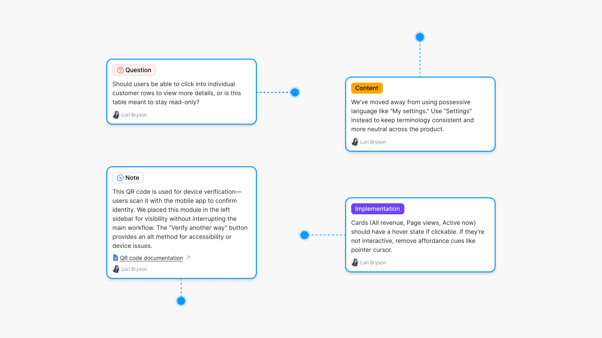
## Why use an annotations component instead?
Built-in annotations are limited to users with full seat or dev mode access. However, many of us work with stakeholders, clients, or teammates who don’t have that kind of access. A component version removes that barrier—anyone can see the notes, and no permissions are required.
###### A component doesn’t have those limitations. Anyone accessing the file can see the annotations; no special permissions are needed.
### Annotations vs. comments
Comments are great for quick questions and feedback. They’re a core part of how teams collaborate. But they’re not built for documenting decisions or providing lasting context. Once resolved, they disappear. On the other hand, annotations stay visible and help preserve important details directly in the design.
### Benefits of annotations
Annotations surface key information directly in the design—no digging, no clicking. That clarity helps people understand the work faster and give better feedback. It also shows the thinking behind the design, which builds trust and saves time.
> Annotations improve comprehension and support better collaboration by making key details visible and clear.
###### Annotations are a simple but powerful form of design documentation.
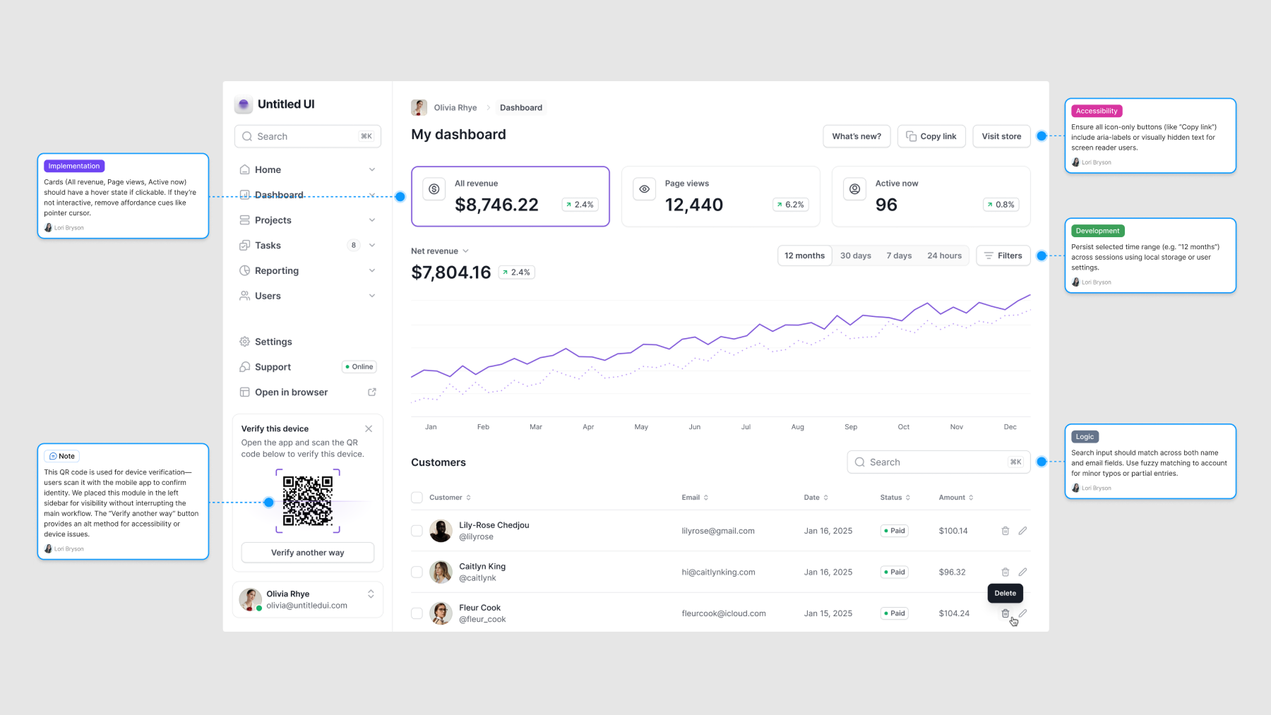
### What is design documentation?
Design documentation helps track how and why a design took shape. It captures notes, context, requirements, and key decisions—so anyone looking at the work can understand it, whether they’re a designer, developer, or stakeholder.
Annotations are one of the easiest ways to build design documentation into your file. They keep important context visible, accessible, and easy to follow.
Here are a few ways you might use annotations in practice:
- **Note:** “This icon is a placeholder—final asset coming from the brand team.”
- **Question:** “Should this modal auto-close after submission?”
- **Implementation:** “Use system font stack here for performance.”
- **Development:** “Match padding to mobile spacing scale (8px increments).”
- **Content design:** “Headline needs a friendlier tone—draft in progress.”
- **Accessibility:** “Ensure focus state is visible for keyboard users.”
- **Legal:** “Include disclaimer text for GDPR compliance (see copy doc).”
You can also use annotations to highlight what’s *new* since the last design review, making updates easier to spot. *For more on how to use design documentation, check out this practical guide.*
[A practical guide to design documentation with real examples in FigmaThis guide explores how to effectively document design decisions and provide context in Figma, creating transparency and improving collaboration throughout your design process. Discover how to establish a single source of truth, minimize miscommunication, and improve team alignment and efficiency.everyday uxJess Eddy](https://www.everydayux.net/a-practical-guide-to-design-documentation-with-real-examples-in-figma/)
## Annotations component for Figma
### Free for everyday ux members
**download 👇**
_This post is for subscribers only._
### Why UX design is still growing: insights from the Future of Jobs Report 2025
URL: https://www.everydayux.net/future-of-jobs-report-ux-design-2025/
Last updated: 2025-08-08T01:00:01.000Z
### Why the future looks bright for UX product designers
Before we dive into the broader labor market trends, here’s a highlight worth celebrating: **UX product designers are among the fastest-growing roles through 2030**. As more companies undergo digital transformation across industries, user experience, product design, and digital interaction skills are becoming more valuable than ever.
After a wave of tech layoffs and tighter hiring across industries, the job market still feels tough. And it is. But this report highlights a long-term trend, not just the current state of things.
As digital transformation continues to reshape industries, demand for user-centered design is projected to grow, especially where seamless digital experiences give businesses a competitive edge.
**In other words, things may be rocky now, but UX design is still positioned to play a critical role in the future of work.**
## Overview of the World Economic Forum’s Future of Jobs Report
The World Economic Forum (WEF) publishes the widely referenced [*Future of Jobs Report*](https://www.weforum.org/publications/the-future-of-jobs-report-2025/?ref=everydayux.net), which forecasts how the global economy, employment trends, and skill demands will evolve by 2030\. The report attempts to predict how much the global economy will change by 2030 and highlights key shifts in employment, skills, and industry demands.
### Why the report matters for global workforce planning
It is released biennially to analyze labor market trends, emerging skills, and the impact of automation, AI, and digital transformation on employment. The report compiles insights from business leaders, policymakers, and economists to forecast the future of work and inform workforce planning. Governments, corporations, and educational institutions cite it to shape policies and training programs.
### Criticism and controversies surrounding the report
However, the report has been criticized for its methodology and assumptions. Some argue that its reliance on employer surveys can lead to speculative projections rather than concrete labor market realities. Others point out that the focus on technological disruption sometimes overlooks socioeconomic factors, such as wage stagnation, labor rights, and the complexities of the gig economy. Despite these critiques, the *Future of Jobs Report* remains essential for understanding workforce trends.
### Emerging skills and job roles to watch
As industries continue to evolve in response to technological advancements, the demand for **design, user experience (UX), marketing, and media skills** is set to rise. According to the *Future of Jobs Report 2025*, these skills are increasingly linked to digital transformation, reflecting the growing need for seamless digital experiences and deeper consumer insights. Companies recognize that in a digital-first world, user expectations are higher than ever, and competitive advantage often hinges on the quality of interactions with technology.
### Technology as a catalyst for change
**One primary driver of this shift is the increasing use of robots and autonomous systems in the workforce.**
These technologies are revolutionizing industries by improving efficiency and reducing costs while introducing new complexities. As automation reshapes industries, the demand for programming, systems thinking, and the top three fastest-growing skills will continue to expand. Managing and optimizing interactions with autonomous technology requires a combination of technical expertise and adaptability—core competencies that will define the future workforce. The ability to think systematically about how different technologies interact and impact workflows is becoming a necessity rather than a niche skill.
### The impact of AI and job displacement
As AI and automation advance, their influence on employment becomes increasingly significant. The report states that 41% of employers plan to replace workers with AI, underscoring the urgent need for workforce adaptation. Although 92 million jobs are expected to be displaced, the shift isn’t purely negative, as 170 million new jobs are projected to be created, particularly in fields that require human creativity, problem-solving, and interpersonal skills.
> While automation threatens many routine jobs, demand is rising for roles that require human creativity, problem-solving, and user-centered thinking—areas where UX design excels.
So, how do you future-proof yourself? The answer lies in **upskilling and adaptability**.
[Designers who do excellent work are “fast on their feet”Designers who do excellent work are fast on their feet, embracing flexibility and adaptability as core traits. These skills help us navigate shifting priorities, collaborate effectively, and grow in our careers. Learn how to cultivate them and stay nimble as a designer.everyday uxJess Eddy](https://www.everydayux.net/designers-who-do-excellent-work-are-fast-on-their-feet/)
### Upskilling by 2030
- **41%** of workers will **not need upskilling** by 2030.
- **29%** will be **upskilled in their current role**.
- **19%** will be **upskilled and re-deployed**.
- **11%** will be **unlikely to receive the necessary upskilling**.
****Continuous learning and adaptability will be critical** in navigating the evolving job market and staying competitive in an increasingly automated world.
### Why UX product designers remain essential
Among the roles poised for significant growth, **UX product designers** stand out as a profession that will benefit from these labor market shifts. The report highlights several factors driving this demand:
- **Expanding need for UX skills** – As companies invest in digital transformation, UX and design skills are becoming critical for creating intuitive and engaging digital products. Businesses understand that a poorly designed user experience leads to lost customers, reduced engagement, and ultimately, lower revenue.
- **Broadening digital access** – With **60% of businesses prioritizing digital expansion**, the need for professionals to enhance user experiences is more pressing than ever. More people are accessing services online, and organizations that fail to provide seamless interactions risk falling behind their competitors.
- **Recognition of UX as a core skill** – Employers across industries, particularly in **telecommunications**, see UX as vital for future success. With the rise of mobile-first services and digital platforms, user experience is no longer just a differentiator but a business necessity.
- **Industry-specific growth** – Sectors like **real estate** are restructuring workforce strategies to accommodate digital trends, opening opportunities for UX designers to improve online platforms and digital interactions. As homebuyers and renters increasingly rely on virtual tours and online transactions, well-designed, user-friendly interfaces can drive customer satisfaction and business growth.
- **Global demand for UX roles** – In Germany, **UI/UX designers are identified as a fast-growing profession through 2030**, reinforcing the increasing significance of UX expertise worldwide. As more countries and industries digitize their services, the need for professionals to bridge the gap between technology and human behavior will continue to grow.
- **UX demand across industries**—While UX roles are explicitly mentioned in certain economy profiles, the Information and Technology Services sector highlights programming skills, suggesting an implicit **demand for UX** professionals to ensure usability in digital products. Additionally, the growing importance of **technological literacy** as a top skill directly affects UX designers, as they must understand and leverage emerging technologies to create innovative and user-friendly interfaces.
- **Talent management and UX retention** – The report identifies **talent management** as a growing skill, indicating that companies will focus more on attracting and retaining top professionals, including UX designers. This highlights the increasing value of UX expertise in the evolving job market.
- **Global recognition of UX skills**—The report notes that design and user experience skills are expected to be widely used across multiple countries. In Argentina, 81% of employers expect UX skills to grow in importance by 2030, followed by Australia (61%), Brazil (70%), China (67%), Denmark (73%), France (77%), and Sweden (82%), among others. This widespread recognition underscores a strong and growing global demand for UX professionals.
---
## Skills for the future
Design, UX, and digital experience are becoming more important as the job market shifts. Alongside UX skills, the report highlights **AI**, **big data**, **cybersecurity**, **creative thinking**, and **adaptability** as essential for the future. These skills connect: AI needs intuitive design, and cybersecurity must be built into digital experiences.
### Top fastest growing jobs
1. Big data specialists
2. FinTech engineers
3. AI and machine learning specialists
4. Software and applications developers
5. Security management specialists
6. Data warehousing specialists
7. Autonomous and electric vehicle specialists
8. **UI and UX designers** 🥳
9. Light truck or delivery services drivers
10. Internet of Things specialists
11. Data analysts and scientists
12. Environmental engineers
13. Information security analysts
14. DevOps engineers
15. Renewable energy engineers
### Top largest growing jobs
1. Farmworkers, labourers, and other agricultural workers
2. Light truck or delivery services drivers
3. Software and applications developers
4. Building framers, finishers, and related trades workers
5. Shop salespersons
6. Food processing and related trades workers
7. Car, van, and motorcycle drivers
8. Nursing professionals
9. Food and beverage servers
10. General and operations managers
11. Social work and counselling professionals
12. Project managers
13. University and higher education teachers
14. Secondary education teachers
15. Personal care aides
### Top fastest declining jobs
1. Postal service clerks
2. Bank tellers and related clerks
3. Data entry clerks
4. Cashiers and ticket clerks
5. Administrative assistants and executive secretaries
6. Printing and related trades workers
7. Accounting, bookkeeping, and payroll clerks
8. Material-recording and stock-keeping clerks
9. Transportation attendants and conductors
10. Door-to-door sales workers, news and street vendors, and related workers
11. Graphic designers
12. Claims adjusters, examiners, and investigators
13. Legal officials
14. Legal secretaries
15. Telemarketers
### Top 10 fastest growing skills
1. AI and big data
2. Networks and cybersecurity
3. Technological literacy
4. Creative thinking 🙌
5. Resilience, flexibility, and agility
6. Curiosity and lifelong learning 🙌
7. Leadership and social influence
8. Talent management
9. Analytical thinking 🙌
10. Environmental stewardship
---
### The road ahead: thriving in a changing workforce
The *Future of Jobs Report 2025* clearly shows that the job market is shifting rapidly, and those who adapt will thrive. With AI and automation transforming industries, the ability to design intuitive, human-centered digital experiences is more valuable than ever.
Continuous learning, adaptability, and creative problem-solving will be key to staying relevant for UX product designers and other digital professionals. Whether in telecom, real estate, or emerging tech, businesses need skilled professionals to bridge the gap between technology and human needs.
#### The future belongs to those who can evolve with it.
Whether that means upskilling in your current role, transitioning to a new industry, or deepening expertise in high-demand fields like UX, adaptability will be key. Invest in learning, stay ahead of trends, and build the skills that will keep you competitive in the future.
### Why expressing ideas is hard and how outlining makes it easier
URL: https://www.everydayux.net/why-expressing-ideas-is-hard/
Last updated: 2025-08-08T01:00:11.000Z
At its core, good communication is about translating your internal thoughts into something others can clearly grasp. Whether you’re putting together a case study or presentation or drafting a message in Slack, the challenge is always the same: **How do you express your idea clearly?**
The truth is, expressing ideas is hard—even when they feel crystal clear in your head. You sit down to write, confident in your message. But suddenly, it all gets messy. You rewrite the same sentence five times, struggle to find the right words, and still feel like you’re not quite saying what you mean.
That’s not a failure.

**That’s the real work of writing:** turning something abstract into something tangible and understandable. And the hardest part? It’s juggling all the pieces—what you want to say, how to say it, and how it fits together—all at once.
### The cognitive load of communication
##### When we try to write or speak clearly, we’re making a lot of decisions at the same time:
- What is the core message?
- In what order should I present the information?
- How do I keep it clear, concise, and engaging?
Doing all this simultaneously is exhausting. It’s a heavy cognitive load, especially when staring at a blank page or blinking cursor. That’s where most people get stuck.
Designers constantly communicate; it’s a core part of our work. Whether through planning documents, Slack messages, or presentations, your ideas live or die by how well you communicate them.
And good instincts aren’t always enough.
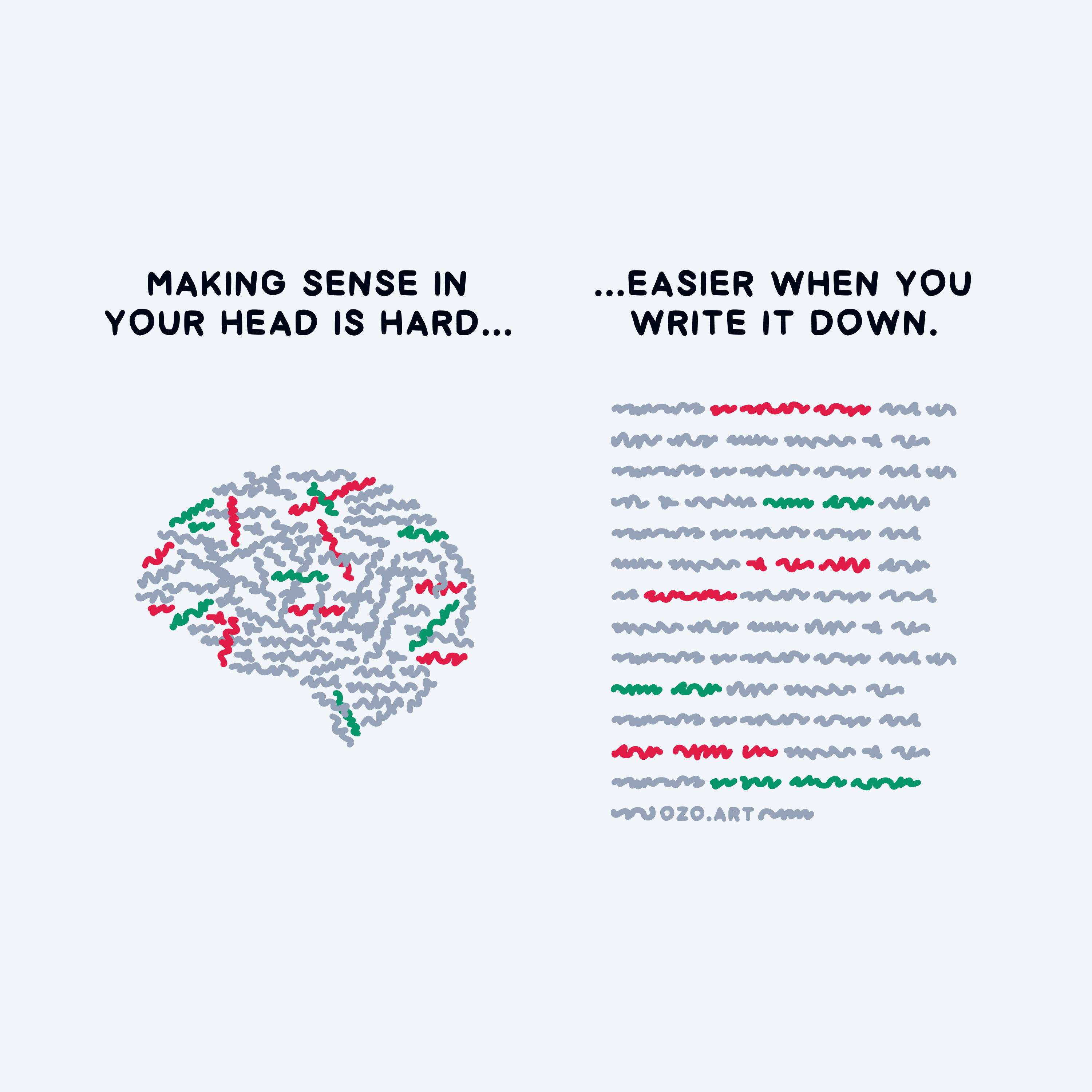
Image courtesy of [Janis Ozolins](https://ozo.blog/?ref=everydayux.net)
### What an outline does
Here’s the good news: an outline reduces the mental strain. It separates the “thinking” from the “writing.”
Instead of trying to shape and structure your message simultaneously, an outline lets you break your idea into smaller, manageable parts—each with a clear purpose and place. This is where clarity begins.
##### At its most basic, outlining helps you:
- Organize your thoughts
- Identify gaps, redundancies, or weak spots
- Visualize the structure before writing paragraphs
- Maintain logical flow and narrative arc
> You can think of it as scaffolding—a temporary structure that supports your thinking while the final message is still in progress.
Outlining gives you a solid base, especially when making presentations or detailed documents.
[How to scaffold compelling presentations using proven storytelling techniquesDiscover ‘scaffolding’—a powerful technique to build the foundation of any presentation. By structuring your story first, you can create engaging, memorable presentations that capture your audience and clearly convey your message.everyday uxJess Eddy](https://www.everydayux.net/how-to-scaffold-compelling-presentations-using-proven-storytelling-techniques/)
### Outlining is a tool for speed and focus
##### Speed is an often overlooked benefit of outlining
Once you’ve built your outline, you no longer guess what to say next. You’re not pausing to question the structure. You’re focused on shaping, polishing, and executing the message.
##### This leads to:
- **Faster writing:** You already know the flow.
- **Clearer thinking:** You’ve filtered out irrelevant pieces.
- **Stronger impact:** Your structure supports your story.
No matter what you’re trying to create, structure gives your message room to breathe. It guides your audience through your logic, making your ideas easier to absorb.
## How to use outlines to communicate better
#### Outlining is easy!
**You don’t need a complicated system.** You only need to think through a few key questions to build a quick outline.
1. What’s the main point?
2. What are 2–3 supporting ideas?
3. What’s the most logical order?
Your outline doesn’t have to be polished. Use rough bullet points, fragments, or short notes. This isn’t the final product—it’s your thinking space.
##### Here’s a simple example:
\- Main idea: why meetings often feel unproductive
\- Supporting: lack of agenda, unclear goals, too many participants
\- Order: identify the problem → explain root causes → share solutions
> This structure gives your brain a concrete model to work with and your audience an easy format to understand.
### Why structure works across mediums
The benefits of outlining aren’t limited to formal essays or big presentations. They apply everywhere:
- Slack messages
- Planning docs
- Emails
- Case studies
- Presentations
- Meeting agendas
- Product specs
- Article drafts
- User research summaries
*Anytime you need to explain something clearly.*
No matter the medium, starting with a structure clarifies early and helps you build momentum faster. It enables you to start from a place of true intention.
> Cognitive psychology backs this up. Research shows that our working memory is limited, and trying to juggle too many ideas at once causes overload. Outlining helps offload that mental burden so your brain can focus on reasoning and clarity.
It also improves retention for both the writer and the reader.

### FAQs: Why expressing ideas is hard and outlining helps
##### Why is expressing ideas so difficult?
Because you’re juggling multiple decisions—what to say, how to say it, and in what order—all at once. That mental load makes it hard to communicate clearly.
##### How does outlining help communication?
Outlining reduces cognitive load by giving your ideas structure. It helps organize thoughts, spot gaps, and focus on execution rather than chaos.
##### Do I need to outline every time I write?
Not necessarily, but even a quick, rough outline can make your communication clearer and faster.
##### Is outlining only for long-form writing?
No. Outlining is useful for emails, Slack messages, plans, and informal notes. It’s a flexible tool for all communication.
##### What if I don’t stick to my outline?
That’s okay. The outline is a guide, not a contract. Its purpose is to get you started and reduce your feeling overwhelmed.
##### How can designers benefit from outlining?
Designers must often explain rationale, pitch ideas, or present user flows. Structure helps them communicate more effectively across teams.
---
### Final thoughts: Clarity starts with structure
Expressing ideas is hard—not because you lack clarity but because clarity takes work. Outlining is one of the simplest, most effective tools for making that work easier.
It’s not about perfection. It’s about creating space to think clearly, communicate purposefully, and write with direction.
Make outlining a habit. It’ll sharpen your communication, strengthen your thinking, and accelerate your writing.
### How to write and present UX case studies that get you noticed
URL: https://www.everydayux.net/ux-case-study-guide/
Last updated: 2026-02-24T01:26:26.000Z
#### Table of contents
- How to make UX case studies stand out
- Case study structure: presentations vs. portfolios
- Case study structure: project ‘snapshots‘
- Start with writing
****Structuring your UX case study for presentation**
1. Lead with impact
2. Clearly define the problem
3. Show your thinking
4. Present the solution
5. Results and impact
6. Reflect on key learnings
****Adapting your case study to your audience**
- Emphasizing impact
- Emphasizing process
- Emphasizing business impact
****Overcoming common UX case study challenges**
****FAQs**
## UX case studies matter
### We find ourselves in a competitive and unpredictable job market.
UX case studies are more essential than ever for every UX designer to build a strong portfolio. Whether applying for product roles, freelancing, or building your credibility as a product designer, a well-crafted UX case study helps you stand out. It doesn’t just showcase your design work—it reveals your user experience process, decision-making approach, and problem-solving skills through clear storytelling. Whether you’re new to UX design or have years of experience, crafting clear, focused case studies is one of the most effective ways to showcase your strengths.
### A strong UX case study can make or break your next interview.
A well-crafted case study highlights your skills and how you approach design projects from insight to execution. It isn’t just a *nice-to-have*—it’s what sets you apart, especially in interviews. It brings your design stories to life—highlighting decisions, trade-offs, and results.
## What hiring managers look for
Many hiring managers want to see how your work fits into larger product design goals—improving the UI, driving engagement, solving business goals, or user pain points. Hiring managers aren’t just looking for beautiful high-fidelity screens—they want to understand how you think. For senior designers especially, the ability to connect design decisions to business impact is often a key differentiator. The best case studies highlight impact, decision-making, and process, making your work compelling and credible.
This guide will help you structure your case study effectively, adapt it for different audiences, and confidently present it in an interview. The best part? Creating a standout case study is totally within your reach.
### Before we dive in, I want to share a personal story to inspire you to be intentional about case studies.
Even for the most experienced designers, interviewing can feel like a battlefield. My last round of interviews was no exception. I met with countless companies, navigated multiple rounds, and encountered some truly bizarre hiring processes.
> But through it all, I learned a lot. I saw ways to improve how I presented myself and my work, and this experience made me take the interview process—and the creation and presentation of case studies—more seriously than ever.
**At first, I presented my work more casually.** But after one particularly bad interview, I realized I needed to tighten things up. I completely changed my approach. I became intentional about presenting my work, reflecting on projects, writing out the details, crafting a compelling story, and packaging it into a rehearsed presentation.
I landed a job just two weeks before I had to leave the country I was living in. I don’t recommend cutting it that close 😱, but by the end of the process—and after nailing one of the interviews—I knew an offer was coming. This process worked because I took the time to refine every detail. I knew my case studies inside and out, which gave me confidence when presenting and, more importantly, allowed me to showcase my passion for the work.
### Mastering case studies changed how I approached interviews.
I also learned that format, audience, and context shape how a case study should be presented. A live presentation needs a different structure from a portfolio piece. How you frame your work should align with your goals, audience, and format.
This comprehensive guide will help you structure your case study effectively, adapt it for different audiences, and present it clearly and confidently.
🚀
I’m launching tools soon to help you write and create case studies. If you’re not a member yet, [join now](https://www.everydayux.net/membership/) to be the first to know.
---
## How to make UX case studies stand out
**Checklist for writing better case studies.**
A great case study does more than showcase your work—it tells a story, reveals how you think, and highlights the ***‘why’*** behind your design decisions.
- **Highlight your strengths.** Clearly define what sets you apart: visual design, prototyping, or strategy.
- **Show impact early.** Lead with results or key takeaways to grab attention before diving into the process.
- **Tailor to your audience.** Highlight what matters most to hiring managers, executives, or clients based on their priorities.
- **Adapt for the platform.** Tailor case studies for portfolios, presentations, and social media—each requires a different depth and framing.
- **Provide context.** Define constraints, team structure, and key goals so readers understand the full picture.
- **Use real constraints.** Highlight challenges, trade-offs, and limitations to show how you solve real-world problems.
- **Focus on insights, not just process steps.** Instead of listing every detail, emphasize key decisions and why they mattered.
- **Cut unnecessary details.** And focus on moments that shaped your direction, challenged your thinking, or revealed something new.
- **Make it scannable.** Use strong visuals, clear headings, and concise writing—hiring managers and clients skim before they read.
- **Keep it personal.** Your case study should reflect your voice, approach, and problem-solving style—not just follow a template.
- **Make it engaging.** Avoid dry, step-by-step breakdowns—frame your case study as a compelling narrative.
- **Use UX research.** To demonstrate how research informed your design decisions, reference early discovery methods, usability, user testing, and interviews.
If you had multiple responsibilities on a project, consider how to communicate them. [Andrew McKay](http://www.andrewmckay.com.au/project/insighttimer/?ref=everydayux.net) does this well by visually breaking down his time across different roles—30% management, 20% mentoring, and 50% hands-on design work. This gives a clear snapshot of his contributions in a simple manner.
The best case studies balance clarity, depth, and storytelling. They provide just enough detail to be insightful while remaining compelling and easy to follow. They don’t just document the work; they make the reader feel the impact, understand your thinking, and see **who you are as a designer**.
---
## Case study structure: presentations vs. portfolios
**A UX case study isn’t one-size-fits-all.**
Presenting a case study in an interview—whether in Figma, Slides, or another tool—differs from how you structure one for your portfolio website.
When presenting live, you guide the audience through the story, controlling the pace and emphasizing key moments. But on the web, people scroll and skim, so your case study needs to be more succinct while still delivering impact. Some designers take this further, distilling case studies into compact project snapshots highlighting final app UI screens and core outcomes.
Whether you’re designing a case study for a live interview or your UX portfolio website, these differences matter. Case study examples that work well in person might not be as effective online, where UX designers need to present their work in a scannable, high-impact format.
While full-length case studies are valuable for presentations, some designers opt for more succinct portfolio case studies. Hiring teams move fast, scanning for relevance in just a few seconds. This is where **project snapshots** come in—compact, high-impact overviews that quickly communicate your work.
Reviewing case study examples from successful UX designers can help you understand what works. Some focus on redesign projects, others on new product development, and some on improving UI for better usability. The format you choose—whether full-length or a snapshot—should reflect your project goals, user experience process, and intended audience.
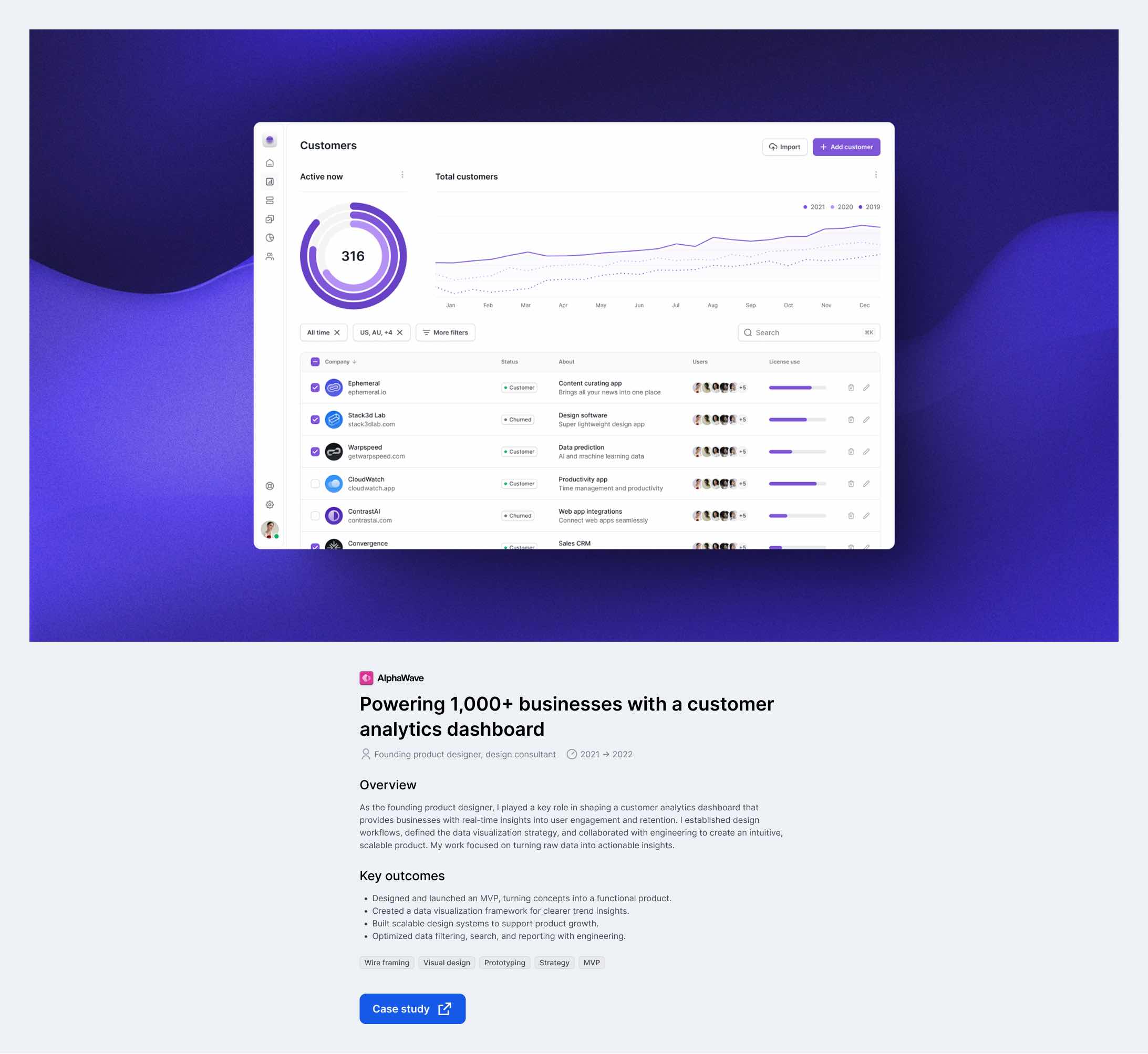
## Case study structure: project ‘snapshots‘
**Designing succinct portfolio case studies.**
More designers are embracing concise portfolio case studies, and for good reason—they align with how hiring teams review work. Hiring managers don’t read—they scan. When evaluating portfolios, they move quickly, spending just a few seconds deciding if a candidate’s work is relevant. A clear, high-impact showcase makes it easier for them to see what you did, your impact, and the final result.
Strong visuals make an immediate impression, so leading with final designs can draw interest faster than a lot of text. Clarity and brevity are key—hiring managers don’t need a deep dive up front, just a high-level view of a project. More detailed explanations come later in interviews.
**A flexible format also helps.** Instead of writing lengthy case studies for every project, designers can **curate a selection of work** in a streamlined way, demonstrating both breadth and depth.
This format is especially useful for designers who can’t share full project details due to IP restrictions. If you cannot share many details of your project, a snapshot format might work best for you.
> [This designer](https://www.seanhalpin.xyz/work/ai?ref=everydayux.net) distills his case studies into three concise paragraphs, using stunning visuals and subtle animations. [Another one](https://lyapustin.com/?ref=everydayux.net) takes a similar approach, using bold imagery, a clear title, a brief overview, and key outcomes—while linking to a more detailed case study for deeper context. Both examples highlight the power of succinct case studies: **They are engaging, high-impact, and easy to scan**.
**However, this format is not without criticism.** Mike Smith, co-founder and art director of the branding studio Smith & Diction, argues that efficiency can come at a cost—limiting the ability to express the passion behind the work.
> “I’ll never stop writing case studies because they show how much I love and care about every project I work on.”
---
## Doing your own thing
### Examples of strong UX design case studies.
There is no single right way to create UX case studies. What matters is showing your thinking, results, and unique perspective as a UX designer.
My friend and one of my favorite designers, [Buzz Usborne](https://buzzusborne.com/work/fairsupply/?ref=everydayux.net), strikes a beautiful balance of depth and imagery with his case studies. They don’t necessarily follow any conventional format but cover everything you might want to know. Instead of adhering to a rigid structure, Buzz organizes his case studies around unique section themes, each offering a distinct lens on the project rather than a linear problem-solution breakdown.
His writing strongly emphasizes design philosophy and decisions, showing what was done and why, framed through thoughtful design choices and guiding principles. He seamlessly blends high-level vision with practical execution, giving readers a strategic understanding of the work and tangible details of how it came to life.
They don’t include an explicit ‘Results’ section with hard metrics. Instead, the impact of his work is **woven into** the clarity of his storytelling and the depth of his thinking. Each case study feels like a real project, not a polished template, making it engaging and memorable. His case studies are visually rich, often diving deep into a project’s aesthetic and structural challenges. They are lighter on process details, focusing more on the end result than the iterative steps to get there.
💬
I asked Buzz to share his approach to case studies, including how he decides what to include, what to leave out, and whether he’s ever adapted his format based on feedback.
### How do you decide what to include (or leave out) when writing a case study, and what’s your guiding principle for structuring them?
I have an agenda behind each case study, which loosely aligns with the “one thing” I want to tell the audience about myself and my work. So, in some cases, I want to show that I worked hard on interaction design—and there are very few words or processes in those. I get you to the goods as soon as possible.
Then, I decided that the journey and the research were worth discussing with others, so I went deep into them. If possible, I try (and recommend) to avoid case studies that attempt to communicate all parts of the design process or make parts that didn’t exist for the sake of a good story.
> The key is to have a range of projects that complement each other — think of your portfolio as a book, and each study is a chapter.
### Have you ever adjusted your case study approach based on how clients or hiring teams responded to them? If so, what changed?
Yes! When I interviewed at Shopify, they communicated a desire to see a project that demonstrated a mix of leadership and strategy. For that, I split off an existing case study *(behind a secret URL)* and then elaborated on all the details I thought they’d be interested in. I went deeper into more information I knew would start a conversation *(things I’d learned, fun little failures, prototypes that didn’t make the cut, etc.)* and updated some of the images to make them more e-commerce-specific.
I even personalized the page a little, giving it a “👋 *Hello Shopify*” title and adding a few splashes of Spotify green here and there. Small details go a long way in communicating, “*I talk your language*.” It wasn’t a heap of effort, but it started a fun conversation and ultimately helped me land the job.
---
Buzz’s case studies show that you don’t need to follow a format or template as long as you can write about the project with a strong point of view that makes the reader feel like they are ***part of the journey***.
Use these stories as a creative springboard—review different formats, borrow what fits your voice, and get inspired to craft case studies that reflect your values and approach.
---
## Choosing the right UX case study format for your goals
*Not all case studies need to follow the same format—the right choice depends on context, audience, and purpose.*
**A full-length case study** is ideal for deep dives, showcasing end-to-end thinking and explaining various aspects of the project. This works best for interviews, leadership roles, or situations where process matters as much as results.
**A snapshot case study** is more concise and designed for portfolios and job applications that hiring managers need to scan. It highlights key outcomes with strong visuals, making it useful when time is limited, project details are *restricted by IP*, or you want to link to a more in-depth case study.
**A narrative-driven case study**, like those by Buzz Usborne, offers a more personal and flexible structure, which can be a powerful format for highlighting design leadership, creative direction, and user experience depth, using storytelling and themes rather than a strict linear breakdown. This approach works well for personal branding and thought leadership, focusing on philosophy and unique insights over process.
> The best portfolios often mix these formats, tailoring case studies to the intended audience.
## What if I’m a freelancer or independent designer?
For freelance UX designers, case study examples highlighting strategic thinking and user experience outcomes are crucial. Potential clients often seek redesigns or UI improvements that produce measurable results.
For freelancers, case studies aren’t just about showcasing work—they’re about selling expertise and building trust. Unlike hiring managers, who scan for relevance and impact quickly, potential clients look for problem-solving, business impact, and strategic thinking to assess fit.
A **snapshot case study** works well for visually-driven work, offering quick, high-impact proof of **design skills** and expertise. A **full-length case study** reassures clients who need to see depth, strategy, and measurable results. A **narrative-driven case study** helps freelancers stand out by sharing their philosophy and process, attracting clients who align with their approach.
The best format depends on the audience and how freelancers prefer to present their work. Instead of defaulting to one style, freelancers should tailor case studies to both business goals and personal style, balancing quick engagement with deeper insights when needed.
> While a visually striking case study can capture attention, strong storytelling ensures it resonates. Before focusing on design and presentation, start with writing—clarifying your narrative, refining key takeaways, and structuring a compelling story.
## Begin your UX case studies by writing
Every great case study begins with words on a page—not layout or visuals. Writing first helps clarify your narrative, refine key takeaways, and ensure your story resonates before worrying about presentation.
It’s easy to focus on design—especially in a portfolio—but great storytelling starts with structure and clarity. A strong case study should stand independently, even in plain text. Writing first also makes it easier to adapt your case study for different formats: a slide deck, a website, or an interview conversation.
[Every landing page design starts in a documentA high-converting landing page starts with a compelling story. Strong copy that resonates with your audience, builds trust, and drives action. By focusing on copy first, you define your message, shape the narrative, and create a clear path for engagement.everyday uxJess Eddy](https://www.everydayux.net/every-landing-page-design-starts-in-a-document/)
Begin by focusing on the problem, your approach, and the impact. Once the story is strong, you can decide how to present it.
> Once your story is clear in writing [or bullet points](https://www.everydayux.net/how-to-scaffold-compelling-presentations-using-proven-storytelling-techniques/), the next step is structuring it to capture attention. A great case study doesn’t just inform—it engages. That starts with impact.
Before jumping into visuals or layouts, many experienced UX designers begin writing case study examples in plain text—focusing on the message and flow first.
[How to scaffold compelling presentations using proven storytelling techniquesDiscover ‘scaffolding’—a powerful technique to build the foundation of any presentation. By structuring your story first, you can create engaging, memorable presentations that capture your audience and clearly convey your message.everyday uxJess Eddy](https://www.everydayux.net/how-to-scaffold-compelling-presentations-using-proven-storytelling-techniques/)
---
## Structuring your UX case study for maximum impact
A well-structured case study engages your audience and makes your work more memorable. Whether presenting in an interview or a team setting, organizing your case study effectively communicates your impact and role.
Some companies timebox case study presentations, often giving candidates 30 minutes to present two case studies—15 minutes each. Prepare your case studies with this in mind, ensuring you can deliver a clear, compelling narrative within the allotted time. Practicing a concise version of your case study will help you stay on track without sacrificing key insights.
**Now, let’s break down key elements to consider when structuring your UX case study so you can tailor an approach that best fits your work and audience.**
### 1\. Lead with impact
**Outcome, background, and context.**
**Why this matters:* First impressions count*.
First impressions matter. A strong case study should immediately communicate the value of your work. Start with a clear, compelling title that signals impact. Don’t wait until the end to reveal what you accomplished—state it upfront.
Use visuals to showcase the final outcome before diving into the process. This helps anchor the reader in what you achieved, making them more engaged in how you got there. If possible, include qualitative or quantitative results early on to reinforce the significance of your work.
Briefly introduce the team and their roles, including your own. This provides context on who contributed and clarifies your specific impact. Clarifying your role within the broader team—whether you collaborated with engineers, product managers, or stakeholders—helps frame the decisions you’ll discuss later.
> By leading with impact, you create a compelling narrative that frames the rest of your case study. It helps your audience quickly grasp the value of your work and why it mattered. When the outcome is clear from the start, the focus shifts to the decisions, challenges, and insights that brought it to life.
💡
****If you want to emphasize impact...**
To emphasize impact, consider moving ‘Results and impact’ earlier in your case study—before ‘Clearly define the problem.’ This shifts the focus from outlining the challenge to proving success upfront, making a stronger first impression before diving into the process.
### 2\. Clearly define the problem
**The problem and its impact**
**Why this matters:* A clear problem makes the solution meaningful.*
Context builds credibility. A strong case study doesn’t just showcase what you designed—it explains why it was necessary. A clear problem statement upfront gives your work meaning and sets the stage for the following decisions.
Be specific about what wasn’t working. To make the design challenge meaningful, frame it regarding user needs, business impact, or friction. Identify the friction points for both users and the business, whether it was a frustrating experience, a barrier to growth, or an operational inefficiency. Go beyond surface-level observations—dig into the behaviors and unmet needs that made this a pressing issue. Connect solving it to broader business goals or strategic priorities to show why solving it mattered.
Well-framed problems make solutions more compelling. The solution should feel tangible, urgent, and directly related to the design choices you’ll outline next.
> When the stakes are clear, your work isn’t just a creative exercise—it’s a necessary response to a real challenge.
### 3\. Show your thinking
**Exploration, research, and trade-offs**
**Why this matters:* Communicating your thinking is as important as the work.*
A strong case study isn’t a step-by-step recap—it’s a window into how you solve problems. Hiring managers and design peers want to see how you navigate constraints, make trade-offs, and refine your approach. Instead of documenting every stage, focus on the pivotal moments that shaped the outcome.
Include your research and testing methods—such as usability testing, task analysis, or A/B experiments—and how they shaped your design decisions. What insights shifted your approach or uncovered new opportunities? Emphasize the key design decisions—the two or three choices with the biggest impact and why you made them. Show how constraints like time, budget, or technical limitations influenced your process and how you navigated those challenges.
> Use visuals to bring these moments to life. Sketches, journey maps, and usability testing insights make your thinking tangible. Don’t just present research; demonstrate how you turned insights into action.
### 4\. Present the solution
**Design execution and outcomes**
**Why this matters:* Your design is the proof of your process—make it clear.*
The best UX solutions feel inevitable—seamless, intuitive, and perfectly suited to the problem. But great design isn’t just about the final result; it’s about the thinking that got you there. A strong case study clarifies how the solution directly addresses the challenges you defined.
Show what makes the design effective. How does it solve the user’s problem? What pain points did it eliminate? Highlight its intuitiveness—what UX principles shaped your approach, and how did you ensure usability? If there’s an innovative aspect, whether it’s a unique interaction, interface design solution, system, or design pattern, make that stand out.
Reinforce the impact with clear, compelling visuals. Before-and-after comparisons make improvements tangible. Screenshots or interactive prototypes help the audience experience the design firsthand. A short walkthrough video can provide context, showing exactly how the solution works in practice.
> The audience should have seen what you built by this stage and understood why it works. The best case studies connect the final outcome to the problem and the key decisions that shaped it.
### 5\. Results and impact
**Measuring success and key learnings**
**Why this matters:* Impact is one of the best measures of your work’s value.*
The best way to demonstrate impact is through measurable results. Metrics add credibility and show the real value of your design decisions. A strong case study ties success directly to the problem you set out to solve. If the goal was to reduce friction in onboarding, show how much it improved. If it was about increasing engagement, provide data that proves the change. A 40% drop in onboarding friction, a doubling of task completion rates, or a 15-point NPS boost in six weeks all make the impact tangible.
Beyond the numbers, highlight unexpected wins and key takeaways. What worked better than expected? Did user adoption reveal insights that shaped future iterations? These learnings show adaptability and strategic thinking.
Reinforce impact with a direct quote from a stakeholder, user, or teammate. A firsthand statement from someone who benefited from the solution can be just as persuasive as the data.
> By this stage, the audience should clearly see the value of your work. The best case studies don’t just document the entire process—they show real-world results and insights.
### 6\. Reflect on key learnings
**Insights, challenges, and growth**
**Why this matters:* Reflection illustrates growth and how a project shaped you.*
A strong case study doesn’t just showcase success—it highlights how you evolved through the process. Every project comes with challenges, constraints, and unexpected turns. How you navigate them is just as important as the final outcome.
Consider what you learned along the way. Did user behavior contradict your assumptions? Did testing uncover insights that reshaped the design? Reflect on your challenges—tight deadlines, technical limitations, conflicting priorities—and how you and your team adapted. If given more time or resources, what would you refine? How would you approach a similar challenge differently next time?
For example, “This project reinforced the value of rapid iteration. Early usability testing revealed that our initial navigation concept confused users. By quickly prototyping and testing alternatives, we landed on a streamlined version that improved task completion rates by 50%.”
This section doesn’t need to be long, but it should be thoughtful and intentional. The best designers continuously refine their approach, demonstrating that awareness strengthens your case study and expertise.
It’s also a great place to show how your design process evolved and how you adapted based on research or team feedback.
> No case study fits every audience perfectly. The strongest case studies are adaptable—structured enough to tell a compelling story but flexible enough to meet the needs of different viewers.
These reflections show that you understand theory and its practical application in complex, real-world settings.
---
## Adapting your case study to your audience
### Tailoring case studies for different audiences.
A single case study format works, but tailoring it to your audience and goals makes it more effective. How and when you present your content also affects its resonance. Some audiences need to see the outcome first, while others benefit from a deeper dive into the process before understanding the impact.
Rather than overhauling your structure, adjust the emphasis and sequence of details to align with their priorities. Below are key modifiers to consider based on your audience and goals.
> Use the structure that works best for your case study, and adjust as needed to match your audience and goals.
### Emphasizing outcomes vs. process
**Emphasizing impact**
Some audiences care most about the outcome. When communicating business value or demonstrating the effectiveness of a solution, lead with results. Establish impact early by highlighting measurable improvements upfront—whether it’s increased efficiency, reduced friction, or improved retention.
Rather than detailing every step of the process, keep it high-level. Focus on the key decisions that shaped the outcome, showing how insights translated into action. Metrics should be clear and prominent, reinforcing the value of the solution in a way that resonates immediately.
If impact is the priority, consider repositioning Results and impact earlier in your case study—potentially as the second section before “*Clearly define the problem.*”This shifts the focus from problem identification to proven success, making a strong first impression before diving into the process.
**Emphasizing approach**
Designers, researchers, and UX teams care about how you make decisions and how your user experience strategy drives results. A strong case study should make your thinking visible—sometimes, how you arrived at the solution is just as important as the solution itself.
When speaking to an audience that values problem-solving, emphasize how research shaped the design by sharing key insights that influenced decisions. Highlight iterations and trade-offs, showing the evolution of the design, including what was tested, refined, or discarded. If technical or strategic constraints played a role, explain how real-world limitations shaped the outcome.
A case study that prioritizes process over results deepens your expertise. It demonstrates what you designed and how and why you achieved it.
**Emphasizing business impact**
Executives prioritize outcomes, efficiency, and strategic alignment over UX methodology. To make your case study resonate, frame the problem in business terms and connect challenges to growth, revenue, or operational efficiency.
Highlight the strategic impact by showcasing measurable results—cost savings, efficiency gains, or competitive advantages. Instead of detailing the full design process, focus on the key decisions that shaped the outcome and drove meaningful business results.
A case study framed for business impact should clearly explain why the work mattered—not just in terms of design but also in terms of delivering tangible value to the organization.
> Structuring your case study is just one part of the process. The other challenge is ensuring your story feels compelling, even when the project doesn’t fit a perfect mold.
**Here’s how to navigate common case study challenges.**
---
## Overcoming common UX case study challenges
Crafting a case study isn’t always straightforward. Some projects lack clear metrics, involve multiple stakeholders, or feel too simple to showcase. No matter the challenge, there’s always a way to tell a compelling story. Here’s how to approach common case study challenges.
**“What if my project didn’t have measurable results?”**
- Not every project produces clear metrics, but you can still demonstrate the impact. Focus on qualitative outcomes, such as improved usability, smoother workflows, or positive user feedback. Show how your work made a difference, even if it’s harder to quantify.
**“How do I make my process sound compelling?”**
- A strong case study isn’t just a timeline of tasks—it’s a story of problem-solving. Highlight key decision points, unexpected challenges, and lessons learned. Did a user insight shift your approach? Did a constraint force a creative solution? These moments bring your process to life. **I call these “story gems.”**
**“What if my project feels too simple?”**
- Complexity isn’t correlated with impact. Some of the best UX work comes from simple projects. Focus on the problem you solved, your decisions, and why they mattered. Even a small, well-executed change can drive meaningful improvements in usability or efficiency—highlight that.
**“What if my project involved multiple stakeholders with conflicting priorities?”**
- This is common. Many projects require balancing competing needs. If different teams had conflicting goals, show how you navigated trade-offs between user needs, business objectives, and technical constraints. Demonstrate how you aligned teams around a shared direction.
**“What if my project wasn’t fully implemented or is ongoing?”**
- Not every project ends with a final launched product. Focus on what you or the team learned if your work is still in progress. Highlight the decisions, early signals of success, and the next steps. Case studies about in-progress projects can still show valuable problem-solving skills.
**“How do I avoid making my case study sound like a generic project summary?”**
- Many case studies read like a checklist—research, wireframes, prototypes. Instead, focus on **insights and turning points**. What unexpected challenges changed the course of the project? What did you initially believe that turned out to be wrong? What tough decisions shaped the outcome? These details make your case study engaging and memorable.
We don’t need to aim for perfection—not every project fits neatly into a traditional format. But the best case studies tell a **clear, engaging, and thoughtful** story about your work. Whether missing key metrics, working on a simple project, or showcasing an ongoing initiative, there’s always a way to craft a compelling narrative.
---
## FAQs
### Relevance and expectations
**Some people think case studies are dead—are they?**
- No, but expectations have changed. The best approach isn’t eliminating case studies or sticking to one format—it’s about making them adaptable. Hiring managers may not read long case studies upfront, but they expect deeper insights at some point, especially for complex roles. The strongest portfolios combine concise, high-impact showcases with the option to explore depth when needed.
**Do hiring managers still read case studies?**
- Yes, but not all hiring managers do it the same way. Some skim for final designs and business impact, while others look for problem-solving depth before deciding. A hybrid approach works best: lead with key takeaways, make the case study scannable, and provide a deeper dive for those who want details.
**Has the industry moved away from detailed case studies?**
- No, but expectations have shifted. Long, overly detailed case studies often go unread—especially in the early hiring stages. Instead, focus on clear, concise, engaging storytelling that conveys impact without overwhelming the reader.
### Format and structure
**Should case studies be long or short?**
- Neither—they should be structured for readability. Hiring managers may spend only 10-30 seconds scanning a portfolio, while interviewers and design leads will read case studies more thoroughly when evaluating expertise. A layered approach works best with clear summaries up front and detailed insights available.
**What’s the best way to structure case studies for different audiences?**
- A multi-layered approach works best:
- Showcase key takeaways and visuals upfront (for skimmers).
- Provide a deeper dive for those who want details (for hiring managers and design leads).
- Use a mix of text, visuals, and interactive elements (videos, charts, prototypes) to keep it engaging and immersive.
**Should I tailor case studies for different companies?**
- Yes. Some designers successfully customize their portfolios for specific companies—adjusting emphasis, adding company branding, or tweaking messaging. Small personalizations (like a greeting or tailored example) can make a strong impression.
**Should I include older or recent projects in my UX case studies?**
- It’s okay to include older projects as long as they’re relevant and well-structured. Some case study examples from earlier in your career can still demonstrate your growth, design thinking, and problem-solving skills—especially if they show redesigns, cross-functional collaboration, or measurable outcomes. Even smaller or older projects can still speak to your growth and career development when framed with intention. If you’re a junior designer, don’t underestimate smaller projects—when framed well, they can show potential, curiosity, and your evolving design process.
**How do I make my case study relevant if I’m early in my design career?**
- Focus on transferable skills and walk through your thinking. Early case study examples can be powerful if you explain your UX design approach, research, and the decisions behind your UI choices—even if the project was small or hypothetical.
**Can I include a hypothetical redesign in my case study portfolio?**
- Yes—many junior and transitioning designers use hypothetical redesigns to demonstrate their skills. Just be clear that it’s conceptual work, and focus on explaining your UX design thinking, the constraints you set, and how you approached solving a real problem.
### Specialized case study needs
**What if I work in Enterprise SaaS or complex B2B products?**
- A high-level showcase alone is often insufficient. These projects typically involve complex workflows, technical constraints, and long decision cycles—context critical to understanding your impact.
- **Clarity beats length—even in complex projects.** Enterprise SaaS and B2B case studies may require more context, but that doesn’t mean they must be long. Strong storytelling distills complexity into clear, engaging narratives. You can show depth without overwhelming detail with sharp writing and focused framing.
A structured case study works best for enterprise SaaS or B2B:
1. Start with high-level takeaways (key metrics, business outcomes, or pain points solved).
2. Provide a clear problem statement and process overview—highlighting research, stakeholder alignment, and trade-offs.
3. Use visuals and real-world constraints to communicate complexity without losing clarity.
This approach demonstrates strategic thinking, adaptability, and the ability to navigate nuanced product environments—qualities hiring teams often look for in senior or leadership roles.
[30 storytelling techniques you can use in your presentations (with examples)Captivating presentations rely on powerful storytelling. This article presents 30 techniques—from crafting relatable protagonists to building suspense—with examples illustrating each one. Use these strategies to connect with any audience and make your message memorable.everyday uxJess Eddy](https://www.everydayux.net/30-storytelling-techniques-you-can-use-in-your-presentations-with-examples/)
---
### A great case study isn’t just a portfolio piece—it’s a chance to showcase how you think, solve problems, and drive impact.
*The most compelling case studies aren’t just step-by-step recaps; they tell a thoughtful story that reveals impact, decisions, and direction.*
Tailoring your case study to the audience and format makes it more effective. Whether presenting live or designing a case study for your Website, structure and clarity matter. Hiring managers scan for quick insights while clients look for expertise and strategic thinking. Adjusting your approach can be the difference between blending in and standing out.
**Most importantly, a case study should feel like *you.***
Strong UX case studies are your most powerful storytelling tool, whether building a UX portfolio, preparing for a job interview, or trying to land freelance work.
Beyond the process and results, it’s an opportunity to communicate your perspective, attention to detail, and passion for great design. Take the time to refine it, make it engaging, and own your story.
[Stand out, stay resilient, and get the design job you deserveLanding a design role takes more than luck—it’s about resilience, strategy, and effectively telling your story. This guide will help you understand the importance of a strong personal brand, navigate interview challenges, and align your skills with employers’ needs.everyday uxJess Eddy](https://www.everydayux.net/stand-out-stay-resilient-and-get-the-design-job-you-deserve/)
### Inside Family Style: A conversation with Jess Walker and Hannah Swann on branding, product design, and differentiation
URL: https://www.everydayux.net/spotlight-interview-with-jess-walker-and-hannah-swann-of-wearefamilystyle-com/
Last updated: 2026-02-24T01:39:23.000Z
[Family Style](https://wearefamilystyle.com/?ref=everydayux.net) is a brand studio founded by Hannah and Jess. They describe themselves as “not an army, just two humble assassins who slay in small spaces.” Operating out of their 150-square-foot studio, they specialize in creating brands with clear points of view that are designed for word-of-mouth growth.
They take a hands-on, in-house approach, working closely with passionate, customer-focused teams to develop creative strategies, brand identities, and scalable systems. Their work spans brand strategy, design, and art direction—all shaped by a deep understanding of their clients’ customers and industries.
**What they do**
Family Style helps brands sharpen their value and create strong, cohesive identities. Their impact is evident in collaborations like Lunchbox Entertainment, where they worked closely with co-founder Jack Wink to develop a clear brand vision and identity. By deeply understanding their clients’ industries, Family Style ensures that brands stand out and make more focused and strategic decisions.
---
**Spotlight interview**
*Hannah and Jess were kind enough to answer several questions about brand, product design, and differentiation. They share a distinct perspective that’s especially valuable for product designers who want to integrate brand design into their work or transition into branding entirely.*
**Read on as we explore** how branding can serve as a competitive moat in an era where AI has accelerated feature parity, making it easier than ever to copy products. Learn how to embed a brand’s point of view into interaction patterns, tone of voice, and feedback loops—reinforcing identity at every stage of the user journey. And for designers working in fast-moving startups with little to no branding, discover effective ways to create a distinct and recognizable product experience, even without a fully developed brand strategy.
Throughout our conversation, one idea remained clear: branding isn’t just a visual layer—it’s a fundamental part of the product experience, shaping how users perceive, engage with, and remember a company. The most defensible brands don’t just look distinct; they think distinct.
**A sharp, ownable point of view isn’t just a differentiator—it’s a long-term competitive advantage.**
---
### Do you see branding becoming an even bigger competitive advantage in the future?
***How do you see this shift evolving? What should companies prioritize in brand design to stay competitive?***
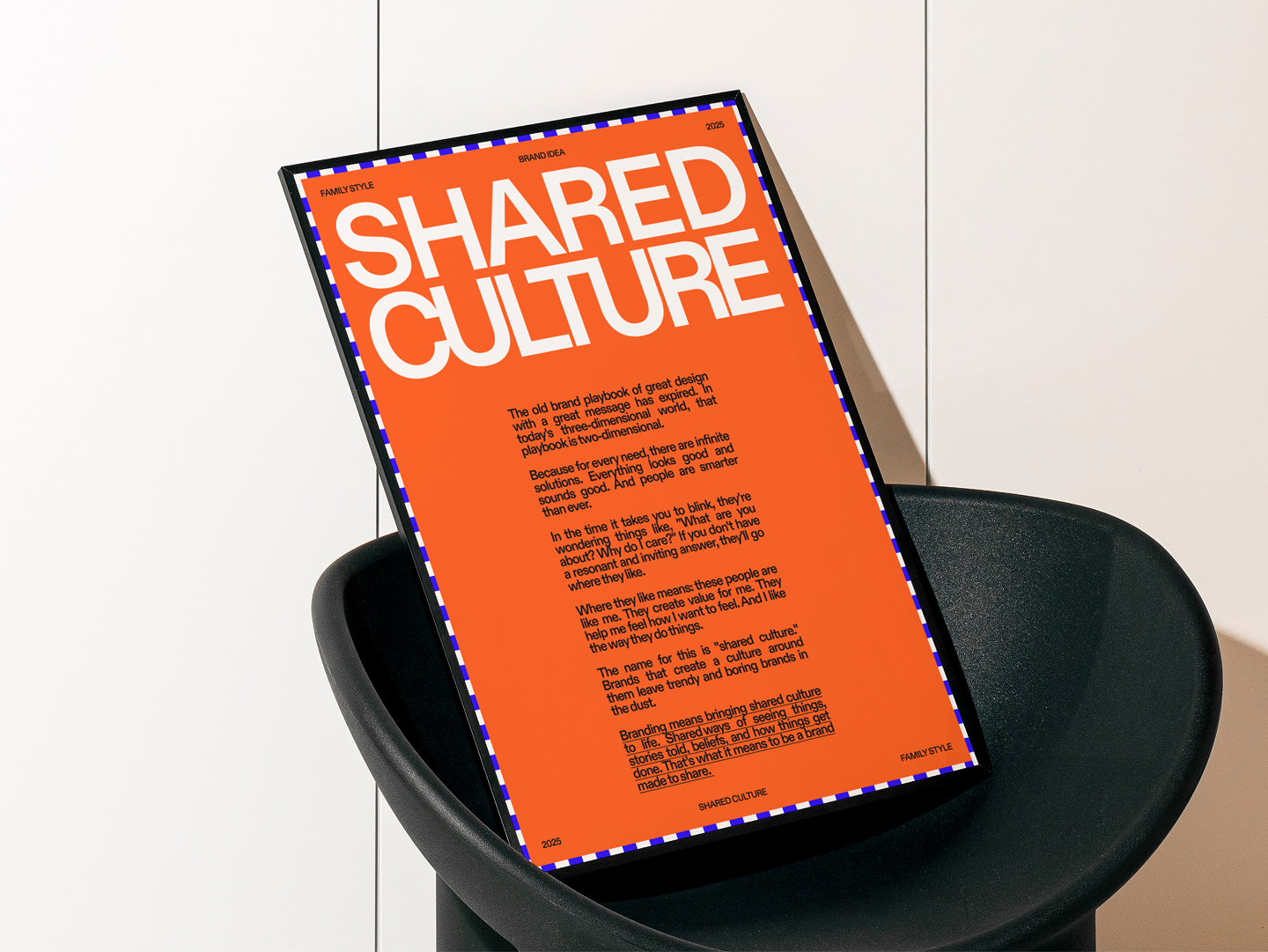
Family Style brand idea.
Branding has always been a differentiator, but many tech startups treated it as an afterthought. They didn’t need to because speed, scale, and being first were better strategies.
Now, AI has accelerated feature parity, making it easier than ever to copy products. What’s hard to copy today? A sharp, ownable POV.
To us, the real shift is in people catching up to the idea that brand is not just aesthetics. It’s a strategic throughline, woven into product, marketing, the business model, and customer experience. Strong branding makes a perspective tangible.
Want to stay competitive? Don’t just look distinct. *Think* distinct. Every touchpoint should reinforce what makes you irreplaceable. You’re building a moat around your product.
Companies that take branding seriously aren’t just designing assets; they’re embedding a unique POV into everything they do. That’s what creates long-term competitive advantage.
---
### How can product designers effectively integrate brand design into software and digital products?
***What elements make the biggest impact on differentiation and competitive advantage?***
Many product designers we’ve worked with think that integrating ‘brand’ means bringing in colors or assets. That’s 20% of the work.
> You already know our answer — the most competitive thing you can do is have a POV.
**You can use your POV to ask:** how would the product communicate this? How would it feel? Then you take this big decision, and bring it into your microdecisions. Focus on interaction patterns, tone, and feedback loops that reinforce the brand’s core idea.
For example, you can amplify emotional moments. Identify the points where users feel something (relief, excitement, frustration) and design to reinforce what you want. A celebratory screen at the end of a long flow. A moment of empathy in a complex process. It doesn’t have to be high production — a well-placed line of copy or a simple animation can be enough.
**Take Mailchimp.** Their brand started quirky and informal, and that comes through in every detail. Success messages aren’t just generic confirmations; you get a high-five from their mascot, Freddie. Microcopy swaps technical jargon for friendly, conversational language. Even error states soften frustration with humor or clever illustrations.
---
### Many designers work in startups with little to no branding—what are some simple, effective ways to establish a cohesive and recognizable design system in that environment?
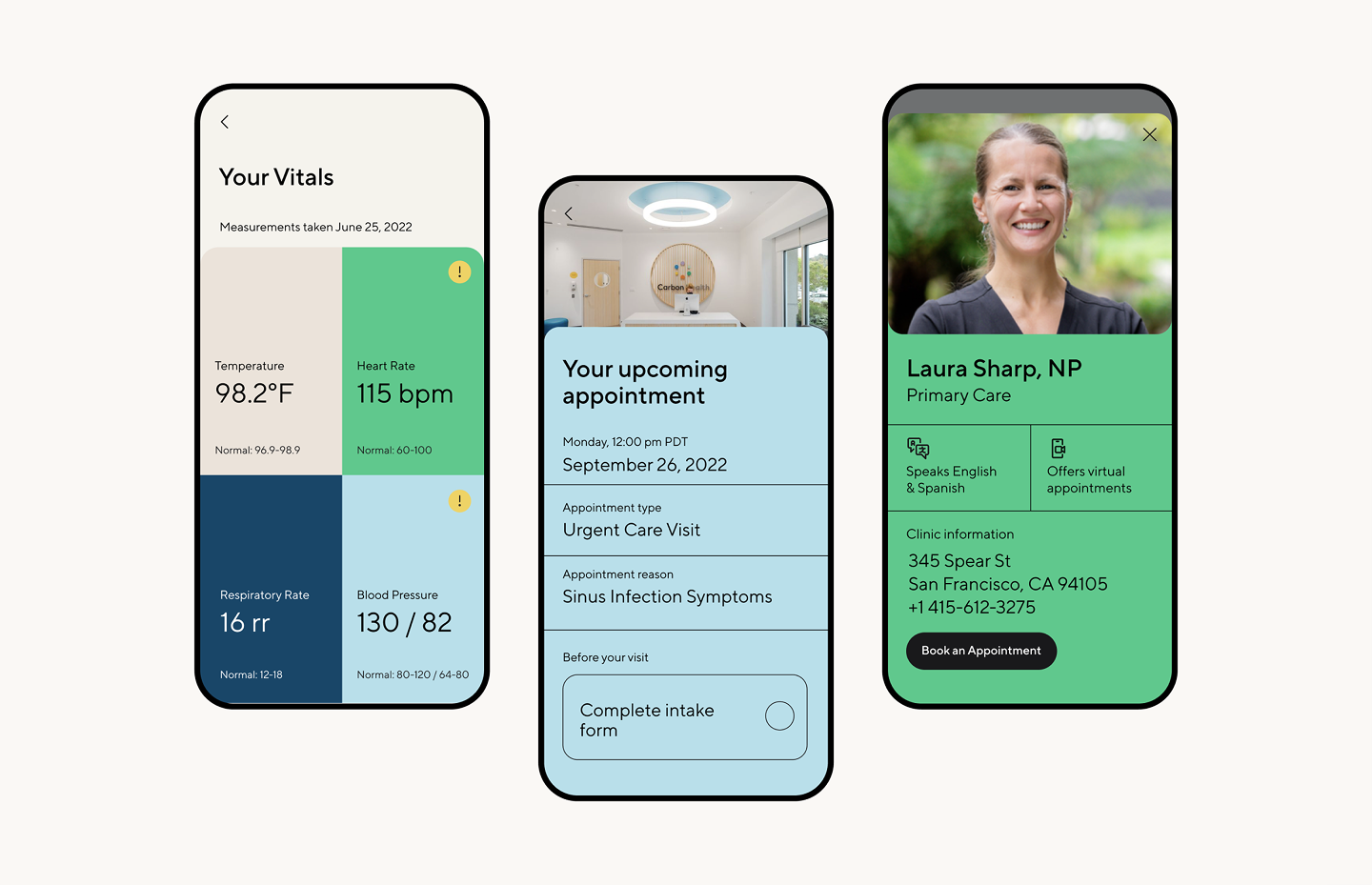
Work done in-house at Carbon Health before the establishment of brand strategy.
**Start simple, but start with intention.** If your company doesn’t have a brand POV, then think about brand as a set of recognizable choices.
You could start with how the product should feel — what are 3-5 attributes that best describe its tone, and what you want to evoke in users.
**A quick way to sharpen this:** list attributes you want to embody, then cross out the ones any competitor could claim. If you wrote “modern, friendly, intuitive” — so did everyone else. What’s left? Get specific.
With that, build. Pick a core color (not 8), a headline font, and a distinct tone. As you scale, layer in secondary elements like icons, illustration, motion, or unique layouts that all reinforce the tone. The goal isn’t to build a rigid system overnight; it’s to create enough distinction that people recognize you when they see it.
---
### How can designers help startups lacking foundational brand strategy identify and reinforce an organizing idea?
**Brand strategy is a coherent customer-facing business strategy, not just a differentiating visual strategy.**

Something we deeply believe is that you don’t always have to start top-down. Often, amazing things happen bottoms-up.
Everybody already has a brand, they just don’t know it yet. It’s scattered across product choices, founder instincts, and early customer interactions. The job of early brand builders at a company isn’t to invent something new, but to find what already resonates and turn it into an unmistakable and compelling throughline.
**Look for recurring themes in customer feedback, product experience, or even how the founders naturally describe the company.** What phrases or emotions keep coming up? Sharpen and strengthen that.
This doesn’t mean overhauling everything — just making small, intentional shifts that align product, messaging, and design around a singular, compelling idea. A great brand strategy doesn’t feel forced; it feels like the business finally clicked into place.
---
### How do you deeply understand a company’s essence to create a brand that makes people feel seen—like it truly gets them?
In-house work done at Asana.
There’s a tension in this question: essence requires ***looking inward***, but making people feel seen requires ***looking outward***.
When we’re working on developing a brand idea, it is forged in the push-pull between the two perspectives.
You can’t just look inward and declare *this is our brand*. It makes for highly irrelevant communication. You also can’t just create something purely around what a customer wants to see. That makes for brands that feel flimsy, trendy, or worse, out of touch with where the market might be going.
So, going back to question four — listen, observe, and look for the moments where the customer, the business, and the future of the market feel totally in sync. Then pressure-test those moments. Are they fleeting? Superficial? Does this idea have business legs, not just creative ones?
When those three things align — customer, market, business — you get a brand that feels resonant.
---
### What advice do you have for product designers who want to strengthen their brand design skills or transition into a branding-focused career?
1. **Study the best.** The best branding work is out in the open — case studies, books, and design breakdowns. [Michael Bierut’s *How To*](https://www.amazon.com/Graphic-Design-Things-Explain-Better/dp/0500296189/?ref=everydayux.net) and [David Airey’s *Identity Designed*](https://www.amazon.com/Identity-Designed-Definitive-Visual-Branding/dp/1631595946/?ref=everydayux.net) are great places to start.
2. **Look for brand opportunities at your company.** If you’re at a startup, branding is probably an afterthought. Step in, define missing elements, and create small brand moments within product design.
3. **Think beyond visuals.** Brand design isn’t just about aesthetics — it’s about perception, emotion, and connection. Pay attention to language, tone, and the broader experience.
### How do your personal values influence your work and the clients you choose to collaborate with?
We are very values-driven, so we can’t cover it all!
**We can say this:** value-creation and emotional depth is core to what we believe and how we work.
**Value Creation:** If brand work isn’t the right solution for a company, we’ll say so. If our services are overkill for where they’re at, we won’t sell them something they don’t need. Many of our intro calls turn into consultative sessions, helping founders break down what they need. And brand help isn’t always the answer. We want the brand work we do to be used as a tool for growth, not a bunch of outputs that get stored in a Google Drive somewhere.
**Emotional Depth:** With the speed of tech disruption right now, the world is looking for a counter-balance. We are having the most fun right now working with people who value customer connection and bringing emotion into brands and products as much as we do. As the world gets hyper-rational, we help bring the irrational.
---
Hannah and Jess’s insights highlight how branding isn’t just about aesthetics—it’s about embedding a distinct point of view into every touchpoint of a company’s product and experience. Whether you’re a product designer looking to integrate brand thinking into your work or a startup navigating branding with limited resources, their perspective offers a valuable reminder: the strongest brands don’t just look different, they think differently.

Jess and Hannah.
*A huge thank you to Jess and Hannah* for sharing their expertise and perspective. Their work at Family Style is a testament to the power of branding as a strategic and competitive advantage, and it’s clear that their thoughtful, hands-on approach is making a real impact. 👏
### How to build trust and enhance collaboration
URL: https://www.everydayux.net/how-to-build-trust-and-enhance-collaboration/
Last updated: 2025-08-08T01:00:43.000Z
This topic is based on a talk I gave at RETHINK in 2023\. You can learn more about RETHINK here: [rethinkhq.com](https://www.rethinkhq.com/?ref=everydayux.net)
### Trust is at the core of effective teamwork
It enables open communication, encourages creativity, and creates a space where people feel comfortable sharing ideas. Without trust, collaboration breaks down, and new ideas struggle to take shape.
For designers, trust goes beyond relationships—it shapes how our work is perceived, shared, and acted on. When we communicate clearly and collaborate effectively, we create the alignment and confidence needed for our ideas to gain traction and lead to better outcomes.
> People don’t buy into ideas; they buy into people.
In this article, we’ll explore why trust is essential, how we can introduce ourselves in more memorable ways to build relationships, and easy-to-implement strategies for better communication.
We’ll also discuss how designers can improve communication at work and through their work. Trust isn’t built solely through words but also through how we present, document, and organize our work.
### Why trust matters
As Stephen R. Covey famously said:
> “Trust is the glue of life. It’s the most essential ingredient in effective communication. It’s the foundational principle that holds all relationships.”
Trust isn’t just a “nice to have.” It’s fundamental to how we work together. When trust exists, teams are more open, communicative, and willing to take risks. They share ideas freely, admit mistakes, and embrace diverse perspectives—all of which drive better collaboration and more innovative outcomes.
While trust is built on many factors, here are three key elements that are particularly relevant to designers:
- **Reliability** – Meeting deadlines, providing regular updates, and acting on feedback.
- **Empathy** – Actively listening, being open to feedback, and understanding team dynamics.
- **Competence** – Sharing knowledge, facilitating discussions, and educating others about our work.
Before diving into communication strategies, it’s important to clarify a key concept: **the difference between trust and psychological safety**. While they are closely related, they serve distinct roles in team dynamics.
### Trust vs. psychological safety
While trust and psychological safety are related, they’re not the same.
- **Trust** is the confidence in someone’s actions and intentions, shaped by their past behavior, reliability, and consistency over time.
- **Psychological safety** is the shared belief that individuals can express ideas, ask questions, and take risks without fear of judgment, punishment, or embarrassment.
A key distinction is that **trust develops over time** through consistent actions, while **psychological safety exists in the moment**, allowing people to speak up without fear. However, like trust, psychological safety can be easily damaged—a single negative interaction, like public criticism or dismissing an idea, can make people reluctant to share. Trust can reinforce psychological safety, but teams can have one without the other. For example, a team might trust each other’s technical skills but hesitate to share new ideas if the environment doesn’t feel psychologically safe. *Both leaders and team members play a role in fostering these conditions.*
We can build trust through how we communicate as a designer. In small ways. When we focus on “ways of working.”
### Building trust through introductions
One of the simplest ways to build trust is to **introduce ourselves in a way that fosters genuine connection**. Trust starts with relationships, and when meeting new people or teams, our introductions can set the tone for collaboration—whether we come across as open and approachable or distant and transactional. Thoughtfully crafting our introductions helps establish rapport and makes it easier for others to engage with us.
#### The typical introduction
> “Hi, my name is X. I’m on X team. I’ve been at the company for X years.”
This tells people *what* we do but not *who* we are. It doesn’t build connection.
#### A better approach
Make introductions **personal, memorable, and engaging** by:
- Sharing interesting details about yourself.
- Including a “hidden fact” that people wouldn’t expect.
- Being transparent—not making it all about work.
- Highlighting work you’re proud of.
- Make it visual through a story, slides, or a short video.
For example:
> “Hi, I’m Alex, a product designer on the growth team. I’ve been designing products for about eight years, but I actually started as a psychology major studying how people make decisions. Outside of work, I’m an amateur baker, and I run a tiny side project where I test cookie recipes. At work, I love digging into user behaviors and figuring out small design changes that drive impact.”
You can create one introduction video or slide deck and share it with multiple teams and individuals. This small effort can make a big impact in fostering relationships and trust.
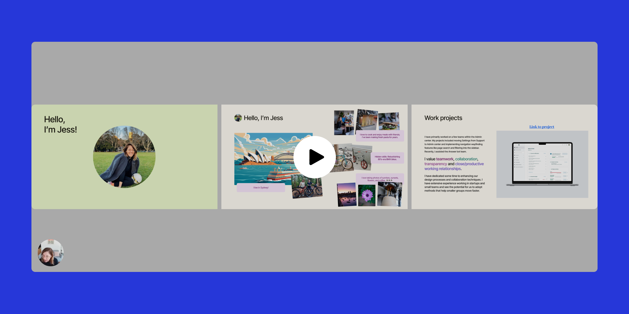
Me, recording my introduction slide deck for a new team.
I’ve had great success using video introductions with new teams. I keep it simple: I walk through a short, three-slide deck in about 30 seconds. The main slides focus on two aspects: who I am personally and professionally.
The personal slide gives a glimpse into my life and hobbies, while the professional slide highlights my values and past work projects, giving people context about my background and experience. This approach tends to catch people by surprise—in a good way! A few colleagues even created their own introduction slides and returned them to me. 🥹
Here’s some of the feedback I received:
- *“Absolutely love the intro video and slides.* 👌🏽*”*
- *“What a lovely way to introduce.”*
- *“I’ve never seen an introduction like that before.”*
Consistent, reliable communication strengthens trust, especially in how designers collaborate, share their work, and ensure clarity across projects. Communicating directly shapes trust within a team, whether presenting design decisions, responding to feedback, or documenting discussions.
### Here are some key opportunities to build trust through communication
#### 1\. Organize your work thoughtfully
- Structure design files so they’re easy to browse.
- Use clear naming conventions to avoid confusion.
- Add clear annotations or notes to your work to ensure others have the context they need to understand.

An example of how I organize a frame in Figma.
#### 2\. Provide context to improve comprehension
- Provide the necessary background information so people have the information they need to engage fully with a project.
- Ensure stakeholders understand what they’re looking at and how to give input.
- Explain **why** a design decision was made.
- Include updates on changes and open questions.
#### 3\. Make information transparent and accessible
- Visualize data—such as research findings—so it’s easy to interpret.
- Keep presentation slides inside your design files for easy reference.
- Document functional requirements.
#### 4\. Use video to communicate effectively
- If you do one thing, do this: Use video to provide clear updates when you can’t be there in person. Walking stakeholders through your work asynchronously builds clarity and trust.
- However, video isn’t always the best option—some prefer written documentation that can be scanned.
- Use **video for complex topics** that need context, such as walking through design rationale.
- Use **written summaries for quick updates**, like small UI changes.
- Choose the right format for each situation to make information easier to understand and more useful to the team.
#### 5\. Capture and document discussions
- When key product conversations happen, document them.
- Use a shared, non-Slack space (like Google Docs) to make decisions visible.
### Recap: We build trust through consistency
Building trust isn’t about grand gestures but our consistent reliability and everyday choices in communicating and collaborating. From responding to feedback with openness to ensuring our work is clear and accessible, trust is reinforced through reliability and thoughtful interactions. Over time, these small actions compound, creating an environment where collaboration flourishes.
We can start today by:
- Making introductions more personal and engaging.
- Structuring our work so it’s easy to navigate.
- Providing context to help others understand our decisions.
- Using video (and written summaries) to improve communication.
- Capturing and sharing important discussions transparently.
### Reflection
*Where can you begin implementing these strategies? Are there opportunities to make your introductions more meaningful? How might you enhance consistency in your communication to strengthen trust?*
Trust isn’t built overnight, but small, intentional actions—how we introduce ourselves, communicate, and collaborate—shape our relationships and team dynamics. The way we communicate and collaborate every day shapes trust. Small, intentional actions add up, helping us build a strong team connection and do better work together.
### Why unfinished creative work might be keeping you up at night
URL: https://www.everydayux.net/why-unfinished-creative-work-might-be-keeping-you-up-at-night/
Last updated: 2026-02-24T01:37:29.000Z
If you’ve ever struggled to fall asleep at night and couldn’t figure out why, you’re not alone. It’s easy to assume the usual culprits—stress, screens, or an inconsistent sleep schedule—but what if the real reason has more to do with how you spend your day?
I recently came across this idea, and it immediately resonated with me. Working full-time while juggling personal creative goals often means there isn’t enough time in the day to accomplish everything. I’ve found myself ending the day with a sense of **yearning**—like something is missing. Recently, that feeling has begun to impact my sleep and overall enjoyment of life. I think this is the reason why.
**Maybe you can relate. I’m excited to share this with you.**
When it comes to tasks, there are things **we *have* to do** and things **we *want* to do**. Our brains process both, but if we neglect the ones tied to personal fulfillment, creativity, or relaxation, they don’t just disappear—they linger. Unfinished creative work can keep our minds active long after we’ve stopped working, making it harder to wind down and sleep.
This scenario relates to the **Zeigarnik effect**, which suggests that our minds hold onto unfinished tasks more than completed ones. If we focus only on obligations and ignore what brings us joy or a sense of agency, our subconscious keeps nudging us, leading to stress or restlessness at night.
If those desired tasks involve relaxation or self-expression, skipping them means missing out on mental decompression, which is crucial for quality sleep. Carving out time for them, even in small ways, can help signal to the brain that letting go and resting are okay.
> If you’ve been feeling restless at bedtime, the problem might not be what you’re doing *before* bed—it might be what you’re *not* doing during the day.
### The science behind unfinished tasks and mental load
*Ever notice how an unfinished task lingers in your mind, nagging at you even when you’re trying to relax? That’s not just you—it’s a well-documented psychological effect.*
In 1927, psychologist **Bluma Zeigarnik** discovered that people tend to remember unfinished tasks more effectively than completed ones. This effect became known as the **Zeigarnik effect**, and it explains why loose ends—whether they’re work deadlines or creative projects—stay active in our minds. If we don’t give them closure, our brains continue to run in the background, making it harder to wind down and sleep.
Then there’s the **default mode network (DMN)**—a part of the brain that kicks in when we’re at rest. The DMN is responsible for processing thoughts that are not directly related to immediate tasks, such as reflecting on the past or planning for the future. The problem? If your creative work feels unresolved, your DMN might keep revisiting it while you’re trying to fall asleep. Instead of drifting off, you’re mentally sketching out ideas, tweaking a design, or composing sentences in your head.
> This scenario explains why making time for creative work during the day can help you sleep better at night.
### Why creative work is different from obligations
*There’s a significant difference between checking off tasks we must do and making progress on a personal, creative endeavor*mentally close the day*.*
Obligations—emails, work deadlines, chores—come with a built-in sense of *relief* when we finish them. You send the email, pay the bill, fold the laundry, and it’s off your plate. There’s no lingering attachment, just the satisfaction of completion.
Creative work doesn’t function like routine tasks. It’s not just about finishing the task or even achieving a sense of accomplishment—it’s about *fulfillment*. When you’re in the middle of something creative, whether writing, designing, or brainstorming, your brain isn’t just processing information—it’s actively making connections, exploring ideas, and problem-solving in an open-ended way. Unlike routine tasks with a clear endpoint, creative work is more fluid, making it harder to set aside mentally when left unfinished.
If you don’t make time for it—or worse, if you start but don’t get far enough to feel real progress—it doesn’t simply fade into the background like a forgotten email. It lingers. The brain keeps track, revisiting it like an unresolved thread, making it feel less like an unchecked box and more like a missed opportunity. And that sense of unfinished business can make it harder to mentally close the day.

### The role of dopamine and motivation in sleep
*Dopamine is often called the “motivation” or “reward” chemical, but it does more than make us feel good—it also plays a role in sleep regulation.*
When we engage in creative work, especially when it feels meaningful or enjoyable, our brains release dopamine. Dopamine helps satisfy our natural craving for novelty and accomplishment. If we don’t get enough of that type of fulfillment during the day, our brains might keep looking for it at night, making it harder to settle down.
It’s why scrolling endlessly on our phones before bed can feel *weirdly* satisfying but not restful—we’re chasing that last little dopamine hit. But if we’ve already given our brains something rewarding earlier in the day, whether through writing, designing, or making something just for fun, we’re less likely to feel that itch for unfinished business when it’s time to sleep.
### Sleep studies on mental rumination
*If you’ve ever found yourself replaying unfinished tasks in your head while trying to fall asleep, you’re not alone—and research shows us why this happens.*
A University of Michigan study found that people who engage in rumination (persistent, repetitive thoughts about unfinished tasks) experience lower sleep quality. The more your brain fixates on what’s left undone, the harder it is to shut down for the night.
Conversely, another study in the *Journal of Occupational Health Psychology* found that making a **to-do list before bed** can help offload those lingering thoughts, improving sleep. This approach applies to creative work, too—maybe it’s jotting down a quick sketch idea, summarizing where you left off in a project, or writing a loose outline for something you’ll pick up tomorrow. Giving your brain a sense of closure might be all it needs to let go and rest, even if you didn’t finish the work.

### How to apply this insight in daily life
*If unfinished creative work can keep our brains buzzing at night, the solution isn’t just about doing more—it’s about structuring our creative time to give us a sense of progress and closure.* Here are a few ways to make that happen:
- **Small creative wins:** Instead of waiting for a perfect block of time, sneak in small creative acts throughout the day. Doodle something between meetings, write a quick paragraph, or play an instrument for five minutes. Even tiny bursts of creativity can help satisfy the brain’s need for progress.
- **Closing rituals:** Make your creative work an intentional stopping point, even if it is unfinished. Jot down a note about where to pick up tomorrow, summarize what you figured out, or take a quick photo of your work. This act signals to your brain that pausing without feeling stuck in limbo is okay.
- **Mindful closure:** Before bed, shift your focus from what’s *left undone* to what you *did* create. Acknowledging even a small step forward helps reframe your progress and allows your mind to rest.
> I always have a handful of creative projects in motion. But when I return to them, I sometimes forget where I left off, which creates friction and makes it harder to dive back in. To fix this, I’ve started keeping a **diary with notes**—a simple habit that helps me pick up where I left off with less effort. It also gives me a sense of **progress and closure**, making creative work feel more fluid and rewarding.
### Additional ways to balance creativity, fulfillment, and rest
- **The “unfinished task dump:”** Before bed, spend just five minutes writing down any unfinished creative ideas, next steps, or loose ends. A *Baylor University study* found that people who wrote down their unfinished tasks before bed fell asleep significantly faster than those who didn’t. The act of externalizing unfinished work helps offload mental processing, making it easier to let go. Keeping a simple *unfinished task journal* or a creative “inbox” where you jot down lingering thoughts can signal to your brain: *I’ve recorded it—I don’t need to keep thinking about it.*
- **Brain dump before deep work:** This method involves writing down any lingering to-dos or unrelated thoughts (e.g., errands, work issues, etc.) before diving into creative work. Studies on cognitive load theory suggest that clearing mental clutter before deep work makes it easier to focus and avoid getting stuck. This quick brain dump tells your mind, “I’ll get to this later,” freeing up cognitive space for creativity.
- **The 85% rule:** Instead of exhausting yourself on a creative project, aim to stop while you still feel engaged—before frustration or fatigue kicks in. Research on *flow states* suggests that we’re most productive and creative when we work at about 85% of our maximum effort. If you stop while still energized, your brain is more likely to return to the work enthusiastically later, making it easier to pick up again without overthinking it at night.
- **The Zeigarnik effect in reverse:** Instead of aiming to finish a creative session with a completed idea, try stopping at an *interesting* point. Leave yourself a half-written paragraph, a half-designed wireframe, or an unresolved concept. This event taps into the *Zeigarnik Effect*—our tendency to remember unfinished tasks—which can actually work in your favor by keeping the momentum alive without the stress of total incompletion. Ernest Hemingway famously employed this technique, stopping mid-sentence so that he always had a clear starting point the next day.
- **The “golden hour” principle:** Try shifting creative work to earlier in the day, even if it’s just 15 minutes. Research shows that our brains have peak creative energy before decision fatigue and external pressures set in. A small early creative win can reduce the feeling of *not getting to what you wanted to do today,* making it easier to unwind at night.
---
### How we engage with creative work during the day directly impacts how we feel at night.
Unfinished creative tasks don’t just fade into the background like work emails or chores—they stay active in our minds, sometimes making sleeping harder. But the solution isn’t necessarily about finishing everything. It’s about *acknowledging* creative progress and small wins and creating rituals to mentally close the loop.
Making even small time for creativity and intentionally wrapping up unfinished work gives us the best chance at restful, uninterrupted sleep.
***Creativity and rest don’t have to be at odds—when balanced well, they can actually support each other.***
---
***Relevant studies***
- Zeigarnik, B. (1927). *On finished and unfinished tasks.* Psychologische Forschung.
- Smit, D. J. A., et al. (2020). *Rumination and sleep: A meta-analysis.* Journal of Affective Disorders.
- Scullin, M. K., & Bugg, J. M. (2016). *Writing about unfinished tasks improves sleep quality.* Journal of Experimental Psychology: General.
### What Flow reveals about the creative process and self-directed learning
URL: https://www.everydayux.net/what-flow-reveals-about-the-creative-process/
Last updated: 2025-08-08T01:01:07.000Z
*Flow* is a visually stunning and deeply emotional animated film that unfolds without dialogue. Its story is told entirely through movement, expression, and breathtaking scenery. Directed by Gints Zilbalodis, the film follows a lone cat navigating a post human world where rising waters force it to form an unlikely bond with other animals. Every frame feels like a painting, immersing the viewer in vast landscapes—submerged cities, stormy seas, and mysterious labyrinths—brought to life with rich, atmospheric lighting and fluid animation.
*Flow* is visually stunning—a testament to both creative independence and the artistic process. From its wordless storytelling to its painterly visuals, every aspect of the film reflects the singular vision behind it.
But beyond its beauty, **Flow* also offers a deeper lesson about creativity—one that invites us to reflect on how we approach our own creative work. At the end of this piece, you’ll find a set of questions designed to spark that reflection.
### Curiosity and self-directed learning
Curiosity, self-directed learning, and an obsession with craft have always been the real engines of creativity. *Flow* reminds us that you don’t need permission, a perfect plan, or the “right” credentials to create something remarkable. What matters is the willingness to **explore**, **build skills by doing**, and **trust that the work will teach you what you need to know**.
> The most meaningful projects often begin as experiments—small ideas that grow through persistence, problem-solving, and a deep connection to the process.
The film’s absence of words places a focus and amplifies its emotional depth, making every interaction between the animals feel meaningful. It is as much about survival as it is about connection, exploring themes of trust, loss, and resilience with quiet beauty. It’s a rare animated film that invites you to feel, letting its world and characters linger long after the final scene.
This kind of storytelling—where every glance and movement carries meaning—requires an artist with a deep connection to the work. For Zilbalodis, that connection was forged through years of **self-directed experimentation**.
### Define your own creative process
Gints Zilbalodis’ journey in creating *Flow* is a rare example of independent filmmaking at its most ambitious. Without formal training in traditional animation pipelines, he relied entirely on self-teaching, open-source tools, and an instinctive approach to storytelling. He didn’t work from a script in the usual sense or use storyboards. Instead, he placed his characters into digital environments and **explored them through the camera**, searching for the story as he moved through the space. This method, which mirrors live-action cinematography more than conventional animation, allowed for a dynamic and fluid sense of motion, giving the film a unique rhythm that feels discovered rather than pre-planned.
**If you're interested in learning more about discovering your own creative process, check out my book.*
[Discover your way to making it - a book by Jess EddyEmbrace creativity as a skill with “Discover Your Way to Making It.” Journey through self-discovery, celebrate small wins and explore the joy of playful experimentation. Dive into personal tales that inspire mastery.a book by Jess Eddy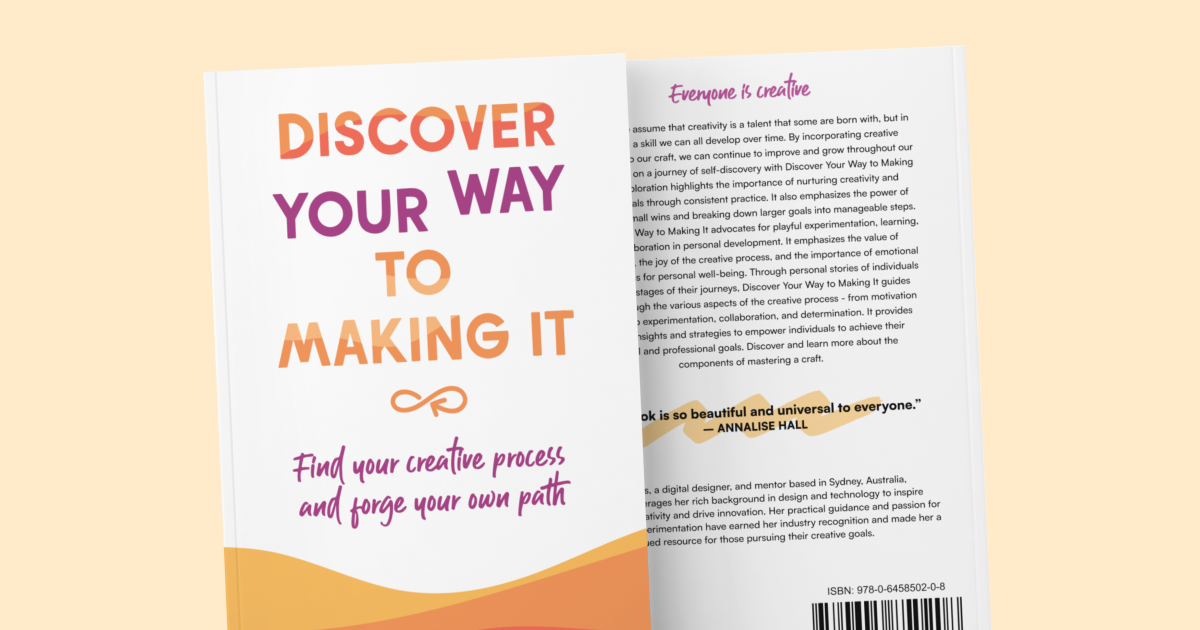](https://jesseddy.com/discover-your-way-to-making-it?ref=everydayux.net)
### Learn by doing
His approach to learning was deeply iterative. Before *Flow*, Zilbalodis had been making animated short films independently since his teenage years, using each project to refine his techniques. For much of his early career, he worked with Autodesk Maya, but in 2019, he fully transitioned to Blender. Blender’s real-time rendering engine, EEVEE, allowed him to work more immediately and intuitively—seeing changes instantly rather than waiting for slow renders, making him more connected with his work and creative process. [All creatives benefit from this kind of immediate, tangible connection to the work—a principle championed by Bret Victor](https://www.everydayux.net/living-and-inventing-with-purpose/). The ability to see and manipulate results in real time made his process more fluid and reinforced his preference for discovery over rigid planning.
### A singular creative vision
Zilbalodis didn’t just direct *Flow*—he animated, edited, and composed a large portion of the music himself. Self-taught at writing music, he composed over seven hours, with only 50 minutes making it into the final film. His approach to composition was exploratory—he created and layered different sounds and moods, choosing what fit aspects of the film organically rather than working from a rigid, predetermined score. His deep involvement in every creative layer gave the film an unusually cohesive identity that feels personal and unfiltered in a way rarely seen in large-scale animated films.
Despite *Flow* eventually becoming an international co-production, its core remained Zilbalodis’ singular vision. His real-life pets and observations of animals in zoos inspired the characters, reinforcing his preference for realism over exaggerated cartoon expressions. The absence of dialogue and anthropomorphism, influenced by Jacques Tati and *Future Boy Conan*, was a deliberate choice—he wanted to tell the story purely through movement, framing, and sound, trusting the audience to engage without exposition.
### A milestone in independent animation
The entire film took five and a half years to complete, an extraordinary feat considering that much of it was driven by one person’s creative momentum. With a budget of €3.5 million, *Flow* became the highest-grossing film in Latvian history, earning $20 million worldwide. It was also the first Latvian film to win a Golden Globe and secure an Academy Award nomination, a milestone that has sparked greater investment in the country’s animation industry.
Beyond its accolades, *Flow* has resonated with filmmakers and creatives drawn to an alternative creative process. In an industry where animation often depends on large teams and rigid structures, Zilbalodis’ success is a rare example of how a singular vision, when fully realized, can be a defining creative act. His work challenges the idea that independent filmmaking has limits—it proves that with persistence, curiosity, and a deep connection to craft, an artist can bring their vision to life on their own terms.
> Creativity begins with curiosity and takes shape through action.
At its core, *Flow* is a testament to what’s possible when filmmakers—or any creative—shape their own process, learning through doing, trusting their instincts, and experimenting with new tools. Zilbalodis’ journey reminds us that you don’t need permission or the perfect conditions to create something meaningful. Creativity thrives in curiosity, exploration, and the courage to build something new.
The only way to find your voice is to start making. But sometimes, the hardest part is knowing where to begin. Here are some questions to help you reflect on your own creative journey.
**Questions to reflect upon**
1. What’s stopping you from starting the creative project that excites you?
2. How can you experiment more in your creative process instead of waiting for the perfect plan?
3. Are you relying on traditional methods because they work or because they’re familiar?
4. What would your work look like if you trusted your instincts more?
5. What tools or techniques have you been curious about but haven’t tried yet?
6. How can you create a more immediate, hands-on connection with your work?
7. What would you make if you had no rules, expectations, or need for permission?
### Three ways designers can be independently strategic at work
URL: https://www.everydayux.net/three-ways-designers-can-be-independently-strategic-at-work/
Last updated: 2025-08-08T01:21:38.000Z
Our industry is rapidly shifting, shaped by economic pressures, globalization, and evolving expectations. Designers are expected to deliver more impact with fewer resources. Yet, many organizations treat strategy and execution as separate concerns—prioritizing high-level planning while undervaluing the hands-on work that moves the needle.
But the most effective designers know strategy isn’t about meetings and slides—it’s about making decisions that drive action. A great strategy isn’t abstract; it provides clarity, focus, and a direct path to execution. When organizations value both equally, they bridge the gap between big ideas and real outcomes.
This is a pivotal moment for designers to take ownership of their impact—not by waiting for permission or direction but by proactively shaping their work. The key is to stop thinking of strategy as something separate from execution and instead use it as a tool to amplify and accelerate your impact.
In this post, I’ll share three proven ways I’ve taken an independent, strategic approach at work—practical strategies that have worked for me and that anyone can start using today.
This is especially relevant now, as many prominent UX thought leaders seem [increasingly disconnected from the realities of modern design work](https://www.everydayux.net/the-current-state-of-ux/). A common criticism is that they focus too much on theory, high-level strategy, and abstract ideas while overlooking the practical, actionable skills designers need to succeed in their roles.
> Strategy isn’t reserved for those with leadership titles. As a designer, you can shape direction through your work, the relationships you build, and the expertise you develop.
## Three ways to be independently strategic in your day-to-day work.
### 1\. Develop your own ideas
One of the most overlooked ways to be strategic as a designer is to generate and test your own ideas rather than wait for direction. This isn’t just about side quests; it’s about proactively identifying opportunities, prototyping solutions, and influencing what gets built.
Many designers operate in a reactive mode, responding to tasks, following briefs, and executing what’s assigned. However, the true impact comes from taking the initiative, identifying opportunities, and proactively shaping solutions. The tools we have access to now make this easier than ever.
AI-powered coding assistants, design-focused no-code platforms like Framer, and animation features like Figma’s Smart Animate have drastically reduced the time it takes to turn an idea into something real. What once required weeks of work can now be built in days—or even hours.
Designers who excel at spotting ideas are skilled at recognizing unmet needs and identifying jobs that need to be done. The next step is finding a way to solve the problem more effectively—whether by refining an existing solution, introducing a new approach, or offering a better alternative to what competitors provide.
> Good ideas start with making something better for someone.
Train yourself to see opportunities and start creating rather than waiting for someone else to dictate what is worth pursuing.
**Idea → Prototype → Share**
- **Look for opportunities that others don’t see**
Strategic designers train themselves to spot opportunities, inefficiencies, and friction in the user experience. It’s not about chasing abstract ideas—it’s about recognizing what could be better, crafting a solution, and making it real.
- **Prototype quickly—speed matters more than polish**
The goal isn’t to create a perfect, production-ready design—it’s to make an idea tangible, although polish does impress. When speed matters, UI kits, component libraries, and AI-assisted tools help designers quickly mock up concepts and build real prototypes.
[6 top UI design kits and why to use them (in 2024)Discover how UI kits can streamline your design process by enabling rapid prototyping, fostering team collaboration, and supporting platform-specific projects. Learn how they help you save time, maintain consistency, and experiment with new ideas cost-effectively.everyday uxJess Eddy](https://www.everydayux.net/6-top-ui-design-kits-and-why-to-use-them-in-2024/)
- **Use AI and design automation to your advantage**
AI-powered coding assistants like GPT, Cursor, and Loveable, no-code design platforms like Framer, and animation features like Figma’s Smart Animate have drastically reduced the time to turn an idea into a reality. What once required weeks of work can now be built in days—or even hours—allowing designers to move beyond static mockups and showcase real, testable experiences faster than ever.
- **Prove value through tangible outputs**
A well-crafted prototype does more than an abstract pitch—it shows what’s possible. Aligning ideas with business goals or user pain points makes them harder to ignore.
- **Share early, share often**
One of the most strategic things a designer can do is get ideas in front of the right people. Circulate prototypes, spark conversations, and iterate based on feedback. Even if an idea doesn’t move forward immediately, it builds credibility and influence over time.
> A prototype is more valuable than a static mockup. A static mockup is more useful than a written idea. And a written idea is more valuable than one that never leaves your head.
By consistently working this way, designers start shaping their own ideas to drive impact. The fastest way to gain strategic influence is by showing what’s possible.
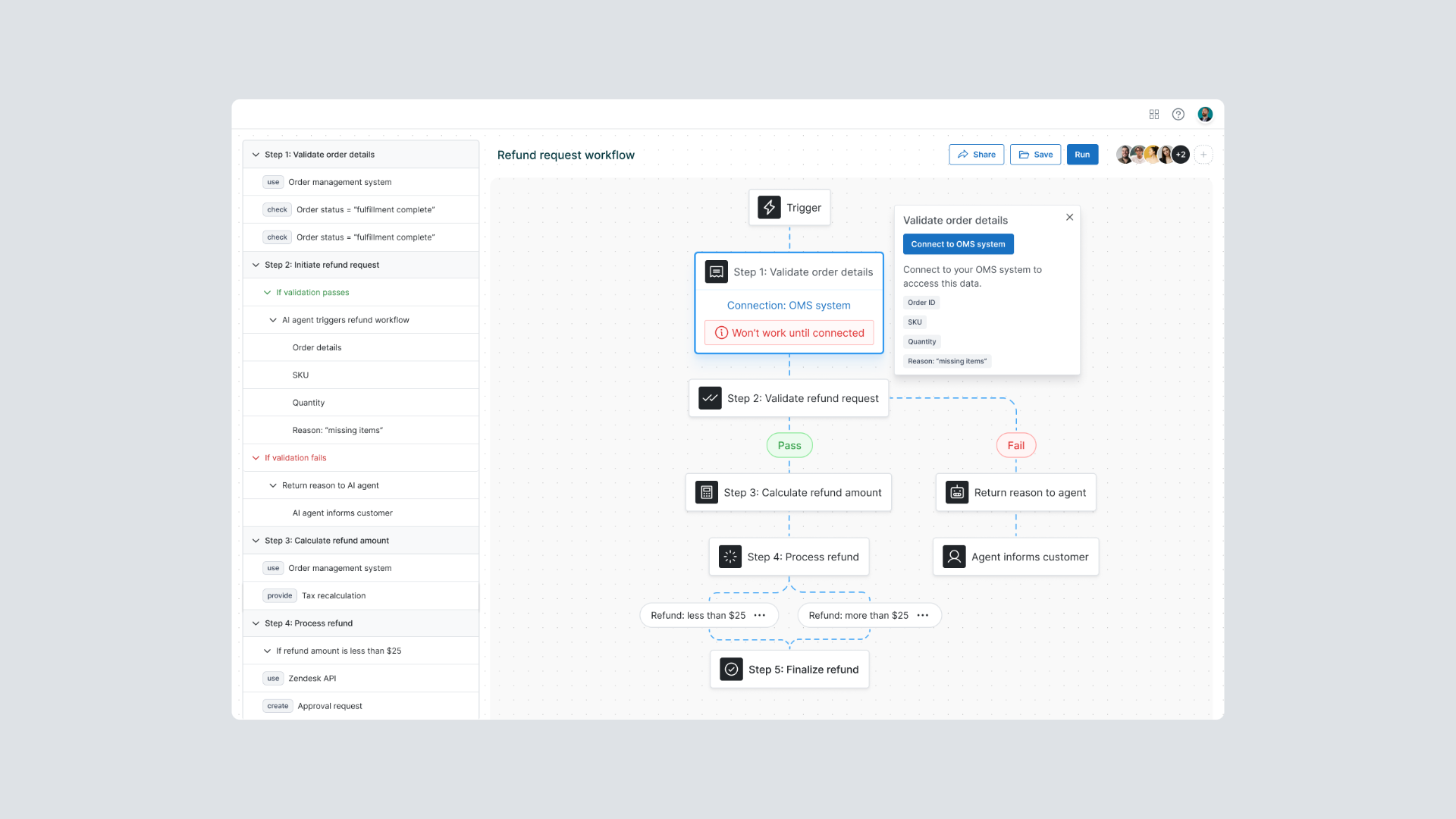
An image showcasing a coded, functional prototype I built to bring an idea to life.
**Once I started applying this approach, I was hooked.**
The tool I use depends on the scenario, but the principle remains the same—quickly turning an idea into something tangible.
- I used **Framer** to build a *realistic marketplace* prototype that connects customers to development starter packages, helping them extend and build new functionality.
_This post is for subscribers only._
### The Duolingo handbook: 9 lessons for designing world-class products
URL: https://www.everydayux.net/the-duolingo-handbook-9-lessons-for-designing-world-class-products/
Last updated: 2026-02-24T01:47:42.000Z
Duolingo’s journey from a small experiment above a Pittsburgh sports bar to the world’s most popular language-learning app is a top-tier example of designing a product well and using processes to support the end result. The company didn’t succeed through a single breakthrough idea—it won by relentlessly iterating, designing for engagement, and using data to refine every aspect of the experience.
Duolingo stands out because of its mission and how well the company executes its product development process. The company pioneered a playful, gamified approach to learning, combining intuitive UX, AI-driven personalization, and smart engagement mechanics to keep users motivated. This resulted in a product that teaches while helping users build daily habits.
Duolingo is now a publicly traded company. It consistently ranks among the top-grossing and most downloaded education apps and is expanding beyond languages into literacy and language certification.
For UX product designers, Duolingo offers a masterclass in creating engaging, sticky experiences. Their ability to blend fun with effectiveness—while keeping millions of users coming back daily—proves that great design is about designing and building products people love to use.
### The Duolingo handbook
The Duolingo handbook is a blueprint behind how the company designs, builds, and refines one of the world’s most engaging learning experiences. It captures the core principles, strategies, and philosophies that drive Duolingo’s success, offering a behind-the-scenes look at what makes the product so effective.
At its heart, this handbook explains how Duolingo balances fun and effectiveness–integrating intuitive design, gamification, rapid iteration, and data-driven decisions while maintaining a strong business model. These principles weren’t just dreamed up; they result from years of experimentation, refinement, and learning from real users.
Duolingo created this handbook as an internal guide to document and share its approach to building engaging, effective products. By openly sharing its principles, the company strengthens alignment across its own teams while offering insights that might inspire the broader tech and product community. More than anything, it’s a way to stay true to their mission of making education accessible and enjoyable for everyone.
[The\_Duolingo\_HandbookThe\_Duolingo\_Handbook.pdf22 MBdownload-circle](https://www.everydayux.net/content/files/2025/02/The%5FDuolingo%5FHandbook.pdf "Download")
---
## Key lessons for UX product designers
Duolingo’s success is rooted in creating an experience people want to return to each day. Over the years, the company has fine-tuned its approach through constant iteration, data-driven design, and a deep understanding of user behavior.
Here are **nine key lessons** from Duolingo’s handbook to help you build more engaging, intuitive, and impactful digital experiences. These principles go beyond good UX—they will help you design products that delight users, drive retention, and create lasting value.

### 1\. Play the long game
Duolingo was never meant to be a quick-hit app. It was built with a long-term vision. The goal was to create a product people use for years, not just something they download, try for a week, and forget about.
This mindset is evident throughout the product design. Duolingo could make more money in the short term by cramming extra ads, which would no doubt frustrate users. Instead, the team prioritizes the experience, knowing that keeping people engaged and coming back is what truly matters.
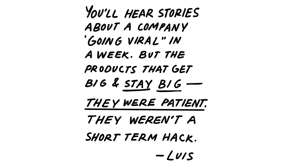
Playing the long game also means betting on technology. Early on, Duolingo invested in text-to-speech rather than recording human voices, trusting that AI-generated audio would improve over time. They hire people who aren’t just talented but also deeply aligned with their mission, building a team that’s in it for the long haul. This long-term thinking is evident in features like streaks, which help turn learning into a habit.
The impact of the company’s choices doesn’t always appear overnight. Still, by being patient and focused on the bigger picture, Duolingo continues to build a product that people return to.
💡
****Are you thinking long-term when it comes to user engagement?**
It’s easy to chase quick wins, but are there areas where short-term trade-offs might hurt retention later? How can you design features that build real habits—keeping users coming back because they **want* to, not because they have to?

### 2\. Make experiences effortless and fun
Duolingo believes great products shouldn’t need a how-to guide—users should understand them instinctively. That’s why the app is designed to feel natural from the start, reducing the need for instructions. They make learning easy.
Simplicity and playfulness keep users engaged. One of the biggest moves in this direction was the *“Juicy”* design update, which introduced brighter colors, rounded elements, and a more inviting aesthetic. It wasn’t just a visual refresh—it reinforced the idea that learning should be fun.
They design features to balance usefulness, ease of use, and delight. The goal is to create an experience people want to use, not because they have to but because they genuinely enjoy it.

💡
****Can users just dive in, or do they need a manual?**
Is your product intuitive enough for people to start using it without instructions? Where can you remove friction and make interactions feel more natural? How can you add moments of delight without making things harder to use?
### 3\. Turn learning into a game
Duolingo believes that learning should feel like play, not work. Gamification is key to making that happen. Features like streaks, leaderboards, and rewards keep learners motivated and transform language learning from a task into a daily habit.
Beyond structured incentives, Duolingo sneaks in moments of delight—quirky characters, playful animations, and offbeat sentences that make lessons more engaging (and sometimes laugh-out-loud funny). These small details add novelty to the experience and make learning feel more like an adventure than studying.
By making every interaction enjoyable, Duolingo keeps motivation high. Combining game mechanics and spontaneous fun helps people stay on track and stick with their language learning on the run.
💡
****How can you make your product more engaging without making it feel like work?**
f context-appropriate, how can you incorporate motivational design elements that encourage consistency? How do you balance structured incentives with unexpected, delightful moments? And most importantly, does progress feel satisfying and meaningful, or does it risk becoming a chore?

### 4\. Move fast, learn faster
Duolingo moves fast, but never at the cost of quality. The team doesn’t get stuck in endless debates—they launch polished first versions (V1s), then test, learn, and refine based on real user behavior. The goal isn’t just to ship quickly but to make improvements that matter.
Data is at the core of this process. A/B testing helps teams understand what works, fine-tuning engagement and learning outcomes before rolling changes out more widely. This cycle of testing and refining allows Duolingo to rapidly adapt to user needs and continuously enhance its learning experience.
💡
****Are you talking more than doing?**
Are ideas getting caught in endless discussions when they could be tested in the real world? How can you get a strong first version into users’ hands faster? And once it’s out there, which data points actually matter to validate whether it’s working?

### 5\. Aim for excellence from day one
Duolingo doesn’t do half-baked releases. Instead of rushing out rough MVPs, the team focuses on polished first versions that meet a high standard. Every new feature must be useful, intuitive, and engaging before it goes live. The goal isn’t just to ship—it’s to deliver a polished experience, not test unfinished ideas on users
A culture of candid but constructive feedback reinforces this commitment to quality. Duolingo follows the principle of *“hard on the work, easy on the people,”* where feedback is direct and focused on improving the product, never tearing down individuals. High standards are the norm, but collaboration remains supportive, allowing creativity and innovation to thrive.
To maintain quality, the team rigorously dogfoods its own product, using it daily to catch issues firsthand. Tools like *Shake to Report* allow employees to flag bugs or inconsistencies instantly. The result is a product that works, feels effortless, and keeps people returning.
💡
****Are you shipping work you’re proud of—or just pushing things out the door?**
Are your features polished and high-quality, or just **good enough*? How do you make sure user feedback is baked into the process early and often? And does your team foster a culture where high standards and constructive feedback go hand in hand?

### 6\. Keep it fast, keep it focused
Duolingo moves quickly by eliminating delays and keeping momentum high. The team increases its *“clock speed”* by ensuring that feature development, A/B testing, and release cycles stay smooth—removing bottlenecks before they become problems.
The secret is ruthless prioritization. If a project or feature doesn’t have a real impact, it’s cut—no wasted effort, no distractions. This keeps teams focused on what moves the needle.
Duolingo also avoids unnecessary bureaucracy. Processes exist only if they help the team make faster, better decisions—never to slow things down. Product Review (PR) meetings, inspired by engineering’s code review process, help create alignment without bottlenecks.
💡
****What’s slowing you down—and does it really need to?**
Where are bottlenecks creeping into your process, and how can you remove them? Are you focusing on the most impactful projects, or are low-value tasks pulling your attention away? And are your processes actually helping you move faster, or are some just getting in the way?

### 7\. Let data do the talking
At Duolingo, decisions aren’t made through endless discussions but based on data and real-world results. Instead of relying on opinions, the team follows a *“show, don’t tell”* approach, using experiments, A/B tests, and user behavior insights to validate ideas and guide product improvements.
Prototypes matter more than pitch decks. Rather than spending time on long presentations, teams build, test, and refine based on how users interact with the product. This minimizes speculation and ensures every idea is backed by evidence.
Duolingo embraces *“show, don’t tell”* through TL;DRs. Every important update—a feature review or a meeting summary—starts with a clear, concise TL;DR. This immediately clarifies key takeaways, reducing the need for excessive documentation and drawn-out discussions. By leading with data, Duolingo stays focused on what truly works, continually fine-tuning the experience to help people succeed.
💡
****Are your decisions grounded in reality or just gut feelings?**
Are your choices based on real user behavior or assumptions? Do you rely on prototypes and experiments to test ideas? When it comes to communication, how can you ensure that key takeaways are clear, actionable, and not lost in the noise?

### 8\. Make experimentation the norm
Duolingo thrives on trying, testing, and iterating because the best ideas often come from unexpected sources. The *“99 bad ideas”* approach encourages teams to think freely, knowing that breakthroughs usually result from exploring what doesn’t work first.
Failure isn’t a setback; it’s part of the process. If an experiment yields valuable insights, it’s a win—even if the original idea doesn’t pan out. This mindset prioritizes innovation, continuous learning, and smarter decisions with every iteration.
Duolingo runs hundreds of A/B tests weekly, constantly refining features and the user experience. Testing at this scale enables fast, data-driven decisions, allowing the team to focus on what works and eliminate what doesn’t.
At the same time, Product Review (PR) meetings help teams stay aligned, keeping experimentation structured while allowing creativity to flourish. A PR meeting at Duolingo refers to a “Product Review,” a meeting where changes to the app are reviewed and approved. Led by the Product Organization, these meetings are open to anyone at the company to listen in. They aim to ensure product decisions are well-informed and aligned with company goals.
💡
****Is your team willing to take risks—or playing it too safe?**
Do they feel comfortable testing bold ideas, even if they don’t work out? How do you make sure every experiment—win or lose—leads to valuable insights? And are you running enough A/B tests and user experiments to continuously validate and refine your product?

### 9\. Keep it playful, keep it professional
Duolingo has mastered the balance between quirky and serious—a fun, engaging, and undeniably effective brand. Its *“wholesome and unhinged”* approach makes learning feel lighthearted, using humor and playful interactions to keep users engaged.
But beneath the fun is a strong commitment to excellence and professionalism. Internally, Duolingo fosters a culture where creativity thrives, but respect, inclusivity, and collaboration remain top priorities. Employees are encouraged to bring personality to their work while upholding high standards.
This balance is reinforced through open communication and transparency. Leaders are approachable, and decisions are shared openly, creating a culture of trust. The annual winter Getaway also plays a role—giving teams dedicated time to connect, recharge, and strengthen relationships in a low-pressure environment.
By blending playfulness with professionalism, Duolingo keeps its product and workplace dynamic, welcoming, and deeply effective. This culture of openness and collaboration not only shapes how the team works but also influences the product itself—ensuring that learning remains engaging, user-friendly, and built with a deep understanding of human motivation.

💡
****Are you striking the right balance between fun and professionalism?**
How do you weave personality into your product and culture without losing credibility? Are humor and playful design enhancing the user experience—or getting in the way? And within your team, how do you foster creativity while keeping collaboration respectful and productive?
---
*These lessons shape how Duolingo designs and builds a world-class product. Its product development process is structured and flexible, ensuring these principles aren’t just ideas but integral to daily practice.*
### The Green Machine: How Duolingo turns principles into action
Duolingo’s approach to product development, known as *The Green Machine*, is an execution system designed to drive continuous innovation while ensuring lasting impact. It’s a structured yet adaptable framework that balances speed, quality, and sustainability.
At its core, The Green Machine follows six key principles that guide decision-making and execution:
1. **Hire exceptional people and give them ownership** – Duolingo brings in top talent and empowers them to lead. Success comes from people who are not only skilled but deeply invested in the company’s mission.
2. Define success upfront – Every project starts with clear, measurable goals. Teams focus on meaningful impact, not just shipping, for the sake of shipping.
3. **Set guardrails and think long-term** – Short-term wins mean nothing without sustainable growth. Guardrails help teams prioritize effectively while staying aligned with Duolingo’s vision.
4. **Build, test, and refine relentlessly** – Execution drives innovation. Teams dogfood their products daily, using real-time feedback to iterate and improve quickly.
5. **Move fast without sacrificing quality** – Duolingo optimizes clock speed, reducing friction between steps to maintain momentum while upholding high standards.
6. **Double down on what works, cut what doesn’t** – If an experiment delivers results, it scales. If it doesn’t, it’s cut—no hesitation, no wasted effort.
This system ensures that Duolingo’s core principles—like prioritizing user experience, designing for engagement, and iterating based on data—aren’t just ideas but daily practices. It allows the company to move quickly while staying focused on what truly matters: building a product that millions of people love coming back to.
---
### Duolingo’s success isn’t about secret tricks or hacks—it’s just the fundamentals done really well.
**Everything we already know works:** prototyping, A/B testing, experimenting, and iterating based on real user behavior.
Their ability to move quickly while maintaining high quality is based on clear priorities, tight feedback loops, and a focus on what matters.
**It**’**s nothing flashy, just solid execution.** Duolingo offers a good reminder that a great product development process comes from getting the basics right and relentlessly improving.
> But Duolingo’s handbook isn’t just a list of best practices—it’s a mindset.
It’s about building products that engage, delight, and create lasting value through constant iteration and learning. These lessons highlight the principles that keep Duolingo at the forefront of user experience, product innovation, and engagement.
Whether designing for education, productivity, or entertainment, the takeaway is clear: prioritize long-term impact, design with delight, move fast but stay thoughtful, focus on quality, and let real user behavior guide your decisions.
**The real question is:** Which lessons will you apply to your work?
### The current state of UX: Adapting to an evolving industry
URL: https://www.everydayux.net/the-current-state-of-ux/
Last updated: 2025-08-08T01:23:06.000Z
**The UX job market is changing faster than ever, leaving many designers wondering how to stay relevant. Economic pressures, role confusion, and the rise of AI have reshaped expectations, making adaptability and impact the keys to thriving in this hyper-competitive field.**
Years of boot camps—*while not inherently a bad way to learn*—have led to a significant influx of junior designers entering the field. This saturation has made it increasingly difficult for newcomers to secure roles, especially as some companies take advantage of the situation by prioritizing overqualified candidates for entry-level positions to cut costs and get more bang for their buck. At the same time, mid-career professionals are stuck—too experienced for senior roles but not quite ready for leadership positions.
Meanwhile, globalization has added a layer of complexity. Many organizations are offshoring UX roles or leveraging visa programs like H1B to access talent at lower costs, limiting opportunities for local candidates.
AI is also reshaping our work, streamlining certain design tasks, and shifting expectations for mid-level roles. Companies increasingly value designers who balance multiple disciplines, including UX, UI, strategy, and more.
> In this environment, designers need a breadth of expertise and the ability to connect their work to business outcomes—not just to stand out but to stay relevant and make a lasting impact.
Adding to the frustration, some companies are posting “ghost jobs”—positions that aren’t genuine but are instead used to gauge market interest or give the illusion of active hiring. For candidates, it’s more than just frustrating—it’s deeply disheartening and demotivating.
So, how can designers navigate this challenging market? A great portfolio alone is no longer enough. To stand out, designers must focus on upskilling, broadening their expertise, and showcasing how their work delivers measurable business impact.
> The reality is clear: succeeding in this competitive field requires more than technical proficiency—it calls for resilience, strategic thinking, and an unwavering commitment to continuous growth.
### The disconnect in UX thought leadership
The role of thought leaders in UX is facing increasing scrutiny, as many professionals express frustration over how out of touch some prominent figures appear with the realities of modern design work. A frequent criticism is that these leaders emphasize theory, high-level strategy, and abstract ideas, often neglecting the practical, actionable skills designers need to thrive in their roles.
This disconnect is most obvious when advice ignores the realities of modern design work—tight deadlines, limited resources, and complex organizational dynamics. While early thought leadership played a crucial role in shaping UX, today’s market demands more from **makers—designers who craft great experiences and connect their work to measurable business impact.** Many now call for thought leadership that better reflects these realities—one that balances strategy with execution and adapts to reality.
### Strategic vs. tactical work
At the same time, people are growing frustrated with the tendency to undervalue tactical work in favor of strategy. While strategic thinking is critical for aligning design with business goals, it often takes precedence over the hands-on work that directly improves user experiences.
Many designers feel that this imbalance makes it harder to demonstrate the value of their contributions. Execution is frequently sidelined in favor of broad strategic discussions that lack a direct connection to delivering better products. The problem isn’t strategy itself—it’s a strategy that remains disconnected from execution.
> The most effective designers aren’t just tactical executors or abstract strategists. They bridge the two, ensuring strategic thinking leads to real, tangible improvements in user experience.
This disconnect becomes especially clear when UX work isn’t tied to clear business impact, making it difficult for teams to showcase their value. Tactical contributions—like refining user interfaces, prototyping new concepts, or iterating based on user feedback—are the building blocks of a great user experience and directly influence key performance metrics. **Without these efforts, strategy risks becoming abstract and removed from the realities of delivering value.**
> In an unpredictable market, the designers who thrive aren’t just those who understand execution or strategy in isolation—they’re the ones who can quickly adapt to shifting priorities, advocate for their work, and find ways to keep delivering impact.
[Designers who do excellent work are “fast on their feet”Designers who do excellent work are fast on their feet, embracing flexibility and adaptability as core traits. These skills help us navigate shifting priorities, collaborate effectively, and grow in our careers. Learn how to cultivate them and stay nimble as a designer.everyday uxJess Eddy](https://www.everydayux.net/designers-who-do-excellent-work-are-fast-on-their-feet/)
### A balanced approach is essential
Strategy and execution shouldn’t be seen as opposing forces but as inseparable parts of effective design. The best strategy enables designers to execute with greater clarity and impact. When organizations value both equally, they bridge the gap between vision and execution, ensuring that ideas don’t just exist in theory but translate into meaningful outcomes.
### The challenge of role confusion in UX
One of the most pressing challenges UX professionals face today is role confusion, often leading to undervaluation and even layoffs. Many organizations *still* lack a clear understanding of UX, treating it as a “nice-to-have” rather than a business-critical function. This misunderstanding frequently results in UX teams being seen as expendable or having their responsibilities absorbed by other departments to cut costs.
The increasingly blurred lines between UX and related disciplines worsen the problem. Designers are increasingly stretched beyond their core responsibilities. They are expected to handle UX and UI, business strategy, and tasks far outside their expertise, from project management to front-end development. This *‘and and and’* problem stretches teams thin, forcing individuals to juggle multiple responsibilities without adequate support or recognition.
**Role confusion extends beyond UX teams.**
Product managers, developers, or others in non-UX roles may assume they can handle UX tasks after minimal exposure to the discipline. This oversimplification devalues the specialized knowledge, methodologies, and user-centered approaches essential to effective UX design.
To address this challenge, UX professionals must advocate for their discipline by clearly communicating the unique value UX brings to the organization. This includes defining boundaries for responsibilities and educating stakeholders about the expertise required to deliver meaningful results. By doing so, UX teams can help ensure their contributions are understood, valued, and protected within the evolving workplace.
### Industry maturity and global dynamics
**The UX industry continues to grapple with significant differences in maturity across organizations.**
Many still operate at a low level of UX adoption, where design is treated as an afterthought rather than a strategic priority. This limits the discipline’s potential to deliver meaningful impact and keeps it from reaching its full value within these environments.
**At the same time, global dynamics are shifting.**
A growing pool of UX talent from countries with lower labor costs has increased competition, making it harder for professionals in higher-cost regions to secure opportunities and maintain job stability. While this global expansion enriches the industry with diverse perspectives, it also heightens concerns about job security and downward pressure on wages.
**For many UX professionals, undervaluation remains a persistent issue.**
Limited appreciation for the discipline and a perception that design is expendable have raised questions about its long-term sustainability in certain sectors. To address these challenges, organizations must deepen their understanding of UX’s strategic importance and create environments where design is valued as a critical driver of business success.
### Evolving as a UX professional
As the UX field becomes increasingly competitive, designers must adapt by expanding their skill sets and proving their impact. Upskilling—whether by mastering new tools, advancing prototyping techniques, or deepening business acumen—has become essential to staying relevant. Today, designers are expected to work beyond traditional UX boundaries, navigating a blend of technical, strategic, and operational responsibilities.
[AI tools are creating new opportunities and leveling the playing field for designersAI coding assistants and no-code platforms unlock new opportunities for designers, making it easier to experiment, prototype, and step into technical roles. As design becomes a key differentiator in a crowded market, now is the perfect time for designers to expand their horizons and skills.everyday uxJess Eddy](https://www.everydayux.net/ai-tools-are-creating-new-opportunities-and-leveling-the-playing-field-for-designers/)
However, this evolution raises an important question: does adapting to these demands risk compromising the core principles of UX? With the growing emphasis on aligning with business goals and delivering measurable results, there’s a genuine concern that the discipline’s user-centered foundation may become sidelined.
> For many, this balancing act can feel like a choice between staying employable and staying true to the craft.
### This tension highlights a deeper debate
Should UX professionals focus solely on personal growth to meet market demands or advocate for systemic changes within organizations that misunderstand or undervalue the discipline? While professional development is vital, addressing structural issues—such as low UX maturity or misaligned expectations—may be equally important for shaping the industry's future.
---
**The UX industry is changing fast and with the expectations placed on designers.**
Competition is fierce, roles are evolving, and many companies are struggling to define where UX fits. Thought leadership often feels disconnected from reality, and strategy is often prioritized at the expense of organizational execution. Many designers feel undervalued, stretched thin, or unsure how to prove their impact.
But despite these challenges, the **core of UX remains unchanged**: solving meaningful problems for users. The difference now is that designers must do more than execute—they must **advocate for their work, connect it to business outcomes, and navigate the forces shaping the industry.**
This doesn’t mean adopting a **strategy for strategy’s sake**—the kind that sidelines execution and focuses on broad, abstract discussions. Instead, it’s about using strategy as a **tool for impact**:
- **Strategy as a survival tool** → Designers cannot rely solely on execution; they must advocate for their work, show its value, and connect it to business impact.
- **Strategy as a complement to craft** → It is not a replacement for hands-on design but a way to give it greater influence and visibility in the organization.
When UX is challenged, designers who adapt—not by abandoning execution but by correlating it with strategy—will thrive. The path forward isn’t about choosing between tactical work and strategy but ensuring that one reinforces the other.
> By staying flexible, advocating for UX’s role, and delivering practical work with measurable impact, you can manage these shifts and define your role and the future of UX itself.
### Why great design still starts in Figma (most of the time)
URL: https://www.everydayux.net/why-great-design-still-starts-in-figma-most-of-the-time/
Last updated: 2025-08-08T01:23:21.000Z
### Figma is essential in UI/UX design
**Coding-first approaches also have their role.**
We’re in the era of very hot takes on design—where, in an attempt to feed the algorithm, rack up likes, or sell courses, people are making bold, attention-grabbing claims about design, tooling, and the industry. Lately, the target has been Figma: *“Figma is dead.”* *“There’s no reason to use Figma anymore.”*
These short-sighted statements lack context and nuance, two qualities that make for meaningful discussions but seem to be in short supply these days.
If you’ve been reading *everyday ux* for a while, you know I’m all for designers using AI tools to code—no surprises there, but replacing design tools entirely with AI? We’re just not there yet.
[AI tools are creating new opportunities and leveling the playing field for designersAI coding assistants and no-code platforms unlock new opportunities for designers, making it easier to experiment, prototype, and step into technical roles. As design becomes a key differentiator in a crowded market, now is the perfect time for designers to expand their horizons and skills.everyday uxJess Eddy](https://www.everydayux.net/ai-tools-are-creating-new-opportunities-and-leveling-the-playing-field-for-designers/)
[How o3 is shaping the future of work: opportunities for designers and beyondo3, the latest iteration from OpenAI, builds on the success of earlier GPT models, with enhanced reasoning, coding, and problem-solving capabilities that are poised to transform design.everyday uxJess Eddy](https://www.everydayux.net/gpt-4-the-future-of-work-opportunities-for-designers/)
That said, we shouldn’t cling to tools or processes just because they’re familiar. Technology moves fast, and part of being a great designer is knowing when something has become outdated—or when a new approach is worth exploring.
The points in this article aren’t rules—they’re ideas and advice. The best way to find what works for you is to experiment. Try new things, challenge assumptions, and see for yourself.
**There’s a time and place for code, and there’s a time and place for design tools.**
I use Figma as the example in this article, but while it may be the industry leader, it’s not the only option. If you use something else, swap Figma out for your tool of choice—the point still stands.
With AI-generated code on the rise and more teams shifting toward code-first approaches, some argue that Figma is becoming obsolete. However, Figma remains a crucial tool for product design, especially when working with teams, defining new experiences, and maintaining alignment.
At the same time, **design tools must evolve to stay relevant**. The demand to go straight from Figma designs to production-ready code is growing fast, and the pressure to streamline this process is shaping the future of design tooling. New integrations, AI-powered automation, and developer-focused workflows are all pushing Figma—and other design tools—to bridge the gap between design and code more seamlessly than ever.
---
## Here’s why design tools matter
_This post is for subscribers only._
### Designing your career: how to optimize for long-term, sustainable success
URL: https://www.everydayux.net/designing-your-career/
Last updated: 2025-08-08T01:23:32.000Z
### Growth begins where comfort ends
Many of us remain tethered to the familiar—clinging to roles, habits, and routines that feel safe but hold us back. For UX product designers, this might mean staying in a comfortable role, defaulting to tried-and-true methods, or avoiding the risk of pursuing leadership opportunities or new challenges.
Stepping into the unknown—whether by seeking a role with greater responsibility, transitioning to a different industry, or advocating for design’s strategic value within your organization—can feel intimidating. However, staying in place has more significant consequences. The longer we delay action, the harder it becomes to create a career that reflects our full potential.
Sometimes, we must embrace the discomfort of uncertainty and use it as a [catalyst for transformation](https://www.everydayux.net/the-future-is-yours-to-create-embrace-change/). Growth doesn’t require drastic changes; it starts with thoughtful, purposeful actions that move us forward. Whether expanding our skillset, seeking mentorship, or identifying when it’s time to pivot, **upgrading our careers starts with the courage to move beyond the familiar.**
Read on to find out why focusing on money too early in your career could hold you back, how side projects can enhance your skills and fuel creativity, and why prioritizing learning over immediate rewards sets the stage for long-term success. Discover the steps to break free from the familiar and design a career that aligns with your aspirations.
---
### Building a career with intention
**Meaningful careers don’t materialize overnight; they’re shaped by deliberate choices prioritizing growth and learning over short-term rewards.** The allure of immediate gains—like a higher salary or a more prestigious title—can sometimes overshadow opportunities to build the skills and experiences that lead to long-term fulfillment.
> A career built with intention starts by stepping back, thinking beyond the moment, and focusing on what will contribute to your growth over time.
One of the most common missteps is prioritizing money too early. In the rush to achieve financial stability or external recognition, it’s easy to overlook the value of acquiring knowledge and building versatility. While financial security is important, the skills you develop ***now*** unlock ***future*** opportunities.
Prioritizing money before growth involves trade-offs that can impact your fulfillment, well-being, and long-term success.
### Shifting your focus to learning and aligning your career with your values, interests, and long-term goals can transform your path as a designer.
**Burnout and stress**
- High-paying jobs often involve high expectations and intense workloads, which can lead to burnout and stress. For designers, this can mean constant pressure to deliver results, leaving little room for creativity, curiosity, or balance.
**Losing what matters most**
- Focusing too much on money can disconnect you from what truly matters. Overemphasizing financial rewards risks losing the sense of purpose, empathy, and connection that makes design work fulfilling and human.
**Investing in long-term growth**
- Prioritizing learning and growth over immediate financial rewards often leads to better career opportunities in the long run. Designers who take on challenging roles that offer growth and skill-building set themselves up for greater success and earning potential later.
**Short-term vs. long-term happiness**
- Chasing money might feel rewarding in the short term, but research shows it doesn’t always lead to lasting happiness. Designers who value growth, meaningful work, and balance tend to find greater satisfaction and well-being over time.
> Careers rarely follow a straight line and often involve lateral moves, transitions into new companies or roles, or even temporary steps backward to build the skills and experiences that lead to your goals and long-term growth.
### Progress comes from making choices that shape your skills, reflect your aspirations, and distinguish you as a designer.
Sometimes, learning from the right mentor matters more than the job itself. If you can work with someone who embodies the skills, mindset, or career path you want to follow, take it—regardless of the paycheck or job title. Do whatever it takes to learn from them and align yourself with opportunities that help you grow into the designer you aspire to be.
> The value lies in creating a career identity that is truly your own.
### Continuous learning: the foundation of an intentional career.
Learning makes you more capable and keeps your work exciting and engaging. Whether you master a technical skill, explore a creative passion, or deepen your understanding of a particular domain, each step you take adds to the foundation for opportunities you may not yet see.
> Building a career with intention means playing the long game.
It’s about prioritizing meaningful growth, exploring paths that challenge and inspire you, and committing to lifelong learning. By staying focused on growth, you can build a career that’s resilient and deeply aligned with your values and goals as a designer.
---
### Harnessing your passions and focus.
Distractions and curiosity, often dismissed as frivolous, can be powerful guides to untapped potential.
For UX product designers, these moments might manifest as **side projects**, **unexplored ideas**, or a **lingering interest** in something outside your immediate role. Rather than ignoring them, learning to harness these impulses can uncover new passions, spark creativity, and lead to meaningful growth and new opportunities. Taking time to follow your curiosity—even briefly—can open unexpected doors and reveal insights that shape your direction. The challenge is directing your energy toward what truly matters while letting go of what doesn’t.
**Purposeful distraction** is one way seemingly unrelated tasks or interests can unexpectedly contribute to your growth. You might naturally gravitate toward something more engaging or fulfilling when avoiding one task. Pay attention to where your focus drifts during these moments. What activities or ideas do you naturally turn to when you have free time? These inclinations aren’t random—they often reveal deeper interests or areas of alignment with your authentic self, pointing to where your energy and curiosity naturally flow.
> Recognizing and exploring these signals can lead to opportunities that feel both meaningful and fulfilling.
### Key benefits of focusing on side projects or purposeful distractions outside of work.
**Skill enhancement**
- Side projects act as a creative sandbox where you can explore new ideas, tools, techniques, and approaches. They allow you to practice and refine your skills outside work constraints, helping you stay sharp and adaptable in a constantly evolving field.
**Improved creativity**
- Engaging in side projects or following your curiosity sparks new ideas and perspectives. The freedom to explore personal interests often leads to breakthroughs that can directly or indirectly enhance your design work.
**Burnout prevention**
- Side projects and hobbies offer a healthy escape from work demands, helping to recharge one’s energy. Taking time for personal interests fosters balance and prevents fatigue from overextending oneself professionally.
**Transferable skills development**
- Exploring your passions outside of work helps you build valuable skills like time management, problem-solving, and creative thinking. These experiences often translate into your professional life, making you a more well-rounded designer.
**Increased job satisfaction and performance**
- Pursuing personal interests provides a sense of fulfillment that carries over into your work. Studies show that people who engage in hobbies outside their jobs often report higher job satisfaction and improved performance at work.
**Showcasing dedication and creativity**
- Your side projects can demonstrate qualities like passion, creativity, and initiative to potential employers or collaborators. They can also showcase a deeper layer of your identity as a designer and set you apart in your field.
**Curiosity** is another key driver of growth. It often nudges you toward areas where your interests and potential intersect. Exploring a new hobby, digging into a topic that excites you, or pursuing a question you can’t stop thinking about can lead to skills and insights that add depth to your expertise. For designers, this might mean learning about behavioral psychology, diving into data analytics, or experimenting with a creative medium outside your usual scope. No matter how small, these explorations are often more significant than they seem.
### Key benefits of following your curiosity.
**It makes you a better thinker**
- Curiosity encourages questioning existing beliefs and exploring new possibilities. Challenging conventional thinking leads to innovative ideas and fresh perspectives that drive meaningful change.
**Predictor of creative performance**
- Studies show that curiosity, especially epistemic (the drive to seek new knowledge), strongly predicts creative problem-solving and innovative thinking. This mindset equips you to tackle complex challenges with unique solutions.
**Catalyst for breakthroughs**
- Curiosity often sparks breakthroughs, as seen in Alexander Fleming’s accidental discovery of penicillin—an observation that led him to investigate further rather than dismiss it. Other innovations, like Post-it Notes, came from open-ended exploration and rethinking ‘failed’ experiments in new ways.
**Empirical evidence of impact**
- Research confirms that curiosity enhances creative performance by fostering the energy and knowledge needed for original solutions. The process of exploration itself often leads to transformative outcomes.
**Fuel for exploration and innovation**
- The energy and knowledge gained from curiosity significantly improve the originality and quality of your work. Whether exploring a new design tool or investigating a novel concept, curiosity can lead to unexpected and valuable insights.
> When approached with intention, curiosity becomes a compass for growth—guiding you toward breakthroughs that can shape your career and your sense of purpose as a designer.
---
**Your career as a UX designer is more than just the roles you take or the projects you complete—it’s the culmination of choices, risks, and moments of growth that reflect your aspirations and** [**values**](https://www.everydayux.net/the-transformative-power-of-personal-values-align-your-life-with-what-matters-most/)**.**
> Growth begins at the edge of your comfort zone, intentional decisions shape your path, and curiosity fuels your creativity.
Whether stepping into a leadership role, seeking mentorship, or exploring a passion project, staying aligned with what truly matters to you is key. Embrace the uncertainty of change, invest in your learning, and harness your energy where it has the greatest impact.
The journey may not always be predictable, but it is yours to shape. By stepping beyond the familiar, prioritizing meaningful growth, and following the threads of curiosity, you’re not just building a career but designing a uniquely authentic future.
### 20 ways to become a better thinker
URL: https://www.everydayux.net/20-ways-to-become-a-better-thinker/
Last updated: 2025-08-10T02:44:03.000Z
**Each principle in this article is paired with a book recommendation for those interested in exploring the ideas further. These books provide deeper insights and practical strategies to help you cultivate the art of deep thinking. They’re an excellent resource for expanding your understanding and implementing these principles.*
Deep thinking is a response to the challenges of modern life. When we take the time to reflect and engage deeply, we unlock a way of thinking that can transform our approach to navigating the world.
## Let’s begin by exploring why this practice matters and what happens when it is absent.
### The consequences of shallow thinking in modern society
***Shallow thinking has become the norm in a culture prioritizing speed and convenience.***
We skim, scroll, and react, prioritizing speed over depth. While these activities might feel satisfying in the moment, they discourage us from thinking critically or exploring our own minds and ideas. Without pausing to reflect or dig deeper, we risk losing the capacity to engage meaningfully with complex issues and uncover what truly matters. Shallow thinking isn’t just a personal challenge—it creates ripple effects in society, fueling misinformation, short-term solutions, and missed opportunities for meaningful progress. The antidote lies in reclaiming the art of deep, deliberate thought—a practice that enables us to see beyond the surface and focus on what truly matters.
### The connection between deep thinking and emotional resilience
***Deep thinking improves your emotional resilience.***
By taking time to process your thoughts and feelings, you build a greater capacity to navigate life’s challenges with clarity and grace. Reflection helps you process your emotions, making it easier to respond thoughtfully instead of reacting impulsively. This resilience grows when you sit with discomfort, analyze the situation, and uncover insights that bring perspective and calm. In a world that often demands quick fixes, deep thinking helps you stay grounded and adaptable, no matter what comes your way.
### The relationship between deep thinking and effective decision-making
***The root of good decision-making is deep thinking.***
When you take the time to explore a problem thoroughly, you can weigh options, anticipate outcomes, and align your choices with [your values](https://everydayux.net/the-transformative-power-of-personal-values-align-your-life-with-what-matters-most?ref=everydayux.net). Deep thinking encourages you to look beyond quick fixes and consider long-term impacts. It also sharpens your ability to spot hidden connections and creative solutions. Ultimately, this kind of deliberate decision-making leads to better results and greater confidence because you know your choices are thoughtful, intentional, and rooted in genuine understanding.
> The practice of deep thinking may seem daunting in a world where we celebrate quick decisions, multitasking and productivity. Yet, deep thinking is a skill that you can cultivate, one deliberate step at a time.
To move beyond shallow thinking, we must actively cultivate habits that deepen our focus and expand our capacity for reflection. The following principles provide practical steps to help you reclaim the art of deep, deliberate thought.
---
## 20 principles to sharpen your thinking
##### 1\. It’s important to sit with a problem longer than feels natural to uncover deeper, more authentic insights on a single thing
Thinking requires focus. It’s not about multitasking or memorizing other people’s ideas—it’s about staying with one question or topic long enough to develop your own perspective. When you focus deeply on one thing, you allow your brain to make connections that aren’t possible in a fragmented state. This kind of attention creates the space for creativity and clarity to emerge. Research has shown that multitasking reduces efficiency and diminishes the depth of thought. You can uncover insights that might otherwise be missed by eliminating distractions and giving your full attention to one idea or problem.
***Inspired by*** [***The One Thing***](https://www.amazon.com/dp/B00C1BHQXK?ref=everydayux.net) ***by Gary Keller and Jay Papasan, which emphasizes the power of focusing on what truly matters.***
##### 2\. Don’t trust your first thought
Our first thoughts are often borrowed—conventional wisdom, cultural norms, or things we’ve heard before. These initial ideas are usually shaped by habit, instinct, or external influences rather than true originality. It’s important to sit with a problem longer than feels natural to uncover deeper, more authentic insights. Question the first conclusion that comes to mind: Where did it come from? Is it based on evidence or assumption? Often, deeper thinking requires wrestling with ambiguity and uncertainty. This patience allows you to refine and reshape your thoughts into something uniquely yours, leading to more insightful and less conventional ideas.
***Based on insights from*** [***Thinking, Fast and Slow***](https://www.amazon.com/dp/B00555X8OA?ref=everydayux.net) ***by Daniel Kahneman, which explores how our initial thoughts are often instinctive and need deeper reflection.***
##### 3\. Only you have the answers
Nobody else can define what truly matters to you. We live in a world saturated with opinions, advice, and expectations, but becoming a thinker requires tuning out external noise and listening to your inner voice. This means reflecting on what you value, what drives you, and what problems you’re truly passionate about solving. Often, the answers you seek aren’t found in others’ experiences or conventional wisdom but in your unique perspective and lived experiences. By trusting yourself and embracing self-inquiry, you can uncover deeper meaning and purpose that align with who you truly are.
***Draws from*** [***Man’s Search for Meaning***](https://www.amazon.com/dp/B009U9S6FI?ref=everydayux.net) ***by Viktor E. Frankl, which emphasizes finding purpose and meaning from within.***
##### 4\. Confront your problems
It’s tempting to distract yourself from challenges or pretend they don’t exist, but avoidance only allows problems to grow. To think deeply and effectively, you must confront your issues head-on, regardless of how uncomfortable they may seem. This involves sitting with your discomfort, reflecting on the root causes, and acknowledging any role you may play in perpetuating them. Solitude can be beneficial, as it removes distractions and external judgments, allowing you to explore your challenges with greater clarity and honesty. Confronting problems directly not only brings solutions but also builds resilience and strengthens your capacity for critical thinking.
***Inspired by*** [***Daring Greatly***](https://www.amazon.com/dp/B007P7HRS4?ref=everydayux.net) ***by Brené Brown, which encourages us to confront vulnerability and find courage in adversity.***
##### 5\. Find your own reality
We live in a noisy world, constantly bombarded by the opinions, expectations, and judgments of others. Social media, news, and even well-meaning friends can blur the line between what truly matters to you and what society deems important. To think clearly, you must step away from this noise and spend intentional time in solitude, reflecting on your own values, priorities, and experiences. This process allows you to separate external influences from your authentic beliefs, helping you discover your own truth. By creating this mental space, you can develop a grounded perspective that’s uniquely yours and free from societal distractions.
***Inspired by*** [***Digital Minimalism***](https://www.amazon.com/dp/B07DBRBP7G?ref=everydayux.net) ***by Cal Newport, which advocates reducing distractions to focus on what truly matters.***
##### 6\. Question your assumptions
Much of what we think and do is built on assumptions we’ve never examined. These unspoken beliefs can shape our decisions, limit our perspectives, and keep us locked into outdated thinking. To become a true thinker, you need to challenge these assumptions. Ask yourself: Why do I believe this? Where did this belief come from? Does it still hold up under scrutiny? Often, assumptions are inherited from culture, upbringing, or past experiences, and they may no longer serve you. Questioning them opens the door to fresh insights and new possibilities, freeing yourself from mental shortcuts that hinder growth.
***Inspired by*** [***The Art of Thinking Clearly***](https://www.amazon.com/Art-Thinking-Clearly-Rolf-Dobelli/dp/0062219693?ref=everydayux.net) ***by Rolf Dobelli, which explores how biases and assumptions shape our thoughts and actions.***
##### 7\. Embrace discomfort
Growth as a thinker happens when you step outside your comfort zone and confront ideas or experiences that challenge you. Discomfort often signals that you’re encountering something unfamiliar, which can lead to new insights and perspectives. Whether engaging with opposing viewpoints, tackling a complex problem, or admitting you might be wrong, leaning into discomfort helps you break free from stagnant thinking. In these moments of tension, true growth occurs as you stretch your mind to consider new possibilities and refine your understanding of the world.
***Drawn from*** [***Mindset***](https://www.amazon.com/dp/B000FCKPHG?ref=everydayux.net) ***by Carol Dweck, which emphasizes how discomfort signals growth opportunities.***
##### 8\. Prioritize deep work
Uninterrupted focus is one of the most powerful tools for developing meaningful and original thoughts. In a world filled with constant notifications and multitasking, it’s essential to carve out blocks of time for deep, focused thinking. This means eliminating distractions, whether putting your phone away, turning off email alerts, or finding a quiet workspace. Deep work allows your brain to engage fully with complex problems, fostering creativity, insight, and breakthroughs that shallow, scattered attention cannot achieve. Over time, cultivating this practice strengthens your ability to concentrate and think deeply about what truly matters.
***Central to*** [***Deep Work***](https://www.amazon.com/dp/B00X47ZVXM?ref=everydayux.net) ***by Cal Newport, which demonstrates how deep concentration enables high-quality thought and innovation.***
##### 9\. Learn to listen
Listening isn’t just about hearing words; it’s about seeking to truly understand the thoughts, feelings, and perspectives of others. Deep listening requires setting aside your assumptions and the urge to respond immediately. By fully engaging with what someone else is saying, you open yourself to ideas that might challenge your worldview or spark fresh insights. This kind of empathetic listening deepens your understanding of others and enhances your ability to think critically and connect ideas. Great thinkers know the value of listening to affirm what they already believe and broaden their horizons.
***Reflects ideas from*** [***The 7 Habits of Highly Effective People***](https://www.amazon.com/dp/B00GOZV3TM?ref=everydayux.net) ***by Stephen Covey, which emphasizes empathetic listening.***
##### 10\. Develop curiosity
Curiosity is the driving force behind discovery and deep thinking. It’s the willingness to ask “why,” “what if,” and “how” about the world around you, even when the answers may not seem immediately useful. By cultivating a habit of asking questions—big and small—you create opportunities to explore new ideas, challenge assumptions, and uncover connections you didn’t notice before. Curiosity encourages you to look beyond the obvious and delve into the unfamiliar, making it a vital trait for growth and innovation. Even seemingly trivial questions can lead to profound insights when pursued with genuine interest.
***Inspired by*** [***Curious: The Desire to Know and Why Your Future Depends on It***](https://www.amazon.com/Curious-Desire-Know-Future-Depends/dp/0465097626?ref=everydayux.net) ***by Ian Leslie.***
##### 11\. Write to clarify your thoughts
Writing is a powerful tool for thinking. It helps you take abstract ideas swirling in your mind and transform them into concrete, structured concepts. By putting your thoughts into words, you’re forced to examine them critically, uncover assumptions, and identify gaps in your understanding. Writing also allows you to revisit and refine your ideas, making them sharper and more coherent. Whether through journaling, essay writing, or brainstorming, this practice enhances clarity, fosters creativity, and builds confidence in expressing your beliefs.
***Based on journaling practices from*** [***The Artist’s Way***](https://www.amazon.com/Artists-Way-25th-Anniversary/dp/0143129252/?ref=everydayux.net) ***by Julia Cameron, which emphasizes writing as a tool for self-discovery.***
##### 12\. Surround yourself with diverse perspectives
Thinking deeply and critically requires stepping outside your echo chamber and engaging with people, cultures, and ideas that challenge your assumptions. Diverse perspectives help you see problems and possibilities from angles you might never have considered. This exposure broadens your understanding, highlights areas of weakness, and fosters intellectual humility. Whether through conversations, books, or travel, actively seeking out viewpoints that differ from yours can inspire growth, spark creativity, and refine your ability to think independently.
***Drawn from*** [***Think Again***](https://www.amazon.com/Think-Again-Power-Knowing-What/dp/1984878123/?ref=everydayux.net) ***by Adam Grant, which highlights the importance of rethinking assumptions and learning from others.***
##### 13\. Practice mindfulness
A noisy, cluttered mind leaves little room for deep, thoughtful consideration. Practicing mindfulness, being fully present, and observing your thoughts without judgment, creates the mental clarity needed for meaningful insights. Focusing on the present moment can quiet distractions and cultivate a deeper awareness of your internal thought processes. This awareness lets you notice patterns, make connections, and approach problems with a calmer, more reflective mindset. Over time, mindfulness enhances your ability to think clearly and helps you remain open to new ideas and perspectives, free from habitual reactions.
***Inspired by*** [***Wherever You Go, There You Are***](https://www.amazon.com/Wherever-You-There-Are-Mindfulness/dp/0306832011/?ref=everydayux.net) ***by Jon Kabat-Zinn, which explains the role of mindfulness in fostering clarity.***
##### 14\. Read widely and critically
Reading is one of the best ways to expand your perspective, but it’s not just about consuming information—it’s about engaging with it thoughtfully. Reading widely exposes you to diverse ideas, disciplines, and worldviews, broadening your understanding of the world. However, to become a thinker, you must also read critically. Question the author’s arguments, evaluate their evidence, and consider alternative viewpoints. Ask yourself: What can I learn from this? What do I agree or disagree with, and why? This active engagement transforms reading from passive absorption into a catalyst for deeper thought and intellectual growth.
***Based on*** [***How to Read a Book***](https://www.amazon.com/How-Read-Book-Classic-Intelligent/dp/0671212095/?ref=everydayux.net) ***by Mortimer Adler, which teaches readers how to engage critically with texts.***
##### 15\. Take time to reflect
Reflection is a crucial practice for fostering deep thinking. It allows you to pause, reflect on your experiences, and connect ideas in a meaningful way. By setting aside time to think about what you’ve learned, what you value, and how you’re growing, you gain clarity about what truly matters. Reflection helps you identify patterns, make sense of complex situations, and refine your thoughts and ideas. Through journaling, meditation, or quiet contemplation, this intentional act of looking inward provides the mental space needed for self-awareness and insight.
***Inspired by*** [***Meditations***](https://www.amazon.com/Meditations-Marcus-Aurelius/dp/9982470353/?ref=everydayux.net) ***by Marcus Aurelius, a timeless example of using reflection for personal growth and self-improvement.***
##### 16\. Cultivate patience
Deep thinking is not something that happens instantly. It requires time, deliberation, and a willingness to sit with ambiguity. When faced with complex problems or ideas, resist the urge to rush to conclusions or seek immediate answers. Instead, give your thoughts the space to unfold and mature naturally. Patience allows you to explore multiple perspectives, refine your ideas, and avoid surface-level solutions. By slowing down and trusting the process, you create room for deeper insights and more meaningful outcomes.
***Rooted in stoicism, as seen in*** [***The Obstacle Is the Way***](https://www.amazon.com/dp/B00G3L1B8K?ref=everydayux.net) ***by Ryan Holiday, which emphasizes patience and long-term thinking.***
##### 17\. Learn from failure
Failure is an inevitable part of growth, but it’s also a powerful teacher. Instead of viewing mistakes as setbacks, treat them as opportunities to reassess your approach, question your assumptions, and refine your thinking. Failure forces you to confront challenges, adapt, and develop resilience, essential for becoming a better thinker. By reflecting on what went wrong and why, you can extract valuable lessons and use them to inform future decisions. Embracing failure fosters growth and strengthens your ability to think critically and creatively under pressure.
***Drawn from*** [***Grit***](https://www.amazon.com/dp/B010MH9V3W?ref=everydayux.net) ***by Angela Duckworth, which highlights the role of resilience and learning from failure.***
##### 18\. Ask better questions
The quality of your questions shapes the depth and direction of your thinking. Instead of seeking quick, easy answers, aim for open-ended, thought-provoking questions like “Why is this happening?”, “What am I missing?” or “What if this assumption is wrong?” Good questions challenge your existing knowledge, uncover hidden patterns, and open the door to new perspectives. They encourage curiosity, spark exploration, and push you to dig deeper into complex ideas. By learning to frame better questions, you enhance your ability to think critically and create opportunities for innovative solutions and a deeper understanding.
***Inspired by*** [***A More Beautiful Question***](https://www.amazon.com/Warren-Berger-Beautiful-Question-%E3%80%902018%E3%80%91/dp/B07KPGYRTC?ref=everydayux.net) ***by Warren Berger, which explores how asking thoughtful, open-ended questions leads to innovation.***
##### 19\. Play with ideas
Thinking doesn’t have to be rigid or overly serious. Some of the best ideas emerge when you allow yourself to experiment and play with possibilities. Explore “what if” scenarios, connect unrelated concepts, or approach a problem from an unconventional angle. Playfulness sparks creativity by breaking down mental barriers and encouraging you to take risks without fear of being wrong. This sense of curiosity and freedom often leads to surprising insights and innovative solutions that wouldn’t emerge from strictly linear thinking. Embrace the joy of exploring ideas for their own sake, and let your mind wander into uncharted territory.
***Drawn from*** [***Lateral Thinking***](https://www.amazon.com/Lateral-Thinking-Creativity-Step/dp/0060903252?ref=everydayux.net) ***by Edward de Bono, which emphasizes the value of playfulness in creative thought.***
##### 20\. Develop a habit of solitude
Solitude isn’t merely the act of being alone—it’s about intentionally creating the mental space to think deeply and connect with your inner self. In solitude, you can step away from distractions, reflect on your thoughts, and engage in meaningful self-inquiry. It’s a time to process complex ideas, reassess your values, and discover what truly matters to you. Regular periods of solitude help you develop clarity, focus, and originality, as the constant noise of external opinions no longer influences you. By cultivating this habit, you create the foundation for sustained, independent thought and creativity.
***Draws from*** [***Silence: In the Age of Noise***](https://www.amazon.com.au/dp/0525563644?ref=everydayux.net) ***by Erling Kagge emphasizes solitude as a pathway to insight and creativity.***
---
Cultivating the art of deep thinking isn’t a single task—it’s a lifelong practice. By adopting these principles, you’ll enhance your intellectual abilities and adopt a more intentional, thoughtful approach to engaging with the world. Begin with one principle and see where it takes you. The results might surprise you.
### Living and inventing with purpose: the power of one guiding principle
URL: https://www.everydayux.net/living-and-inventing-with-purpose/
Last updated: 2025-08-08T01:23:55.000Z
*In January 2012,* [*Bret Victor*](https://worrydream.com/?ref=everydayux.net) *delivered his now-legendary talk, Inventing on Principle, at the Canadian University Software Engineering Conference (CUSEC) in Montreal.*
Speaking to an audience of students and software engineers, Victor introduced a radical idea: instead of simply following passions or mastering skills, **anchor your work and life to a guiding principle**—a belief in what’s truly necessary and right.
Victor is no ordinary technologist.
A designer, engineer, and former member of Apple’s Human Interface team, he has spent his career rethinking how we interact with technology. His work focuses on empowering creators through tools that provide real-time feedback and remove barriers between ideas and execution. Victor’s guiding principle is that creators thrive with an immediate, tangible connection to their work. This belief has become a rallying cry for innovation across design, programming, and education.
Victor’s talk reverberated far beyond the software engineering community, inspiring creators and technologists to rethink their work approach. For Victor, the challenges creators face aren’t just technical but moral.
**His call to action is clear.**
> By grounding our efforts in one guiding principle, we can create tools, systems, and ideas that unlock human potential and drive meaningful change.
The question his talk leaves us with still lingers: **what principle will guide you, and how will it shape the world you help create?**
---
### What guides your decisions?
For most people, the answer is typically pursuing passions or mastering skills. While those paths can bring fulfillment, aligning one’s life with a guiding principle is another often overlooked way to live and work.
In his talk *Inventing on Principle,* Bret Victor challenges us to rethink our approach. He suggests that rather than following fleeting passions or fixating on skill-building, we should focus on principles—clear, actionable beliefs that define what we find meaningful and necessary.
**Victor’s guiding principle is simple yet profound:** *Creators need an immediate connection to their creations.*
This principle focuses on removing delays and barriers that separate creators from the impact of their work.
For example, Victor demonstrates a coding environment in which changes update instantly, allowing creators to see the results of their ideas in real-time, uninterrupted by the traditional write-compile-test cycle. He also showcases tools for dynamically visualizing circuits, enabling users to observe electricity flow and component behavior as they adjust. This approach makes building and learning intuitive and interactive.
By embedding this principle into the design of tools, he illustrates how aligning his guiding belief with design fundamentally shapes his decisions and approach to building.
**Why does this matter?**
*Because principles provide *direction* and *clarity*.*
They aren’t just abstract ideals but a framework for making decisions and assessing whether our work is right or wrong. For Victor, seeing creators struggle with tools that disconnect them from their creations isn’t just a technical issue—**it feels like a moral wrong**. When we frame our work regarding right and wrong, our purpose becomes sharper and our efforts more impactful.
Living by a principle doesn’t just apply to technology; it’s a mindset shift.
It’s about recognizing what truly matters and using that belief to shape how you think, create, and contribute. In a world of distractions and competing priorities, a principle becomes a compass, pointing you toward a life of focus, purpose, and fulfillment.
**So, what principle might guide your journey?** And how could it transform not just what you create but how you live?
---
### The broader reach of principles: lessons from visionaries
Principles don’t just guide individual work—they can shape entire fields.
When aligned with a clear, actionable belief, a principle becomes more than a personal guide; it morphs into a lens through which we see what’s possible and what needs to change. History is full of examples of people who used principles to leave an indelible mark, not by following trends but by challenging the status quo and reimagining what could be.
Take [Larry Tesler](https://www.everydayux.net/teslers-law-managing-complexity/), for example. Tesler pioneered the concept of modeless computing, a revolutionary idea in the 1970s. At the time, early software forced users into cumbersome workflows—like toggling between “command mode” to navigate text and “insert mode” to type. These modes created frustration, making technology feel more like an obstacle than a tool.
Tesler’s principle was clear: **no one should be trapped in a mode**.
He envisioned tools that adapt to users, not the other way around. This belief inspired intuitive innovations like cut, copy, and paste commands and click-and-drag text selection—features we now take for granted but that revolutionized how we interact with computers. By challenging the status quo, Tesler paved the way for the seamless, intuitive interfaces we rely on today.
Or consider Doug Engelbart, whose principle wasn’t just about computers but their potential to amplify human intelligence. Engelbart envisioned a world where computers were tools for collaboration, problem-solving, and navigating knowledge. Guided by this principle, he invented many foundational ideas of modern computing, including the graphical user interface and the mouse. His work wasn’t about incremental improvements but about using technology to help humanity tackle its biggest challenges.
And then there’s Alan Kay, who approached computing with children in mind. His principle? Computers should amplify human thought and creativity. This belief drove his work in creating the first object-oriented programming language and the desktop interface as we know it. Kay’s vision wasn’t just technological—it was deeply cultural, rooted in the idea that empowering children with computational thinking could lead to a more enlightened, creative society.
> These examples highlight a powerful truth: principles don’t emerge from solving immediate problems or reacting to trends. They come from seeing something wrong in the world—something others might not even recognize as a problem—and committing to change it.
Visionaries like Tesler, Engelbart, and Kay didn’t follow predefined paths. They used their principles to chart new territory, often challenging widely accepted norms. Their work reminds us that principles aren’t static ideals but active forces that drive us to rethink, reimagine, and rebuild.
**The question isn’t just what you believe in—it’s how you’ll let that belief guide you to create something that matters.**
---
### Discovering and living your principle
Finding a guiding principle is a deeply personal journey.
It’s not something you stumble upon overnight—it’s a reflection, exploration, and self-discovery process. When unearthed, your principle becomes the foundation for working, thinking, and contributing to the world. It gives your efforts direction and purpose.
But how do you discover what truly matters to you?
Start by looking back at your experiences. Think about the moments in your life or work that left a lasting impression. What kinds of problems made you feel compelled to act? What achievements felt most meaningful? Often, your principle is hidden in these pivotal moments, waiting to be uncovered.
Bret Victor's principle was inspired by frustration with tools that disconnected creators from their work. Larry Tesler was seeing users struggle with modes in early software. These weren’t just annoyances—they represented something deeper, a wrong that needed addressing. Pay attention to the issues that stir a similar sense of urgency or injustice in you.
As you reflect, patterns will emerge.
You might notice recurring themes in what energizes you or makes you feel dissatisfied. Do you care deeply about clarity? Empowering others? Challenging inefficiency? These threads are clues to your principle.
Living by a principle also means embracing a sense of responsibility. When you see something that violates your principle, it’s not just a missed opportunity—it’s a call to act. This turns a principle into more than an idea; it becomes a compass for your decisions and efforts.
**Finally, don’t rush the process.**
Discovering your principle is as much about broadening your horizons as narrowing your focus. Try new things, explore unfamiliar territory, and take each experience as a chance to understand better what resonates with you and doesn’t.
Living by a principle isn’t always easy but deeply rewarding. It provides a sense of clarity and purpose that anchors you, even when the path ahead is uncertain. It transforms your work from simply solving problems to creating something meaningful.
---
Bret Victor’s *Inventing on Principle* isn’t just a talk—it’s a call to reimagine how we live, work, and create. By anchoring ourselves to a guiding principle, we can transcend the limits of simply following passions or solving problems. Principles give us clarity, focus, and a moral compass to navigate complex challenges and drive meaningful change.
Victor’s ideas remind us that the tools, systems, and innovations we create don’t just solve problems—they shape the world. Whether you’re a designer, engineer, artist, or entrepreneur, the principles you choose to live by can inspire others, redefine fields, and leave a lasting impact.
The world needs people who aren’t just problem-solvers but principle-driven creators. Will you answer the call?
### The ordinary path to extraordinary excellence
URL: https://www.everydayux.net/the-ordinary-path-to-extraordinary-excellence/
Last updated: 2025-08-08T01:24:06.000Z
#### Concepts
1 / The quality of your practice matters more than how much you practice
2 / Technical proficiency multiplies effort
3 / Daily habits and rituals
4 / The power of your environment
5 / Excellence is built step by step
6 / Specialization and focus
7 / The mindset of excellence
8 / The redefinition of “ordinary”
9 / Excellence is not magic
10 / Climbing the ladder to excellence
### Greatness isn’t born—it’s built.
In [*The Mundanity of Excellence*](https://academics.hamilton.edu/documents/themundanityofexcellence.pdf?ref=everydayux.net), sociologist Daniel Chambliss debunks the myth of innate talent and extraordinary effort. **He shows mastery emerges from ordinary, deliberate actions repeated consistently over time.**
What seems magical or unreachable is often the result of mundane habits executed with focus and intention. Success isn’t about dramatic breakthroughs but steady progress and a commitment to the fundamentals.
Chambliss’s insights remind us that excellence is accessible to anyone willing to embrace deliberate effort, incremental improvements, and a purposeful mindset.
Here’s how.
## 1 / The quality of your practice matters more than how much you practice
**Greatness isn’t about grinding out endless hours or chasing the famous 10,000-hour rule.**
It’s about ***how you practice***. What matters isn’t the time you spend but how you spend it. Top performers are distinguished by focused, intentional effort; every opportunity is designed to improve specific skills.
**Deliberate practice vs. mindless repetition**
Sociologist Daniel Chambliss highlights the critical difference between deliberate practice and mindless repetition. Elite swimmers don’t just swim lap after lap; they zero in on targeted improvements, such as refining their breathing rhythm to optimize oxygen flow or adjusting body alignment to reduce drag. These small, intentional adjustments compound over time, creating a foundation for long-term success. In contrast, swimmers who repeat poor form, like holding their heads too high, reinforce bad habits, ultimately limiting their progress.
**Deliberate focus on quality**
This principle extends beyond swimming. Basketball legend Stephen Curry doesn’t simply spend hours shooting free throws—he meticulously analyzes every detail, from his stance to the angle of his release, making subtle refinements that lead to consistent excellence. His extraordinary performance stems not from endless repetition but from **focusing on the details and high-quality practice**.
**The secret to elite performance**
Elite performance isn’t about working harder—it’s about working smarter. Top performers prioritize ***quality over quantity***, breaking their craft into components and improving each with precision. This deliberate, thoughtful approach transforms small, intentional efforts into the mastery that sets them apart.
### Using the quality of practice method
Choose a specific area to focus on and deliberately improve it during your next project. You can refine your craft with intention and precision by targeting one skill at a time.
Here are some examples:
**Refine interaction design.**
- Perfect micro-interactions or transitions to elevate the quality of your designs and prototypes. Pay attention to timing, feedback, and seamless movement between states.
**Focus on journey mapping.**
- Use journey maps as a communication tool to simplify and clarify complex processes. Break down each step to ensure your team fully understands the flow and can collaborate effectively.
**Improve communication and collaboration.**
- Present your design decisions to build trust with teammates or stakeholders. Use storytelling, visuals, or analogies to align everyone around the same vision.
> Whatever you choose, make your focus intentional. Give yourself the time and space to hone that skill, and track your progress to ensure consistent improvement.
---
## 2 / Technical proficiency multiplies effort
**Small, precise adjustments can make all the difference.**
**Refining the details**
Daniel Chambliss explains that technical proficiency—not sheer effort—defines excellence. It’s not about working harder; it’s about refining the component parts that contribute to performance.
Consider the entry angle of a dive. Elite swimmers adjust their technique to minimize splash and resistance, creating a smoother transition into the water. These small adjustments can shave fractions of a second off their time—fractions that add up and win races. Compare that to swimmers who sprint through laps without refining their technique. They exhaust themselves, fighting the water instead of working with it. By honing their skills, elite swimmers achieve effortless speed, while others struggle despite equal or greater effort.
### Using the technical proficiency method
Mastery comes from refining your skills with focus and intention. **Choose a technical skill to improve** and prioritize it in your daily work.
Here are some examples:
**Master Figma’s auto-layout.**
- Create designs that are consistent, scalable, and quick to iterate, reducing manual adjustments and errors.
**Perfect reusable components.**
- Streamline your design process and ensure pixel-perfect consistency by building and refining component libraries.
**Sharpen problem-solving skills.**
- Break down complex challenges into smaller parts, explore possible solutions, and pinpoint the most effective one to execute.
> Whatever skill you choose, be intentional. Technical precision isn’t about working longer—it’s about working smarter. The small, focused improvements you make today will multiply your impact tomorrow.
---
## 3 / Daily habits and rituals
**Excellence isn’t built on grand, sporadic efforts. It’s built on habits.**
**Consistency drives improvement**
Daniel Chambliss highlights that consistent routines are the foundation of high performance. Elite athletes repeat ***small, purposeful actions*** until effective techniques become automatic, enabling them to perform reliably under pressure.
For example, elite swimmers follow structured training schedules, refining strokes in the morning, building strength midday, and swimming in the afternoon to enhance speed and endurance. This seemingly mundane repetition drives continuous improvement.
**Habits under pressure**
*Habits shine brightest in high-stakes moments*. When nerves and pressure threaten focus, ingrained routines remain steady. A swimmer who practices their butterfly stroke daily will execute it flawlessly in a race—even if anxiety clouds their thoughts. Their body knows what to do.
**Why consistency matters**
Small, repetitive actions build lasting improvement. They instill discipline and confidence, ensuring athletes perform at their best, even in challenging situations.
### Using the daily habits and rituals method
Excellence is built on consistent, purposeful actions. Choose a daily habit that helps you grow as a designer and commit to it.
Here are some examples:
**Sharpen your skills with daily practice.**
- Spend 30–60 minutes each morning designing, prototyping, or experimenting with typography to refine your craft over time.
**Seek best-in-class inspiration.**
- Before starting a project, look for designs that set a high bar and use them to guide your goals.
**Expand your knowledge.**
- Dedicate time to reading books or articles that deepen your understanding of design strategy, storytelling, or visual hierarchy.
> Consistency is the foundation of excellence. Committing to small, purposeful habits creates a reliable path to improvement and mastery.
---
## 4 / The power of your environment
**Excellence doesn’t happen in isolation.**
Daniel Chambliss emphasizes that the social environment—including coaches, teammates, and culture—plays a critical role in achieving greatness. When surrounded by people who set high standards, hold you accountable, and normalize hard work, you naturally adopt the habits and mindset that drive success.
**How high-performance environments shape growth**
Chambliss observed that success is often normalized within the right environment. In elite swimming teams, habits like twice-daily training, flawless technique, and constant feedback are not exceptions but the standard. Similarly, designers thrive in growth-oriented environments emphasizing high standards, constructive feedback, and learning opportunities. Teams that prioritize quality inspire everyone to elevate their work, while regular critiques from peers and mentors foster iteration and improvement. A culture of experimentation and collaboration ensures constant skill-building. Improvement becomes a natural and continuous process when excellence is woven into the environment.
### Using the power of your environment method
Excellence thrives in the right environment. Here’s how to cultivate spaces that inspire and challenge you:
**Prioritize mentorship.**
- Focus on joining a team or learning from someone whose work you admire. The right mentor can guide you toward higher standards.
**Surround yourself with inspiring designers.**
- Observe their processes, attention to detail, and problem-solving approaches to elevate your own work.
**Seek constructive feedback.**
- Work with peers or mentors who push you to improve and hold you accountable.
**Engage with growth-oriented communities.**
- Join critique groups, professional networks, or online forums celebrating excellence and fostering collaboration.
> Immersing yourself in high-performance environments will help you naturally adopt the habits, mindset, and standards that lead to success.
---
## 5 / Excellence is built step by step
**Greatness doesn’t come from dramatic breakthroughs.**
**Improving step by step**
In *The Mundanity of Excellence*, sociologist Daniel Chambliss explains that mastery is achieved through incremental progress. Elite swimmers don’t become champions overnight—their success comes from gradual, manageable improvements. Beginners focus on basics like floating, kicking, and rudimentary strokes. Intermediate swimmers refine these fundamentals, improving breathing rhythm, arm position, and body alignment. Advanced swimmers hone the smallest details, such as perfecting hand entry angles or tweaking stroke counts to conserve energy.
**The power of marginal gains**
Chambliss highlights the compounding effect of small improvements, often called marginal gains. For swimmers, shaving 0.1 seconds off a push-off or perfecting a dive’s entry angle may seem insignificant, but combined, these refinements lead to meaningful performance boosts. Each improvement builds on the last, creating a ripple effect that transforms overall ability.
**Small wins build confidence**
Focusing on small, achievable goals builds confidence and momentum. For swimmers, improving reaction time at starts or perfecting turns creates a sense of progress that fuels further motivation. These incremental successes reinforce the belief that improvement is always possible, fostering resilience and a growth mindset.
### Using the incremental progress method
Mastery is built through small, deliberate improvements over time. Here’s how designers can apply this method:
**Break down your craft into components.**
- Focus on specific areas like typography, interaction design, or accessibility. Refine each piece to strengthen the overall foundation.
**Celebrate small wins.**
- Acknowledge progress, like creating a polished design component or simplifying a complex workflow. These moments boost confidence and keep you motivated.
**Stay consistent.**
- Commit to regular, focused improvements. Over time, these small adjustments will add up, transforming your work and elevating your skillset.
> Excellence doesn’t come from sudden leaps. The deliberate pursuit of incremental improvements, step by step, leads to greatness.
---
## 6 / Specialization and focus
**Excellence isn’t about doing everything—it’s about doing the right things exceptionally well.**
**Targeting key skills for improvement**
In *The Mundanity of Excellence*, sociologist Daniel Chambliss explains that mastery comes from focusing on the most important skills and techniques. Elite swimmers prioritize elements that have the greatest impact on their performance:
- Sprinters hone explosive starts, powerful strokes, and anaerobic endurance.
- Distance swimmers concentrate on pacing, aerobic capacity, and energy conservation.
Attempting to train for both sprints and long-distance races often leads to mediocrity. Specialization enables athletes to refine unique skills and strategies for success in their chosen discipline.
**Mastering the details that matter most**
Chambliss observed that elite swimmers dedicate themselves to areas with maximum impact:
- **Freestyle:** Streamlining body position and arm recovery to reduce drag.
- **Butterfly:** Timing kicks, and arm pulls for optimal propulsion.
- **Breaststroke:** Achieving seamless transitions to maintain speed.
Rather than spreading energy across unrelated goals, swimmers focus on fundamentals like core strength and perfecting starts and turns—small but decisive details that can determine the outcome of a race.
**Sharpening the blade**
Specialization is like sharpening a blade. Effectiveness comes from repeatedly honing critical techniques until they are razor-sharp, ensuring every effort is focused where it matters most.
**Avoiding distractions**
***Specialization requires saying no to pursuits that don’t align with your goals***. Swimmers forgo unrelated sports or routines that risk fatigue or injury and prioritize technical improvements over general activities. This clarity of purpose isn’t about doing more—it’s about focusing on what drives success.
### Using the specialization and focus method
Consider what skills will have the greatest impact and focus on refining them:
**Craft compelling presentations and narratives.**
- Simplify complex ideas into clear, visual stories that resonate with stakeholders, building confidence in presenting and explaining decisions.
**Refine visual design and prototyping skills.**
- Create stunning, usable designs and bring ideas to life with intentional, interactive prototypes.
**Strengthen teamwork and collaboration.**
- Lead productive critiques, facilitate workshops, and design workflows that empower your team while ensuring seamless handoffs.
> Specialization sharpens your craft. Focusing on the most important skills can amplify your impact and create outstanding work.
---
## 7 / The mindset of excellence
**Excellence isn’t just about skill or effort—it’s about how you see the work.**
**Turning challenges into growth opportunities**
In *The Mundanity of Excellence*, sociologist Daniel Chambliss emphasizes how mindset shapes mastery. Elite performers don’t simply work harder; they think differently. For swimmers, this means reframing challenges as opportunities:
- **Seeing tough sets as opportunities:** A challenging workout—like 10x100 meters on a tight interval—isn’t a burden but a chance to build stamina and mental toughness, making future races feel easier.
- **Welcoming competition:** Faster swimmers are seen as benchmarks, not threats. Racing someone better becomes an opportunity to improve, not a source of stress.
This mindset allows them to thrive where others might stagnate.
**Finding joy in the work**
*Elite performers find joy in the process, not just the results*. For swimmers, it’s the satisfaction of executing a precise stroke or completing a tough set. For designers, it might be crafting an elegant solution, discovering new insights through testing, or collaborating effectively with a team. Shifting your mindset turns challenges into opportunities, setbacks into lessons, and hard work into something meaningful and rewarding.
### Using the mindset of excellence method
Adopting a growth-oriented mindset can fuel your development as a designer:
**Reframe tough projects as opportunities.**
- See complex user flows or tight deadlines as chances to sharpen your skills. Focus on what you’ll learn, not just the effort involved.
**Celebrate small wins.**
- Acknowledge progress, whether refining a tricky interaction, improving a design’s clarity, or mastering a new tool. Use these successes to stay motivated.
**View setbacks as data.**
- Analyze failures: What could you do differently? Treat mistakes as stepping stones for future improvement.
> Adopting a growth-oriented mindset makes the journey to excellence more meaningful and rewarding.
---
## 8 / The redefinition of “ordinary”
**Excellence often seems magical from the outside. But for elite performers, what looks extraordinary is simply routine.**
**Turning the extraordinary into routine**
For elite swimmers, maintaining a streamlined body position during every push-off is second nature—a movement practiced so often that it becomes automatic. While this might feel awkward and require constant effort for beginners, elite swimmers glide effortlessly across the pool, resulting from thousands of small, deliberate adjustments. What seems extraordinary to an outsider is simply the product of consistent, well-practiced habits. It’s not magic—it’s just what they do every day.
### Using the redefinition of “ordinary” method
As a UX designer, you can apply the same principle to your craft. Mastery comes from turning foundational skills into second nature and continuously raising your standards.
**Focus on refining the basics.**
- Hone foundational skills like alignment, spacing, and color balance until they’re intuitive. Pay attention to details such as micro-interactions, button states, and animations. Master the art of creating clear, user-friendly workflows. These seemingly “ordinary” elements combine to create extraordinary designs.
**Normalize growth through consistent challenges.**
- What feels difficult now can become routine with repetition. Start small by tackling increasingly complex UX flows or prototyping techniques. Regularly step out of your comfort zone by exploring new design systems or testing bold ideas. Aim to elevate your work with every project, turning yesterday’s challenges into today’s norms.
**Build routines that make excellence automatic.**
- Begin every project with thorough user research to ground your designs in real-world insights. Establish workflows that prioritize iteration and feedback to refine your ideas. Develop a habit of usability testing to ensure your designs meet user needs and expectations.
> Mastery isn’t about dramatic breakthroughs—it’s about making excellence feel ordinary.
---
## 9 / Excellence is not magic
**Greatness isn’t some unexplainable gift.**
**Perfecting the dolphin kick**
In *The Mundanity of Excellence*, sociologist Daniel Chambliss explains that mastery isn’t about innate talent or natural ability—it’s about consistent, deliberate effort over time. This perspective shifts success from unattainable to within reach for anyone willing to do the work.
Take the dolphin kick, for example. An elite swimmer’s smooth, powerful kick might seem effortless to an outsider—like they were born with it. But for the swimmer, that fluidity results from hours of practice and countless small adjustments. They experiment with timing and rhythm, refine their body alignment to reduce drag and learn how to generate power from their core.
The result is impressive, but it’s not magic. It’s the product of methodical, focused practice. Through this deliberate process, even swimmers who initially struggle can achieve exceptional results.
### Using the excellence is not magic method
As a UX designer, you can apply this principle to your craft. Great design isn’t the result of sudden inspiration or innate talent—it’s built through intentional practice and attention to detail.
**Break challenges into smaller pieces.**
- Isolate and refine specific aspects of your work, like swimmers who focus on individual performance components. Analyze user flows step by step to identify friction points. Experiment with micro-interactions to create smoother transitions. Iterate on one design element, like typography, until it feels just right.
**Build habits that drive growth.**
- Seek regular feedback to uncover blind spots and refine your ideas. Dedicate time to learning new tools or experimenting with new techniques. Revisit past work to identify patterns and areas for improvement.
**Embrace the power of repetition.**
- Test and retest your designs with real users to see what works. Refine your design systems to ensure they are cohesive and scalable. Explore multiple variations of a single idea to expand your creativity.
> By focusing on deliberate, incremental improvements, you’ll build a strong foundation for success—step by step.
---
## 10 / Climbing the ladder to excellence
**Greatness isn’t achieved in isolation—it’s shaped by our environment.**
**Why growth environments matter**
In *The Mundanity of Excellence*, sociologist Daniel Chambliss emphasizes that success is often normalized within the right environment. In elite swimming teams, habits like twice-daily training, flawless technique, and constant feedback are not exceptions but the standard. Similarly, designers thrive in growth-oriented environments emphasizing high standards, constructive feedback, and learning opportunities.
Teams that prioritize quality inspire everyone to elevate their work. Regular critiques from peers and mentors foster iteration and improvement. A culture of experimentation and collaboration ensures constant skill-building. Improvement becomes a natural and continuous process when excellence is woven into the environment.
**How environments drive growth**
Chambliss observed that each level of swimming creates conditions that demand growth:
- At the **club level**, swimmers focus on basics like stroke technique, endurance, and participation.
- At the **regional level**, they refine technical skills and adopt consistent training habits.
- At the **national level**, they master advanced techniques such as pacing and precision, often training multiple times daily.
Designers face a similar progression in their careers:
- **Early in your career**, you focus on foundational skills, such as mastering design tools, conducting research, and collaborating effectively.
- **As you advance**, you refine technical and soft skills, like articulating design decisions, leading workshops, and fostering teamwork.
- **At senior levels**, you’re expected to drive strategy, mentor others, and deliver consistently exceptional work.
Each stage builds on the last, and the quality of your environment—peers, mentors, and team culture—shapes your ability to rise to new challenges.
### Using the ladder principle
As UX designers, we can use the ladder principle to guide our growth. Here’s how:
**Surround yourself with excellence.**
- Seek out teams or mentors who challenge and inspire you. Join environments that emphasize collaboration and high-quality work.
**Embrace higher expectations.**
- Focus on mastering the skills most valuable to your current role. Adapt to increasing demands in technical execution, strategic thinking, or leadership.
**Treat challenges as preparation.**
- See obstacles as opportunities to build your skills for future success. Let today’s hurdles prepare you for tomorrow’s possibilities.
> By embracing this progression, you can create a career defined by growth and mastery.
---
### Excellence is within reach
The journey to mastery doesn’t demand magic or innate talent—it requires focus, discipline, and persistence. Chambliss’s research underscores that greatness comes from doing ordinary things exceptionally well, day after day.
Whether perfecting your craft, embracing challenges, or surrounding yourself with high-performing peers, the path to success is accessible to anyone committed to the process.
> Excellence isn’t flashy—it’s built on consistency. And it’s achieved one deliberate action at a time.
### The future is yours to create.
How to embrace change and align with your true self
URL: https://www.everydayux.net/the-future-is-yours-to-create-embrace-change/
Last updated: 2025-08-08T01:24:21.000Z
Change is a constant, but some years bring transformations that feel especially pivotal. For many, 2025 is shaping up to be one of those years—a time of significant personal and collective shifts. Whether navigating career transitions, reevaluating relationships, or simply responding to the rapid pace of life, **this year calls for a fresh perspective and a willingness to grow.**
Change can be exciting but often brings uncertainty.
How do we adapt to new circumstances without losing sight of who we are? How do we let go of outdated patterns and create space for something better? These are questions worth exploring, especially as we strive to build lives aligned with our [values](https://everydayux.net/the-transformative-power-of-personal-values-align-your-life-with-what-matters-most?ref=everydayux.net) and aspirations.
I wrote this guide to help you embrace change and growth in a practical, grounded way. You can confidently navigate transitions and direct your life by focusing on reflection, adaptability, and purposeful action. Whether you’re facing small adjustments or major life shifts, the insights here will empower you to thrive and create a future that resonates deeply with who you are.
### The power of embracing change
Change is one of life’s only constants, yet it often catches us off guard.
When we resist change, we cling to what’s familiar and sometimes view it as an inconvenience or a threat. But resisting change only creates stagnation, keeping us stuck in outdated patterns that no longer serve us. The truth is, change is not the enemy—it’s a doorway to growth and transformation.
> We open ourselves to new possibilities when we shift our mindset and see change as an opportunity.
Every change, no matter how small, can expand our horizons and lead us closer to what we truly want and who we truly are. A career shift might introduce you to a passion you never considered. A move to a new city could lead to friendships and experiences that redefine your sense of community. Even unexpected challenges, while difficult, often teach us resilience and reveal strengths we didn’t know we had.
We shouldn’t ignore the discomfort that change can cause—rather, we can embrace it and see its possibilities.
When we approach change with curiosity and openness, we create space for growth and discovery. We can use this moment to build a life that aligns with our values and aspirations. What’s on the other side might be something extraordinary.
### Recognizing the call to action
Life has a way of nudging us when it’s time for a change.
Sometimes, the signs are subtle—a lingering sense of dissatisfaction, a desire for something more, or a quiet feeling that we’ve outgrown our current situation. Other times, the signs are impossible to ignore: a new opportunity arises, circumstances shift, or unexpected challenges push us to reevaluate our current situation.
Recognizing these moments is the first step toward meaningful growth.
They often manifest as feelings of restlessness or frustration, like something in our lives no longer fits. Perhaps your job feels unfulfilling, or your relationships lack the depth they once had. These feelings aren’t problems to fix; **they’re signals that something deeper is stirring—a call to action.**
On the flip side, life might present opportunities that open new doors.
A chance to learn a new skill, connect with inspiring people, or explore an idea that excites you can all be signs that it’s time to move in a new direction. These opportunities might feel risky or uncertain, but often, they’re where growth begins.
The key to recognizing the call to action is paying attention to these signals and listening to your intuition. Life isconstantly invites uso step out of our comfort zones and into something more aligned with who we are becoming.
> The more we tune in, the better we can identify when to take that leap and trust in the journey ahead.

### Discovering your unique role
Each of us has a unique role in the world—a combination of strengths, passions, and perspectives that no one else can replicate.
Recognizing and embracing this individuality is essential for living a fulfilling and impactful life. We can contribute authentically and meaningfully when we focus on what makes us unique.
It’s easy to fall into the trap of comparison, especially in a world where other people’s lives and successes are constantly displayed. But comparison distracts us from what truly matters: **our own journey**.
Your value isn’t determined by how you measure up to others but by how well you align with your strengths and the contributions only you can make. Self-awareness is the key to discovering your unique role.
**Start by reflecting on the following questions:**
- What activities make you feel energized and engaged?
- What skills or talents come naturally to you?
- What do people often turn to you for advice or support about?
The answers to these questions can provide valuable clues about where your strengths lie and how to use them to make a difference.
It’s also helpful to identify your [personal values](https://everydayux.net/the-transformative-power-of-personal-values-align-your-life-with-what-matters-most?ref=everydayux.net) and what gives your life meaning. These guideposts can help you focus on what feels most authentic and fulfilling rather than chasing external validation.
Finally, allow yourself to grow into your role over time. Your purpose isn’t fixed—it evolves as you do. By **staying curious**, reflecting on your experiences, and leaning into your strengths, you’ll find your unique role and truly contribute to the world.
### Letting go of what no longer serves you
Change often requires letting go, a process that can feel liberating and daunting.
Over time, we accumulate habits, roles, and relationships that, while once meaningful, may no longer align with who we are or the direction we’re going in. Holding onto these anchors can keep us tethered to the past, making it harder to move forward.
Outdated habits, for instance, may feel comfortable but can limit your growth. Perhaps you’ve developed routines that once supported your goals but now feel stagnant or counterproductive. Similarly, roles you’ve taken on—whether at work or in your personal life—might no longer reflect your current aspirations. Even relationships can evolve; some may no longer nurture or support your well-being.
Letting go isn’t about abandoning the past but recognizing when something has run its course. **Start by asking yourself:**
- Does this habit, role, or relationship bring value to my life today?
- Does it align with who I am becoming?
- Am I holding onto it out of fear, guilt, or obligation?
Once you’ve identified what no longer serves you, take small, compassionate steps to release it. For habits, replace them with ones that align with your current goals. For roles, communicate your needs and boundaries with clarity. And for relationships, approach the transition with kindness, focusing on gratitude for their role in your journey.
Letting go takes courage, but it’s also an act of self-respect. Creating space opens the door to new possibilities and makes room for what truly aligns with your values and aspirations. Remember, releasing what no longer serves you isn’t a rejection of the past—it’s an embrace of the future.
### Building confidence in prioritizing yourself
Prioritizing yourself is often misunderstood as selfishness, but it’s one of the most essential acts of self-care and self-respect.
When you prioritize your needs, you protect your well-being and ensure you can fully be present for others and the things that matter most to you.
> The first step is to reframe self-care as a necessity rather than a luxury.
Like recharging a phone, you need to recharge your energy, time, and focus to function at your best, which isn’t indulgence; it’s creating a solid foundation for your physical, mental, and emotional health.
**Start with simple practices that build self-trust and self-worth:**
- **Set boundaries**: Learn to say no to commitments or demands that drain your energy and don’t align with your priorities. Boundaries are an act of kindness to yourself and others.
- **Schedule “me time”**: Treat your well-being as a non-negotiable appointment. Whether exercising, journaling, or simply resting, carve out time to focus on what rejuvenates you.
- **Celebrate small wins**: Acknowledge your achievements, no matter how small. This simple act reinforces your sense of capability and helps you appreciate your progress.
- **Practice self-compassion**: Speak to yourself with kindness and understanding, especially during setbacks. Remind yourself that growth is a journey, not a race.
Building confidence in prioritizing yourself also requires letting go of guilt. It’s natural to feel obligated to meet others’ needs, but remember that you can’t pour from an empty cup. When you prioritize your well-being, you’re better equipped to contribute to the people and causes you care about.
Ultimately, putting yourself first isn’t about being selfish—it’s about being sustainable. When you honor your needs, you cultivate a life of balance, fulfillment, and purpose. By trusting in the value of your own care, you empower yourself to thrive and inspire others to do the same.
### Becoming open to receiving
Receiving is a simple concept but often surprisingly difficult in practice.
Many of us instinctively hesitate to accept help, love, or new opportunities. We might worry about appearing weak or feeling undeserving or fear the vulnerability of letting others or new experiences into our lives. Yet, being open to receiving is just as important as giving—it’s how we grow, connect, and thrive.
One of the biggest challenges in receiving is overcoming the internal blocks that prevent us from accepting offers. These might include beliefs like “I should handle everything on my own” or “I don’t want to burden anyone.” But receiving isn’t a burden—it’s part of the natural flow of relationships and growth. As you likely feel fulfilled when you help others, allowing others to support you creates a sense of connection and shared humanity.
Creating space to receive starts with acknowledging your worthiness. You deserve care, kindness, and opportunities for growth just as much as anyone else. Practice letting go of guilt or self-doubt by reminding yourself that receiving isn’t selfish—it’s necessary for balance and reciprocity in life.
Here are a few strategies to help you become more open to receiving:
- **Practice gratitude**: When someone offers support or a new opportunity, focus on gratitude rather than discomfort. A simple “thank you” to acknowledge their gesture works fine.
- **Say yes more often**: Challenge yourself to say yes to offers of help or invitations, even when it feels uncomfortable; this creates opportunities to build trust and connections.
- **Reflect on past wins**: Remember that accepting support leads to growth or positive outcomes. Use these as proof that receiving can be a good thing.
- **Reframe vulnerability**: See vulnerability as strength, not weakness. Letting others in allows for deeper relationships and shared experiences.
By becoming more open to receiving, you invite abundance into your life and allow others to contribute to your well-being and growth.
This process helps reinforce the natural give-and-take that keeps relationships and opportunities flowing. Being open to receiving honors the connections and possibilities that help you become the best version of yourself.
### Managing your inner dialogue
Your conversations with yourself are some of the most important you’ll ever hold.
> Your inner dialogue shapes how you see yourself, the world, and your potential.
Yet, many of us struggle with self-doubt and negative inner narratives that hold us back. Managing this internal chatter is essential for building confidence and embracing growth.
Self-doubt often disguises itself as “rational” thoughts: “I’m not ready,” “I’m not good enough,” or “What if I fail?” These narratives might feel protective, but they often keep you stuck in a loop of hesitation and fear. The first step in managing your inner dialogue is identifying these negative patterns. Pay attention to the recurring thoughts that arise when facing challenges or new opportunities.
Are they rooted in fear, comparison, or past experiences? Simply recognizing them helps loosen their grip.
Once you’ve identified these thoughts, it’s time to replace them with constructive and empowering ones. Here are some tools to help:
- **Reframe the narrative**: Challenge negative thoughts by asking yourself, “What evidence do I have that this is true?” Replace limiting beliefs with more balanced perspectives, such as “I may not have all the answers yet, but I’m capable of learning.”
- **Practice self-compassion:** Talk to yourself like you would a friend. Instead of being harsh, offer encouragement and understanding: “It’s okay to feel unsure—this is a chance to grow.”
- **Use affirmations**: Create statements that reflect your strengths and potential. For example, “I am resilient and capable of overcoming challenges.” Repeat them often to build confidence and counter self-doubt.
- **Focus on past successes**: Remember when you overcame obstacles or achieved something meaningful. Let those experiences serve as proof of your ability to navigate the present.
- **Adopt a growth mindset**: Replace “I can’t” with “I can’t yet.” Viewing challenges as opportunities to learn and grow makes setbacks feel less like failures and more like stepping stones.
> Your inner dialogue has the power to shape your reality.
By shifting from self-criticism to self-support, you create a mental environment that fuels resilience, confidence, and clarity. Managing your inner dialogue isn’t about silencing all negative thoughts—it’s about letting the empowering ones take the lead, which is a choice.
With practice, you’ll build a mindset that supports your growth and helps you move forward with courage and conviction.

### Navigating transitional phases
Transitions can be challenging.
They often leave us feeling caught between two worlds: the familiarity of the past and the uncertainty of what’s ahead. This “in-between” phase can feel uncomfortable, even disorienting. Yet, it’s also where growth happens—where we let go of what no longer serves us and begin building something new.
Acknowledging this discomfort is an essential first step. It’s normal to feel unsteady when the ground beneath you is shifting. You might feel a mix of emotions: excitement, fear, impatience, or even grief for the parts of your life you’re leaving behind. Recognizing these feelings without judgment can help you navigate the transition with greater self-awareness and compassion.
Here are some tips for staying grounded and patient during transitions:
- **Embrace the pause**: Transitional phases often come with uncertainty but are also opportunities to slow down and reflect. Use this time to reconnect with your values and consider what you truly want in the next chapter.
- **Focus on small, actionable steps**: Instead of trying to solve everything at once, break the process into smaller, manageable steps. Progress—even in tiny increments—builds momentum and confidence.
- **Lean on routines**: Familiar habits and routines can provide stability during uncertain times. Whether it’s a morning walk, journaling, or meditation, these rituals can ground you when everything else feels in flux.
- **Stay present**: It is easy to get caught up worrying about the future or mourning the past. Practicing mindfulness—focusing on what you can do today—helps you stay connected to the present moment.
- **Seek support**: Transitions are not meant to be navigated alone. Share your thoughts and feelings with trusted friends, family, or mentors. Their perspective and encouragement can remind you that you’re not alone in this journey.
- **Practice patience**: Growth takes time. Allow yourself to move through the transition at your own pace without rushing the process. Trust that clarity and alignment will come with time and effort.
Navigating transitional phases is rarely easy, but it’s a necessary part of growth. By staying grounded, patient, and open to the process, you create space for transformation. The discomfort of being “in-between” is temporary, but the rewards of embracing change and moving forward authentically are long-lasting.
> Trust the journey and allow yourself to grow into the new reality waiting for you.
### Reevaluating relationships
As we grow and evolve, our relationships naturally shift. While some connections deepen and flourish, others may no longer align with our evolving selves. Recognizing when a relationship no longer supports our growth is essential to creating space for connections that truly uplift and nurture us.
**Signs that a relationship may no longer align with your growth include:**
- **Consistent negativity**: The relationship feels draining or one-sided, with little mutual support or positivity.
- **Lack of understanding**: You find it increasingly difficult to relate to one another, and efforts to bridge the gap feel strained.
- **Feeling stuck**: The relationship keeps you tethered to outdated patterns, roles, or beliefs that no longer reflect your current self.
- **Diminished respect**: Mutual respect or trust has eroded, and efforts to repair the dynamic have not been successful.
Letting go of a relationship, whether a friendship, partnership or professional connection, can be one of the hardest aspects of personal growth. However, it’s important to approach this process with respect and kindness—for both yourself and the other person.
**Here’s how to navigate this transition:**
- **Reflect on the relationship’s value**: Acknowledge the positive moments and lessons it brought into your life. Gratitude for the relationship’s role can help you release it with compassion.
- **Communicate honestly**: When possible, share your feelings openly and respectfully. Honest conversations can provide closure and maintain mutual dignity.
- **Set boundaries**: If a relationship is causing harm or holding you back, establish clear boundaries to protect your well-being. Boundaries aren’t about shutting others out but about honoring your needs.
- **Focus on what uplifts you**: Redirect your energy toward relationships that inspire, support, and encourage growth. Surround yourself with people who align with your values and aspirations.
Reevaluating relationships helps you make choices that honor your journey. Letting go of relationships that no longer serve you creates space for deeper, more fulfilling connections. By choosing authenticity and alignment, you foster a supportive environment that allows you and those around you to thrive.

### Practicing self-awareness
Self-awareness is the foundation of intentional living.
It helps you stay connected to what truly matters, enabling you to make choices that align with your values, goals, and aspirations. By cultivating a habit of reflection, you can navigate life with clarity and purpose, even during times of uncertainty or change.
**To deepen your self-awareness, start by asking yourself thoughtful questions:**
- What brings me joy and fulfillment?
- What drains my energy or feels out of alignment?
- Am I living according to my values, or have I drifted from them?
- What do I want to prioritize in this season of my life?
- What am I holding onto that I need to let go of?
These reflections create a space to identify patterns, clarify what’s most important, and realign your actions with your priorities. Approach this process with curiosity and compassion rather than judgment. Growth is a journey, and self-awareness is about understanding where you are and not criticizing yourself for where you think you should be.
Incorporating regular self-check-ins into your routine can strengthen your self-awareness over time. Here are a few simple ways to do this:
- **Daily reflection**: Spend a few minutes at the end of each day journaling or thinking about what felt meaningful or challenging.
- **Weekly reviews**: Dedicate time weekly to evaluating your progress toward your goals and identifying areas where you might want to adjust your focus.
- **Mindfulness practices**: Activities like meditation, deep breathing, or quietly sitting still can help you tune into your thoughts, emotions, and physical sensations.
- **Quarterly or seasonal resets**: Use natural breaks in the year to reflect on your broader goals, values, and intentions.
Self-awareness helps you stay curious and open to growth.
By regularly checking in with yourself, you create a practice of intentionality and ensure that your life reflects what truly matters to you. The more you understand your inner world, the better equipped you are to shape your outer one.
### Overcoming resistance to growth
Growth often brings resistance—those internal roadblocks that keep us tethered to what feels safe and familiar. Resistance usually stems from a fear of the unknown, a natural response to stepping outside our comfort zones. While this fear is a normal part of the process, it doesn’t have to hold you back.
Fear of the unknown often manifests as self-doubt, hesitation, or a desire to maintain the status quo. It whispers questions like, “What if I fail?” or “What if this isn’t the right path?” These doubts are protective mechanisms, and while well-intentioned, they keep you from discovering what’s possible. The key to overcoming resistance isn’t eliminating fear—it’s learning to move forward despite it.
**Here are practical ways to embrace curiosity and push past resistance:**
- **Reframe fear as excitement**: Recognize that fear and excitement often feel similar—both signal that you’re on the edge of something significant. Shifting your mindset from “What if I fail?” to “What if this works?” can make a big difference.
- **Break it down**: Big changes can feel overwhelming, so focus on small, manageable steps. Each small win builds momentum and makes the process feel less daunting.
- **Cultivate curiosity**: Instead of fearing the unknown, approach it with curiosity. Ask yourself, “What can I learn from this experience?” or “What’s the worst that could happen, and how would I handle it?”
- **Create a support system**: Surround yourself with people who encourage growth and remind you of your potential. Their support can help you stay grounded and motivated.
- **Visualize the outcome**: Spend time imagining what success looks and feels like. This practice can make your goals feel more tangible and motivate you to keep going.
> Resistance to growth is often strongest right before a breakthrough.
By leaning into curiosity and taking intentional steps forward, you’ll find that the fear of the unknown fades, replaced by confidence and a sense of accomplishment. Growth isn’t always comfortable, but it’s where transformation happens. Embrace the discomfort as a sign that you’re on the right path, and trust yourself to navigate what comes next.
### Adapting habits and routines
As your life evolves, so do your needs, values, and priorities.
The habits and routines that once served you may no longer align with who you are becoming. Adapting your daily practices is essential to staying connected to what matters most and creating a balanced and fulfilling life.
**Adjusting habits and routines begins with reflection. Ask yourself:**
- Do my current habits support my goals and values?
- Am I allocating my time and energy in ways that feel meaningful and sustainable?
- Are there practices that no longer serve me or create unnecessary stress?
Once you’ve identified areas for change, make intentional adjustments that reflect your evolving needs and values. Here are some examples:
- **Incorporate rest**: If you’ve been operating on overdrive, create space for rest and recovery. This might mean scheduling downtime, improving your sleep routine, or adding restorative activities like meditation or yoga to your day.
- **Set boundaries:** Protect your time and energy by avoiding commitments that don’t align with your priorities. Boundaries aren’t about isolation but about focusing on what truly matters.
- **Simplify commitments**: If your schedule feels overwhelming, evaluate which tasks or obligations are essential and which you can delegate, postpone, or remove entirely. Simplifying creates room for clarity and focus.
- **Update morning or evening routines**: These quiet moments anchor your day. Small tweaks to your routines, whether journaling, exercising, or setting intentions, can greatly impact your mindset.
- **Align work practices with values**: If growth or creativity are priorities, find ways to incorporate them into your workday. For example, you might carve out time for learning, collaboration, or brainstorming new ideas.
Change doesn’t have to be drastic to make a difference. Even small shifts in your daily habits can create a ripple effect that supports your growth and well-being. Regularly reassessing and adapting your routines ensures that your actions align with your current needs and values. This ongoing refinement process allows you to live with greater intention and harmony, no matter how life changes.

### Staying open to connection
Relationships are at the heart of the human experience, providing support, inspiration, and purpose. While some dynamics may naturally shift as we grow and evolve, staying open to connection ensures that we continue to foster meaningful relationships and find a sense of belonging in shared goals.
Cultivating connection starts with being intentional about the relationships you nurture. While some connections may fade as your values and priorities change, others can deepen and flourish when approached with care and curiosity. Here’s how to stay open to connection even as life changes:
- **Be present**: Genuine connection begins with presence. Make time for meaningful conversations and fully participate in interactions with friends, family, and colleagues.
- **Express appreciation**: Let people know how much they mean to you. Simple gratitude acts like saying thank you, complimenting, or checking in to strengthen bonds.
- **Communicate openly**: Honest communication builds trust and understanding, especially as dynamics shift. Share your feelings and listen actively to others’ perspectives.
- **Stay curious**: Approach relationships with curiosity and a willingness to learn. Ask questions, explore shared interests, and celebrate each other’s growth.
As you navigate transitions, a connection can also bring purpose and meaning. Aligning with others who share your goals and values creates opportunities to collaborate, contribute, and grow together. You may experience this through joining a community or group that inspires you, participating in exciting projects, or working toward a common vision with loved ones.
Finding purpose in connection doesn’t mean every relationship needs to be profound or long-lasting. Even brief interactions—a kind word, a shared smile, or a moment of understanding—can billow positivity and remind us of our shared humanity.
### Aligning with your true self
Alignment with your true self means living in a way that reflects your deepest values, aspirations, and authentic identity. It’s about creating harmony between who you are, what you do, and how you show up. When aligned, life feels purposeful, fulfilling, and uniquely yours.
So, what does alignment look and feel like in daily life?
A sense of ease and clarity often characterizes it. Decisions feel natural because they align with your inner compass. You may notice more energy and enthusiasm for your actions, reflecting your true priorities.
Relationships feel more authentic, and you’re more likely to set boundaries that protect your time and energy. Simply put, alignment feels like living in integrity with yourself.
**Here are tips for making choices that reflect your values and aspirations:**
- **Clarify your values**: Reflect on what matters most to you. Are you prioritizing growth, connection, creativity, or something else? Knowing your core values is the foundation of alignment.
- **Pause before decisions**: When faced with a choice, ask yourself, “Does this reflect who I am and what I want?” This moment of reflection can help you avoid decisions driven by fear, pressure, or habit.
- **Say no when needed**: Alignment often requires saying no to things that don’t serve you, even if they’re tempting or expected. Saying no creates space for opportunities that truly resonate.
- **Check-in regularly**: Alignment isn’t a one-time achievement—it’s an ongoing process. Schedule regular self-check-ins to ensure your actions, habits, and relationships still reflect your evolving self.
- **Embrace authenticity**: Show up as you truly are without trying to conform to others’ expectations. Authenticity strengthens alignment by keeping your actions true to your identity.
- **Align with purpose**: Find opportunities to align your actions with your larger aspirations. Whether you choose work that reflects your passions or dedicate time to causes you care about, purpose-driven decisions amplify your alignment.
Aligning with your true self doesn’t mean life will always be easy or free of challenges, but it does mean that your choices will consistently reflect what matters most. By staying connected to your values and aspirations, you build a life that feels meaningful and intentional—one where every step is a reflection of your authentic self.

### Trusting the process
Growth is rarely a straight line. It’s a journey full of twists, turns, and unexpected detours. Sometimes, it may feel like you’re taking two steps forward and one step back. This non-linear nature of growth can be frustrating, but it also makes the process so transformative.
Even when it seems unclear, trusting the journey is essential for reaching a place of greater fulfillment.
> Life’s unpredictability is a feature, not a flaw.
Growth often happens in unexpected ways, and the lessons we need most can come from unexpected challenges. Trusting the process means embracing uncertainty and believing that every experience—successes, setbacks, and everything in between—contributes to your evolution.
**Here’s how to cultivate trust in yourself and the journey:**
- **Focus on the present**: Growth happens in the small, consistent actions you take each day. Instead of worrying about the destination, focus on showing up fully in the moment.
- **Let go of perfection**: Progress mustn’t be perfect to be meaningful. Trust that even small steps forward are moving you closer to where you want to be.
- **Celebrate the detours**: Sometimes, the most valuable insights come from unexpected paths. Rather than resisting change, embrace it as part of your unique journey.
- **Lean into your intuition**: Trust your inner guidance when making decisions. Your intuition often knows the way, even when your logical mind is uncertain.
- **Practice patience**: Growth takes time, and meaningful change rarely happens overnight. Give yourself grace and trust that the process will unfold as it’s meant to.
- **Reframe setbacks as lessons**: Challenges and failures aren’t signs of failure but opportunities to learn and grow. Trust that each obstacle will shape you into a stronger, wiser version of yourself.
Trusting the process doesn’t mean you’ll always have the answers or feel confident every step of the way. It means believing in your capacity to adapt, learn, and keep moving forward, even when the path is unclear.
Embracing the journey and trusting yourself creates a foundation for steady, resilient, and deeply fulfilling growth.
---
Change is inevitable, but how we respond to it defines our journey.
You can navigate life’s transitions with clarity and intention by embracing change, reflecting on your needs, and aligning with your true purpose.
Each step forward, no matter how small, brings you closer to a life that resonates deeply with your identity and values.
As you move through this year, approach it with openness and curiosity. Let each challenge become an opportunity, each decision a reflection of your growth, and each connection a source of inspiration. Growth may not always be linear, but it’s in the process that we discover our strength and purpose.
**The future is yours to create.**
Trust yourself, honor your journey, and embrace the possibilities ahead. This time is yours to align with what matters most and build a life that inspires and uplifts you every step of the way.
### The transformative power of personal values: align your life with what matters most
URL: https://www.everydayux.net/align-life-and-work-with-personal-values/
Last updated: 2025-08-10T02:29:05.000Z
#### Article contents
****Part 1: Understanding values**
- Values as identity and purpose
- Building self-worth through your values
- The relationship between values and identity
- Balancing the hierarchy of values
- Integrating values across life domains
- The impact of conflicting values
- Overcoming societal pressure to conform
- The evolution of values over time
- The role of cultural or societal influences on values
- Values in relationships
****Part 2: Living your values**
- Living in alignment and finding inspiration
- The role of values in setting goals
- Intrinsic motivation drives success
- Prioritizing your life sets you free
- Delegation and focusing on high-value activities
****Part 3: The transformative power of values**
- Raising awareness of your values brings them to life
- Exploring the shadow side of values
- Your perception shapes your reality
- Challenges and feedback reveal your values
- The role of values in overcoming trauma
****Part 4: Practical applications**
- Weaving your values into your work
- Define your purpose with a personal mission statement
Personal values are the invisible threads that weave meaning, purpose, and authenticity into our lives. They influence our decisions, shape our identities, and guide how we connect with the world. Whether it’s creativity, family, growth, or resilience, values reflect what we hold dear and define who we are at our core.
Understanding personal values is especially important for UX and product designers. Values inform how you approach collaboration, problem-solving, and work methods and align your professional goals with your personal sense of purpose. By anchoring your work in authentic values, you can have better working relationships and design products and experiences that resonate more deeply with users while maintaining fulfillment in your career and life.
Yet, despite their importance, values often operate beneath the surface, unexamined and underutilized. By bringing them into focus, you can unlock a deeper understanding of yourself, make more intentional choices, and align your actions with what truly matters.
This article explores the transformative power of values, starting with understanding their role in shaping identity and purpose, moving into how to live in alignment with your highest priorities, and culminating in practical applications for everyday life. Through reflection and actionable insights, you’ll discover how to embrace your values as a foundation for authenticity, growth, and fulfillment.
**Let’s begin by uncovering why values are the key to a life well-lived.**
---
## Part 1: Understanding values
*Learn how your values shape your identity, relationships, and priorities.*
### Values as identity and purpose
> Your highest value is the foundation of your identity.
It’s who you are, what you stand for, and your sense of purpose.
Aristotle called this **telos**—your ultimate purpose. When you live according to your highest value, everything in your life starts to align: your goals, decisions, and even the knowledge you seek. Living by your values isn’t just a way to exist—it’s how you thrive.
### Building self-worth through your values
Your confidence and self-worth naturally increase when you focus on what matters most to you. Engaging in highly meaningful activities makes you feel capable and inspired because your efforts reflect your true self. On the other hand, when you spend time on tasks or goals that don’t align with your values, your self-esteem can take a hit. The more you honor and weave your values into your life, the stronger and more fulfilled you’ll feel.
### The relationship between values and identity
**Your values are the foundation of your identity, dynamically expressed through your actions and choices.**
Living in alignment with your values ensures that your identity remains authentic and grounded. When you recognize and honor what matters most, your actions naturally reflect your true self, creating a coherent and empowered sense of who you are.
### Balancing the hierarchy of values
**Understanding the unique hierarchy of values in yourself and others is crucial for building harmonious relationships and making effective decisions.**
Everyone prioritizes different aspects of life, and recognizing these priorities fosters mutual respect and reduces conflict. Appreciating the value systems of those around you creates space for collaboration, understanding, and more authentic connections.
### Integrating values across life domains
**Your values don’t just apply to one area of your life—they guide various aspects, from relationships and work to health and personal growth.**
Integrating your values into these areas creates consistency and harmony, ensuring your life reflects your true identity. This process begins with identifying how each value manifests in different aspects of your life. For example, valuing connection might mean deepening personal relationships, fostering collaboration at work, and engaging with your community. While certain values may take precedence in specific areas, finding ways to honor them across your life creates a sense of alignment and fulfillment that enhances every moment.
### The impact of conflicting values
Conflicting internal or external values can create tension, indecision, or emotional turmoil.Internally, you may be torn between balancing career growth and family time. Externally, differences in values between individuals or groups can lead to misunderstandings or clashes. Resolving these conflicts starts with clarity: understanding your hierarchy of values and determining which takes precedence in a given situation. Flexibility and compromise may also be necessary to find harmony between competing demands. By addressing conflicts directly, you create the space to act with integrity and maintain alignment with what truly matters.
### Overcoming societal pressure to conform
Societal norms and expectations can sometimes pull you away from your authentic self, creating tension between external demands and personal values. This pressure to conform might lead to misaligned decisions or actions, leaving you unfulfilled or disconnected. Reclaiming authenticity begins with recognizing when external influences are at odds with what you truly believe. It requires the courage to reflect honestly and make choices that align with your core values, even when they diverge from societal expectations. By standing firm in your principles, you create space for a life that feels genuine and purposeful—a life shaped by your values rather than the pressures of conformity.
### The evolution of values over time
Your values are not fixed; they evolve as you grow and adapt to new phases of life. This natural progression reflects shifts in priorities, circumstances, aspirations, and lessons learned from experiences. What matters deeply to you in one stage of life might take a backseat as new opportunities, relationships, or responsibilities emerge. Embracing this evolution allows you to align with what feels most authentic in the present moment, ensuring your life remains purposeful, dynamic, and responsive to change. Recognizing this fluidity also helps you approach life with greater self-awareness and flexibility, allowing for growth and deeper fulfillment over time.
### The role of cultural or societal influences on values
Cultural and societal norms significantly influence our values from an early age. These influences can empower or restrict us based on their alignment with our true selves. By reflecting on your values, you can identify which beliefs genuinely resonate and which are driven by outside pressures. This reflective process enables you to redefine your priorities and embrace a more authentic life. Furthermore, understanding where your values originate cultivates empathy and enhances your awareness of how others are influenced by their perspectives.
### Values in relationships
Values are crucial in relationships, influencing how you connect, communicate, and handle differences. Understanding your own values helps you articulate your needs and priorities clearly. Similarly, recognizing the values of others fosters empathy and creates a foundation for mutual respect. Conflicts often arise when values clash, but these moments can also be growth opportunities. By identifying shared values and acknowledging differences, you can strengthen your connections and build more harmonious relationships in your personal life or the workplace.
---
## Part 2: Living your values
**Discover ways to align daily actions with your core values for a more purposeful life.**
### Living in alignment and finding inspiration
When your daily actions reflect your personal values, you’ll feel inspired rather than driven by external motivation. That’s the difference between living with purpose and just getting by. Aligning your actions with what truly matters energizes you from within, turning even the simplest tasks into meaningful experiences. Have you ever felt stuck in a rut, going through the motions without a sense of direction or meaning? This feeling often comes from a misalignment between your values and your actions. When your choices reflect your values, it’s easier to experience direction and thrive—life feels purposeful and steady.
### The role of values in setting goals
Your values are the foundation of meaningful goals, providing direction and purpose to your ambitions. When goals align with your values, they naturally express who you are, motivating you from within. This intrinsic connection ensures that pursuing your goals feels fulfilling, not forced. Setting values-based goals begins with asking what truly matters. For example, someone who values creativity might focus on artistic projects, while someone who values growth might prioritize personal development. When your goals reflect your values, they carry a deeper significance, inspiring sustained effort and making the journey as rewarding as the destination.
### Intrinsic motivation drives success
Think about the things you love doing the most—your values are nearby. Activities connected to what brings you joy are a source of intrinsic motivation, meaning you don’t need external rewards or pressure to stay engaged. Energy comes easier when you focus on what you like. In contrast, tasks outside your values often feel like a chore, requiring constant external motivation.
### Prioritizing your life sets you free
When you focus on activities that align with your highest values, life becomes simpler, more productive, and far more fulfilling. It’s not about cramming in more tasks—it’s about focusing on what truly matters. You free yourself to live with clarity, inspiration, and purpose by eliminating distractions and low-priority commitments.
### Delegation and focusing on high-value activities
No one can do everything—and you don’t have to. When you’re clear on your highest values, you can delegate tasks that don’t align with them. Delegating frees up your time and energy to focus on what inspires and fulfills you. This process isn’t about avoiding responsibility; it’s about ensuring your attention is on what creates the most meaning in your life.
---
## Part 3: The transformative power of values
*Explore how challenges, perception, and reflection can deepen your connection to your values.*
### Raising awareness of your values brings them to life
When you get clear on what truly matters to you, something fascinating happens—you begin to notice those values showing up more in your life. It’s like learning a new word and suddenly hearing it everywhere. By focusing on your values, you’re signaling to your brain, “This is important,” which shifts your awareness to notice things that align with them. The more you pay attention to your values, the more you’ll see opportunities to integrate them into your daily life. You don’t have to force change—it happens naturally as your awareness grows.
### Exploring the shadow side of values
No matter how deeply held, every value has a potential shadow side. When a value is prioritized without balance or taken to an extreme, it can create unintended challenges. For instance, a strong commitment to achievement might lead to burnout if self-care is neglected, or valuing independence too highly might make collaboration difficult. Recognizing these potential pitfalls requires self-awareness and a willingness to reflect. By acknowledging where values might create conflict or strain, you can find ways to balance them with other priorities. This doesn’t diminish their importance; instead, it allows you to live by your values more intentionally and sustainably. When values are embraced with clarity and balance, they remain a source of strength rather than a source of tension.
### Your perception shapes your reality
It’s not the world that defines your experience—it’s how you perceive it, and your values play a big role in shaping that perception. Your values act like a filter, influencing what you focus on, how you interpret situations, and what you prioritize. How you choose to see the world doesn’t just reflect your mindset—it reflects what matters most to you.
### Challenges and feedback reveal your values
Challenges can act as a powerful feedback system, showing how closely your life aligns with your values. Obstacles often highlight a disconnect between your actions and priorities, offering clarity and a chance to realign. When you embrace challenges as moments of insight, they reveal what truly matters and inspire purposeful change.
### The role of values in overcoming trauma
Recognizing the hidden benefits or lessons in challenging experiences can transform how you perceive trauma. These difficult moments often highlight gaps between your actions and values, offering growth and realignment opportunities. By reframing challenges as catalysts for learning and self-discovery, you can integrate them into your journey and move forward with greater strength and clarity.
---
## Part 4: Practical applications
*Turn your values into actionable strategies for personal and professional growth.*
### Weaving your values into your work
Once you’ve identified your core values, you can notice opportunities to bring them to life in your work and everyday actions. Your values aren’t just abstract ideas—they’re tools you can use to create meaning and purpose in everything you do. By intentionally integrating your values into your work, you align your contributions with what truly matters to you, creating a more fulfilling and impactful experience.
### Define your purpose with a personal mission statement
A personal mission statement provides clarity and direction and empowers you to articulate who you are and what you stand for. Writing one starts with identifying your highest values, reflecting on your strengths and passions, and focusing on how you want to contribute to the world. This mission becomes your compass, helping you stay grounded and make meaningful daily choices.
---
Your personal values are more than abstract ideals—they are the blueprint for living a meaningful and fulfilling life. By understanding and embracing your core values, you can align your decisions, actions, and goals with what truly matters to you. This alignment creates a sense of purpose, builds self-worth, and helps you navigate life’s challenges with clarity and resilience.
As you reflect on your values and integrate them into your daily life, remember that this is a journey, not a destination. Your values may evolve over time, shaped by experiences, relationships, and growth. By staying attuned to these changes, you can ensure that your life reflects your authentic self.
Whether through practical exercises like journaling, examining conflicts, or creating a personal mission statement, uncovering and honoring your values is transformative. It connects you more deeply to yourself and empowers you to make a lasting impact on the world around you.
Take the time to uncover your values, live by them boldly, and watch how they shape a life filled with purpose, alignment, and joy.
### How o3 is shaping the future of work: opportunities for designers and beyond
URL: https://www.everydayux.net/gpt-4-the-future-of-work-opportunities-for-designers/
Last updated: 2025-08-08T01:24:51.000Z
OpenAI’s latest model, o3, set to be released on **January 10th**, builds on the advancements of previous GPT versions while offering enhanced reasoning abilities, stronger coding skills, and a deeper understanding of real-world problems. This positions o3 to tackle more complex and nuanced tasks, setting a new benchmark for practical applications across industries, including design.
**Here’s a simple breakdown of what’s new in o3:**
- **Improved reasoning:** o3 excels at handling complex tasks, such as coding, math, and general problem-solving. Building on the advancements of earlier GPT models, including GPT-3, o3 showcases improved reasoning abilities, deeper understanding, and enhanced capabilities.
- **Better performance**: o3 scored an impressive 87.7% on the GPQA Diamond benchmark, which tests advanced reasoning and science skills. This marks a significant step forward for AI’s ability to tackle high-level challenges.
- **Top-notch coding skills**: o3 has achieved a 2727 Elo score on Codeforces, placing it in the top 0.8% of programmers. This achievement underscores its advanced coding capabilities, building upon the foundation set by earlier models.
- **Better at solving real-world problems**: o3 outperformed previous models by scoring 71.7% higher on the SWE-bench Verified benchmark, a key indicator of its ability to solve real-world coding issues with increased reliability.
- **Smarter in multiple areas:** o3 is not only stronger in coding, but also improves in areas like math and science, offering a broader range of applications compared to previous GPT models.
- **Advanced AI for practical tasks**: With enhanced reasoning capabilities, o3’s potential to assist in tasks by navigating apps and browsers, set the stage for AI-driven agents that will play an integral role in the future of work.
These updates mark a huge leap forward in AI, pushing its limits in coding, problem-solving, and general knowledge. o3’s capabilities are setting the stage for a more AI-integrated future.
---
## The impact of these changes
The release of o3 is set to drive significant change across industries, particularly in areas like problem-solving, coding, data analysis, and scientific research. As AI systems like o3 take on more technical tasks, employees can collaborate with AI, allowing them to focus more on creativity, higher-level strategic work, and more complex coding and analysis tasks.
**Here’s how this shift will impact the future of work:**
### Increased efficiency and automation
o3, which outperforms previous versions in coding and problem-solving, can now handle tasks that once required significant time and expertise—such as a wider range of coding, data analysis, and technical problem-solving—more efficiently. This efficiency boost will free people to focus on more creative and strategic work, hopefully, 🤞🏽 making jobs more engaging and productive. As routine tasks and research become easier and more automated, employees will have more time to tackle higher-level, value-driven challenges.
### Upskilling and new roles
This shift will allow individuals to use their judgment, human-centered thinking, and innovation to drive strategic decisions, solve complex problems, and build stronger relationships in areas where AI still has limitations. Meanwhile, they can leverage GPT for tasks that support their goals—like parsing data, ideation, Q&A, gathering feedback, and even refining concepts—freeing up more time for higher-level creative and strategic work.
### Collaboration with AI
Rather than replacing jobs, o3 will become a powerful tool for collaboration, helping people work more efficiently, generate ideas, and drive innovation. For example, designers and product managers can use o3 to bring ideas to life by creating coded prototypes, analyzing large data sets, or even building custom GPTs to interact with research findings or generate insights. With o3, professionals can push the boundaries of their work, accelerating creativity, refining problem-solving, and achieving new levels of efficiency and innovation.
### Disruption of traditional roles
Certain roles, particularly in data entry, routine coding, and customer support, may decrease as AI takes over these tasks. As a result, people in these positions must shift toward roles that require more human insight, such as strategic development and complex decision-making.
### Shift in education
As advanced AI like o3 becomes more widespread, educational curricula will evolve to meet the growing demand for automation and AI development. There will be an increased focus on AI literacy, learning how to collaborate with AI, and developing skills for creating and managing AI agents. Alongside these technical skills, institutions should emphasize nurturing creativity, strategic thinking, and problem-solving to complement automation and harness AI’s full potential.
> In summary, o3’s release will change how we work. Some tasks will become obsolete, but many new, creative, AI-driven roles will emerge. The workforce will evolve, prioritizing collaboration with AI over traditional manual labor.
## The impact on designers
As AI tools like o3 evolve, UX designers have the opportunity to transform their roles in exciting and innovative ways. AI’s growing capabilities allow designers to leverage enhanced reasoning, coding skills, and problem-solving abilities to push the boundaries of design.
**Here’s how designers can use these advancements:**
### Stronger brainstorming partner
With o3’s enhanced reasoning abilities, it will become a powerful collaborator and design partner. It can help brainstorm new ideas, consider different approaches to complex problems, and explore creative possibilities more quickly and efficiently. Beyond just generating ideas, o3’s improved capabilities will allow designers to refine their thinking and uncover innovative solutions. Engaging in dialogue with o3, like the process engineers use called rubber ducking, will help designers sort out their thoughts, clarify their approach, and test different ideas. This interactive conversation allows designers to approach challenges from new perspectives and discover solutions they might not have considered before.
### Design feedback
With o3’s advanced reasoning abilities and ability to analyze images and context, designers can use it to get valuable, nuanced feedback on their designs. o3 excels at spotting issues or overlooked details that may not be immediately apparent, such as inconsistencies in visual hierarchy or potential usability problems. By analyzing designs from multiple perspectives, o3 can suggest improvements and highlight areas for optimization. This feedback loop speeds up the design process, allowing designers to make quicker improvements and create more polished designs focused on the user.
### Easier coding and prototyping
Whether you’re building fully functional prototypes with user interactions, data flows, and API integrations or creating quick “smoke and mirrors” prototypes, o3 makes prototyping easier and more accessible than ever. Designers can now generate code and implement complex features without relying on developers. With o3’s enhanced capabilities, you can experiment with interactive elements, dive into data-driven designs, and rapidly prototype new ideas on your own. This newfound autonomy lets designers prototype in ways that were once out of reach, unlocking more possibilities.
### Better problem-solving in real-world scenarios
o3’s ability to solve real-world challenges will make it an invaluable tool for designers. It will offer actionable insights, helping them tackle specific design issues—like optimizing user flows, improving accessibility, or refining visual hierarchy. o3 can also assist in solving business-related challenges, such as aligning design decisions with company goals or identifying competitive trends. By leveraging o3’s problem-solving power, designers can work faster, make more informed decisions, and stay creative without feeling overwhelmed by the complexity of their tasks.
### Designing AI for people
> As AI becomes more integrated into our products, designers must deepen their understanding of conversational design, ethics, and AI to create interfaces that allow users to interact effectively with these systems.
Traditionally, this involves designing conversational interfaces, chatbots, or interactive dashboards that help users understand, control, and trust AI tools.
As AI becomes more subtlely embedded in products, designers must ensure it performs as intended at every touchpoint. This includes clearly communicating when AI makes decisions, especially when transparency is crucial to building user trust. The challenge is to ensure these systems are not only functional, accessible, and intuitive but also **transparent**.
This means explaining how AI decisions are made and encouraging trust by ensuring fairness, reliability, and confidence in its actions.
In summary, o3 will enhance designers’ abilities, freeing time and unlocking new opportunities for coding, creativity, and problem-solving.
> AI will be a valuable collaborator, enabling designers to concentrate on high-level strategic thinking and innovation.

## Where AI is taking us: collaboration and new roles ahead
As AI continues to evolve, it will do more than automate tasks. It will enhance our capabilities and open new possibilities for innovation and creativity.
**Here’s how AI is shaping the future of work:**
### AI as a tool for reasoning and optimization
AI is improving its reasoning skills, especially in math and coding, where tasks are more straightforward and have clear parameters. While AI excels in these areas, we’re still far from mastering more complex, nuanced tasks like fiction writing or understanding emotions. However, AI is getting closer to handling a broader range of tasks, which could completely shift how we think about intelligence.
### AI-assisted research and competitive analysis
With o3’s potential to navigate apps and browsers in 2025, designers can use it for competitive and user-focused research. Whether gathering insights on market trends or analyzing competitor products, o3 could make research tasks quicker and more thorough. Designers can delegate these tasks to AI agents, freeing more time for creative thinking and strategic decision-making.
### Agents, automation, and the future of work
By 2025, AI agents could be navigating workflows across apps, running tasks in the background while we focus on higher-priority work, dramatically transforming how we operate. While AI-assisted software development is already helping builders create faster and smarter solutions, the real impact will come from AI taking on more complex, cross-functional tasks. This automation will free humans to focus on strategic thinking, problem-solving, and creative innovation, making us more powerful and efficient. However, human insight will still be crucial to guide and align AI with broader organizational and project goals.
### Human and AI collaboration
As AI becomes more effective, people will have more time for creative and strategic work, creating more opportunities for collaboration. While personal ambition and individual success will still matter, there’s an opportunity—*perhaps idealistically*—for the focus to shift toward driving innovation, with collaboration and teamwork at the core of solving larger, more complex problems. AI will amplify our ability to tackle these challenges, making both individual contributions and teamwork essential for achieving collective success.
### The future of software engineering
AI will speed up software development, but engineers won’t be replaced. The real value lies in using AI to enhance our abilities. AI will make it easier for [non-developers to bring their ideas to life](https://x.com/Iruhdam24/status/1873428198601699824?ref=everydayux.net) and write code. Still, skills like taste, creativity, craftsmanship, and understanding human needs will become more important. Engineers will continue to play a crucial role in guiding AI and ensuring we solve the right problems correctly.
---
### o3 marks a major milestone in AI’s evolution
o3 represents the latest evolution in the GPT series, refining and enhancing the capabilities seen in previous models to tackle more complex and creative challenges. It offers powerful tools to reshape how we work, particularly in design. With enhanced reasoning, coding skills, and real-world problem-solving abilities, o3 has the potential to transform industries, including UX design.
For designers, o3 offers a unique opportunity to streamline tasks, automate routine work, and collaborate more effectively with AI, unlocking new creative possibilities and speeding up innovation.
> The future of design is bright for those who embrace AI’s evolving role, unlocking new opportunities for creativity and innovation.
By working alongside these powerful tools, designers can focus on strategic thinking, push the boundaries of their creativity, and create innovative, user-centered products that resonate deeply with their audiences.
The potential for what we can achieve together as AI advances is limitless.
### Don’t let the lack of high-fidelity designs slow your team down: try these ways of collaborating
URL: https://www.everydayux.net/dont-let-the-lack-of-high-fidelity-designs-slow-your-team-down-try-these-ways-of-collaborating/
Last updated: 2025-08-08T01:25:03.000Z
This article is for designers, design managers, and engineers looking to improve team collaboration and creativity without waiting for high-fidelity designs. It provides strategies to overcome bottlenecks, involve engineers earlier, and foster stronger alignment for better outcomes. It also addresses common challenges in design-engineering collaboration and offers practical approaches for better ways of working.
A common challenge for design and development teams is **the tendency to wait for perfect, high-fidelity designs before starting development work.** Sometimes, teams fall into this pattern because they’re unaware of alternative ways to collaborate effectively or face constraints by rigid processes and strict time blocking. This post explores why waiting for perfect designs might limit your team’s potential and introduces dynamic collaboration strategies to work more collaboratively, improve speed and creativity, and achieve better outcomes.
## A focus on adaptive collaboration
While high-fidelity designs have their place, waiting for them to begin development can create bottlenecks, especially when speed or adaptability is crucial. This delay slows progress, misses opportunities to explore ideas, and prevents resolving technical challenges early. Rigid handoffs reduce flexibility, making it harder to adapt to new insights and stifling rapid iteration, ultimately hindering the team's responsiveness. ***Instead, focus on adaptive collaboration***—finding ways to move the project forward with whatever level of definition you have at each stage, choosing the right approach for the moment.
## When to use high-fidelity designs
High-fidelity designs act as detailed specs and guides, offering clarity and precision in translating ideas into a tangible vision. However, just as you wouldn’t wait for a complete architectural plan to begin prototyping a 3D model, your team might not always need fully polished designs to start delivering meaningful results.
While high-fidelity designs play a role in the process, they aren’t always the key to progressing or succeeding as a team. Effective collaboration and leaner ways of working can help teams move faster and be more creative.
> To move beyond bottlenecks, teams need adaptable ways of working that focus on collaboration at every stage of the design and development process. These six methods illustrate how teams can better align and work smarter.
## Six effective ways to collaborate
Great collaboration between design and development involves finding ways to work together that keep things moving forward and make the process smoother and enjoyable for everyone. The goal is to align early, communicate, be flexible, solve problems faster, adapt to changes, and create better products. Beyond relying on high-fidelity designs, here are six approaches that foster collaboration and help bridge the gap between design and development.
### **1\. Use quick communication**
Many decisions, clarifications, and problem-solving efforts happen through dialogue—often in tools like Slack—and these exchanges play a critical role in shaping the product. Fred Brooks famously observed in [*The Mythical Man-Month*](https://www.amazon.com.au/Mythical-Man-Month-Software-Engineering-Anniversary/dp/0201835959?ref=everydayux.net): ***“Software is mostly communication.”*** Platforms like Slack excel at cutting through the noise and facilitating quick, focused conversations. Not every question needs a fully designed solution; sometimes, a simple text response is all it takes. This approach keeps things moving forward without slowing the team down. When using this approach, document decisions in a central location outside the conversation to keep key points trackable, organized, and accessible.
***Here’s where quick text-based communication works best:***
- Making rapid decisions to prevent bottlenecks.
- Resolving straightforward questions without extra artifacts.
- Addressing blockers in real time to maintain momentum.
***Tips:***
- Write clear, focused messages.
- Start with the main question or issue.
- Format your messages neatly for easy reading.
- Use visuals to clarify complex points.
- **Pro-tip:** Design custom Slack message templates using [Block Kit](https://api.slack.com/block-kit?ref=everydayux.net).
---
### **2\. Share ideas early and often**
Sharing ideas early is one of the best ways to promote collaboration throughout the design process. This approach brings the team together from the outset, allowing you to gather feedback and iterate to refine or discover the right idea or approach. You can present initial concepts—rough sketches, mid-fidelity wireframes, flows, diagrams, or early prototypes—and use that input to refine the work. Don’t hesitate to share work before it’s perfect; the goal is to gather feedback, adapt, and evolve. Early input is key to creating a product that truly works for everyone.
***How to effectively share ideas early and iterate collaboratively:***
- Share initial concepts early to involve the team.
- Gather focused, actionable feedback to improve the work.
- Rapidly iterate and evolve ideas based on team input.
***Tips:***
- Share rough concepts early—don’t wait for perfection.
- Ask for specific, actionable feedback from everyone involved.
- Keep iteration cycles quick to sustain momentum and validate designs.
---
### **3\. Create definition through mid-fidelity**
Mid-fidelity designs are perfect for quickly communicating core ideas and establishing a solid foundation. With this method, you can clearly envision the entire end-to-end experience. Mid-fidelity wireframes allow you to move fast and focus on functionality and the overall picture. Moreover, they are excellent conversation starters and lead to great product discussions. You can rapidly generate concepts by skipping polished details without getting caught up in finer design elements. Mid-fidelity is especially effective when working with a design system, making it easy for developers to translate designs into functional code. Once the team has progressed, high-fidelity designs can follow, and you can leverage feedback to further refine.
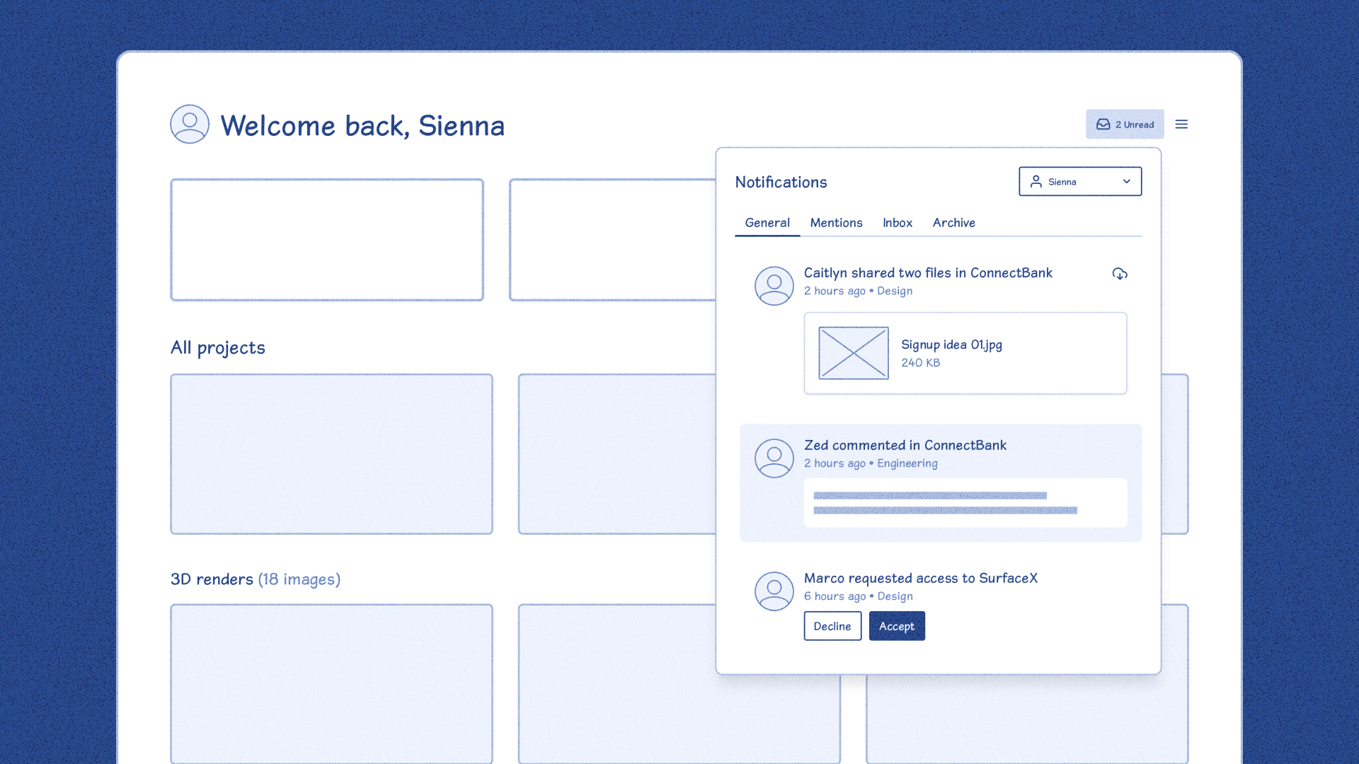
Example of a blueprint wireframe: quick to create, yet highly informative.
***This approach is particularly effective for:***
- Quickly defining and generating core ideas.
- Prioritizing speed over polished design.
- Moving quickly into code.
- Promoting productive product discussions.
***Tips:***
- [Use a design kit](https://www.figma.com/community/file/887892609124245416?ref=everydayux.net) to avoid starting from scratch.
- Focus on functionality, not aesthetics.
- Use mid-fidelity designs as a tool for conversations.
---
### **4\.** Co-design and code
Sometimes, the best way to solve complex challenges is for designers and developers to collaborate in real-time—whether through coding, brainstorming on a virtual whiteboard, or tweaking designs on the fly.
_This post is for subscribers only._
### 30 storytelling techniques you can use in your presentations (with examples)
URL: https://www.everydayux.net/30-storytelling-techniques-you-can-use-in-your-presentations-with-examples/
Last updated: 2026-02-24T01:28:55.000Z
#### Storytelling techniques
1 - Start with a powerful hook
2 - Appeal to curiosity
3 - Craft a relatable protagonist
4 - Highlight the problem
5 - Create a villain
6 - Build anticipation
7 - Establish stakes
8 - Create contrast
9 - Use dialogue
10 - Show, don’t tell
11 - Employ sensory detail
12 - Use strategic repetition
13 - Use symbolism
14 - Use visual metaphors
15 - Build suspense
16 - Master the pause
17 - Create a sense of timing and pacing
18 - Add humor
19 - Connect to a larger vision
20 - Use authenticity
21 - Make it personal
22 - Simplify complex ideas
23 - Establish a clear structure
24 - Reflect on a core theme
25 - Include a call to action
26 - Close with inspiration
27 - Know your audience
28 - Foster a sense of belonging
29 - Practice relentlessly
30 - Build a strong narrative arc
This post is for paid members.
This article expands on:
[How to scaffold compelling presentations using proven storytelling techniquesDiscover ‘scaffolding’—a powerful technique to build the foundation of any presentation. By structuring your story first, you can create engaging, memorable presentations that capture your audience and clearly convey your message.everyday uxJess Eddy](https://www.everydayux.net/how-to-scaffold-compelling-presentations-using-proven-storytelling-techniques/)
Storytelling and presentation skills come up a lot, and for good reasonow we communicate has a huge impact on how our ideas (and we ourselves) are received.
For me, improving in this area has been a gradual process. I focused on making each presentation just a little better than the last. Working in a large tech company allowed me to observe some incredible storytellers in action, which really helped me raise the bar for my own work.
I first got interested in storytelling techniques when a colleague shared a simple deck of tips. I started using them to structure my presentations and was surprised at how effective they were. That curiosity pushed me to dig deeper, and over time, I pulled together this list of 30 techniques.
This isn’t a step-by-step guide or a formal course, but I hope it sparks some new ideas for how you frame and present your content. Even picking a few techniques to try can make a big difference in clarity and impact, and you’ll keep improving with each presentation.
Each technique comes with a practical example. In this article, I use the scenario of “onboarding new hires with AI-powered checklists” to show what each one looks like in action.
****Onboarding new hires with AI-powered checklists**
Imagine onboarding new hires with a simple, AI-powered checklist—no complex systems, no confusing training—just an effective, guided checklist that streamlines the entire process.
These examples illustrate how these techniques can be applied in practice. While your context may differ, focus on the methods themselves and imagine how you might adapt each one to suit your own presentation or storytelling style. I hope these examples offer useful perspectives, and I’m excited to share them with you—dive in and enjoy!
### Here are the techniques...

## Capture attention
> Making a strong first impression is essential. The techniques in this section are designed to instantly engage your audience and draw them into your story, setting a compelling tone for the journey ahead.
### 1 - Start with a powerful hook
**Your hook sets the stage.** A well-chosen hook instantly grabs attention, making your audience eager to hear what’s next. Whether in design presentations, client pitches, or user research debriefs, an engaging opening sets the tone and draws your audience into the story from the very first moment. This technique is equally valuable in presentations and creative writing, where captivating the listener or reader early on can make all the difference. A powerful hook—such as a surprising fact, a compelling question, or a vivid scene—sets the stage for an impactful, memorable narrative.
Imagine seamlessly onboarding new employees with nothing more than a checklist—no complex systems, no training hurdles, just simple, effective checklists refined and facilitated by AI.
### 2 - Appeal to curiosity
**Curiosity is a powerful tool for drawing your audience in and keeping them engaged.** By sparking their desire to know more, you create a sense of intrigue that compels them to stay with your story. This technique is widely used in mystery writing, advertising, and public speaking to maintain interest and build anticipation. Posing an intriguing question, hinting at future revelations, or strategically withholding details can keep your audience on their toes, eager to discover what happens next. By tapping into their natural curiosity, you ensure they remain invested in your narrative.
What if a simple checklist could evolve into an AI-powered, automated onboarding experience? How would that streamline the process and reduce the usual confusion?
_This post is for paying subscribers only._
### How to scaffold compelling presentations using proven storytelling techniques
URL: https://www.everydayux.net/how-to-scaffold-compelling-presentations-using-proven-storytelling-techniques/
Last updated: 2026-02-24T01:38:29.000Z
Today, I’m sharing a technique I use to build the foundation of my presentations, a process I call “scaffolding.” Scaffolding helps me create a solid structure before diving into the script or final design. In this example, I’ll explain how I used this technique for a 3-minute pitch in an innovation competition, where my idea was shortlisted for the People’s Choice Awards. I’ll adapt the content since this was a work project, but the storytelling techniques remain the same.
In addition, I’ll show you how to use simple yet powerful storytelling techniques to create a compelling pitch and sell your ideas. I won’t show you the exact script or final presentation, but you can practice these techniques and apply them to your own presentations.
If you’re interested in diving deeper, check out the post (for paid members only), which explores these techniques further using real examples.
[30 storytelling techniques you can use in your presentations (with examples)Captivating presentations rely on powerful storytelling. This article presents 30 techniques—from crafting relatable protagonists to building suspense—with examples illustrating each one. Use these strategies to connect with any audience and make your message memorable.everyday uxJess Eddy](https://www.everydayux.net/30-storytelling-techniques-you-can-use-in-your-presentations-with-examples/)
### Starting a presentation is hard
Creating a presentation from scratch can feel daunting. Figuring out where to start, what points to include, and how to structure your story can be overwhelming. That’s where scaffolding comes in.
**So, what is scaffolding?**
### Scaffolding is a basic framework for your content
whether it’s a presentation, design, or written piece. It allows you to approach presentations in manageable steps, helping you shape a compelling story while keeping your core message front and center. By creating this structure, you can clarify your ideas, focus your story, and make intentional choices about each section. Scaffolding lets you see the bigger picture and make purposeful decisions about messaging and content flow.

### My scaffolding process
Here’s how I use scaffolding to create a structured, story-driven presentation:
##### Outline the presentation
I begin by listing key bullet points to capture the main points I want to cover. This stage involves clarifying my ideas without worrying about the order or delivery.
Here’s an example:
- **Introduction**
- What is the platform, what it covers
- Alex and Jess roles, and broader team
- **The problem we’re solving**
- Problem statement
- Why is this a problem (current content and the gaps)
- **The user/customer**
- IT Managers & Implementation Specialists
- What we know about what they need
- **The internal problem**
- Teams require guidance on how to effectively showcase the capabilities of their features and communicate how they fit into the larger ecosystem to improve sales.
- **The opportunity for the company**
- Organize our information around value
- Translate how to unlock value with tangible actions
- **The opportunity for you**
- This platform gives you the opportunity to effectively showcase your capabilities
- **How we’ll address the opportunity**
- New content, use cases, how-to-guides, and case studies
- First release, use cases, here’s an example
- **The process**
- We’ve made it as easy as possible to write content
- Here’s how
- **The broader vision for the platform**
- Where we are now, where we want to go
- Features, tooling, and content
- **Closing**
- Be a part of this exciting opportunity!
### Organize and sequence the points
- Next, I sequence these points logically and align them with storytelling techniques. This alignment creates a narrative and provides a framework for my slides/presentation.
### Choose storytelling techniques
- I often use techniques like “The hook,” “The villain,” “Building anticipation,” “Connecting to a larger vision,” and “Show, don’t tell.” These techniques become placeholders for empty slides in Figma (or Google Slides) and guide the narrative flow.
### Map techniques to slides
- With each slide mapped to a technique or key point, I start fleshing out the specific message for each (for example, a slide for “The hook”).
### Write the script
- Once the structure is solid, I draft a script for each slide, jotting down what I want to say. I keep these notes in a notepad off-screen for easy reference during the presentation. This stage helps me polish the storytelling elements and visualize how everything will come together.
Here’s an example of the talking points I prepare for a single slide; I create a set like this for every slide in the presentation:
##### Workshop Slide 5: Why this discussion is important now
- Why this discussion matters now: significant economic shifts are impacting our work lives.
- Companies are pushing to achieve more with fewer resources, increasing job strain and burnout.
- Even in good times, jobs often fall short of our expectations.
- Limited opportunities can hinder personal and professional growth.
##### Design and iterate
- Finally, I design each slide, test the flow, and refine the script until the presentation feels polished and cohesive.
While this process works well for me, the most important thing is finding a system that makes storytelling accessible and manageable for you. By following these steps, you create a presentation that’s both effective and easy to build upon.
### Why storytelling techniques matter
Great presentations blend compelling content, storytelling, confidence, and active audience engagement. Mastering all these areas takes intention and consistent practice, but integrating storytelling techniques helps you make a powerful impact right from the start.
When building a presentation, storytelling techniques can improve how you deliver and frame your content and help you connect with your audience on a deeper level.
Next, I’ll discuss the storytelling techniques I used in my pitch and show how you can use them to enhance engagement in your presentation.
### Example scenario
****Onboarding new hires with AI-powered checklists**
Imagine onboarding new hires with a simple, AI-powered checklist—no complex systems, no confusing training—just an effective, guided checklist that streamlines the entire process.
These examples will give you a clearer picture of how storytelling can make your message more compelling and engaging. Let’s see how these storytelling techniques come together in a real-world example.
---
### 1 - Start with a powerful hook
**Begin by painting a vivid picture:** “Imagine a world where onboarding new hires takes just a few clicks. There is no endless paperwork or complicated training modules—just one seamless checklist powered by AI.”
- *This technique immediately engages your audience and sets the stage for future benefits.*
### 2 - Create a villain
**Introduce a “villain” to create tension and make your solution more desirable:** “Many companies struggle with chaotic, inefficient onboarding processes. HR teams are constantly overwhelmed, new hires feel lost, and productivity suffers.”
- *By personifying the problem, you build tension and make the benefits of your solution more enticing.*
_This post is for subscribers only._
### The two epiphanies that shape how leaders understand and engage with their teams
URL: https://www.everydayux.net/the-two-epiphanies-that-shape-how-leaders-understand-and-engage-with-their-teams/
Last updated: 2025-08-10T02:15:32.000Z
This article features a Q&A with Evan LaPointe, founder of CORE. In it, he shares his insights on leadership and the pivotal epiphanies that can transform how leaders understand and engage with their teams.
### Evan LaPointe, founder of CORE
Evan is a serial entrepreneur and visionary leader who founded, grew, and sold multiple businesses across product, sales, marketing, and analytics. His journey includes pioneering digital marketing attribution, developing products for tech giants like Google and Adobe, and earning several patents. Notably, Evan was the inventor of Satellite, an analytics-based technology acquired by Adobe. His influence extended further as he played a key role in shaping the long-term product strategy for Adobe’s Experience Cloud, a testament to his visionary leadership.

Evan LaPointe, founder of CORE
Driven by a desire to help companies evolve beyond incremental improvements, Evan founded [Core](https://www.core-sciences.com/?ref=everydayux.net) in 2017\. Core is focused on fostering highly intentional cultures, elevating talent philosophies, and prioritizing design to drive creativity and innovation. With a passion for human-centered design and unlocking businesses’ full potential, Evan’s work has empowered over 3,000 brands, including Microsoft, Apple, and Verizon, to transform their approach to customer experiences, analytics, and team building.
In addition to his professional achievements, Evan is a multi-instrumentalist, avid golfer, and collector of vinyl records. He maintains a personal mission to help great people do amazing things.
Drawing on his extensive experience and vision, Evan points out—two key epiphanies that shape how leaders understand and engage with their teams.
### The two epiphanies
As Evan explains [in this tweet](https://x.com/evanlapointe/status/1836790019002089848?ref=everydayux.net), as we grow as leaders and managers, we typically experience two important shifts in understanding—**two epiphanies**. The first one is what he calls the “human nature epiphany.” This happens when we realize that people don’t always act as we expect them to. We learn that humans tend to resist change, prefer safety over risk, and sometimes offer opinions on things they may not fully understand. While this insight can explain why people behave the way they do, **it often leads us to view everyone as the same**—risk-averse, self-interested, and resistant to new ideas.
> But Evan believes this is only the first step, not the most helpful one.
The second, far more important epiphany is what Evan calls **the “personality epiphany.”** This is where things shift. Instead of lumping everyone together, we start to see people as individuals. We notice that while some people avoid change, others embrace it. While incentives may drive some, others are motivated by a sense of purpose. Some individuals thrive on taking risks, while others focus on mastering their craft. Evan says this deeper understanding allows us to recognize each person’s unique strengths and match them to the right roles.
Evan believes that this second epiphany is the key to creating smarter, more collaborative, and more successful teams. It’s the shift from hiring for skills alone to prioritizing mindsets that help businesses and leaders truly thrive.
> Evan has deep insights into leadership and innovation. In a recent conversation, he shared more about his philosophies and pivotal epiphanies.
## Q&A with Evan
##### For leaders stuck in the ‘human nature epiphany,’ how can they recognize that they’re treating people too similarly, and what immediate steps can they take to break free from that mindset?
**Evan:** A clear sign that you may be struggling with this epiphany is that you’re constantly saying and thinking the word “should.” You’re caught up in how things *should* happen, how others *should* behave, and how situations *should* turn out. Related phrases like “you would think...” or “one would assume...” are also signs of this mindset.
Instead of dwelling on what *should* happen, shift your attention to reality—*what is happening*, *what did happen*, and *why*. Connecting “why” to reality helps you understand people’s choices. Once you know why, you’ll become strategic rather than stubborn and impulsive.
This is most easily seen in sales. Salespeople understand that how a prospect *should* act is irrelevant—what matters is how they *will* act. By recognizing this, they become perceptive and strategic, adapting their words and actions to guide each prospect towards a positive outcome, rather than stubbornly repeating the same ineffective behaviors.
The immediate step here isn’t cookie-cutter: you need to learn how to become perceptive, predictive, and strategic. This means challenging your mind to operate in ways it hasn’t before. Anyone can do it, but it requires accepting that the world doesn’t work the way you think it should—and that’s a necessary skill.
---
##### You could argue that leaders who reach the ‘personality epiphany’ sooner—seeing people as individuals—become more effective leaders. How can leaders accelerate their path to this deeper understanding?
***Evan:*** This is not up for debate: leaders who haven’t reached this epiphany are simply not effective. They may look like great leaders for a while—maybe a few quarters—because they’re good at rallying people, pushing them forward, and creating a simple message and direction. However, over time, these one-size-fits-all approaches will increasingly clash with the unique traits of individuals, leading to escalating problems.
Accelerating this path is actually simple. It starts with realizing there’s no evidence in your life that people are similar—not your kids, siblings, family, managers, teams, leaders, or classmates. Everywhere you look, human beings are fundamentally different. The fact that we persist in seeing people as similar, despite clear evidence to the contrary, means we are actively denying what is evident.
The beauty of overcoming active denial is that once you let go of it, the world will teach you faster than you can imagine. You don’t need to start doing something different—you need to stop denying the reality of individuality.
---
##### When hiring, how can leaders spot candidates with the right mindset, not just the right skillset, during interviews?
***Evan:*** Identifying the right mindset begins before you even interview candidates. Few leaders take the time to clearly define the ideal mindset for the role before starting interviews.
Most managers look for a mindset they personally like, without considering whether it’s truly the best fit for the role. This happens often in product work, for example. Many leaders seek product hires with qualities like humility, predictability, hard work, and structure. But these qualities don’t necessarily make someone great at product. Successful product people are typically **hyper-compassionate**, **hyper-curious**, and **hyper-creative**. Leaders often miss ideal candidates because they focus on personal compatibility instead of what the role demands.
You don’t need to hire someone you dislike, but it’s crucial to recognize when your personal preferences may clash with what’s objectively best for the role.
Once you understand the mindset needed for the role, ask questions designed to reveal that mindset. Questions that dive into compassion, assertiveness, creativity, or organization might include:
- “You’re facing a problem, and there is a clear best practice for how to solve it. What do you do?”
- “Why do you want this job, in particular?”
- “We are about to make the wrong decision. What do you do?”
- “How do you feel about teams that don’t have a documented process?”
You’ll be amazed at how different—and revealing—people’s answers to these questions can be. Most people don’t realize that interview questions should be designed to demonstrate a candidate’s true style and mindset, rather than just confirming their experience. “Have you ever...” questions may indicate whether a person has certain experience, but they reveal almost nothing about their style or approach. A person’s style and approach are what you will see moving forward, not just their past experience. It’s important to embrace this.
---
##### How can individual contributors develop the right mindset to thrive in their roles?
***Evan:*** Instead of focusing on having the ‘right’ mindset, recognize that people have a range. Aim to develop a broad range of adaptability that acknowledges and leverages your natural preferences. A narrow mindset limits your ability to handle diverse challenges, while embracing your full range helps you succeed across many contexts.
Understanding your own preferences is crucial. [Our personality assessment](https://www.core-sciences.com/new-core-identity?ref=everydayux.net) helps you understand your natural preferences and recognize areas where adapting may be challenging. This self-awareness enables you to recognize when you need to push yourself to grow rather than remain rigid.
Once you have a better understanding of yourself, focus on growth in key areas. Push yourself in areas that expand your adaptability, such as:
- Being more compassionate
- Being more creative
- Thinking more deeply
- Allowing some chaos and disorder
- Relaxing and reducing impulsivity
- Knowing when to stay quiet or speak up
- Being more tactful
- Understanding and addressing others’ anxieties
You can remain authentic while making intentional choices to expand your capabilities. Most ICs need more range, self-awareness, and intentionality. With these qualities, they can position themselves as dynamic, adaptable professionals, placing them in the top tier of talent.
---
##### If leaders still prioritize skillset over mindset, how can they expect their teams to grow, innovate, or handle challenges?
***Evan:*** You can still grow, innovate, and handle challenges with a skillset-first mentality, but you’re going to feel like you’re constantly swimming against unseen obstacles. You’ll notice inconsistencies across team members and frequent misinterpretations, particularly regarding innovation.
People who lack openness often believe that innovation can be reduced to a simple process, as their mindset tends to favor structured thinking. They undervalue natural gifts and assume those qualities can be recreated with forms, scoring systems, or research. This misconception can lead to significant misunderstandings. They try to teach innovation skills without recognizing the underlying obstacles. Without an innovative mindset, these efforts often result in ineffective ideas and wasted time.
It’s like trying to cook a turkey in a refrigerator—without the right environment, true innovation can’t happen. Teams can still grow and tackle challenges, but they’ll likely do so at a pace and efficiency of less than 10% compared to a mindset-first approach. Sometimes, like the turkey in the refrigerator, they might even move in the opposite direction.
---
##### What can individual contributors do if their manager doesn’t understand their strengths or mindset? How can they navigate this situation to still thrive in their role?
***Evan:*** [According to Gallup](https://www.gallup.com/workplace/231593/why-great-managers-rare.aspx?ref=everydayux.net), companies fail to select the candidate with the right talent for managerial roles 82% of the time. So, if you find yourself with a manager who doesn’t ‘get’ you, remember: this is unfortunately common. Here’s the game plan…
1. **Assess futility.** If your manager is truly ineffective and creating a toxic work environment, your best move is to start looking for a change. Consider making it a career non-negotiable to work with great managers whenever possible, as it brings benefits across the board: faster learning, more opportunities, better work-life balance, and more happiness. Bad managers, on the other hand, can seriously limit your potential.
2. **Recognize ‘futility’ versus personal preferences.** Futility doesn’t mean your manager is just pushing you or giving feedback you don’t like. A truly ineffective manager prioritizes trivial things, creates useless work, provides feedback based on personal biases, and may even act hurtfully. Good managers may challenge you, but they prioritize well, give valid feedback, and genuinely want you to grow.
3. **Refine self-awareness and communication.** Assuming it’s not entirely futile, view this experience as a chance to articulate your strengths and mindset clearly. Managers who don’t ‘get it’ are actually the perfect crash test dummies for refining your communication skills. Develop the ability to explain and defend the value of non-obvious qualities like creativity, compassion, comfort with chaos, and sensitivity to risk.
In my coaching, this need for clear articulation is a recurring theme. Most people struggle to describe their work’s value effectively, and poor answers to these types of questions can squash your potential. However, once you can effectively communicate your unique value, even to those who may not initially appreciate it, your career trajectory becomes significantly steeper.
---
Evan’s journey reminds us that truly great leadership isn’t about having all the right answers—it’s about asking the right questions and seeing people for who they really are. By embracing both the “human nature” and “personality” epiphanies, leaders can move beyond superficial fixes to create teams that are resilient, adaptable, and deeply connected. Whether hiring, managing, or growing, it’s about prioritizing mindset over skill set and valuing the unique dynamics of each individual. This shift doesn’t just benefit businesses; it transforms cultures, making space for innovation, collaboration, and authentic success.
Interested in more insights like this? [Subscribe to the CORE newsletter](https://core-concepts.beehiiv.com/?ref=everydayux.net) for regular updates on leadership, culture, and innovation.
### Stand out, stay resilient, and get the design job you deserve
URL: https://www.everydayux.net/stand-out-stay-resilient-and-get-the-design-job-you-deserve/
Last updated: 2025-08-08T01:26:58.000Z
Searching for a new design role takes more than luck—it requires preparation, confidence, and a clear strategy. This article offers tips to help you present your best self and navigate the challenges of interviewing. Even if you’re not actively job hunting, these insights will help you stay ready for when the right opportunity comes along.
## Preparing for sudden changes
It’s wonderful to be in a job you love—feeling fulfilled and challenged by your work is a great place to be. While you enjoy this moment, it’s also wise to keep an eye on the future. Career paths are rarely linear, and unexpected changes can happen to anyone. Sudden layoffs or restructures might require you to start job hunting without much notice.
> The best time to prepare for a job search is before you need one.
Keeping your portfolio and resume current, even when you’re not actively job hunting, is always a good practice. Equally important is staying engaged with your professional network and with what’s going on in the industry. This way, if things change unexpectedly, you’ll be ready to pivot, take action, and make your next move without scrambling to start from scratch.
In times of uncertainty, resilience and preparedness are your greatest assets. More than just bouncing back, resilience helps you adapt to whatever comes your way. Here are some simple practices to help you stay resilient and ready:
- **Keep your portfolio and resume current**: Regularly update your website and resume with new projects, skills, or accomplishments to reflect your latest work.
- **Reflect on your growth:** Regularly assess your skills, identify areas for improvement, and set goals to keep advancing.
- **Practice storytelling**: Get comfortable giving presentations and revisit your [case studies](https://www.casestudy.club/case-studies?ref=everydayux.net), thinking about how you would explain your work.
*With practical preparation covered, let’s focus on emotional readiness for job searching.*
## Prepare yourself emotionally
Job searching can be challenging, especially during uncertain times, but emotional preparation can make a difference. Sudden layoffs can be overwhelming, but they also offer a chance to reset and refocus. The journey may be tough, and the job market competitive, but opportunities are still out there. The key is to stay adaptable, resilient, and ready for whatever comes your way.
Rejection is part of the journey—sometimes, you’ll go through multiple interviews without any feedback. Set realistic expectations, and treat each step as a learning experience. Finding the right role takes time, but every “no” is progress that brings you closer to the right “yes.” Stay focused, keep moving forward, and see each setback as a chance to refine your approach.
*Once you have the right mindset, it’s time to craft a personal brand that makes you stand out.*
## Craft a strong personal brand
How you present yourself really matters. Personal branding is your opportunity to show who you are, what you stand for, and the unique value you bring to the table. If you haven’t thought much about your branding, now is the time.
Treat marketing yourself as a design project. Your resume, website, and case studies deserve the same level of attention to detail that you would give any client project. Refine your brand as an evolving project that represents your best self.
Think about your message. How do you want to talk about yourself? What are your strengths, skills, and core values? Your personal brand should convey all of this clearly and consistently across your portfolio, resume, and LinkedIn profile.
Make sure everything—your website, resume, case studies, and professional profiles—is consistent and aligned in tone, design, and content. If your portfolio follows a bold and minimal design language, ensure your resume and LinkedIn reflect that same style. Consistent visuals and messaging help employers understand you at a glance.
If you don’t have a website yet or feel like yours could use an upgrade, you don’t need to start from scratch. Platforms like [Framer](https://www.framer.com/?via=uigoodies&ref=everydayux.net) offer templates that make it easy to quickly create a polished, professional site. This investment is worth making—a strong online presence can set you apart in the crowded job market.
*Once your personal branding is solid, the next step is learning how to align yourself with what specific employers are looking for.*
## Analyze job descriptions for insights
Pay close attention to how employers talk about their open positions. Job descriptions are full of valuable insights into what companies need and value, and they can guide how you position yourself in your application.
**Take a look at this sample job description:**
> *Design is incredibly important to us, and we consider it our competitive advantage. As a Product Designer on the team, you’ll be at the forefront of driving our product forward and realizing our vision. Through beautiful and thoughtful design, and through elegant solutions to complex problems, you’ll make a big impact to the way businesses grow and communicate with their customers every day.*
What does this tell us? This company sees design as a core strength and a competitive edge. They’re looking for someone proactive who can align with their ambitious vision. They use phrases like *“beautiful and thoughtful design”* and *“elegant solutions to complex problems,”* which means they value aesthetics and functional effectiveness. The role promises meaningful impact, which means they want someone who can make a real difference for their users.
**How can you use this information to position yourself?**
- **Highlight relevant projects**: Make sure you showcase work that aligns with the company’s emphasis on beautiful, impactful design.
- **Emphasize strategic impact**: Show how your work has driven tangible outcomes. Whether improving user experience, solving challenging problems, or delivering measurable results, these details matter.
- **Consider your language:** Incorporate the company’s values naturally rather than simply repeating their words. For instance, if they value “impactful design,” demonstrate how your past projects created meaningful impact for the business or customer. Ensure your portfolio reflects both aesthetic quality and strategic depth.
*Once you understand employer needs, you should focus on how your skills and experiences can benefit the company and the role.*
## Show how you can benefit the company
You’ll likely get questions like, *“Why do you want this role?”* or *“Why do you want to work for this company?”* It’s easy to fall into the trap of talking about what excites you personally or how the role will help you grow. While those points are valid, remember that employers want to know how you will help them.
This doesn’t mean you can’t talk about what interests you—just don’t lead with it. Focus on how your skills, experience, and values align with the company’s goals. Highlight relevant experiences that address their specific challenges, and tailor your cover letter or application to each job. Show how your background supports their objectives and why you’re uniquely suited to help them succeed.
Employers feel reassured when you demonstrate how your skills fit their needs and how you’ve tackled similar challenges. When you address how your experience aligns with their expectations, you show both preparation and commitment.
Be ready to answer, *“Why do you want to work for this company?”* A good answer requires research—look into the company’s history, how it started, who the founders are, their story, its culture, and what customers say about it. This kind of knowledge helps you deliver a personalized response that shows you’ve taken the time to understand them. **The goal is to find an authentic connection to the company.**
### **Example answer**
> *“I’m genuinely drawn to this role because your company’s story resonates with me. I admire how the founders started with a vision to solve \[specific problem\] and how that vision has evolved to create meaningful solutions that empower your customers. My experience transforming complex challenges into elegant, user-centric solutions aligns perfectly with the impact your company strives to achieve. I’ve worked on projects where thoughtful design was the key to bridging gaps in communication, much like your focus on helping businesses connect more deeply with their customers. I’m eager to bring my skills in \[specific relevant experience\] to your team and be a part of this journey, impacting your clients and the industry.”*
This response shows that you’ve done your homework, connects your personal experience to their needs, and conveys enthusiasm for the role—all while keeping the company’s priorities at the center.
*To truly stand out, you also need to effectively showcase your problem-solving abilities through compelling case studies.*
## Develop impactful case studies
You don’t want to realize the importance of preparation after the interview is over. Knowing how you will present yourself, your skills, and your work is crucial—and the best way to prepare is to write it all out. Writing out your thoughts helps you clarify your ideas, and once you’ve done this thoroughly, you can refine your presentation for each interview.
Case studies are a vital part of this preparation. These aren’t just the case studies on your website—these are the stories you bring to life during interviews. This is your opportunity to make a lasting impact. Presenting with confidence helps convey your message clearly and instills confidence in others about your abilities. Remember, part of your success is about optics—people may not remember every detail, but they will remember how you made them feel and the impression you left. Your goal is to spark genuine interest and leave a memorable mark.
> Typically, two well-prepared case studies are enough for most interviews.
Spend time crafting these case studies—they’re about telling a story. Focus on showing your process, how you collaborate, and how you navigate challenges. Make them personal by looking for the ***“story gems”*** that add color to your narrative. Maybe it was a breakthrough moment, an impactful conversation with a product manager, or a piece of customer feedback that changed your approach. The design process is rarely linear, so share the real moments that made the project come to life.
To truly convey impact, close each case study by emphasizing the key metrics or business outcomes your work directly influenced. Highlight these results clearly, as they provide concrete evidence of your contributions. Quantifiable outcomes like increased customer retention, reduced support tickets, or a boost in sales are powerful indicators of the value you bring as a designer. You’ll leave a strong, lasting impression by ending with the results that improved the product experience and helped the business.
Think of your case studies as design projects themselves. Every detail you show reflects your taste, style, and commitment to quality. Invest the effort into designing your slides, polishing your story, and ensuring each detail contributes to the overall narrative. Embrace the process—this is your chance to show off your design thinking and storytelling skills.
---
Landing your dream design role takes effort, but it's within reach with the right mindset and preparation. Build resilience, refine your personal brand, and align your skills with each employer’s needs. Treat every interview as a chance to learn, and view setbacks as steps toward the right fit.
Trust in your ability to make an impact, stay determined, and keep moving forward—the right opportunity is waiting.
### Designers who do excellent work are “fast on their feet”
URL: https://www.everydayux.net/designers-who-do-excellent-work-are-fast-on-their-feet/
Last updated: 2025-08-08T01:27:11.000Z
****Note**: I briefly cover this topic in the “[How to Become More Influential as a Product Designer](https://www.rethinkhq.com/programs/developing-influence-as-a-designer?ref=everydayux.net)” ReThink workshop.
Designers who do excellent work are fast on their feet. But what does that mean? At its core, it’s about embracing flexibility and adaptability, not just as skills but as essential traits that shape how we approach challenges and opportunities in our work. It’s about not clinging to a single idea or approach when external circumstances or new information call for a shift.
Projects naturally evolve and change during the design process. New information emerges, diverse opinions come to light, and some ideas may fall apart under scrutiny. Designers who are fast on their feet can smoothly adjust to these shifts, staying flexible and avoiding attachment to earlier decisions.
**Shifting effectively requires developing flexibility and adaptability skills.**
**Flexibility** is the ability to change or adjust to new conditions while maintaining effectiveness and balance. It’s about staying open to new ideas, rapidly shifting approaches, and handling unexpected situations without losing sight of the larger goal. When we’re flexible, we’re quick to incorporate the ideas of others, change direction as new information comes in, and stay focused despite the chaos of deadlines and feedback.
**Adaptability**, meanwhile, is the resilient capacity to evolve with changing environments and external demands. It’s not just about willingness—it’s about actively engaging with change, whether by learning a new skill to meet project requirements or adopting a positive mindset in a challenging situation. Being adaptable means we can shape-shift to meet new challenges.
### These skills are a competitive advantage
Flexibility and adaptability give designers a competitive edge, helping us navigate the ambiguity underpinning our work. We’re often tasked with finding the right problem to solve amid competing priorities, moving toward solutions based on what we know, what’s uncertain, and what we hope to discover. Designers who develop these traits can handle shifting conditions and thrive in them.
**This ties directly to the “make it work” mindset.** Some individuals will always find a way to make things work—or at least try—no matter the circumstances. I’ve been fortunate to work with people like this throughout my career, and their approach has taught me the importance of pushing boundaries and searching for creative solutions, no matter what challenges come my way. This mindset is incredibly freeing because it shifts your perspective; instead of seeing limitations, you see possibilities. It instills confidence that even the toughest challenges can be overcome, making you feel like anything is possible.
### Recognizing when to shift your approach
Pay attention to moments that signal the need for a shift. It’s common to encounter situations where new data contradicts earlier design decisions, or the project scope expands midway through. These changes often bring discomfort; that feeling can be a signal in itself. Sometimes, unforeseen constraints—like budget cuts or tighter deadlines—force you to rethink your strategy. These scenarios demand adjustments and indicate that a change in approach is necessary. We can resist, or we can adapt. In these cases, it’s not just about addressing small details but rethinking how we approach the situation to drive the project forward.
*This is not an excuse for dysfunctional dynamics but rather a reminder to remain flexible in facing challenges without compromising healthy collaboration or project integrity.*
### Building flexibility and adaptability over time
Flexibility and adaptability are skills that can be honed over time. One way to develop them is by actively seeking new challenges and stepping outside your comfort zone. Taking on unfamiliar projects or learning new tools helps you build the muscle to pivot quickly and adjust to changing circumstances. Another key is to reflect on your past work. Identify moments when these traits were crucial, and think about how to apply those lessons to future projects. The more you practice, the more these skills become second nature, helping you stay agile in uncertainty.
### How flexibility and adaptability enhance collaboration
Collaboration puts a spotlight on flexibility and adaptability. Effective collaboration means finding common ground and staying open to new ideas, even when they challenge your initial assumptions. Working alongside diverse teams, from engineers to product managers, requires adjusting your approach and accommodating different perspectives and personalities. Flexibility often shows up as openness to new ideas and the ability to incorporate feedback from others, while adaptability may involve changing direction or process as the project evolves. These traits make you a more effective collaborator and help your peers and teams adjust quickly, working together toward shared goals.
### How flexibility and adaptability support career growth
Flexibility and adaptability are essential for long-term career growth, especially as design, technology, and the ways we work continue to evolve. Designers who thrive get good at anticipating change. Flexibility lets you confidently work on unfamiliar projects, experiment with new tools or ideas, and collaborate fluidly with teams across disciplines. Meanwhile, adaptability pushes you to constantly refine your approach or process, whether mastering a tool or improving your design process or strategic thinking. These traits set you apart, making you the designer people want to work with and hire. Over time, they open doors to roles that demand greater expertise, more influence, and the ability to lead with confidence.
> Ultimately, flexibility and adaptability keep designers nimble in the face of change. They allow us to navigate even the most complex and challenging environments, ensuring that we’re always focused on delivering the best outcomes, no matter what unexpected shifts arise. Perhaps most importantly, these traits help us meet today’s demands and prepare us for the unknowns ahead, ensuring continual growth and success.
**Practical tip**: Make it a habit to reflect on each project you work on. Identify the moments you had to adjust or evolve and consider how you could have approached the situation differently. Over time, this practice will strengthen your ability to respond quickly and effectively when things shift unexpectedly.
### AI tools are creating new opportunities and leveling the playing field for designers
URL: https://www.everydayux.net/ai-tools-are-creating-new-opportunities-and-leveling-the-playing-field-for-designers/
Last updated: 2025-08-08T01:27:34.000Z
Design and development are beginning to merge. With AI coding assistants and no-code/low-code platforms becoming more mainstream, designers can now create and build like never before—even without a deep technical background. This shift opens up exciting opportunities as design becomes a key differentiator in an increasingly competitive market. It's also changing how we view what designers can do, how they collaborate with developers, and the new skills they can acquire to stay relevant and thrive.
This article will examine how these new tools level the playing field between design and development, help designers bring their ideas to life faster and create new career paths for those who want to leverage the tools to evolve. There’s much to be excited about!
#### Table of contents
1. Design is the competitive edge
2. Should designers code? Yes, but with a twist.
3. The path to new and evolving design careers
### **Design is the competitive edge**
The emergence of [AI coding assistants](https://tools-resources.notion.site/Coding-assistants-c242ced86a0b451d925e23c8152fda16?ref=everydayux.net) and low-code/no-code platforms, such as [Framer](https://www.framer.com/?via=everydayux&via=uigoodies&ref=everydayux.net), are significantly transforming the landscape for designers. More people, even those without formal technical backgrounds, now have the power to build software. As coding becomes more accessible, the playing field between design and development is leveling. **But this shift puts the spotlight squarely on design, making it a key competitive advantage.**
As software creation becomes easier and more accessible, the market is flooded with new products and tools. With this abundance of options, companies can no longer rely on functionality alone to stand out—**exceptional design has become the key differentiator**. Smart companies have recognized this for some time. It’s not enough for a product to simply work; it must deliver a great user experience. Well-designed products drive customer loyalty, engagement, and long-term success.
As coding barriers lower, the demand for specialized UX and product design skills will only grow. Companies will rely on designers to create products that function seamlessly and connect with users on an emotional level. This combination of usability, thoughtful design, and strong branding will separate the winners from the rest in today’s crowded market.
Companies prioritizing design and user experience from the start are more likely to succeed. Products that make life easier for users, look great, and build strong connections will thrive in an era where it’s easier than ever to create software—but harder than ever to create something truly special.
---
### **Should designers code?**
**Yes, but with a twist.**
The question of whether designers should code has been debated for years. Some argue that designers should stick to their craft, while others believe understanding code is key to effective collaboration and execution. This debate often misses the point—design and development are so interconnected that it’s not about choosing one or both. In reality, designers don’t need to be full-fledged coders, but **basic code literacy can go a long way** in helping them do better design work.
That said, with the advancement of AI coding assistants, this debate has become outdated. Thanks to these tools, designers—and anyone, really—can now build simple apps and prototypes without needing to master coding. **Designers are in a prime position to take advantage of these technologies, but the shift isn’t about becoming developers.** Knowing how to use these tools effectively to support the design process is important.
The no-code and low-code movement has made it easier for designers to step into the world of building, this still requires a certain level of code literacy. Designers may not need to learn to code from scratch, but understanding the basics helps them navigate these tools and use them to enhance their work and work with the tools. The real benefit isn’t just about building apps—it’s about enhancing communication and bringing ideas to life more seamlessly.
> There’s a big difference between a static prototype in Figma and a coded prototype that feels real, where the line between mockup and functionality blurs.
AI coding tools let designers create these immersive, “smoke-and-mirrors” experiences, surprising and delighting their audience. This ability to prototype more realistically makes the design process more impactful and improves the final product. Why? Because using something firsthand—rather than just imagining it—leads to better design decisions.
These tools also shape how designers and developers collaborate. While designers can now build independently, the need for clear communication and teamwork hasn’t disappeared. Designers and developers must collaborate on projects to do high-quality work. The challenge is learning to integrate these AI tools into team workflows to enhance collaboration.
Finally, as AI coding assistants become more common, design education will need to evolve, too. Instead of focusing so much on teaching designers to code, programs should shift toward teaching them how to work with AI and no-code tools. Basic code literacy will remain important, but the real value will come from leveraging these technologies to prototype, iterate, and innovate faster. This way, designers can focus on what they do best—creative problem-solving—while staying on the cutting edge of tech.
### My recommendation
Use ChatGPT and/or Claude (or both) to create apps or prototypes using HTML, CSS, and JavaScript. I recommend this tech stack because it’s the simplest, most flexible, and allows you to run your app locally on your computer. While Claude often leans toward React, be sure to specify HTML, CSS, and JavaScript for a more straightforward approach. JavaScript is incredibly versatile—you can replicate nearly any functionality found in frameworks like Ruby, PHP, or Python. Even better, JavaScript lets you create “smoke and mirrors” prototypes, allowing you to simulate features without fully building them—perfect for illustrating and testing ideas.
**Before diving in**
Put on your product manager hat and write a simple spec that outlines what you’re building and why—providing context to the AI coding assistant tools. You can even brainstorm or refine your approach with them.
**When you start building**
Work in small, manageable chunks instead of tackling everything at once. Build one feature at a time to avoid overwhelming the AI coding assistant and work more smoothly.
---
### The path to new and evolving design careers
If you’re a designer considering a more technical career path, now is the perfect time to explore it. With today’s tools, transitioning into roles like design engineering or creative technologist is more achievable than ever. These roles allow you to build on your design skills while adding enough technical know-how to create more immersive and innovative experiences. It’s an exciting opportunity to expand your skillset and try something new.
[**Design engineers**](https://resend.com/careers/design-engineer?ref=everydayux.net) focus on turning design concepts into fully functional products through front-end development, ensuring that designs are visually polished and technically optimized. [**Creative technologists**](https://careers.duolingo.com/jobs/7635193002?ref=everydayux.net), on the other hand, push boundaries by blending art, design, and technology to create innovative, often experimental, experiences. Whether you’re drawn to development or want to explore the creative possibilities of technology, these career paths are opening up new avenues for designers ready to dive in.
This shift in roles couldn’t have come at a better time. As the tech industry adapts to a slowing economy—and widespread layoffs—many designers are reconsidering how to adapt and future-proof their careers. AI coding assistants can play a big role in this transformation. They’re opening up new opportunities for designers and reshaping traditional design roles in the process.
---
We’re entering a new era for designers, where the lines between design and development are becoming increasingly blurred, and the tools at our disposal are more powerful than ever. AI coding assistants and no-code platforms are unlocking new possibilities, allowing designers to experiment, deeply prototype, and even step into more technical roles. Whether you’re looking to explore technical paths like design engineering, dive into creative technology, or simply elevate your current skills, there’s never been a more exciting time to be a designer.
Yet, while these tools are reshaping the landscape, they aren’t replacing the core of what makes great design—creativity, problem-solving, and human-centered thinking. By embracing these new tools, you’re future-proofing your career and growing as a designer. So, whether you’re ready to expand your horizons or a company seeking to innovate, now’s the perfect time to embrace these tools and unlock the full potential of what’s emerging.
### Content, confidence, and context: how optics shape your career growth—a self-reflection guide
URL: https://www.everydayux.net/content-confidence-and-context-how-optics-shape-your-career-growth-a-self-reflection-guide/
Last updated: 2025-08-08T01:27:47.000Z
Shreyas Doshi [first introduced this model on Twitter](https://x.com/shreyas/status/1831859610715869523?ref=everydayux.net), explaining how ****content**, ****confidence**, and ****context** shape how professionals are perceived in the workplace. His perspective struck me as both realistic and refreshingly simple, and I wanted to share it in a way that would be especially useful for designers. Using this framework, I’ve created a simple self-reflection exercise to help you better understand your role and identify areas for growth.
In many mid-sized and large companies, **optics**—how you’re perceived—play a huge role in your career progression. While doing good work is important, it only gets you so far; success also depends on how you present yourself and how well you understand your company’s inner workings. Shreyas Doshi explains that this comes down to three main areas: **content**, **confidence**, and **context**.
**Content** is the work itself—your ideas, problem-solving skills, and your impact on the business. **Confidence** is how you show up—whether you come across as someone who can handle tough tasks and lead effectively. Finally, **context** is how well you understand your company’s culture, power structures, and key players.
If you’re strong in just one of these areas but struggle with the others, you may find yourself stuck at a certain level, no matter how talented you are. Shreyas Doshi emphasizes that to move into higher leadership roles, like director or VP, you must be strong in at least two dimensions without falling behind in the third. This helps explain why some people get promoted even if they don’t seem to be the most competent—**they often excel in confidence and context**.
> Excelling at work isn’t just about the results you deliver but also how others perceive your impact. **Optics** play a major role in how you’re viewed across these three areas, and mastering that perception is key to unlocking new career opportunities.
So, how do you know where you stand in terms of **content**, **confidence**, and **context**? A simple self-reflection exercise can help you get a clearer picture of how you’re perceived and where you might need to improve. Doing this before your quarterly review is a great way to prepare and show up more confidently for the discussion. Take time to think carefully through the last quarter, and jot down anything that stands out—both the wins and the areas you could have handled differently.
This reflection isn’t about perfection; it’s about progress. You’ll be better equipped to continue growing and positioning yourself for new opportunities by evaluating yourself honestly. Here’s a simple framework to guide your reflection. While self-reflection is powerful, seeking feedback from peers or mentors can provide a fuller picture of how you’re perceived. Consider asking trusted colleagues for their honest insights on your strengths and areas for growth.
## **Self-reflection exercise**
### **Content** – What have you done?
This section is about the insights and ideas you bring to the table, your problem-solving skills, and the results you deliver. Think about both short-term wins and long-term business impact.
- How have your ideas or solutions addressed complex problems or unmet needs?
- What specific impact have your ideas or solutions had on the team or the company?
- How has your work influenced key business metrics or advanced strategic goals?
- In what ways have you raised the bar or driven innovation through your contributions?
***Take a moment to reflect on these questions, and jot down any thoughts or notes that come to mind.***
---
### **Confidence** – How do you show up?
Confidence is about the image you project at work. It’s how others perceive your ability to handle tough tasks and how you communicate. Do you come across as someone who could lead?
- How do you feel when communicating your ideas or leading a project?
- Do people trust you to tackle difficult challenges?
- How would your peers or leaders describe your presence in meetings or decision-making?
- When others see you in action, do they view you as someone who can lead confidently and handle responsibility?
***Take a moment to reflect on these questions, and jot down any thoughts or notes that come to mind.***
---
### **Context** – How well do you read the room?
This is about understanding the company’s culture, power structures, and what makes key players tick. It’s about adapting your approach based on your environment.
- How well do you understand the key players and decision-makers in your company?
- Have you adjusted your approach to align with the preferences or quirks of leadership?
- How do you adapt your communication style to different personalities or biases?
- How effectively do you navigate your company’s culture and power dynamics?
***Take a moment to reflect on these questions, and jot down any thoughts or notes that come to mind.***
---
## Considerations
It’s important to note that not everyone is focused on moving up in their career. Some designers prefer to deepen their expertise and make an impact within their current role without necessarily aiming for leadership positions. Regardless of your goals, understanding how you’re perceived can help you make intentional choices about how you contribute and where you grow.
While mastering optics is key to career progression, remaining authentic to your values is also important. Balancing how you’re perceived by staying true to your strengths and personal style will help you find fulfillment in your role and empower you to be confident in your unique contributions, regardless of external expectations. You shouldn’t have to change who you are to get ahead—if optics are important to you, it’s about finding the intersection between being yourself and demonstrating your value in a way that resonates with others.
Even if promotion isn’t your primary goal, improving your mastery of content, confidence, and context can enhance your effectiveness, influence, and satisfaction. It’s not just about moving up; it’s about growing and contributing meaningfully.
Self-awareness is at the core of improving content, confidence, and context. Regular self-reflection helps you understand how others see you and uncovers opportunities for continuous personal and professional growth. If you’re looking to strengthen any of these areas, here are a few practical tips:
- **For content:** Focus on delivering measurable results and actively seek feedback on your ideas.
- **For confidence:** Practice public speaking or seek opportunities to lead small projects to build your leadership presence.
- **For context:** Spend time observing your company’s culture and power structures and ask trusted peers for their insights.
---
Remember, success at work isn’t just about what you achieve but also how you’re seen. Use this exercise to reflect, grow, and project the professional image you want to build.
### Why content designers are essential in the age of AI
URL: https://www.everydayux.net/why-content-designers-are-essential-in-the-age-of-ai/
Last updated: 2025-08-30T22:45:45.000Z
Many content designers feel the pressure of AI rapidly infiltrating their field, often without their say or input. Many of these designers realize sitting back isn’t an option. Content designers recognize the importance of shaping how AI is developed and utilized to ensure the creation of high-quality and inclusive digital content.
> The real threat to content design jobs isn’t AI itself—it’s companies that don’t understand the true value of content designers.
When content design is viewed as nothing more than “word wrangling” or “text generation,” companies may turn to AI, missing the deeper, strategic work that content designers do.
Content designers aren’t just writers; they’re strategists who ensure that every piece of content—whether for an app, a website, or a crucial user prompt—is crafted with accessibility, clarity, tone, and user experience in mind. Content designers develop content tailored to specific contexts, guiding users to communicate clearly and integrate seamlessly into the overall experience. While AI can generate words, content designers give those words purpose and precision.
Therefore, if AI is to be integrated into content design, content designers must remain deeply involved in its development and implementation. Their expertise ensures digital experiences remain human-centered, relevant, and ethical.
---
### Here are some key reasons why content designers are irreplaceable.
- **Human insight can’t be automated.** Content designers have a deep understanding of user behavior. They know how to write content that genuinely resonates with people, something AI can’t replicate. This human empathy and insight are irreplaceable.
- **Content design is more than just text generation.** Content designers do much more than write text—they shape information to ensure accessibility, clarity, tone, style, and context, ensuring that every piece fits the needs of specific users and situations. AI can generate text, but can’t tailor content to every context or ensure it integrates smoothly into the overall user experience.
- **The human perspective is essential.** AI can process vast amounts of data, but it lacks emotional intelligence. Content designers understand the nuances of tone, empathy, and context, which are essential for creating messages that genuinely connect with users.
- **AI is just a tool, not a solution.** On its own, AI doesn’t understand user needs or how to create content that resonates with them. Content designers can help fine-tune AI-generated content, ensuring that what it generates is valuable and user-focused. Human oversight is crucial to ensuring AI works effectively.
- **Collaboration is key.** Content designers don’t work in isolation—they’re part of a bigger team, collaborating closely with UX, development, and product teams. AI might assist with content, but it can’t replace the collaborative process that ensures content aligns with a project’s larger goals.
- **AI requires high-quality content to perform effectively.** It needs to be trained on high-quality, accessible content to be useful. Content designers play a crucial role in curating and maintaining this content, ensuring that AI produces reliable, accurate and user-focused results.
- **AI’s creativity has limits.** While AI can be a productivity booster, its reliance on existing data and lack of human insight limit its ability to innovate. And let’s not forget—**it still hallucinates**, often producing inaccurate or misleading content. That’s where designers step in to catch mistakes and ensure AI adds real value.
- **We need to be real about AI.** AI is often overhyped as a magical fix, but it’s unpredictable and sometimes unreliable. Honest conversations about what AI can and can’t do help set the right expectations and show why human oversight is still necessary.
- **Content needs constant care.** Even if an AI model is trained on your content, it requires regular maintenance. Content design standards evolve, user needs change, and information can quickly become outdated. Without regular updates, AI-generated content will lose relevance and accuracy.
- **AI can perpetuate biases.** If left unchecked, AI can unintentionally reinforce biases in the data it’s trained on. Content designers play a crucial role in identifying and resolving these issues, ensuring that AI-generated content is fair, ethical, and unbiased.
---
## Insights from Chelsea Larsson
[Chelsea Larsson](https://www.chelsealarsson.me/?ref=everydayux.net), Head of Content at Anthropic, was kind enough to share valuable insights on the intersection of content design and AI. As a creative leader, Chelsea utilizes language and design to make products feel more relatable and human. She builds AI travel tools with a strong focus on content design. She is passionate about model design, content strategy, building high-performing design teams, and fostering ethical, user-centered LLM-based experiences.
In this conversation, Chelsea addresses several key questions about how content designers can navigate and shape the evolving role of AI in content creation.
###### How do you think content designers and AI can best work together?
**Chelsea:** For me, it falls into three opportunity areas: using LLMs to generate content, designing LLM content through model design, and designing/writing the UI content for genAI product experiences. All three opportunities will yield higher-quality outputs if the “maker” has strong content sensibilities.
###### How do you think content designers can stay involved in shaping AI’s role in content creation, especially in companies that may undervalue their strategic contributions?
**Chelsea:** I hope CDs who don’t have space to make an impact in their role can find a better role—but that’s not always an option! If you are interested in AI and it’s not on your roadmap, what’s the next best action you can take? Befriend a machine learning scientist at your company. Explore the AI strategy plan to see if there’s an emergent content design opportunity. Discuss with your manager the possibility of testing internal LLM tools in your design work. Find a way, basically.
###### What are the biggest risks you see if AI is allowed to generate content without the involvement of content designers?
**Chelsea:** In general, a content tool built without the input of content experts is going to be a sub-par tool. Content Designers aren’t the only content experts out there, but we are readily available in the tech companies where AI is being developed. We are familiar with user groups, use cases, evaluation criteria for high-quality content, content challenges at scale, and the risks associated with non-compliant and non-inclusive content. You could do a lot worse than include a content designer in your core genAI product team.
---
As AI continues to impact content design, it’s clear that machines can’t replace content designers. Designers’ unique value lies in their ability to create content that’s functional, accessible, ethical, and aligned with real user needs. Without their expertise, AI risks producing content that lacks nuance, empathy, or even fairness, leading to experiences that feel disconnected from what users truly need. Content designers provide the human touch that makes the final product thoughtful, impactful, and, well, human.
### Improve your strategic thinking skills: the most valuable tool for a designer
URL: https://www.everydayux.net/improve-your-strategic-thinking-skills-the-most-valuable-tool-for-a-designer/
Last updated: 2025-08-10T01:55:51.000Z
Michael D. Watkins is a Professor of Leadership and Organizational Change at IMD in Switzerland and a world-renowned expert on leadership transitions. He has written 15 books, including the bestseller [*The First 90 Days*](https://www.amazon.com/First-90-Days-Strategies-Expanded/dp/1422188612/?ref=everydayux.net), which has sold over 1.5 million copies and is available in 23 languages. Watkins has taught at Harvard Business School and [INSEAD](https://www.insead.edu/?ref=everydayux.net) and co-founded [Genesis Advisors](https://www.genesisadvisers.com/?ref=everydayux.net), a consultancy focused on helping leaders navigate transitions. In 2023, he was recognized as a top management thinker and inducted into the Thinkers50 Management Hall of Fame for his groundbreaking work in leadership and management.
In 2024, Watkins released his latest book, [*The Six Disciplines of Strategic Thinking*](https://www.amazon.com/Six-Disciplines-Strategic-Thinking/dp/1529146585/?ref=everydayux.net), providing readers with practical tools for developing essential strategic thinking skills. This book draws on his deep expertise, offering actionable frameworks to help you tackle challenges and innovate better.
---
## Why should designers be interested in his work?
Strategic thinking is one of the most important skills a designer can have. It’s the key to making a real impact in your role. Watkins’ work is all about helping you build this essential skill. With strategic thinking, you can take on more meaningful projects, make informed decisions, and expand your influence within your company. Watkins provides practical, straightforward advice to help you develop and apply strategic thinking every day.
### Strategic thinking for designers
**Strategic thinking is crucial for designers for several reasons.**
- It shifts your role from executing tasks to participating in larger conversations, allowing you to add value beyond design.
- It aligns your work with business goals, helping you make a greater impact on users and your company’s success.
- Understanding business objectives enables you to advocate more effectively for users, promoting user-centered design at higher levels.
- Strategic thinking enables you to make more informed decisions. It weighs long-term goals, market trends, and business constraints to prioritize the most impactful features.
- A strategic mindset encourages you to approach challenges in a different way, leading to more relevant, compelling, impactful, and innovative ideas.
- Strategic thinking is crucial for advancing your career if you aspire to a leadership role.
- It enhances stakeholder collaboration and helps you maintain a clear view of the big picture, ensuring your work is sustainable and adaptable.
---
## The six disciplines of strategic thinking
In *The Six Disciplines of Strategic Thinking*, Watkins outlines six key disciplines that help leaders and designers develop strategic thinking skills. He emphasizes that these skills can be learned and developed through practice, providing practical tools, frameworks, and real-world examples to make these concepts accessible to anyone looking to grow.
1. **Pattern recognition**: Spot trends, connections, and opportunities (or risks) in complex situations.
2. **Systems analysis**: Understand how different factors within a market or organization interact.
3. **Mental agility**: Quickly adapt to new information and changing situations.
4. **Structured problem-solving**: Take a systematic approach to challenges, from defining the problem to brainstorming and implementing solutions.
5. **Visioning**: Set ambitious yet realistic goals and shape a clear direction for your work.
6. **Political savvy**: Navigate workplace politics, build alliances, and influence key stakeholders.
---
### 1 / Pattern recognition
Pattern recognition is a foundational skill for leaders and designers. Watkins explains that it helps you cut through complexity and make sense of challenging situations by spotting important signals within the noise. It’s about understanding not just what’s happening but *why* it’s happening and how things are connected. This process helps you recognize opportunities that others might miss.
This skill is foundational because it helps you grasp what’s happening, understand why it’s happening, and see how different elements are linked together. You can spot strategic opportunities by digging into the ‘why’ and uncovering these connections. Once you identify the relationships, you can begin predicting how changes in one part will impact the rest, giving you an edge in anticipating challenges and opportunities.
At the heart of pattern recognition is the **recognize-prioritize-mobilize cycle**.
- **Recognize** critical patterns or changes in the environment.
- **Prioritize** based on potential impact.
- **Mobilize** the necessary resources and take the appropriate actions to respond.
Building **mental models** is another key aspect of pattern recognition. These models help you grasp the deeper structures and relationships within your field, enabling you to see beyond the immediate situation and anticipate future challenges or opportunities. Watkins references a **chess grandmaster** who doesn’t just see the pieces but recognizes deeper patterns and vulnerabilities; leaders and designers who master pattern recognition can see what others don’t and propose better ideas.
---
### 2 / Systems analysis
System analysis, as outlined in *The Six Disciplines of Strategic Thinking*, helps leaders and designers make sense of complex systems. It’s all about breaking down complex situations and focusing on the most important aspects. In today’s world—whether in business or beyond—systems can get really complex. No one can model every little detail, but that’s okay. Even simplified models can guide smart decisions.
Watkins references climate models. They don’t capture everything, but do a good job of predicting what matters. In business, the same idea applies. You don’t need to understand every variable to make a good strategic call. What you need is to focus on the key dynamics that drive outcomes.
System analysis starts by breaking down complexity into smaller pieces. Then, you figure out how those pieces interact with each other. This process is interesting because once you understand the relationships, you can start predicting how changes in one part of the system will impact the others.
Systems analysis provides a clearer, broader view. You can see how the internal parts of the organization (such as processes and functions) are connected and how external factors (like market trends, customer behaviors, or regulations) impact the system. Recognizing these connections lets you anticipate ripple effects and respond before things spiral out of control.
---
### 3 / Mental agility
Mental agility is crucial for leaders and designers who must think on their feet and adapt to constantly changing situations. It’s about shifting your thinking between different levels of detail—what Michael Watkins calls “cloud-to-ground” thinking. Picture yourself moving from the big picture (up in the clouds) to the fine details (on the ground), and then back up again. This fluid and intentional shifting between perspectives enables great strategic thinkers to remain flexible and make informed decisions.
At the heart of mental agility are two key abilities. First, **level-shifting** is the ability to analyze a situation from different angles, whether thinking broadly about the business or focusing on specific details. Then there’s **game-playing**, where you anticipate how other key players (like competitors or market forces) might react and factor that into your strategy.
Mental agility also means absorbing **new information quickly** and refocusing on what matters most. Especially in fast-moving, uncertain environments, it’s all about zeroing in on the relevant details and adjusting your approach. This thinking requires **flexibility**, allowing you to switch between tasks and shift your attention as needed.
Mental agility enables you to continually reassess and rethink the best course of action, balancing perspectives—seeing both the immediate details and the long-term implications of your decisions.
---
### **4 / Structured problem-solving**
Structured problem-solving involves breaking big, complex challenges into manageable steps. It’s a crucial skill that helps you cut through the noise and focus on what really matters.
Designers often face constraints like tight deadlines, unclear problem spaces, or limited resources. Despite these challenges, finding ways to follow a structured process is crucial, even if it’s a lightweight version. A structured approach ensures a better outcome for all.
Watkins breaks this down into five simple phases: *defining roles*, *framing the problem*, *exploring solutions*, *deciding on the best option*, and *committing to action*. This structured approach is particularly useful when dealing with complex, uncertain problems where clarity is crucial.
The process starts by **defining roles** and ensuring everyone understands their part and responsibilities. It then moves into **framing the problem**—getting really clear on the actual challenge so you’re solving the right thing.
Next, you **explore solutions**. It’s essential to examine all possible angles and consider various approaches to address the challenge. After that, it’s time to **decide on the best option**, which means weighing the pros and cons, assessing trade-offs, and figuring out which idea makes the most sense.
Finally, it’s about **committing to action,** planning the steps, assigning responsibilities, and implementing the solution. This way, you’re not just coming up with ideas—you’re making sure they get executed effectively.
For more on this topic, check out the ****Navigating Ambiguity Kit**, which includes tactics for problem framing, reframing, and more. You can find it here: [jesseddy.com/navigating-ambiguity](https://jesseddy.com/navigating-ambiguity?ref=everydayux.net).
---
### 5 / Visioning
Visioning is about creating an inspiring picture of where your organization or product can go and why that future matters. Vision sparks excitement and gives people a clear sense of purpose. A great vision unites everyone around a shared goal. But it’s not just about goal setting. It’s about creating a picture of the future that excites people and gives them a clear sense of purpose, creating a path to a shared destination.
**Here’s how Watkins frames it.**
> Your vision should be **ambitious enough to inspire** but also **achievable** enough to keep people from feeling discouraged. If it’s too far-fetched, the team may feel overwhelmed. If it’s too easy, they might not feel challenged or engaged. The key is finding that sweet spot where the vision stretches the team but still feels possible.
Visioning provides a clear focus for your product. It serves as the North Star, guiding decision-making and keeping everyone aligned, ensuring efforts are cohesive and moving in the same direction. Visioning is not just about addressing immediate needs; it requires a long-term perspective, looking beyond today’s challenges and envisioning the future of your organization or product.
An effective vision is not rigid; it’s adaptable. As circumstances shift and new information becomes available, leaders and designers must refine the vision to keep it relevant. This adaptability ensures that the vision remains practical while still inspiring progress. Communication plays a critical role here. A vision only works if it’s clearly and consistently communicated to everyone involved, from leadership to front-line teams.
**Visioning goes hand-in-hand with strategic planning.** The vision defines where you want to go, while strategic planning creates the roadmap to get there. It’s an ongoing process that requires constant reassessment and adjustment, balancing ambitious goals with realistic steps to keep the vision motivating and achievable.
---
### 6 / Political Savvy
Watkins defines **political savvy** as understanding power dynamics and working effectively with them. It’s not about manipulation; it’s about recognizing the human side of organizations and leveraging that insight to achieve results.
A key aspect of political savvy is building alliances and influencing key stakeholders. Watkins discusses using a **sequencing strategy**: be thoughtful about how you approach people to build momentum. Start by gaining support from key individuals, and once they’re on board, it’s easier to win over others.
Another important aspect is managing opposition. It’s about avoiding actions that could make others feel threatened, which might cause them to push back against you. Instead, think of moving people toward your goal gradually—step by step—instead of trying to make everyone leap at once. This incremental approach helps create genuine buy-in.
Ultimately, political savvy is about knowing who you need on your side, figuring out how to get them there, and bringing others along without creating unnecessary resistance. It’s about building real relationships and understanding the organization’s dynamics to move things forward—one careful, intentional step at a time.
---
Michael Watkins’ six disciplines provide a clear and actionable guide for developing strategic thinking skills. Whether you’re a designer looking to align your work with business goals, a leader navigating complex systems, or someone aiming to inspire and influence others, these disciplines provide the tools needed to thrive in today’s fast-paced environment. By practicing skills like pattern recognition, systems analysis, mental agility, and embracing visioning and political savvy, you can make a greater impact in your role and do more meaningful work.
### Easily extract content strings with this Figma plugin
URL: https://www.everydayux.net/figma-plugin-for-extracting-content-strings/
Last updated: 2025-08-08T01:28:35.000Z
Introducing [***Extract Content Strings***](https://www.figma.com/community/plugin/1415951175911323433/extract-content-strings?ref=everydayux.net) – a Figma plugin that helps you surface and extract content strings from your designs. This plugin scans your Figma file for text layer names containing unique IDs, making it easy to copy and paste content strings for use outside of Figma. This post explains how the plugin works and how to manage and export content strings in your design files.
### What are content strings?
Developers use content strings to store and manage the text displayed in an application–this allows them to separate the content from the code, helping with consistency, localization, and ease of maintenance.
### Why use content strings?
Content strings not only separate code and content but also streamline localization, making it easier to translate UI copy for multilingual support. This method reduces duplication and simplifies managing and updating text, especially in larger projects.
### The designer’s role
You may not have directly worked with formal content strings as a designer. Typically, you create content within your designs, followed by an editing and approval phase. Afterward, developers might manually input your content, hardcode it, or—if your team follows a more structured process—export it in a format developers can easily integrate. Here, the plugin becomes invaluable, helping you quickly locate and extract content strings from Figma and streamlining the handoff to developers.
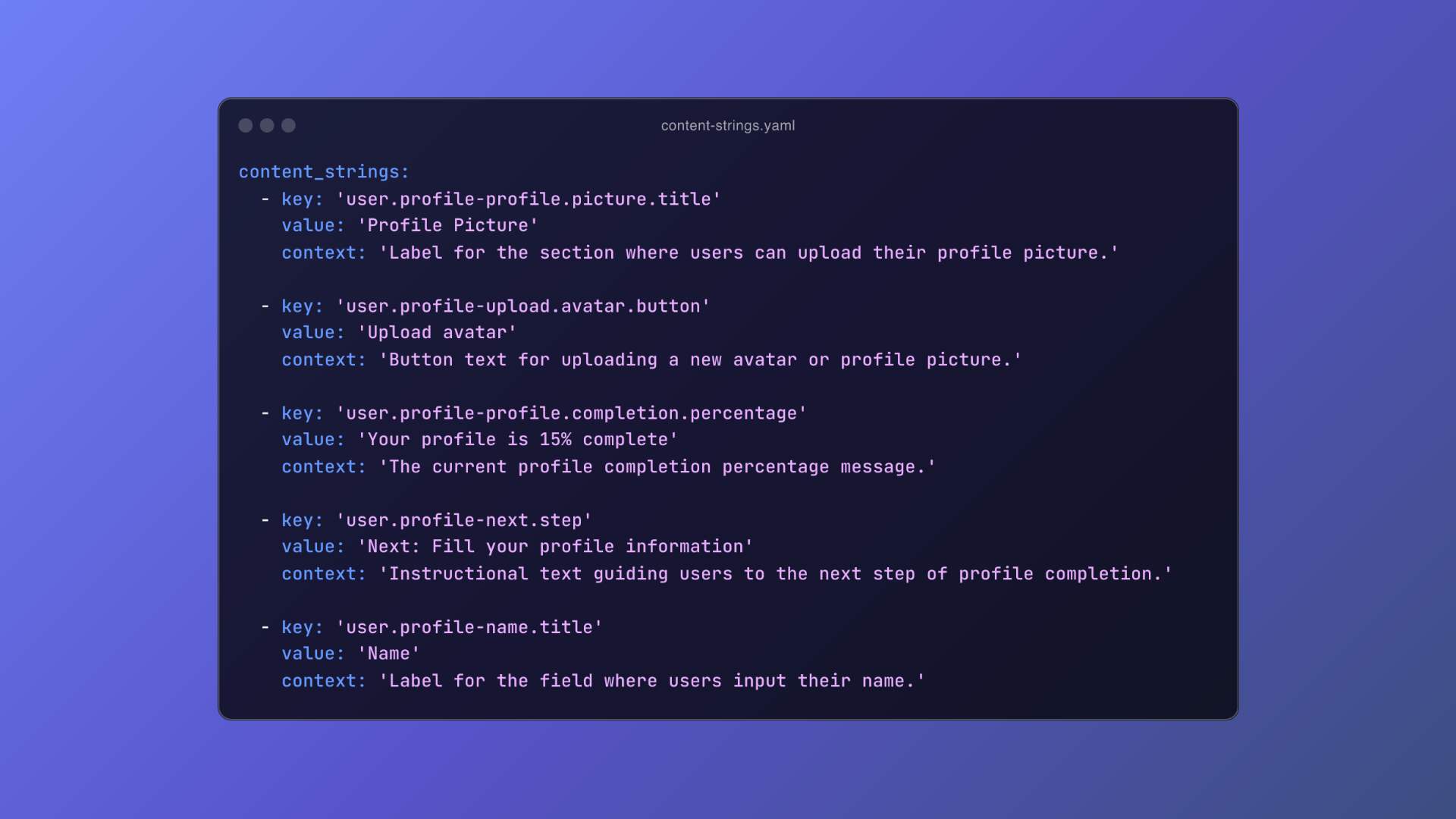
An example YAML file with content strings.
### How this plugin works
This plugin scans text layers on the current page of Figma file for content that matches the prefix of the unique ID (e.g., “content\_string\_”) you define. Most developers rely on prefixes to organize and manage these strings, and a typical content string might look something like this:
`key: 'user.profile.settings.modal.description'
value: 'Adjust your profile settings'
context: 'A brief description indicating the purpose of the modal.'`
A content string can include additional details, like the “context” in this example, but it **must always contain** a unique ID (sometimes referred to as a key, ID, or token) and the actual content, often called the value:
`key: 'user.profile.settings.modal.description'
value: 'Adjust your profile settings' `
Developers use the unique ID in their code to reference and display the corresponding content. This approach is particularly useful when localizing content, allowing teams to manage translations easily. By separating content from the code, developers can easily swap out language-specific strings without disrupting the application.
### Demo
0:00
/0:30
1×
---
### How to use this plugin
This plugin requires some initial manual setup to link unique IDs with content. Once configured, you can quickly copy and paste all your content strings!
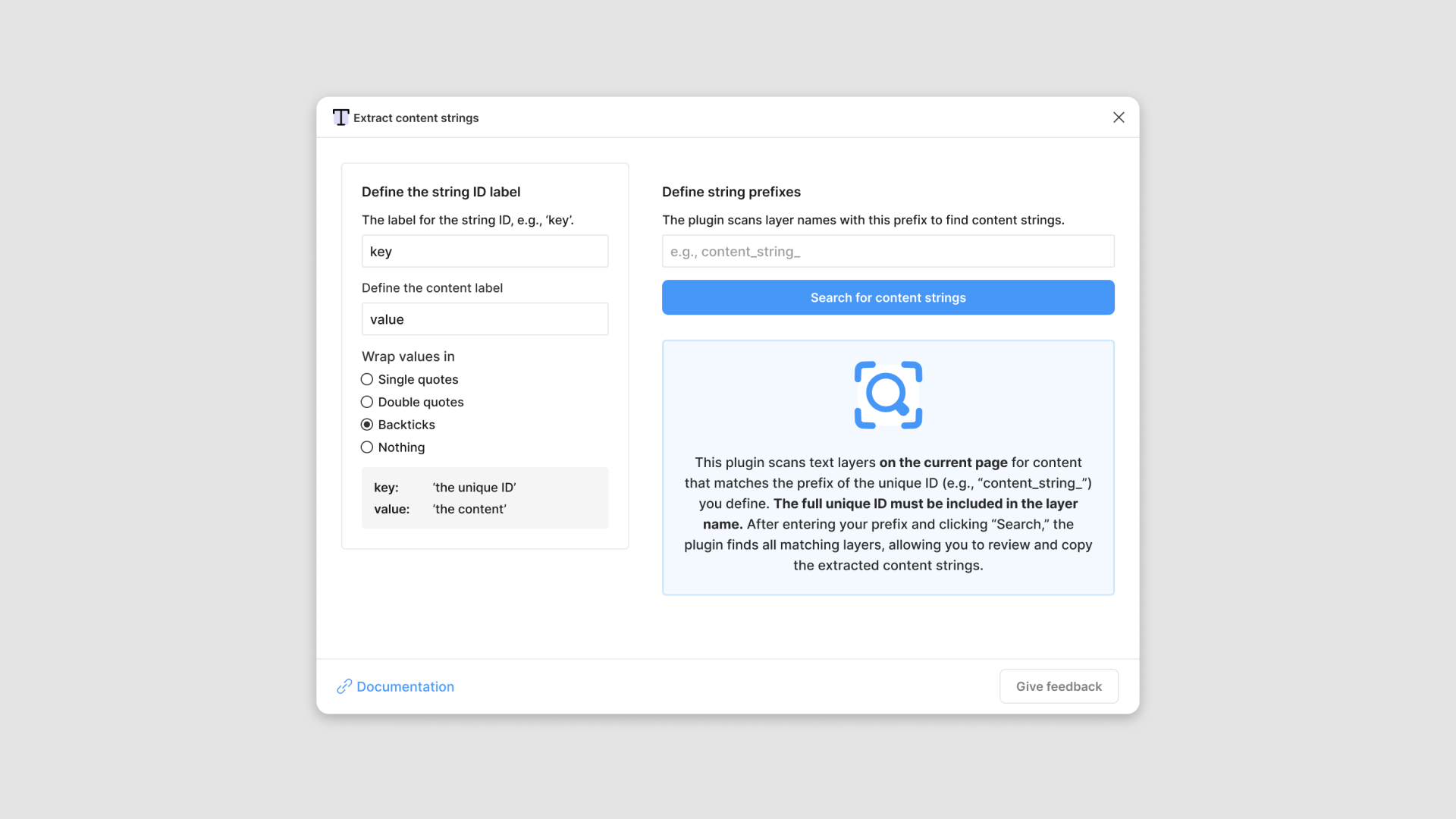
1. The plugin scans text layers on the current Figma page for content strings that match the prefix of the unique ID you define (e.g., “content\_string\_”).
2. For example, if your content strings begin with “user.profile”, you’ll use that as your prefix.
- *Example unique ID*: `user.profile.settings.modal.description`
- *Your search prefix*: `user.profile`
1. Ensure the full unique ID is used as the layer name for the corresponding text.
- *Text layer name*: `user.profile.settings.modal.description`
### In summary
1. Define a prefix for your content strings (e.g., “user.profile”).
2. Ensure the full unique ID is used as the text layer name (e.g., “user.profile.settings.modal.description”).
3. Enter your prefix and run a search.
4. The plugin will scan the text layers and match content based on your prefix.
5. Easily copy and paste the extracted content strings.
### Install the plugin
You can view and install the plugin from the [Figma Community page](https://www.figma.com/community/plugin/1415951175911323433/extract-content-strings?ref=everydayux.net).
### Test file
Download this test file, which includes content strings in the layer names.
[Extract content strings - Figma plugin test fileExtract content strings - Figma plugin test file.fig3 MBdownload-circle](https://www.everydayux.net/content/files/2024/10/Extract-content-strings---Figma-plugin-test-file-1.fig "Download")
### Provide feedback
Feel [free to share your feedback anytime](https://docs.google.com/forms/d/e/1FAIpQLSfNYzW06j8Xvqe1hn%5F18onjPmTQg8HkIhz958LfnZ3oO4EEQA/viewform?ref=everydayux.net)—thank you! If you’ve used this plugin in your workflow, I’d love to hear about your experience.
❤️
I’d like to thank Gleb S. for his help collaborating on a review of this app, willingly and kindly sharing his expertise and knowledge and helping me put some finishing touches on the plugin. [Check out some of his work](https://www.figma.com/@g?ref=everydayux.net), it’s awesome.
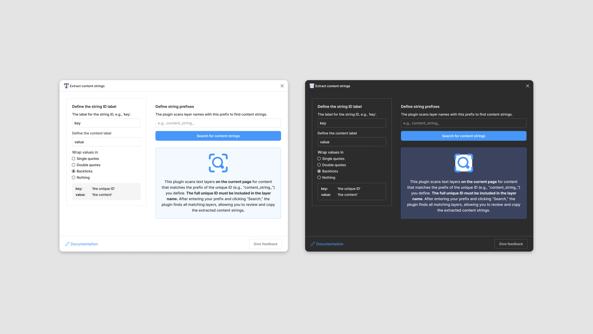
The extract content strings Figma plugin in light and dark mode.
### A practical guide to design documentation with real examples in Figma
URL: https://www.everydayux.net/a-practical-guide-to-design-documentation-with-real-examples-in-figma/
Last updated: 2026-08-10T17:47:27.000Z
Listen to a conversation about this article
0:00
/554.52
1×
*This audio was created using* [*Google NotebookLM*’*s*](https://notebooklm.google.com/?ref=everydayux.net) *Audio Overview feature, which transforms written content into a podcast-like experience with natural-sounding AI hosts discussing the material. It's still experimental, so I'd love to hear your feedback—whether you liked it or not! Let me know what you think.*
#### Table of contents
1. What is design documentation?
2. The problem
3. The importance (and value) of design documentation
4. Make design decisions and documentation visible
5. Create a culture of documentation
6. In-depth examples
7. A Figma template
8. Final thoughts and additional resources
---
### Introduction
This post clarifies the importance of design documentation and offers tips for incorporating it into your Figma files. **How you document is less important than ensuring you do it.** The advantage of documenting in Figma is that it’s easily accessible and sits alongside your designs. The key is determining the level and style of documentation that best suits your project.
⬇️
There is a free Figma template at the bottom of this post.
*Sign up for a free membership to access the full article and download the free Figma template.*
---
### What is design documentation?
Design documentation provides context, implementation notes, and an ongoing record of design decisions, processes, and requirements. It often captures the rationale behind design decisions, serving as a communication tool that supports engineering and keeps stakeholders informed. This documentation ensures everyone—whether a designer, developer, or stakeholder—can follow along, contribute, and stay aligned throughout the project.
**Software is mostly communication**. A significant portion of software development isn’t just about writing code—it’s about effective communication between team members, stakeholders, and users. Many decisions, clarifications, and problem-solving efforts occur through dialogue, like in Slack, and these conversations shape the product. As Fred Brooks famously highlighted in [*The Mythical Man-Month*](https://www.amazon.com.au/Mythical-Man-Month-Software-Engineering-Anniversary/dp/0201835959?ref=everydayux.net)*:*
> software is mostly communication.
Brooks emphasized that effective communication is critical to managing complexity in software projects. Without it, miscommunication and fragmentation can easily derail progress.
**Design documentation is a key tool in software development**, as it promotes transparency and collaboration within the team. Providing a clear rationale behind decisions and communicating well ensures that everyone has the necessary context to work more efficiently and effectively.
Moreover, it plays a vital role in team alignment and trust building. When stakeholders and team members can easily access and understand design decisions, it creates a sense of involvement and shared responsibility. Documentation also provides a historical reference and context for present and future projects, and simplifies onboarding by allowing new members to catch up on the reasoning behind past choices quickly.
**In short, design documentation isn’t just about keeping records—it’s about creating a transparent and efficient process that creates clarity, builds trust, and allows for better teamwork.**
### The problem
When working on a product or feature with your team, many important decisions happen in real-time, often in informal spaces like Slack. You’re constantly communicating with developers, product managers, and other stakeholders, making adjustments and product decisions on the fly. **These conversations are vital, but the problem is that they’re rarely documented outside of these quick exchanges.**
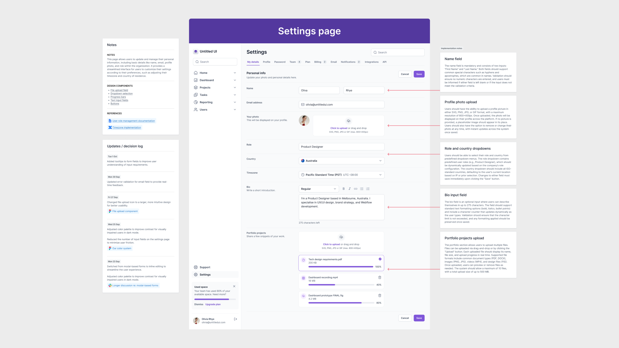
This scenario presents several challenges: information gets lost, miscommunications occur, and we revisit decisions, relying on memory to recall details. When we need to explain the reasoning behind a design choice later, it’s often buried in Slack threads or Figma comments. These informal exchanges make it easy for critical context to disappear, leading to confusion, inefficiency, and frustration.
**Software development relies heavily on the flow of information between team members.** If this information isn’t captured properly, the risk of miscommunication grows, and teams can lose track of why they made certain decisions.
### The importance (and value) of design documentation
While it’s easy to focus on moving quickly when collaborating with your team, taking the time to formalize your documentation is both helpful and necessary for several reasons. Without structured documentation, it’s easy to lose track of decisions. Formal documentation bridges that gap and fosters tight-knit collaboration, trust, and team alignment.
_This post is for paying subscribers only._
### In just two minutes, Simon Sinek reveals why trust beats performance in leadership
URL: https://www.everydayux.net/trust-vs-performance-leadership-simon-sinek/
Last updated: 2025-08-08T01:29:22.000Z
### Simon Sinek: a trusted voice in leadership
Simon Sinek is globally recognized for his insights on leadership and inspiring others to lead with purpose. Born in England and raised in cities like Johannesburg, London, and Hong Kong, he eventually settled in the United States. After studying cultural anthropology at Brandeis University, Sinek began his career in advertising but soon pivoted to entrepreneurship.
His TED Talk, [*How great leaders inspire action*](https://www.ted.com/talks/simon%5Fsinek%5Fhow%5Fgreat%5Fleaders%5Finspire%5Faction?ref=everydayux.net), became a viral sensation, elevating him to one of the most influential leadership thinkers today. With bestselling books like [*Start With Why*](https://www.amazon.com/Start-Why-Leaders-Inspire-Everyone/dp/1591846447/?ref=everydayux.net) and [*The Infinite Game*](https://www.amazon.com/Infinite-Game-Simon-Sinek/dp/0241385636?ref=everydayux.net), Sinek continues to reshape how businesses think about leadership and culture. His core message revolves around trust, purpose, and the human side of leadership.
### Performance vs. trust: the Navy SEALs’ perspective
In one of his most impactful talks, Sinek introduces a graph used by the Navy SEALs to evaluate team members. The graph compares two factors: performance and trust.
- **High performance, high trust**: the ideal leader.
- **High performance, low trust**: the most dangerous type of leader—what Sinek calls “toxic.”
- **Medium or low performance, high trust**: preferred over high performance with low trust.
The Navy SEALs, considered one of the most elite teams in the world, consistently choose trust over talent. This model translates directly into business environments. Organizations that favor trust-based leadership tend to build healthier teams, reduce turnover, and improve collaboration.
### Why businesses must rethink leadership metrics
Too often, companies prioritize performance indicators—revenue targets, KPI’s sales goals, productivity—while overlooking intangible yet critical qualities like trust and character. The result?
**Toxic leaders may excel individually but poison team culture.**
Businesses need to ask:
- Is this leader fostering trust within the team?
- Do they collaborate well with others?
- Are they building a culture of safety and openness?
The truth is, trust isn’t hard to measure. Teams usually know who the toxic players are. If you ask, “Who causes the most problems?” the same name often comes up. Conversely, the most trusted person on the team might not be the top performer, but they’re usually the one others turn to for support and guidance.
### Trust creates stronger, longer-lasting results
When trust is at the center of leadership, organizations benefit in countless ways:
- Higher employee retention
- Better communication
- Increased collaboration
- Stronger team morale
- Sustainable performance over time
No matter how high-performing, toxic leaders create stress, division, and instability. The short-term wins they bring aren’t worth the long-term costs.
Sinek’s message is clear: **Businesses must prioritize trust and character in leadership development**. Doing so protects teams and promotes innovation, loyalty, and lasting success.
---
### Frequently asked questions
**What is the trust vs. performance matrix Simon Sinek uses?**
- Simon Sinek references a matrix often used by the Navy SEALs, which plots performance on one axis and trust on the other. This visual framework helps organizations evaluate team members based on their accomplishments and behavior within the team. The ideal team member scores high on trust and performance, but SEALs would rather have a trustworthy teammate than a highly skilled but untrustworthy one.
**How can you build trust as a leader in a new team?**
- Building trust starts with consistency, transparency, and empathy. Leaders should follow through on promises, listen actively, give credit generously, and own up to mistakes. Creating psychological safety, where team members feel comfortable speaking up, also plays a key role in developing trust.
**What are some early signs of a toxic leader?**
- Early red flags include micromanaging, taking credit for others’ work, gossiping, fostering competition over collaboration, and lacking accountability. Toxic leaders may also ignore feedback, blame others for failures, and operate with a “results at any cost” mindset.
**How does trust impact team productivity?**
- High-trust teams tend to be more collaborative, innovative, and resilient. When trust exists, teams spend less time managing conflict or protecting themselves and more time working toward shared goals. It reduces friction and enables faster, more effective decision-making.
**Is there a way to quantify trust in an organization?**
- While trust is inherently subjective, it can be measured through anonymous surveys, 360-degree feedback, employee engagement scores, and team health assessments. Some organizations also use trust-specific metrics, such as net trust scores or behavioral indicators.
**What books by Simon Sinek explore trust in more detail?**
- Trust is a recurring theme in Sinek’s work. [*Leaders Eat Last* ](https://www.amazon.com.au/NEW-LEADERS-EAT-LAST-Simon-Sinek/dp/B09VQ1RNP2/?ref=everydayux.net)dives deep into how leaders can build trust and psychological safety within their teams. *The Infinite Game* emphasizes the importance of long-term thinking and values like integrity and transparency that build lasting trust.
---
## Why toxic leaders get promoted
0:00
/2:21
1×
### Confidence is quiet, insecurity is loud
URL: https://www.everydayux.net/confidence-is-quiet-insecurity-is-loud/
Last updated: 2025-08-08T01:29:35.000Z
Listen to a conversation about this article
0:00
/536.2
1×
*This audio was created using* [*Google NotebookLM*’*s*](https://notebooklm.google.com/?ref=everydayux.net) *Audio Overview feature, which transforms written content into a podcast-like experience with natural-sounding AI hosts discussing the material. It's still experimental, so I'd love to hear your feedback—whether you liked it or not! Let me know what you think.*
---
The phrase *“confidence is quiet, insecurity is loud”* has become widely recognized in personal development discussions, but its exact origin is hard to trace. The concept has been passed down through various cultural idioms and teachings that emphasize the strength of quiet self-assurance over loud, boastful behavior.
### Popularization in modern culture
In recent years, this phrase has gained traction, particularly through social media and motivational content. Its popularity stems from how it concisely and relatably encapsulates an observable truth about human behavior. Many people have found it useful for understanding the differences between genuine confidence and the external displays often associated with insecurity, empowering them to navigate social situations with more insight.
### Cultural and psychological roots
Though the modern phrase is simple, the idea has deep historical roots in many cultures. For example, sayings like ‘empty vessels make the most noise’ reflect the same notion that those with less inner confidence tend to seek more external validation. This historical perspective can enlighten us about the enduring nature of human behavior and the wisdom of past generations.
### Literary mentions
This phrase is a variation in Steve Magness’s book, [*Do Hard Things: Why We Get Resilience Wrong and the Surprising Science of Real Toughness*](https://www.amazon.com/Hard-Things-Resilience-Surprising-Toughness/dp/006309861X/?ref=everydayux.net), where he writes, *“True confidence is quiet; insecurity is loud.”* While the exact wording may vary, the contrast between genuine self-assurance and insecurity has been explored in literature for years, often in leadership, resilience, and personal growth contexts.
> The phrase “confidence is quiet, insecurity is loud” highlights a fundamental difference between how people express confidence and insecurity. True confidence manifests in calm, measured behavior, while insecurity often reveals itself through attention-seeking actions or overcompensation.
### Confidence is quiet
True confidence is rooted in an internal sense of self-assurance. Confident individuals don’t need to broadcast their accomplishments or constantly prove their worth. They are comfortable with their strengths and weaknesses, allowing them to navigate challenges without needing external validation. This quiet confidence often results in the following:
- Composure in the face of criticism or failure
- A focus on actions rather than words to demonstrate ability
- A lack of concern for external praise or attention
- An ability to let go of unnecessary conflicts or arguments
Confident people understand that their worth is not tied to how others perceive them and are content with letting their actions speak for themselves.
### Insecurities are loud
In contrast, insecurity often drives individuals to seek external validation to compensate for their self-doubt. Insecure individuals may engage in more noticeable or disruptive behaviors to gain approval or mask their vulnerabilities. These behaviors can include:
- Bragging or boasting about achievements to seem more capable.
- Responding defensively or aggressively to criticism or perceived slights.
- A constant need for reassurance from others.
- Difficulty accepting mistakes or admitting faults.
Because insecurity is rooted in fear and doubt, people often overcompensate, seeking validation from others to cover up internal uncertainty.

## **Benefits of understanding this concept**
Recognizing the difference between “confidence is quiet” and “insecurities are loud” offers valuable insights into personal development, relationships, and overall well-being. By understanding this concept, individuals can cultivate genuine confidence while fostering more meaningful connections with others.
### Personal growth
Understanding the distinction between quiet confidence and loud insecurity helps individuals focus on building inner self-assurance. This realization encourages self-reflection and personal growth, guiding people to develop a stable sense of self-worth that isn’t dependent on external factors. As a result, individuals are more likely to:
- Build resilience in the face of adversity.
- Focus on long-term goals rather than short-term validation.
- Cultivate a sense of peace and fulfillment from within.
### Improved relationships
People can approach their relationships more thoughtfully by recognizing the behaviors associated with insecurity. Understanding that some individuals may act out of insecurity can help foster compassion and patience in challenging situations. Additionally, cultivating quiet confidence leads to healthier relationships, reducing the need for constant validation or conflict. Benefits include:
- Stronger, more balanced relationships built on mutual respect.
- Reduced conflicts stemming from insecurity or jealousy.
- More authentic, meaningful interactions.
### Mental health
Quiet confidence contributes to improved mental well-being by promoting self-acceptance and reducing anxiety. Individuals who are confident in themselves are less likely to experience the stress of seeking constant approval or validation. This internal confidence leads to the following:
- Higher self-esteem and greater emotional stability.
- Lower levels of stress and anxiety as external opinions become less significant.
- A healthier outlook on personal achievements and failures.
### Seizing opportunities
Confident individuals are more likely to embrace challenges and seize opportunities, trusting their abilities and not fearing failure. Understanding the quiet nature of confidence allows people to take calculated risks without proving themselves to others. This mindset promotes:
- A willingness to step outside one’s comfort zone.
- Greater success in personal and professional endeavors.
- The courage to pursue passions without fear of judgment.

## **Implementing this mindset**
Cultivating quiet confidence and overcoming the urge for external validation requires intentional practice and self-awareness. By focusing on personal growth and internal self-assurance, individuals can begin to embody the mindset where “confidence Is quiet,” and insecurities no longer drive behavior.
### Focus on personal growth
The first step in implementing this mindset is shifting focus from comparison to self-improvement. Instead of seeking external approval, concentrate on developing your skills, knowledge, and character. Prioritizing personal growth over validation from others allows you to:
- Set goals that reflect your values, not societal expectations.
- Engage in continuous learning and self-development.
- Take pride in progress rather than waiting for external praise.
### Practice self-acceptance
Confidence stems from accepting both your strengths and weaknesses. Recognizing and working to improve your flaws without harsh self-criticism builds a strong sense of self-worth. To practice self-acceptance:
- Reflect on your achievements and areas for improvement with honesty.
- Avoid comparing yourself to others, focusing instead on your unique path.
- Embrace imperfections as part of your growth journey.
### Develop trust in your abilities
Trust in your capabilities is key to maintaining quiet confidence–this requires belief in your ability to handle challenges and setbacks without relying on others to boost your self-esteem. To build this trust:
- Take on challenging tasks, even without guaranteed success.
- Embrace failure as a chance to grow.
- Quietly celebrate accomplishments as validation of your abilities.
### Respond calmly, not reactively
Quiet confidence manifests in calm, measured responses to situations, especially in the face of adversity or criticism. In contrast, insecurity often leads to defensive reactions or overcompensation. To implement this mindset:
- Pause before responding to criticism to reflect.
- Focus on solutions and growth, not defense or approval.
- Maintain a calm, composed demeanor in tough situations.
### Seek internal validation
Instead of relying on external validation for a sense of worth, develop the habit of seeking internal satisfaction. Reflect on how your actions align with your values and long-term goals, and trust that this alignment is more important than external approval. To foster internal validation:
- Create personal benchmarks for success based on your goals and principles.
- Regularly reflect on progress with self-assessment.
- Release the need for constant praise or recognition.

### Conclusion
Individuals can foster deeper personal growth and emotional resilience by embracing the mindset that “confidence Is quiet” and recognizing the loud nature of insecurity. This shift in perspective allows for healthier relationships, improved mental well-being, and greater success in personal and professional pursuits. Cultivating quiet confidence empowers individuals to trust their abilities and seek internal validation, leading to a more peaceful and fulfilling life. It’s a mindset that encourages authenticity, growth, and a steady pursuit of one’s goals without needing external noise or validation.
### 14 ways to apply Jakob’s usability heuristics in user interface design
URL: https://www.everydayux.net/14-ways-to-apply-jakobs-usability-heuristics-in-user-interface-design/
Last updated: 2025-08-10T01:41:27.000Z
### Jakob’s ten usability heuristics
Nielsen’s ten usability heuristics are a collection of design principles that help designers create user experiences. They offer general usability guidelines in key areas by addressing common issues such as consistency, error prevention, and ease of use. These principles aid designers in designing high-quality user experiences that are simple to navigate, comprehend, and engage with.
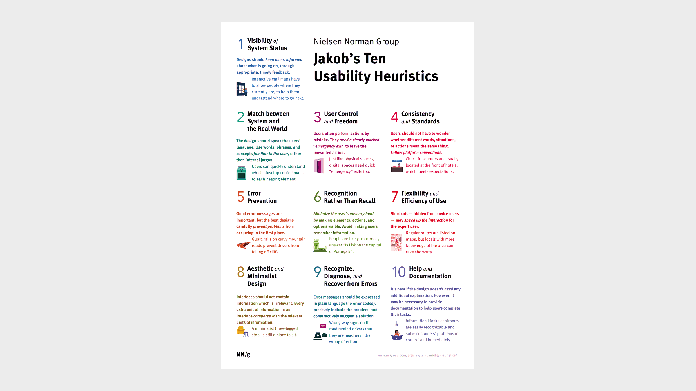
Jakob’s usability heuristics
### The evolution of Jakob’s heuristics
Jakob Nielsen introduced the ten usability heuristics in 1994, and in 2020, the Nielsen Norman Group updated their explanations with more detail and examples for better context. While the core principles have remained the same, they’ve been adapted to new technologies and integrated with human-centered design practices. With the increasing complexity of systems, there’s a stronger focus on error prevention, and designers often combine heuristics with other UX methods to ensure a comprehensive approach to usability.
### Adapting Jakob’s heuristics
Designers today are reimagining Jakob’s heuristics to meet modern design challenges. They’ve expanded their use to cover a wide range of interfaces, including mobile apps, wearables, voice interfaces, and augmented/virtual reality. The heuristics now also cater to emerging technologies, such as gesture controls and voice commands.
> Alongside usability, designers now emphasize emotional design, focusing on delight and engagement to create more meaningful user experiences.
### **The heuristics in conversational design**
Designers can utilize Jakob’s heuristics to enhance conversational interfaces, such as chatbots and voice assistants. Some heuristics *(like showing the system’s status and giving users control)* help bots communicate their abilities and allow users to navigate freely. However, designers are updating many principles to address the unique challenges of conversational interfaces, such as handling errors in speech recognition and maintaining a consistent tone throughout a conversation. Researchers are even creating new heuristics specifically for chatbots, building on Nielsen’s original principles to make them more relevant for these evolving areas; here are some examples:
- Be transparent about the fact that users are interacting with a bot, not a human.
- Inform users about what tasks the chatbot can perform.
- Ensure the conversation flows naturally and logically.
- Design for smooth error handling to guide users back on track.
- Maintain a consistent personality and tone throughout the interaction.
- Ensure the chatbot remembers and uses context during the conversation.
- Use multimedia elements only when they enhance the conversation.
- Provide proactive suggestions or prompts to help users navigate.
- Offer a seamless handoff to human support when needed.
- Be transparent about how user data is collected, used, and stored.
While these new heuristics offer valuable guidance for conversational interfaces, designers can still rely on Jakob Nielsen’s original principles to create intuitive, user-friendly designs.
### Limitations and considerations
When using Nielsen’s heuristics, designers should be aware of several limitations. The interpretation of heuristics can be subjective, leading to inconsistent results across evaluators. Heuristic evaluations often lack direct user involvement, which can result in important user perspectives being overlooked. There’s a risk of identifying issues that aren’t actual problems for users and overlooking context-specific challenges unique to certain domains. Over-reliance on these principles can stifle innovation, and the heuristics offer little guidance on prioritizing issues or balancing conflicting principles. Additionally, evaluations tend to produce qualitative, not quantitative, data, which can be less persuasive to stakeholders. Finally, some argue that the heuristics may only partially address some aspects of modern interfaces, suggesting the need for supplementary principles.

[A heuristic evaluation template - template for Figma](https://www.figma.com/community/file/905622673082476274?ref=everydayux.net)
## 14 ways to use Jakob Nielsen’s ten usability heuristics for user interface design
##
##### 1 / Conduct heuristic evaluations
The most common way to apply Jakob Nielsen’s ten usability heuristics is through a heuristic evaluation. This process involves reviewing an interface based on established usability principles to identify potential issues. It helps surface design problems early, ensuring the product design adheres to best practices.
##### 2 / Use as a design checklist
Use Jakob Nielsen’s ten usability heuristics as a checklist when working on UI designs to evaluate and improve your designs or to report on potential improvements. The ten heuristics will help you quickly identify, improve, or avoid common usability pitfalls.
##### 3 / Guide design decisions
When bringing our ideas to life, designers make many small and large decisions. Utilize the heuristics in this process to inform your decision on which design choices best prioritize the user experience.
##### 4 / Identify improvements
When redesigning interfaces, use the heuristics to audit and prioritize which usability issues to address first based on their severity and impact. This approach helps focus design efforts on the most critical areas that will yield the greatest improvements in the user experience.
##### 5 / Inform user testing
Structure usability tests to evaluate how well an interface aligns with the ten heuristics. By concentrating on these heuristics during user tests, designers can obtain specific feedback on important aspects of the interface, such as consistency, visibility of system status, and error recovery.
##### 6 / Justify design choices
When explaining design decisions to stakeholders or team members, reference the heuristics. Use them to provide a clear, objective framework for defending design choices and show that they are rooted in established usability principles rather than personal preferences.
##### 7 / Educate team members
Use the heuristics as a framework to teach usability principles to non-designers on the team. By sharing these heuristics, teams can establish a common understanding of what makes a product usable, thereby fostering better collaboration among designers, developers, and product managers.
##### 8 / Analyze competitor interfaces
Apply heuristics when evaluating competitor products to identify areas for improvement in your designs. This activity helps you benchmark your product’s design and user experience against competitors and discover opportunities to differentiate.
##### 9 / Refine design patterns
Review existing design patterns and components with the heuristics in mind to ensure they follow usability best practices and that common interface elements are intuitive and easy to use. This will reduce friction and make the product easier to learn and adopt.
##### 10 / Inform information architecture
Use heuristics like “Match between system and real world” to guide the structure of information and navigation. This IA activity will help you design and organize information in the product that reflects users’ mental models, making it easier for them to find what they need and understand how to navigate the interface.
##### 11 / Enhance error handling
When designing system responses and messaging, pay special attention to heuristics related to error prevention, recognition, and recovery. This attention to detail helps minimize user frustration by providing clear, actionable error messages and offering ways to recover from mistakes.
##### 12 / Improve help documentation
Use the “Help and documentation” heuristic to guide the creation of more effective help content. Ensure that documentation is easy to find, understand, and navigate, helping users resolve issues independently without relying on customer support.
###### 13 /Use heuristics in design reviews
Use the heuristics as a structured framework during design reviews to identify gaps and areas for improvement. Incorporating heuristics in design reviews helps ensure that usability is always a priority when reviewing and iterating design work.
##### 14 / Creation of design principles
Translate the heuristics into internal design principles for guidance on all projects. Make them a common part of your workflow and use them to keep usability best practices at the forefront of your mind.
---
### Conclusion
By incorporating Jakob Nielsen’s ten usability heuristics into your design process, whether for traditional user interfaces or emerging technologies like conversational interfaces, you can focus on creating high-quality user experiences. These principles provide valuable guidance in various scenarios.
### 6 top UI design kits and why to use them
URL: https://www.everydayux.net/top-ui-design-kits-and-how-to-use-them/
Last updated: 2025-08-10T01:16:51.000Z
### What is a UI kit?
Think of a UI kit as a designer’s shortcut. It’s a bundle of ready-made interface elements—buttons, icons, form fields, menus, typography, and color palettes—that you can drop into your designs instead of creating from scratch. A good UI kit speeds up your workflow, keeps your product looking consistent, and still leaves room for customization. It’s not as comprehensive as a full design system (no lengthy rulebooks or detailed principles). Still, many are built with accessibility in mind and are updated frequently to stay on trend.
### Why use a UI kit?
UI kits help designers move from idea to concept in record time. With a ready-made library of components, designers can quickly assemble interfaces and explore multiple directions without having to redraw the basics each time. This speeds up the early exploration phase, making it easier to test ideas, iterate rapidly, and gather feedback.
For prototyping, UI kits provide the building blocks needed to create functional and realistic mockups, helping teams validate concepts faster and with less effort. They also enhance collaboration, providing stakeholders and team members with a clear and consistent visual reference.
Many kits are tailored to specific platforms, such as iOS or Android, ensuring designs align with platform conventions from the outset. For teams on a budget, free UI kits offer a cost-effective way to experiment with different approaches, saving both time and resources in the early stages of a project.
### 6 UI design kits to speed up your workflow
#### 1 / Untitled UI
[untitledui.com](https://www.untitledui.com/?aff=BN8LK&ref=everydayux.net), a free Figma UI kit, and from $129
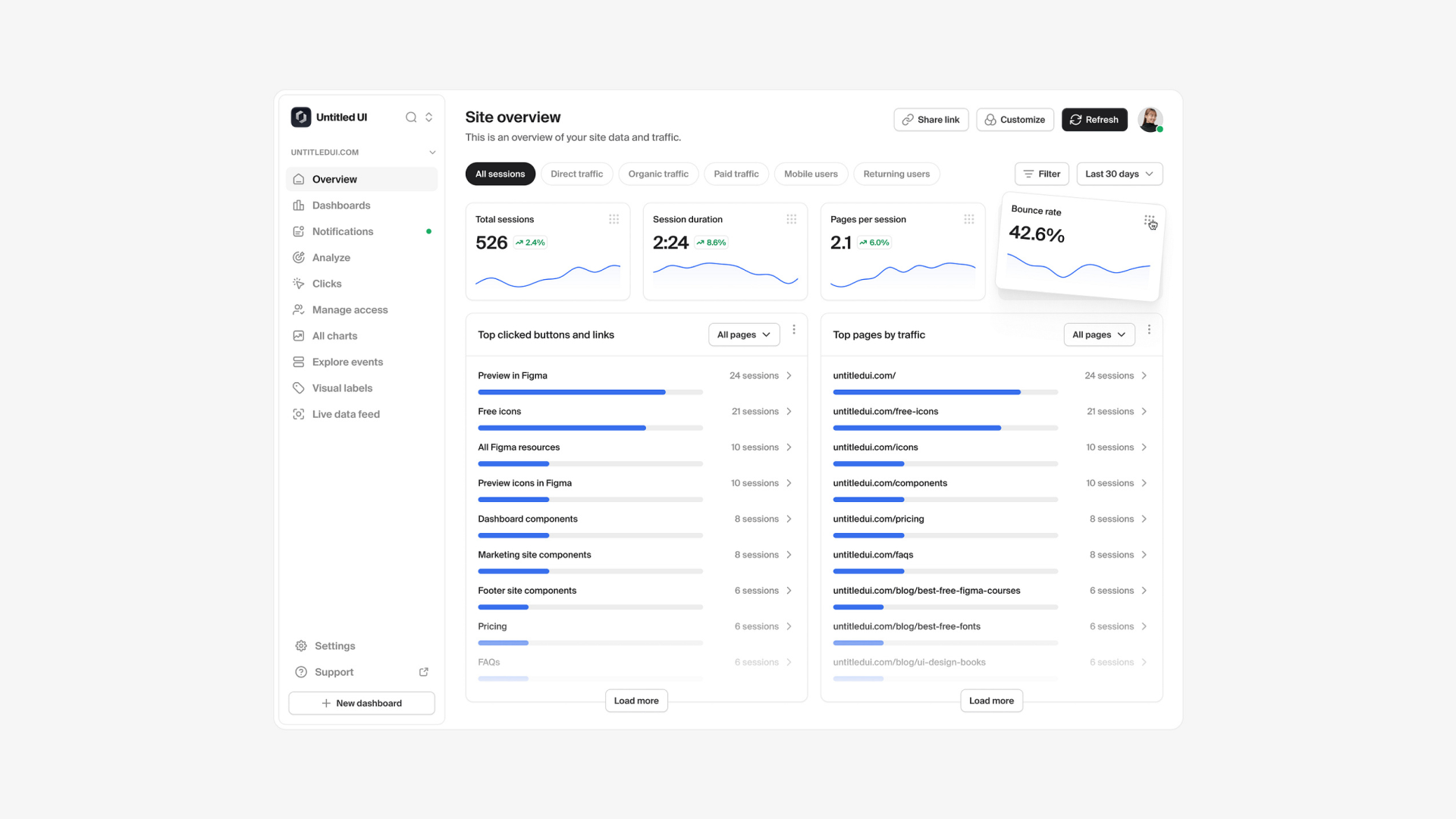
##### About this kit
Untitled UI is one of the largest and most advanced UI kits and design systems for Figma. Crafted with precision, it features over 10,000 components and variants, smart variables, Auto Layout 5.0, and extensive accessibility features, making it a comprehensive toolkit for any design project. It supports everything from landing pages to complex web applications and integrates seamlessly with Figma’s newest features, including color, spacing, and typography variables.
_This post is for subscribers only._
### Tesler’s law in design: Why managing complexity matters more than ever
URL: https://www.everydayux.net/teslers-law-managing-complexity/
Last updated: 2025-08-10T03:39:52.000Z
## What is Tesler’s law?
Tesler’s law, also known as the law of conservation of complexity, suggests that every system has a certain level of complexity that cannot be eliminated—only managed. This principle doesn’t mean removing complexity altogether but rather deciding who should deal with it: the user or the system.
Larry Tesler, a pioneer in human-computer interaction, believed that good design shifts complexity away from the user. This mindset drove much of his work across industry giants like Xerox PARC, Apple, Amazon, and Yahoo.
### Larry Tesler’s legacy in computing
At Xerox PARC in the 1970s, Larry Tesler helped develop innovations like cut, copy, and paste functionality and modeless software design—fundamentals that still shape modern computing.
At Apple, he played a key role in projects such as the Apple Lisa and Newton, eventually becoming the Chief Scientist. His influence extended to Amazon and Yahoo, where he continued championing user-centric design. Tesler passed away in 2020, but his contributions remain vital to understanding interface and product usability.
### Good design takes time
There’s a common misconception that simple design is easy to create. In reality, designing something simple takes more time than building something complex.
> If our goal was to ship complexity, anyone could be a designer.
However, great design is about intentionally managing and reducing cognitive load. That process takes thought, iteration, and refinement.
### Managing complexity, not eliminating it
According to Tesler’s law, complexity in a system doesn’t vanish. It gets transferred into the product’s design or the user’s experience.
- When we optimize for user experience, the product handles the complexity.
- When we prioritize speed or ease of development, users often manage the complexity themselves, which can result in frustration.
This is why truly simple-feeling products often involve layers of hidden sophistication—automation, streamlined workflows, and intelligent defaults that reduce user friction without compromising core functionality.
[How Slack decides to send a notificationSlack’s approach to sending notifications might seem simple, but a closer look reveals a surprisingly complex decision-making process.everyday uxJess Eddy](https://www.everydayux.net/how-slack-decides-to-send-a-notification/)
### Simplicity vs. minimalism
Simplicity and minimalism are often confused, but they serve different purposes:
- **Simplicity** is about clarity and ease of use.
- **Minimalism** focuses on aesthetics and reducing elements to their bare essentials.
A minimalist product can still be difficult to use, while a product designed with simplicity can have robust functionality and remain easy to navigate.
Tesler’s law reminds us that the goal isn’t to remove features—it’s to manage their complexity so that users aren’t overwhelmed. A well-designed product can be powerful, feature-rich, and still intuitive.
### Simpler isn’t always better
Some products, such as CAD software, video editing suites, or data analytics platforms, are naturally complex. Their users need access to deep, nuanced functionality. Trying to oversimplify these tools can hinder their usability for those who rely on them.
The real challenge isn’t to strip away features—it’s to make the complexity manageable and discoverable. A truly good interface meets users where they are, striking a balance between depth and accessibility.
### Using progressive disclosure
One effective strategy for managing complexity is progressive disclosure. This design approach reveals only the most essential options upfront and gradually introduces advanced features as users become more familiar with it.
Examples of progressive disclosure include:
- Hiding advanced settings until needed
- Showing onboarding tips or tooltips contextually
- Using collapsible sections for secondary content
This method respects both beginners and experts. It keeps the interface clean and approachable while allowing deeper exploration over time.
### Complexity evolves over time
A key idea often overlooked in Tesler’s law is that complexity is not fixed—it changes as users grow and technology evolves.
As users become more proficient, they can handle more sophisticated features. In turn, designers can progressively introduce new functionality that matches that growth.
For example, a photo-editing app might start by showing new users basic tools. As their skills develop, the interface can expand to offer advanced controls, filters, and adjustments. This evolving complexity feels natural because it grows with the user.
Designers should always consider how user experience evolves, adjusting the presentation of complexity to match user familiarity and needs.
---
## Common myths about simplicity in design and user experience
### 1\. Simpler is always better
This idea isn’t always true. In many cases, oversimplification harms usability. Removing too many options or dumbing down interfaces can make products less functional, especially for professional or technical users. Tesler’s law doesn’t advocate for simplicity at all costs—it supports clarity, not limitation.
### 2\. Minimalist design means good UX
Minimalism is a visual style, not a guarantee of usability. A sparse, clean interface might look beautiful, but it offers no guidance or functionality.
On the other hand, designing for simplicity requires intentional decisions about how features are surfaced, grouped, or hidden, aligning with Tesler’s principle of managing—not removing—complexity.
---
## FAQs about Tesler’s law in design
**What is Tesler’s law in simple terms?**
- Tesler’s law states that every system contains some inherent complexity that cannot be removed. Effective user experience design ensures the system handles this complexity, not passing it on to the user. The goal is to make interactions feel intuitive without sacrificing functionality.
**Why does simplifying a design take longer?**
- Creating a simple and intuitive experience requires more effort than building something complex. It requires deeper thinking and iteration to hide complexity. Simplicity is achieved not by doing less but by doing more behind the scenes.
**Is Tesler’s law only relevant to UX/UI design?**
- Tesler’s law is most visible in UX/UI, but its principles apply far beyond screen-based design. Any system involving user interaction—such as support services, physical products, or documentation—benefits from managing complexity to reduce user burden. It’s a universal principle of user-centered thinking.
**How does progressive disclosure help manage complexity?**
- Progressive disclosure is a technique where users are initially shown only essential information, with more advanced features revealed as needed. This approach reduces cognitive load and helps users learn at their own pace. It keeps interfaces approachable while supporting depth for more experienced users.
**Can you completely remove complexity from a product?**
- No, and that’s the core of Tesler’s law. Complexity doesn’t just disappear—it has to go somewhere. You can hide, reduce, or organize it better, but can’t eliminate it. If the system doesn’t absorb it, users are left to figure it out, often resulting in frustration or failure.
**What are good examples of Tesler’s law in action?**
- Apple’s modeless interfaces simplify powerful interactions without requiring users to toggle between modes. Google tools like Docs and Analytics use progressive disclosure to reveal advanced capabilities gradually. Notion offers flexibility through its layered complexity, adapting to both beginners and power users.
**How can product teams decide which complexity to shift to the system?**
- Teams can observe user behavior through usability testing and journey mapping to pinpoint high-friction tasks. Frequent, repetitive, or error-prone Tasks are strong candidates for system-side complexity management. The goal is to reduce decision fatigue and streamline common workflows.
**What’s the difference between Tesler’s law and Hick’s law?**
- Tesler’s law deals with the location of complexity—whether the system or the user manages it. Hick’s law, on the other hand, addresses decision time, which increases with the number of choices presented. Together, they help designers strike a balance between information clarity and efficiency.
**How does Tesler’s law apply to AI or machine learning interfaces?**
- AI systems often mask complexity by automating recommendations, predictions, or decision-making. Tesler’s law is at play when simple interfaces make these complex processes usable. The challenge lies in offering transparency and control without overwhelming users with excessive detail.
**Can Tesler’s law be applied to content design or information architecture?**
- Yes, content designers use Tesler’s law by structuring information logically, reducing jargon, and presenting content progressively. Whether in onboarding, FAQs, or long-form guides, managing complexity helps readers easily navigate content. It’s just as relevant for words as it is for UI.
**How do you apply Tesler’s law in the development of a minimum viable product (MVP)?**
- It is important to identify and absorb only the most essential complexity in early-stage products. Prioritize core features that offer immediate value and reduce friction. Complexity can be layered in as the product grows through thoughtful iteration and user feedback.
**How can we test whether we’re managing complexity effectively?**
- User testing is the most effective way to validate how well complexity is handled. If users hesitate, struggle to complete tasks, or abandon workflows, the design may present too much complexity. A clean interface means little if usability suffers underneath.
---
### Conclusion: design isn’t about reducing—it’s about managing complexity
Designers often feel pressure to make things “simple.” However, as Tesler’s law teaches, simplicity isn’t about removal but thoughtful organization. Some complexity is necessary. The real skill lies in making that complexity feel natural and manageable. Designers must decide whether users should bear the brunt of complexity or whether the product should handle it for them.
By applying strategies such as progressive disclosure, embracing evolving user needs, and understanding the balance between minimalism and usability, we can design powerful and user-friendly experiences.
Tesler’s law in design remains a guiding principle for anyone seeking to create products that not only work but also feel effortless to use.
### Do Design: why beauty is key to everything - Alan Moore
URL: https://www.everydayux.net/do-design-why-beauty-is-key-to-everything-alan-moore/
Last updated: 2025-08-08T01:30:59.000Z
### Who is Alan Moore?
Alan Moore is a writer, designer, and business innovator known for his compelling vision of how beauty, creativity, and purpose can transform individuals and organizations. With a career spanning multiple continents, Moore has authored several books that explore the intersection of design, culture, and business, including *“Do Design: Why Beauty is the Key to Everything.”* He is passionate about bringing beauty into everyday life and believes that businesses can be a force for good by integrating meaning and authenticity into their work.

Alan Moore
Alan Moore has partnered with global companies, governments, and educational institutions to reimagine leadership, culture, and innovation. Through writing, speaking, and teaching, he advocates using beauty and creativity to drive positive change. Moore’s insights have resonated with a global audience, inspiring leaders to rethink how they approach innovation and the role of beauty in shaping a better world.
### Do Design: why beauty is key to everything - Alan Moore
Alan Moore, in his book “[Do Design: Why Beauty is the Key to Everything](https://www.amazon.com/Do-Design-Beauty-Everything-Books/dp/1907974288/?ref=everydayux.net),” invites us to strive for a world that is more beautiful, meaningful, and joyful. He challenges us to rethink and reinvent our roles as human beings, urging us to embrace creativity, purpose, and an appreciation for beauty in everything we do. It’s not just about aesthetics; it’s about finding truth and creating a life filled with restorative and regenerative actions that bring happiness.
In a recent conversation with Aidan McCullen, Alan Moore delves deeper into the themes of his book, *“Do Design: Why Beauty is the Key to Everything.”* Moore invites us to strive for a more beautiful, meaningful, and joyful world. He challenges us to rethink and reinvent our roles as human beings, urging us to embrace creativity, purpose, and an appreciation for beauty in everything we do.
[Listen to the full conversation on YouTube](https://www.youtube.com/watch?v=1BR%5F4Dlbg3w&ref=everydayux.net).
Moore discusses a shift among younger generations searching for companies with purpose. They aren’t content to simply collect a paycheck—they want work that aligns with their values and contributes positively to the world. As one CEO he interviewed said, “People don’t come here for a paycheck; they come here to work on a project.” This shift reflects a desire for impact that is a ripple, not a splash, showing that meaningful change is gradual and often unmeasured. As Albert Einstein said, “Not everything that can be counted counts, and not everything that counts can be counted.”
Moore critiques how organizations approach innovation, pointing out that *“innovation inside organizations is an oxymoron.”* Companies often focus on risk mitigation, deadlines, and revenue, while true innovation requires a creative approach that asks, *“What is the best outcome I can create?”* This vision-driven mindset is often embodied by the maverick or change-maker who starts with the end in mind and doesn’t worry about the challenges. As Moore says, *“The greatest risk is not taking one.”*
Moore encourages us to see beauty, creativity, and purpose essential to a meaningful life. He reminds us that we should strive for a world that is not only productive but also joyful and beautiful. Focusing on what we can create and how it can bring happiness, we tap into our unique potential and connect more deeply with the world around us.
Ultimately, Moore believes that hope is a fundamental part of our identity. It pushes us to invest our unlimited resources—our creativity, passion, and vision—into achieving meaningful outcomes, even when they seem elusive. By keeping the shimmering coast of utopia in our sights, we can live in a way that reflects our highest values and aspirations.
Moore’s vision is clear: to build a world where beauty, creativity, and purpose guide our choices. In doing so, we make space for a truly worthwhile life filled with joy, meaning, and a sense of belonging.
### **Damn you, Alan Moore**
Tim Galles, Chief Idea Officer at Barkley Kansas, shares his experience participating in one of Moore's programs, highlighting the benefits of integrating beauty and purpose into business practice.
Chief Idea Officer Tim Galles of Barkley Kansas speaks about his experience participating one the schools programmes, and its benefits.
### To retain designers, companies should enable them to grow
URL: https://www.everydayux.net/designer-retention-through-growth/
Last updated: 2025-08-10T00:56:13.000Z
*This article is adapted from an* [*original post in UX Collective*](https://uxdesign.cc/to-retain-designers-companies-should-enable-them-to-grow-jess-eddy-adec6a74e442?ref=everydayux.net) *on September 22, 2020.*
### The gap in growth paths
Many organizations default to management as the only clear path forward. But not all designers want to be managers. Many thrive as individual contributors (ICs), focusing on craft, problem-solving, and strategic influence, while avoiding people-management duties. Companies that build intentional IC growth paths, with well-documented career progression frameworks, tend to retain top talent longer and avoid losing senior designers to avoidable churn.
Common missteps include assuming “leading one big project” equals growth, or offering sporadic training without tying it to role evolution. Real growth for ICs requires a structured approach, an expanding scope, and increased influence.
##### A 3-part framework for IC growth
1. **Skill mastery** – Deepening expertise in areas like design systems, accessibility, motion design, or service design.
2. **Cross-functional influence** – Driving strategic decisions, shaping product vision, and earning influence across teams.
3. **Thought leadership** – Mentoring peers, publishing industry insights, or creating internal frameworks that improve practice.
##### Making growth tangible
Leading companies make IC advancement visible and measurable. For example, companies like Intercom or Shopify have a transparent IC career framework that maps IC career stages with defined impact expectations, moving from delivering high-quality work to shaping the work of others, influencing roadmaps, and championing design vision at the executive level. Contrast that with companies where IC progression is undefined; designers plateau, disengage, and often leave.
##### Integrating learning into everyday work
Designers crave novelty, new experiences, challenges, and opportunities for personal growth. Learning opportunities are most effective when embedded in live projects, rather than being treated as extra work. Practical approaches include:
- Rotating designers across product areas every 6–12 months to broaden problem-solving skills and expose them to new contexts.
- Pairing ICs with researchers to co-lead usability studies, user interviews, and data analysis to deepen understanding of user needs and behavior.
- Assigning stretch projects that require new tools or methods, like introducing animation principles into a web app, experimenting with new testing methodologies, or designing for a new platform entirely.
##### A scrappy growth playbook for start-ups
Start-ups often face unique challenges when providing growth opportunities for designers. With their primary focus on achieving profitability and stability, they may struggle to allocate resources for formal development programs. However, neglecting growth can quickly lead to disengagement and high turnover. Even in resource-constrained environments, growth is still possible through creative approaches such as:
- Informal mentorship between junior and senior designers.
- Monthly skill-sharing sessions or design critiques.
- Side experiments that align with company goals but give designers creative freedom.
- Cross-role exposure, such as having designers shadow engineers or marketers, to build a broader product sense.
##### The role of mentorship and feedback
Mentorship and feedback play crucial roles in a designer’s growth and development, regardless of their level of experience. Even senior ICs benefit from having a sounding board and receiving constructive input on both their work and career direction. Companies can support this by pairing experienced designers with less experienced ones through formal programs that set clear guidelines around meeting cadence, discussion topics, goal-setting, and progress tracking. They can also encourage organic mentorship by creating spaces for collaboration and knowledge sharing, such as workshops, lunch-and-learns, or regular design critiques. Feedback should be frequent, specific, and safe—some teams schedule recurring “design feedback hours” to ensure it becomes a consistent and valued habit.
##### Personalized growth plans
Companies need to take a personalized approach to truly support designers’ growth. This means working closely with each IC to identify their desired growth direction, the new skills they want to acquire, and how their role can evolve to accommodate these aspirations. To make this successful, managers may need to adapt the designer’s existing role or create new opportunities within the current position. One-size-fits-all career ladders rarely meet everyone’s needs. Managers and ICs should collaborate to define growth goals, skill focus areas, and opportunities for expanded influence, whether by adjusting responsibilities, shaping new projects, or creating hybrid roles that allow ICs to lead in new ways.
##### Retention health check
**Ask:**
- Can ICs grow without becoming managers?
- Are the growth criteria clear and measurable?
- Do designers get regular, actionable feedback?
- Is learning integrated into project work?
- Are there influential opportunities beyond the immediate team?
##### Why it matters
**Investing in IC growth isn’t just a retention tactic; it’s a product quality strategy.** Designers who keep evolving bring sharper execution, richer problem-solving, and the ability to shape product direction. Companies that make space for this don’t just keep talent; they raise the standard of the entire customer experience.
### 24 top Figma plugins in 2024
URL: https://www.everydayux.net/top-20-figma-plugins-in-2024/
Last updated: 2025-08-08T01:31:45.000Z
*This list combines the most frequently mentioned Figma plugins from various sources, chosen for their functionality, popularity, and ability to improve design workflows.*
### What are Figma plugins?
Figma plugins are add-ons that expand the capabilities of Figma and FigJam, allowing users to do more than what’s possible with the default features. These plugins offer extra tools, automate repetitive tasks, and provide customization options, making the design process smoother and more efficient.
### Why use Figma plugins?
Figma plugins help you work smarter by automating repetitive tasks, adding creative tools, and simplifying your workflow with features that fit your needs. They make it easier to design, collaborate, and get more done with less effort.
---
## 24 top Figma plugins
### Productivity
- [**Autoflow**](https://www.figma.com/community/plugin/733902567457592893/autoflow?ref=everydayux.net): Automagically draw flow arrows in Figma! Illustrate user flows, diagrams, or graphics in a hand-drawn or minimalist style.
- [**Content reel**](https://www.figma.com/community/plugin/731627216655469013/content-reel?ref=everydayux.net): Efficiently pull text strings, images, and icons from a shared palette.
- [**Rename it**](https://www.figma.com/community/plugin/731271836271143349/rename-it?ref=everydayux.net): Batch rename layers to organize and clean up your Figma files.
### Photos, icons & illustrations
- [**Unsplash**](https://www.figma.com/community/plugin/738454987945972471/unsplash?ref=everydayux.net): Easily add high-quality stock photos from Unsplash’s library directly into your designs.
- [**Icons8**](https://www.figma.com/community/plugin/791103617505812222/icons8-icons-illustrations-photos?ref=everydayux.net): Access a vast collection of icons, illustrations, and pictures without leaving Figma.
- [**Blush**](https://www.figma.com/community/plugin/838959511417581040/blush?ref=everydayux.net): Create and customize illustrations directly in Figma.
### Prototyping and interaction
- [**ProtoPie**](https://www.figma.com/community/plugin/908870217222043020/protopie?ref=everydayux.net): Turn Figma designs into high-fidelity prototypes.
- [**Jitter**](https://www.figma.com/community/plugin/961270034818256057/jitter-animation-for-figma?ref=everydayux.net): Add motion and animation to your designs easily.
- [**Breakpoints**](https://www.figma.com/community/plugin/824289601590456356/breakpoints?ref=everydayux.net): Preview responsive layouts and share animated prototypes.
- [**LottieFiles**](https://www.figma.com/community/plugin/809860933081065308/lottiefiles-create-animations-export-from-figma-to-lottie?ref=everydayux.net): Convert your Figma designs into Lottie animations.
### Code export
- [**Anima**](https://www.figma.com/community/plugin/857346721138427857/anima-figma-to-code-react-html-vue-css-tailwind-devmode-inspect-react-html-vue-css?ref=everydayux.net): Generate React, HTML, Vue, CSS, and Tailwind code from your designs.
- [**Locofy**](https://www.figma.com/community/plugin/1056467900248561542/locofy-lightning-figma-to-code-in-1-click?ref=everydayux.net): Convert designs into production-ready code for web and mobile apps.
### Specialized design tools
- [**Fast isometric**](https://www.figma.com/community/plugin/1249759048471403961/fast-isometric?ref=everydayux.net): Quickly create isometric designs.
- [**Table creator**](https://www.figma.com/community/plugin/885838970710285271/table-creator?ref=everydayux.net): Generate custom-styled, easily editable tables.
- [**Remove BG**](https://www.figma.com/community/plugin/738992712906748191/remove-bg?ref=everydayux.net): Automatically remove image backgrounds with a single click.
### AI-powered plugins
- [**Magician**](https://www.figma.com/community/plugin/1151890004010191690/magician?ref=everydayux.net): Use AI for copywriting and generating unique icons from text.
- [**Musho AI**](https://www.figma.com/community/plugin/1302057916867700387/musho-ai?ref=everydayux.net): Turn prompts into nearly complete, dev-ready websites.
### Design system management
- [**TokensStudio**](https://www.figma.com/community/plugin/843461159747178978/tokens-studio-for-figma?ref=everydayux.net): Handle complex design systems efficiently.
- [**Design system organizer:**](https://www.figma.com/community/plugin/802579985985331070/design-system-organizer?ref=everydayux.net) Copy styles and variables across files, swap libraries selectively, and manage all components, styles, and variables in one place.
### Image optimization
- [**TinyImage compressor**](https://www.figma.com/community/plugin/789009980664807964/tinyimage-compressor?ref=everydayux.net): Export compressed image files.
- [**Vector to 3D**](https://www.figma.com/community/plugin/1264600219316901594/vector-to-3d?ref=everydayux.net): Convert text and vector nodes into 3D models.
### Consistency and organization plugins
- [**Design lint**](https://www.figma.com/community/plugin/801195587640428208/design-lint?ref=everydayux.net): Find and fix design errors automatically, with real-time updates.
- [**Super tidy**](https://www.figma.com/community/plugin/731260060173130163/super-tidy?ref=everydayux.net): Align frames, rename, and reorder layers to keep files organized.
- [**Style organizer**](https://www.figma.com/community/plugin/816627069580757929/styles-variables-organizer?ref=everydayux.net): Group, merge, and fix color and text styles effortlessly.
### The best sites for UX research
URL: https://www.everydayux.net/the-best-sites-for-ux-research/
Last updated: 2025-08-08T01:32:05.000Z
**As designers, we often find ourselves in situations where we must persuade stakeholders to trust our expertise and design decisions.**
It’s a familiar challenge—convincing others to see the thought and strategy behind our work. While our experience and knowledge carry weight, they’re not always enough to sway opinions, especially in high-stakes design reviews or feedback sessions. This is where research becomes our secret weapon.
User research isn’t just a checkbox in the design process; it’s one of our most powerful tools. We can strengthen our arguments and build credibility by grounding our decisions in data—user insights, behavioral studies, or industry trends.
> Research validates our designs and educates stakeholders, making them partners in understanding the “why” behind our choices.
When we bring research, we shift the conversation from personal opinions or preferences to objective evidence. It allows us to connect design decisions to user needs, business goals, and measurable outcomes. And, let’s face it, few things are as persuasive as showing how a particular design choice addresses a real problem or creates value for users.
So, the next time you conduct a design review or receive feedback, lean on research. Use it to tell the story of your design, explain the “why” behind your work, and help others see its merit—not just as a creative choice but as a thoughtful solution grounded in insight.
> Research doesn’t just make our designs better; it makes us better advocates for our work.
Incorporating research into your design process and presentations can significantly strengthen your case and build stakeholder confidence.
### Here are some ways to integrate research
- **User feedback:** Start with the most direct source of insight—your users. Interviews, surveys, and usability tests can uncover their needs, pain points, and preferences. Highlighting how your designs address these real-world concerns makes your work more relatable and convincing.
- **Industry best practices:** Tap into established design guidelines, successful case studies, and expert opinions to show how your approach aligns with what’s proven to work. This connection to industry standards reinforces your expertise and demonstrates that your designs are grounded in sound principles.
- **Data and analytics:** Numbers tell a story, too. Analyze quantitative data from existing products, competitor research, or analytics tools to identify trends, measure impact, and predict outcomes. Showing how measurable insights back your design decisions helps bridge the gap between creative vision and tangible results.
- **Scientific studies:** Use psychology, neuroscience, or human-computer interaction research to add depth to your design rationale. Citing studies about cognitive load or color perception can provide a scientific foundation for your choices and make them harder to dispute.
By weaving research into your process, you’re doing more than just addressing stakeholder concerns—you’re elevating the conversation. It’s not about blindly following others’ suggestions; it’s about using research as a guiding light to validate your decisions and advocate for designs that truly serve the end-users. When your work is grounded in evidence, gaining stakeholder support becomes less of a battle and more of a shared journey toward creating something impactful.
---
## The best sites for UX research
**Nielsen Norman Group** ([nngroup.com](https://www.nngroup.com/articles/?ref=everydayux.net))
- The gold standard for research-based UX guidance. Known for pioneering usability testing and heuristic evaluations, they offer in-depth articles, reports, and training from world leaders in UX research. Ideal for anyone looking to master user-centered design with rigor and precision.
**The Laws of UX** ([lawsofux.com](https://lawsofux.com/?ref=everydayux.net))
- A visually engaging site that combines key UX design principles in a digestible and memorable format. It provides quick access to psychological theories and design laws, such as Fitts’s Law and Hick’s Law, and explains how to apply them to create intuitive, user-friendly designs. Perfect for designers seeking evidence-based insights to inform their work and those looking to refresh their knowledge of fundamental UX principles.
**Coglode (**[**coglode.com**](https://www.coglode.com/?ref=everydayux.net)**)**
- This site explains the “why” behind human behavior and offers tools that uncover a hidden behavioral language. It is perfect for diagnosing challenges and crafting user-centered solutions grounded in behavioral science.
💡
Use Coglode’s [Figma behavioral design system](https://www.coglode.com/figma?ref=everydayux.net) to support your ideas with evidence.
**Baymard Institute** ([baymard.com](https://baymard.com/?ref=everydayux.net))
- Your go-to resource for e-commerce UX research. With over 49,000 hours of large-scale studies, Baymard specializes in actionable insights for optimizing online shopping experiences. Perfect for boosting conversions and refining checkout flow with proven data.
**User Interviews blog** ([userinterviews.com/blog](https://www.userinterviews.com/blog?ref=everydayux.net))
- A treasure trove for mastering UX research. Their "UX Research Field Guide" blog offers comprehensive how-to guides on methods like card sorting and usability testing. Packed with insider tips, it’s a must-read for conducting effective and impactful research.
**UX Collective** ([uxdesign.cc](https://uxdesign.cc/?ref=everydayux.net))
- A vibrant global design community sharing curated stories on UX, visual design, product strategy, and beyond. With insightful case studies and thought-provoking articles, it’s the perfect site for staying inspired and informed.
**UX Matters** ([uxmatters.com](https://www.uxmatters.com/?ref=everydayux.net))
- Practical advice from seasoned UX professionals. It covers everything from research methods to strategic planning; it’s beginner-friendly while offering valuable insights for experienced designers. A dependable resource for day-to-day UX challenges.
**DesignKit by IDEO** ([designkit.org](https://www.designkit.org/?ref=everydayux.net))
- IDEO’s human-centered design approach is distilled into an accessible toolkit. Featuring free methods, tools, and case studies, this site is perfect for learning and applying design thinking to solve complex problems creatively.
**UX Stack Exchange** ([ux.stackexchange.com](https://ux.stackexchange.com/?ref=everydayux.net))
- This is a highly active Q&A community where UX professionals share solutions to real-world challenges. Whether you’re troubleshooting a design issue or exploring best practices, this crowdsourced platform is invaluable for staying sharp.
**UX Myths** ([uxmyths.com](https://uxmyths.com/?ref=everydayux.net))
- This site debunks common UX misconceptions with evidence-based insights. Separating fact from fiction helps designers avoid pitfalls and embrace research-informed decision-making for stronger design outcomes.
**Silicon Valley Product Group** ([SVPG.com](https://www.svpg.com/?ref=everydayux.net))
- Where product management meets UX design, SVPG provides deep insights from industry leaders to align user needs with business goals. It is a must-read for bridging the gap between strategy, design, and product development.
**GoodUI Datastories** ([goodui.org](https://goodui.org/datastories/?ref=everydayux.net))
- This site features data-driven case studies that showcase UI patterns proven to convert. With compelling evidence and ROI-focused examples, it is perfect for designers who want to back their work with numbers and achieve measurable results.
**Luke W** ([lukew.com](https://www.lukew.com/?ref=everydayux.net))
- A trusted resource for mobile-first and cross-device design. Luke Wroblewski shares data-backed best practices and actionable insights, making it a must-visit site for responsive and adaptive UX design.
**UX Movement** ([uxmovement.com](https://uxmovement.com/?ref=everydayux.net))
- Tactical advice and tutorials for refining your UX and UI design skills. The site explores the latest trends and techniques, offering practical tips to elevate your work and stay ahead in the field.
**Smashing Magazine** ([smashingmagazine.com](https://www.smashingmagazine.com/?ref=everydayux.net))
- A comprehensive resource covering all aspects of web design and development. Known for its in-depth guides and practical tips, it’s a valuable site for designers navigating the entire design process, from research to implementation.
**UX Booth** ([uxbooth.com](https://uxbooth.com/?ref=everydayux.net))
- Empowering the next generation of UX professionals with helpful guides, case studies, and inspiring interviews. Whether entering the field or looking to level up, UX Booth offers the tools and motivation to succeed.
### Keep, Ditch, or Pivot: a fun and fast way to evaluate your ideas
URL: https://www.everydayux.net/keep-ditch-or-pivot-a-fun-and-fast-way-to-evaluate-your-ideas/
Last updated: 2025-08-08T01:32:21.000Z
Evaluating your ideas doesn’t have to be a tedious, drawn-out process. If you’re looking for a quick, engaging way to assess your next big app or product idea, try the **“Keep, Ditch, or Pivot”** method. This approach is all about getting instant feedback, sparking creativity, and confidently deciding on your ideas — all in a fun and informal setting!
Why is evaluating ideas important? Choosing the right idea can make or break your next project. By considering ideas early and effectively, you save time, resources, and energy on concepts with the most potential for success. The “Keep, Ditch, or Pivot” method offers a simple, playful way to determine which ideas are worth pursuing and which might need a rethink or a pass.
**If you're looking for a more formal, systematic way to evaluate your ideas, check out this post.**
[A systematic approach to evaluating your ideas: 10 criteria for assessing your app’s potentialChoosing the right idea is crucial for success. Use a systematic evaluation process to assess your app’s potential. Consider factors like problem identification, feasibility, market demand, and scalability to ensure your idea stands out, meets user needs, and remains viable for the long haul.Welcome to everyday uxJess Eddy](https://www.everydayux.net/a-systematic-approach-to-evaluating-your-ideas-10-criteria-for-assessing-your-apps-potential/)
## How to play “Keep, Ditch, or Pivot”
1. **Gather your crew**: Invite a small group of trusted friends, colleagues, or mentors — ideally 4-6 people — willing to provide honest feedback. The more diverse the group, the better!
2. **Pitch your ideas**: Everyone should come prepared with 2-3 ideas. Present them quickly — think of it as a rapid-fire round, with 1-2 minutes per idea. Keep it concise, focusing on the core concept and its potential impact.
3. **Decide their fate**: For each idea, the group decides whether to “Keep” it (move forward), “Ditch” it (discard), or “Pivot” it (tweak, reframe, or combine with another idea to make it stronger). Discuss briefly why the group chose each option and keep the feedback constructive.
### Why “Keep, Ditch, or Pivot” works
- **Quick decisions**: This method helps you avoid analysis paralysis by forcing fast, gut-level decisions.
- **Engaging feedback**: The game format encourages participants to be candid and constructive, fostering an open and lively discussion.
- **Creative insights**: The time pressure can spark spontaneous ideas and connections that might not emerge in a slower-paced discussion.
### Pro tips for making it fun and effective
- **Set the mood**: Make it feel more like a brainstorming party than a formal meeting. Snacks, drinks, or a relaxed environment can help.
- **Use colorful visuals**: Use colorful post-it notes or a whiteboard to visually track the “Keep,” “Ditch,” and “Pivot” ideas.
- **Rotate the facilitator**: Have different people present each idea to keep the energy flowing.
- **Mix up the group**: Include a mix of familiar and new participants to balance comfort and fresh perspectives.
- **Encourage collaboration**: During “Pivot” discussions, encourage participants to build on each other’s ideas, fostering collaboration and synergy.
- **Use a timer**: Keep the pace lively by setting a timer for pitches and feedback rounds.
- **Document decisions**: Take quick notes on why each idea was kept, ditched, or pivoted. This step will help you reflect on the feedback later and make more strategic decisions.
### After the game: next steps
- **Follow up quickly**: Schedule a follow-up meeting within a week to discuss the next steps for the “Keep” and “Pivot” ideas.
- **Keep an open mind about “Ditch” ideas**: Sometimes, what seems like a dead end now could spark new insights or combinations.
- **Remember, this is just a starting point**: The “Keep, Ditch, or Pivot” game is one tool in your idea evaluation toolkit. You can do further research, testing, and validation to develop the most promising concepts fully.
## Conclusion
Remember, the best ideas often emerge from a playful, collaborative process — so have fun and see where your creativity takes you!
Using the “Keep, Ditch, or Pivot” method, you’ll get instant feedback, foster creative insights, and quickly decide which ideas to pursue, tweak, or drop. Gather your crew and start playing today to see which of your ideas are ready for the next big step!
### Automatically turn on Do Not Disturb when Zoom is open (MacOS Sonoma)
URL: https://www.everydayux.net/automatically-turn-on-do-not-disturb-when-zoom-is-open-macos-sonoma/
Last updated: 2025-08-08T01:32:38.000Z
To stay focused during Zoom meetings and ensure notifications aren’t visible during screen-sharing sessions, you can use macOS’s built-in Focus mode to automatically enable “Do Not Disturb” whenever Zoom is in use. This feature helps prevent interruptions by silencing notifications and alerts while the Zoom app is open. Follow the steps below to set up this useful automation on your Mac.
### Automations on macOS
Automation on macOS allows you to streamline tasks and make your device work more efficiently by automatically performing actions under certain conditions. One of the most common ways to create automation on macOS is through Focus mode settings.
**Focus mode automations** are simple ways to manage your notifications and device behavior based on specific triggers like time, location, or app usage. For example, setting up a Focus mode for “Zoom Meetings” will automatically turn on “Do Not Disturb” whenever Zoom is active. These settings are managed directly in the System Settings under Focus, tightly integrating with macOS’s notification and status management system.
### Set up focus mode for Zoom on macOS Sonoma
1. **Open system settings**:
- Click on the Apple menu in the top left corner of your screen and select **System Settings**.
2. **Select Focus**:
- In the sidebar, find and click on **Focus**.
3. **Create a New Focus Mode**:
- Click the **+** button at the bottom left to create a new Focus mode.
- Name it something like “Zoom Meetings.”
4. **Set App-Based Automation**:
- Under the **Set a Schedule** section, click the **Add Schedule** button.
- In the dialog that appears, select **App** as the trigger type.
- In the app list, search for **Zoom** and select it.
- The Focus mode will activate when you open or use the Zoom app.
5. **Customize your focus mode**
- Choose which notifications to allow while in this mode (e.g., allow calls from specific contacts or apps).
- Adjust these settings according to your preferences.
6. **Enable sharing across devices (optional)**
- Enable the **Share Across Devices** option to apply this Focus mode across all your Apple devices (like your iPhone or iPad).
7. **Save your settings**
- Click **Done** to save your new Focus mode settings.
### Enjoy notifications-free meetings
With this setup, your Mac will automatically activate “Do Not Disturb” whenever you open Zoom, silencing notifications and helping you focus on your call. When you exit Zoom, the Focus mode will turn off, restoring your notifications and ensuring notification-free meetings.
### Embracing flexibility: when linear processes fall short in feature development
URL: https://www.everydayux.net/embracing-experimentation-in-large-organizations/
Last updated: 2025-08-08T01:32:51.000Z
Large organizations often adhere strictly to plans, schedules, and roadmaps, which makes adopting an experimentation mindset challenging. This scenario becomes especially complicated when developers are already allocated to other projects, and you must justify the team’s time and resources without a guaranteed return on investment. Experimentation is inherently unpredictable—we can’t foresee outcomes or rely on rigid plans. Instead, we must adapt to customer feedback and new information, allowing our plans to evolve as we learn.
More rigid, standard plans and processes like the one below break down quickly when a project involves many unknowns and requires an experimental approach:
1. Conduct customer interviews
2. Summarize findings
3. Design solution/prototype
4. Test prototype with customers
5. Scope MVP/final design
Due to constraints or a company’s reluctance or inability to invest in research, many designers often start at step 3: designing a solution or prototype. This plan also overlooks the iterative nature of steps 3 and 4, where designers optimally will cycle between designing, testing, and refining the solution based on feedback.
**This linear plan assumes everything will go smoothly, providing the necessary information to validate a solution and scope an MVP.** However, this is a cut and dry process that doesn't match what might actually happen as we learn more. In a more experimental approach, the process might involve different outcomes: *scoping an MVP*, *conducting additional interviews*, *pivoting*, or *even abandoning the project altogether*.
The idea of adapting to customer feedback and working in experimentation mode isn’t new, in fact it’s the cornerstone of good design, but it’s often difficult for large organizations to embrace. Startups, by contrast, are more naturally equipped for this approach; they thrive on being scrappy, moving forward amid uncertainty, and adapting their plans on the fly. In a large organization, working in an experimental mode can feel nearly impossible due to constraints on people and resources.
### **Embracing an experimental approach**
Sometimes we need a more experimental approach—one that is flexible and suited to navigating unknowns, similar to the mindset often adopted by startups. In reality, the outcomes of the process could vary widely: we might scope an MVP, conduct additional interviews, pivot to a new direction, or even abandon the project entirely. This approach requires constant adaptation and a willingness to learn at every step. It acknowledges that product development is not a straight line from point A to point B but a continuous loop of learning, testing, and adjusting. It’s the collective effort and adaptability of our team that will make this approach successful.
_This post is for subscribers only._
### 14 tips for improving your problem-solving skills
URL: https://www.everydayux.net/14-reminders-and-tips-for-exploring-problems/
Last updated: 2025-08-10T00:27:05.000Z
Identifying the right problem and solving it well is one of design’s toughest challenges. In a rapidly changing world, sharpening these skills is a lifelong endeavor. Effective problem-solvers clarify what they know (and don’t know), seek diverse perspectives, lean on research, and refine their thinking as they go. With curiosity, openness, and a willingness to iterate, designers can uncover root causes, explore multiple paths forward, and craft solutions that truly work.
> **“A problem well stated is a problem half solved.”** — *Charles Kettering*
##### Here are 14 key reminders to help you think critically and creatively about solving the right problems in the right way.
##### 1 / Figure out what you know and don’t know
Write down all the problems you know, related to the problem space. Document what you don’t know but would like to discover; what information is missing?
##### 2 / Find people to talk to
Who in your organization can help you? Who has the knowledge that you want to acquire? Identify the people to speak with, write a brief script, set up meetings, begin your investigation, and start asking questions. Follow wherever these conversations guide you.
##### 3 / Look at what the research tells you
What does your research and data tell you about the problem space? Where does it guide you, and how can it help you? What is it telling you *not to do*?
##### 4 / Think about how you’re framing problems
Are you looking at the problem from the right angle? Analyze it from different perspectives. Consider the bigger picture; consider how you are stating the issue.
##### 5 / Start designing ideas
**And don’t wait for permission.** Ideas are cheap, and they’re most effectively communicated when shown (instead of told). Do not worry about polishing; focus on quickly developing your ideas. Prototype! Use a UI kit (who cares); get it done. Share your ideas, receive feedback, see what resonates, and iterate.
##### 6 / Generate a lot of ideas
Too often, we pick one idea and stick with it. Our process and ability to succeed break down quickly when we fail to consider all potential solutions. The magic happens when we diverge and consider many different ideas. Get good at designing ideas rapidly. Don’t overthink it.
##### 7 / Demystify the problem
Big problems can be complex and often intertwined with other issues. Find ways to break big problems down and visualize them! Help others understand. Only when we know something can we talk about it.
##### 8 / Be open-minded and curious
Children are great at asking questions; as adults, we sometimes forget. If you could solve this problem in any way, how would you do it? Ask, “What if”—what if we? **Be audacious**; it costs nothing to think big.
> “*The important thing is not to stop questioning. Curiosity has its own reason for existing.*”— Albert Einstein
##### 9 / Think about the root cause
Often, we build solutions that don’t solve the problem correctly because we don’t fully understand the underlying cause of the issue. Reflect deeply on the situation and its underlying causes.
##### 10 / Look beyond what is right in front of you
The surface-level details only tell part of the story. Enhance your observation skills and develop the ability to look beyond the surface to gain a deeper understanding of the cause and effect related to the problem.
##### 11 / Consider the cause and effect
Consider how and why things happen, recognizing the cause-and-effect relationships in your problem space. If necessary, map them out.
##### 12 / Prioritize and understand trade-offs
Which problems are worth solving now and why? What do you gain or lose by not solving a different problem? Which problem, if you solved it, would solve other problems?
##### 13 / Test your ideas
The best way to get feedback on and validate an idea is to see what happens when it’s out there in the market. Do you want to wait that long and risk wasting the time and money invested in building an idea? If not, find ways to test your concept sooner.
##### 14 / Do not fall in love with your ideas
We are hardwired to love our ideas. Don’t. Remember to stay as focused and unbiased as possible. Follow the evidence, let conversations and feedback guide you, and kill or adapt your ideas with all the new information that comes in.
---
## Resources and links
- [Problem statements in UX discovery](https://www.nngroup.com/articles/problem-statements/?ref=everydayux.net) (article)
- [Don’t jump to conclusions: why designers need to get good at finding the right problem](https://uxdesign.cc/dont-jump-to-conclusions-why-designers-need-to-get-good-at-finding-the-right-problem-e540ae0033d6?ref=everydayux.net) (article)
- [Problem framing, not problem-solving: the skill necessary to grow as a UX professional](https://dataanddesign.substack.com/p/problem-framing-not-problem-solving) (article)
- [A beginner’s guide to UX problem solving](https://uxdesign.cc/a-beginners-guide-to-ux-problem-solving-be4bdaf26950?ref=everydayux.net) (article)
- [Navigating ambiguity digital cards and toolkit](https://jesseddy.com/navigating-ambiguity?ref=everydayux.net) (tool)
- [Questions to look at a problem from many different angles](https://www.figma.com/community/file/1101364669776455189?ref=everydayux.net) (Figma resource)
- [Badass: Making Users Awesome](https://www.amazon.com/dp/1491919019?ref=everydayux.net) (Book)
- [Inspired: How to Create Tech Products Customers Love](https://www.amazon.com/dp/1119387507?ref=everydayux.net) (Book)
- [More essential reads for designers](https://tools-resources.notion.site/Essential-reads-for-designers-765e461f0c9b4e4a8b44fd1dbe04a83d?ref=everydayux.net) (Book list)
### The future is decided by optimists
URL: https://www.everydayux.net/the-future-is-decided-by-optimists/
Last updated: 2025-08-08T01:36:41.000Z
The phrase “the future is decided by optimists” reflects the idea that individuals with a positive outlook and the ability to see potential in challenges drive progress and change. Optimists believe in the possibility of improvement, even in uncertain or challenging circumstances. They envision a better future, a future that is not just a dream but a tangible reality waiting to be shaped. Their optimism inspires hope and fuels their determination to make that vision a reality.
By nature, we designers are often inherent optimists—or at least we should be. To design is to imagine something better than what currently exists, to see opportunities for improvement, and to believe that change is possible. We look at a problem or a need and see not just what is but what could be. We always look for ways to improve experiences, solve problems, and improve people’s lives. This attitude requires a sense of hope and belief in the future, even when the path isn’t clear.
> “Optimism is the faith that leads to achievement. Nothing can be done without hope and confidence.” — Helen Keller
### Optimistic people are more effective
This belief in optimism is supported by research. In [*Eat That Frog*](https://www.amazon.com/That-Frog-Action-Workbook-Procrastinating/dp/1523084707?ref=everydayux.net), Brian Tracy discusses Martin Seligman’s twenty-two-year study at the University of Pennsylvania, highlighting optimism’s critical role in success. Optimistic people exhibit behaviors that make them more effective in nearly every area of life. As designers, we can learn from these findings and apply them to our own work, using optimism to improve our everyday lives.
Seligman found that optimism is the most important quality you can develop for personal and professional success. Optimistic people have four key behaviors, all learned through practice and repetition:
1. **Look for the good in every situation** by finding something beneficial, no matter what goes wrong.
2. **Find the lesson in every setback** by believing that difficulties teach valuable lessons and help you grow.
3. **Focus on solutions** by taking action when things go wrong, asking, “What’s the solution?”
4. **Think and talk about goals** by focusing on the future and where you’re going rather than where you’ve been.
You feel more focused and energized when you continually visualize your goals and positively talk to yourself. You experience a greater sense of control and personal power.
### **Optimism, an example**
[Sara Blakely](https://www.instagram.com/sarablakely?ref=everydayux.net), the founder of [Spanx](https://spanx.com/?ref=everydayux.net), had a simple idea: to create more comfortable and flattering undergarments for women. Although she wasn’t an expert in fashion design or had connections in the garment industry, she believed her idea could make a difference.
Blakely maintained a positive outlook and was convinced there was a market for her product, even when others doubted her vision. She enthusiastically embraced every challenge, seeing setbacks as learning opportunities and growth. When faced with rejection from manufacturers, she remained upbeat, believing that someone would eventually see the potential in her idea. Her optimism kept her energized and creative throughout the journey, allowing her to pitch her product confidently and passionately.
Eventually, her positive attitude and belief in her vision paid off when a manufacturer took a chance on her. Spanx went on to become a billion-dollar brand, revolutionizing the shapewear industry. Blakely’s story is a testament to the power of optimism, not just persistence, in bringing a new idea to life.
### Optimism is key to creativity
**Optimism motivates us to ask “What if?”** and explore new ideas without being limited by existing constraints or what the present moment tells us. Optimism inspires us to tackle challenges and believe our work can make a meaningful difference. In a constantly changing world, an optimistic mindset helps us move forward, adapt, develop ideas, and create a better world.
### Optimism vs. toxic positivity
While optimism can be a powerful tool for motivation, creativity, and overall well-being, it’s important to distinguish it from toxic positivity. Optimism acknowledges challenges and setbacks while holding onto hope for improvement. Toxic positivity denies or downplays negative emotions and experiences. As designers, embracing optimism means recognizing the potential for change while staying realistic about our difficulties. It’s not about ignoring obstacles but believing in our ability to overcome them.
### How to be more optimistic
- **Take care of your physical health** by prioritizing regular exercise, adequate sleep, and a balanced diet.
- **Reframe negative thoughts** by consciously turning them into positive ones, challenging their validity, and replacing them with balanced interpretations.
- **Practice gratitude** by keeping a gratitude journal, sharing three things you’re grateful for daily, or reflecting on positive experiences before bed. [Check out my favorite gratitude journal](https://amazon.com/dp/0991846206/ref=syn%5Fsd%5Fonsite%5Fdesktop%5F0?ref=everydayux.net). 📔
- **Surround yourself with positive people** with a positive attitude, encouraging and inspiring you to be your best.
- **Limit negative media exposure** by setting boundaries on news consumption, seeking uplifting content, and balancing negative news with positive stories.
- **Focus on solutions** by identifying actionable steps to address challenges, breaking down large problems into smaller tasks, and celebrating small victories.
- **Visualize success** by imagining positive outcomes, creating a vision board, and using positive affirmations to build an optimistic mindset.



> Ultimately, the future is shaped by those who believe in it enough to act on their ideas. With their focus on imagining and creating better outcomes, Designers are not just natural optimists, but also significant contributors to shaping the future.
### Emotional intelligence: the key differentiator
URL: https://www.everydayux.net/emotional-intelligence-the-key-differentiator/
Last updated: 2025-08-08T01:36:54.000Z
The concept of emotional intelligence (EQ) has roots in ancient philosophy, but it was Daniel Goleman’s groundbreaking book, [*Emotional Intelligence*](https://www.amazon.com/Emotional-Intelligence-success-relationships-Discover/dp/107797213X/?ref=everydayux.net)*,* that brought it into mainstream awareness in 1995\. Goleman argues that while intelligence (IQ) can help you excel academically and kickstart a career, it’s emotional intelligence—or EI—that truly distinguishes top performers and leaders in the workplace.
> "But once you're in those professions, everybody else is about as smart as you are. That's where emotional intelligence kicks in. People who emerge as outstanding performers or the best leaders have high emotional intelligence, and their IQ is not that relevant at that point." –Daniel Goleman
Unlike IQ, which tends to remain constant throughout life, emotional intelligence can be developed and strengthened at any stage. Goleman highlights that by improving our EQ, we can build more compassionate communities, become better parents, and even make more environmentally conscious choices.
Recognizing that EQ can be cultivated over time provides a powerful tool for personal development. By understanding and enhancing our emotional intelligence, we can improve our relationships, find greater fulfillment in life, and ultimately achieve greater success.
### Watch the video
### Every landing page design starts in a document
URL: https://www.everydayux.net/every-landing-page-design-starts-in-a-document/
Last updated: 2025-08-08T01:37:12.000Z
It’s tempting to jump straight into design, but a high-performing landing page starts with strong messaging. A page that resonates with its audience prioritizes the message first, ensuring the design enhances—rather than dictates—the content. While visual layout is important, content should shape the structure and guide the user toward action.
Many marketers and designers treat copy as an afterthought, filling in text after creating the layout. This often leads to forced messaging, awkward phrasing, and missed opportunities to connect with visitors. When copy comes first, it allows for a more strategic approach, ensuring every word is intentional and serves a clear purpose.
A copy-first approach also establishes the foundation for the rest of the page. It defines the key selling points, addresses audience pain points, and creates a logical flow that leads visitors to take action. Instead of designing blindly and hoping the right words fit, starting with copy ensures that design and messaging work together seamlessly to engage and convert users.
## Why a copy-first approach works
### Copy drives the message and narrative
The core purpose of a landing page is to communicate a specific message and prompt visitors to act. Writing copy first ensures a clear, compelling story without being constrained by design elements. When the message is developed before the design, a stronger narrative flow leads visitors naturally through the page. This approach ensures that every section has a clear purpose and supports the ultimate goal—capturing leads, driving sales, or encouraging sign-ups.
### Copy informs design decisions
Design should support the message, not the other way around. Writing first allows designers to create layouts that enhance key messages rather than forcing content into a pre-existing design. For example, if a landing page emphasizes a unique value proposition, the design can highlight that message through contrast, typography, or callout sections. When copy drives design, the final product feels intentional, with visuals reinforcing rather than competing with the message.
### Facilitates better collaboration
A copy-first approach strengthens cooperation between writers and designers. Designers can build around the messaging, ensuring a cohesive and user-focused experience. Designers can make informed decisions about space allocation, hierarchy, and visual emphasis with a well-structured copy document. This synergy reduces back-and-forth revisions and fosters a more integrated creative process in which both teams work toward a common goal.
### Good for efficiency and project management
Starting with copy streamlines the process, making aligning with campaign goals, sales funnels, and timelines from the outset easier. With the messaging framework in place, stakeholders can provide early feedback, reducing the risk of costly redesigns. Additionally, developers and marketing teams can begin working on other campaign elements while the design is refined, leading to a more efficient workflow.
_This post is for subscribers only._
### Use the “shoulder tap” method to improve designer/ developer collaboration
URL: https://www.everydayux.net/use-the-shoulder-tap-method-to-improve-design-and-development-collaboration/
Last updated: 2025-08-08T01:37:27.000Z
Collaboration between designers and developers can be challenging, especially in large or remote organizations. In smaller, in-person teams, spontaneous interaction is easier, but larger organizations often require a more structured, calendar-based approach to communication. However, even in these settings, balancing focused work with flexible availability is crucial to maintain productivity and prevent work bottlenecks.
### **The “shoulder tap” method**
One simple yet effective way to foster better collaboration is the “shoulder tap” method. This approach involves developers proactively reaching out to designers before starting any task or ticket related to UI/UX design. A quick, informal check-in — either face-to-face or via a Zoom call — allows both parties to align on the task requirements, clarify expectations, and discuss any potential issues upfront.
The “shoulder tap” method is proactive rather than reactive. By discussing tasks before development begins, teams can prevent misunderstandings and mistakes, reducing the need for rework and improving overall project efficiency.
### **Why businesses should care about collaboration**
- **Increased job satisfaction and engagement**: Collaboration fosters a positive work environment, significantly boosting job satisfaction and engagement. When employees feel their ideas are valued and considered, they are more motivated and productive, leading to stronger connections with coworkers and a more engaged workforce.
- **Better business results**: Purposeful collaboration is vital for high-performance organizations to achieve their desired outcomes. When teams work together with clear goals, they are more likely to meet their objectives and drive success.
- **Minimizing communication breakdowns**: Effective collaboration minimizes communication breakdowns, which are often the root cause of mistakes and delays. A 2017 study by the Institute for Corporate Productivity found that organizations promoting collaborative working are five times more likely to be high-performing.
### **“Shoulder tap” method benefits**
- **Higher-quality work**: According to research by project management software provider Wrike, teams that collaborate effectively make fewer mistakes. The survey found that 88% of respondents believed communication breakdowns were the primary cause of project delays and failures. The “shoulder tap” method minimizes these breakdowns, resulting in fewer errors and less rework.
- **Increased employee happiness**: Encouraging collaboration can create a more positive environment that improves employee morale and retention. Studies show that when employees feel their input is respected and considered, they experience a 50% increase in job satisfaction. Moreover, forming strong connections with coworkers in collaborative settings enhances engagement.
- **A sense of purpose**: A study of over 1,100 companies revealed that the effectiveness of collaboration is largely driven by purpose. When teams collaborate with a clear purpose, they achieve better business outcomes. For example, Patagonia, one of the companies highlighted in the study, utilizes purposeful collaboration to drive its desired results.
### **Using the “shoulder tap” method with your team**
For the “shoulder tap” method to be effective, both designers and developers need to adopt an open and receptive attitude. Designers should be ready to provide prompt feedback, while developers should seek clarification whenever necessary. This mutual engagement enhances the productivity of both roles and, by extension, the entire team.
### **Practical tips for implementing**
- **Set clear expectations**: Define the tasks requiring a “shoulder tap” and ensure all team members understand when and how to use this method.
- **Choose the right tools**: To make the process seamless, utilize tools that facilitate quick, informal check-ins, such as Slack or Zoom.
- **Encourage regular feedback**: Encourage a culture where both designers and developers feel comfortable providing and receiving feedback.
### **Try this proactive approach to collaboration**
If you want to improve collaboration between designers and developers, the “shoulder tap” approach can be a game-changer. However, remember that it’s not just about the technique itself but also about how teams implement it within the broader context of their communication strategies.
By adopting the “shoulder tap” method, your team can achieve higher-quality work, improved job satisfaction, and a greater sense of purpose — all while minimizing mistakes and encouraging a collaborative culture.
### A systematic approach to evaluating your ideas: 10 criteria for assessing your app’s potential
URL: https://www.everydayux.net/a-systematic-approach-to-evaluating-your-ideas-10-criteria-for-assessing-your-apps-potential/
Last updated: 2025-08-08T01:37:44.000Z
Ideas may come easily, but choosing the right one is crucial. When properly nurtured and developed, a great idea can disrupt industries, establish new paradigms, and significantly impact the world. The real challenge isn’t generating ideas but effectively evaluating and selecting them. This process of discernment is what distinguishes successful innovators from mere dreamers. While it’s important to dream (this is where we begin), the key is having a thorough evaluation process that involves analyzing your idea with logical reasoning and understanding the demands and potential of the market.
**If you**’**re looking for a more fun and less formal way to evaluate your ideas, check out this post.**
[Keep, Ditch, or Pivot: a fun and fast way to evaluate your ideasLooking for a fun way to evaluate your ideas? Try the “Keep, Ditch, or Pivot” method! This playful approach helps you quickly assess which concepts to pursue, tweak, or drop. Gather your crew, pitch your ideas, and decide their fate to spark creativity and move forward with confidence.Welcome to everyday uxJess Eddy](https://www.everydayux.net/keep-ditch-or-pivot-a-fun-and-fast-way-to-evaluate-your-ideas/)
> “You do not rise to the level of your goals. You fall to the level of your systems.” — James Clear
Having systems in place is crucial for achieving consistent and repeatable successful outcomes. Systems offer structure and efficiency while lowering the risk of failure. By adopting systems, we minimize our dependence on memory, intuition, and luck. We can attain desired outcomes through clear, precise steps that can be learned and replicated. This approach is particularly advantageous when tackling intricate, multifaceted tasks requiring coordination and effective management of multiple factors.
I am sharing my ten criteria for evaluating ideas, a robust yet adaptable framework I developed to aid in the decision-making process over the years.
### The ten evaluation criteria
1. **Problem identification**: The foundation of your idea
2. **Problem magnitude**: Assessing the scale of the issue
3. **Feasibility**: Gauging the practicality of your idea
4. **Viability**: Evaluating the business sense of your idea
5. **Differentiation**: Standing out from the crowd
6. **Market demand**: Getting familiar with the market
7. **Scalability**: Building with growth in mind
8. **Regulatory compliance**: Understanding the legalities
9. **Maintenance and support**: Sustaining user engagement and app relevance
10. **Sustainability**: Developing for the long haul
### This post illustrates these concepts using a hypothetical app called EcoTracker.
EcoTracker enables users to track their daily carbon footprint and offers personalized recommendations for reducing it. The app includes features such as tracking transportation, monitoring home energy usage, logging dietary choices, and monitoring waste production. It also provides educational content on sustainability and the consequences of various lifestyle choices.
💡
[Grab this free Google docs evaluation template](https://docs.google.com/document/d/1UoNQsBxcDQwnDT%5FXZ6i%5FJKh5smHMG3qEmKVoOvko4EE/edit?usp=sharing&ref=everydayux.net)
## #1 Problem identification
### **The foundation of your idea**
Every successful app begins by identifying problems or needs the market needs to address more effectively. When evaluating your app idea, consider the following:
- Can it solve a real problem?
- Does it fill a gap in the market?
- Can it simplify a process?
- Does it provide a unique service or offer entertaining content?
This isn’t just an exercise; it’s about giving your app a clear purpose. This purpose will guide your development process and attract your target audience.
### **Problem identification example**
> EcoTracker addresses the problem that many individuals want to live more sustainably and reduce their carbon footprint but often need more knowledge or tools to track their progress and make informed decisions effectively.
### **Actionable tips**
- Brainstorm potential issues your app could address. Valuable insight sources include market research, user surveys, and personal experiences.
- Assess the severity and reach of each problem. Does it affect a wide demographic or a specific group? This understanding will help define your target audience.
- A clear understanding of the problem or need will enable you to design your app more precisely to address it.
---
## #2 Problem magnitude
### **Assessing the scale of the issue**
Magnitude refers to the scale of the problem your idea aims to solve. It’s not just about creating something cool — it’s about creating something that makes a substantial impact.
- How many people experience the pain points (problems or difficulties) your idea will alleviate?
- What is the intensity of the problem? Solving urgent issues translates into value.
- Could others beyond your initial target group be facing the same problem? If so, this could signal scalability and further growth opportunities.
### **Problem magnitude example**
> The problem of climate change is huge and affects the entire world. Although governments and businesses have important roles, individual actions also make a difference. EcoTracker can assist people worldwide in making lifestyle changes that, when combined, can have a significant impact.
### **Actionable tips**
- Ask: Who needs my app and why?
- Conduct market research. Analyze online conversations, conduct surveys, and review available data to estimate potential user base size.
- Consider the impact of your app’s solution on the user’s daily life or work. A higher impact can lead to a higher value.
- Explore whether your idea applies to other demographics, potentially leading to greater growth.
---
## #3 Feasibility
### **Gauging the practicality of your idea**
Can you build your idea with your current skills, technology, and resources? It’s crucial to consider:
- Do you or your team have the skills to develop the app, or can you realistically acquire them?
- Have you anticipated potential development challenges and strategized how to address them proactively?
Disregarding feasibility could lead you to pursue an unachievable goal, exhausting time and effort.
### **Feasibility example**
> Given technological advancements and available carbon footprint data, developing EcoTracker is possible. The main challenge lies in making the tracking process effortless and user-friendly. One could achieve this through intuitive design and automating tracking wherever feasible. User testing can help validate the app’s feasibility.
### **Actionable tips**
- Honestly assess your resources and capabilities. Compare them with what’s needed to realize your idea.
- If there’s a skills gap, consider the practicality of acquiring those skills or plan for hiring or partnerships.
- Conduct a risk analysis to identify potential hurdles and plan for overcoming them.
- Every step in understanding feasibility brings you closer to successfully turning your idea into a functional app.
---
## #4 Viability
### **Evaluating the business sense of your idea**
For your app to be successful, it needs to make business sense. Ask yourself:
- Can it generate revenue and meet your business’s broader goals?
- What is your monetization strategy (purchases, ads, subscriptions, partnerships)?
- Are the development and maintenance costs justifiable, given the potential revenue?
Ignoring the viability check can result in a technically brilliant but financially unsustainable app.
### **Viability example**
> EcoTracker could generate revenue through in-app purchases (e.g., advanced features), partnerships with sustainable businesses, and ads. It aligns with broader societal sustainability goals.
### **Actionable tips**
- Draft a clear monetization plan. Explore different models and combinations.
- Compare anticipated revenue with estimated development and maintenance costs.
- Ensure your app aligns with and contributes positively to your overall business goals.
- Be cautious of app ideas that become resource drains without adequate returns.
---
## #5 Differentiation
### **Standing out from the crowd**
> Is your app offering something new and unique, or does it blend in with the current market? Identify your app’s unique value proposition (UVP). Analyze competitors’ offerings to generate ideas for enhancing and distinguishing your product. Your audience will only notice you if your vision stands out.
### **Differentiation example**
EcoTracker offers real-time tracking, personalized suggestions, an educational component, and a community feature for sharing progress and tips.
### **Actionable tips**
- Clearly define your app’s UVP. Identify what sets it apart and why users should care.
- Analyze competitors’ strengths and weaknesses to identify gaps you can fill and introduce innovative features or designs.
- Differentiate in a way that resonates with your target users.
---
## #6 Market demand
### **Getting familiar with the market**
Determine if there is real market demand for your app to stand out among the many creative ideas competing for attention.
- Are people interested in what you offer?
- Is there a need for a solution like yours?
- Does your idea align with current industry trends?
Neglecting market research can result in developing an app that misses the mark or doesn’t align with market needs.
### **Market demand example**
> As climate change awareness grows, there’s a greater need for practical tools to help individuals make a difference. Gathering feedback from users of similar apps could offer valuable insights into desired features and improvements.
### **Actionable tips**
- Conduct thorough market research. Talk to potential users/customers and look for evidence of demand.
- Monitor user feedback on similar apps. What do users love or wish was different? Can your app provide the ’different’?
- Stay on top of industry trends. Is your app aligning with the wave or swimming against it?
- Understanding market demand now can save you from investing in an unwanted app later.
---
## #7 Scalability
### **Building with growth in mind**
Launching an app is a huge milestone, but it’s just the beginning. Plan for growth and development early. As your app gains popularity, its infrastructure should be able to handle the increased usage without massive overhauls or performance issues.
Given the pace of technology, static apps risk falling behind. Users prefer applications with up-to-date, cutting-edge features. Have a clear strategy to attract and retain users. Without scalability, your app may struggle to keep up with demand, disappoint users, and damage your reputation.
### **Scalability example**
> EcoTracker can grow and improve by adding features like gamification, detailed activity breakdowns, expansion to new regions with localized data, and continuous data updates based on the latest research.
### **Actionable tips**
- Imagine your app going viral. Can its infrastructure support the uptick in activity?
- Envision your app a year or two down the line. What new features did you release?
- Consider your user acquisition and retention strategies. Do you have a solid plan?
---
## #8 Regulatory compliance
### **Understanding the legalities**
Understanding and meeting legal obligations is crucial, especially concerning sensitive information. Your app must meet all privacy standards and take necessary precautions to protect user data. Laws can change, so stay current to maintain compliance.
### **Regulatory compliance example**
EcoTracker must abide by data protection regulations to protect sensitive user data. Implementing sustainable practices, such as green hosting providers, would also benefit the company.
### **Actionable tips**
- Identify all applicable laws and regulations. Are you adequately protecting user data, including sensitive information?
- Establish a system for staying informed about relevant legal changes.
- When in doubt, seek legal advice to avoid potential pitfalls.
---
## #9 Maintenance and support
### **Sustaining user engagement and app relevance**
Your app’s launch is only the beginning. Establish a customer support system to promptly and efficiently address user issues, building a loyal audience. Create a feedback loop to gather and implement user opinions. Ignoring feedback may lead to user frustration, dissatisfaction, and churn.
### **Maintenance and support example**
> EcoTracker can maintain user engagement by regularly releasing new features, improving suggestions based on feedback, and promptly addressing technical issues. It could gather feedback through in-app surveys and a community forum.
### **Actionable tips**
- Plan updates and improvements ahead of time, even before your app's release.
- Offer various customer support channels (email, live chat, FAQs).
- Gather user feedback through forms, surveys, or social media monitoring.
- Don't just collect feedback; incorporate the right feedback. Listening to users is crucial for app development and progress.
---
## #10 Sustainability
### **Developing for the long haul**
Developing an app is an ongoing process, not a one-time endeavor. For success, your app must continuously improve, remain relevant, meet user needs, and increase in value over time.
Consider diversifying your revenue streams instead of depending on a single source for long-term sustainability. While one source may work short-term, multiple sources increase long-term profitability. Plan for ongoing expenses and how to cover them. Without financial sustainability, your app won't be sustainable for long.
### **Sustainability example**
> To remain financially stable, EcoTracker can explore various income sources, such as in-app purchases, partnerships, and advertisements, to cover maintenance, hosting, and user support expenses. The team can also seek grants or sponsorships to support its environmental education component.
### **Actionable tips**
- Imagine your app’s future state. How can it continue providing value to users? What new features make an impact?
- Explore revenue options beyond in-app purchases and ads. Consider partnering with related businesses or offering premium services.
- Budget for initial development, ongoing maintenance, updates, marketing, and unexpected expenses.
- Have a financial backup plan.
---
## Conclusion
Remember, every remarkable invention began as a simple idea. Systematically evaluating your ideas through the lens of logic enables you to sort, rank, and refine them. Scrutinize, assess, and improve your concepts. Most importantly, keep innovating. The world eagerly awaits your next exceptional idea!
### How Slack decides to send a notification
URL: https://www.everydayux.net/how-slack-decides-to-send-a-notification/
Last updated: 2025-08-08T01:37:55.000Z
“How Slack Decides to Send a Notification” gained popularity for brilliantly capturing the complexity behind a seemingly simple decision. Using an intricate flowchart, it humorously and professionally illustrates the numerous factors Slack considers when deciding whether to send a notification to a user.
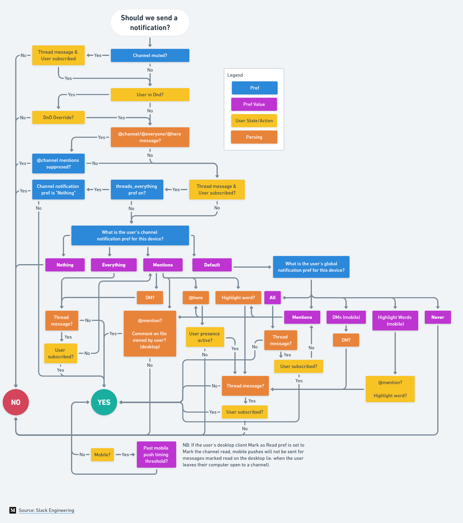
This image connected with many people because it showed the intricate and thoughtful processes behind something as common as a notification. It resonates with users who have dealt with unpredictable notifications, offering a relatable and entertaining take on the issue. The image also provided a rare look into the careful decision-making that influences user experiences, emphasizing the importance of balancing functionality with user needs.
The image’s clever blend of simplicity and humor makes it highly shareable, quickly becoming a sensation among the tech community. It reminds us that even the smallest product decisions involve a lot more thought than one might assume, reinforcing the value of thoughtful design and product development.
> “Complexity is often hidden in the simplicity of a well-designed experience.” — Unknown
> This is one of my favourite examples of a workflow.
>
> "How Slack decides to send a notification."
>
> Keep this in mind the next time someone asks you to design a "simple" feature. [pic.twitter.com/EOWcMaDZuz](https://t.co/EOWcMaDZuz?ref=everydayux.net)
>
> — Jess ♡ (@jesseddy) [February 21, 2023](https://twitter.com/jesseddy/status/1627923011490975746?ref%5Fsrc=twsrc%5Etfw&ref=everydayux.net)
[See the Twitter conversation](https://x.com/jesseddy/status/1627923011490975746?ref=everydayux.net).
### Collaborative design: 3 powerful examples from different industries
URL: https://www.everydayux.net/untitled/
Last updated: 2026-02-24T01:24:37.000Z
Collaborative design is a fantastic facilitation tool that harnesses the collective input of stakeholders with diverse perspectives to generate the best ideas. While the specific methods may vary across industries, the ultimate goal remains consistent. By incorporating a variety of perspectives in a structured and intentional manner, we can do great things by inviting diverse perspectives into the work.
What I love about UX and collaborative design is that they are really a set of tools that allow you to problem-solve in different contexts. Once you learn the methodologies, you can apply them to anything. I’ve seen it work so many times, and it feels like magic each time because it's so effective and relatively fast. As a designer, this is a huge win.
**This article will explore collaborative design in three different environments.**
## **Example #1: Urban planning in Indonesia**
In this example, Firm Foundation (a company that aims to reduce environmental vulnerability in riverfront settlements) worked with Solo Kota Kita (an Indonesian NGO that helps citizens and government officials understand the complexities of the built environment). Together, they organized workshops with three riverfront communities in Banjarmasin, Indonesia, to envision, design, and create a sustainable community space at the confluence of the Martapura River and Andai Canal. The city's planning and public works departments and local leaders were also invited to participate.

During the collaborative (or “participatory”) design process, residents had the opportunity to share ideas for improving their neighborhoods. Firm Foundation used different tools and activities to elicit the best information and feedback from the group, including:
- **Transect walk:** Observing and documenting the neighborhood with residents using a simple map and symbols.
- **Neighborhood model:** Building physical models to help residents understand relationships between different areas and scales.
- **Problem tree:** Visualizing and analyzing problems, causes, and effects to identify root issues and potential solutions.
This structured process allowed urban design solutions to unfold naturally, removing much of the guesswork. The designers and planners still had the important job of executing the actual design, but they could draw on the valuable information and shared vision produced by the group.
## **Example #2: Community building in Detroit**
The Detroit Collaborative Design Center (DCDC) uses a process called “Neighborhood Engagement Workshop” (NEW) to empower residents to renew their communities through collaboration and coalition-building.
> “Workshops bring a mix of stakeholders, including community residents, youth, business owners, local government representatives, etc., to the same table to discuss neighborhood assets and needs. These diverse stakeholders often bring separate goals to the table, but through the workshop process, they achieve a common strategic vision that positively impacts each individual goal.”
This example stands out because of its focus on community-building. We start to see a common theme core to collaborative design, no matter the industry or specific process: bringing people with different perspectives together around a shared vision.
Typically, 20-30 people attend each DCDC workshop, with each participant asked to gather input from the larger community. The process also includes broader engagement strategies like surveys, comment boxes, and public events to gain input and feedback on the design.
## **Example #3: Architecture and integrated project delivery**
In architecture, methods like Equal Design Partners (EDP) and Integrated Project Delivery (IDP) aim to involve all key stakeholders early in the design and decision-making process. Like a good software design and development process, IDP recognizes the value of understanding technical implications from the start. You can't design something optimally without that perspective.
One article notes, “Architects didn’t become architects to be designers among designers. They became architects to design.” This statement reflects the common perception that architecture is an individual pursuit, with the architect as the sole visionary. But in reality, the most successful architects recognize the value of collaboration.
Like UX/UI designers who work together to create better solutions, architects can enhance their creative vision by collaborating with others. The results can be incredibly powerful when a group of architects comes together to build on each other's best ideas. The collective expertise and diverse perspectives can lead to innovative designs that no single architect could have conceived alone.
Of course, this doesn’t mean architects should abandon their design sensibilities. Rather, it's about finding the right balance between personal vision and collaborative input. By being open to the ideas of others while still maintaining their unique point of view, architects can create designs that are distinctive and optimized for real-world needs.
Collaboration doesn’t mean compromising your design sensibilities. It’s about striking a balance between your vision and the valuable input of others. By being open to new ideas while staying true to your unique perspective, you can create distinctive and optimized designs for real-world needs. Collaboration allows you to tap into the collective wisdom and expertise of the group, arriving at solutions you might not have considered on your own.
However, it’s important to understand that collaborative design is not entirely about handing over the reins. It’s about facilitating a process that allows different viewpoints to enrich and refine the design. As the architect, you still critically synthesize these perspectives into a cohesive, functional end product, whether it's a building, a community space, or a landscape. Collaboration is a tool to enhance your design, not a replacement for your skill and vision.
### **The magic of collaborative design**
Collaborative design is a potent tool for tackling complex challenges across industries. By bringing diverse stakeholders together in a structured process, we can uncover the best ideas, foster buy-in, and develop superior solutions more efficiently. This approach harnesses the collective intelligence and creativity of the group, leading to outcomes that are more than the sum of their parts.
I've witnessed the magic of collaborative design firsthand in my UX work, and the examples we've explored demonstrate its transformative potential in fields like urban planning, community-building, and architecture. Despite differences in specific activities, the core principles of inclusion, shared vision, and facilitated co-creation remain consistent. These principles create a framework for collaboration that anyone can adapt to suit the unique needs of any project or team.
We'll see collaborative design embraced more widely, from product development to policymaking. As our world becomes increasingly complex and interconnected, this approach offers a way to navigate that complexity and create solutions that truly work for everyone. While it may require a shift in mindset for those accustomed to working independently, the benefits of collaboration far outweigh any initial discomfort. Collaborative design unlocks innovation, builds consensus, and produces more robust and resilient outcomes.
If you haven’t tried collaborative design yet, I highly recommend it. Bring together a diverse group, create a space for open discussion, and watch as new ideas and possibilities emerge. No matter what you're working on - a digital product, a community project, or a building - you'll be amazed by the energy, creativity, and progress of designing together. So go for it - embrace collaborative design and see where it leads you.
### Designers just get each other
URL: https://www.everydayux.net/why-designers-get-each-other/
Last updated: 2025-08-08T01:38:32.000Z
As designers, we’ve all been there—receiving vague feedback like “looks weird” from someone who isn’t a designer. Our immediate reaction is to ask, “Can you be more specific?” We need the details, the reasoning, and the ‘why” to make meaningful changes. But when talking to another designer, we somehow get it. A simple “looks weird” carries a context that doesn’t need unpacking.
> Anyone to a designer: "looks weird"
> Designer: "can you be more specific?"
>
> Designer to designer: "looks weird"
> Other designer: "yeah, it does"
>
> — Jess ♡ (@jesseddy) [October 24, 2019](https://twitter.com/jesseddy/status/1187200917243744258?ref%5Fsrc=twsrc%5Etfw&ref=everydayux.net)
I understand why this tweet went viral; it perfectly captures that contrast, highlighting the unspoken language we share with our peers. This understanding is built on a foundation of shared knowledge and experience, a sense of knowingness. You can skip the explanation with another designer because they already know what you mean. However, when we talk to non-designers, we often have to explain things in more detail to make the feedback useful.
These little moments remind us how our experience shapes how we see, interpret, and discuss our work. This tweet is so relatable because it speaks to the heart of our daily interactions and the unique communication styles with our peers and in our creative field.