
This article includes a free Figma resource for everyday ux members. The file is at the bottom of the page; sign up or log in to access it.
Let’s talk about annotations in Figma.
Annotations are one of the simplest—and most overlooked—tools for design documentation in Figma. Let’s break down what they are, why they matter, and how to use them effectively (even if your team doesn’t have full access).
What are Figma annotations?
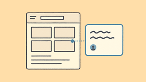
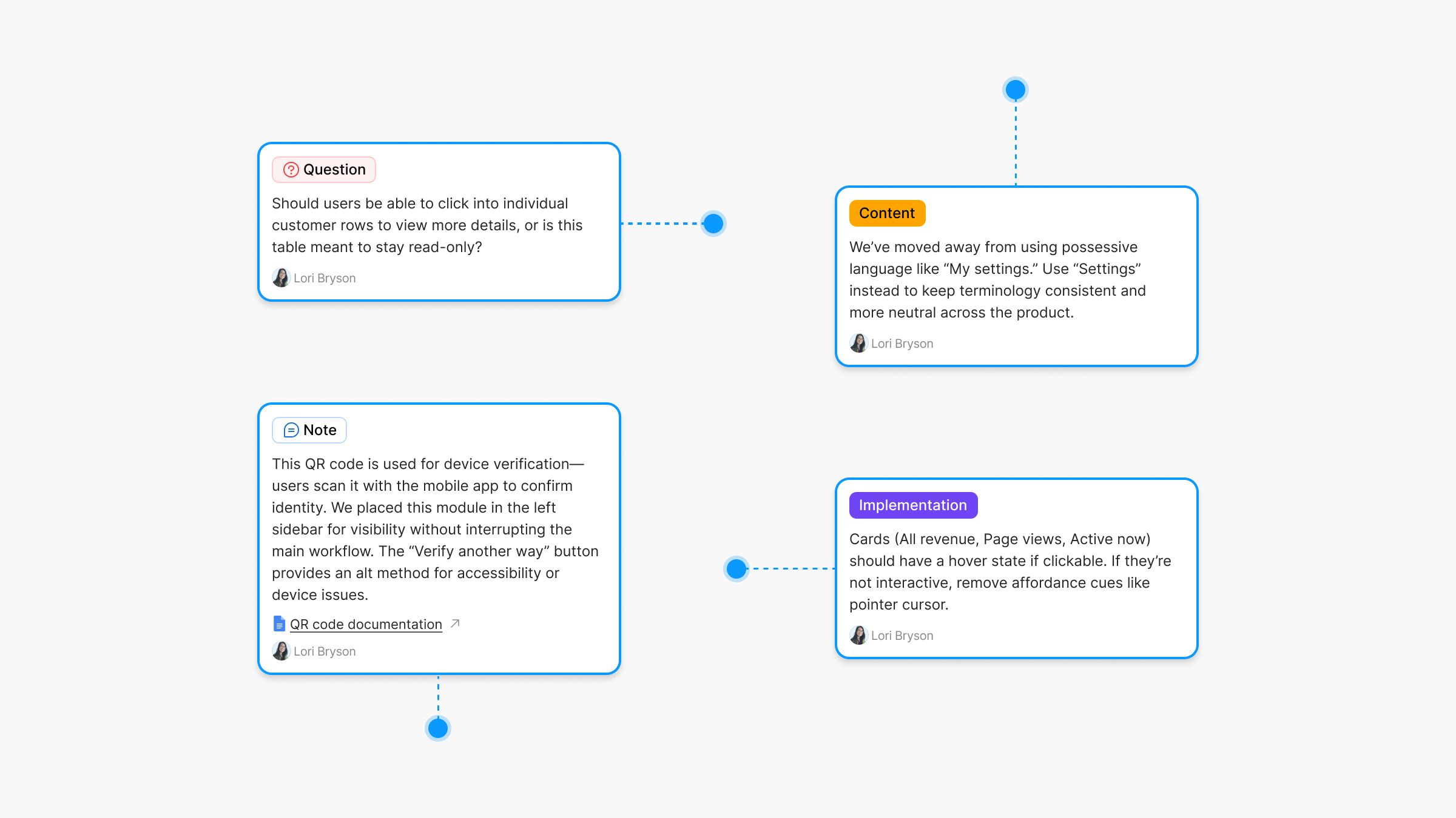
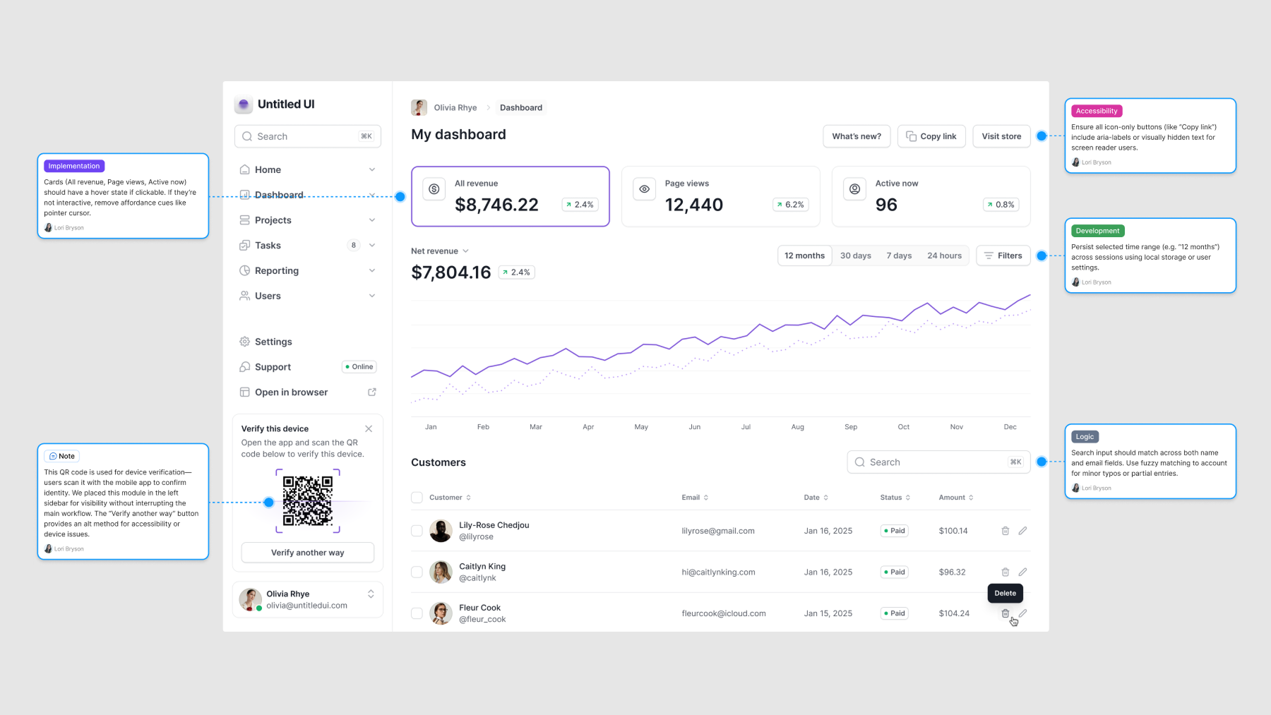
Annotations are contextual notes you can attach directly to design elements. They help teams communicate clearly by surfacing key details—like spacing, interaction, or accessibility requirements—right in the file. You can label them by type (Development, Interaction, Accessibility, etc.) and use them to explain design choices, flag implementation details, or call out what still needs work.
Design annotations make it easier for everyone to understand what they’re looking at—and why it matters.
Figma’s recent update to annotations
Figma recently updated its annotations feature, which we’ve all been waiting for. This feature is fundamental to how designers work.
At its core, designing software is about communication. Designers constantly need to highlight specific aspects, clarify decisions, raise questions, and share context. A lot of that happens through quick dialogue; having those conversations inside the design file is essential.
Figma annotations
Figma finally updated its annotations feature, which many of us have been waiting for. But there’s a catch: annotations are only visible to users with a full seat or dev mode access.
If you’re like me, most of your stakeholders don’t have full seats or dev mode. This means that I still can’t use this feature in practice. And I’m guessing I’m not the only one. That’s why I created an annotations component that works much like Figma’s but without the access limitations.
And since it’s a component, you can customize it to fit your specific needs.
Why use an annotations component instead?
Built-in annotations are limited to users with full seat or dev mode access. However, many of us work with stakeholders, clients, or teammates who don’t have that kind of access. A component version removes that barrier—anyone can see the notes, and no permissions are required.
A component doesn’t have those limitations. Anyone accessing the file can see the annotations; no special permissions are needed.
Annotations vs. comments
Comments are great for quick questions and feedback. They’re a core part of how teams collaborate. But they’re not built for documenting decisions or providing lasting context. Once resolved, they disappear. On the other hand, annotations stay visible and help preserve important details directly in the design.
Benefits of annotations
Annotations surface key information directly in the design—no digging, no clicking. That clarity helps people understand the work faster and give better feedback. It also shows the thinking behind the design, which builds trust and saves time.
Annotations improve comprehension and support better collaboration by making key details visible and clear.
Annotations are a simple but powerful form of design documentation.
What is design documentation?
Design documentation helps track how and why a design took shape. It captures notes, context, requirements, and key decisions—so anyone looking at the work can understand it, whether they’re a designer, developer, or stakeholder.
Annotations are one of the easiest ways to build design documentation into your file. They keep important context visible, accessible, and easy to follow.
Here are a few ways you might use annotations in practice:
- Note: “This icon is a placeholder—final asset coming from the brand team.”
- Question: “Should this modal auto-close after submission?”
- Implementation: “Use system font stack here for performance.”
- Development: “Match padding to mobile spacing scale (8px increments).”
- Content design: “Headline needs a friendlier tone—draft in progress.”
- Accessibility: “Ensure focus state is visible for keyboard users.”
- Legal: “Include disclaimer text for GDPR compliance (see copy doc).”
You can also use annotations to highlight what’s new since the last design review, making updates easier to spot. For more on how to use design documentation, check out this practical guide.
 Jess Eddy
Annotations component for Figma
Free for everyday ux members
download 👇